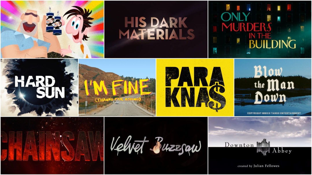
Welcome to part seven of Art of the Title's semi-annual 10 Women of Title Design feature article, bringing the number of women showcased to 70!
In March of 2015, we published our first article in celebration of International Women’s Day entitled 10 Women of Title Design. Every year since, we've returned with a new group of 10 women in the title design industry to celebrate. When I first conceptualized this feature, I knew of about 20 women whose work I could showcase. I've been doing research since then, ever on the lookout to uncover the names of women and non-binary creators working in title sequence design. I'm humbled and overjoyed to share these ten additional names.
This year the list includes creative directors, animators, motion designers, and CG artists who have been creating work in the last couple of decades, spanning a variety of genres across both TV and film. Join us as we celebrate another Women's History Month and shine a light on some often unsung contributors to this artform.
10 Women of Title Design That You Should Know – Part Seven
Claire Typaldos
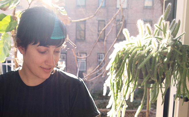
Title Designer Claire Typaldos
Claire Typaldos is a creative director and designer based in Los Angeles, California.
Originally from New York, Typaldos has created title sequences for films Blow the Man Down (2020), The Jesus Rolls (2019), Yearly Departed (2020), This Film is About My Mother (2022), and Resurrection (2022), as well as Netflix web series I Like to Watch (2019).
She attended Wesleyan University, graduating with a bachelor’s degree in Fine Arts and has completed artist residencies including Anderson Ranch Arts Center in Snowmass Village, CO, Pocoapoco in Oaxaca, MX, and Kala Art Institute in Berkeley, CA. She works primarily in film, hospitality, branding and packaging design. Notable clients include Netflix, Apple, and Folklor.
Blow the Man Down (2020)
CATEGORY: Film
Blow the Man Down (2020) – main titles by Claire Typaldos
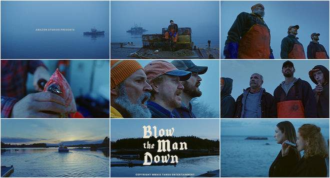
In Bridget Savage Cole and Danielle Krudy’s neo-noir black comedy Blow the Man Down, Priscilla (Sophie Lowe) and Mary Beth (Morgan Saylor) are newly orphaned sisters saddled with grief and a floundering business in the fishing village of Easter Cove, Maine. One drunken, violent night sends the sisters down a path of secrets, scoundrels and savage consequences. Named after a traditional sea shanty sung by sailors since at least the 1860s, the song in the opening works wonderfully to establish the film’s environment and the conflict at its center: the old ways butting up against a new generation. The song is thought to describe an incident at sea wherein a strong wind, most often a sudden gale during a storm, knocks a battle-ready ship (or “man-o’-war”) over. The storm, in this case, begins with two young women.
Beautiful blue-tinged cinematography by Todd Banhazl (The Strange Ones, Hustlers) floats among grisled deck hands, one of whom puffs stolidly from a vape pen. The voices calling clear across the water come care of David Coffin (who gives a cheeky wink), Jacek Sulanowski, Daniel Lanier and Thomas J. Goux. The film’s title, designed by Claire Typaldos (who also designed the opening to 2022's Resurrection), appears in cream-coloured blackletter typography. The text is stacked and solid and, in a nod to the effects of older film eras, it's doused in an optical-style glow and paired with a copyright line.
Clarissa Donlevy
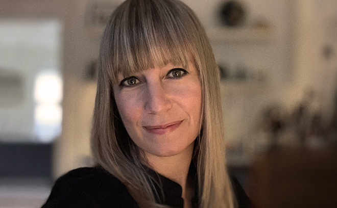
Creative Director Clarissa Donlevy
Clarissa Donlevy is a creative director and designer for film, TV, games and commercials. Originally from Sydney, Australia, she began her career in London, UK, working for SuperUnion, BBC, and Carlton Television / ITV, before returning to Sydney to work for Garner Mclennan Design and Foxtel. In 2007, she relocated to Los Angeles, where she has worked with Engine Group, Prologue, yU+co, Imaginary Forces, and Elastic. She has a bachelor of arts from University of Western Sydney, where she studied design.
Her title design credits include openings for films The Quiet American (2002), Dragonball Evolution (2009), Whiteout (2009), Gossip (2021), and Australia TV series Love My Way (2004). She was creative director on the title sequences to TV series His Dark Materials (2019), which won the BAFTA for Best Titles and Graphic Identity in 2020, and Netflix's The Last Dance (2020). She has directed teasers for HBO's The Pacific (2010) and Turbine's 2007 video game The Lord of the Rings Online, helmed creative direction for a 360 campaign for Redbull TV's documentary series The Horn (2016), designed visual effects sequences for The Tempest (2010) and brand identities for films Crazy, Stupid, Love (2011), Horrible Bosses (2011), and The Mortal Instruments: The City of Bones (2013). Along with the BAFTA Award, her work has been honoured with Clio, Addy and Telly Awards.
His Dark Materials (2019)
CATEGORY: TV
His Dark Materials (2020) – main titles by Elastic
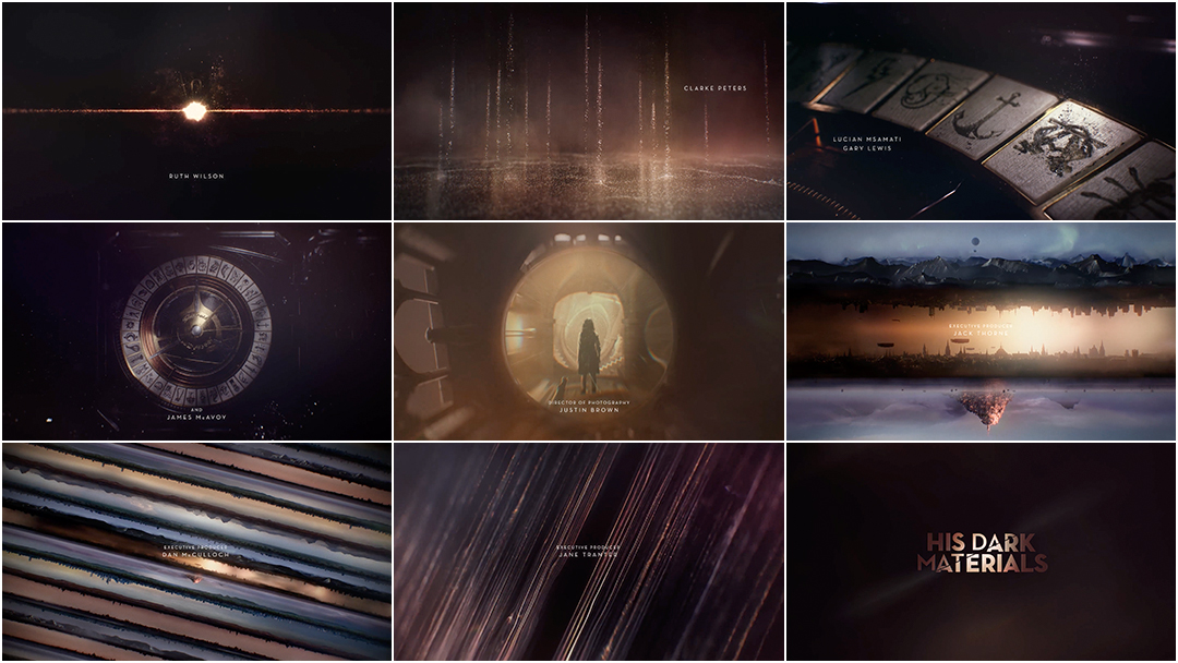
For the opening to the 2019 TV adaptation of Philip Pullman's lauded His Dark Materials trilogy, studio Elastic welds together a soaring sequence of dust and doorways, mechanisms and mystery.
After the first 20 seconds, the intro's movement becomes one long zoom out. A young woman stands alone, a knife behind her back and her animal companion by her side, as staircases and hallways swallow her up, Escher-style, eventually giving way to mountains and forests. Flying machines zoom across skies unknown. Cities stack one on top of the other. These worlds in parallel are arranged horizontally, strata of universes appearing like pages in a book or strings on an instrument, waiting to be plucked. When the title appears in the last frame, it is sliced in two, a fissure down its middle, foreshadowing the rift at the heart of this sweeping story.
Behind these epic titles are creative director Clarissa Donlevy and a robust team of designers, animators and compositors from LA-based Elastic and Cardiff-based Painting Practice. The score, awash with hope and thumping with adventure, was created by Grammy Award-winning composer Lorne Balfe. The sequence won the 2020 BAFTA Award for Best Titles and Graphic Identity.
Catalina Matamoros Puerto

Title Designer Catalina Matamoros Puerto
Catalina Matamoros Puerto is a Colombian animation director and illustrator.
She studied design at Universidad de Los Andes and animation and digital arts at the University of Southern California. Her first short film Out of Line (2015), co-directed with Alicja Jasina, was a semifinalist at the Student Academy Awards, and her second film We Are the Immigrants (2016) has been shown in festivals around the world and was a finalist for Best School Short Film at the Iberoamerican Animation Quirino Awards.
While at Los Angeles production studio Picturemill, she contributed to title sequences for Storks (2016) and Prison Break (Season 5). She has also designed titles for several shorts as well as feature film I’m Fine (Thanks for Asking) (2021).
I'm Fine (Thanks For Asking) (2021)
CATEGORY: Film
I'm Fine (Thanks for Asking) (2021) main titles
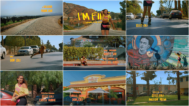
In the opening to Kelley Kali and Angelique Molina’s 2021 film I’m Fine (Thanks For Asking), single mother Danny (Kelley Kali) wheels around the streets of Pacoima, California. Danny, recently widowed, and her eight-year-old daughter Wes have been “camping” in a tent on the edge of town while they find a better situation.
In a yellow tee, pink tank top, black bike shorts and fanny pack (an outfit picked out by Wes) and leopard-print roller skates, Danny dances her way into town. These moments are full of hope before the backbreaking reality of the day – scraping together enough money to secure a new apartment – gets into full swing. Set to Tha Alkaholiks’ punchy “DAAAM!” and showing Danny busting loose in front of local murals and hangouts, the opening recalls Rosie Perez’s sharp moves in Do The Right Thing (1989). Flowing cinematography by Becky Baihui Chen moves from close-ups on roller skates and dusty hands to wide shots of Danny set against vibrant wall art and busy intersections, the street corners and vacant lots bright in the sun and alive with the shake of her hips.
Set atop the sequence is yellow and pink hand-lettering created by designers Catalina Matamoros Puerto and Brian Vincent Rhodes. The text wiggles and shakes, echoing Danny’s energy. It’s a radiant, personality-driven opener that shines a light into Danny’s world: lonely and gruelling but full of light, too.
Tamsin McGee
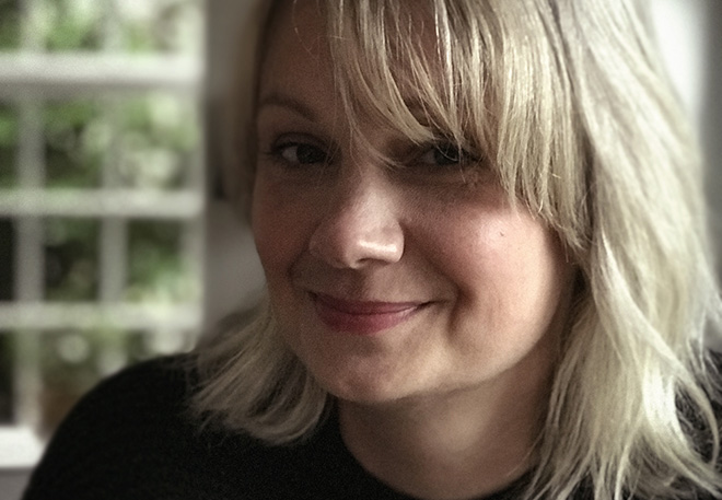
Creative Director Tamsin McGee
Tamsin McGee is an Emmy Award-winning art director and motion designer based in London, England.
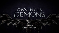
Originally from Hertfordshire, McGee moved to London in the ’90s to study for a BA in Graphic Design at The London College of Printing. After graduating she joined Hugo Moss at Huge Designs. Her title design credits include Downton Abbey (2010), Da Vinci’s Demons (2013), The Newsroom (Season 2) (2013), Jekyll and Hyde (2015), The Son (2017), One of Us (2017), The Walking Dead (Season 9) (2018), and Hold the Sunset (2018).
Downton Abbey (2010)
CATEGORY: TV
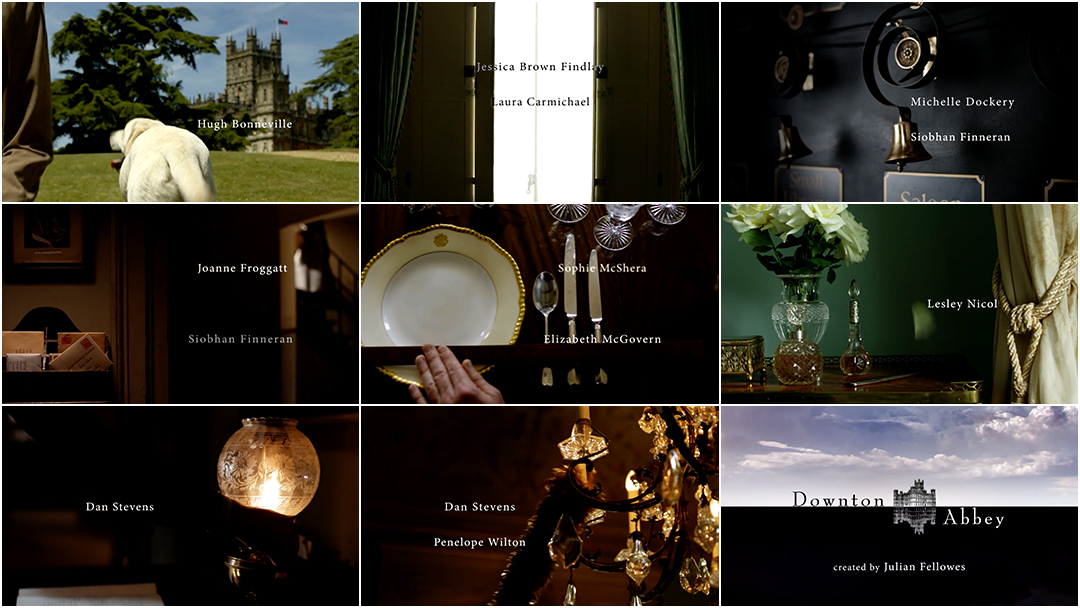
Downton Abbey (2010) – main titles by Huge Designs
When Tamsin McGee and Hugo Moss of Huge Designs set about designing the title sequence of Downton Abbey, they had a major advantage: the theme music had already been created. Often designers work with temporary tracks as composers write music concurrently or after the fact but in this case composer John Lunn had stumbled into the theme early on. Scenes of expansive lawns, elegant draperies, servants’ bells, copper kettles, gilded plates and silverware, creamy roses and crystal candelabra were clipped and cut together by the team at Huge to invite viewers into the Yorkshire home of the Crawleys, an aristocratic family, and their servants in the post-Edwardian era.
Lunn had initially written backing music for scenes in the first episode, which does not feature a title sequence, but by the time that episode was finished that piece of music had taken hold. Lunn reworked it into a 30-second theme that, when paired with the visuals, adds a sense of drama, intrigue and darkness to the lush imagery. “They're quite vague, the titles,” said Lunn, speaking with Town and Country about the sequence’s visuals. “You see candelabras and a dog’s bottom and there's pictures of the house but it's the music that's really kind of giving an idea of the thing you're about to see.” When the title of the show appears at last, the screen is horizontally split in two, light and dark, the words interrupted by the English country house set in the center against a cloudy sky, tiny on the sprawling horizon. Its inverse appears in the bottom half, upside-down in a black expanse. A secret world.
Anna Lindqvist
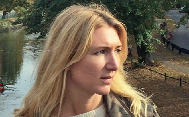
Title Designer Anna Lindqvist
Anna Lindqvist is a motion designer, art director, and illustrator based in Sweden.
Lindqvist grew up in Gothenburg, Sweden, and in 1997 she moved to Stockholm where she attended various art schools, eventually joining post company The Chimney Pot, where she created motion graphics for eight years. In 2010, she started Kavorka, a company that produces motion graphics for music videos, feature films and festivals. She has designed motion graphics and animation for Lady Gaga, Swedish House Mafia, and Maroon 5, as well as brands like Dior, Absolut, Stella McCartney, and H&M. The music video for Lady Gaga's "Paparazzi" featuring Anna's graphic design and animation won a 2009 MTV Video Music Award.
She has designed the title sequences for TV series Midnight Sun (2016), Farang (2017), and Roslund & Hellström: Box 21 (2020) and for films including Suddenly (2006), Control (2007), Eastern Plays (2009), The Last Sentence (2012), and The 100-Year-Old Man Who Climbed Out the Window and Disappeared (2013), A Man Called Ove (2015), Stockholm, My Love (2016), Para Knas (2017) and Call Mom! (2019).
Para Knas (2017)
CATEGORY: Film
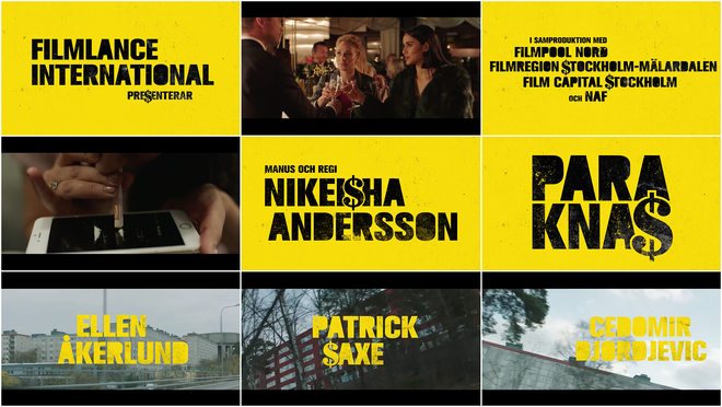
Para Knas (2017) main titles
“Think weird, ugly, dirty but nice.” These were the instructions that Para Knas director Nikeisha Andersson had for title designer Anna Lindqvist. For Andersson’s debut feature film, Lindqvist took that advice to heart to create a set of bombastic, cadmium-yellow title cards.
Para Knas (aka Money Problem) follows teenagers Sara (Roshi Hoss) and Amida (Ellen Åkerlund), a pair of friends living in Stockholm who are yearning to break free of their financially limiting lives and willing to do it by any means necessary. The title sequence, sharply edited by Andersson, Julian Antell and Håkan Wärn and set to thumping electro from composers DeadMono, plays in lightning-fast spurts of hyper-saturated club scenes, drugs, and the consequences of a wild time. The heavy typography in black and then yellow, dotted with dollar signs, introduces the key players as the song “Hässelby Gård” by Ken Ring featuring Olle Haggberg ushers in the film. It’s a bifurcated sequence, with a trailer-like peek at the chaos to come and, after the title card, a gentle introduction to the tough but stable world of these two ambitious girls.
Soyeon Kim
Soyeon "Dottie" Kim is a filmmaker, illustrator, and educator based in Monterey, California. Kim was born in Seoul, Korea. While she studied painting at college, she developed an interest in moving images, which led her to the world of animation and media arts. She has been producing independent films since 1993, as well as working on projects in advertising and film production as a director, art director, designer, and animator. In 2009, she directed (with Todd Hemker) the title sequence for the animated feature film Cloudy with a Chance of Meatballs.
Her independent films and commissioned works have been screened in over 400 film festivals worldwide. She runs design and animation studio Yellowshed with Hemker and teaches animation and visual/motion design at the California State University, Monterey Bay.
Cloudy with a Chance of Meatballs (2009)
CATEGORY: Film
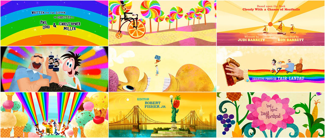
Cloudy with a Chance of Meatballs (2009) main-on-end titles by YELLOWSHED (Todd Hemker & Soyeon Kim)
For the end of Cloudy with a Chance of Meatballs, Phil Lord and Chris Miller’s exuberant 3D-animated caper, studio Yellowshed created a delightful movable feast. Fields of cupcakes and watermelons, a bicycle with wheels of sliced citrus and boats with swiss cheese sails float by in a buffet of 2D animation laden with colour and texture. In a nod to Terry Gilliam’s stop-motion sequences for Monty Python, a hand drops into frame to place a steel cloche over a dancing Baby Brent wearing a giant roast chicken. Later, a hand makes off with a slice of cherry pie. The energy is bright and fanciful, much of it due to the continuous camera moves, the action rushing along from left to right.
The delightful sequence was co-directed by Yellowshed’s Soyeon Kim and Todd Hemker, who took their cues from Lord and Miller. They wanted the film to end on an “absurdly happy note set in a utopian trippy wonderland made out of food,” says Hemker. The two worked to create a narrative for the animation that showed the newfound closeness of the father and son characters and the mayor getting his comeuppance, providing a sense of closure for the film.
Margherita Premuroso
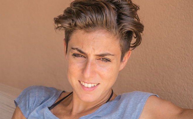
Title Designer Margherita Premuroso
Margherita Premuroso is an award-winning art director, character designer, animator, and illustrator working in title sequences, commercials, film, video games, and print.
She has contributed to title sequences for Suburbicon (2017), Feud: Bette and Joan (2017), The Putin Interviews (2017), Lodge 49 (2018), Tell Me A Story (2018), Velvet Buzzsaw (2019), and Semi-Permanent Sydney 2019. She has worked with studios Prologue, Elastic, and Mustache. In 2017, she was nominated for an Outstanding Main Title Design Emmy Award for the Feud: Bette and Joan (2017) title sequence. She is based in Milan, Italy.
Velvet Buzzsaw (2019)
CATEGORY: Film
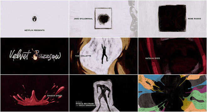
Velvet Buzzsaw (2019) — main titles by Elastic
For the 2019 horror-satire Velvet Buzzsaw, which sees various art aficionados savagely skewered, studio Elastic created a sharp and sketchy animated opener. Best known for their slick, CGI-based title sequences for TV series like True Detective, Game of Thrones, and Westworld, here Elastic tries a different tack under the inspired creative direction of Neil Kellerhouse and Hazel Baird. Directed by Dan Gilroy (Nightcrawler, Kong: Skull Island) and starring Jake Gyllenhaal and Rene Russo, the film pokes fun while taking some gory swipes at the contemporary art scene in Los Angeles.
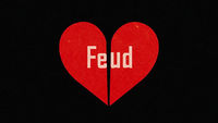
To create the colourful, painterly sequence Kellerhouse and Baird worked with a team including designers Margherita Premuroso and Jared Purrington and art director Diego Coutinho. The intro takes cues from American Psycho’s bloody, tongue-in-cheek opening titles (the music by Marco Beltrami and Buck Sanders in particular) while aligning itself with the graphic simplicity of openers to shows like Mad Men or Feud: Bette and Joan (which Premuroso also worked on).
Olney Atwell
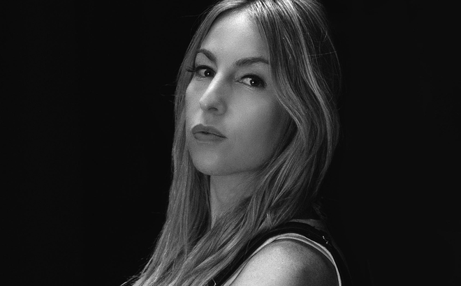
Motion Designer and Director Olney Atwell
Olney Atwell is a motion graphics artist and director working in tv and film. Hailing from Rockland, Maine, Atwell has over a decade of experience working in the film, TV and music industries.
After attending University of Maine's New Media program, she worked as a motion designer at Visionmill and received two Telly Awards for her work. In 2007, she enrolled in graduate school at NYU in the Digital Imaging and Design Program. In 2009, she interned at NBC and later worked as an animator and designer at MSNBC before moving to Los Angeles in 2012 to start Darkred Studios. She has designed titles for films Hot Tub Time Machine 2 (2015), Vacation (2015), Popstar: Never Stop Never Stopping (2016), Always Be My Maybe (2019), The Unauthorized Bash Brothers Experience (2019) and Young Rock (2021), as well as the TV series VEEP (Season 5) and show graphics for Modern Family, Connection Lost, Carpool Karaoke, Miracle Workers and The Good Place.
Chainsaw (2015)
CATEGORY: Short Film
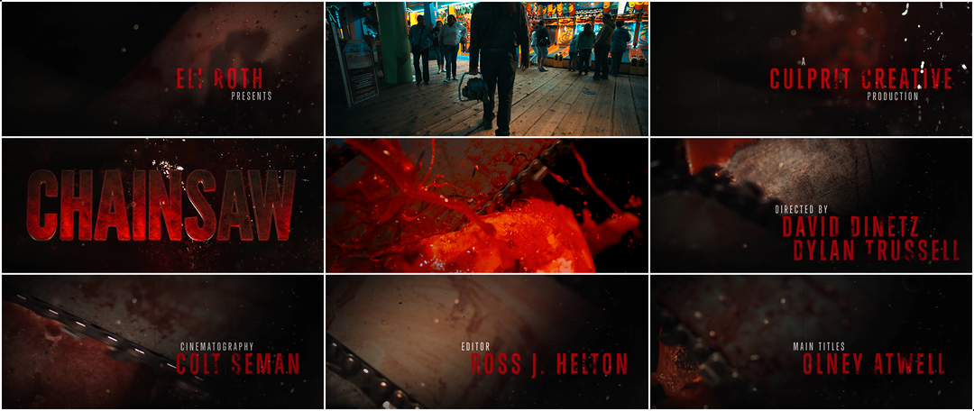
Chainsaw (2015) main title reveal and end titles by Olney Atwell
“The neighbors were definitely debating whether to call the police,” says motion designer Olney Atwell about the shoot to capture the macro footage for Chainsaw’s main titles. The 2015 short from directors David Dinetz and Dylan Trussell is about a killer who slaughters attendees of a carnival haunted house. As we follow the nameless madman through the amusement park, the credits appear in hits of blood-red, scratched film textures, and flashing condensed typography atop a background of viscera and whirring steel teeth.
Atwell had just one night to create the titles for the gory flick, designing instinctively with Adobe After Effects and Element 3D to create credits that suited the footage. The title text is gargantuan and glistening, filling the screen, unstoppable. “Mannequins were rigged with blood-filled water balloons and then murdered with a real chainsaw,” she says. “You can feel the wetness of the blood and the sheen of the chainsaw blade. It’s gorgeous and gruesome at the same time.” The grinding, squelching sound design came care of Ross Helton with music by Hamburg-based composing team 2WEI.
Tnaya Witmer
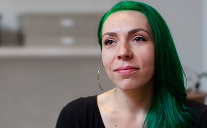
Motion Designer and Art Director Tnaya Witmer
Tnaya Witmer is a motion designer and art director based in Los Angeles. Witmer graduated from the Art Institute of Pittsburgh with a degree in Video Production in 2005 and began her career in the film and television industry as a freelance editor before transitioning into motion graphics.
In 2014, Witmer joined Sarofsky Corp. in Chicago where she worked on title sequences for Captain America: The Winter Soldier (2014), Guardians of the Galaxy (2014) and Guardians of the Galaxy Vol. 2 (2017), OFFF Mexico 2015, Ant-Man (2015), Doctor Strange (2016) and Captain America: Civil War (2016). In 2018, she moved to Los Angeles to pursue freelance projects. She has also worked on titles for films Halloween (2018) and Captain Marvel (2019); TV series Weird City, Only Murders in the Building, Mayors of Kingstown, and The Kings of Napa; as well as commercials for Verizon, Budweiser, and Minute Maid. In 2022, she was nominated for an Emmy Award for Outstanding Main Title Design for her work on the opening titles to Only Murders in the Building.
Only Murders in the Building
CATEGORY: TV
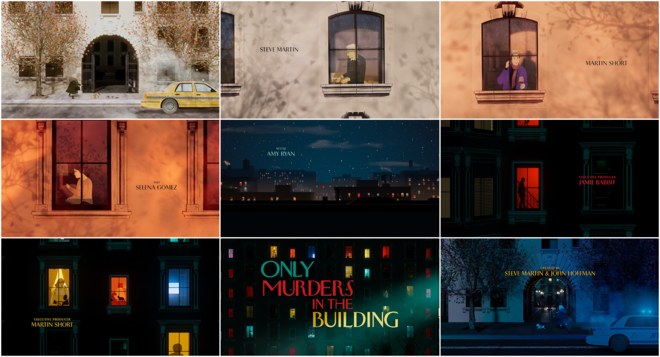
Only Murders in the Building (Season 1, Episode 1) main titles created by Elastic
For the upbeat, elegant opening to Hulu’s Only Murders in the Building, creators Steve Martin and John Hoffman were looking for an ode to New York City and the curious chaos of its neighbourhoods. The show revolves around three tenants of an apartment building who work together to solve a murder and record a podcast about it. To introduce this scenario, creative director Lisa Bolan (Carnival Row, Captain Marvel), designer Tnaya Witmer, illustrator Laura Perez, and a team at studio Elastic crafted an intro that combines voyeuristic longing, comedy and the intrigue of true crime.
Taking inspiration from the design of the Arconia, the titular building, the title sequence has an Art Deco feel and a midcentury charm. As the fire alarm goes off, each bright window provides a glimpse into a life. There’s a hint of Rear Window, of course, but the tone lands somewhere between the openers for You’ve Got Mail (supremely sweet) and Marvel’s Jessica Jones (down and gritty). And the cherry on top? Each episode’s opening features a different Easter Egg: a set of Scrabble tiles, a dancing Hula figurine, a bee – another way to keep viewers hunting for clues. A lot can happen in the time it takes to walk your dog.
Svenja Frahm
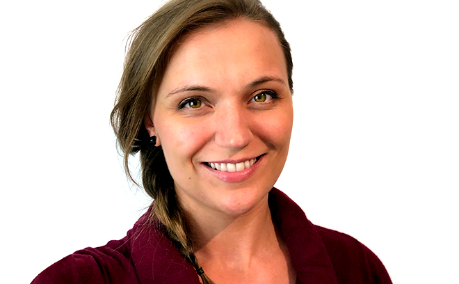
Motion Designer and Director Svenja Frahm
Svenja Frahm is a motion designer and director based in London, England.
Frahm has contributed to title sequences including An Education (2009), Strike Back (2010), Fresh Meat (2011), The Last Panthers (2015), The Tunnel (Season 2) (2016), Beowulf: Return to the Shieldlands (2016), Philip K. Dick's Electric Dreams (2017), Luther (2018), Hard Sun (2018), and The Secret of Immortal Code (2018). In 2018, her work on the title sequence to Electric Dreams was nominated for a Royal Television Society Craft & Design Award.
Frahm studied graphic design in Germany, where she is originally from, as well as China and the UK. She has a BA in Graphic Design and Advertising from Buckinghamshire New University and an MA in Graphic Moving Image from University of the Arts London. She has worked with studios including Momoco, Channel 5, Radiant Studios, FirewithoutSmoke, Kemistry, Venture Three, and Petrol Ltd.
Hard Sun (2018)
CATEGORY: TV
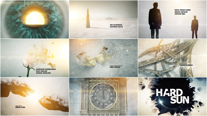
Hard Sun (2018) – main titles by Momoco
“News had just come over / We had five years left to cry in,” sings David Bowie. “News guy wept and told us / Earth was really dying.” Like the Bowie song, the duo at the heart of Neil Cross’s series Hard Sun know they have just five years. Elaine Renko (Agyness Deyn) and Charlie Hicks (Jim Sturgess) are two enemies-to-allies police officers who stumble into evidence that the world will soon end. The pre-apocalypse drama is jointly produced by BBC One and Hulu and is set in London. It follows Renko and Hicks as they dodge government operatives intent on keeping the impending solar catastrophe under wraps.
To open this story and ground it from one episode to the next, UK-based studio Momoco created a high-contrast title sequence filled with light, blueprints, and the silhouetted shapes of creatures great and small disintegrating into the ether. “For the Hard Sun title sequence I created some of the epic scenes from scratch,” says 3D artist Svenja Frahm. With direction from Momoco creative director Nic Benns and art director Miki Kato (who also handled typography), Frahm created elements of the sequence including the tree and the intertwined junction, among other striking images. The sequence underscores the gravity of the show’s stakes and the connection between the characters, now bound together in their own tight orbit.
—
To discover more title designers, take a look through our directory of designers. And if you know of any women or non-binary creators working in title design who haven't yet been featured on the site, let me know.
Art of the Title's mission is to champion the work of title designers and all those involved in the craft. The 10 Women of Title Design articles are one of of the site's efforts toward more balanced representation, a priority that is vital to our mission and to ensure a thriving, diverse industry.
WANT MORE?
Check out the earlier articles:
10 Women of Title Design
10 More Women of Title Design
10 Women of Title Design — Part Three
10 Women of Title Design — Part Four
10 Women of Title Design — Part Five
10 Women of Title Design — Part Six

