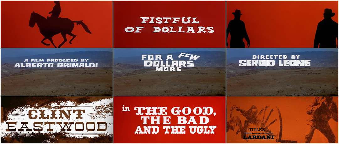
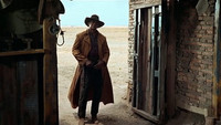
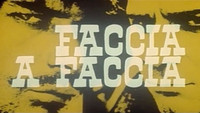
While the myth of the American West may have been forged in the pages of dime store novels and on the screens of Hollywood in the first half of the 20th century, it is three Italians who would define the second: director Sergio Leone, composer Ennio Morricone, and title designer Iginio Lardani. As a team, they triple-handedly defined the Spaghetti Western, which came to supplant its all-American counterpart as due north for the genre.
The Spaghetti Western – so-called due to its low-budget Italian production – is a thrice-removed facsimile of the real thing, passed down through pulp literature via American film adaptation. Its fast and loose approach to both content and structure caricatured the West as a land of larger-than-life heroes and villains ever-drifting through a procession of towns, jail cells, Italo-Mexicans, saloons, and sunsets in search of salvation or revenge, often one and the same.
Director Sergio Leone seemed to understand the Western landscape in his bones, strategically placing both narrative and practical concerns within its borders like pieces on a Cinemascopic chessboard. Morricone's peculiar blend of Western folk, orchestra, avant-garde, and anything else he had laying around gifted the genre a soundtrack like no other. And the title sequences and graphic design of Iginio Lardani introduced the world to a visual language and titling format that would become synonymous with B-movie bravado and Western film, period.
While of course not the only genre heavyweights, as Clint Eastwood would attest, the trio are most responsible for its defining conventions, best channeled into a seminal trilogy that would also become their legacy: A Fistful of Dollars (1964), For A Few Dollars More (1965), and The Good, The Bad and The Ugly (1966), also known as The Man With No Name Trilogy, or simply, the Dollars Trilogy.
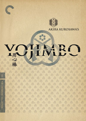
Akira Kurosawa's Yojimbo (1961).
Watch the opening titles
With its deep focus compositions, over-bronzed antagonists, curious editing style, and formatting bordering on avant-garde, the trilogy is most certainly not of Hollywood pedigree, instead taking influence from more expressive Japanese cinema. In fact, A Fistful of Dollars is a virtual copy of Akira Kurosawa's 1961 film Yojimbo, with only modest alterations to its story and structure. This mashup of Eastern folklore and Western substance, filtered through an Italian lens and charmed with idiosyncratic low-budget resourcefulness and outright showmanship, proved an ideal new home for the dated genre.
Nowhere is this showmanship more evident than in the trilogy's enigmatic title sequences, which, unlike Leone and Morricone's contributions, had no previous tangible association with Western film. Lardani's titles can be more easily traced back to the animated titles of Saul Bass (Vertigo, 1959) and Maurice Binder (Charade, 1963), both pioneers of motion graphics in film, though primarily in the thriller and spy genres. However, as with Leone's adaptation of Kurosawa's material, Lardani adopts their format while adding his own signature.
"My dad," recalls Alberto Lardani in 2002, "…he really invented this kind of work. Of course, titles have always been there since the invention of the cinema, but he kind of renewed the art. He tried to put ideas in it, to do peculiar things…he was born sort of as a painter."
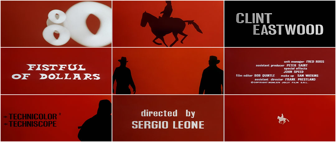
A Fistful of Dollars (1964)
Like Bass and Binder, Lardani entered film by designing posters and other print collateral, and also cut countless trailers and promos throughout his career. Though it’s uncertain if he had already been involved with A Fistful of Dollars in such a capacity, he had no previous titling experience when Leone invited him to create its titles. Since there was no budget set aside, the relationship was mutually beneficial and afforded Lardani full creative control over the end product – a luxury extended to few in his field, particularly freshmen.
—Alberto LardaniHe kind of renewed the art. He tried to put ideas in it, to do peculiar things.
Working mostly at his home study in Via Reno, Rome, he designed a sequence unique to both the genre and the craft, blending graphic design, experimental animation and typography, and in-camera optical effects with an equally–novel Morricone soundtrack. Combined, they are an instant classic: visceral and bold, the essence of a Leone Western distilled into shades of good, bad, and their arbiter, blood red.
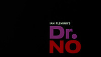
It is no accident, however, that his sequence shares similarities with Binder's groundbreaking titles for Dr. No (1962), which helped birth the modern spy genre. Given that film's runaway success in Italy, there is little doubt that Lardani and his collaborators were courting the same audience with a similar bouquet.
While backed by MGM, A Fistful of Dollars' release was delayed by three years in the US, mostly because the studio didn't know what to do with it. Far from being a classic Western, they instead marketed it as an art film, and despite its limited release, it enjoyed strong grassroots support, becoming the sixth-highest grossing film of 1964. Its success begat a loose sequel, For A Few Dollars More, the following year.
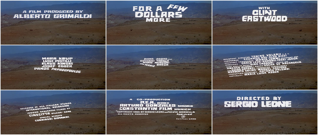
For a Few Dollars More (1965)
As was common with films of the era, Lardani frames his titles against a single emblematic backdrop, here the untamed West by way of Southern Spain. However, far from window dressing, he establishes its desolation, raw beauty, and magnitude as a single image, so deep that the distant mountains bleed into the sky. Its horizon is multi-leveled and ambiguous, fractured into layers – each, presumably, with its own lone horseman somewhere between points A and B. The horseman on Lardani's plateau – so dwarfed by the landscape as to be missed if not for the pulsing sun-dot over his location – is gunned down en route, and after what is perhaps the best improvised performance by a horse in any Western film, he himself fades into the landscape, soon forgotten.
The presence of the sun is the only theme carried over from A Fistful of Dollars – there used to end the sequence, here to open it – and is in both cases is visually detached from the body of the titles. The title cards themselves originate as off-camera cigar smoke to become an extension of the landscape, meticulously hand-animated to crawl over its features, associating the film's players with the setting. While unique in their design, the technique used to render them is similar to that of Saul Bass' situational titles for Hitchcock's North By Northwest in 1959, in which type is set against the orthographic window panes of a Manhattan high-rise. Lardani's type, however, is more playful, reacting not only to the environment but also Morricone's avant-Western theme, punctuated by gunfire from the unseen sniper, who has now turned his attention to long-range graphic target practice.
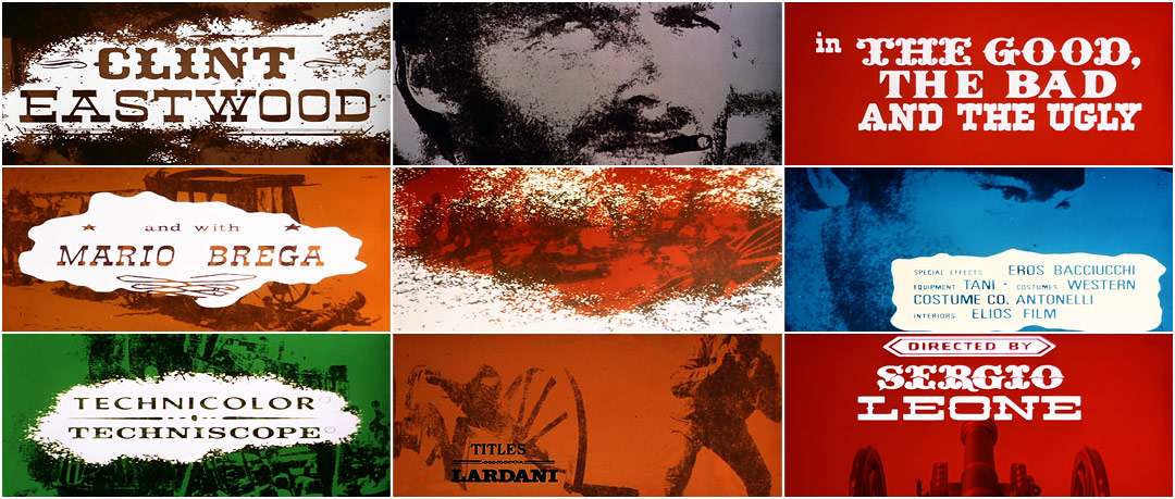
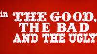
The Good, the Bad and the Ugly (1966)
Lardani's titles for the trilogy’s capstone The Good, The Bad and The Ugly are presented almost as an anthology of his previous two sequences, combining the pacing, duotone coloring, and silhouetted horsemen of his first entry with the kinetic typography of his second. He also incorporates high-contrast photography and liquid and sand effects, which are used both as optical mattes for shot transitions and as backdrops for the title cards.
—Alberto LardaniHe placed the coffee and filmed it with the camera upside down. It looked as if the wind was taking it away
It is Lardani's most confident entry in the Dollars Trilogy, experimenting with multiple formats and techniques with little attempt to mask their origins. The typography in particular is decidedly anti-academic, mixing typefaces that would otherwise clash, harmonized here through their presentation and formal typesetting. Combined with Morricone's genre-bending score, it is a tour de force, a love letter-cum-art film tribute to the Wild West.
To create many of the optical effects in the sequence, Lardani repurposed a multiplane Pace 1 camera*, often used by cel animation studios, instead superimposing elements like oil, paint, and photography to build layered graphic composites. "The camera is set vertically and under it there's a bright flat surface, illuminated with lights that come from below, or from above," recalls Alberto, who often assisted his father. "…He used this as if it was a painting canvas, only the opposite way. He subtracted color from a black film. It's as if you were doing an oil painting."
*Invented by Walt Disney in 1940, the multiplane camera was used for animation. It featured stacked planes of glass painted with elements of a cel animation. This allowed the animator to reuse the background, foreground, or any elements not in motion, saving hours of labor.
Lardani was equally resourceful with other in-camera and practical effects, using water to guide the paths of ink trails and coffee grounds to simulate blowing sand. "He poured some coffee powder and filmed it using this high-contrast film and the camera reversed," said Alberto. "Basically, he placed the coffee and filmed it with the camera upside down. It looked as if the wind was taking it away." He also fixed hand-tinted filters to the camera, reducing the amount of post-coloring needed to create the sequence; simulated aging was accomplished by re-photographing film stills through panes covered in ochre jelly. "Simple in a way,” said Alberto, “but the important thing is that he carefully considered the result. Because now this sort of thing does not have the same effect… you can do anything electronically, but you should think that these were very peculiar things. They were not seen anywhere else."
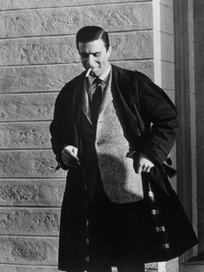
Designer Iginio Lardani
Though not explicitly credited, it is assumed that Lardani is also responsible for the standalone title cards found within the film, designating which players are indeed the good, bad, and the ugly.
As with Leone and Morricone, Lardani's contributions to the Dollars Trilogy lead to a brilliant industry career, garnishing several other Westerns along with many films outside the genre, though almost exclusively in Italy. His irreverence, low-budget ingenuity, and unvarnished design style split a new branch off the title design family tree, stemmed from the modernism of Bass and Binder via Andy Warhol to become a rallying cry for B-film productions everywhere. Quoted liberally in subgenre and exploitation films throughout the ’70s, his work has since become shorthand for indie credibility and gritty nihilism, frequented by the likes of Quentin Tarantino, Guy Ritchie, Robert Rodriguez, and Oliver Stone.
Iginio Lardani, sometimes mistakenly credited as Eugenio and known simply as “Gigi” to friends and family, passed away in 1986. His son, Alberto, with whom he collaborated often in his latter years, continued his work and became a respected editor and title designer in his own right, editing his last film, Voce del Verbo Amore, only three years before his own death in 2010.
Our thanks to Dr. Peter J. Hanley, whose research was invaluable to the writing of this article.
Title Design: Iginio Lardani

