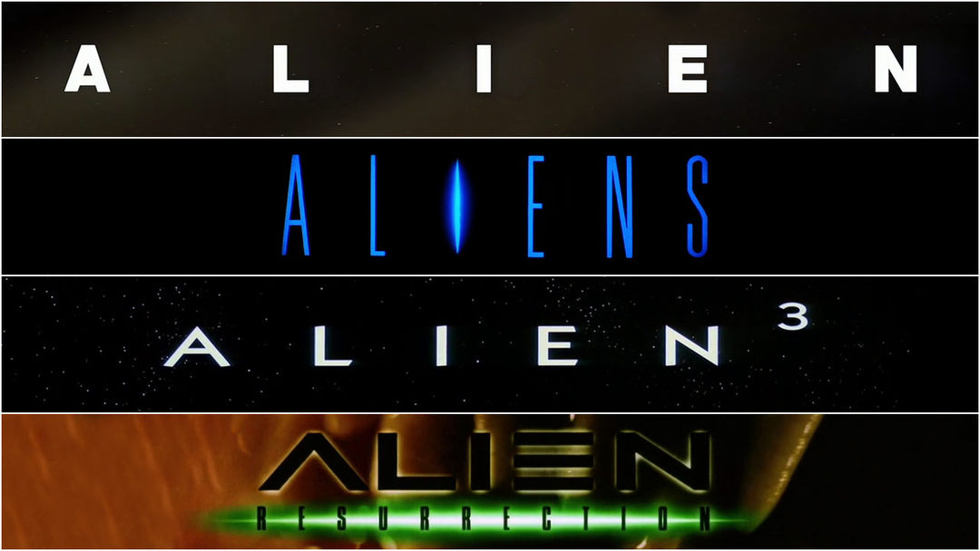
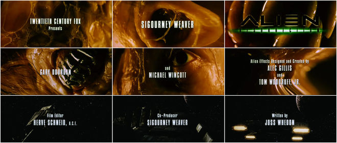
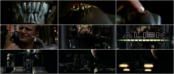
Note the consistency of design in the title sequences to the Alien Quadrilogy. Note too how they differ. Does each tangent of theme reflect the respective film?
Alien
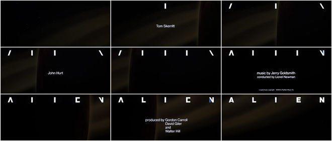
Crossing over an eclipsing planet with the title appearing in non-linear, segmented letters. From the outer letters inwards (even the middle swath of the letter "E" is last to appear), everything points to the center. That is where the parasitic pupae come from – the middle of you. Steady, dark tension.
Aliens
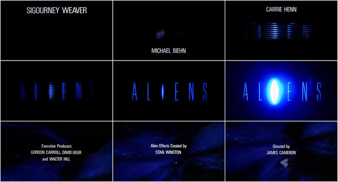
The sparse, soldiering snare drum opens to an almost digital yet organic titling, like the profile of some never before seen hive. The text, apparitional at first, seems to be gestating; the "I" blooms into a symbol of life and we are in the story with a masterful tilt down on the encroaching vessel. Fairly glorious.
Alien³
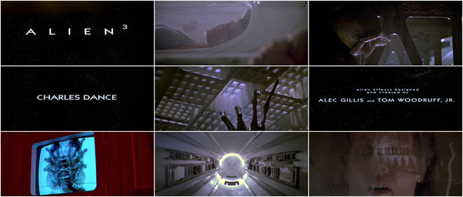
The last brassy notes of the 20th Century Fox theme hold and contort into the reverberating growl of the film's soundscape. Then, the familiarity of the abyss punctuated by staccato, mini cut scenes that move the story along. New format, familiar threads... the wrinkle, we begin to understand, will be in the telling. Nothing quite like facehuggers interrupting stasis to earn cinematic trust!
Alien: Resurrection
The womb-like viscera of human and alien-crossed monstrosities connotes a bastardization.
SUPPLEMENTAL: Alien: Resurrection - special edition open
Conceptually interesting but perhaps too great a departure. And no one puts bug guts anywhere near their mouth. Not unless they are chocolate-covered and never if they're space bugs. And who fires spitballs at a window needed for navigation? I can't seem to get past that, even with the now-boilerplate spaceships in space shot.

