The Golden Age of the American B-Movie Title Sequence
Part 2: The End of the Production Code
The ’60s were a time of change, not only in politics and social norms, but also the arts, and cinema in particular. Hitchcock's Psycho, released in 1960, became the first box office blockbuster to be distributed without official approval from the Motion Pictures Distributors Association of America (MPDAA), which set rigid guidelines for sex and violence in American film.
It signalled that not only were audiences hungry for more engaging and risqué content, but that the Big Six studios – Fox Film Corp., MGM, Paramount Pictures, RKO Radio Pictures, Warner Bros., and Universal Studios – were willing to appease.
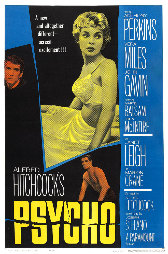
Poster for Alfred Hitchcock's Psycho (1960)
Perhaps more to the point: Psycho cost but a fraction of most studio films to make and its returns were considerably higher.
Thus began a decade-long game of chicken between Hollywood and its patrons, each prodding the other to their limits. The censorship goalposts were pushed so far back as to be lost in the fog of America's ongoing free speech debate. The censors became so marginalized by this cinematic machismo, and so overwhelmed by the explosion of art house films and venues, that they could simply no longer hold the line. In time, the MPDAA would be replaced by the three Bs of B-flicks: Blood, Beasts and Breasts.
The social upheaval of the ’60s angled the film industry to favor reality over fantasy, with topics like sex, violence, race, sociopathy, and outsider culture increasingly winning out over science fiction, creature features, and other atomic age folderol from the ’50s. So it’s no surprise that the B-industry embraced – and often pioneered – this new wave of American low-budget vérité, itself having claimed rights to the territory long before Hollywood.

Make sure to read Part One:
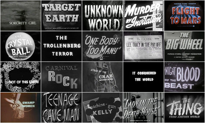
They Came From Within: B-Movie Title Design of the 1940s & 1950s
As with the films themselves, B-movie title sequences of the ’60s were an open and evolving field, inviting a wide range of artists and craftspeople to the trade, from cel animators and VFX directors to album cover and poster designers. Driven to innovation more by necessity than choice, this new generation of designers built on the modern template established in the ’50s while embracing new technologies, trends, and techniques.
B-movie title designs increasingly served a dual purpose, both legitimizing their low-budget features while colluding with their marketing campaigns to hold a unified visual front – often a B-movie’s only chance for survival in the wild. Their success in doing so would set the B-movie industry marketing standard for decades to come.
Grindhouse Ghouls
While horror remained a popular B-genre throughout the '60s, most of the innovation came from elsewhere, with British suspense and Italian slashers consistently dominating the box office. American studios would acquiesce to their influence by importing directors like Roman Polanski (Rosemary's Baby, 1968) and George Romero (Night of the Living Dead, 1968) towards the end of the decade, but in the meantime there was no shortage of inventive domestic entries.
The Little Shop of Horrors (1960)
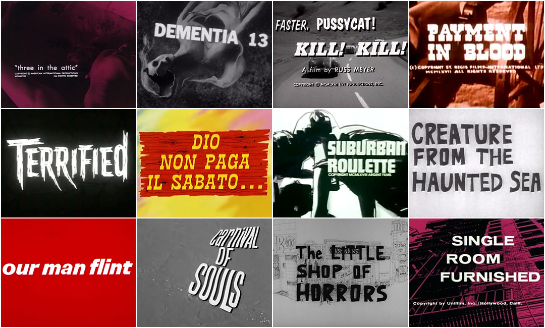
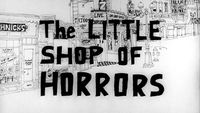
Every bit as camp as its '86 singalong remake, the title sequence to the original Little Shop of Horrors (1960) features an impossibly long illustrated panorama of Los Angeles' downtown Skid Row, establishing the character of its featured neighborhood. The production logo at its mast bears a striking resemblance to another much more famous sticker-dot title design years later: Maurice Binder's Dr. No.
Warner Bros. animation veteran and B-movie title pioneer Paul Julian's opening sequence for Corman's Creature from the Haunted Sea (1961) looks even cheaper than the film itself, but its limitations are used to its advantage.
The animation loops are recycled both across the sequence and within its parts, with the repetition itself becoming the narrative.
Creature from the Haunted Sea (1961)
This storytelling device and animation style are again recycled by Saul Bass two years later in his titles for It's A Mad, Mad, Mad, Mad World.
Herk Harvey's $33,000* opus Carnival of Souls (1962) features a haunting no-budget title sequence by crewman Dan Fitzgerald, who had previously designed the titles for industrial films at Hertz-Lion International, Harvey's commercial production studio based in Lawrence, Kansas.
*At the time, B-movie budgets were in the $50,000 to $100,000 range. Studio film budgets were around $1 million to $5 million.
Filmed by Fitzgerald himself, the titles are a careful combination of black-and-white details of the Kaw River, a key location in the film, and broken typesetting to match its contours. Accompanied by a hypnotic organ score by blues drummer Gene Moore and embedded minutes into the film, the sequence blends into the narrative while serving a more subversive role: to break the viewer from the previous reality and guide them into a new, parallel one, without their knowledge.
A deceptively simple, if not progressive, sequence on its own, its wings are fully earned in context with the film's twist ending.
Carnival of Souls (1962)
Francis Ford Coppola's first "legitimate" film, backed by Roger Corman, Dementia 13 (1963) is a deliberate Psycho knock-off, though their title sequences have little in common.
Dementia 13 (1963)
It is Paul Julian's final and most sophisticated sequence, juxtaposing religion, monument, and decay in a series of stepped, multi-layered dissolves and pans, leaving its footprint on the film by fracturing its very first shot.
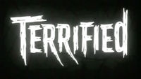
The cold opening to Terrified (1963) is both ambiguous and haunting: a ghost town, an overgrown graveyard, coyotes and unknown creatures of the night at its edges. Amongst the tombstones, a masked villain taunts a bound man as he slowly drowns him in an open grave. Its title sequence is an extension of his terror, zooming in on his bloodshot eyes, then his dilating pupils to frame the main title card and subsequent credits.
Little more than a glorified version of static horror title sequences common in the ’30s and ’40s, it builds on the template with narrative context and strong type design.
Terrified (1963)
Simulated Sex
Feminism and the sexual revolution were in full swing by the mid-'60s, promoted on film by would-be liberated starlets and filmmakers eager to exploit them in the absence of the MPDAA. The Supreme Court case of Jacobellis vs. Ohio in 1964 further defined the boundaries of hardcore pornography, thus ironically allowing "reputable" independent film studios to release anything but, and without the stigma of an X-rating.
Faster, Pussycat! Kill! Kill! (1965)
From this came such B-movie genres as burlesque, sexploitation, nudie cuties, and “roughies” – so-called for their masochistic themes – pioneered by directors like Russ Meyer (Mudhoney, 1961) and Doris Wishman (Bad Girls Go To Hell, 1965) and many others at the crossroads of storytelling, obscenity, and free speech.
As with the film itself, the boundaries of the title sequence to Russ Meyer's seminal film Faster, Pussycat! Kill! Kill! (1965) are blurred. They begin with a hard-boiled voiceover, underscored by a beat jazz track and visualized by its own sound wave, all stabbing away at the darkness with increased fervor.
The titles themselves are released by a smash-cut go-go dancer montage, introducing not only the film's anti-heroic trio and their profession, but also their vices: sex, cars, rock n' roll, weak men, and opportunity.
The sequence ends with the trio speeding along Interstate 15 against the flow of traffic, on their way to new adventure.
Single Room Furnished (1966)
Single Room Furnished (1966) begins with an arguably disingenuous eulogy to its lead actress, burlesque performer Jayne Mansfield, before launching into its graphic title sequence. Composed of illustrations and tinted high-contrast location photographs, it blends seamlessly into its opening shot.
*There has been some debate as to whether Binder was directly involved with the titles, but there are enough credible sources to support the credit until further notice.
Barbarella's 1968 title sequence was designed by longtime Bond title designer Maurice Binder* in between You Only Live Twice (1967) and On Her Majesty's Secret Service (1969) and filmed by VFX director Arcady Brachianof. As cheeky as it is clever, the sequence combines kinetic type with glamour shots of newcomer Jane Fonda in a sexy zero-g duet.
No real attempt is made to conceal its method of construction, but that’s beside the point.
Barbarella (1968)
A softer-than-softcore porn masquerading as a morality tale about the seedier side of suburban life, the titles to Suburban Roulette (1968) may as well be lifted from the pages of The Joy of Sex, with loose sketches of sexual acts alongside other suburban trappings: violence, jealousy, and children.
Suburban Roulette (1968)
The New Wild West
In parallel to the rise of sexploitation, the stoic Western genre was given its own B-treatment promoted by international-minded studios like MGM. They had discovered that Italy, with its lean tax breaks and rugged terrain, could double as the American West when squinted at, and so they filmed an entire genre within and around its borders.
The Spaghetti Western, as it came to be known, not only launched the careers of bonafide American stars like Clint Eastwood and Lee van Cleef, but also an entire graphic title aesthetic, pioneered by poster designer Iginio Lardani. His eclecticism, bright colors, and innovative techniques were co-opted as the visual signature of the genre, which to this day are a quick-and-dirty signifier of indie filmmaking, evoked often by A-listers like Quentin Tarantino and Oliver Stone.
Fort Yuma Gold (1966) (aka For a Few Extra Dollars)
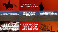
Fort Yuma Gold (1966), while not an official sequel to director Sergio Leone’s infamous Dollars Trilogy*, it would have liked to be, even briefly calling itself For A Few Extra Dollars.
The Dollars Trilogy includes:
• A Fistful of Dollars (1964)
• For A Few Dollars More (1965)
• The Good, the Bad, and the Ugly (1966)
For more information, read A Fistful of Titles: The Westerns of Iginio Lardani
It also features many of the same cast and locations, and a title sequence that may as well have come from Lardani’s own hand.
Where it loses points on originality, it earns them back with a strong visual execution and creative typesetting and image manipulation.
As with Fort Yuma Gold – and almost any Spaghetti Western, really – comparisons between Payment in Blood’s (1967) title sequence and Lardani's work are apt, with a similar color palette, staccato pacing, and type design.
Payment in Blood (1967)
However, where Lardani uses the format to glamorize the rawness of the Wild West, here it is used as a dramatic device, painting the American Civil War and its players with a clash of red, white, and blue, buttressed by the US and Confederate flags spinning off their axes.
One of the few genre films to break from Lardani's recipe, if only slightly, the titles to Kill The Wicked (1967) are a creative blend of cel-animated illustrated backdrops, graphic spirals, psychedelic color washes and slab serif typography.
Unlike most Spaghetti Western titles, which at least made attempts at passing themselves off as American, Kill The Wicked remains proudly apart, with a bouncy pop tune by crooner Roberto Matano and a full set of Italian title cards, despite the film itself being dubbed in English and first distributed in the US.
Kill the Wicked (1967)
Far-Out Fanfare
Though reality-based subject matter prevailed in ’60s cinema, there was still no shortage of fantasy films. The spy genre as reimagined by James Bond spawned an entire industry of low-budget knock-offs and parodies, including Modesty Blaise (1966), Woody Allen's Casino Royale (1967), and a pair of Flint films (Our Man Flint, '66, and In Like Flint, '67).
The titles to Our Man Flint (1966) borrow liberally from Bond title designer Maurice Binder's playbook, with pop-art colors and high-contrast imagery mixed in with female silhouettes and an element of voyeuristic danger.
Our Man Flint (1966)
Featuring a theme song mere octaves away from an actual Bond title track and titled “Our Mann Flute” by jazz legend Herbie Mann, the sequence doesn't deviate much from Binder's established spy aesthetic. It does, however, use a then-novel solarizing technique, which would become popular in hippie and psychedelic culture a few years later.
"You've heard of the sexual revolution," says a disembodied voice-over at the head of 1968's Three in the Attic. "I'm probably one of its first casualties."
Three in the Attic (1968)
So opens Richard Wilson's film, which, as with Our Man Flint, capitalizes on America's growing psychedelic drug culture. Its titles are a reflection of that conceit, with solarized sexual imagery distorted by rippling water, set to a groovy tune by British folk sensation Chad and Jeremy.
To learn more about iconic designer Sandy Dvore, check out this video produced for the Hollywood Museum by Quinn Monahan
The sequence was designed by title newcomer Sandy Dvore, who had previously gained notoriety for his cover work on Buffalo Springfield's 1966 self-titled debut album. While the influence of titling giants like Bass and Binder is apparent in its design, Dvore would soon move from their shadow to establish his own visual language in the coming decades.
The B-movie industry was at a fever pitch by the end of the ‘60s, releasing a half dozen films per week – even if only a handful deserved, or even qualified for the moniker. The eclecticism of independent cinema in this period proved a valuable experiment, weeding out sub genres while doubling down on proven fanfare – a trend that would evolve to near-perfection in the coming decade.
UP NEXT!
The 1970s-80s: Vigilantes, Psychopaths, and Road Warriors from 3D to 36DD.
Special thanks for Greg Dedrick and Gary Huggins for their assistance in researching this article.
HAVE YOU READ Part One?
They Came From Within:
B-Movie Title Design of the 1940s & 1950s
Support for Art of the Title comes from


