This weekend, Graphic Design—Now in Production – an exhibition co-organized by the Walker Art Center and the Smithsonian Institution’s Cooper-Hewitt, National Design Museum – opens in its third venue: the Hammer Museum in Los Angeles.
The exhibition features key work produced since 2000 in the most vital sectors of communication design including magazines, newspapers, books, and posters; branding and identity programs for corporations, subcultures, and nations; the entrepreneurial spirit of designer-produced goods; the renaissance in digital typeface design, information design, and the storytelling potential of film and television title sequences.
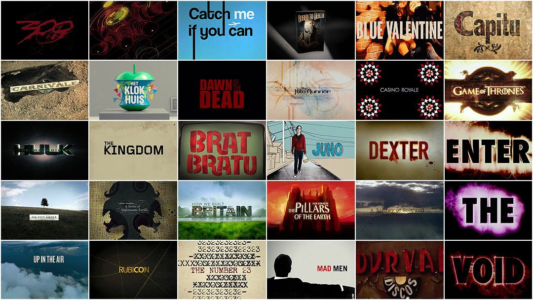
For the latter section, Art of the Title curated a comprehensive list of film and television title work created within the last decade that exemplifies contemporary title design. Twenty-eight sequences were chosen from studios such as Prologue, Imaginary Forces, Digital Kitchen, Elastic, yU+co., Lobo and MK12, and designers like Gareth Smith & Jenny Lee, Kuntzel+Deygas, Daniel Kleinman, Tom Kan, Jamie Caliri and Johnny Kelly.
The clip licensing contract included the initial run at the Walker Art Center and the second venue at Cooper-Hewitt in New York City, but any additional museum venues – including the Hammer Museum – would require re-negotiation of the original contract. The television titles section was extended through 2014 without issue, but sadly our film list selection had to be reduced from fifteen to seven sequences due to the costly licensing fees required by the studios. The following sequences remain in the show and we'd like to thank their associated studios for the continued support.
Enter the Void (Fidélité Films)
Blue Valentine (The Weinstein Company)
The Incredible Hulk (Marvel)
Iron Man (Marvel)
The Number 23 (New Line Cinema)
300 (Warner Bros.)
Durval Discos (Africa Filmes)
Our companion video piece above (and on Vimeo) was created to highlight the complete collection of curated title work, and the comprehensive and beautifully illustrated exhibition catalogue is still available, with write-ups and interview excerpts from Art of the Title for all 28 sequences. The catalog also contains a specially commissioned introduction for the title design section from Ben Radatz, partner and creative director of MK12 (Stranger Than Fiction, The Kite Runner, Quantum of Solace), the entirety of which we are pleased to present below.
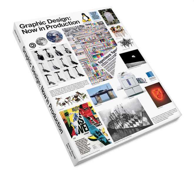
Exhibition catalog available on Amazon
Design in Motion by Ben Radatz.
Film titles are containers of information about the film they’re attached to. They denote its title, the key players, and a whole checklist of studio legalities and other folderol that comes with feature film production. They’ve grown in complexity and importance over the years, but their core function has always remained the same, if by definition alone.
What separates a good title sequence from those that are strictly functional are the artists behind them. Since the origins of the craft, title designers have used this precious real estate as a means to promote avant-garde thinking to mainstream audiences. From Show Boat (1936) and Ben-Hur (1959) to Psycho (1960) and the entire Bond catalogue (1962–), title design has come to be defined by its artistic and popular relevance, perpetuated by artists from all walks of life and encouraged by a studio system able to promote their work on a massive scale.
Title design has taken on many forms over the years. In the silent era it gave context to the audience, addressing key plot points and adding dialogue to muted conversations. Titles of this era borrowed heavily from print design of the early 1900s, as that proved a familiar format for audiences who were still marveling at the technology itself. During the golden era, titles became a branding tool for the films themselves, setting audience expectations by evoking the content of the film in their designs. Crime dramas were stamped with pulp-inspired headlines, romances were adorned with flowing ribbons, and Westerns evoked the brazen Wanted posters of the Wild West. These techniques set films apart in an increasingly saturated marketplace in which the major film studios competed not only against one another, but with a fierce new rival: television.
Throughout the 1950s and ’60s—the birth of the modern school of title design—titles became works of art in and of themselves, challenging the audience and the industry with experimental techniques and a conceptual depth never before considered. Designers such as Saul Bass, Pablo Ferro, and Maurice Binder teamed up with visionary directors such as Alfred Hitchcock, Stanley Kubrick, and Terence Young to produce title sequences that not only redefined the medium but also helped to shape a new era of graphic design in which modernism and abstraction became the vocabulary for a postwar consumer culture.
The independent and B film movement of the 1970s produced a generation of future A-list directors, many of whom had become accustomed to shooting on a budget and did not consider film titles to be an essential line item. In fact, their school of verité filmmaking actively reduced the role of the title sequence to its most basic ingredients. These filmmakers carried this sentiment over into the ’80s and early ’90s, and combined with an established studio system that made it nearly impossible for outsiders to enter the field, the title industry fell into a slump. With notable exceptions, title sequences of this era were things that had to be sat through more than enjoyed.
The ’90s saw a paradigm shift in feature film production, with the digital revolution influencing everything from the mechanical process of filmmaking to the content on the screen itself. Title sequence design underwent a similar transformation. Encouraged by a handful of new filmmakers who embraced this technology and sought to collaborate with like-minded artists, this era produced a number of influential title sequences, perhaps none more significant than Kyle Cooper’s title design for David Fincher’s film Se7en.
With its frenetic typography, staccato pacing, and irreverent visual mash-ups, Cooper’s work on Se7en is often considered a landmark in modern title sequence design, both for its craftsmanship and its lasting impression on the viewing public. It was the flagship entry for Cooper’s new studio, Imaginary Forces, after he parted ways with R/GA—an industry giant for more than thirty years before it shifted its focus to advertising in the mid-’90s. Se7en also came to symbolize a fundamental shift in the production of title sequences. The industry had reached a critical mass before then, requiring expensive hardware and software unavailable to most artists, yet was unable to keep pace with a booming film industry. But a combination of affordable technology, the Internet, an available workforce, and audience demand allowed boutique studios to flourish, oftentimes under the guidance of industry vets who took full advantage of the vacuum left behind by the old guard. Equipped with the means to create and distribute work on their own, they became the luminaries of a new generation, followed by scores of artists and designers empowered by their success and able to compete on their own terms. Almost overnight, the entire industry shifted to accommodate this new model, and for the first time in decades, Hollywood was listening.
A more competitive industry also meant that quality work could be produced for a wider variety of media. Television quickly adopted the trend, commissioning title sequences on a par with anything found on the silver screen. HBO was at the forefront, commissioning elaborate sequences for shows such as Six Feet Under (2001–2005) and Carnivàle (2003–2005). Mainstream television soon followed suit, and by the mid-2000s, any show worth its salt had an opening sequence that rivaled the quality of the program itself, from FX’s Nip/Tuck (2003–2010) and Fox’s House M.D. (2004–) to AMC’s Mad Men (2007–), Breaking Bad (2008–), and Rubicon (2010). More recently, video games have embraced title sequences as a means to reach beyond their niche demographics and promote a more cinematic sensibility, with franchises such as Call of Duty, God of War, and Metal Gear Solid pioneering a new sophisticated visual direction in title design.
Variety defines this new era. From the retro-inspired opening sequences of Catch Me If You Can (2002) and Kiss Kiss Bang Bang (2005) to the tech-heavy montages of Iron Man (2008), The Incredible Hulk (2008), and everything in between, artists continue to breathe new life into an age-old craft. While past title sequences relied on an entire shoe-in industry for support, husband-and-wife teams and small studios are now the norm. Available technology has broadened the playing field in a way never before possible, giving individuals access to many of the same tools available to the pros. Artists who were once confined to the print medium or low-budget experimental films—which, incidentally, have always inspired title design—can now cross over and put their work in front of a much wider audience.
This trend, established by Cooper and his peers in the mid-1990s, continues with increased momentum, and will likely follow an upward trajectory so long as there are artists and designers bringing new and exciting ideas to this ever-evolving medium.

