After 50 years and 23 films, the James Bond franchise is inarguably the most successful and steadfast in film history. Based on a canon of novels by journalist and WWII intelligence officer Ian Fleming, Bond was already a household name in the United Kingdom a decade before reaching the silver screen. But it was Sean Connery's performance as a souped-up version of Fleming's iconic superspy that turned 007 into one of the UK's largest cultural exports, on par with Doctor Who and The Beatles.
In his literary form, Bond was a much-welcomed boost of national pride for a country which had only begun to stabilize after the War; on film, he became an icon for a postwar boom generation with aspirations and disposable income, with Connery leading the charge as the world's most famous playboy on and off the job. Bond films became style forecasts, dictating everything from fashion and gadgetry in the pages of Playboy and Esquire, interior design courtesy of visionary set designer Ken Adam, to car, drink, and firearm preferences around the world.
The mission began in 1962 with Dr. No, Fleming’s sixth Bond novel. Since then, the franchise has cycled through six leading actors, eleven directors and two generations of producers, but it has always followed the blueprint of Fleming’s original works – if more in spirit than in literal adaptation – despite having exhausted most of his material by the late ’80s. And while its reasons for success are as numerous as its fans, every Bond film carries in it the same root DNA – a cocktail* of simple ingredients, in varying quantities: international conspiracy and espionage, high-tech gadgetry, supervillains, nine-life action scenes with explosions disproportionate to their cause, exotic locations, sultry associates and cheeky one-liners – all summarized in a simple phrase known the world over:
*shaken, not stirred.
Bond, James Bond.
But there are also two famous visual Bond hallmarks not of Fleming origin: the “Bond Barrel” sequence, in which white dots animate in stop-frame fashion across the screen to become a gun barrel aimed at 007, and the main title sequence: a sovereign piece of graphic real estate nestled into every Bond film, usually around 15 minutes into the first act, at the conclusion of the traditional pre-title action sequence.
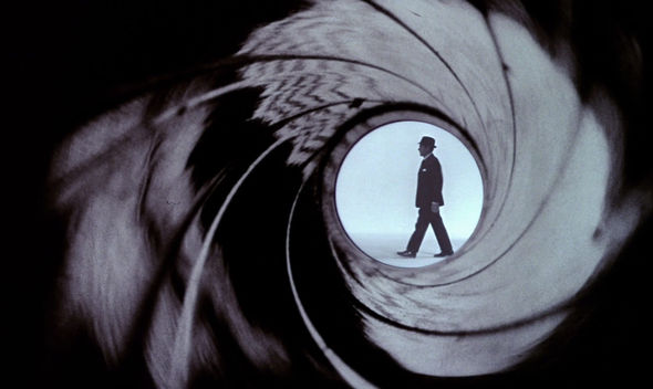
Binder-designed Gun Barrel
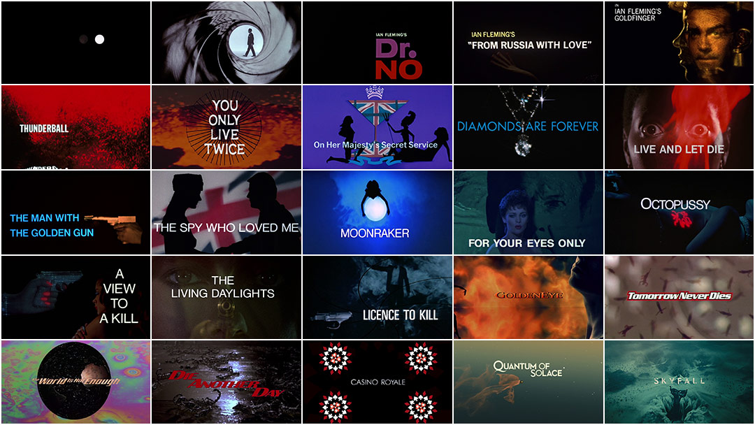
As with the films themselves, most Bond titles draw from a self-governed set of themes, but they are also liberal in their application of them. Female forms, stylized violence, implied danger, guns, imaginative photography, motion graphics, and academic typography are paired with a billboard anthem and presented through the thematic lens of the film itself – as in the underwater ballad of the Thunderball titles or the cosmic backdrops of Moonraker.
In spite of the tropes, the Bond titles are not formulaic – they have become a genre unto themselves, and as such they hold a certain immunity from criticisms aimed at its format. To criticize a Bond title for featuring silhouettes is to criticize a Tolkien novel for featuring hobbits. If it isn't your thing, you'll move on; if it is – and generally speaking, it is – you'll come back, expecting more and better.
In broad terms, Bond sequences can be defined as a strong visual statement accompanied by a high-profile pop ballad, both bordering on excess. Technology for art's sake has also played an important role over the years. In some cases it’s evidenced in their construction, from optical film compositing, in-camera effects, and stop-frame animation in the ’60s to experimental CGI and digital compositing, motion capture, and motion control in recent years (and likely an untold number of late-night innovations throughout). But technology has also found its way to the foreground as an aesthetic: lasers, projections, science-grade high-speed and closeup photography, and an array of optical tricks have all made prominent cameos over the years.
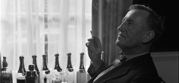
Author Ian Fleming
It has been the role of the sequences’ four directors – Maurice Binder, Robert Brownjohn, design studio MK12, and Daniel Kleinman – to balance these concerns with their own interpretation of the film and the Bond legacy, and to shepherd the tradition intact through successive eras.
Just as the Bond films have had a significant impact on culture at large over the years, so too have their title sequences affected the landscape of graphic and title design in the latter half of the century and onwards, due in equal measure to the creative and technical contributions of its directors and a savvy and supportive production backbone willing to take box office risks to protect their integrity.
BEN RADATZ, partner and creative director at design studio MK12, details the history of the James Bond title sequence from Maurice Binder to Robert Brownjohn to MK12 and finally DANIEL KLEINMAN, here interviewed about his involvement with the franchise.
Famed British writer Roald Dahl recalls a meeting he once held with original Bond producers Cubby Broccoli and Harry Saltzman, who had called him up about writing the screenplay for You Only Live Twice:
"You can come up with anything you like so far as the story goes," they told me, "but there are two things that you mustn't mess around with. The first is the character of Bond. That's fixed. The second is the girl formula. That is also fixed."
"What's the girl formula?" I asked.
"There's nothing to it. You must use three different girls and Bond has them all."
"Separately or en masse?"
American designer Maurice Binder was already 37 when he titled Dr. No, and his reputation as a commercial artist was well-established. His career began as an art director at Columbia Pictures in Los Angeles during World War II before moving to New York in the ’50s as the advertising director for Macy's, then to London in the ’60s where he designed titles for Stanley Donen films. He was approached by Harry Saltzman and Cubby Broccoli after they saw his titles for Donen's film The Grass is Greener at its London premiere that same year.
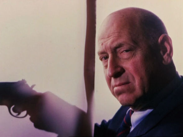
Title Designer Maurice Binder
Binder forged a close relationship with Saltzman and Broccoli and produced a total of 14 title sequences for the franchise – along with an untold number of trailer and promotional edits throughout – with his last film, Licence to Kill, made only two years before his death in 1991. It is Binder who is primarily responsible for introducing many of the best-known Bond title sequence tropes – the most important, of course, being the format itself, with silhouettes coming in a close second. "Binder,” said longtime Bond production designer Ken Adam, “was a lovely man, who liked, very much, to photograph silhouetted naked ladies."
Ironically, the Dr. No titles are perhaps the least Bond-esque of the canon, when you consider the themes for which Bond titles have become known. Nowhere else, for example, is minimalist graphic animation featured so prominently. It is also one of only two sequences in which composer Monty Norman's famous “James Bond Theme” is featured in the sequence itself. And while all Bond sequences are visually abstract, most are not as elusive as Dr. No, which cycles through colored dots, squares, silhouettes of Calypso dancers and blind panhandlers, and three unique pieces of music, bound together only by the consistency of the title cards themselves.
Dr. No (1962)
The idea of using graphic dots to represent the barrel of a gun famously came from Binder assembling a presentation using white price tag stickers only minutes before a meeting with the producers. "That was something I did in a hurry,” explained Binder. “I just happened to have little white price tag stickers and I thought I'd use them as gun shots across the screen. We'd have James Bond walk through and fire, at which point blood comes down on screen. That was about a twenty-minute storyboard I did, and they said, ‘This looks great!’"
What began as a short vignette meant to introduce the Bond character was expanded into a full title sequence. All of the elements were shot on black and white film and the negatives were then hand-colored and rephotographed along with the title plates to create the final composite, with Binder's stickers becoming the centerpiece of one of the most beloved and best-known title sequences in film history. And while the dots can be appreciated as a purely visceral design statement, their connection to the Barrel sequence endows them greater meaning, each dot becoming a bullet either intended for or delivered by 007.
Binder was succeeded by Robert Brownjohn on the next two Bond films: From Russia with Love in 1963, and Goldfinger in '64. Also an American import, Brownjohn migrated to London in the early '60s on advice from close friend and typographer Bob Gill. At the time, London boasted a vibrant postwar advertising and film economy with an appetite for American talent, on the heels of a similar boom in the US a decade prior. Brownjohn became familiar with Harry Saltzman through social circles and was invited to title Bond based on his growing reputation as an art director, having worked with advertising giants J. Walter Thompson and McCann-Erickson.
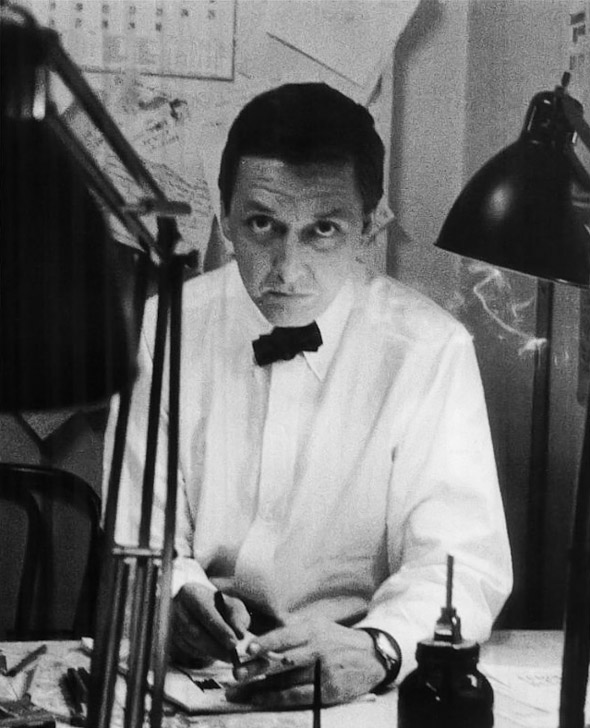
Designer Robert Brownjohn
Brownjohn was a student of Bauhaus luminary Låszlo Moholy-Nagy at the Institute of Design in Chicago, where he studied in the 1940s. His emphasis on experimental design and typography was apparent in Brownjohn's own work, himself having credited Moholy-Nagy for encouraging him to experiment with projecting images onto forms – a technique at the center of each of his Bond titles.
A longtime advocate and practitioner of experimental typography, Brownjohn believed that thoughtful and provocative type compositions could resound as well as any image or work of art. "I think the revolution in typography has been in terms of image," said Brownjohn at a typography forum in 1959. "The picture and the word have become one thing. The only real advance… has been the use of type not as an adjunct to an illustration or the image but in its use as the image itself." Moholy-Nagy echoes a similar sentiment in his book Painting, Photography, Film, saying, "Every period has its own optical focus. Our age: that of the film...it has given us a new, progressively developing creative basis for typography too. Instead of using typography – as hitherto – merely as an objective means, the attempt is now being made to incorporate it and the potential effects of its subjective existence creatively into the contents.”
Unlike Binder's Dr. No titles, which were modern and intellectual, Brownjohn's two entries were provocative and naughty, yet still very much of the times, evidenced by their progressive design and racy subject matter, which likely wouldn’t have met Production Code standards even five years earlier.
From Russia with Love (1963)
In From Russia With Love, Brownjohn projects the film titles as slides directly onto the body of a backlit belly dancer – a theme revisited later in the film as a symbolic divide between the civilized West and exotic East. The title cards themselves are static, inheriting their motion from the gyrations of the dancer.
With a budget of £850, Brownjohn and animation assistant Trevor Bond – neither of whom had experience with live action photography and did not compile a shot list – spent three days with performer Julie Mendez, experimenting with different projected compositions. Brownjohn also included several shots of a second belly dancer, who became camera shy and walked off the shoot early on. A third performer was used for face closeups, as the producers did not believe Mendez to be pretty enough.
Brownjohn has claimed that his inspiration for the sequence came from watching students walk across the path of a projector during a lecture he once gave; others say that it came to him during the end title crawl of an early screening of the film. He had previously considered a direction in which the film’s narrative would play out as a game of chess, but ultimately chose a more engaging subject matter. In his article “Sex and Typography” for British magazine Typographica, he notes: “On this type of film the only themes to work with are, it seems to me, sex or violence. I chose sex.”
Brownjohn, who abhorred storyboards and scripts, pitched the concept to Saltzman and Broccoli by removing his own shirt and standing in front of a slide projector. “It’ll be just like this,” he said, “except we’ll use a pretty girl!”
Goldfinger (1964)
Reproducing this technique proved more difficult on set, as the amount of light required for the projections to register on 35mm film far surpassed the capabilities of conventional units. "The lighting cameraman tried to take a reading from the projected typography and noticed that the needle hardly moved on his Weston master,” said Brownjohn. “So the whole thing was shot with a wide open shutter." To further compensate, a 3000-watt bulb was fitted into the projector and Mendez was instructed to perform within a very limited space to avoid falling out of focus. "The final result achieved what I now call instant opticals – with everything done in the camera rather than the laboratory."
Brownjohn further evolved his techniques in Goldfinger, this time projecting footage from the film directly onto actress Margaret Nolan, painted gold from head to toe, matching her curves with the projected action. Though he had previously experimented with clever relationships between type and form in From Russia With Love, exemplified by the belly dancer’s glare through the projected 00s of 007, it is in Goldfinger that he qualifies the technique by giving it greater purpose, using the female form as a 'double landscape' on which to graft and recontextualize the projected images. Knees become hills that Bond must traverse, a golf ball makes a perfect drop into Ms. Nolan’s cleavage after having carefully navigated her arm, and the grill of Bond's Aston Martin DB5 (making its very first appearance in a Bond film) masks her face, her lips replaced by its ever-switching decoy license plate as Shirley Bassey croons “…for a golden girl... knows when he's kissed her, it's the kiss of death...”
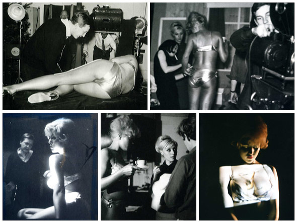
Goldfinger live-action title shoot. © Herbert Spencer
Goldfinger was a box office success, and Brownjohn won a prestigious Design & Art Director’s Club Gold Award for his efforts the following year. Saltzman and Broccoli were so pleased that they offered to establish an independent production company for the sole purpose of creating Bond title sequences under his watch – an offer which he ultimately declined, for unknown reasons.
Maurice Binder returned to the franchise in 1965 to direct the titles to Thunderball, which featured several sequence firsts: the use of optical compositing techniques, in which elements filmed separately are combined by layering the negatives together, and the use of kinetic typography, with the title cards rippling on and off, and – because it would happen eventually – the first appearance of full nudes in a Bond film.
Binder adopted Brownjohn's burlesque silhouettes and made them even more provocative while contextualizing them in the same modernist aesthetic he first applied to Dr. No, integrating them into minimal compositions with bold colors and clean, justified typesetting.
Thunderball (1965)
If there were a point of origin for the modern Bond title sequence, it would be Thunderball. This is due not only to its abundant silhouettes and thematic backdrops, but also its compositions and assembly, creating a self-contained graphic world that bestows the sequence with a dreamlike quality common to all Bond title sequences to follow. Binder also introduces a narrative thread and the element of danger in the form of divers pursuing their female counterparts, giving the sequence greater relevance to the film. And while both he and Brownjohn had previously incorporated thematic elements into their sequences, Thunderball is the first to holistically embrace a theme as its premise, with water seeping into every nuance of its design.
Binder's sequence for You Only Live Twice further evolves his experiments with optical compositing, this time creating “windows” from silhouettes though which other imagery is seen. Its composites are sophisticated and fluid, often blending together several animated elements at once – no small feat for film machinery circa 1967.
You Only Live Twice (1967)
The theme is exotic and unsubtle, with geisha girls sulking in front of dramatic close-up shots of erupting volcanos – both essential plot elements, and in Binder's hands a giveaway visual double entendre. He loosens his Modernist belt a notch, breaking code by using a theme font for the primary title cards. He also integrates partially-lit subjects and photographic backgrounds for the first time, creating palettes and compositions which are almost certainly influenced by the Exotica movement of the ’60s, typified in the tropical album covers of Arthur Lyman and Martin Denny.
Binder continues to refine his compositing techniques in his next few sequences, notably introducing scale differences to the tradition's vernacular in On Her Majesty's Secret Service (1969), by placing Bond on the hand of a clock. He also experiments with optical distortions and op-art animation, both popular memes at the time. In 1970’s Diamonds are Forever – his most photographic sequence to date – optical mattes are used exclusively to enclose female forms within the shapes of diamonds and vice versa.
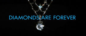
Diamonds Are Forever (1970)
Live and Let Die (1973) is perhaps Binder's boldest sequence and still the most aggressive entry in the franchise, mixing blatant nudity and dramatic lighting with plenty of fire, seen mostly through the eyes of a burning skull. Hard edits and crowded compositions work in concert with Paul McCartney's iconic theme song, matching its frantic pacing at the onset with fast action set against reds and oranges, then cooling to a palette of blue sparks and smoke as the track slows, and returning again to warmer hues as the sequence closes in the hands of a woman.
Live and Let Die (1973)
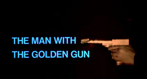
The Man with the Golden Gun (1974)
In Live and Let Die, Binder employs a similar, yet more refined type animation technique as in Thunderball, warping the text as though seen through water. He further explores refractions in his title sequence for The Man With the Golden Gun (1974), this time manipulating not only the title cards but also the background, projecting images of classic nudes and the film's iconic Golden Gun through pools of rippling water.
Binder's titles for The Spy Who Loved Me (1977) come at the tail of one of the most famous Bond pre-title action sequences, in which 007, incarnated by Roger Moore, is ambushed by Russian agents and skis off a cliff during the ensuing chase, freefalling for 20 seconds before pulling his Union Jack parachute. In a seamless transition into the title sequence, the parachute is caught by a pair of hands as silhouettes of a woman and Bond himself – in his first such appearance in a title sequence – bounce through the screen in ultra-slow motion, setting the pace for the rest of the sequence with help from Carly Simon's smoky theme song.
The Spy Who Loved Me (1977)
Scale relationships are mostly irrelevant in this sequence, with women trampolining in front of abstract details of guns, while others perform gymnastics on the barrels of actual guns. The sequence is a seamless montage with no obvious edits, but it is also spatial, with a “virtual” camera moving from one vignette to the next, going so far as to match-move images during transitions and track animation into live-action plates.
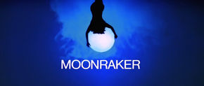
Moonraker (1979)
Binder carries over his affair with trampolines to Moonraker in 1979, this time orienting the silhouetted women around the frame to give the impression of zero-gravity. He also uses graphic animation within the sequence – something he hadn't done since On Her Majesty's Secret Service a decade prior.
For Your Eyes Only (1981) is the only Bond title sequence to feature the theme song performer within the sequence itself, integrating soft-light closeups of Sheena Easton amongst silhouettes of women running and swimming about, with 007 in pursuit and/or to their rescue.
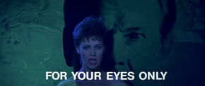
For Your Eyes Only (1981)
In Octopussy – Binder's eleventh Bond sequence – he departs somewhat from the format of his past few sequences and uses a technique previously only used by Brownjohn: projecting images onto female forms, only this time the projections originate from lasers – a novel technology in 1983. He further uses lasers to bisect clouds of smoke, creating ephemeral backgrounds over which silhouettes fly about in slow motion.
Octopussy (1983)
Binder met head-on with the mid-80s in his next sequence, A View to a Kill, which features the franchise's only top-billboard theme song by the pop duo Duran Duran working with longtime Bond composer John Barry – a commission awarded to them after John Taylor, their bassist, met Cubby Broccoli at a party and asked him, "When are you going to get someone decent to do one of your theme songs?"
Binder matches Duran Duran's high-energy pop theme with an equally loud palette of neon paint, applied to guns and women and filmed under blacklight. His trademark silhouettes are present but subdued, taking a backseat to cross-dissolved vignettes of fire, ice, and neon psychedelia.
A View to a Kill (1985)
Ever the tongue-in-cheek provocateur, Binder opens the sequence with a woman unzipping her jacket to reveal a hidden 007 logo painted between her breasts, with “IAN FLEMING'S JAMES BOND” superimposed – a composition as iconic and as relevant as any of his best efforts.
Binder, who once summarized his Bond titles as “girls, guns, smoke, and steam,” would often inject micro-trends into his sequences – recurring elements that would find their way into several of his titles and then vanish: silhouetted hands to introduce or close the sequence, images and type distorted though water, close-ups of eyes, the official 007 logo as key art, and also recycling iconic footage, as with a Roger Moore performance used in both The Spy Who Loved Me and A View to a Kill.
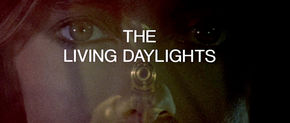
The Living Daylights (1987)
In the Living Daylights (1987) Binder again works with water distortions and optical mattes but softens his color palette dramatically from his previous entry, this time working primarily with shades of red, blue, and yellow, overlapping to become tertiary combinations.
Binder's final Bond entry, Licence to Kill (1989), is the most sophisticated of his sequences from a technical standpoint. He returns again to many of his favorite themes, but with a much cleaner and more refined execution. This is certainly due in part to rapid advancements in film technology at the end of the decade, with nonlinear editing and digital compositing fast replacing the analog solutions he had mastered over his 23-year tenure with the franchise.
Licence to Kill (1989)
Ironically, only at the the advent of the digital age did it become apparent that many themes frequented by Binder – his silhouettes, image composites, and creative titling – were ideas often several decades ahead of the technological means. And while girls, guns, smoke, and steam may be the things for which he is best remembered, it is perhaps his ability to understand both his audience and his material, and deliver to both with consistency and novelty, that his popularity has endured.
"So you put in three girls. No more and no less. Girl number one is pro-Bond. She stays around roughly through the first reel of the picture. Then she is bumped off by the enemy, preferably in Bond's arms."
"In bed or not in bed?" I asked.
Maurice Binder's passing in 1991 coincided with the departure of longtime Bond director John Glen and Timothy Dalton as 007, and along with a tangle of legal disputes between EON and MGM, the franchise went into a record six-year hiatus. British film critic Tom Shone even suggested that it was “time to junk Bond” in 1992, arguing that the obsolescence of the franchise "was nowhere more lovingly observed than in the films’ title sequences, shot by Maurice Binder." During this time, Cubby Broccoli developed health problems and nominated his daughter, Barbara Broccoli, to succeed him as co-producer – a title he had shared with his stepson Michael G. Wilson since Moonraker.
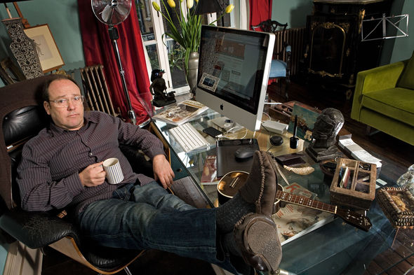
Title Designer Daniel Kleinman
Barbara was faced with revitalizing the franchise – a challenge, given the explosion of top-dollar, effects-heavy blockbusters in the early ’90s and the end of the Cold War, which immediately dated the classic spy genre. Eager to modernize, a new Bond was enlisted in the form of Pierce Brosnan – a popular actor on both sides of the Atlantic whose classic British charm and genre flexibility made him an obvious candidate for the job. Similar shake-ups were made across the board, with a host of new talent on screen and behind the scenes. To this end, popular music video director Daniel Kleinman was invited to join the franchise as the new watch for the Bond title tradition.
Kleinman had directed over 100 videos in the ’80s before he was approached to direct the music video for Gladys Knight's theme song to Licence to Kill in 1989, which almost certainly lead to his consideration for the titles. Having experimented extensively with special effects and post-production in his previous work, he seemed a logical successor to Binder, whose embrace of technology only increased as the new millenium neared. Kleinman and Binder also shared formatting sensibilities, with Binder describing his own Bond sequences as "the forerunners of today’s pop videos" in 1991.
"Licence to Kill" music video
Prior to his work as a director, Kleinman attended the Hornsey College of Art in Haringey, England, and worked as a storyboard artist on music videos in the early '80s. He moved on to a successful career in advertising in the '90s, where he earned the title of Most Awarded Director in the World by the industry standard Gunn Report, with similar accolades from many other publications and foundations.
Whereas Binder and Brownjohn shared a modernist aesthetic influenced in part by the Bauhaus school of design prevalent in the '60s and again popular in the '80s, Kleinman's design approach was at once eclectic and holistic, using new technologies to create layered montages of live action, animated, and graphic elements with a narrative foundation. His background in music video direction also gave his work a tangible relationship to sound, further strengthening the link between Bond sequences and their theme songs.
“I am really riffing on a language already invented. [Binder and Brownjohn] were making it up from scratch, something far more difficult,” notes Kleinman, “but I do feel I've brought some individual creative input of my own to the titles and tried to make them more narrative and less just collage-like sequences.”
Kleinman-designed barrel sequence from GoldenEye
Kleinman first updated the iconic Bond Barrel sequence, which had gone through several previous iterations as new actors were brought into the role of 007, but had always used the same pinhole gun barrel photograph shot by Binder for Dr. No, making it the franchise's longest-standing visual trope. Kleinman gave the sequence a CGI treatment, adding reflection and physical movement to the barrel as it tracks along with Brosnan while still retaining the graphic characteristics of Binder’s original photograph.
This new Barrel sequence opened the 17th Bond film, GoldenEye (1995) – a title which Fleming borrowed from a counterintelligence operation he had helmed during WWII – and before the action had even begun, audiences knew they were in for a new Bond experience.
Kleinman further delivered with his freshman entry into the Bond title canon, beginning with the inside of a reflective, photorealistic gun barrel, in what seems a deliberate contrast to the traditional Barrel seen just minutes before, perhaps to ease the audience into the new Kleinman vernacular.
GoldenEye (1995)
Yet there is not much easing to be done. From the explosive gunshot that kicks off the sequence to the backlit women against a wall of fire immediately following it, it is apparent that Kleinman isn’t interested in shocking the format. But it’s also clear that he won’t be following the creative lead of Binder and Brownjohn, either. From the outset, his vision for the Bond titles included a third dimension, both as a topical treatment and, more importantly, as a means to dive even deeper into the murky dreamworlds of the Bond titles.
“I'm very aware of and keen to preserve the best of the heritage of Bond imagery, a universally understood visual language that is a shortcut to sexiness, excitement, mystery, humour, sophistication, and glamour, a language entirely invented by my predecessors,” says Kleinman. “It would be more than foolish to throw away the instant familiarity and kudos the iconic visual style brings with it. Not to build on the history of what makes Bond Bond and not just another action film would be a disservice to the franchise and the audience. However, with the heritage must come innovation – it's not good enough just to rehash the same imagery; I want to elaborate, experiment, freshen up, and generally play with the key elements that come with the territory of Bond.”
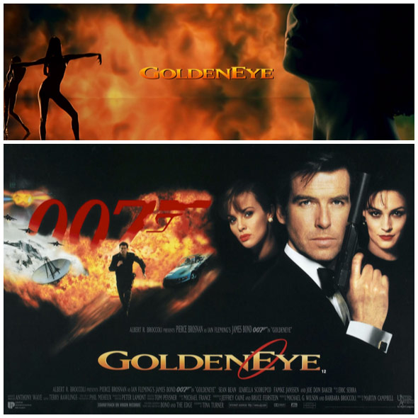
GoldenEye branding
There is another significant, yet more subtle, constant that sets Kleinman’s sequences apart from those of his predecessors: lighting. By default, all Binder and Brownjohn sequences assume black as their foundation, with colors being additions. Kleinman’s approach is more inclusive, often treating backgrounds as sources of light rather than as voids.
In GoldenEye and onwards, with some exceptions, Kleinman’s silhouettes are not graphic elements; they just happen to be in conditions that perpetually light them as such – in this case, in front of walls of fire, or the smoky graveyards of the crumbling Soviet Union. GoldenEye’s typography is classic and similar in treatment to past sequences, with one key difference: the main title card, which uses the film’s branding script, as seen in the posters, trailers and other collateral – the first such cross-branding attempt since Dr. No.
Kleinman’s GoldenEye titles did not disappoint fans of Binder or Brownjohn (they’re often in polarized camps); if anything, it proved that new vision and new technology were in fact essential and healthy for the franchise, and would only improve on the existing model.
In Tomorrow Never Dies (1997), Kleinman puts his love of technology on full display, delving into the world of ones and zeroes, both as a theme and as a means of creation. It’s a sequence immersed in technology, alternating between visualised cyberscapes of data streams and circuitry, and more analog – though equally penetrative – x-ray vignettes of machinery and women. In another Bond title first, it also features fully-CGI characters in the form of invisible women emerging from printed circuit boards.
Tomorrow Never Dies (1997)
The micro-narrative plays out as a battle between analog and digital, with both remaining mostly in their corners and intersecting only when the digital world is shattered by bullets, and again when a woman dives into the matrix and is swallowed, closing the sequence. While 007 made a brief appearance as a silhouette in GoldenEye, he is entirely absent in Tomorrow Never Dies, breaking with a tradition that had been in place since The Spy Who Loved Me in 1977.
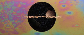
The World Is Not Enough (1999)
Kleinman’s titles for The World Is Not Enough (1999) immerse Bond in an oil-themed landscape populated with women who are defined entirely by its substance, either by being covered in it, inheriting its diffractive coloring, or becoming an extension of it.
In Die Another Day (2002), Kleinman further tweaks the format by treating the titles as a seamless extension of the film’s opening sequence, slowly introducing graphic and thematic elements around – and sometimes over – live action footage of Bond being tortured by his North Korean captors. In what seems a reverse-homage to Brownjohn’s projections in Goldfinger, Kleinman also distorts his footage using a female form, this time refracting it through CGI femme fatales made of ice.
Die Another Day (2002)
It’s the most visually confrontational Bond sequence since Live and Let Die. Fire and ice battle for dominance amidst scorpions, lightning, and showers of sparks, warped through the prism of a close-up diamond and set to Madonna’s aggressive electro-pop theme. And while Kleinman’s formatting of the sequence may be novel, its overarching narrative is familiar to many Bond sequences: 007 at odds with his aggressors and his own psyche, lost in a maze of his own making.
Casino Royale, the 21st Bond film and Kleinman’s fifth, ranks high on the list of franchise shake-ups, along with On Her Majesty’s Secret Service and GoldenEye. There was a new Bond, for starts – Brosnan was out and Daniel Craig was in. It was also a new kind of Bond: raw, young, headstrong, without the varnish of his predecessors. Suits are an exception, not a rule.
Casino Royale is Ian Fleming’s first Bond novel, and his only 007 work not yet adapted for the screen (unless you consider the unofficial 1967 spoof film of the same name, which shares modest ties with the book). It was an appropriate source for the franchise, which sought to reinvent Bond by going all the way back to his origin.
Casino Royale (2006)
Like Fleming’s original character, Craig’s Bond is somehow more tangible, more vulnerable, more human. He makes mistakes, falls in love, and gets beaten up a lot. He doesn’t always have a clever comeback. And his world has changed – grittier, more confusing, and more lateral. The threats hit closer to home, not concocted in a space station or volcano lair. To track down the baddies, Bond needs to get his hands dirty and break some rules (and ribs), and that’s just what he does in Casino Royale.
Kleinman taps into this new Bond energy in his sequence by streamlining, eliminating anything that doesn’t directly relate to Bond’s character or the premise of the film. Noticeably missing are the female forms, for example – a staple in every Bond title sequence, regardless of their thematic relevance. In their place is a different form of intimacy: violence. Close up, personal, consequential. It’s a portrait of 007 in his current form – before the perks, before the women.
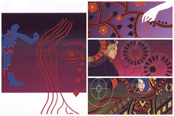
Daniel Kleinman's Casino Royale sketches
“Casino Royale had to be a bit different,” says Kleinman. “It was Bond starting off. Before the title sequence he wasn't even 007, so the titles are really about him becoming a 00 agent. The dancing girls were left out for narrative reasons as Bond was not yet the lady-killer that he is to become; he has not had his heart broken and been betrayed by a woman and he's not the deadly assassin who needs to throw himself into the life-affirming physicality of sex to compensate for the horror of the constant death surrounding him.”
As in GoldenEye, Kleinman demonstrates his talent for translating the tone and intent of the film through his unique filter, again helping to reboot the franchise with a new graphic language. But unlike his first sequence, the vernacular in Casino Royale is reserved, maintaining a uniform color palette and stylistic thread throughout, placing Bond in a vectorized, casino-themed world in which gambling and risk parallel his own trajectory as a soon-to-be 00 agent. But while Kleinman’s choice of graphic motif is flat and two-dimensional, the violence itself is anything but, with Bond making short work of his opponents in choreographed action scenes on par with those of the film itself.
Kleinman further disorients the Bond purists by creating a custom Bond Barrel as a bridge into the titles from the opening sequence, breaking with tradition by using the last shot of the sequence as the target seen through the Barrel, with Bond firing at an actual attacker. This gives the sequence greater relevance to the film, and – as with many of his efforts during his tenure as a Bond title director – challenges and modernizes a long-standing motif without discarding its heritage or intent.
"In bed or not in bed?" I asked.
"Wherever you like, so long as it's in good taste. Girl number two is anti-Bond. She works with the enemy and stays around throughout the middle third of the picture. She must capture Bond, and Bond must save himself by bowling her over in sheer sexual magnetism. This girl should also be bumped off, preferably in an original fashion."
"There aren't many of those left." I said.
"Well find one."
Kleinman was succeeded by American motion design studio MK12 on Quantum of Solace, directed by Marc Forster. A frequent collaborator with MK12, Forster enlisted the studio to create the main title sequence and the graphic user interfaces in the film, and also a new Bond Barrel, which was placed at the tail end of the film in another franchise first.
Quantum of Solace (2008)
Previous to Quantum of Solace, MK12 was best known for producing experimental short films – often as a collective – and advertising campaigns in the US and abroad, and was discovered by Forster in 2005 via FX Cartel, a Montreal-based VFX scouting agency who had seen their work at a local film festival. MK12's affection for experimental animation techniques and graphic design was a perfect match for Forster's brand of neosurrealist filmmaking, and they forged an ongoing partnership across several films leading up to Bond in 2008.
MK12’s sequence sets Bond in a desert environment – a theme frequented in the film – as he is pursued by an unseen foe, with the desert itself turning against him as the dunes transform into female forms, threatening to swallow him.
“Much of the action in the film takes place in desert environments, and in that we saw an opportunity to address not only the theme of the film but also Bond as a character. As Bond goes through an emotional transformation in Quantum, his allegiances become ambiguous – both to the audience and to his peers. The desert seemed an ideal setting to illustrate that uncertainty.” —MK12
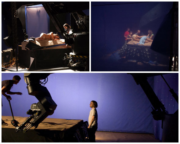
Quantum of Solace live-action title shoot
Inspired by Kleinman's use of modern technologies and spatial compositions, and Binder and Brownjohn's streamlined design sensibilities, MK12’s sequence references both eras, combining in-camera effects with motion control camera moves and digital landscape extensions, seamlessly integrating Bond into backdrops of women hundreds of times his size. Yet the colors remain graphic and limited throughout, defined by a twilit palette of blue and golden yellow, cycling from dusk to dawn over the course of the sequence.
“Preserving the tradition of the sequence was really important to us, and somewhat counterintuitively we chose to work with a lot of the pre-established tropes, particularly from the earlier years. This is most evident in our type design, which was inspired by Binder’s famous stop-frame dots in his Dr. No sequence, but it also informed our use of color, tone, and rhythm. We did this both as an homage and as a continuation – a contribution to the larger coloring book.” —MK12
"Girl number three is violently pro-Bond. She occupies the final third of the picture, and she must on no account be killed. Nor must she permit Bond to take any lecherous liberties with her until the very end of the story. We keep that for the fade-out."
—Roald Dahl, Playboy, June 1967
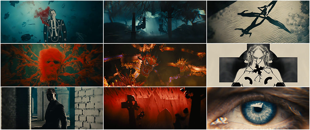
Kleinman returned to the franchise for its 23rd film, Skyfall, in 2012. While the sequence bears many of his signatures – kaleidoscopic imagery, shadowplay, shattered glass, and perhaps most noticeably, the female form – there is little else about the Skyfall titles that resembles his previous entries. His palette is much darker, both in tone and theme, with murky underwater vistas, sand traps, shadowy Escherian mazes, a crumbling manor, and tombstones resembling the form of a skull, all buried deep in the mind of a dying James Bond falling further into his own depths.
Kleinman uses key themes from the film effectively as stand-ins for Bond’s own inner conflicts, pushing through haunted, surrealist landscapes with the slow tenacity of a locomotive, always in motion, never pausing for reflection.
Realized at VFX/post house Framestore, with whom Kleinman had previously collaborated on Goldeneye and Tomorrow Never Dies, the sequence is a combination of live-action photography and digital worlds and elements, all combined in a virtual camera move.
“Taking Kleinman’s first round of storyboards, a 3D pre-visualisation was created with partner company The Third Floor that refined the concepts and established the sense of continuous movement that Skyfall director Sam Mendes and Kleinman sought.” —Framestore
Skyfall (2012)
After a brief underwater introduction, a majority of the sequence takes place within the walls of the manor, insofar as it also represents Bond’s own psyche, reinforced by the camera pushing through his iris once past the manor doors. This is repeated again at the end of the sequence, leaving the viewer to wonder when the transition had been made from internal to external.
"At the beginning of the film there’s always an amazing action sequence, and this time it ends with Bond being shot. So one of the things I wanted to do was perhaps suggest what might be flashing through Bond’s mind as he thinks he might be dying," Kleinman noted in an interview with Movieline. “It’s quite a macabre and dark sequence, because I think the film is about Bond coming to terms with things that have happened in the past and with [Judi Dench's M]. It’s a very emotional story – more so than most Bond films. My intention is to set up an atmosphere that gives you little clues, little hints, but is not too specific.”
It is perhaps this sole premise – the art of the tease, the threshold between ambiguity and revelation, light and dark, good and evil, kitsch and culture – that is common to all Bond title sequences, regardless of their subject matter or means of execution. It's an invitation to join 007 on his own personal quest through the world of international espionage – a chess game with ever-changing borders and murky allegiances, told through analogy and abstraction. Its delivery has been channeled through different artistic and thematic visions and become more sophisticated with each new entry, but this core function has remained intact, woven into the larger fabric of the James Bond mythos.
While for now only the Broccolis and the Wilsons may know what 007’s next mission will be, if there is one known, it is that James Bond not only withstands the test of time but improves with age, not surviving but evolving, defining his era as much as he is defined by it. And as savvy and relevant as the franchise has proven to be, so too will its title sequences continue to set the tone for each new film while blazing their own trail through the lexicon of title sequence design.
Afterword:
• Ben Radatz is currently a partner at MK12 and co-director of the Quantum of Solace title sequence. While his involvement in the franchise does pose a conflict of interest in writing this piece, the intention is to present all Bond title sequences – including his own – with objectivity.
• While all Bond sequences are represented in this piece, they do not all receive equal attention. This is not due to shortcomings in execution; rather, sequences were selected for expansion based on their landmark creative, conceptual, and technical contributions to the franchise.

