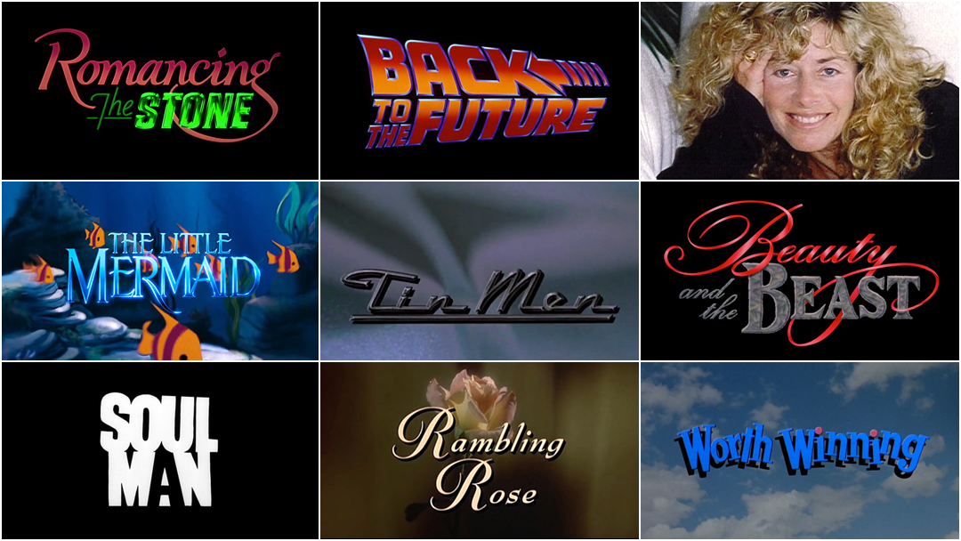
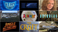
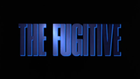
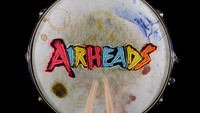
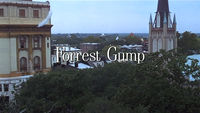
In 1996, critic Laurie Halpern Benenson, writing for the New York Times, called Nina Saxon “one of the most sought-after designers in the business” and it was true: some years, she could barely keep up with demand. Beginning in 1980 and working well into the 2010s, Saxon lent her titling talent to more than 200 films and TV series, working with directors including Robert Zemeckis, Martin Scorsese, Lasse Halström and Michael Lehmann. Her compelling visions and iconic graphics can be found in the familiar type of Back to the Future (1985), the slow bloom of Rambling Rose (1991), the glowing grin of Stay Tuned (1992), the searching light of The Fugitive (1993), and the floating feather of Forrest Gump (1994).
Title Designer Nina Saxon
Over the span of her 30-year career, Saxon established herself as a pillar of title sequence design, a defining figure of the branded blockbuster film, a logo legend, and a master of painting with light.
If the 1950s and ’60s was the Designer era of title sequences, dominated by creators with identifiable aesthetic signatures like Saul Bass, Maurice Binder and Pablo Ferro, then the 1980s was the Logo era, dominated by creators like Nina Saxon, Richard Greenberg and Richard Morrison. For Saxon, it wasn't just her ability to design effective and vibrant title logos that set her apart. It was her devotion to both practice and practicalities, her ability to read the room and to navigate the intricacies of a deal – or, to use her words, to hustle. Because she transitioned into the craft after working as a visual effects artist and animator, most notably on the first three Star Wars films, she was as comfortable with optical effects, mattes and typography as she was with animation, downshooter cameras and stop-motion. Perhaps that is also why she was able to approach title design with fresh eyes and usher in a new era: the branded blockbuster film.
From the bodice-ripping swashes of Romancing the Stone (1984) and the shimmering capitals of The Little Mermaid (1989) to the collaged chaos of Airheads (1994) and the spinning sandwiches of Good Burger (1997), and from the glowing markup of Antitrust (2001) to the blinged-out branding of Beauty Shop (2005), Saxon experimented with typography, technique and media, creating a distinct aesthetic solution for each project – her work disappearing into the scene entirely where necessary – and leaving an indelible mark on the industry.
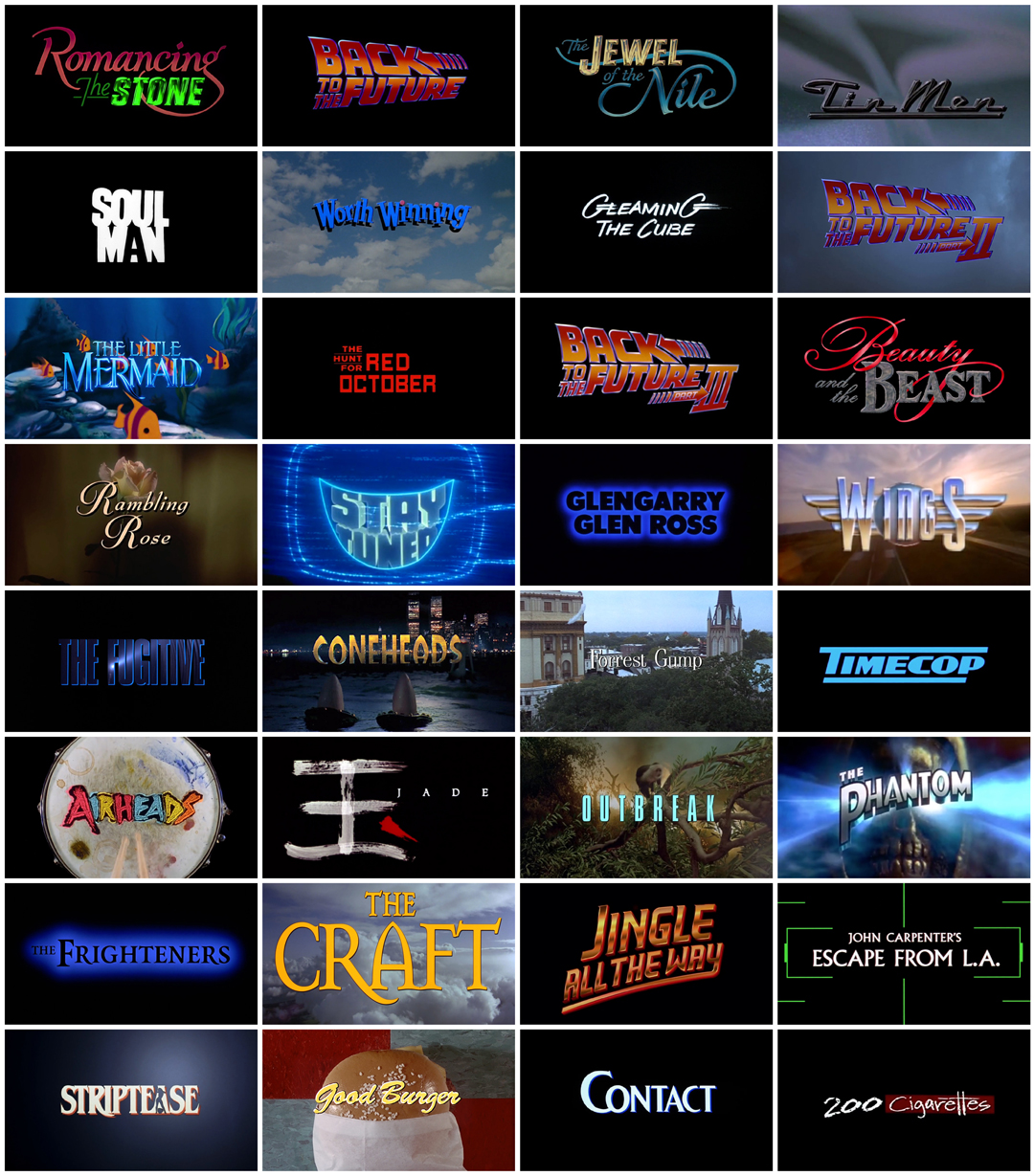
A selection of title cards from films featuring design work by Nina Saxon
But she didn’t start out with movies in mind. Her initial plan? “I was going to be a psychologist,” she says. After getting into the University of California, Los Angeles, she enrolled in a smattering of elective classes in film and animation and found she enjoyed it. Her first film assignment was to make a short, which she decided to shoot on location with Planned Parenthood. She filmed a childbirth which she intercut with music. The short nabbed her the Jim Morrison Film Award and that was it. “I got hooked into the movie business,” she says.
—Nina SaxonGeorge Lucas marked the place where the bullet came out and you had two or three frames, that’s all
The Jim Morrison Film Award is an award for directing given by the UCLA School of Theater, Film and Television to selected graduates and undergraduates. More info.
She set out to find a job and, after sending letters to every creative director she could find in San Francisco and L.A., she got a phone call from director John Korty. He had just won an Academy Award for the documentary Who Are the DeBolts? And Where Did They Get Nineteen Kids? and he had a job for her. Saxon recalls that he said, “If you come up here to Mill Valley, I could pay you $100 a week. You’re gonna work nine ’til two in the morning, probably six weeks.” She put her belongings in a trunk and headed north.
Other notable Korty Films “alumni” include directors David Fincher (Se7en) and Henry Selick (Coraline), editor Marcia Lucas (Star Wars), screenwriter David Webb Peoples (Blade Runner), and production designer Harley Jessup (Monsters, Inc.). It was in this Mill Valley milieu that Saxon met editor Donn Cambern, who became her mentor. When there was a lull in projects, Saxon called Cambern, who mentioned that there was a movie assembling crew and the production manager owed him a favour. They were hiring 900 people. It was called Star Wars. Was she interested? Saxon didn’t think the film had much going for it but she saw an opportunity to expand her skills. “So I went to work for an optical house and learned how to do the laser bullets!” she says.
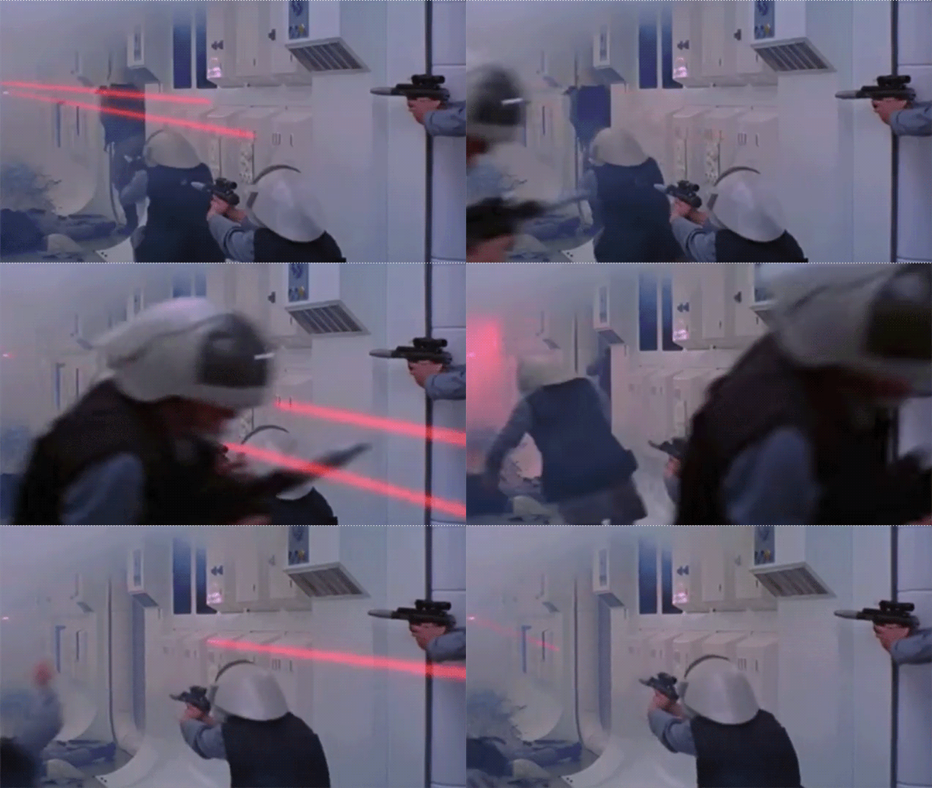
An example of Star Wars laser blasts, created by Nina Saxon
Star Wars (1977)
While working at optical house Modern Film Effects, Saxon learned about rotoscoping and created all of the laser bullets for the first three Star Wars films. It was a lot of work but she makes it sound like a snap. “It was all done in black and white with mattes. George Lucas marked the place where the bullet came out and you had two or three frames, that’s all,” she says. “You’d just take a piece of black paper and cut a strip straight across. You cover up the first frame, you cover up the other frame, you rewind it, you put the red filter in, and then put it together optically. Put in a red 29 filter, fog 5. That makes it a little fuzzy. It was no big deal.”
—Nina SaxonEverybody was starting at the same time! And I was right there, going, ‘What the fuck is this, like, R2D2 thing?
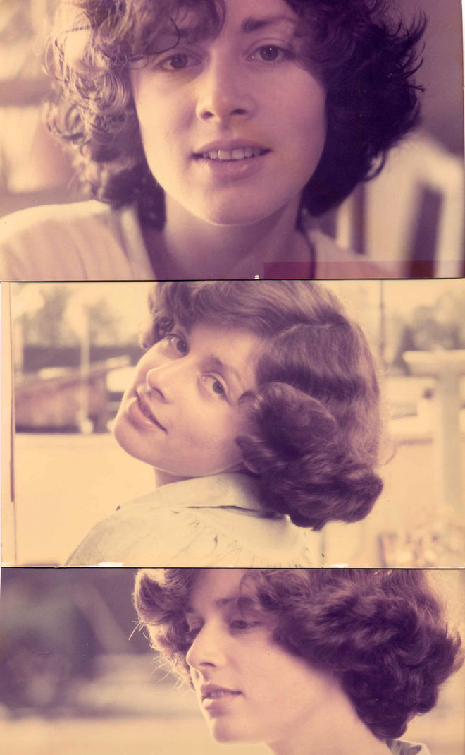
Nina Saxon in 1982, in her early 20s
By the third film, Return of the Jedi, she didn’t actually do the work. “By the third one, I advised them,” she laughs. “I didn’t actually do it. It was pretty easy.”
But Saxon still didn't think Star Wars was anything extraordinary. “I knew Romancing the Stone was going to be successful. I knew that Back to the Future was going to be successful. I didn’t know that Star Wars was going to be successful.” When I tell her that Dan Perri, the designer behind the film’s iconic opening sequence, didn’t think Star Wars would be anything special either, she laughs. “Nobody did except George Lucas,” she says. “I guess he knew what he was doing but it was just so weird!” At the time, some of Saxon’s friends encouraged her to financially invest in the film. “I remember people saying to me, ‘Borrow $1,000 from your grandfather and buy stock in Fox,’” she recalls. “And I said, ‘Who wants to see a movie about a princess and a gorilla running around in space?’ And the stock went from nine to 42 in four days!”
Star Wars was initially on the "B track" for cinema owners across the United States and even executives at Twentieth Century Fox had their doubts. Read the Hollywood Reporter's article 'Star Wars' Flashback — When No Theater Wanted to Show the Movie in 1977
Saxon may have missed out on the stock but she did not miss out on the networking, the skill building, and the credit of a lifetime. “I developed a lot of good relationships by being the grunt there,” she says. The Star Wars production is where she met Bruce Green, who become an editor (working with directors Garry Marshall and Steven Spielberg) and Steve Starkey, who became a producer (working with director Robert Zemeckis). “[Green] was the runner that picked up the film and took it to the airport to send to George Lucas,” says Saxon. The two would later work together on the titles to Disney’s The Princess Diaries, which Green edited. When she met Starkey, he was an assistant editor on Star Wars. A few years later, that connection got her in the room for Back to the Future, which Starkey produced. “Everybody was starting at the same time! And I was right there, going, ‘What the fuck is this, like, R2D2 thing?’” she laughs.
After Star Wars, Saxon worked for visual effects and graphics pioneer Robert Abel, co-founder of Robert Abel & Associates, the company behind many innovative effects for films like The Andromeda Strain (1971) and Tron (1982). RA&A were on the cutting edge of optical effects and digital technology, using CGI in commercials and film. It was there that Saxon expanded on the visual effects skills she picked up on Star Wars and learned to paint with light. “It’s a process where the light’s projected under the camera, all the art’s black and white, and you cover up different areas,” Saxon explains. “You learn the names of all the filters, like a 47 is a deep blue and a 16 is green. You can create a logo in 17 different colour variations with different coloured bevels and hairlines and present them to directors without making coloured art! And it’s so luminous. I learned a lot by the time I got to Romancing the Stone.”
The 1980s and the Rise of the Blockbuster
The 1980s saw three important changes occur in the film industry: the rise of the blockbuster, the rise of the film franchise and the rise of the title design studio. Star Wars had swept in a megapicture mentality and with it a focus on branding, merchandise and visual effects. Many films of the era eschewed the full-fledged title sequence in favour of a strong logotype with a secondary typeface laid over opening footage. As author Michael Betancourt writes in his book The History of Motion Graphics: from Avant-Garde to Industry in The United States:
“By 1984, designers Nina Saxon and Richard Morrison had transformed the opening titles so the title-logo was placed apart from the rest of the credits, which then disappear into the body of the narrative. The direct heritage of this approach is the dispersal of the credits into the opening scenes of the film, with only minimal apparent ‘design.’”
This was particularly prevalent in films headed for the franchise machine. Think: Romancing the Stone and Back to the Future, perfect examples of this format, but also Friday the 13th (1980), Raiders of the Lost Ark (1981), Ghostbusters (1984), Gremlins (1984), and Robocop (1987). As Saxon explains, “most movies had titles that integrated into the film. Lots of movies had logos and then other kinds of type – you just had to be able to clear it legally.”
Romancing the Stone (1984)
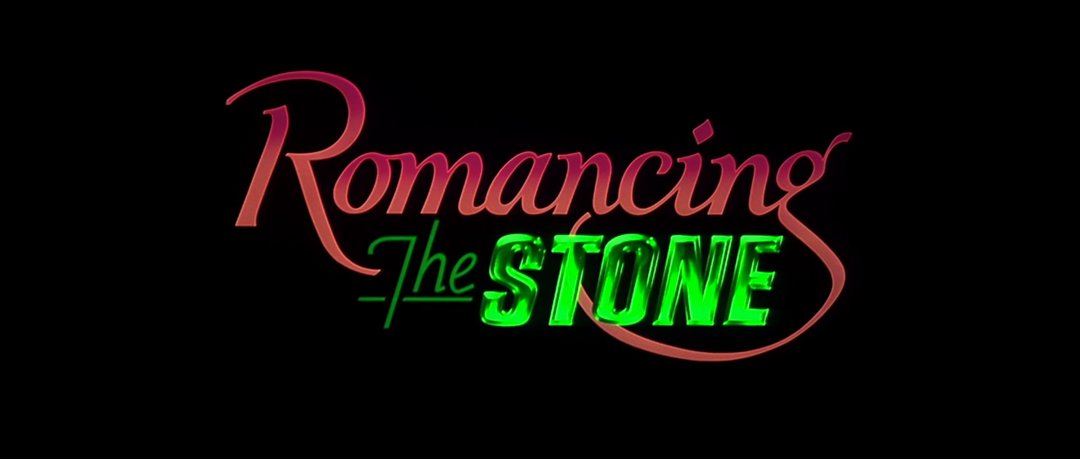
Romancing the Stone (1984) main title card
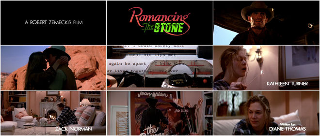
On Romancing the Stone, Saxon took charge of the logo design, painting it with light the way she’d learned at Robert Abel & Associates and choosing the typeface for the credits that appeared over the opening scene. The action-adventure comedy, about a reclusive romance novelist (Kathleen Turner) who travels to Colombia to save her sister and soon finds herself entangled with a cocky treasure hunter (Michael Douglas), was a surprise hit for Twentieth Century Fox. Romancing the Stone wooed audiences with its thrilling heists, vibrant jungles, and colourful characters and was a box office smash, propelling Michael Douglas and Kathleen Turner into stardom.
Romancing the Stone (1984) main titles
It was also the catalyst for Nina Saxon’s long career as a title designer. “I had to make my own deal on that, which was a big deal,” she says. Her training in psychology proved as useful as her experience in animation and design, especially when it came to client politics. In a 2006 interview with the Los Angeles Times' Susan King, Saxon said: "A lot of what I do is creative, but a lot of it is service and being there for people." This sense of service is what allowed Saxon to navigate the psychological aspects of the business. When she was hired by Michael Douglas to create the titles for Romancing the Stone, she quoted a higher fee than was expected. Douglas, a producer as well as star of the film, agreed to Saxon’s fee with the caveat that she accompany him to advertising and publicity meetings as an ally. “Michael pulled me into those meetings to direct the person in the publicity department. That’s really why he hired me.”
—Nina SaxonA lot of what I do is creative, but a lot of it is service and being there for people.
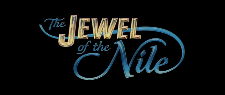
Fox already had a logo in mind for the film but reactions to the mark were mixed. “Lon Levin had designed a mark but it wasn’t good," says Saxon. "It had a lowercase R. It didn’t have the swashbuckling feeling that Michael Douglas was looking for.” Saxon had to see that it was changed, with different proportions and a much bigger R. Meanwhile, Zemeckis had something else entirely in mind. “The beginning scene is Kathleen Turner writing this scene over sand and [Zemeckis] wanted the typography to blow in and blow out,” she says. Michael Douglas intervened and told her not to follow Zemeckis’s instructions. She had to step carefully to handle competing demands from director and producer. “I had to walk that line with them. I said, ‘Bob, this is really becoming more of a branding issue for the movie...’ So he got out of the way. He focused on the film.” Saxon moved forward to execute the look of the title card, supervising the optical team at Twentieth Century Fox. “Using that technique, Painting with Light, I made the ‘Stone’ emerald green. Then I came up with the typeface for the rest of the credits that went over the living room and the end credits. I did the sequel for Michael, too. Jewel of the Nile.”
The Jewel of the Nile (1985) main titles
"I see my work as providing an introduction to a film that sets both an artistic and a thematic tone. When I do my job well, the audience is involved with the film before the credits have even finished," says Saxon.
Saxon went on to design the titles for many of Robert Zemeckis’s films thereafter, including Back to the Future II and III, Forrest Gump (1994), Contact (1997) and Flight (2012). “He’s just as loyal as the day is long!” she says. “And that was how I started.”
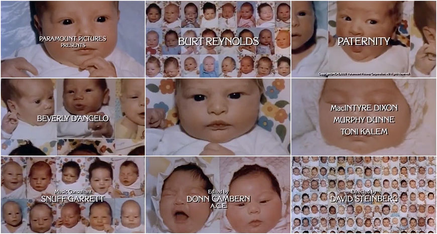
She had also done a few smaller projects along the way. After Star Wars, she worked on 1980’s Oh! Heavenly Dog, a Chevy Chase movie about a murdered private-eye sent back to Earth in the form of a dog, for which she did visual effects. “I actually didn’t do the main title on this,” she says. “I started out doing visual effects and that led into title design.” She officially made the move into title design with 1981’s Paternity, about a single man (Burt Reynolds) on the hunt for a baby mama with no strings attached. As with Star Wars, she got the job through editor Donn Cambern, who would bring Saxon into numerous jobs throughout her career.
Paternity (1981) main titles
For Paternity’s titles Saxon had help from Bob Hickson, someone she “was dating at the time.” Hickson assisted by doing the paste-up. “I had him cut up pictures of babies and paste them up and then I would photograph them,” she says.
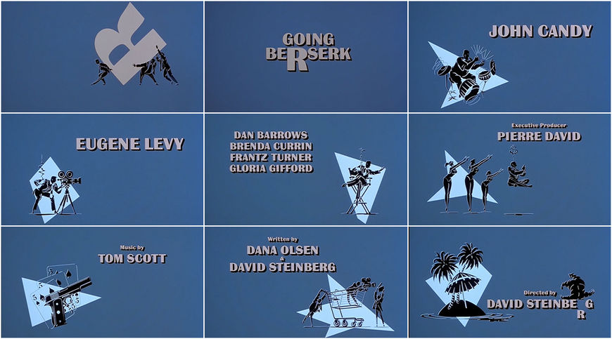
For the main titles to 1983’s Going Berserk the job was more complicated. To create the minimal but upbeat opening Saxon worked with Cambern and illustrator Dan Quarnstrom.
Going Berserk (1981) main titles
The film, which Saxon describes as “kind of awful,” is a wedding comedy about a chauffeur-slash-drummer (John Candy) who’s engaged to a congressman’s daughter and encounters a host of wacky characters before the big day. The title sequence at its helm stands apart from the film, a piece unto itself that pairs Quarnstrom’s illustrations with a rap that details the film’s plot in straightforward rhymes:
Now John's the drummer out in the street
But the man can't even keep a beat
So he spins his wheels to make ends meet
“It was really not a great song,” says Saxon. “And it was a lot of work!” The project exceeded its scope, requiring dozens of illustrations from Quarnstrom which created some tension. “That was when I had to start learning about setting limits,” she recalls. But after those jobs and after Romancing the Stone, countless doors began to open for her and other crew members. Robert Zemeckis made Back to the Future the following year, which was an even bigger smash and provided Saxon with another opportunity to create an opening title that would stand the test of time.
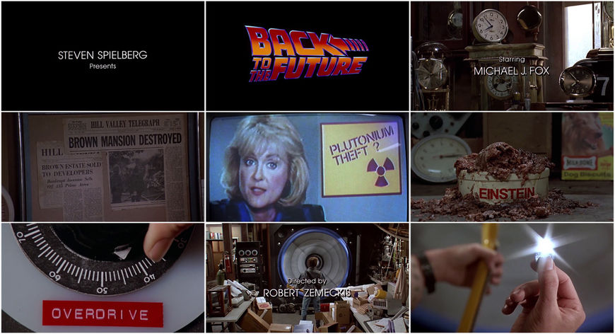
Back to the Future (1985)
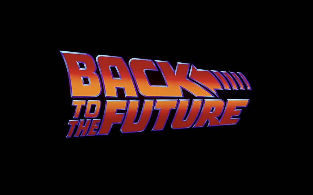
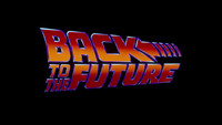
Back to the Future (1985) main title card
The studios behind Back to the Future, Universal and Amblin, were interested in establishing the film as a branded franchise. Two looks for the logotype had been developed: a slanted sans-serif similar to what we know today and one that, Saxon says, “looked like an old Western movie, which was really bad.” The editor, Artie Schmidt, preferred the latter. “They brought me in and asked, ‘Which do you like?’ I said, ‘Well, given the movie you just showed me, this one!’” Saxon preferred the sans-serif. “I didn’t design it,” she explains. “But I did use painting with light to colour it.” It’s unclear which member of Universal’s advertising department created the original draft artwork for the Back to the Future logo but it was Saxon who created the shimmering, vibrant and animated final mark that appears in the film and that has been referenced and spoofed ad infinitum.
—Nina SaxonPainting with light was just a real gift to me as a designer because nobody else knew how to do that.
Back to the Future (1985) main titles
Saxon explains her process:
“I would make the typeface, the matte for the face, the bevel, the matte for the bevel. I would make the hairline, the matte for the hairline, and I could then make the hairline travel. I could have a glint go around in a circle. I could make ‘Back to the Future’ more orange on top, more red on the bottom or vice versa by blocking out different parts of the image. The light came from below and I would have mattes so I could block out the center to expose the bevel to the light. That was what I learned at Robert Abel and Associates. It gave you all the flexibility in the world! If you wanted ‘Back to the Future’ to be purple and blue and have an orange bevel, you could do it using the same artwork.”
Saxon presented Zemeckis and the producers with several versions of the title card, making it purple or gold or red until they came to an agreement. Then she picked the secondary typeface, Gothic. "Painting with light was just a real gift to me as a designer because nobody else knew how to do that," she says.
The work poured in after that. “After Back to the Future and Romancing the Stone, it wasn’t that hard for people to trust me. Those two movies launched my career. I just started hustling after that," she says. Usually projects came to her via the editor on a project, like her mentor, Donn Cambern, or Raja Gosnell, who brought her into Mrs. Doubtfire.
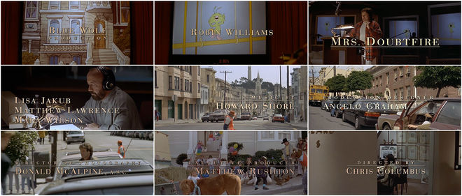
Mrs. Doubtfire (1993)
Mrs. Doubtfire (1993) main titles
“That was fun, working with Raja Gosnell,” says Saxon. She considered her relationships with film editors vital. “They were really important because you were working to their counts and you had to make everything fit with them directly. It’s all relationships. That’s half the battle.” Since the opening scene to Mrs. Doubtfire, featuring Robin Williams recording vocals for a cartoon bird, was already set, Saxon sat with Gosnell to size and place simple typography overtop. She was flown to San Francisco at 10:00 am and was back home in Los Angeles by 2 o’clock.
“Every movie was different and it was always really important to me to have really good typography,” she says. Where some designers’ stylistic and aesthetic signatures are clearly visible – a certain sense of composition, a specific use of type – Saxon molded solutions to suit each project. Sometimes that meant being artistically invisible – using simple typography that allowed a scene to shine, as in Mrs. Doubtfire – and sometimes that meant going bigger. “[The typography] needed to be readable and it needed to feel like the film. Its feeling, its flavour. It’s like a book cover. If it’s an intense action movie, there would be an ‘action’ typeface or font – it would say something, integrate into it. That was my vision.”
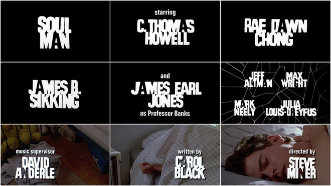
Soul Man (1986)
Soul Man (1986) main titles
For 1986’s Soul Man, a movie about a spoiled white teenager masquerading as Black in order to qualify for a scholarship, she devised a minimal but unique typographic solution that captured the film’s central themes. “I was reversing black and white,” she says. “There’s one letter that’s reversed… that was a good idea!” The letters are set tightly together, their angles overlapping, one character in each word inverted or cut out. The lines of the letters are slightly imperfect, lending the credits an organic, individual quality.
Tin Men (1987)
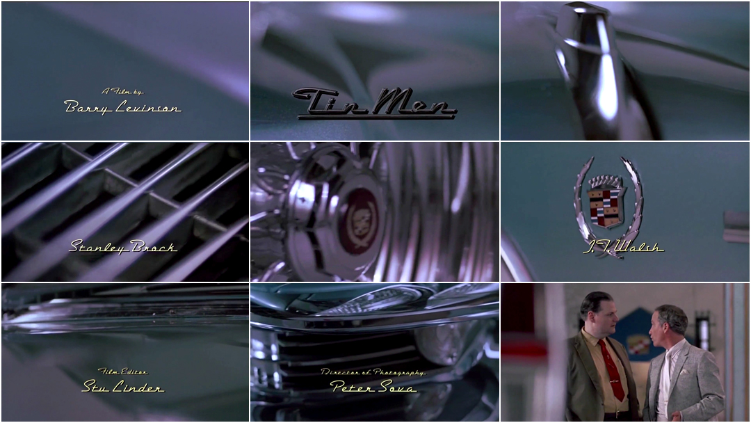
The following year, Saxon collaborated with designer Deborah Ross and a shooting crew to capture a gleaming Cadillac for Tin Men. The film, about two dueling, cutthroat salesmen and their precious cars in 1960s Baltimore, opens with smooth shots of a Cadillac exterior, shimmering swaths of chrome and aluminum overlaid with embossed cursive typography. “Tin Men was a great sequence to do,” she says. “In the first scene Richard Dreyfuss is standing there and the salesman says, ‘Boy, is she sexy,’ and Dreyfuss says, ‘Who?’ And he says, ‘The car.’” Saxon and the crew decided to shoot the car in sensual close-ups. “That’s the sex object of the movie,” she explains.
Tin Men (1987) main titles
The car, a 1963 Cadillac Coupe DeVille, had sustained significant damage during the film’s production and needed to be repaired and re-chromed for the title sequence shoot.
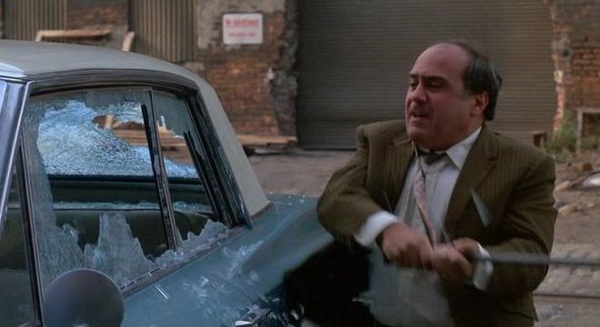
Still from Tin Men (1987) in which Danny DeVito's character takes a crowbar to a Cadillac
A second unit crew was hired to shoot the car at numerous angles as it spun slowly on a turntable. During the shoot, however, they encountered a problem – after re-chroming, the Cadillac’s weight was improperly calculated – and the turntable broke down. It had to be operated by hand, which produced a far less steady rotation. “Peter Sova [the cinematographer] was having a nervous breakdown because it was bobbling!” Saxon recalls. “It was going up and down rather than smooth. It would start to turn and then it would bobble.” After a painstaking shoot, Saxon sat with the editor, Stu Linder, and used every single shot, dissolving one into the next and marking each spot in order to get all 20 credits on the footage. “That was intense, just to get that little scene in the movie. We barely made that one. What if we hadn’t had that extra shot for the ‘Directed By’ part?”
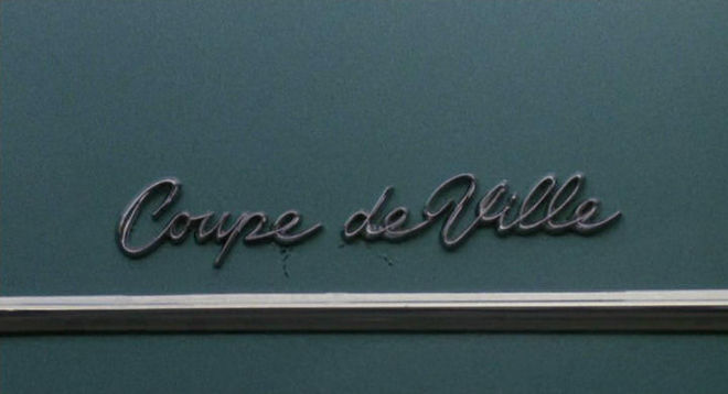
Still from Tin Men (1987) showing the lettering on the side of the 1963 Cadillac Coupe DeVille
If the typeface looks familiar, that’s because it’s based on an automotive classic. “We used a typeface called Bel Air,” says Saxon. “That was done by a company called Andresen, based on the Cadillac. They actually physically put every letter together, so it was a very expensive typesetting job!”
Established in Los Angeles, Andresen Typographics was a phototype firm with locations throughout the western U.S. Their collection was one of the most extensive of the 1980s and included original typefaces designed in-house. Bel Air was created by Clive Piercy for Andresen and included in the company's 1985 catalog.
Saxon/Ross
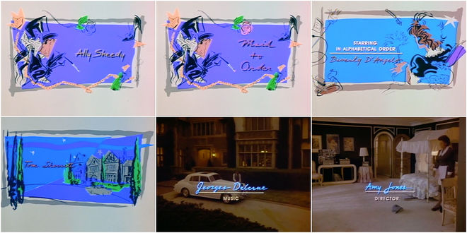
After their work on Tin Men (1987), Saxon and Deborah Ross joined forces to form Saxon/Ross Film Design, a title design partnership that lasted until 1992. Ross was a designer in her own right, working on titles for films like The Boss’s Son (1978), Roadie (1980), Modern Problems (1981), and Doctor Detroit (1983). “She was a good designer and we did a lot of work together that was good. She could do logo design really well,” says Saxon about Ross. From the get-go, the two snagged high profile clients, landing a recurring gig with Disney and designing titles for movies of the week. The duo’s first project for Disney was a quickie, a title card with animation for TV movie Babes in Toyland.
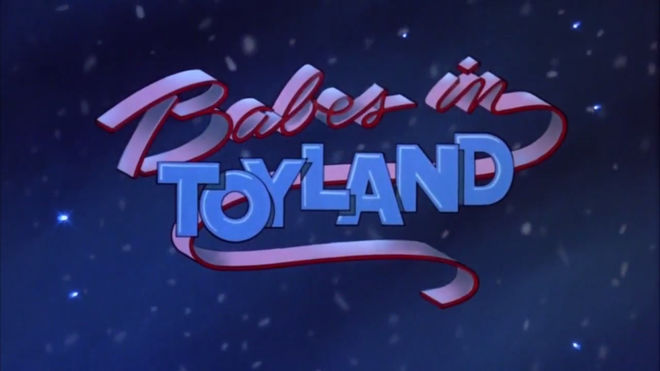
Still from the 1986 TV movie Babes in Toyland, with titles designed by Saxon/Ross Film Design
Soon the pair were designing a new title sequence every week. “It became a regular account, which was really nice and afforded us the money to be able to expand and hire an assistant here or there, move and equip our studio better. We could project into the future.”
Maid to Order (1987) main titles
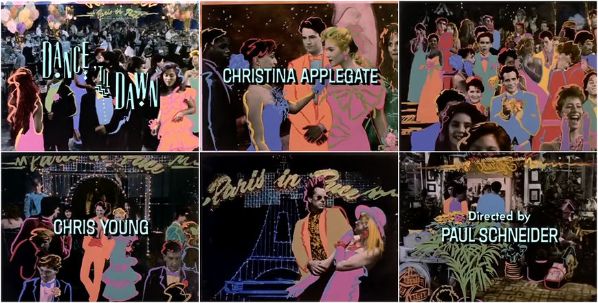
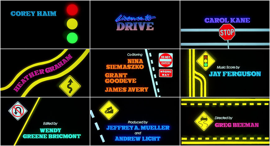
The pair found a simple simpatico, combining their backgrounds in film, design and effects (Saxon) and lettering, design and theatre (Ross), experimenting with various techniques on each project. “I often art directed or we would work together and throw things back and forth,” says Saxon. Many of their title design projects in the late ’80s were for TV movies, teen comedies that allowed them to play with colour, illustration and vibrant graphics. In 1988’s Dance til Dawn, pastel colours are brushed over stills, breathing bright life into the scenes. In License to Drive, two lettering styles are combined – a lean slanted serif inside a thick one – to create one Frankensteined typeface bursting with personality and paired with stocky lines and automotive iconography.
Dance 'Til Dawn (1988) main titles, designed by Saxon/Ross Film Design
License to Drive (1988) main titles, designed by Saxon/Ross Film Design
Working with lettering and typography was something both designers took delight in. Combining typefaces, whether cursive, serif or sans, extended or compressed, both Ross and Saxon enjoyed coming up with creative typographic solutions. “That was something I loved to do and she loved to do, especially where the initial letter would be different than the rest of the word or in a different alphabet.”
Made in Heaven (1987) main titles
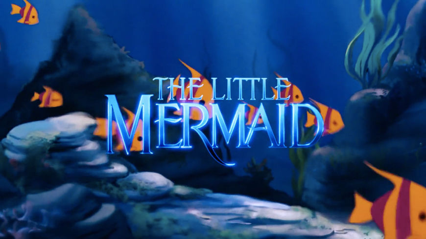
The Little Mermaid (1989)
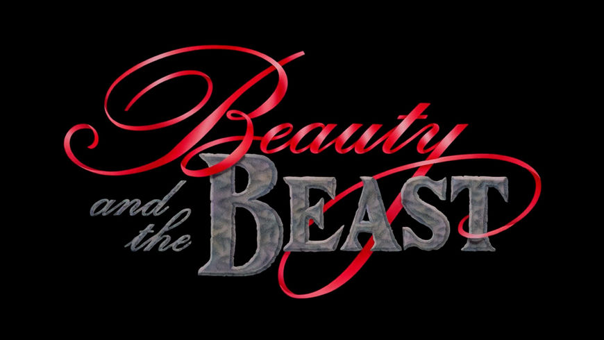
In 1989, Saxon/Ross designed the title card for Disney’s The Little Mermaid and, in 1991, for Beauty and the Beast. Saxon again painted the letters with light. “That was something I knew how to do,” she says. “[Deborah] knew how to actually design letterforms.”
The Little Mermaid (1989) main titles
Unlike their work for directors and for movies of the week, their projects with Disney were constrained, usually involving only a logo design and animation. “Disney was difficult,” Saxon recalls. “They called the shots about the money and it was a question of animating [the title] and putting a ripple through it. We didn’t do any other credits type for it, it was just the logos for those two. I animated it. It was more hands-on than Back to the Future or Romancing the Stone but it was a similar kind of branding.”
Beauty and the Beast (1991) main titles
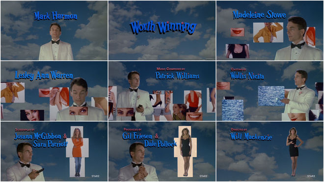
Worth Winning (1989)
In 1989 Saxon/Ross also created the opening to Worth Winning, a box-office bomb with “phenomenally flat” direction but a memorable opening sequence. The film is about a self-centered weatherman named Taylor Worth (NCIS’s Mark Harmon) who bets his friends he’ll be able to propose marriage to – and be accepted by – three women of their choosing. Its main titles might best be described with the words Sexist Shopping Channel.
Worth Winning (1989) main titles
“It was a tough one,” recalls Saxon. “We shot this whole live action sequence for it.” In the opening, Worth stands among clouds and blue sky. Sliding around him are rectangular video clips of women – their legs, breasts, butts, mouths, eyes. Smug and bemused and armed with a TV remote, Worth evaluates the selection and chooses body parts to assemble his ideal woman. “It was really a horrible concept. It was the director’s concept,” says Saxon. “I remember sitting next to [Harmon] and he said, ‘This movie is so sexist. I mean, It’s so disgusting.’ And that was the concept for the opening. Pulling that off was a big deal.” The sequence took several weeks and cost $250,000 to produce, including hiring and paying talent. It featured a title logo created by Scott Mednick and Associates and, once Saxon/Ross completed their shoot, production, and titles work, animation from West Indigo, Inc. and video enhancement from Malcolm McNeil. As for the final woman in the sequence, the weatherman’s dream woman? That’s supermodel, actress, and entrepreneur Kathy Ireland, who did not receive a screen credit for her work.
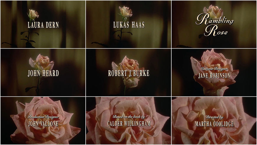
Rambling Rose (1991)
As the '80s came to a close, Saxon began to use different techniques, including stop-motion. The first of these stop-motion title sequences was the opening to 1991's Rambling Rose, a Martha Coolidge film starring Laura Dern as a meandering and promiscuous young woman who is taken in by a family and offered a job as a housemaid.
"That was my baby and it was a real dream job because that rose time-lapsed open during the night," says Saxon.
—Nina SaxonWe got one great rose. To me, that was more exciting than something like Stay Tuned. It was live, it was real, it was questionable whether it would work!
Rambling Rose (1991) main titles
"The type was one thing but having the rose open... We had to put it in hot water and put a camera on it that went one frame at a time and then see the next day if it opened... and it was beautiful. A lot of the roses didn’t do it. They’d open and they dropped leaves or withered and died under the heat of the lamp that was lighting them. We got one great rose. To me, that was more exciting than something like Stay Tuned. It was live, it was real, it was questionable whether it would work!" she laughs.
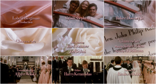
The shoot required a lot of experimentation and many roses to achieve. To create the slow bloom of Rambling Rose, Saxon worked with optical house West Indigo, Inc. and an Oxberry camera, which could capture action at one frame per second. Saxon compares it to 1989's Chances Are, for which she shot slow camera pans across silk, photographs, and soft pale roses.
Chances Are (1989) main titles
"We had to get all these flowers and once you get them under a camera, you see all the defects. You’re sitting there with tweezers pulling out all the little buds that look brown but three feet away look gorgeous. That’s what working with flowers was like."
When the 1980s came to a close and the '90s loomed brightly ahead, Nina Saxon was just gearing up. “The ’80s for me was a blur of lots of different people, lots of different things and hustling a lot of people,” she says. That hustle would continue into the 1990s and 2000s, seeing Saxon’s business and client base expand exponentially along with her exploration into different media including more stop-motion, animation, and the digital realm.

