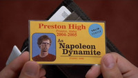
Spanning nearly 60 years in the film and advertising industries, designer Pablo Ferro’s career is one brimming with innovation, ingenuity, and constant reinvention. And he’s not done, yet.
Throughout his life, Pablo has adhered to an ideal of constant motion, reminding himself to experiment and always “keep it moving,” a lesson he learned from his grandfather and a scorpion.
Make sure to read Part One of our interview with Pablo Ferro
In Parts One and Two of our three-part interview with title designer Pablo Ferro and his son Allen, Pablo discussed his beginnings in New York City in the 1950s, his first agency, his collaborations with directors Stanley Kubrick, Norman Jewison, and Jonathan Demme, his friendship with actor Steve McQueen and editor Hal Ashby, and his advertising work for NBC and Burlington Mills. Pablo also recounted a story from 1970 which packs a formidable one-two punch: a harrowing encounter with a hitman, and the subsequent usurpation of the Pablo Ferro, Films company by his brother, José.
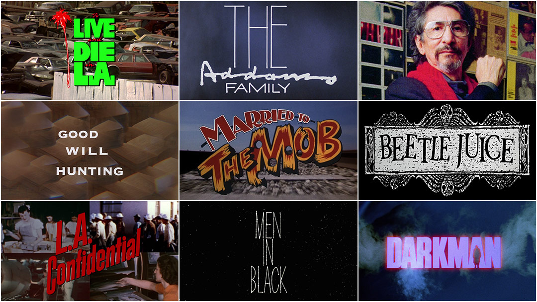
In Part Three, we enter the 1980s. Pablo did what he’s always done: he kept it moving. He moved from New York to Los Angeles, the very heart of the American film industry. There, he operated under the moniker De Pablo De Pablo, distancing himself from the now-sullied Pablo Ferro, Films, and formed a partnership with Hal Ashby, now a feature film director. The two worked under the names Northstar Media and Caligraphic Pictures and collaborated on a number of films. Then, Pablo joined Title House, and thundered into the ’90s and the digital age with his indelible title designs for Darkman, The Addams Family, Men In Black, L.A. Confidential, To Die For, and many more.
Now approaching his 80th birthday, Pablo Ferro and his son Allen discuss their time in Los Angeles, their collaboration and recent work, and their upcoming projects. Because there’s always so much more to be done.
Part Three
So, now we’re in the ’80s and you’ve moved to LA. Were you working on your own?
Pablo: Just myself, as De Pablo De Pablo.
Allen: Being There was the start of the end of De Pablo De Pablo. Pablo partnered with Hal Ashby on Being There.
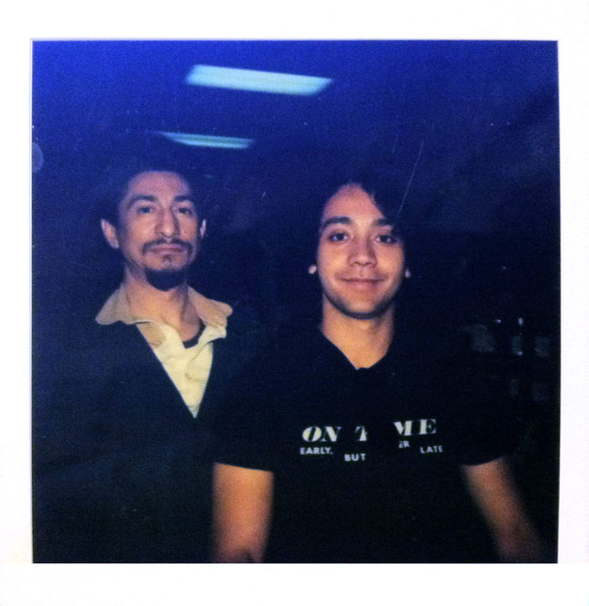
Pablo and his son Allen Ferro, 1981
Pablo: The only film that appears with the De Pablo De Pablo name is Bound for Glory, for Hal. For Citizens Band, I tried to get it in there since I had an office at Paramount with De Pablo De Pablo, but the producers said no. They said, “We hired Pablo Ferro and we need your name.”
Right, they wanted your reputation. Allen, when did you start working with Pablo?
Allen: I was exposed to it when I was a kid but I was involved early on, probably when I was 15 years old. I had moved my father from New York to Los Angeles during the summer of ’79. Then he asked me to move to Los Angeles at the last minute, and I agreed. He and Hal were just finishing Second-Hand Hearts (1981), finishing post-production on Being There (1979), and were in pre-production on Lookin' to Get Out (1982).
I really became involved with Being There – that was my first official project with my father. Up until then I was sneaking into his office and working on the Oxberry, learning how to shoot, and doing things in the dark room. Everything was still film. After Lookin' to Get Out, I started working at a trailer company called Flamingo Films and this is when [Pablo and Hal] formed Northstar Media, located at Lorimar Studios in Culver City. Later on, I quit the job at Flamingo Films to run day-to-day production at Caligraphic Pictures.
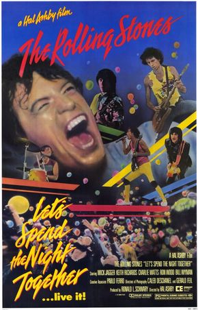
Poster for Let's Spend the Night Together (1981), the Rolling Stones live concert film directed by Hal Ashby. Pablo Ferro was the creative consultant.
Pablo and Hal were also doing a Rolling Stones movie so it was this flurry of projects going back and forth – but Pablo would be off doing something else too. They had a whole slate of scripts that they were going to produce. They were about to embark upon that. But I think that went bye-bye when Hal died [in 1988].
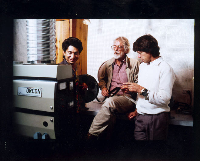
Pablo, Hal Ashby, and Mick Jagger, 1981
After that, we brought the remaining staff over to Caligraphic, incorporated and continued to work under that banner. That's where a number of other projects like To Live and Die in LA, Stop Making Sense, Amityville 3D came into play.
And Beetlejuice, of course, where Randy Braun, who's a fairly well-known designer now, was working for my father too. She's great.
So when did you start Caligraphic Pictures?
Allen: 1983. At its peak, we had probably 10 or 15 employees. Jonathan Demme, William Friedkin, and Hal Ashby were three big clients of his who were, you know, friends. They turned out to be friends. The Prince of Darkness trailer was in there.
Tell us a little about Married to the Mob, from 1988.
Pablo: For Married to the Mob we went to Oxnard, California, and shot at the railroad tracks.
Allen: There is no way to match Long Island train stations so it just became very relevant to see the tracks which is what he wanted graphically, anyways. So, Pablo tried to find a private railroad. Oxnard was the closest privately run railroad where they could shut down a track and give us space to mount a camera.
Pablo: Yeah, everything you see, the tracks in the titles, that’s what we shot and that’s quite a view in angles besides the straight-on shot, the main thing.
Married to the Mob (1988) - main titles
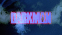
A personal favorite of ours is Darkman from 1990.
Allen: That's got a great story to it!
Pablo: That one, you know, we came into the production and we went to see all the footage. They had Darkman appear and disappear in smoke – I loved those shots. So we took those and made a sequence like that, doing the same thing. We found some nice stuff to put in there. It was great work.
Darkman main titles (1990)
Pablo: I went to UCLA to get the brains and stuff they had with the microscopes. I wanted to get footage to put in the montage and they supplied tapes for that.
Allen: Yeah, the great thing about that is that we had taken, like, AVR 5, ½-inch color video, and pulled it into – I want to say it was called Video Telecom, but it's where Foto Kem is now, in Burbank. And we basically did everything on film from video, from ½-inch video. So the composites were done on video and then pulled onto film from there.
Darkman (1990) - anger montage
Let’s talk about The Addams Family (1991). Did you go back to your past lettering style with that?
Allen: Not The Addams Family! We designed new lettering for Addams Family which was based off of Charles Addams’ writing.
Pablo: Allen actually did the lettering of Addams Family!
Allen: Yeah, Pablo tasked me with going into the archives and extrapolating Charles Addams’ letters. He wanted to get an alphabet for it and so I got an alphabet that had three sets of capitals and three sets of lowercase. They were all slightly different and he used those and blew them up for The Addams Family.
The Addams Family (1991) - main titles
Was Bound For Glory (1976) a similar thing? Whose lettering is that?
Pablo: On Bound For Glory that's Woody Guthrie's own handwriting! Hal had a lot of letters that [Woody] wrote and I picked out some letters and made an alphabet, and then we blew it up and used it for the titles.
Allen: It's like a beautiful hidden homage, you know?
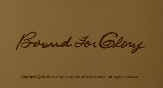
Bound for Glory title card, 1976
When did Caligraphic Pictures officially end?
Allen: It lasted a little bit longer than a decade, until around 1994. I exited at that point though I was still consulting with Pablo when he worked at a place called Title House. It was during the time of Anna Karenina, L.A. Confidential…
Title House four-walled Pablo and the whole organization. It was an optical company. Keith Allen and his son Mark were very smart for bringing Pablo on. He had four or five people working at Caligraphic and Title House brought them all over.
Including you, Allen? Did you stay on?
Allen: I ended up doing Fred Mogubgub's thing – I went over to Paramount. Yes, I made a mistake and went over to Paramount. I should have probably stuck it out.
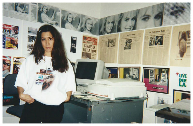
Joy Ferro Moore (above) was business manager/agent for Pablo Ferro from 1994 until about 2011. This photo was taken at Title House in 1997.
There is a resonance to all this ’cause my father and I never stopped working with each other – it just becomes more of a perigee, with Pablo as the sun that the solar system revolves around. You just have to be in orbit at the right time. By the time I went to Paramount I was out of orbit. Pablo had a good support system over there at Title House though, on Cahuenga Boulevard. Joy Ferro Moore [Pablo's daughter] was involved at that point.
Pablo: Joy got all the work and publicity. They got big pictures after that and I was so happy I could help them. I had a big space there and of course I would bring work in with top films. When I first started they only did low-budget films and then later started to do bigger budget ones. Title House is no longer, though. They are retired.
Allen: You know, Keith Allen and Mark Allen [at Title House] were very honorable, very good people to work with. But they were a practical optical house. It was very cutthroat back then and we were heading into digital – we were smack-dab in the middle of developing digital in the industry.
What about Men in Black (1997)?
Pablo: We just did the typography with Barry Sonnenfeld and Men in Black. I did a bunch of combinations of type and he asked me which one I liked. And I pointed to that one and that is the one he used. He let me use the style.
Allen: It somewhat pigeonholed Pablo over the years. It is kind of strange as Barry would come back to him – we had these 15-minute meetings – and he'd come in and go, "So, Pablo, guess what lettering I want you to use on this one?" [laughs] and then the meeting is over! In terms of placement and creative and everything else though, it's all Pablo.
Men in Black (1997) - main titles
You did the L.A. Confidential titles in 1997, too, right? That has a whole montage scene. Did you create that?
Pablo: Yeah. They asked us to come in and do that. We did it with the director, Curtis Hanson, and that was great. We got some great shots we didn't use, too.
Curtis and I both researched and we would pick out the best ones and try to put them in somewhere. The footage they had was great and we even had a multiple screen for the main titles – he wanted to show all those scenes together.
L.A. Confidential (1997) - main titles
It's almost like a postcard, with the four scenes and the main title.
Pablo: Right! And they even loved what I did with the title when DeVito goes to the typewriter and types out those last lines.
Allen: Oh yea, Danny DeVito. That was part of the narrative.
So then you did the 1998 remake of Psycho which of course has the famous Saul Bass title sequence, but you added some color to it.
Pablo: Right, a little bit. Elaine Bass came in and worked with me. They wanted to make sure we wanted to please Saul and I didn't. Good thing in those days he held the titles quite long so we had to use the same music, but of course we had more names. I just took his print and made it high contrast so it would be a sharp line and we put color in it. We tried every color and green seemed to be the most pleasant to work with. We used a lot of his graphics without really showing that we were.
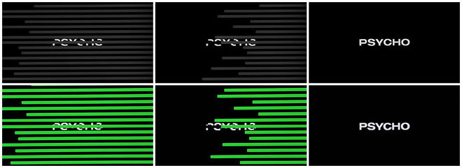
Psycho 1960 and 1998 comparison
So, when did you finish working at Title House?
Allen: I'm gonna say around 2000.
And do you have a white whale – is there a project that you always wanted to make?
Pablo: I’d love to finish these films that I did, like Five Minutes Late. I did some stories that were very interesting but bizarre. Julian Barry and I did the best work at that time. When Sony cameras came out with the portable ones, I got it right away and I said, I can do the film myself! I can see what it looks like. I can change the lighting. So I started doing that.
The Inflatable Doll by Pablo Ferro - short film clip
I did three films about mental illness without even realizing. Julian was writing, we were working together. That was how we did three more: The Lawyer, The Bridge, Five Minutes Late, and things like that, only working on it after our other jobs.
Allen: The four short films. Sony had created these commercial helical scan black & white reel to reel ½-inch video cameras. They were very heavy and you had to wear a backpack – reel to reel – and they gave him two or three of them.
You just run around shooting stuff and he ran around and shot material for films. Later on, we transferred them onto 16mm.
Pablo: Well, 16mm and then to 35mm.
Ahmet Ertegün was a Turkish-American musician and businessman, best known as the founder and president of Atlantic Records, as a leader of the 1950s R&B revolution, and for discovering or championing many artists of the time.
Allen: Yeah, they became a labor of love, almost a white whale, those projects, along with a project he did for Ahmet Ertegun. It was the 25th Anniversary of Atlantic Records and Ahmet had given him access to the whole library of Atlantic Records for the film project. Ahmet literally had the whole library delivered to my dad’s office – thousands of records.
Pablo: I like Ahmet, what a gentleman. But he didn’t like what I made and said, “Nothing personal, but I don’t like that,” so, I said okay. But he liked Bette Midler. So I sent him [a section from the overall] piece with Bette Midler singing and I kept the rest! Like I always say about this film: "He's got the copyright and I've got the copywrong."
Allen: They insisted that Pablo send his cut and all the materials back and he refused. Somebody at the office said they owned the copyrights. That’s when he coined the phrase, “Well, I own the copywrongs.”
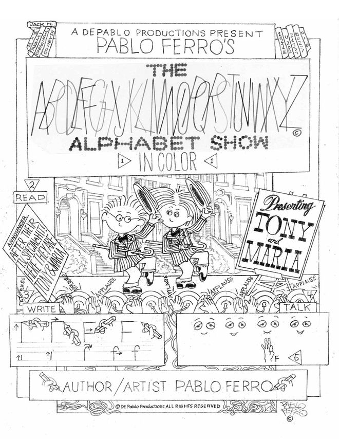
Alphabet book page examples
What are some of the projects that you are working on now?
Pablo: There’s the alphabet book which everybody seems to like. These two little kids talk to each other about what the letter is doing. They are very cute while everything around them is very real – they are the only ones that are cute. That’s the difference there.
Allen: We’ve spent a great part of the last year and a half culling the majority of the materials that have been in storage for academics so it’s literally been a re-purposing and re-branding of the artistry with a direct reference, sometimes three-dimensional, because it shows the work that he has done which really runs the gamut of all forms of art.
These materials that we’ve gotten together, culled them – we are trying to put together exhibits and he’s putting together wonderful books.
Pablo: I have a font book that I put together.
Allen: Right, we’re putting together a series of font books of Pablo’s fonts. The type book is the most powerful of those in terms of significance, and then there’s the alphabet book which shows his cartoon style in a very whimsical and, I think, genius way. It references teaching – it shows teaching in a visceral way.
We just finished working with Huffington Productions where we did a movie of theirs called Sins of Our Youth and utilized one of Pablo’s fonts for it. So, you know, we’re a foundry now! Those fonts don’t exist anywhere, though. He utilized one of the fonts on that title sequence and in addition to that, we use different title art for the front end titles and the main-on-end titles – a totally different rendition of the same artwork. It’s actually kind of beautiful.
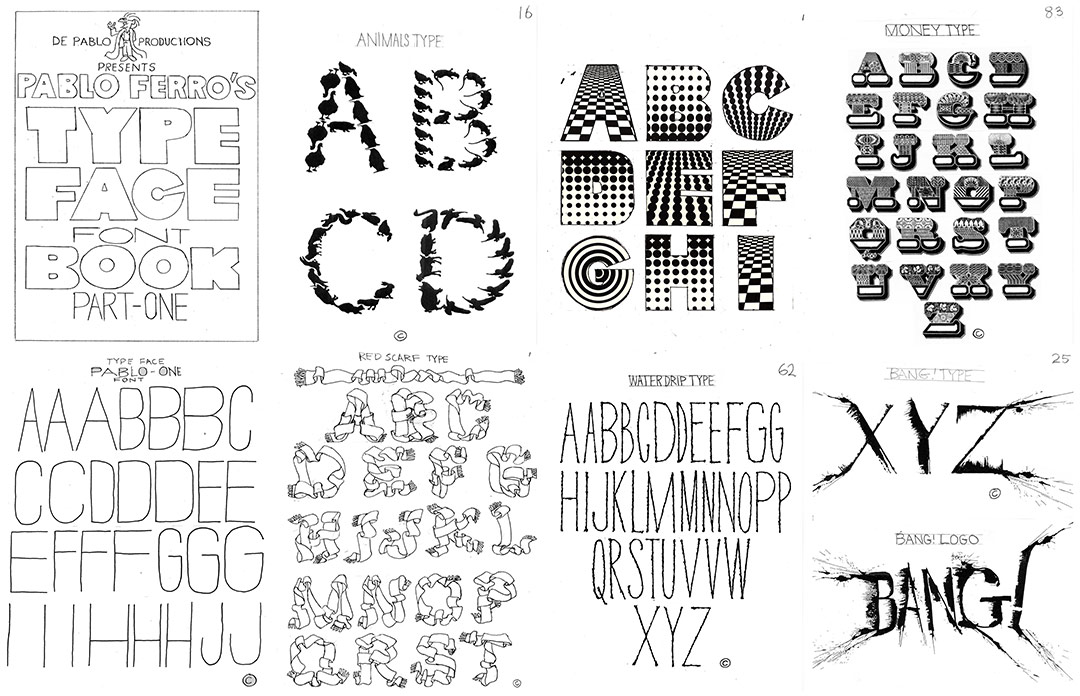
Pablo Ferro Type Face Book page examples
What moniker are you using now? Are you working with others or just the two of you?
Allen: Pablo Ferro and Associates! We work together, paradrop in, and walk out. We surrounded ourselves with a support group of artists that we know and trust implicitly. We know how to do this technically but we also need to trust the artists too. The schedules don't let us do R & D.
Pablo: It is good to know technically about everything – production and post-production. When you work for someone it makes it easier for them.
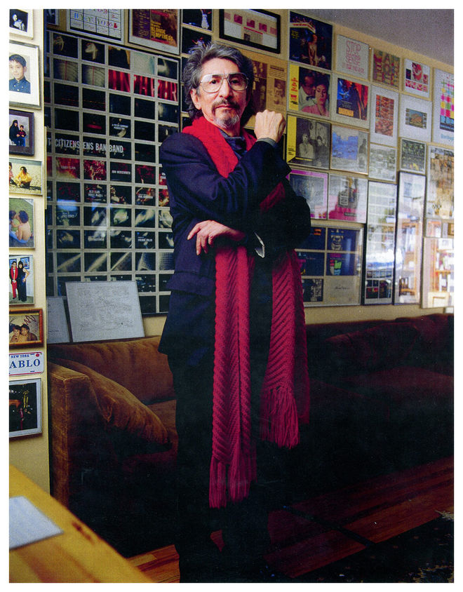
Pablo at his home studio, 2003
Allen: It lends to a much smoother working situation. With the technology leaning towards that, we still maintain a clear path to post-production. We work within that construct and make things happen that don't challenge the physics of post-production.
Out of all of the work that you've done, Pablo, what are you most proud of?
Pablo: Well, I'll tell you: Stanley Kubrick left me completely alone and I was able to do a trailer that cannot be copied because every cut will take you a day to do.
For A Clockwork Orange.
Pablo: Yeah. Every frame is perfect with the music and it tells you the whole story at the same time without saying a word or reading words aloud – it gives you emotion. I could see why nobody imitated it – it takes a lot of work. It's an amazing trailer.
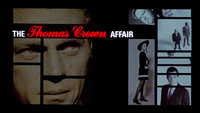
Allen: Yeah, it really is. That's a real hard question to answer for myself because I look at some of these things and I'm just floored by them. I mean look at The Thomas Crown Affair in terms of opticals – the way they were back then! He probably should have gotten an Academy Award for special effects.
Do you have your own favorite title sequences that you like – by others?
Pablo: The Man with the Golden Arm. Saul Bass. When I saw that I couldn't believe it. He's got a simple drawing and it's so powerful. I said, "Wow, that's a beauty."
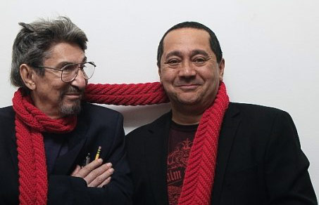
Pablo and Allen Ferro, 2009
Thank you so much, Pablo. We really appreciate you taking the time to remember all of this for us.
Pablo: My pleasure. I still remember being a little kid that was working on a farm – milking the cows, bringing them to the grass, and I was very happy. I mean, I remember taking the milk to town to sell it early in the morning and it was still dark and I would look at the trees, and the trees sometimes would turn into an animal – I would see an elephant or a tiger and I would go, “Wow!”
Allen: He was always very graphic, even back then.
Pablo: The lighting and the shape of the trees gave me that. I'm always seeing images. I just thought everybody was like that.
Special thanks to Allen Ferro for his assistance in researching this article.
Support for Art of the Title comes from


