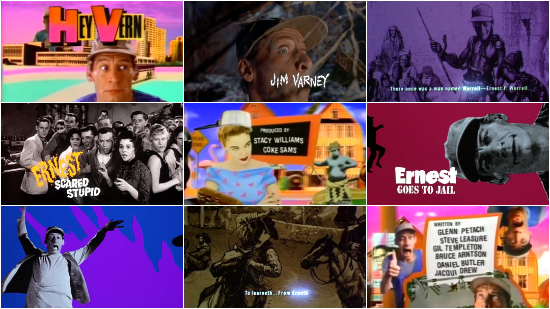
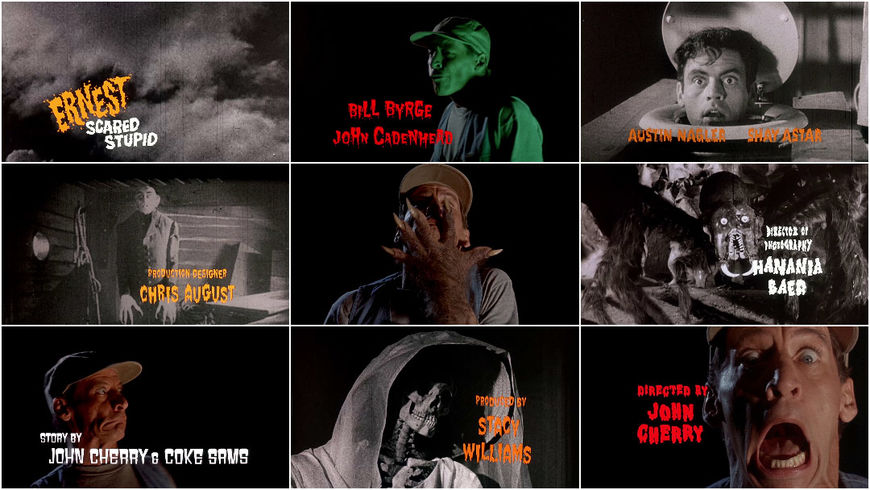
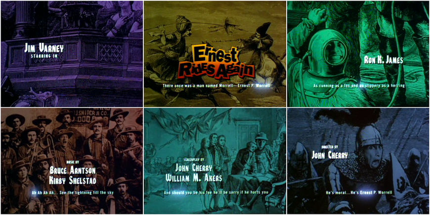
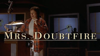
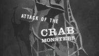
Lightning strikes. The organ clangs. A long-faced, ball-capped man rises into the frame, his eyes bulging and his head trembling in fright. For the next two minutes and 20 seconds, this man’s impossibly elastic face – framed in close-ups as intimate as The Passion of Joan of Arc – will embody a spectrum of emotions: arrogance, befuddlement, trepidation, distaste, and deep, primal fear. In Sunset Boulevard, the faded silent queen Norma Desmond says, “We didn’t need dialogue – we had faces then!” If only she had lived to see Jim Varney.
These are the opening titles from Ernest Scared Stupid (1991), and Varney is playing his signature character, Ernest P. Worrell. Ernest emerged in 1980 in a series of TV commercials from the Nashville-based advertising agency Carden and Cherry, and directed by the company’s executive vice-president, John R. Cherry III. The ads stuck to a dependable formula: Ernest, a know-it-all dumbbell in a denim vest, aggressively pitches goods and services to his long-suffering neighbour “Vern.” Dairy products, local newscasts, orange juice, Coca Cola, Mello Yello, Elvira’s Movie Macabre… there was nothing for which Ernest could not muster enthusiasm. (Though the commercials became nationally popular, Ernest’s endorsements meant little to Vern, who would violently shut his window on the neighbour’s hands).
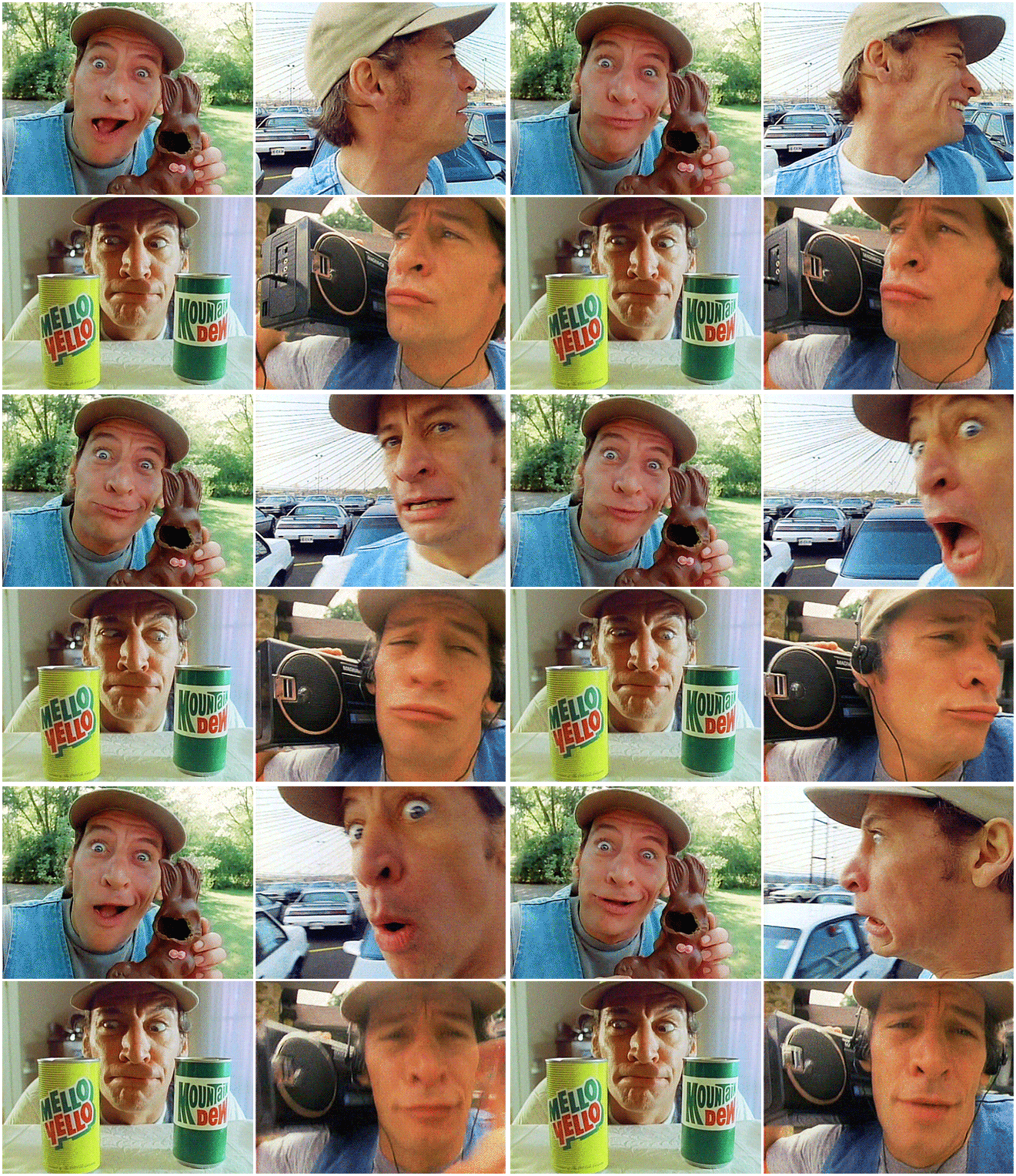
Clips from various commercials starring Jim Varney as Ernest P. Worrell
Ernest took on a life of his own, spawning an unlikely franchise that would encompass 10 feature films (all but one directed by Cherry), a children’s television show, a TV special, numerous short films, and hundreds upon hundreds more commercials until Varney’s death in 1999. In the popular imagination, the Ernest films are lowbrow entertainments for children. The popular imagination is not wrong, but even hard-nosed adults must respect the relentless energy of Jim Varney, who rivalled James Brown as the hardest-working man in show business.
—John R. Cherry IIIWe had to come up with ways for it to be interesting. My guiding light was: as weird as you can get it.
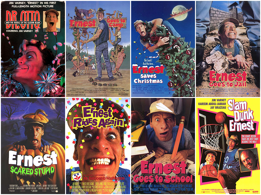
Posters from Ernest P. Worrell movies including Dr. Otto and the Riddle of the Gloom Beam (1986), Ernest Goes to Camp (1987), Ernest Saves Christmas (1988), Ernest Goes to Jail (1990), Ernest Scared Stupid (1991), Ernest Rides Again (1993), Ernest Goes to School (1994), Slam Dunk Ernest (1995)
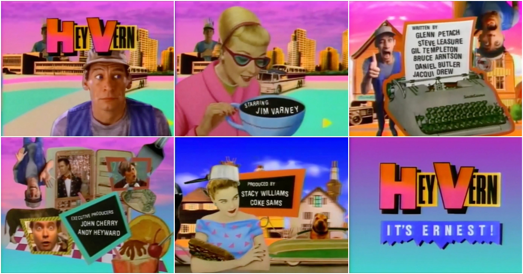
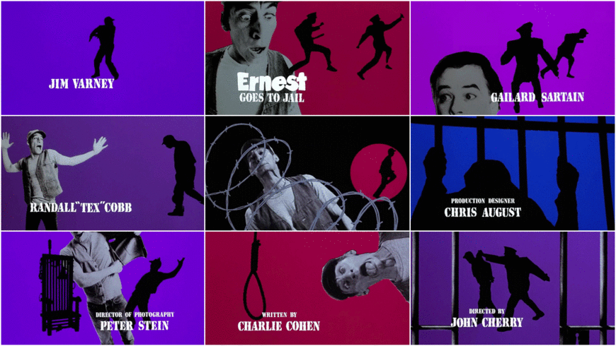
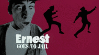
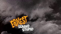
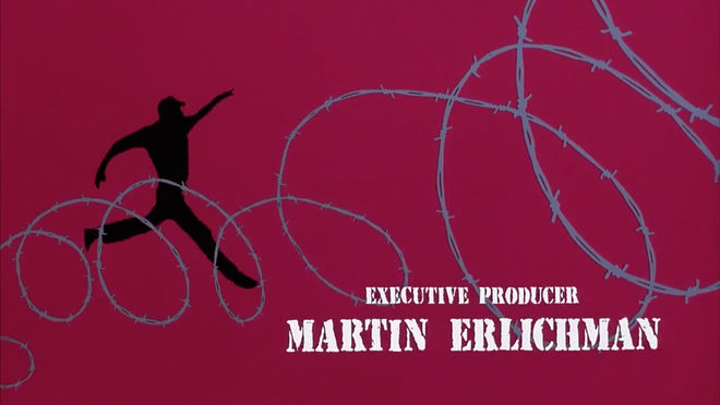
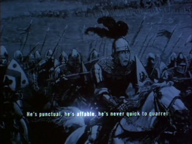
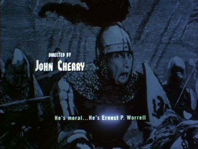
And if you’re anything like this adult, you’ve probably regularly dropped by YouTube to revisit some of the franchise’s most iconic sequences: their opening titles. These scenes distill the Ernest saga down to its essence. Four sequences in particular stand out: Ernest Goes to Jail (1990), which set Varney’s stark silhouette – running from guards, dragging a ball-and-chain, grasping the bars of his cell – against brightly-coloured backdrops; Ernest Scared Stupid (1991), which alternated Varney with clips from vintage horror movies; Ernest Rides Again (1993), which imposed Ernest’s face on a series of historical engravings, set against a pompous song about his bravery and valour (“Even as a lad he was sensitive and caring / As cunning as a fox and as slippery as a herring”); and Hey Vern, It’s Ernest! (1988), the short-lived TV show whose credits are a cross between Terry Gilliam and Pee-wee’s Playhouse.
Series mastermind John R. Cherry III was both a professional illustrator and an adman with visual flair and financial resourcefulness. In an interview with Art of the Title, he said, "None of these had big budgets. They were $3,000 or $5,000. So we had to come up with ways for it to be interesting." When asked about his aesthetic strategy, he said, "My guiding light was: as weird as you can get it."
All four sequences were designed by BARBARA LASZEWSKI GARNER, former assistant art director at Carden and Cherry and animation designer for the Ernest films and TV show. Art of the Title spoke to Garner in 2013 about her work on Ernest Scared Stupid, and in this follow-up interview we explore the full range of her work for the Ernest P. Worrell universe.
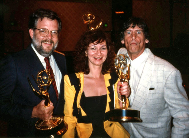
Director John Cherry, Animation Designer Barbara Laszewski Garner, and Actor Jim Varney with their Emmy Awards in 1989
What was your path from Carden and Cherry to the Ernest movies?
Barbara: I was a graphic designer, and I really wanted to do motion graphics, because I took some animation classes in art school. I fell into that at Cascom, which was a motion graphics company. The guy who started that company used to shoot a lot of stuff for Carden and Cherry, and one day he came into the agency and asked our art department if anyone wanted to do a storyboard for a logo ID. I immediately said, "I do! I do!" I did the storyboard, and he thought I had a very good sense for motion and timing and all that, so when he started his company, he asked me to come and be the art director.
But I already had this relationship with the agency and John Cherry. We used to call John "Buster" – that’s his nickname. They had a company, and called me into this meeting, and I thought it was just going to be a consultation on titles for the Hey Vern, It’s Ernest! show. I sat down, and there was this whole group around a conference table… they had done the 13 shows already, but they didn’t have opening titles, and they were asking me all kinds of questions. I was just there to consult, and Buster looks at me and says, “Okay, can you have this done in two weeks?” I said, “Well… hmm… okay.”
Two weeks doesn’t seem like a lot of time.
Barbara: No, it was no time! I was pretty freaked out, because it was a big job to put together. But anyway, it all came together, it looked great, we won an Emmy for it – it was terrific.
Hey Vern, It's Ernest! (1988) main title sequence, directed by Barbara Laszewski Garner
Particularly on the TV show, but also in the films, your credit sequences draw on a lot of kitschy historical imagery, whether it’s clips from old horror movies…
Barbara: Yeah, that was for Ernest Scared Stupid – I got a lot of clips that had to be public domain. That became a real issue, to find clips that would work, but the ones I found were really cheesy, which really worked. I would say Ernest Scared Stupid definitely had that feel.
Ernest Scared Stupid (1991) main title sequence, directed by Barbara Laszewski Garner
Barbara: Ernest Goes to Jail, I wouldn’t call that necessarily old and kitsch. The Hey Vern, It’s Ernest! titles… I guess you’d call it kind-of ’50s…
A bit of a Pee-wee’s Playhouse flavour.
Barbara: Yeah, it was like that.
And the TV show also has a Monty Python-esque look.
Barbara: Right. That was the first title sequence I did with them. They had a graphic designer/illustrator, Joel Anderson, at the agency who actually did all the graphics. He supplied me with tons of images and graphics and stuff, and I had the opening title music, and I had to have that track read. I used animation directorial sheets, so each line was a move. I directed it that way, to the soundtrack. I had all these pieces of art and great graphics all sprawled out on my floor, and I was trying to make sense of it. That’s how I directed it, and then we put it together in post, which was almost the first video thing I did. Everything else I had done to date was on film and then transferred to video, but this was actually put together in video in post-production.
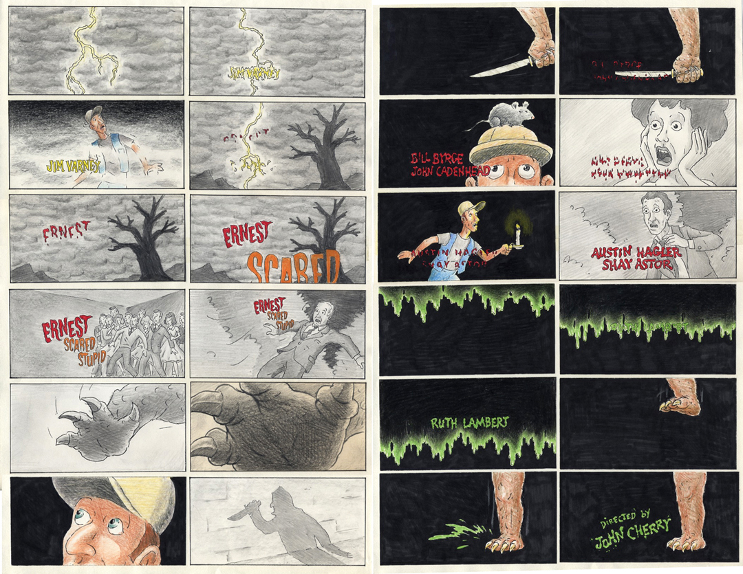
Image Set: Storyboards for Ernest Scared Stupid (1991) by Barbara Laszewski Garner and John R. Cherry III
How long would the credits for something like Ernest Scared Stupid have taken to make from beginning to end?
Barbara: Maybe two, three months. I know I spent a good two, three weeks in L.A. It wasn’t a speedy thing like you can do now when everything’s done on computers. You were doing everything on film, and when you have 16 layers of optical prints, if you make one little mistake, you have to start from scratch – you can’t even edit it. You’re on the animation camera doing all these passes, and it is very laborious, very tedious. Now, I do some magazine productions in print – I’m semi-retired, really – and I do three magazines a month. If I was still doing paste-up and layout, there’s no way I could do three magazines a month by myself. It’s just a different world.
When a company like Disney is involved, does the work have to go through a lot of approvals?
Barbara: That was something that the producers dealt with. But yes, on Scared Stupid, we had to get public domain footage because they were not going to pay for a lot of film footage. That had to go through pretty rigorous legal department stuff, and they had to send OKs.
Ernest Goes to Jail (1990) main title sequence, directed by Barbara Laszewski Garner
I obviously have to ask about working with Jim Varney. What was he like?
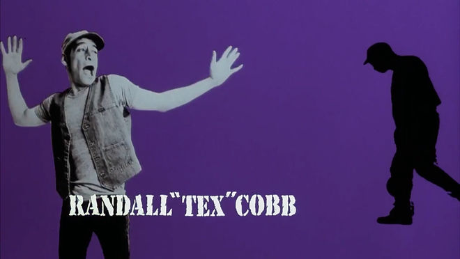
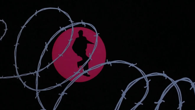
Barbara: Oh, he was just delightful. He was a total goofball, and he was really easy to work with because I really didn’t have to do much directing – I would just tell him what I would need, and he would just do it. For the Ernest Goes to Jail titles, we shot those on high-contrast film so we could get all those silhouettes. That was kind of a take-off on the I Spy opening – and I actually met Herbert Klynn, the guy who did those titles, later, and we became best friends, I did some work with him.
Barbara: It was really fun to work with Varney, really easy, just a total goofball all the time, and acting like Ernest, spewing these ridiculous philosophies. He was a lot of fun.
Did you just say, "Okay, do a different face now…"?
Barbara: Well, I would tell him what kind of face I was looking for and he’d do that. I’d tell him, "Okay, look worried," or "Look freaked out" – that’s all I would need to say, and he would do these incredible things. For the silhouettes [in Ernest Goes to Jail], of course, that was just him sneaking around, being behind bars, and he just did it. The black-and-white cut-outs that come in and out of frame in that sequence, that was optical layering – I think there were 16 to 20 layers sometimes, and it was all optically printed.
What was John Cherry like as a boss?
Barbara: He was great. [laughs] He was just like a big child – we would have great fun with him always. We’d always have these crazy times at the office.
I was new, I was really young, so I was answering to the creative directors, Dwana "Sam" Wherry and Steve Leisure. I didn’t work with John directly on stuff [at Carden and Cherry] – we worked together later, when I was doing the titles and things like that. He was easy to work with – extremely creative, with really great ideas all the time. He was also an illustrator – he did beautiful drawings, and did a lot of the storyboards for the films.
Ernest Rides Again (1994) main title sequence, directed by Barbara Laszewski Garner
All four of the title sequences had very memorable music. Did your storyboards predate the music?
Barbara: I think that’s right. There weren’t really storyboards for Hey Vern, It’s Ernest! – that was just a lot of graphics thrown at me that I had to make sense of. The music was already composed, and I directed to the music so everything would hit when it needed to. Goes to Jail, I can’t remember what came first – I think maybe the idea of what it was going to look like, and then that was given to the composer to come up with a song, and we were able to marry the two together.
Did you have much communication with the composers?
Barbara: Oh yeah, we were really good friends. This whole group was like best friends – I still know Bruce [Arnston] and Kirby [Shelstad], they’re old friends now.
Where did the idea for the Ernest Rides Again credits come from?
Barbara: That was either John Cherry’s idea or one of the art directors in the agency. Those graphics were supplied already, and I can’t remember if I actually edited those visuals together [of Varney’s face superimposed on historical figures] or if I just added the titles.
It’s a very fun sequence.
Barbara: It is – that one is a lot like Monty Python.
The Ernest franchise went from ads in Nashville to movies with Disney, and then became an independent, direct-to-video series. Did these changing circumstances have a big impact on the resources and time that were available to you?
Barbara: Well, Rides Again had the least amount of budget, I guess. That was the last one I worked on, and it wasn’t that memorable. The others were fairly big productions, and I would go out to L.A. to work with the optical people out there – Hal Cohen [optical supervisor] and Marie Davis [visual effects editor], who was just fantastic. The concept would happen here [in Nashville], and for the production of it I would have to go out to L.A. Now, the show was all done here in Nashville.
Before closing, I’d like to return to the Carden and Cherry agency. How big an operation was it? You mentioned it had a bit of a family atmosphere.
Barbara: It did. It was in a beautiful old building. I’m from New York City, and when I moved down here, I thought I was on another planet. It was not a huge advertising agency, but it was one of the bigger ones in Nashville – not size-wise, but in terms of reputation. It had maybe 30 people working there. It did grow – they had more people after I left. It was a fun time, and I really enjoyed my work. Who knew that I would find it down in Nashville, Tennessee?

