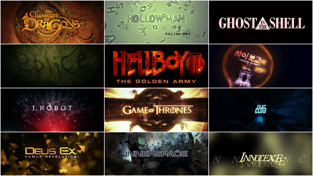
While title sequences come in all shapes and sizes, it is of course inevitable that similar topics and themes will emerge from the pile. These don't necessarily have to be genre-specific and in fact, their ability to transcend film genres is part of the lasting appeal. Consider the Saul Bass school of graphic animation and the many genres that particular aesthetic has been applied to, from comedies and romances to thrillers and capers. The detail-oriented montage is another example, where the audience is introduced to themes in a film or information about its players through relevant close-up or overlapping imagery.
Whether by accident or trend, these categories are born from a universal appeal and are often broad in scope: graphic animation, nostalgic influence, situational type (in which the titles are integrated realistically into live-action footage), photomontage, and so on. The microscopic, inner world has also emerged as a common topic, embracing both the mechanical and the organic – and, sometimes, a combination of the two.
There are certain narrative, technical, and graphic techniques for which title design is an ideal venue. Because of its short format and creative license – and sometimes because of their budgets – title sequence real estate is often used to explore elaborate, abstract worlds previously unknown or unseen. For this reason – combined with an enduring human fascination with how things tick – Inner Workings is a theme that is frequented by a broad spectrum of genres (though, to be fair, most often by sci-fi and fantasy).
The following are a collection of some of our favorite sequences under this umbrella, selected not only for their superior execution but also their creative significance and contribution to the craft.
Chasseurs de dragons (2008)
Created by Mac Guff Studios for Guillaume Ivernel and Arthur Qwak’s animated fantasy adventure, the title sequence to Chasseurs de dragons (also known as Dragon Hunters) is a steampunk wonderland, populated with intricate, animated clock components, strange nautical contraptions, skeletal remains, and cartographic and cosmic imagery, all bathed in a warm firelight and explored by a single graceful camera move.
The sequence begins with the camera pulling away from the film’s opening scene and back through the eye of a dilated porthole, locking the audience into a world that is both microscopic and panoramic. The imagery is ethereal at first, with bundles of gears orbiting each other as celestial bodies do, backed by parchment illustrations of fantasy worlds and arabesque patterns, dotted with illuminated constellations. Over time, the imagery becomes more concrete, slowly escorting the audience out of the sequence and back into the story.
Hollow Man (2000)
Borrowing from the distinctive look of microscopy and photomicrography, the Hollow Man titles rely on a simple premise and clean execution to convey their message. The full sequence takes place in a petri dish of sorts, with the title cards arranging themselves from an alphabet soup of microbe-like letters swimming amid other microscopic elements.
Directed by William Lebeda at Picture Mill, it’s an apt introduction to a film about human transformation on the molecular level.
Ghost in the Shell (1995)
A classic upon its release, the title sequence to Ghost in the Shell (also known as Kôkaku Kidôtai) is a curious mix of 8-bit type animation, then-hi-tech CGI, dreamy anime, and naked torsos, all set to composer Kenji Kawai’s intimidating, minimalist score. It follows the construction of a cyborg from the inside out, first embracing a cold, tech-heavy aesthetic as the robot’s inner-core is assembled, feathering into softer imagery and warmer colors as the cyborg takes on a more human form, soon emerging from the mechanical womb as a young woman.
Splice (2009)
As beautiful as they are grotesque, the main titles to Vincenzo Natali’s 2009 sci-fi thriller Splice are impossible not to watch, but perhaps more difficult when it becomes apparent that the setting is some kind of fluid-filled womb, the titles grafted to the inner walls as a cancerous growth. The walls themselves appear to be made of different types of organic matter — mammalian, reptilian, some even plant-like. A thick field of suspended particles reminds us that we are in the equivalent of amniotic molasses, escorted by a single light through caverns of ambiguous organic matter.
Designed by Kook Ewo and realized at Chez Eddy after an extensive pre-production process, the titles effectively set the tone for the film while familiarizing the audience with its own brand of genetic cloning.
Hellboy II: The Golden Army (2008)
Combining a single, sweeping camera move with a jarring number of near-concussions as cogs and wheels self-assemble within inches of the viewer, the title sequence for Hellboy II is, essentially, a carnival ride through a mechanized version of hell, with a brief detour into a graphic, da-Vincian purgatory. Created by Double Negative for Guillermo del Toro’s arguably superior franchise sequel, the machine eventually forges the components of the Hellboy II logo — and, analogously, of Hellboy himself.
Game of Thrones (2011)
A fiery astrolabe orbits high above a world not our own; its massive Cardanic structure sinuously coursing around a burning center, vividly recounting an unfamiliar history through a series of heraldic tableaus emblazoned upon it. An intricate map is brought into focus, as if viewed through some colossal looking glass by an unseen custodian. Cities and towns rise from the terrain, their mechanical growth driven by the gears of politics and the cogs of war.
From the spires of King’s Landing and the godswood of Winterfell, to the frozen heights of The Wall and windy plains across the Narrow Sea, Elastic’s thunderous cartographic flight through the Seven Kingdoms offers the uninitiated a sweeping education in all things Game of Thrones.
Read our in-depth discussion with main title designer Angus Wall.
I'm a Cyborg, But That's OK (2006)
Unlike the Hellboy II titles, in which cogs and other mechanisms are rendered with a very tactile, heavy aesthetic, I’m a Cyborg, But That’s OK (also known as Ssa-i-bo-geu-ji-man-gwen-chan-a) addresses a similar subject matter from a different angle. Here, the machinery is treated delicately, given an almost translucent x-ray quality, with compositions and movement leaning towards abstraction. Situational type is integrated into the machinery, fixed to cogs and wheels passing through frame.
This sequence plays on viewer’s expectations by first presenting itself as heavy-handed, undermined somewhat by Yeong-wook Jo’s Elfman-like score. The palette is cold and dark throughout, only at the end rising into the warm analog glow of light bulbs arranged in showboat display around a central cog, topped by the main title itself. The score — which had previously seemed menacing — now assumes a carnival-like quality, without ever changing tempo. This contrast and confusion of intent establishes a theme which is carried throughout the film.
Fight Club (1999)
We follow a path outwards from the “fear center” of our protagonist's brain, moving through various cerebral micro-landscapes and exiting a skin pore, gracefully ending between the sights of a Smith and Wesson 4506 pointed into his mouth.
Realized by VFX house Digital Domain under the visual direction of Kevin Tod Haug for David Fincher’s post-punk soliloquy, irreverence and lack of context are perhaps this sequence’s greatest assets, aided further by a mash-up Dust Brothers score cranked to 11 and a rave-flyer-inspired sans serif typeface designed by the late P. Scott Makela.
This immediate relationship between cause and effect — where the source of fear is linked directly to the chemistry behind that emotion — establishes that the violence in Fight Club is not trivial. For as many times as the movie-going public has seen a gun in someone’s mouth, they’ve never considered its tangible emotional weight — at least, not to the visceral extent of Fight Club. It’s a sentiment that isn’t easily forgotten during the film’s many, many fight scenes.
Want to know more? Read our feature interview David Fincher: A Film Title Retrospective.
I, Robot (2004)
At first mechanical, then microscopic, then electric and, finally, aquatic (or perhaps cosmic?), Picture Mill’s artful opening sequence to Alex Proya’s 2004 adaptation of Asimov’s seminal novel I, Robot is nothing if not ambiguous, presenting some of the film’s core themes through abstraction and detail, sealed with a unified color palette and a fluid, single-shot camera move. This abstraction, however, is soon challenged by reality, as the audience is pulled from the dreamlike ambiance of the sequence into the film’s chaotic underwater opening.
Deus Ex: Human Revolution (2011)
Adam Jensen is dying. The blinding lights of an operating theater melt away in a mechanical fever dream of pleading voices, surgical tools, and rent flesh. Memories of lost love flash between images of a broken and dissected form, while shattered limbs and failing organs — the embodiment of Jensen’s flawed humanity — are replaced with the cold perfection of carbon fiber and silicon. A body restored, a soul fractured — but what remains of the man? A corporate thrall bound to unseen masters or a transcendent being gifted with the power to change everything?
Echoing the central motif of Eidos-Montreal’s video game — the merging of the real and artificial — Goldtooth Creative’s stunning title sequence for Deus Ex: Human Revolution seamlessly blends both live-action and computer-generated imagery to introduce players to a world at the dawn of a cybernetic renaissance.
Read our in-depth discussion with the game director and title sequence designers.
Innerspace (1987)
Contained almost entirely within the structure of a single ice cube, the title sequence for Joe Dante’s underrated sci-fi comedy Innerspace takes viewers on a fantastic molecular voyage from the bottom of a scotch glass to the hands of a swaggering hotshot. Foreshadowing the film to come, a simple change in scale transforms the ordinary into the alien. Frozen water becomes a shimmering crystalline maze of glacial hydrogen and oxygen, while the chatter of a cocktail party is depleted to become little more than abstruse reverberations — an infinitesimal world reconstructed with every clink of the tumbler.
As Wayne Fitzgerald and David Oliver Pfeil’s martial titles contrast against the coruscating background the longest drink pour in movie history concludes, introducing us to future micronaut Lt. Tuck Pendleton.
Bicentennial Man (1999)
In the not too distant future (2005 to be exact), inside the factory of NorthAM Robotics, a man is manufactured — a positronic man. Hands, arms, legs, eyes — all the things that make us human — some assembly required. Our mechanical protagonist NDR (or Andrew Martin as he will later become known) is just one of thousands and thousands of anonymous automatons conveyed piece by piece down the factory line, constructed like a car or some other industrial good. These robots are bound for lonely lives of servitude or maybe something more.
Computer generated imagery may have hit new heights in 1999 thanks to films like The Phantom Menace, but part of what makes Imaginary Forces’ title sequence for Bicentennial Man especially endearing is the fact that almost everything on screen is a genuine physical object. All those wires, actuators, and composite materials might not add up to a real live robot, but they inarguably have a life to them that even most modern visual effects still can’t match.
The sequence as a whole essentially operates as a less grim counterpart to the iconic Terminator 2: Judgment Day teaser trailer from 1990. Instead of the assembly of a sinister Austrian cyborg, the viewer is treated with the fabrication of a servile robot played by the late Robin Williams. When paired with moving type that mimics the pistons, pumps, and motors central to the manufacturing process and James Horner’s industrious score, the sequence rises to the near-whimsical heights. This overly sentimental Asimov adaptation doesn’t have much going for it, but the opening sequence is a definite highlight.
Ghost in the Shell 2: Innocence (2004)
The title sequence for Ghost in the Shell 2: Innocence follows in the footsteps of its predecessor, virtually recreating it with a more polished, up-to-date aesthetic, even dusting off Kawai’s already-famous score. But Ghost 2 is still an accomplishment in its own right, once again pushing the limits of then-current CGI while servicing a simple, effective premise.
Support for Art of the Title comes from


