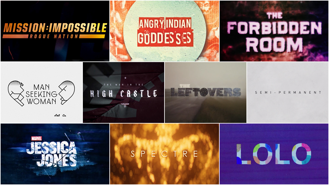
The Very Best Title Sequences of 2015, as chosen by Art of the Title
For our second annual list of the year’s top 10 title sequences, Art of the Title’s editors chose from among film, television, video games, and conferences. The Top 10 of 2015 were chosen based on criteria such as originality and innovation, impact, atmosphere, relevance to subject matter, and technique.
Paring the long list down from 50 to just 10 was a difficult task, but we believe these sequences represent the cream of the crop. So remember: Title sequences do not exist in a vacuum. They are not conjured out of thin air. They’re painstakingly crafted, composited, and hand-drawn by teams large and small all around the world, with budgets modest and mighty, in state-of-the-art facilities and in home studios. We invite you to sit back, relax, and enjoy some of the most interesting and innovative work to hit screens this year.
Art of the Title's Top 10 Title Sequences of 2015
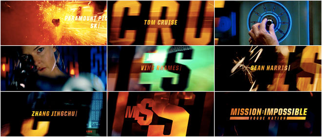
10. Mission: Impossible — Rogue Nation
CATEGORY: FILM
Created by Filmograph
For the title sequences that bookend Rogue Nation, the fifth installment in the Mission: Impossible film franchise, LA-based studio Filmograph worked under fittingly impossible timelines to deliver not one but two sequences: an opening to declare the arrival of the film and a closing to round it off with levity, all at breakneck speed. The opening sequence acts as both trailer and primer, dousing the audience in style and rhythm while giving glimpses of the film to come. The familiar typography and that iconic Lalo Schifrin-composed score ground the sequences in the series’ origin as a ’60s television show, while stepping firmly into new territory.
9. The Man in the High Castle
CATEGORY: TV
Created by Elastic
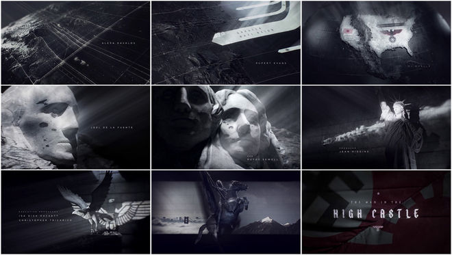
In Amazon’s The Man in the High Castle, an adaptation of Philip K. Dick’s alternate history novel of the same name, it’s 1962, the Allies lost World War II, and the two major Axis powers have divvied up North America between them. The narrative revolves around film canisters containing a revolutionary re-writing of history. That notion – of a dangerous film retelling history – is woven into the fabric of the show’s title sequence created by Elastic.
We move over a map of North America as monuments have combat footage projected on and through them. Lady Liberty, Joan of Arc, and the eagle blend together effortlessly to establish believable Nazi–American iconography. But the most poetically resonant choice made here is the use of “Edelweiss”. Ironically, this well-known “Austrian” song actually isn’t Austrian at all – it’s an American song, written by two Jewish songwriters (Rodgers and Hammerstein) for The Sound of Music in 1959. For an American to sing “Bless my homeland forever” in this alternate historical context is downright tragic. The key emotion conveyed by The Man in the High Castle’s title sequence is one of yearning, of doomed nostalgia, and the quiet struggle to maintain one’s identity in the face of huge forces.
Read our in-depth discussion with Creative Director Patrick Clair of Elastic.
*With notes from Ian Dawe
8. Lolo
CATEGORY: FILM
Created by Laurent & Françoise
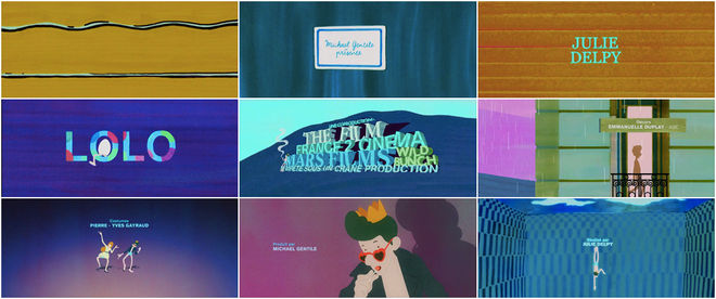
This is Lolo. He emerges from a sea of vibrating colour, cool and effortless. The hand-drawn opening sequence for Julie Delpy’s film Lolo, directed by French duo Laurent & Françoise, establishes the spirited and irregular tone with smashing aplomb. The duo, previously known for their short animation LSD ABC, here dive into title design for the first time, and likely not the last. The sequence, a pastiche of ’60s cartoon stylings and warm swaths of pigment, features Lolo striding across the landscape to Andy Williams’ jaunty track “Music to Watch Girls By”. Lolo transcends boundaries and dances in time. He winks knowingly, all cigarettes and seduction, and just like that, it’s all over. He’s the future of humanity.
Read our in-depth discussion with Director Julie Delpy and Designers Laurent & Françoise.
7. Spectre
CATEGORY: FILM
Created by Daniel Kleinman
*While we recognize that versions of the Spectre title sequence may exist elsewhere online, we respect Eon's wishes not to show the sequence in full at this time.
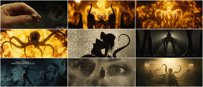
The title sequence of any Bond film often has the heaviest burden to carry. It must recall the brand, ooze style, establish tone, excite and awe, all while living up to the high standards set by its predecessors – and Skyfall is a tough act to follow. But as Sam Smith’s mournful theme “Writing’s on the Wall” says: “I’ve been here before.”
It’s a formula we’ve come to relish, and one unlike any other in title design: the women, the weapons, and James Bond, tangled among it all. For the opening of Spectre, the 24th film in the series, Bond title design stalwart Daniel Kleinman, studio Rattling Stick, and the effects team at Framestore assemble a powerful mix of imagery to reintroduce the British super spy and his foe du jour. Flesh, flames, and those sticky, reaching tentacles call back to previous Craig-era 007 adventures with fleeting glimpses of old allies and adversaries. The combination, though familiar in its routine, is executed flawlessly. Coupled with Smith’s driving and impassioned theme, the sequence is easily one of 2015’s strongest as well as a standout entry in the Bond stable.
6. The Leftovers (Season 2)
CATEGORY: TV
Created by Elastic
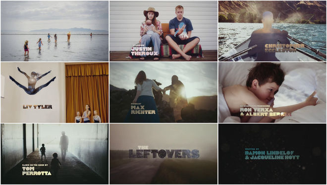
It’s rare for a television series to completely reinvent itself between seasons, but that’s precisely what the showrunners of HBO’s The Leftovers did – and the show’s opening title sequence was a key part of that reinvention. Season two of The Leftovers uproots its characters from sleepy Mapleton, New York and transplants them to the enigmatic town of Jarden, Texas, a place seemingly untouched by the “Sudden Departure.” Season two’s drastic change of scenery and tone necessitated a new introduction for the series. Charged with succeeding yu+Co’s weighty first season opener, Angus Wall and studio Elastic opted to forego the religious iconography and to reflect the new focus on family and personal realities. Guided by Iris DeMent’s folky “Let The Mystery Be,” the sequence is a montage of photographs depicting the private lives of Americans, from intimate moments to major milestones. The departed appear as silhouettes, outlines filled with natural phenomena – cloud formations, starfields, sunsets – empty spaces left in people’s hearts. Where did they go? What happens now? The opening titles, like the show itself, seem unwilling to offer an answer. And that’s okay.
5. Angry Indian Goddesses
CATEGORY: FILM
Created by Plexus
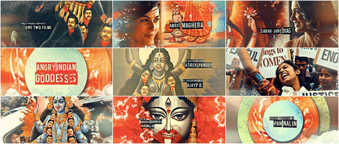
When Angry Indian Goddesses premiered at the Toronto International Film Festival in September of 2015, it received a tearful standing ovation. In November, it premiered in its home setting of India, heavily edited and censored, down to its exuberant opening title sequence.
Angry Indian Goddesses is a film that holds an intersectional lens up to contemporary Indian society, taking an unflinching look at gender, sexuality, patriarchy, class, friendship, and all their pressure points. It’s a film bursting with colour and razor-sharp emotion, and so its opening titles must follow suit. The sequence, designed by Mumbai-based studio Plexus, weaves together images of the cast with protest photography and Indian deities in power poses. Likenesses of goddesses like Kali are ubiquitous in India, sold on cards and bookmarks, used in calendars, embroidered on fabrics and painted on walls. It’s surprising, then, that the opening title sequence was heavily altered for its Indian theatrical run. The original version of the sequence, before the film hit the Censor Board, is above – in all its glory.
Read our in-depth discussion with Director Pan Nalin and Studio Plexus.
4. Man Seeking Woman
CATEGORY: TV
Created by Digital Kitchen
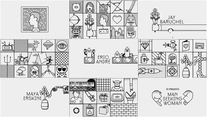
A young New Yorker walks away, seemingly calm from a freshly dead relationship, with some garbage bags, a terrarium, and his own personal raincloud overhead. Oh, and dead birds fall on the poor schlub. And that’s the joke. That’s the absurdist, spastic humor of Simon Rich’s Man Seeking Woman, a sitcom that makes literal what we all too often internalize in the emotional minefields of love.
To convey that sense of romantic and manic whiplash, Digital Kitchen assembled the FXX show’s title sequence with a series of snappy black-and-white animations hurtling forward through an ever changing three-by-five grid. We get tidy little doodles of trolls, trains, and tridents; frowning condoms, wilting flowers, cassettes, skulls, and ray guns. It’s a giddy bit of nonsense that hints at Man Seeking Woman’s disparate, breakneck comedy.
Read our in-depth discussion with Executive Creative Director Camm Rowland of Digital Kitchen.
*With notes from Blake Goble
3. Marvel's Jessica Jones
CATEGORY: TV
Created by Imaginary Forces
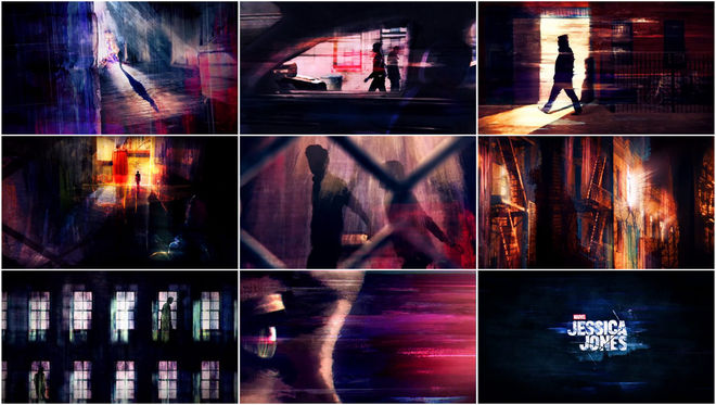
Get to know the darkest corners of Hell’s Kitchen through the eyes of Jessica Jones (Krysten Ritter), the titular superhero-turned-private-investigator – a hard-drinking, hard-hitting misfit whose troubled past has finally caught up with her. The line between private eye and voyeur slowly blurs as Jones haunts the rain-soaked streets, peering down alleyways and into foggy tenement windows, always watching, always being watched. Composer Sean Callery’s theme starts out slow and jazzy, but then takes on a frantic, frenzied dimension as her shadowy hunt continues – a hint of purple ever on the periphery.
Produced by Imaginary Forces with creative director Michelle Dougherty at the helm, the Jessica Jones title sequence stunningly transposes the distinctive painting style of Alias cover artist David W. Mack to set the stage for a complex and disturbing comic book yarn unlike anything Marvel has produced to date.
2. Semi-Permanent Sydney 2015
CATEGORY: CONFERENCE
Created by Raoul Marks
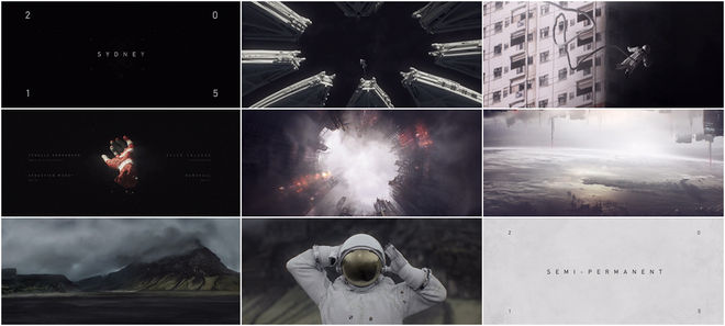
Away from the hustle, bustle, and endless distraction of our world, you stand alone at the edge of possibility. It’s out here that ideas live — tumbling through the vastness of memory and experience — where grand monuments drift by in the void, shattered and half-formed, bigger than life. Title designer Raoul Marks’ extraordinary opener for Semi-Permanent Sydney 2015 visualizes the challenges that any creator faces when trying to do what they do: create. The sequence, which is essentially a short film, wears its influences proudly on its Ortho-Fabric sleeve. Will inspiration fuel your vision? What awaits you at the end of your voyage? Breathe it all in and find out.
Read our in-depth discussion with Title Designer Raoul Marks.
1. The Forbidden Room
CATEGORY: FILM
Created by Galen Johnson
If a film is lost, can it be remade?
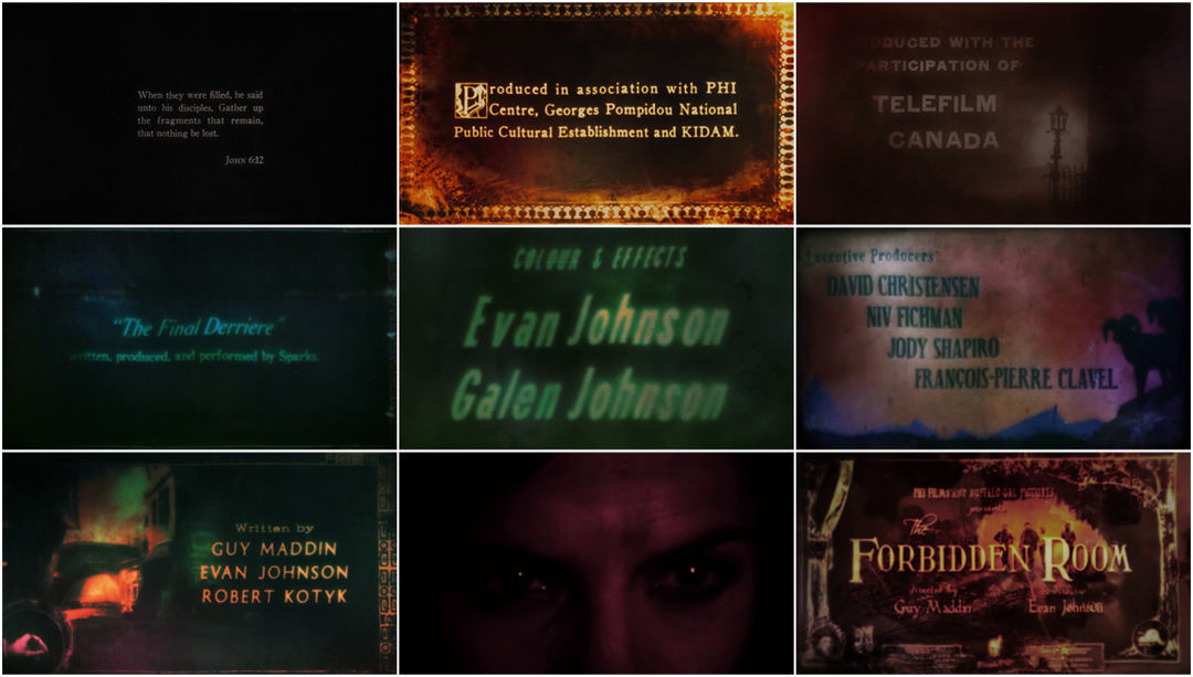
The answer to that question is waiting to be unearthed in The Forbidden Room, a feverish experimental feature from Canadian auteur Guy Maddin and longtime collaborator Evan Johnson. At once a gleeful throwback to the silent movie era and an incomprehensible love letter to the “lost movie,” the film’s narrative cannot be easily parsed. The opening moments of The Forbidden Room are a muddy and melted statement of intent, assailing the viewer with a barrage of old-timey title cards, all badly degraded either physically or digitally, many changing style and typeface mid-credit. Full of half-heard musical overtures and opening notes, this clamourous introduction sets the stage for a chain of seemingly unrelated vignettes based upon silent films both real and imagined. The whole experience feels as though someone exhumed a box of tattered film reels from a partially submerged basement, hastily spliced them together, and projected the strange results out into the world for all to see. The final product is a remarkable pastiche of early title design that would be almost indistinguishable from the real thing if not for Maddin’s distinctive sensibilities.
Read our in-depth discussion with Production Designer and Title Designer Galen Johnson.
—
...and that's a wrap!
There are so many amazing title sequences we weren’t able to include in this top 10, but a number of this year’s most notable sequences can be viewed by looking at our 2015 titles list.
Love our choices? Disagree with our picks? Did your favourite title sequence not make the cut? What were your favourites? Be sure to tweet us at @ArtoftheTitle and have your say.
Thanks for joining us for another incredible year in title design.
Here’s to an exciting 2016!
—Art of the Title

