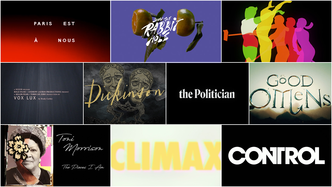
The Best Title Sequences of 2019, as chosen by Art of the Title
For our sixth annual list of the year’s top 10 title sequences, Art of the Title's panel of experts chose from among film, television, video games, events, and conferences. The Top 10 of 2019 were chosen based on criteria including originality and innovation, impact, atmosphere, relevance to subject matter, and technique.
Paring the long list down from more than 200 to just 10 was a difficult task, but one done with relish. This year's title sequences were painstakingly created by teams large and small all around the world, with budgets modest and mighty, in state-of-the-art facilities and in home studios. So sit back, relax, and enjoy some of the most interesting and innovative work to hit screens this year.
Art of the Title's Top 10 Title Sequences of 2019
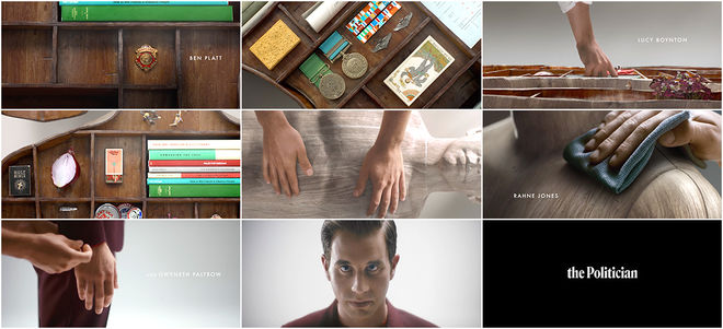
10. The Politician
CATEGORY: TV
Created by Elastic
Netflix’s The Politician is a new comedy-drama-sometimes-musical from the team behind Glee. It’s an appropriately off-the-wall look at American politics and governance in the vein of Alexander Payne’s Election (1999), a satire that explores the state of play through the microcosm of high school. Enter Payton Hobart (Ben Platt), a young politician who will stop at nothing to become president… of his Santa Barbara, California high school. Does he actually want to lead his classmates to something greater or is this just another stepping stone on the road to fulfilling his ambitions?
The Politician’s opening titles may hint at the truth. This thoroughly engrossing effort spearheaded by Elastic’s Heidi Berg and Felix Soletic illustrates that achievements count even if the reason for their pursuit is entirely hollow. Payton is an empty vessel, a human-sized shelf in need of filling with not just medals and awards but also perspectives and ideology – and oh how he fills them up. A politician is a construct. They are an assembly of ideas and policies, a projection of people’s hopes, dreams, and fears who are, more often than not, wrapped up in an attractive or charismatic package and may, in truth, be entirely devoid of substance. But what makes them the real deal, a true political animal, is that they never actually see themselves that way. Vote Payton for Class President! WP
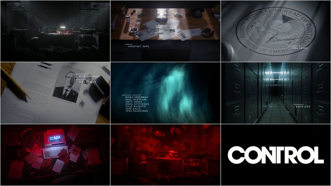
9. Control
CATEGORY: Game
Created by Remedy Entertainment, Elastic
Video game title sequences often have an air of novelty about them. A big-budget game with a glossy title sequence usually comes off as nothing more than an effort to appear more cinematic or prestigious than it actually is – and the industry’s tendency to ape design tropes from film and TV doesn’t exactly help. So when a game like Remedy Entertainment’s Control features a title sequence that would be considered compelling and original by the standards of any medium – and it gives credit where it’s due mere moments into a 15-20 hour playthrough – it’s worth taking note.
The new original IP from the Finnish developers behind Alan Wake and Max Payne, Control is a third-person action-adventure game that puts players in the role of Jesse Faden, an agent of the Federal Bureau of Control (FBC), a secretive government agency tasked with protecting the public from phenomena which violate the laws of physics, time, and space. That’s really all you should know before entering the FBC’s enigmatic New York headquarters at the beginning of the game, aside from the fact that the building is infinitely larger on the inside and may be connected to alternate dimensions. Make sense? It’s not really supposed to. Control’s titles pull back the curtain ever so slightly on this tantalizing premise, but what fun is a mystery if you’re given the answers right away? The game’s opening titles are a major clue that what you’re about to play is gonna be weirder than usual. WP
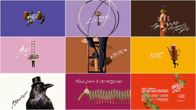
8. Down the Rabbit Hole 2019
CATEGORY: Conference
Created by Merijn Hos, Jurriaan Hos
Now, we’re not saying that you’re going to the annual Down the Rabbit Hole music and arts festival in the Netherlands to do drugs and listen to incredible recording artists live on stage, we’re merely noting that the event in question is named for a figure of speech that is synonymous less and less with Lewis Carroll and more the act of tripping out.
But if you are planning to take that kind of trip, then you’ll be positively chuffed to know that Down the Rabbit Hole continues to enlist the talents of the Brothers Hos – Merijn and Jurriaan – to create the promotional material for the festival, including the surreal title sequences that have launched successive editions of the event. Expounding upon their previous work with increasingly bizarre and captivating results, the Hos’ organic circles and 3D spheres have given way to strange creatures formed out of everyday objects and body parts. Hands without arms and legs without bodies combine with vases and vegetables to become odd beings. Insects with spinach wings? A raven in a tophat? A teacup with legs?! Why not? Inky type hovers about like smoke, rippling in space as the beasties march by. Is it all just weird for the sake of weird? Sure, maybe a little. But if you’re attending Down the Rabbit Hole with Thom Yorke and 10,000 new friends then it’s exactly the sort of charming peculiarity that’s going to make your festival experience all the more enjoyable. WP
7. Good Omens
CATEGORY: TV
Created by Peter Anderson Studio
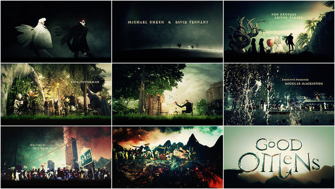
In the beginning was the word. But Aziraphale and Crowley were there, too. Soon there were also fruit-bearing trees and enormous stone cherubs, phone booths and spaceships, and people — so many people — all marching together on a bizarro pilgrimage toward their doom.
This is the premise of the opening credits to Good Omens, the six-episode TV adaptation produced by Amazon Studios and BBC based on the popular 1990 novel by Terry Pratchett and Neil Gaiman. The ragbag opening, which combines the characters, humour and surreal tone of the series with 3D objects, live-action elements, and original 2D illustrations, was created by London-based Peter Anderson Studio and features carnival-esque music by composer David Arnold. It all comes together to find a sweet spot somewhere between the otherworldly work of illustrator Dave McKean and the wacky collage of director-animator Terry Gilliam, a brilliantly “bonkers” concoction that sets the show apart while introducing its narrative, stars, and offbeat humour. LL
6. Toni Morrison: The Pieces I Am
CATEGORY: Film
Created by Mickalene Thomas, Johanna Giebelhaus, Timothy Greenfield-Sanders, Declan Zimmermann
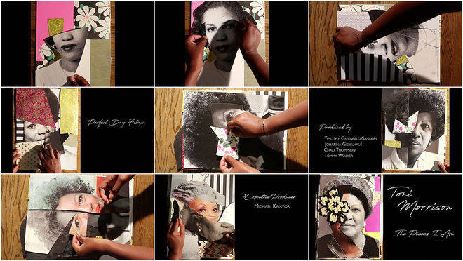
Toni Morrison, the celebrated writer and editor, recipient of the Presidential Medal of Freedom and winner of the Nobel Prize, mother of two and teacher of millions, died in August 2019. It is her powerful voice that carries us through director Timothy Greenfield-Sanders’ sweeping and intimate documentary. “She gather me, man,” says Morrison, reading from Beloved, her 1987 Pulitzer Prize-winning novel. “The pieces I am. She gather them and give them back to me in all the right order.” We watch as a pair of hands assembles irregular shards of photographs and patterned paper – a scrapbook portrait built upon itself. The hands belong to Brooklyn-based mixed-media artist Mickalene Thomas, who physically gathers pieces of Morrison and arranges them into a shifting video portrait.
It’s an astounding opening, a prelude that takes Morrison’s words literally and continues her work championing Black artists and voices. It also sets the stage for Morrison to speak candidly and for her friends and colleagues to share their thoughts. The film goes to great lengths to create a sense of craft and an intimacy between subject and viewer and it all begins here, with the titles. LL
5. Vox Lux
CATEGORY: Film
Created by Chris Taylor, Brady Corbet
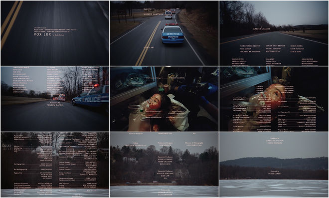
Brady Corbet’s sophomore feature Vox Lux, called “the anti-A Star Is Born,” starts with a bang. In the opening segment, “Prelude 1999,” it’s the end of the millenium and 13-year-old Celeste (Raffey Cassidy) is in middle school, just one of many students bustling into class. What comes next is a bleak, terrifying affair and the origin story of a pop idol: a boy enters the room and begins shooting, killing the teacher and several students and seriously injuring Celeste. As an ambulance carries her, wide-eyed and immobilized, through the wintry Staten Island landscape, the title appears, small and unremarkable, followed by a credits roll that inches slowly upwards. The credits keep coming, creating a shield of names over Celeste; a bodyguard of text. This credits crawl, normally rolling downwards and reserved for the end of the film, was designed by Chris Taylor (who also created stage graphics that appear later in the film) with direction from Corbet. The urgent choral score by Scott Walker gives the scenes heft while cinematography by Lol Crawley, shot in a tight 1.66:1 aspect ratio and on Kodak 35mm, moves from vehicle mounts to handheld to a pan and zoom out, providing both intimacy and steely distance. The sequence stands apart, the unusual motion and density of the credits creating space between this teenage trauma and the troubled, glittering star Celeste will become.
Later, when the closing title card appears at the end of the film, it’s bright and modern, the text large and in charge, and a fitting mark for Celeste’s brand, now fully formed. LL
4. Dickinson
CATEGORY: TV
Created by Shine
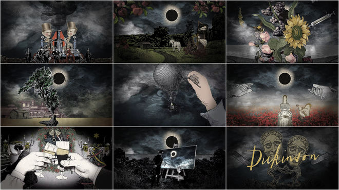
Watching Apple TV+’s series Dickinson, one word immediately comes to mind: refreshing. Matching anachronistic dialogue and music with sumptuous, period-specific sets and costuming, the series is an irreverent, wild, and above all fun depiction of the life of Amherst, Massachusetts-born poet and renowned shut-in Emily Dickinson.
With its initial slate of shows, including The Morning Show, See, For All Mankind, and Dickinson, Apple's new streaming service has come out swinging, ensuring it joins the fray dressed to the nines. Naturally, there's been an investment in the brand and graphic presentation of each offering. Most feature longer, full-fledged opening sequences but not Dickinson, which stands out with its 15-second title hits designed by production studio Shine. Each episode features a different collage of vintage illustrations and etchings, restless text and a jolt of thick electronic beats from composers Drum & Lace and Ian Hultquist, enlivening the experience of each installment and breathing modern life into this mid-19th century story. There’s a confidence in a title treatment like this that, when it works, is delightful, endearing and contagious. “Title divine” indeed. LL
3. Climax
CATEGORY: Film
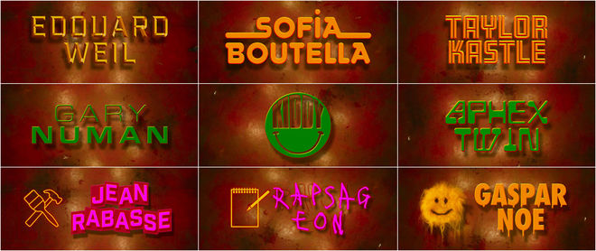
Created by Tom Kan, Gaspar Noé
After seeing Gaspar Noé’s 2009 film Enter the Void, director David Fincher had high praise for its title sequence (created by Paris-based designer Tom Kan) calling it “a jackhammer to the middle of your forehead.” Flowing from that same impulse (and after the flop that was 2015’s Love) comes Climax, Noé’s most recent offering to the New French Extremity genre. The film follows a troupe of dancers as they rehearse a stunningly choreographed routine and then celebrate, drinking sangria that, we soon learn, contains a dangerous hallucinogen.
Where Enter the Void took viewers inside the body, Climax penetrates the darkest, shrieking corners of the mind. It’s a visually intense and sonically vibrant film, the sort that plunges you into fresh hell and gets under your skin. Its pulsing, 3D title sequence, again designed by Kan, appears more than 40 minutes in and features enormous typography, driving electronic beats, and bright punches of iconography. And similar to Vox Lux, the main title card is shifted to the end of the film and the dense crawl of credits to the start. Kan describes Noé as “among those creators who advance the progress of their field by considering the title sequence as its own whole.” Doing so gives the film a stronger foothold in the memories of viewers, delivering a graphic wallop for the ages. Ten years after the jackhammer, it’s a joy to behold. LL
2. Spring 2019 Apple Event
CATEGORY: Conference
Created by Buck
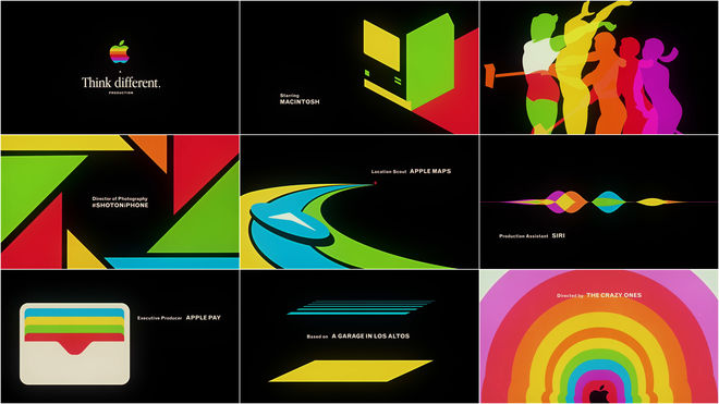
For Apple’s Spring 2019 Event, a hybrid press conference and product launch the company holds several times a year, viewers were invited to think differently about the role of the title sequence and start a real-time conversation.
Produced by design studio Buck, the sequence is both a celebration of Apple's groundbreaking innovations and a chronicle of its landmark ad campaigns through the decades. Embracing the modernist aesthetics that inspired the look and feel of the original Mackintosh computer and assembled from the iconography of the tech giant’s products and commercials, the opening is a rollicking visual history of the company – set entirely in the hues of its classic rainbow logo. From the Mac to iMac, iPod to iPad, from Ridley Scott’s unforgettable 1984 Super Bowl promo to Chiat/Day’s silhouette dancers. The opening is tried-and-true Apple marketing: Celebrate the new thing by first reminding aficionados and industry-watchers of all the other things the preceded it. In the hands of another company this might have come off as self-congratulatory or presumptive – it remains to be seen whether the TV streaming platform and video game subscription service announced during the event will have the same staying power as, say, the personal computer or iPod – but Apple’s track record is tough to argue with. WP
1. Paris est à nous (Paris is Us)
CATEGORY: Film
Created by Nina-lou Giachetti, et al.
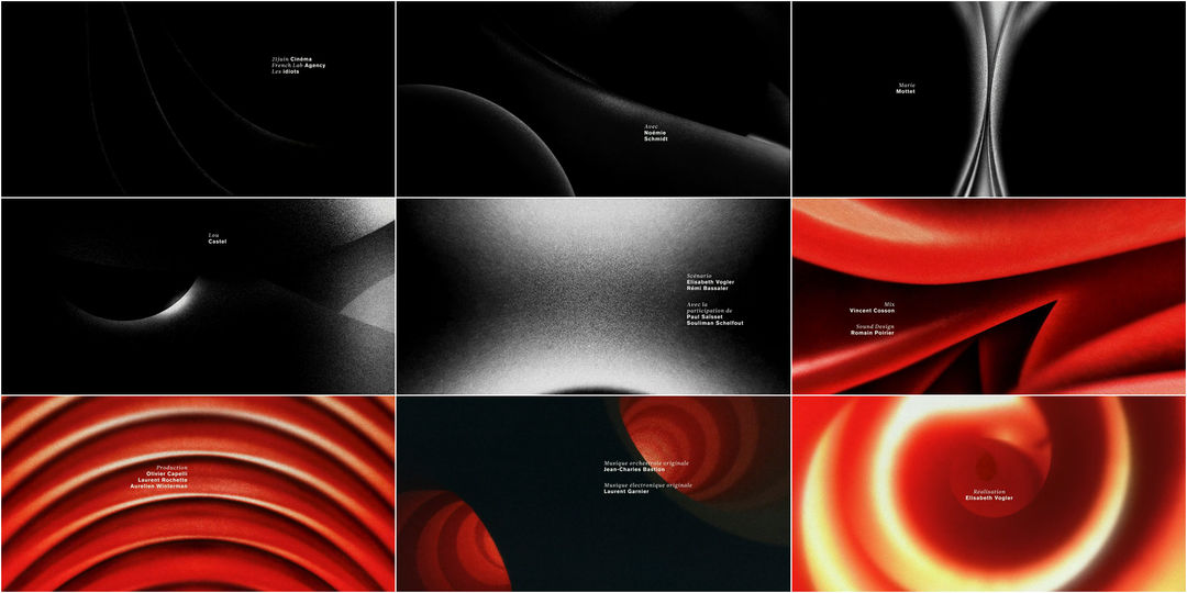
Paris est à nous (Paris is Us), one of Netflix's first original releases in France, was also director Elisabeth Vogler’s debut feature. Adventurous and gorgeously shot, it’s a dreamy film that, much like its central character Anna (Versailles’ Noémie Schmidt), is concerned with experiences and sensations, prioritizing exploration without the need for a clear destination.
Its title sequence, designed by motion designer Nina-lou Giachetti and a small Paris-based team, embodies this indecision and abstract searching. Noisy textures and indefinite shapes abound, encouraging ideas of human forms, intimacy and distance. A shoulder, a collarbone, two cheeks rounding towards each other. There’s a dash of German Absolute film influence here, a nod to Walter Ruttman’s Opus animation experiments of the 1920s. The music by Jean-Charles Bastion and Laurent Garnier is at first delicate and circular, a smattering of synthesizers and strings, held fast by low notes stretching out like horns calling across dense fog. After an ominous minute, the colour arrives, deep red, and with it a throbbing bass beat, the shapes wrapping up into a rotating iris. Altogether, it’s a solidly realized piece of motion design, an exciting artistic choice for a first-time director and a fascinating breath of fresh air. LL
Honourable Mentions
We would like to make special mention of the invigorating opening to The New York Times' investigative docuseries The Weekly, which premiered on FX in June 2019 and which each week follows a different breaking news story and the journalists covering it. The succinct 35-second title sequence was created by studio Afternoon Inc. with guidance from The Times' art director Kelly Doe and features photography and video footage from around the world beautifully cut to audio from composer Joel Pickard.
Also receiving an honourable mention is the main-on-end sequence to The Lego Movie 2: The Second Part, which builds on the stop-motion credits from the original but moves into an all-digital space and offers a new, perhaps even catchier credits song. With lyrics like "If they were a person, I would marry the credits," the song "Super Cool" by Beck featuring Robyn and The Lonely Island is a fun, winking homage to cast and crew and the art of the title sequence.
...and that's a wrap!
There are so many amazing title sequences we weren’t able to include in this top 10, but many of the year’s most notable sequences are available in our 2019 titles list. We recommend checking out the wonderfully wacky opening to short-lived but treasured series Tuca & Bertie, the gorgeous titles for Semi-Permanent Sydney 2019, and the tweed-and-tween opening to FITC Web Unleashed 2019.
Love our choices? Disagree with our picks? Did your favourite title sequence not make the cut? Join us on Twitter at @ArtoftheTitle and have your say.
Thanks for joining us for another incredible year in title design. Here’s to an exciting new decade!
—Art of the Title

