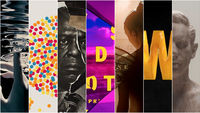
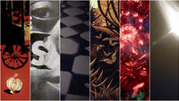
The Best Title Sequences of 2020
It’s been a year like no other. A year when so many of us turned to screens to connect or, indeed, to disconnect; when we ached for a dollop of entertainment, a moment of escape or a dose of comfort, for something familiar or something completely new.
This year, for Art of the Title’s seventh annual list of the year’s top 10 title sequences, we’re doing something new. We reached out to our community to pull in new voices and to expand the team that calls the shots for the Top 10 Title Sequences of the Year.
Chosen by Art of the Title's panel of experts
The 2020 panel includes: Yussef Cole, motion graphic designer and writer; Manija Emran, creative director and co-founder, Me & The Bootmaker; Frank William Miller, Jr., design director, Matter Unlimited; Robin Nishio, director and graphic artist; Louise Sandhaus, graphic designer, educator and author; plus Art of the Title’s founder Ian Albinson and Editor-in-Chief Lola Landekic.
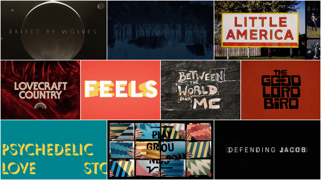
The panel chose this year’s top titles from among film, television, video games, web series, events and conferences. These title sequences were painstakingly animated, painted, composited, illustrated, torn and pasted, shot, performed and typeset by teams large and small all around the world, navigating a global pandemic, with budgets modest and mighty, over video calls, in state-of-the-art facilities and in home studios. So sit back, relax, and enjoy some of the most interesting and innovative work to hit screens this year.
Art of the Title's Top 10 Title Sequences of 2020
10. Between the World and Me
CATEGORY: TV Movie
Created by Elastic
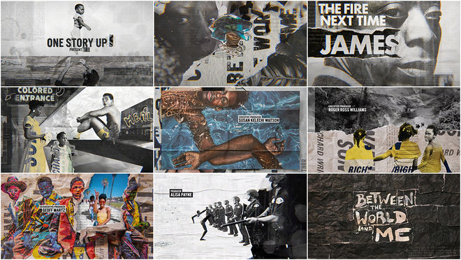
Brisk and brimming with energy. So begins Between the World and Me, the HBO special based on the adaptation and staging of Ta-Nehisi Coates’s non-fiction book of the same name.
Produced by creative director Hazel Baird, art director Diego Coutinho and a team at studio Elastic, the special's opening titles set up Coates’s experiences growing up in inner-city Baltimore and explore issues surrounding Black life in the United States. Coutinho drew inspiration from Coates’s books (the cover art for Between the World and Me makes an appearance along with work by painter Calida Garcia Rawles, who created the artwork for his 2019 novel The Water Dancer), as well as the texture of paper, layered and torn, and the watercolours of Molly Crabapple, whose illustrations appear in the film proper. Director Kamilah Forbes urged an interplay between scenes of suffering and scenes of affection, beauty, and art, as well as the inclusion of more books. Look closely and spot Toni Morrison’s Song of Solomon, Richard Wright’s Native Son and Frantz Fanon’s The Wretched of the Earth. Set to the rousing second verse of Black Thought & Salaam Remi's “Soundtrack to Confusion,” the titles are a bustling collage of documentary and archival footage, paste-up and stop-motion, and excerpts from Coates’s work. The resultant sequence is an exuberant march through time and space, a scrapbook pulsing with pain and pride.
9. The Invisible Man
CATEGORY: Film
Created by Greenhaus GFX
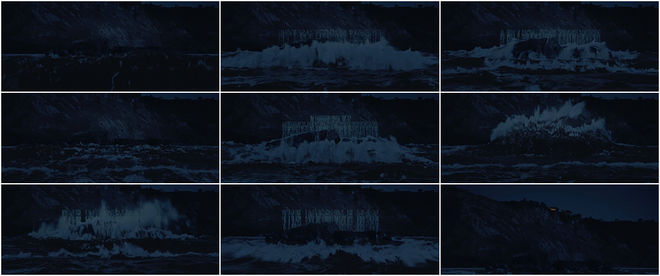
For the opening of 2020's The Invisible Man, director and screenwriter Leigh Wannell’s retelling of the 1897 novel by H.G. Wells, studio Greenhaus GFX created a simple, spine-tingling title reveal. What’s remarkable here is what’s missing. From the first moments of the picture, when the massive letters of “Universal” rotate around the globe amid silence and an ominous rumbling, it’s all systems go on atmosphere. At the bottom of a cliff, in the half-light of evening, waves crash against rock, revealing the opening production credits, only visible thanks to the splash of the tide.
To create the sequence, Greenhaus worked with a crew from Beverly Hills Aerials to capture drone footage off the coast of Palos Verdes, Los Angeles, chosen to match the look of the film’s shooting location in Australia. It’s the “best modern re-imagining of the low budget horror movie title,” says panel judge Robin Nishio. “It sets up the opening act well and, on second viewing, captures the gaslighting horror that is the rest of the film.” The eerie opening both foreshadows the film’s climactic battle in which water and liquids play a vital role and nods at a central tenet of horror storytelling: what is monstrous can be vanquished only once it’s revealed.
8. My Psychedelic Love Story
CATEGORY: Film
Created by Jeremy Landman with Brian Do, David Do, and Steven Do
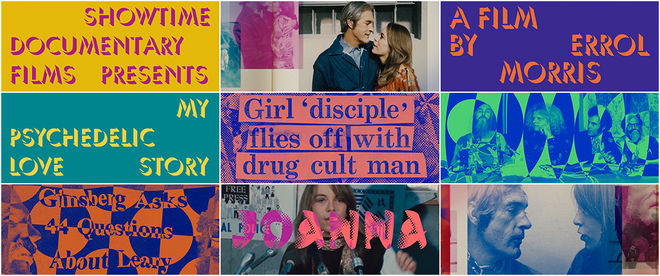
“Montage ecstasy,” says panel judge Louise Sandhaus, describing the opening to Errol Morris’s 2020 documentary My Psychedelic Love Story, centered on the acid-fueled love affair between Joanna Harcourt-Smith and Timothy Leary, the so-called high priest of LSD.
Graphic designer Jeremy Landman and a team of animators use bold colour with a potpourri of effects, type treatments and shapes, layering mystical imagery, archival photographs and cut-out headlines to give the sequence the vibe of a playful trip; a headlong dive down the rabbithole. The credits are set in a shadowed typeface and placed atop blazing colour contrasts, all stewed together to create a hodgepodge of vivid psychedelia. This treatment also populates the film proper, resulting in an experience of boundless surprises and graphic delights.
7. Defending Jacob
CATEGORY: TV
Created by yU+co
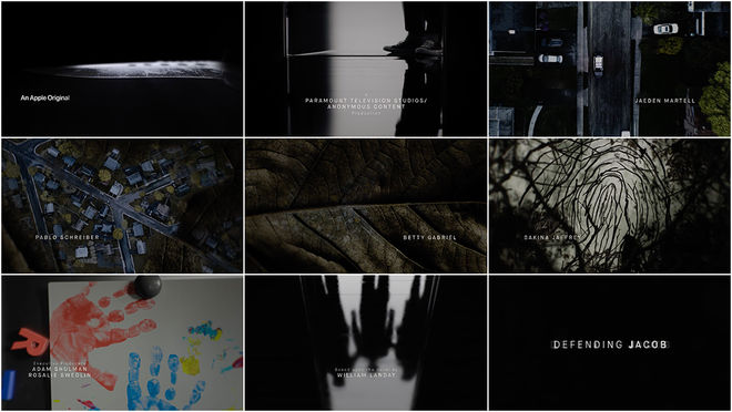
In Apple TV+’s eight-episode thriller Defending Jacob, Hollywood’s stalwart Captain America Chris Evans heads to court, playing a lawyer whose teenaged son is accused of murder. Like the miniseries itself, a mood piece as much as it is a nuts-and-bolts crime drama, the title sequence moves slowly and somberly to unspool a story with ample clever turns. Created by studio yU+co (Mrs. America, Crazy Rich Asians) the opening is a window into a family torn apart, the contemplative score by Atli Örvarsson walking a knife’s edge of ticking tension and pressurized grace.
“I’m a sucker for transitions,” says panel judge Robin Nishio and indeed, there’s something so satisfying about seeing one image turn seamlessly into another, their creases and edges lined up just so. What are the rules and where are the boundaries? Where does one moment end and another begin?
6. Little America
CATEGORY: TV
Created by Teddy Blanks, CHIPS
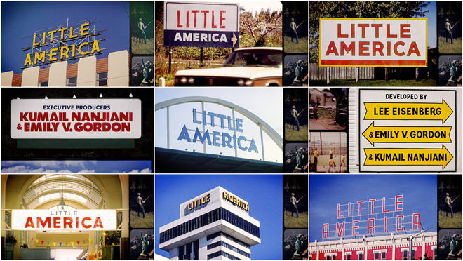
Little America, one of this year's many offerings from Apple TV+, showcases eight intimate portraits of the immigrant experience in the United States spread across the 70s, 80s, and 90s. The big-hearted anthology series is written and executive produced by Lee Eisenberg (The Office), who serves as showrunner along with Sian Heder, and developed by writing duo Kumail Nanjiani and Emily V. Gordon (The Big Sick), also executive producers on the series.
Each episode opens with classic visions of small-town Americana. For the titles, designer Teddy Blanks places the names of the crew and cast (largely as-yet-unknown actors) into vintage scenes: highway billboards, store signage, the side of a wagon, a gas station A-frame, integrating each name into the scenery like it was there all along. The names and the signs change with each instalment and are paired with episode-specific music, often a cover of an American hit. Episode two features a cover of Lauryn Hill’s “Doo Wop (That Thing)” by Quantic and Anita Tijoux, while episode six features “Bang Bang (My Baby Shot Me Down)” written by Sonny Bono sung in Mandarin by Hong Kong actress Betty Chung. Altogether the effect is that of a much-loved photo album, an insistence that all of the people who live in a nation form its whole.
5. The Good Lord Bird
CATEGORY: TV
Created by King and Country, LLC
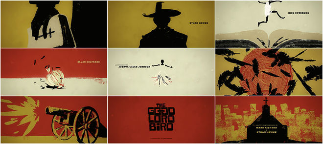
The good book, a blackbird, a spiralled sun, a bloodied feather, and a leaping figure, transforming into an onion to avoid the slings and arrows of the day. These are some of the images, expressed in black and blue, brick red and butter yellow, in a stark woodcut style, that form the opening sequence of The Good Lord Bird, Ethan Hawke’s spitfire series for Showtime.
Based on the novel of the same name by James McBride, the show follows Henry Shackleford (Joshua Caleb Johnson), an enslaved boy, and John Browne (Hawke), an abolitionist, as they travel together with Browne’s “gunfighters of the gospel” in the years just before the American Civil War. The animation was created by studio King and Country and features the uplifting hymn “Come on Children, Let’s Sing” by gospel singer and civil rights activist Mahalia Jackson. Spurred forward by Jackson’s invigorating contralto, the titles paint a picture of brutal and bare country, spare living, and historical myth. Jackson once said, “I sing God's music because it makes me feel free.” An apt choice for a series with emancipation in its heart.
4. Feels Good Man
CATEGORY: Film
Created by Arthur Jones, Jenna Caravello, Nicole Stafford, Khylin Woodrow
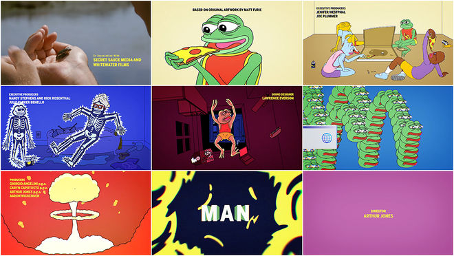
Artist Matt Furie grew up drawing cartoons, particularly frogs with prominent, anthropoid faces. In 2005, he published Boy’s Club, a comic featuring a cast of gangly goof-offs, among them a frog named Pepe who became a messageboard in-joke and then an Internet sensation. Spreading like wildfire from Myspace to Tumblr to 4Chan, Pepe became a symbol of hate used by various far-right and white supremacist groups in the mid-2010s.
Fast forward to 2020. Director Arthur Jones’ doc Feels Good Man tells the story of the amphibian’s appropriation, its effects on Furie and our current meme-infused culture. Spectacular segments of animation by Jones, Jenna Caravello, Nicole Stafford, and Khylin Woodrow bring Pepe to life. Beginning with the opening titles, the animation gives the film a jump-start and establishes a visual language that moors the picture in a bright and bizarre reality. The opener features bold title type, rich colour, and, in the words of panel judge Louise Sandhaus, “a whiz-bang crescendo." The film is capped off in style, too, with a closing animation to match: Pepe dives away in a totally zen sunset send-off. Ultimately, the titles are a wonderfully accessible, inviting and joyful introduction to a far-reaching and powerful cartoon phenomenon.
3. Playgrounds Festival 2020
CATEGORY: Conference
Created by The Panics
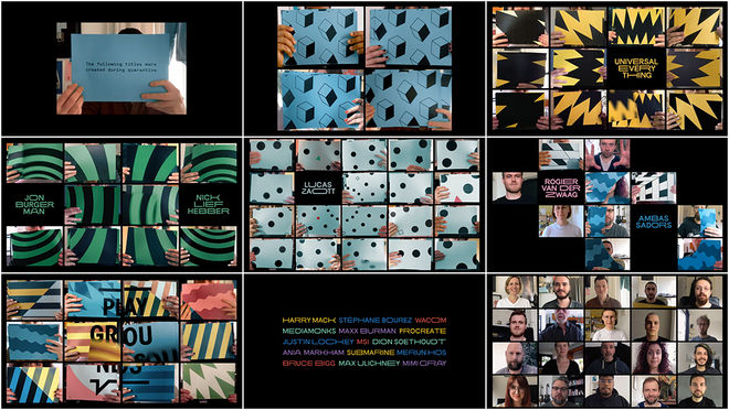
“If there’s one thing that’s come out of this pandemic it’s aesthetics that make use of this gridded platform known as Zoom. That’s what these titles do – for the most part – to great fun and effect," says panel judge Louise Sandhaus. “If you’ve got limitations, exploit them.”
This year conferences and festivals the world over were tested for their resourcefulness. Events were cancelled, postponed or transformed altogether. In the case of Playgrounds, a set of conference-style events taking place bi-annually in Eindhoven, Berlin and Amsterdam, the events moved entirely online. Tasked with creating the festival’s opening video, director Erwin van den IJssel and the team at Amsterdam-based studio The Panics decided to follow suit. Using a combination of this year’s video-chat software of choice, Zoom, paired with the time-honoured technique of stop-motion, each member of the 22-person team contributed to the titles from the comfort of their own homes.
With 962 printed pages, 3848 edges cut, eight ink cartridges used, and 3 papercuts suffered, the project is a delightful, feel-good example of playfulness and ingenuity at their best.
2. Lovecraft Country
CATEGORY: TV
Created by Antibody
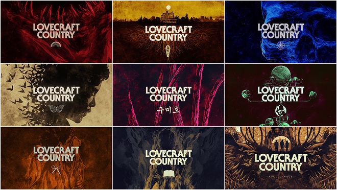
The latest adaptation of Lovecraftian lore is HBO’s aptly named series Lovecraft Country created by Misha Green and based on the 2016 book of the same name by Matt Ruff. Lending itself easily to TV, the collection of interrelated stories weaves together such supernatural horrors as monsters, malevolent spirits and magic with the real-life horrors of racism, brutality and war. While set in 1950s Jim Crow-era America, the series bears a sharp relevance to today, highlighting how little has changed and issuing a critical counterblast at H.P. Lovecraft himself, a notorious racist.
The show’s openings – vibrant 11-second hints of the eldritch terrors to come – were created by studio Antibody. Each episode bears a different illustration by Australian artist Ken Taylor depicting an evil force that lingers beneath the thin veil of civilization: a terribly toothy mouth, a decaying skull, a home with roots deep underground, combined with an episode title and a symbol or phrase in white. The tenth and final opening brings these elements “full circle” in a stunning cornucopia of teeth, butterflies, roots, celestial bodies, tentacles and creeping creatures. Released in a year that saw weeks of protest and unrest in response to police brutality and racial injustice across the U.S., the show is not only a solid slice of entertainment but an intriguing work of cultural commentary. The titles keep it short and strong, a recognition of where the limelight belongs.
1. Raised by Wolves
CATEGORY: TV
Created by Studio AKA
In the 22nd century, on an alien world far from their war-ravaged home, two atheistic androids and their clutch of human children try to eke out an existence in a mysterious landscape. Drawn into their orbit is a ship carrying members of a religious order, the Mithraic Church, who seek to start a new, belief-driven civilization.
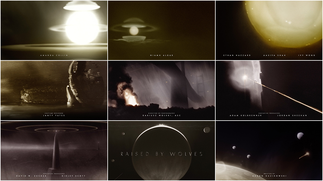
Anchoring this epic new sci-fi series from HBO is an elegiac opener created by director Steve Small of Studio AKA and a team of artists using a combination of 3D, rotoscope and hand-drawn artwork. Looking at the animated logo of his production company Scott Free, it seems clear that Alien director Ridley Scott is a fan of dark, painterly aesthetics. So it’s no big surprise that Raised by Wolves, created by screenwriter Aaron Guzikowski and with Scott on board as executive producer (and director of the first two episodes), uses a similar look for its titles.
Full of grief, longing, and death, the title sequence provides the emotional underpinnings of the series while serving up backstory and a reminder that the characters are refugees fleeing devastation. Much of the emotion is conveyed through the beautifully haunting main title theme by composer Ben Frost and featuring vocals by musician and voice artist Mariam Wallentin. In her voice and in the bursts of starshine that pierce the murky darkness, there’s tenderness and light, too. “Pulling you from the ground, just like love will do,” she says, her words carrying sorrow and hope, ashes and topsoil, and the question: What will come of this dark harvest?
Honourable Mentions
We would like to make special mention of the end titles by Saskia Marka for the The Queen's Gambit, which became Netflix's most-watched limited scripted series to date. Featuring animations created via coding language Processing, its stark black-and-white imagery harkens back to early cinema and the first abstract animations – the beginnings of what we think of today as motion graphics.
Second honourable mention goes to the titles of Russian series The Last Minister, a comedic lead-in to a show about a hapless bureaucrat roped into running a long-neglected state agency staffed with bunglers and backslappers. The sequence is Mad Men-meets-The Young Pope, a side-scroller that places credits in-situ, floating in the midground amid priceless vignettes establishing the key players. браво!
Also receiving a special mention is the stand-out opening sequence for Blow the Man Down, the confident debut feature from directors Bridget Savage Cole and Danielle Krudy, which sets itself apart with a shanty for the ages. In beautifully captured images of coastal Maine by cinematographer Todd Banhazl, a group of weathered fishermen sing of life by the sea. The lone mariner puffing on a vape is a satisfying, modern touch.
...and that's a wrap!
There are so many amazing title sequences we weren’t able to include in this top 10, but many of the year’s most notable sequences are available in our 2020 titles list.
Love our choices? Disagree with our picks? Did your favourite title sequence not make the cut? Join us on Twitter at @ArtoftheTitle and have your say.
Thanks for joining us for another incredible year in title design. Here’s to an exciting new decade!
—Lola Landekic
Editor-in-Chief, Art of the Title

The Art of the Title 2020 judging panel, clockwise from top-left: Yussef Cole, Manija Emran, Frank William Miller, Jr., Robin Nishio, Louise Sandhaus; plus Art of the Title Editor-in-Chief Lola Landekic and Founder Ian Albinson

