Michael DeForge’s Top Five
Michael DeForge is a visual artist and comics creator based in Toronto, Ontario. He is the author of the series Lose published by Koyama Press as well as the books Ant Colony and Birds of Maine published by Drawn & Quarterly. He has won numerous Ignatz and Doug Wright Awards. In recent years, he has been curating Stuck Inside Watching Shit, a live stream of handpicked films. I reached him by phone to chat about his top five title sequences.
—
Hi, Michael. It's great to talk with you. I’m so excited about the title sequences you've chosen.
Michael DeForge: I’m glad! I’m very flattered to be picked, I’m a big fan of the site.
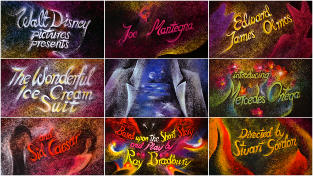
Thank you! Obviously I’m a fan of yours so it’s nice to bring it all together. I was just rewatching one of your picks, the titles for The Wonderful Ice Cream Suit, and it was blowing my mind again. How did you first see The Wonderful Ice Cream Suit?
MD: It’s a weird movie. It’s a weird place to find such an ornate title sequence. I always need to have movies going while I’m drawing. I like watching more deliberately but while I’m working I like having something in the background. I usually have a random arrangement of things playing and I put it on on a lark. It’s a weird one because it’s Stuart Gordon, who’s known for Re-Animator and all these horror movies but it’s a family-friendly Disney movie that’s an adaptation of a Ray Bradbury story. It has no science fiction elements at all. It just happens to have this very beautiful, ornate title sequence.
The Wonderful Ice Cream Suit (1998) main title sequence, created by Aleksandra Korejwo and Robert Dawson
It’s got so many incredible images. The creator is Aleksandra Korejwo and it’s coloured salt that she uses. The way that it moves gives it such an ethereal quality.
MD: Yeah, I think that’s why it’s so surprising that this movie that I believe was straight-to-video would have something so beautiful and painstaking… this clearly took a lot of time. That must have been something that stopped being done just for how expensive and time-consuming it was. It’s a technique I mostly associate with, like, Soviet Bloc animation or NFB ’70s things.
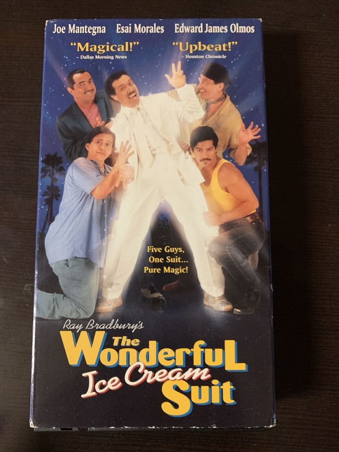
The VHS box cover for The Wonderful Ice Cream Suit
I vaguely remember seeing the VHS at stores as a kid and you know, the box art has it looking like a family B-movie. But it actually is a very warm and loving movie. Especially knowing Ray Bradbury himself is a conservative, it is a very empathetic movie about these people who are down on their luck who basically timeshare this suit. One of them is an aging communist, one of them is more of a playboy, one of them is unhoused and they come together to share this suit and fulfill their dreams. It ends up being quite touching and charming in a way that I don’t think the box art necessarily conveys but the title sequence does. It’s a very warm and colourful opening.
The end titles also have these nice colour screens with little drawings.
MD: The little doodles at the top. Yeah!
I feel like as an illustrator I default to wanting to see illustrations in title sequences. It’s not that everything needs to be illustrated but a little bit of effort goes a long way.
The Wonderful Ice Cream Suit (1998) end title sequence
It’s a language that you speak so you’re maybe more in tune to that when you see it. That also makes me think of another of your picks, the opening to Smiley Face. It's a whole different style of illustration.
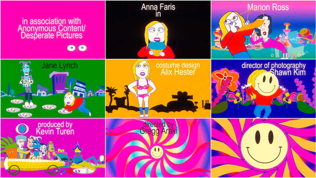
MD: That’s an all-timer for me. I could watch that over and over. I’m a big Sally Cruikshank fan. I don’t feel like the work she’s known for is from this era, the later era, heavier on the Flash and digital elements. It’s really loud and maximalist but also has these really elegant minimalist drawings in it. The way she uses that technology tends to push her drawings into even more abstract shapes.
Smiley Face (2007) — main titles by Sally Cruikshank
Right, she did a bunch of cel animation cartoon titles in the ’80s and then she took a break from titles for a while, and then when she comes back it’s this digital, vibrant gradient-filled cornucopia.
MD: Yeah. Some animators tried to use digital animation techniques to replicate traditional techniques and it usually looks kind of awkward or bad. I like that she leans into the digital-ness of it. She just goes the other direction with it and takes advantage of it being a whole new world, a whole new space to experiment in.
There’s always been a beautiful looseness to her drawings and here she lets that go even further. It’s even more gestural.
MD: I’m very attracted to that type of cartooning, where a shape is just evoked rather than fully fleshed out. When a cartoonist is confident enough to be loose and minimal, that’s something I envy. That’s such a flex. It’s the type of confidence that can really only come with decades of experience, though. When you are drawing and you realize you don’t need twenty lines to draw something, you only need three lines to draw it, that’s only something you learn when you have been doing it for decades.
Let’s talk about your next pick, Office Killer, in which the opening credits are projected onto various surfaces. What was the context in which you saw this movie and how did it hit you?
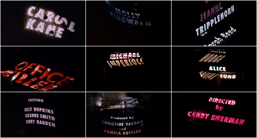
MD: This was a recent watch for me, definitely one of my pandemic watches. It was recommended by a friend because I was complaining about when fine artists take a stab at doing a movie, a lot of the time they end up as interesting messes. Few of them are all that compelling. This friend was like, “You personally would love Office Killer.” And yeah, everything about it is great and it’s clear that [director] Cindy Sherman is a huge movie nerd. She references all these noir movies in it and it has all these very deadpan screwball qualities to it.
—Michael DeForgeThe title sequence is a very elegant solution of something kind of contemporary that still evokes the design of older movies. She’s using older techniques to make something new.
Office Killer (1997) main titles, designed by Marlene McCarty and Donald Moffett / Bureau N.Y.
MD: The title sequence is a very elegant solution of something kind of contemporary that still evokes the design of older movies. She’s using older techniques to make something new. It looks like the Kiss Me Deadly titles but instead it’s projected in this very nice way. She’s an art person, she’s probably done all kinds of projection work. It’s like a gallery wall.
I love that you also picked Grendel, Grendel, Grendel. What a strange, beautiful film.
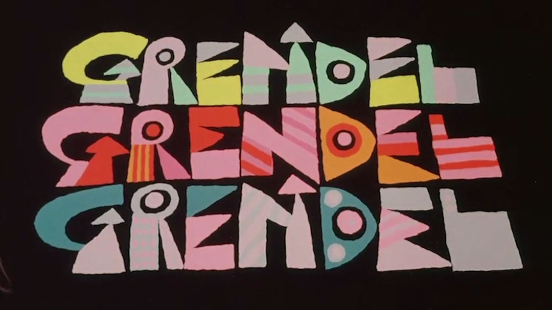
MD: The Grendel titles are weird because they’re brief and flashy for how the rest of the movie is. They flash on screen.
Grendel, Grendel, Grendel (1981) main titles
MD: The movie is by Alexander Stitt who is a cartoonist and designer in Australia. He did a lot of commercial advertising campaigns. I think aside from this movie the animation that he’s most known for was this, like, Australian public health campaign called “Life. Be In It.” The commercials for it are very good. They feature Aunty Ivy who is apparently a real-life local gardener, in Sydney, and Stitt did this cartoon version. She became a spokesperson in this public health campaign.
The gardener’s name was Ivy? That’s some nominal determinism.
MD: Yeah! [laughs] The National Museum of Australia has some of the posters.
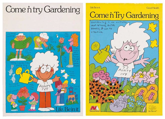
‘Life. Be in it’ Come ’n try Gardening posters depicting Aunty Ivy, the character created by graphic designer and animator Alexander Stitt based on Sydney gardener Ivy Lorinc
From the National Museum of Australia
MD: He’s just a really great illustrator and designer and the way he uses text, you can see, both in the title cards and in his commercial designs, is so cool. You can see what the vibe of the movie is before any of the illustrations come on. It’s a very underrated piece of animation. There’s been a re-appreciation of these oddball moments of animation history. Like, Son of the White Mare has been having a moment over the past few years, which is a movie I love a lot. I think if people like Son of the White Mare they would like Grendel, Grendel, Grendel. It’s also very experimental and very wild and it comes from a different illustration tradition than Son of the White Mare but it has some overlapping stuff, like the way it works with colour fields and the way it drops linework for most of the movie. It pushes things to really abstract shapes despite being kind of a depressed-middle-aged-guy take on an adventure story but something you could take your family to see, presumably.
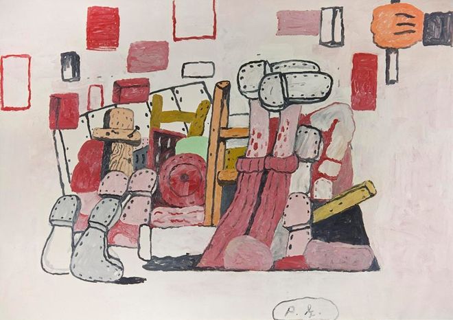
Cellar, Philip Guston (American, 1913–1980). 1970. Oil on canvas.
© THE ESTATE OF PHILIP GUSTON
There are scenes in it that almost remind me of like – when it’s just the lumpy, fleshy colours with little bits of hair, which a lot of the movie is, if you take a still from that and you don’t have the fun cartoon voices – it almost looks like it could be a Philip Guston painting. I just love this movie.
I also love the lettering style which seems to be harkening back to a mid-century style.
MD: I think of it as the platonic ideal of cartoon lettering. This is what I wish my lettering looked like if I had a bit more skill. It looks so simple but it’s clearly the work of someone who has put a lot of time and thought into lettering this way. I really like looking at it.
It reminds me of the Saul Bass opening for Not With My Wife You Don’t! from the mid-60s.
MD: Oh wow, yeah. Totally. This is a great example of a little goes a long way.
Not With My Wife, You Don't! (1966) title sequence created by Saul Bass
I like doing title lettering a lot but my default is sort of the gig poster thing, of doing more ornate noodly lettering, just very elaborate. It’s a nice reminder that you don’t need that. [laughs] You can just have a scribbly thin line and it can be just as striking.
And your last pick, The Girl on the Broomstick. Tell me about this choice.
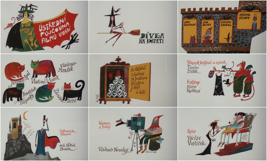
MD: This is just a fun one, it’s still illustrations. The illustrator is Adolf Born. This is a style of illustration I really like. It’s in the vein of Ronald Searle or other illustrators that I grew up with and I would pore over a lot as a kid. I think these are perfect still illustrations. It captures the tone of the movie, which is pretty fun, like a retro-Czech take on a Sabrina the Teenage Witch sort of premise. A young witch-in-training gets up to mischief in a supernatural school and then gets kicked out and has to hang out in the city for a while. I would be thrilled if this aesthetic came back and if this type of title sequence came back. It’s another one where I think of it as a very nice and simple solution of still images.
—Michael DeForgeIt seems like illustration used to be part of the texture of our day-to-day way more. You would see it all over the place.
Dívka na koštěti (aka The Girl on the Broomstick) (1972) main titles, illustrated by Adolf Born
MD: That era of illustration, when it was more common to have these odd illustrated title sequences or book covers, as an illustrator I romanticize that time period. It seems like illustration used to be part of the texture of our day-to-day way more. You would see it all over the place. Now you still maybe see it all over the place but in something disagreeable, like a mural for a real estate developer or something. [laughs]
There’s been a turn towards things that are so polished and rounded and sterilized… I know what you mean. Your selections look back toward a less polished, looser, more instinctual kind of making.
MD: Right. I do feel that lumpy cartooning is out of style and I’d like it to be back in style! [laughs] These illustrations and Alexander Stitt’s in Grendel, Grendel, Grendel are a type of drawing that is a little lumpier. Almost like “ugly” cartooning that I really love and I’m really attracted to. Things come in and out of vogue and I could see that coming back in fashion again.


