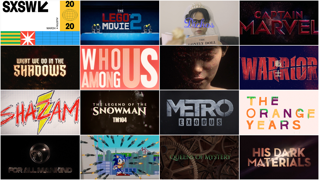
The SXSW 2020 Title Design Competition screening and judging process, set to take place on March 15th in Austin, Texas, was cancelled this year. So we've brought all the nominated work together here.
For title designers in the United States, there are few avenues for formal peer recognition. There is no Oscar for title sequence design. In the United Kingdom, there's a BAFTA for Titles and Graphic Identity and in the United States, there's a Primetime Emmy Award for Outstanding Main Title Design – but just for work in television. So other than the Emmys, which is limited to titles produced for TV, the most notable award for title design in the United States is given by SXSW. In fact, the SXSW Excellence in Main Title Design Award is medium- and genre-agnostic and this year the finalist title sequences span the fields of film, television, conferences, education, and music.
On March 6, the 2020 edition of the SXSW Conference & Festivals was called off due to coronavirus concerns. Art of the Title's Editor-in-Chief Lola Landekic was slated to be a judge at the Title Design Competition. The annual screening, usually presented in front of a large, enthusiastic audience and succeeded by a brief judging process, was cancelled, so we'd like to give the nominated designers the large, enthusiastic audience of Art of the Title.
Please join us in celebrating all of the nominated title sequences.
Update: Congratulations to studio Imaginary Forces on their Excellence in Title Design Award for their work on TV series See (2019), and to studio Blue Spill on their Special Jury Recognition for their work on Why We Hate (2019).
_
The 2020 Finalists for the SXSW Title Design Competition
Dichos
Designer: Gwenaëlle Gobé
Dichos (2020) main titles and phrase cards
Fancifully illustrated title graphics of Latin American expressions for each episode of the web series Dichos which attempts to translate the untranslatable while educating (and miseducating) audiences about Latin American proverbs.
The Lego Movie 2: The Second Part
Creative Director: Brian Mah
Studio: Alma Mater
The Lego Movie 2: The Second Part (2019) main-on-end title sequence
The Lego Movie 2: The Second Part main-on-end title sequence takes us through a super cool series of carefully designed Lego kinetic sculptures that celebrate themes from the film.
OFFF Barcelona 2019
Designer: Chris Bjerre
OFFF Barcelona 2019 opening titles
OFFF Barcelona is one of the largest design conferences in the world that hosts many of the leading and emerging design talents.
This title sequence is meant to honor the spirit of the event while exploring the struggle of finding creative enlightenment. Things often have to become ugly and grotesque before they can turn into something beautiful.
The setting is a parallel universe where our infrastructure and power grid has collapsed.
All lines of communication have broken down and the world is left bare. In the absence of influence, organic life starts to evolve into something new.
Captain Marvel
Creative Director: Lisa Bolan
Studio: Elastic
Captain Marvel (2019) main-on-end title sequence
End title sequence designed for the film Captain Marvel. Playing with graphic composition and scale, the highly stylized moments visualizes the life journey of Captain Marvel while re-introducing the superhero with cosmic superpower.
Digital Design Days Geneva 2019
Designers: Filipe Carvalho and The Joelsons
Digital Design Days Geneva 2019 opening titles
Repetition is ever present in our lives, leading us down a path with no end in sight. It’s up to us to break out of it. As Albert Einstein once said: “the definition of insanity is doing the same thing over and over, expecting different results."
Warrior
Creative Director: John Likens
Studio: Method
Warrior (2019) main titles
Method transports audiences to post-Civil War San Francisco in the Emmy-nominated stylized martial arts-inspired title sequence for Cinemax’s Warrior, a new show highlighting the era’s clash between Chinese- and English-speaking cultures. Maintaining a three-color palette throughout the full CG sequence, artists harkened back to the era by blending dimensionalized stills and action-heavy fight animation. Artists also applied abstract painterly textures as a tool to transition between imagery and highlight specific details on clothing, storefronts, and more.
Who Among Us
Creative Director: Jordan Turner
Studio: It's Got Stealth
Who Among Us (2019) main titles
Built around a repeating mantra, the titles for Who Among Us combine a bold retro style with a toy commercial aesthetic. As the sequence nears the main title card, it breaks apart to reveal the unnerving reality of the game show and its host.
What We Do in the Shadows
Creative Director: John Likens
Studio: Method
What We Do in the Shadows (2019) main titles
What We Do in the Shadows is an American comedy horror television series created by Jemaine Clement, based on the 2014 film of the same name written by Clement and Taika Waititi, that premiered on March 27, 2019, on FX. The series follows four vampire roommates living in New York City. Telling their story of how they lived there for the ages; using old world historic imagery, we placed artifacts in custom photorealistic interior environments, fully CG & meant to be fireside environment in the home
Jeezy – TM104: The Legend of the Snowman
Creative Directors: Nik Kleverov, Harshit Desai
Studio: Native Foreign
Jeezy – TM104: The Legend of the Snowman album promo
We take viewers on a journey through Jeezy's life, from the streets to the mic, to the future - in anticipation of his last album, TM104: The Legend of the Snowman.
Shazam!
Creative Directors: Jon Berkowitz, Brad Colwell
Studio: Aspect
Shazam! (2019) main-on-end title sequence
The Shazam end title sequence brings to life the adolescent fantasies of Shazam’s foster-brother, Freddy Freeman. We dive into Freddy’s “journal” to view his deepest superhero-obsessed desires and dreams, expressed in hand-drawn animation, as they come alive in this flip-book style sequence constructed from his doodles and toys. Working closely with the film’s directors, Aspect wrote, designed, animated and composited the sequence.
TEDxSydney 2019
Creative Director: Scott Geersen
Studio: Substance
TEDxSydney 2019 opening titles
We store the knowledge of humankind in libraries, we conserve our art in museums and galleries. We hoard the genes of plants and seeds, and record and reproduce every aspect of our world digitally. But these pursuits leave an imprint, and progress has the potential for unintended consequences. As our environment turns against us and the need to safeguard humanity grows, the dual nature of our legacy is highlighted. We have gained, but we have also lost, and may still lose more. This is the contrast highlighted in the TEDx titles: a celebration of what we have, and a reminder of its fragility.
Pause Fest 2019
Creative Directors: Alex Mikhaylov, Max Chelyadnikov
Studio: Loop
Pause Fest 2019 opening titles
’A New Hope' is a challenging metaphor for everyone affected by the tech age that still considers some developments today as normal in our culture, traditions and society. We are not programmed to foresee what the exponential technology can do to our society. How much are we going to pay for all bad decisions that we are making today? ‘A New Hope’ digs deep into our worst nightmares and what could happen if we loose control over those exponential tech advances. It also depicts how popularity mixed with power can transform the society into unpleasant and dangerous place. We have a hope that our collective consciousness will drive us to a much safer, happier, inclusive and prosperous place.
Under the Influence
Designers: Matt Morgan, Zach Law
Under the Influence (2019) main titles
It’s a fact: the smartphone and its social media applications are addictive. As habit-forming effects surface at an alarming rate, we seem to shift our gaze. Bite-sized warning flares lift into the public sphere, but this vital discussion rarely goes beyond clickbait headlines and trendy explorations.
Under The Influence raises a mirror to our obsessive society by building sensitive inroads to the conversation, rather than arriving at some prescriptive conclusion. True stories ripped from the headlines allow our audience to identify with specific characters and plotlines, while respecting the evolving nature of the subject matter.
Lust
Designer: Rudy Schultz
Studio: Ringling College of Art + Design Department of Motion Design
Lust (2019) title sequence
Through the use of self-shot body imagery, warm colors, and hazy videography, "Lust" explores the idea of being consumed by the strong desire for sex. Lust, at its core, is only the body producing estrogen or hormones to fuel your sex drive. However, when you have this feeling yourself, it doesn't feel scientific at all; it's animalistic if anything.
The Orange Years
Creative Director: Ali Clark
Designers: Justin Harder, Paul Prudhomme
The Orange Years (2020) main titles
The Orange Years is a feature documentary that chronicles the golden years of Nickeldeon – that wild network that broke all the rules and let kids be kids! The title sequence uses iconic imagery to spur nostalgia and pay homage to the shows that shaped our childhood.
Observation
Designer: Jon McKellan, Serjan Burlak
Studio: No Code
Observation (2019) opening titles
Observation is a sci-fi thriller game from creators of Stories Untold, No Code. In 2026, astronaut Emma Fisher finds herself to be the only surviving crew member on board the low orbit space station Observation. Not only that, but Emma finds herself inexplicably marooned in orbit of Saturn, with the station AI 'SAM' for company.
SAM, controlled by the player, has a new found conciousness, and must work with the player discover not only what has brought them to Saturn, but what the reality of SAM's new role might really be.
Observation is a BAFTA-winning and critically acclaimed game from Scottish developer No Code, along with publisher Devolver Digital.
Queens of Mystery
Designers: Ian Emes, David Hawcock, Garry Walton, Peter Haddon, Mark Ford
Queens of Mystery (2019) main titles
Using real pop-up paper folds filmed in 3D and enhanced with VFX, these titles introduce viewers to the bucolic setting for Queens of Mystery - a tongue-in-cheek mystery series about three crime writer sisters helping their cop niece solve murders - created by Julian Unthank and produced by Sly Fox Productions for Acorn TV.
Queens of Mystery seeks to refresh and revive a classic murder mystery format in a contemporary and playful way, a sentiment echoed in the title sequence which evokes the shows many literary twists, making the audience feel like they're entering a fairytale and capturing the essence of the surreal world of Queens of Mystery.
Why We Hate
Designer: Allison Brownmoore
Studio: Blue Spill
Why We Hate (2019) main titles
Led by executive producers Steven Spielberg and Alex Gibney, Blue Spill's design director Allison Brownmoore and flame artist Anthony Brownmoore worked to explore cinematic approaches to the title sequence.
We wished to present an image which seemed innocuous, and then to reveal the hate behind the image. Our primary challenge was that for the sequence to work as cohesive aesthetic, the images needed to work effectively in two states; pre-reveal and post-reveal. This presented a considerable challenge and required an iterative compositing approach.
The title sequence worked effectively across the series, exploring the impact of hate across societies.
Tell Me a Story (Season 2)
Creative Director: Karin Fong
Studio: Imaginary Forces
Tell Me A Story (Season 2) (2019) main titles
Three fairy tales intertwine in this overture for Tell Me A Story. The new season re-imagines the princess stories – Beauty and the Beast, Cinderella, and Sleeping Beauty – into a modern psychological drama. Set in Nashville, the plots twist and turn among family secrets, a thorny bramble of crimes and tragedy. Grimm stories indeed.
The Botanist
Designer: Michael Rosen
The Botanist (2019) main titles
As a botanist takes a solo journey into the mountains in 1979, his notes document the growth of various flowers, trees and fungi. As a psychedelic influence begins to take hold... Where will this lead?
Carnival Row
Creative Director: Lisa Bolan
Studio: Elastic
Carnival Row (2019) main titles
A sinister yet beautiful note to anticipate the show's rich and detailed mix of fantasy, dystopia and mystery.
His Dark Materials
Creative Director: Clarissa Donlevy
Studio: Elastic
His Dark Materials (2019) main titles
The title captures complex themes and ideas while transporting the viewer on a mind-bending journey across a multiverse enveloped in a unique and stunning aesthetic, rich with symbolism and iconography. It is an homage to Pullman's beloved stories.
Game of Thrones (Season 8, Episode 3)
Creative Director: Angus Wall
Studio: Elastic
Game of Thrones (Season 8, Episode 3) (2019) main titles
The 8th and final sequence explores the idea that there is more under the surface than previous seasons, that there is an interior and depth in terms of the layers that were only hinted at before. It's an intimate, micro view of what's going on.
Metro Exodus
Creative Director: Andy Hall
Studio: Elastic
Metro Exodus (2019) main titles
A semi abstract interpretation the hero's journey. The stark setting reflects the slow decay of society and the fragility of our hero’s experience. The delicate nature of snow frozen in a moment interprets the effects each character has on others.
See
Creative Director: Karin Fong
Studio: Imaginary Forces
See (2019) main titles
Imagine a world in the future where humans no longer have eyesight. That is the premise of See and the starting point of our main title design. We worked closely with the show’s blindness consultant, props and art department to create the aesthetic and sound design behind the sequence. Using ropes, walking canes and echo-locating clicks for communication, See delves into a dimension beyond sight. Stream the original series on Apple TV+.
For All Mankind
Creative Director: Alan Williams
Studio: Imaginary Forces
For All Mankind (2019) main titles
The course of human history can be altered in a single moment—one butterfly-flap of the wings that shifts our shared trajectory forever. In our case, the butterfly just happens to be a Soviet cosmonaut landing on the Moon. Since the dawn of time, we’ve been looking to the stars to understand our place on Earth. It’s a common thread that binds us and inspires us to invent, explore, discover. Here, these common threads collide as we represent the course of human history being changed in that single event – the Soviet Union beating America to the Moon – and the world we make together in its wake.
La Venganza de Mascarita, or
Matando Cabos 2: La Máscara del Máscara
Creative Director: Maribel Martínez Galindo
Studio: Diecinueve36
Matando Cabos 2: La Máscara del Máscara (2020) main titles
We decided to create all kinds of incredible characters such as aliens, robots, martians, sirens and anyone who would defy social order for our hero to fight against. All hypothetical situations in order to show his strength and courage of Mascarita.
Locke & Key
Creative Director: William Lebeda
Studio: Picturemill
Locke & Key (2020) main titles
Sonic the Hedgehog
Creative Director: William Lebeda
Studio: Picturemill
Sonic the Hedgehog (2020) main-on-end titles
Mains on End sequence for the film Sonic the Hedgehog. A delightful retelling of scenes from the film, lovingly reimagined in the style of the classic Sega Genesis 16bit games.
Panic Room #18: Rebirth
Creative Director: Kim Taylor
Studio: House of Panic
Panic Room #18: Rebirth (2020) opening titles
Forget lab-grown meat, what happens when we start lab-growing our own mutant cyborg children to do our bidding?
This title sequence from House of Panic director Kim Taylor brings to life a phantasmagoria of genetic experimentation gone nasty. Spinning a cinematic tale in a short, sharp slice of biological horror it asks: What twisted horrors is mankind capable of creating once he learns to manipulate nature to his depraved will?
The titles set the scene for the bi-annual Amsterdam event Panic Room, featuring talks from inspirational creatives spanning multiple fields. This special 18th edition also coincides with the rebirth of The Panics as a company, formerly known as PostPanic.


