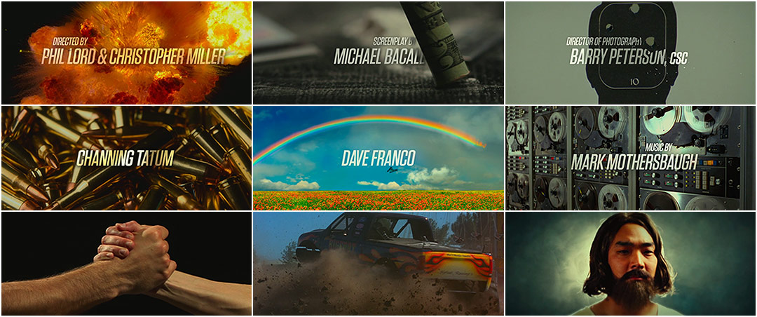
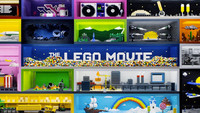
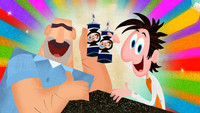
It’s easy to get swept up in the surge of gratuitous imagery delivered by Imaginary Forces for their main-on-end titles to 21 Jump Street. Amongst the mix of drugs, sex, horse cock, and explosions on the order of ridiculous, there lies a masterful choreography of color and motion.
Although rebooting the franchise that made Johnny Depp a household name may have been a tall order for Relativity Media, the task of recapping a film as raunchy and scatterbrained as Jonah Hill’s take on the ’80s classic seems taller still (especially after the climactic twist)! Regardless, Brian Mah's creative team met the challenge and delivered a fitting swansong containing just the right amount of R-rated content while giving a reverent nod to the original series creator, Stephen J. Cannell. Chillax bros, the popped collar is real!
Directors Phil Lord and Chris Miller:
So one thought we had initially was to do the Jump Street show end titles idea and to work in little clips. We might have pitched that to Brian and said, "Can you figure a way to do this?" We didn't want to do bloopers or extra jokes at the end; it just felt too tired. And what we liked about what they were doing was that it was an assault on your senses. We figured if you didn't like the movie it would obliterate your brain to the point that you’d think that you did like it.
A discussion with Creative Director BRIAN MAH of Alma Mater (and formerly of Imaginary Forces during the sequence's production).
To start, could you give us a little background on yourself? Some details on your time with IF as well as your new venture?
I attended the Ringling College of Art and Design and majored in graphic design. In senior year, I noticed the work that Imaginary Forces was doing and was quickly enticed by the motion design industry. I specifically targeted them as the company I wanted to work for, and after graduation, tailored my portfolio towards motion-based projects to get my foot in the door. I was hired at Imaginary Forces in January of 2002 and spent the next ten years working as a designer, director, and creative director. I absolutely loved my time there. The environment allowed me to experiment in a wide variety of exciting mediums ranging from film titles and feature marketing to broadcast, experience design, and commercials, with a vast array of extremely talented people. The collaborations there eventually led me to the next step: forming my own studio. In March of this year, myself, Kathy Kelehan, and James Anderson branched off to form Alma Mater. Kathy was the producer on the 21 Jump Street project and both she and James are Imaginary Forces alumni.
How were you first approached about 21 Jump Street? What were the directors looking for?
Phil Lord and Chris Miller contacted IF and requested to work with me. Apparently, a mutual friend had recommended me for the project. I was thrilled to get the call. Our team went to Sony, watched the film, and met with the directors to discuss the scope of the project. They were looking for design solutions for three areas of the film: the opening title, the main-on-end sequence, and designs for the "drug phase" screens which would highlight the various stages characters go through as they take H.F.S*.
*"Holy Fucking Shit," the fictitious drug sold throughout the film.
They wanted something simple for the opening title – a visual vehicle that could quickly set up the 21 Jump Street brand while getting right into the movie.
They wanted the drug phases to be intentionally crude. The plot line introduces them with a homemade YouTube video that shows how amazing this drug is. Phil and Chris wanted the graphics for each phase to seem authentic – to have a sense of style while still looking authentic, like something a high school student could have made.
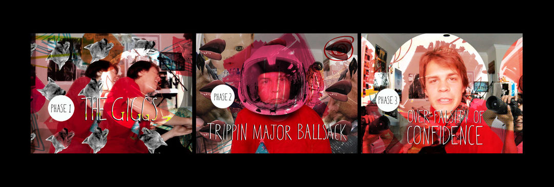
Drug Phase "YouTube" title concepts
The main-on-end sequence was very open from a creative standpoint. They wanted us to have fun and were totally up for anything that logically progressed from the last scene and complemented the tone of the film. We continued to discuss it, going deeper into the various scenes and personalities of the main characters. The two leads saw themselves as law enforcement badasses; they signed onto the force because they liked the idea of high-speed chases and explosive shoot-outs, while in reality, they rode around on bikes and helped kids fish frisbees out of ponds. This idea of their overactive imaginations eventually inspired the concept behind the main-on-end sequence.
What were your initial concepts and what did they eventually go for?
The concepts for the opening played with color. We wanted to do something simple with blues and reds to express the police-oriented themes of the movie. We presented a variety of options to explore the potential of this conceit. The filmmakers were drawn to two approaches: one which was gritty, painterly, and included big, bold typography, and another based around offsetting the colors of the typography in a more flickery, light-based fashion. We experimented with variations of each, and in the end landed on a hybrid of the two.
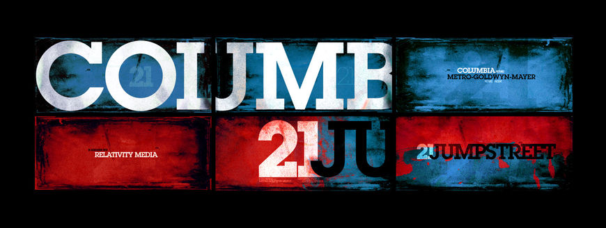
Main title concepts
The drug phases were inspired by collage techniques, excessive Photoshop filters, and quirky typefaces. We tried to keep the imagery funny, random, and low quality, as though the high school student had downloaded these images from random sites at all different resolutions. We tried to play with pattern and texture while avoiding the instinct to over-design. These phases have two applications in the film: the moment in the YouTube video when you are first introduced to them, and then they are revisited later in what we called the more "cinematic" versions of the graphics, when the main characters take the drug. The cinematic versions were designed to take these basic principles and push them further.

Drug Phase "Cinematic" concept
For the main-on-end, we kept the presentation concise, showing a limited number of concepts, but covering a range of tones. We showed a purely typographic option, a graphic icon-based treatment, and the idea which was chosen, a concept based around wall-to-wall imagery.
There were three things that went into and inspired that last one. Firstly, the main characters’ All-American, macho badass self-image. I wanted to make a sequence that would give a glimpse into the minds of these guys, letting the audience see how they really saw themselves. Secondly, we were inspired by 1980s TV titles, specifically the ones with a fast-cut montage of scenes from various episodes, usually set to some amazing theme song, giving the viewer snippets of action from the series. This always made their "world" seem much bigger than the individual episode you were about to watch. This device felt very appropriate, given the fact that the film is based on just such a series. I loved the idea of creating our own version of that and allowing the action to be exciting, random, and ridiculous. I wanted to create something which would reference moments from within the film but which also alluded to events without – as if there were episodes that the viewer hadn't seen. Thirdly – and this may sound funny – but we also took inspiration from stock footage.
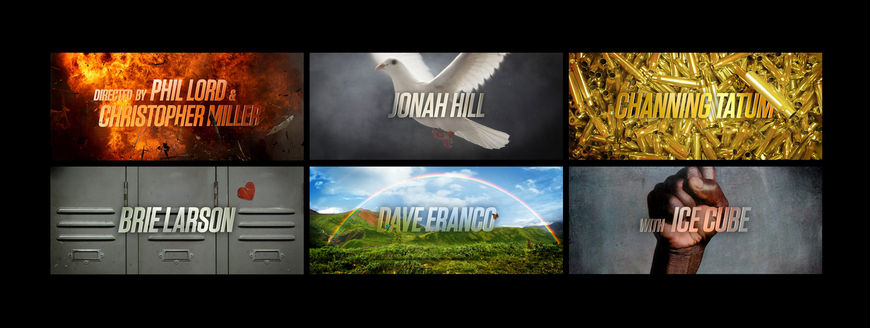
Main-on-end title concepts
We didn't have the time or money to generate the number of shots we needed for the montage from original photography, so the only option was to use stock. I typically avoid using stock footage, because it usually has a cheesy and dated aesthetic quality or subject matter that seems a bit random. Whenever we had to consider using stock for a project, I’d start looking through online libraries and get turned off by the pages and pages of nondescript men shaking hands and eventually push for a custom shoot. This project, however, made all of that seem perfect. I felt if we embraced the stock aesthetic, the dated look would give the sequence a nod to the type of ’80s television which inspired the film, and the random nature of the content could complement the "stream of consciousness" approach to the edit.
How did the production stage go?
The production was a lot of fun and a lot of work. Each sequence posed its own technical and conceptual challenges.
For example, the main-on-end sequence was about research and clever image pairings. We wanted content which would hit on two levels: fitting stylistically within the film's action/comedy vernacular as well as playing off the credits themselves in a funny way. For example, the "Edited by" card is paired with an axe hacking away at a tree stump and the "Executive Producer" cards are paired with stacks of money and vaults being blown up.
The opening titles were definitely a challenge in pacing and integration. The goal was to create an energetic introduction while keeping it simple enough that it didn’t detract from the story. We created some motion tests to develop the two boards that the directors favored, experimenting with how the textures and typography could come to life. After pursuing both directions, the filmmakers became attached to aspects of each, and in the end we took elements from both for the final.
Main title concept animatics
The drug phases were crazy! They were so much fun to work on and required such a different mindset. It felt like we were trying to forget the rules we knew regarding typography or techniques to preserve image quality, while playing with things like color correction and rotoscoping. I worked with some really talented designers on these scenes and we had a lot of fun discussing whether we should use a slice of pizza and a ninja or a handful of nacho chips and a rollerblade in the collage. These conversations sometimes felt ridiculous, but we knew that if they made us laugh, they’d make others laugh too.
And you used Sony’s image library for the main-on-end, right?
Yes. In the initial pitch, there were a lot of things still in flux. The directors were just beginning to talk to Rye Rye, who’s also in the film, about creating a track for the end sequence that was a re-imagining of the theme song. So it was a few weeks before we got a track to cut to. The temp track allowed us to establish a pace that felt right, thereby dictating the amount of stock footage clips that worked with the tempo. This was when we realized the quantity and variety of footage that we’d need to fill it and keep it interesting was more than we had. The filmmakers and the post production supervisor, Desmond Cannon, helped us get access to Sony Pictures’ Stock Footage Library. It was such a critical resource. It immediately opened the doors to an endless number of fantastic shots! We spent the upcoming weeks combing through it, literally trying out hundreds of options.
Talk about your relationship with Phil Lord and Chris Miller, and the development and feedback process.
Phil and Chris were extremely collaborative, which made this a great experience for us. Their excitement is contagious; after showing them our initial main-on-end concept, they immediately saw its potential. They were fun to brainstorm with, giving us insight into possible image pairings, props, and scenes we could reference. It’s always great to work with clients who have a clear sense of what they like and what they don't. Despite their crazy schedules, they always made a point of being available and we were often on the same page.
Main-on-end title concept animatic
What was the schedule like – how long did it take from the first meeting to the finished product?
The total schedule was about eight weeks after the initial meeting. Once we landed on the creative direction, it moved very quickly.
Is there anything that you wish you could have included but that didn't make the final cut?
Not specifically. Like I said, I really got into the task of finding the best clips to complement each credit and beat. And while I am thrilled with the ones we landed on, I could have spent another month searching through those libraries! It kind of became an obsession; I would spend my evenings poring through endless pages of footage, then come in the next morning with literally 150 clips of stock to try out. There is always a part of me that wonders if there could have been a better clip for this or that, but I am still really happy with the end result.
Is there anything in the sequence that you're particularly fond of?
There is a hilarious moment in the film where Jonah Hill's character is praying to a statue of Jesus which looks of Korean descent – "Korean Jesus." It was so funny, we knew we had to work a reference to it into the title. One day I was talking with an assistant designer at IF, about the project and it dawned on me: I asked him, "Are you Korean?" He hesitated – he was suspicious – and he said,"...yes." Then a few days later we were in the lobby, shooting him dressed up as our very own Korean Jesus! He was a great sport about it; halfway through the shoot, I realized we should’ve rented a fog machine to give the shot a more ethereal atmosphere. A co-worker had some of that Gold Bond Medicated Foot Powder and he suggested that we stand at his side and sprinkle it into the air. The effect worked great!

In these stills, you can see the moment when we tossed the foot powder, as well as the expression on his face when he realized what we were dumping on him. The end of the sequence, when you see his face pop up for a split second, makes me laugh every time.

