Always leave them wanting more… Unless of course there’s more money to be made, in which case recycle the same idea over and over again for as long as possible. This Hollywood tendency to try to turn anything and everything into long running franchises is brilliantly lampooned in Alma Mater’s end credits for the extremely self-referential sequel 22 Jump Street.
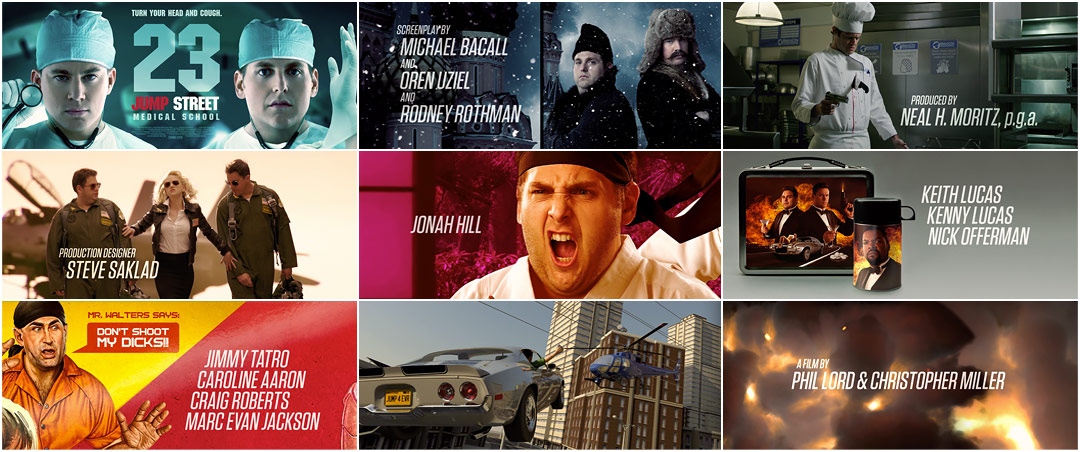
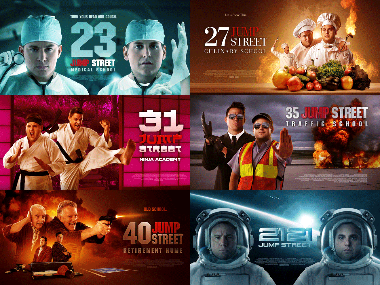
21 Jump Street is a premise that lent itself to over 100 hours of television in the late 80s and early 90s, so the idea of increasingly far-fetched sequels to the film adaptation isn’t really so far-fetched at all. To cap off the latest Jump Street adventure, not only are nearly two dozen concepts for sequels pitched, complete with posters and taglines, but our heroes also get the complete sell-out treatment: video games spin-offs, tie-in merchandise, and even an 1980’s style animated series. Going undercover in every kind of school from medical to dance, Schmidt and Jenko seem destined to become the best educated and most skilled cops on the force, if Hollywood has its way.
A discussion with Creative Director BRIAN MAH, Executive Producer KATHY KELEHAN, VFX/Animation Supervisor JAMES ANDERSON, and 22 Jump Street directors PHIL LORD and CHRISTOPHER MILLER.
When did you begin to think about the end title sequence for the film?
Phil Lord: We had always planned to do something. Originally we ended the movie with Jonah and Channing walking away from Cube saying, "We are never ever going to do this again," and then we were going to cut to future Jump Street movies with other actors.
Is it true that the original ending was different, and that test audiences demanded something else?
Christopher Miller: Yes. The audience was sad that their two favorite friends were not together doing this forever. So we changed the ending and the concept of the titles became Schmidt and Jenko living happily ever after, while at the same time having some fun with the idea of infinite Hollywood sequels.
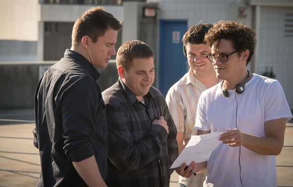
Channing Tatum, Jonah Hill, Christopher Miller and Phil Lord on set
Tell us how you developed the new concept for the end sequence.
Phil: We talked about it with Alma Mater, who suggested it didn’t just need to be sequels, it could be spin-offs, board games, animated series, etc. Then we put a million ideas on a whiteboard in our office and started figuring out which ones we could shoot.
Chris: We always go to them first. We didn’t hear any other pitches. They are always up for the challenge.
How and when was Alma Mater first approached about this sequence?
Kathy Kelehan: We'd barely gotten the Lego titles out the door in December when co-producer Will Allegra contacted us saying that the guys wanted to start discussing the titles for the upcoming Jump Street sequel. We scheduled the first official meeting the week The Lego Movie opened. We knew it would be tough to top the 21 Jump Street titles, so we were happy to get a head start and focus our full attention on the project.
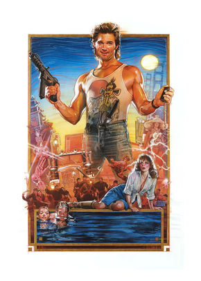
Film poster inspiration from Drew Struzan. See more work on Drew's official site.
What were your first steps?
Kathy: Our first meeting was very early in the post process. Phil and Chris began by taking us through the themes and motifs in the film, one of which was the idea of doing the same thing again and again, while becoming more over the top and worse.
Brian Mah: We loved this concept and quickly gravitated towards the idea of using film posters to showcase the ridiculous themes of future sequels. It seemed like there were so many funny avenues that could be explored with squeezing every last drop out of a film franchise.
I initially designed a couple of sample concept posters, based on the montage aesthetic of Drew Struzan and vintage James Bond posters. I liked the idea of including a few random, unexplained scenes from these fictitious sequels within each design. It seemed like it would provide opportunities for funny imagery juxtapositions, while filling out the tone of each film with additional characters and plot points.
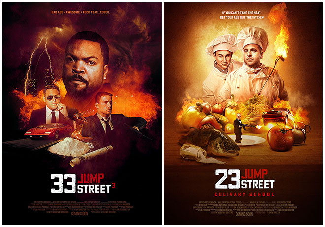
Concept posters by Brian Mah
James Anderson: We also proposed that the sequence could be taken even further, expanding it to include video games, board games, action figures, and cartoons based on the series as well. Knowing that they would work almost like chapter headings in the sequence, we began by brainstorming the specific themes for the sequels.
Brian: We listed potential concepts and sketched out rough executions that we thought would be funny, trying to keep it within the "school-based" vernacular that the franchise is based on. Some of the early concepts included "Semester at Sea," "Culinary School," "Flight School," and "Sunday School." We even thought it would be funny if Jenko got killed in a sequel called "Graduation Day" and then was resurrected in another film called "Sunday School."
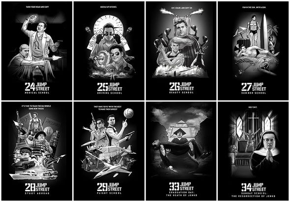
Sketched poster concepts
As we all we kept pitching ideas for themes and content back and forth with Phil and Chris, the list snowballed until it included way more ideas than we could actually produce in the timeframe. In fact, everyone had so many hilarious ideas that the hardest part was cutting the list down.
Kathy: Once we all felt good about the concepts, we had a whirlwind schedule for production. There was an enormous amount of designs, props, animations, and shoots that needed to happen to execute all of the concepts. As each piece of this massive puzzle was being created, we would assemble edits in Avid to present to the directors. It was a very fluid dialogue; we would present a cut, then they would provide feedback with a new version, and then we would respond with our feedback.
How involved were you with the live-action shooting?
Kathy: Due to the compressed timeline and the amount of imagery that needed to be covered, the schedule was divided into two units, operating side by side. Phil and Chris directed each live-action vignette (which included Jonah Hill, Channing Tatum, Ice Cube, Seth Rogen, Anna Faris, and Bill Hader), and we were responsible for photographing the actors for the film posters.
Phil: We had one day, and we decided to use locations on the Sony lot so we could move quickly and easily. We shot in the commissary kitchen. We turned a hallway of the Marketing building into a hospital. We also had deleted scenes from the body of the movie itself (Art School, Return of the Ghost, Richard Grieco’s cameo) that we repurposed into sequel ideas.
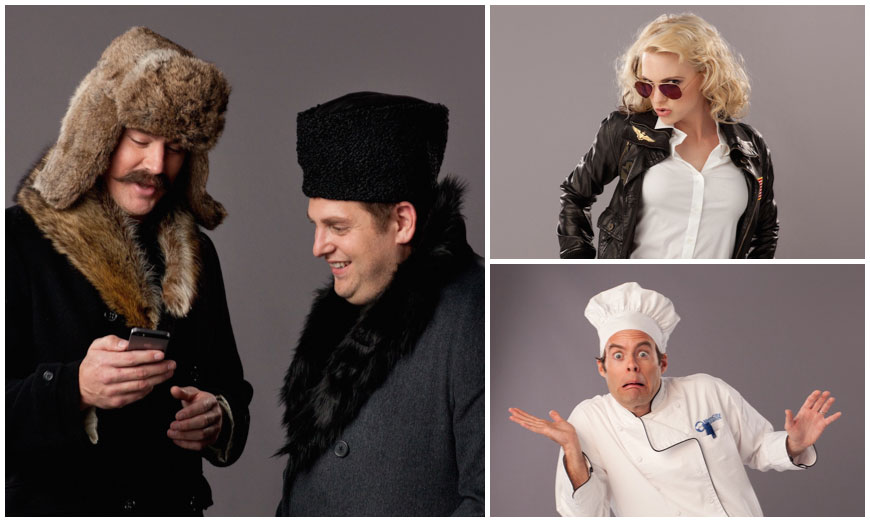
Film poster photo shoot with Channing Tatum, Jonah Hill, Anna Faris, and Bill Hader
Kathy: Throughout the day, the actors would bounce back and forth between the live action sets and ours, and within each window we would photograph them in a wide variety of themed costumes and poses. We even tried to cover a range of emotion in the stills, as though after 15 sequels in, the characters start growing impatient and annoyed by these ridiculous and endless missions. The actors all really got into it, giving us plenty of material and options for the sequence. Bill Hader was the last actor that we shot that day, and had our whole crew cracking up as we shot his expressions and poses playing the villainous chef of "Culinary School".
Talk about the cameos you were able to get. Were those all planned?
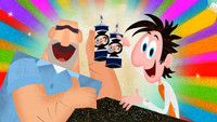
Chris: It was really last minute, so we were lucky to get the people we got. We reached out to friends we thought would be welcome faces and we knew were fun to work with and could be funny in 5 seconds of screen time. It turned into a Cloudy With A Chance Of Meatballs reunion with Bill and Anna. Seth was working on the lot already so that didn’t hurt.
Did you create everything in-house? And did you realize how involved the concepts would be when they were first developed?
Kathy: Almost every piece of content was created in-house, which was the biggest challenge of this sequence. The sheer quantity of elements needed to make the franchise feel like it had been exhausted was overwhelming. In the 4 weeks following the shoot, we had an extensive laundry list of content left to produce.
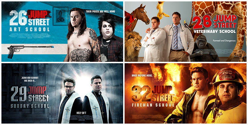
Finished film posters
We sifted through the photography, making selects and composing 20 full-scale movie posters in Photoshop. Each of them were built at 10K resolution to be able to zoom into details of the designs. To design and finish a single theatrical poster is usually a months-long process, so you can imagine how ambitious it was to create so many of these so quickly.
James: For the video game, we modeled each of the characters in ZBrush, then designed, choreographed and animated the levels in Maya and After Effects. We wanted to fill the levels with as many details as possible from the plot points of the first two movies (like the exploding chickens in the car chase scene, and the biker gang riding around with drug filled piñatas on the back of their motorcycles).
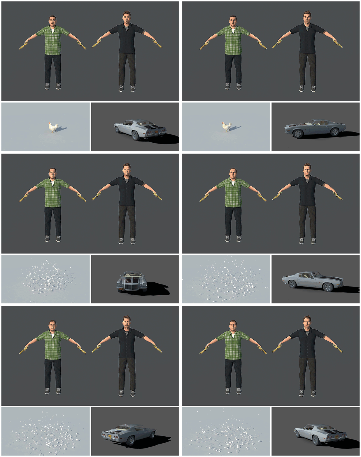
Video game character design and render tests
It was also very important to us to make this title sequence feel like a mixed media experience, so while many of the scenes were constructed digitally, we built a lot of the components practically as well.
Brian: The board games and action figures were created using a combination of 3D printing and hand painting techniques, while the packaging for this merchandise were designed and illustrated digitally. Once we had finished the construction of all of the props, we had an additional live action shoot where we cast two children interacting with the toys.
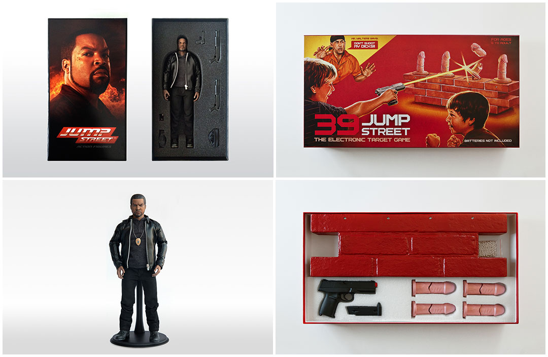
Action figure and board game packaging
Kathy: That was a pretty funny casting session, given what these kids were being asked to do. We were fortunate to find parents who were fans of the franchise, and had a sense of humor – so they totally got what were going for.
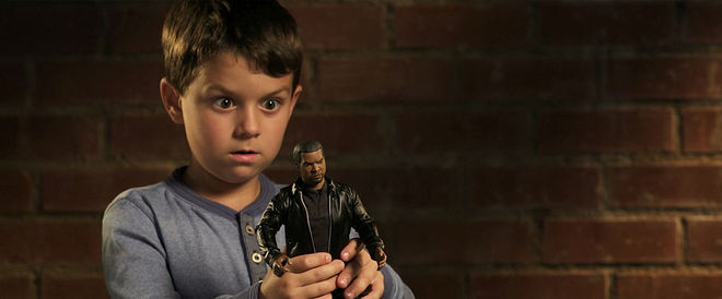
Brian: The cell-animated cartoon was the only segment where we enlisted the help of another company. After we had designed the characters, storyboards, logo and background paintings, we collaborated with Starburns Industries for the execution of the animated series. They did a stellar job bringing life and authenticity to the scenes, and turned it around in record time considering the tedious process of traditional animation. At the end of the day, pulling off this title sequence in the allotted timeframe required a lot of talented people working hard around the clock. We definitely knew from the beginning what we would be getting into with this concept, but the collective enthusiasm for it convinced us that the late nights and hard work would be worth it in the end.
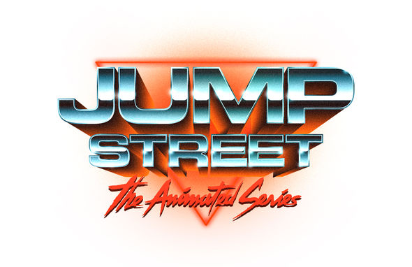
Title card, character, and background designs for the cartoon segment
created by Starburns Industries
Was the possibility of actual subsequent sequels ever a consideration or concern? (23 Jump Street has been announced)
Chris: Yes, but we told ourselves on some level it wasn’t a scorched earth sequence, but instead a sequence that exhibited the promise of more Jump Street movies. I can tell you however that as far as future movies are concerned, we are treating the end title sequence as canon.
Were there any concepts that didn’t make the final cut?
Brian: For some reason, I really got into designing games around this franchise. I loved the idea of creating these inappropriate kids games based on themes in the films. I designed two board games; one made it in, and the other didn't. In one of our early design presentations, I had pitched a "shooting gallery" type of game that involved shooting a series of plastic penises off of a brick wall. That concept was really well received and made it into the final sequence just as planned.

Unused “shooting gallery” board game concept
The second board game concept was based on the fact that Schmidt always ends up shooting Jenko at the end of the movie. I thought it would be hilarious to have a game which plays like a cross between the card game "War" and Russian Roulette with plastic pellets. Each player would sit across from the other with a Gold Desert Eagle hand gun pointed right at the other player. The players would each have a stack of cards with various icons printed on them. If the player turns over a card with a bullet on it, he gets to shoot his friend.
I just pictured those old Saturday morning toy commercials advertising a couple of young kids playing this game which seemed like a scene from The Deer Hunter, and thought it would be funny – I know it sounds sick. We went as far as physically building and photographing the game, but in the edit it felt like it would take too much time to explain, and between that and the other game, might be too much "Board Game" time for the sequence.
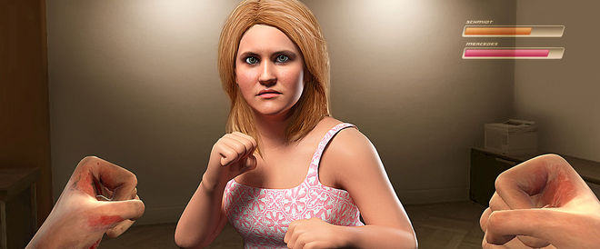
Unused 'Mercedes fight level' for the video game
James: We had also designed an additional level for the "Jump Street Video Game" based on the scene where Schmidt gets into a fist fight with Mercedes (Jillian Bell's character). It was meant to look like a first person boxing game where you punch her in the face every time she tries to kiss you. We never ended up building the level, but we've included the concept frame to show the idea.
Phil: We tried to get on to the Jeopardy set for a Quiz Show scandal one, but it was their wrap party that day. We wrote a film within a film within a film bit for a “Film School” sequel but it was too elaborate to pull off in the time allotted. There were probably a dozen more, including one where Jenko got to do a White House Down-style Secret Service movie and protect the president (who we wanted to be played by Cate Blanchett).
Who did you work with on this title sequence, and how big was the production team?
Kathy: Our core team consisted of about 12 people, which included designers, animators, editorial and production. We also collaborated with several specialists around the world for the various mediums of the sequence. Concept artist Luke Belderes and illustrator Mike Thompson (aka Mike T) created beautiful paintings for the board game packaging. We worked with two designers overseas, Alessandro Strickner and Francesco Terragin, to create some of the logo graphics.
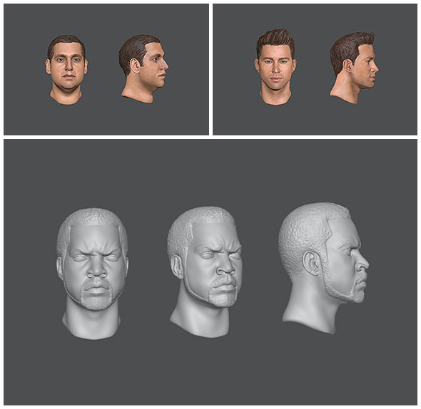
Character designs for the video game and action figures by Margaret Dost
James: Margaret Dost modeled all of the actors for the video game and the action figures in ZBrush. After the models were finished and 3D printed, we worked with Brent Jones to hand paint the action figure heads and hands. Both of these artists did an amazing job of bringing these figures to life.
Brian: Aaron Platt, a photographer and DP that we have collaborated with a lot over the years, shot the plates of the actors for the poster designs and the scenes of the two kids playing with the action figures and games. Greg Aronowitz, a talented prop maker and special effects artist, fabricated and painted some of the additional action figure accessories and board game pieces as well. James Randolph, Jay Stuckswich and Art Vogt helped design the cartoon interpretations of Jenko and Schmidt, while Starburns Industries animated the cartoon sequences. The list goes on and on. All in all, at least 50+ people helped make this project come together. It was a big crew but everyone was excited about the concept so they all worked very hard to pull it off.
Which tools and software did you use to put it all together?
James: We used the Avid, for editorial, which seemed like the most efficient tool for passing edits back and forth with the film editors. Maya and V-Ray were used for modeling, animating, and rendering the video games sequences. Z-Brush was used to model the heads of the action figures and shooting game “pieces," which were then 3D printed and painted. We used Photoshop, and Illustrator to design and finish the movie posters and After Effects for creating the camera moves and compositing the typography into the scenes.
“Previously on” and main title of the film
What element(s) of this sequence are you most happy with?
Brian: I am partial to the tactile elements we created for the sequence. The action figures and board games were so fun to design. We would all sit around and brainstorm what accessories would be included with an Ice Cube action figure or what the packaging of a Jump Street Board Game would look like – the more inappropriate the better. If the entire team would laugh out loud at a concept sketch, we knew that we were on the right track.
How was the working relationship with Phil and Chris? You must have a kind of shorthand by now.
Brian: We definitely do. It is always an honor and a pleasure for us to work with those guys. Each time we have received a call for one of their projects, it has historically had a few things in common:
- It is always a fun/exciting subject matter or brand to explore.
- It is always a very open brief – which we love.
- It is always an ambitious undertaking – which translates to ton of work!
- It is invariably an experience with an end result that we are very proud of.
When you add all of that up, it's easy to see why we always jump at the chance to collaborate whenever they call.
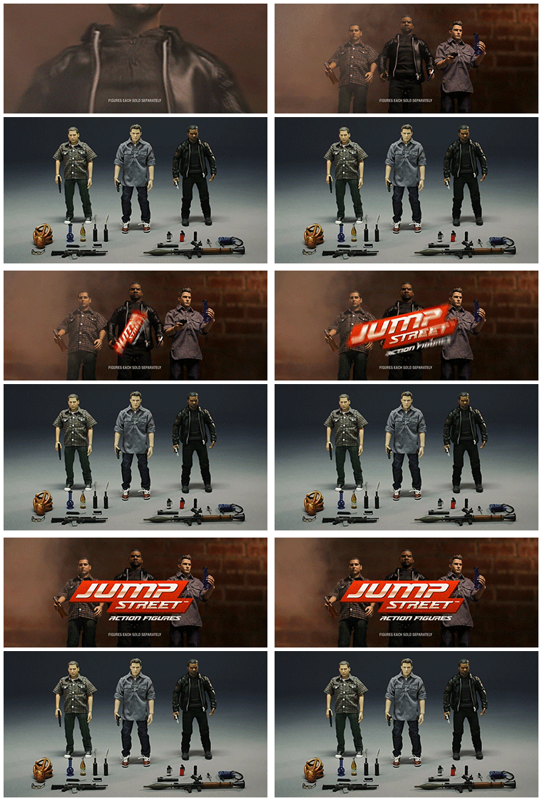
The Jump Street Action Figure set, with accessories
Kathy: One of the things we enjoy most about working with Phil and Chris is that they are true collaborators in every sense, and are constantly finding ways to push the sequence further and funnier.
Memorable main-on-end title sequences are becoming a something of a signature in your movies. 1) What do you have against opening titles? 2) Do you feel pressure to end your films in this way now?
Chris: 1) We love opening titles. Hopefully one day we will be confident enough to put titles up front and know the audience will have the patience to watch and enjoy them. 2) Pressure? No. It’s a great opportunity to do something totally unique, something that pushes the boundaries stylistically, and to make a little film within a film. It’s one of our favorite parts of the process!
What are some of your personal favorite title sequences, either classic or contemporary?
Phil: Anything by Saul Bass, Scott Pilgrim, Catch Me If You Can, Jackie Brown, Game of Thrones, the Disney version of Robin Hood, and about a hundred others.
Support for Art of the Title comes from

CINEMA 4D BY MAXON
Featuring an Unmatched Live 3D Pipeline with Adobe After Effects CC

