1982. Manchester. A pulsing beat and a slap on the back. The Haçienda opens its doors.
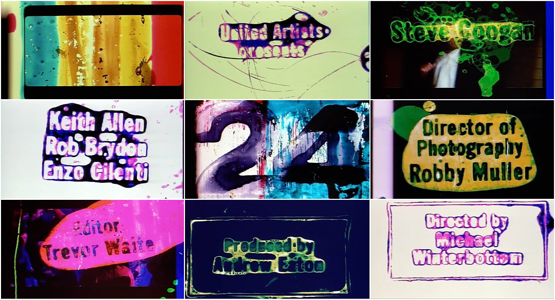
In Michael Winterbottom’s 2002 film 24 Hour Party People (FAC 401), we follow Tony “Mr. Manchester” Wilson (Steve Coogan) as he tells the story of the Factory Records label and the infamous nightclub it spawned. We are given a glimpse into a time when bassline and rhythm ruled this Northern England town. A vibrant amalgam of alternative rock, burgeoning electronic music, and psychedelia burst forth with unprecedented colour and energy. In stepped Factory Records and The Happy Mondays, New Order, the Stone Roses, Inspiral Carpets, Northside, 808 State, James, A Guy Called Gerald. Hot off the intensity of punk politics and influenced to various degrees by the American house music scenes, these artists rejected London as the centre of the universe.
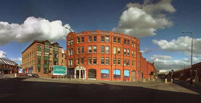
The Haçienda building in Manchester. Photo by Aidan O'Rourke.
There are a handful of parts to any movement, and one of them is always the look. The graphic elements that reify the scene and turn it into physical art, into objects and apparel to have and to hold, to look back on with fondness. Factory Records had several designers up their sleeve for this purpose including graphic designers Peter Saville and Mark Farrow, London-based firm 8vo, and Central Station Design. Where Saville, 8vo, and Farrow favoured a cleaner, more precise aesthetic, Manchester-based Central Station leapt into the fray with manic energy and bold swaths of colour, their fingerprints embedded in each album cover and poster, each piece imbued with the feeling of something alive and exuberant.
In the story of Factory Records and the Madchester movement there was the music, the place, the people, but it was the art that allowed fans to place a palm upon the time period and say: We were there. And we’ve got the 12-inch to prove it.
So open Pills ‘N Thrills and Bellyaches in another tab and dive into Madchester.
A discussion with PAT CARROLL, KAREN JACKSON, and SAM CARROLL of Central Station.
Tell us a little about yourselves and Central Station.
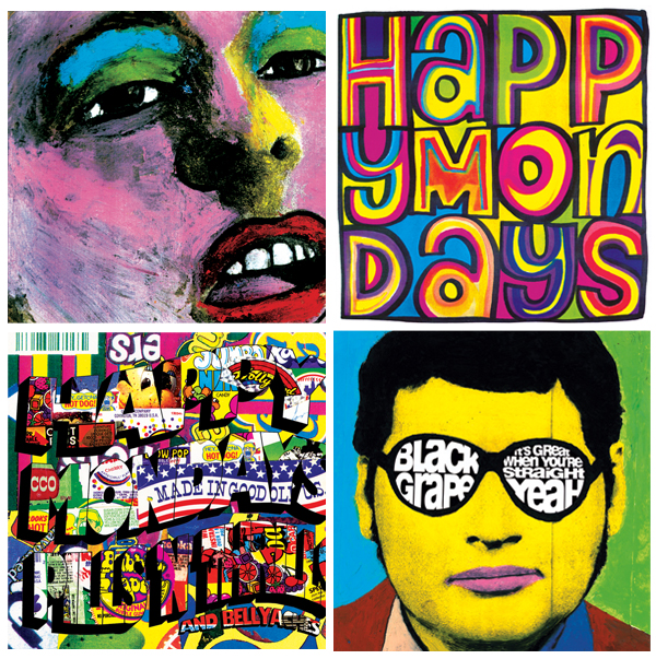
Album artwork designed by Central Station for bands Happy Mondays and Black Grape
Pat: Central Station has evolved over time, from our work in the ’80s and ’90s with Factory Records, Happy Mondays, Black Grape, and Nicolas Hytner, to the most recent chapter, operating under “Central Station Art” with our son Sam, working with Revolution Films and Michael Winterbottom on all their titles and graphics, various TV titles, music videos and new art.
Karen: We have been lucky enough to collaborate with some great people along the way, all whilst trying to contribute something to the culture.
Sam: The company has provided a vehicle for us to explore ideas, love, art, family. It's hard to talk about ourselves separately from the work.
How would you describe Central Station's style?
Sam: “Sophisticated Punk.”
Karen: That said, if it's commissioned design work, we always try to synthesise the client’s vision through the lens of our tastes and influences.
Clip from the documentary TV series Celebration: Madchester – Sound of the North (1990) produced by Granada Television featuring Matt Carroll, Pat Carroll, and Karen Jackson.
Watch it on YouTube.
Tony Wilson has been quoted as saying: “The second half of the Factory story is best summed up by the painterly eccentricity of Central Station, Matt, Pat and Karen.” Is this true? How do you feel about this?
Pat: We'd like to think so! If Tony said it, it must be true. To be considered as summing up any part of something as culturally significant as Factory Records... you can only feel proud about that.
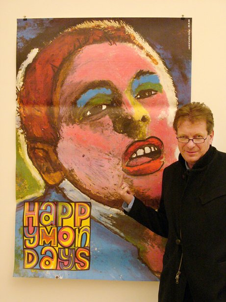
Tony Wilson, Factory Records manager, with the Happy Mondays Bummed poster in 2005.
Photo © Richard Bellia.
Karen: We loved Tony. He always fought in our corner and if anyone questioned the value and importance of the cover art, he used to say, "Does the Catholic church pour its wine into mouldy earthenware pots? I think not."
How did you come to work on 24 Hour Party People?
Karen: The first meeting was with Mark Tildesley, the production designer, and he filled us in on the project.
Pat: I think our reputation preceded us and the main reason for the meeting was to check we weren't mad before we met Michael, the director. Since then Mark has become a good mate and went on to do us all proud with his work on the Opening Ceremony for the London Olympics with Danny Boyle.
See photos from the 2012 Olympic Games Opening Ceremony here, and watch a video of Suttirat Larlarb and Mark Tildesley describing their work with director Danny Boyle here.
What was your first meeting like with Michael Winterbottom?
Karen: We met Michael in the bar at the Palace Hotel in Manchester, where all the crew were based during shooting.
Pat: When we turned up he was still auditioning prostitutes for the scene in the back of Peter Kay's van! We got on really well and chatted all night about the Manchester music scene.
So how did you begin, with 24 Hour Party People? What was your process for creating this title sequence and the graphics?
Karen: Well, initially there wasn't going to be a title sequence.
Pat: So we suggested that we could do the main titles – even though at the time we had no experience – just pure passion and love for the artform.
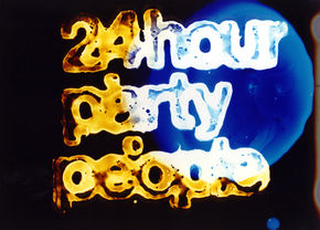
Initial typographic logo treatment for 24 Hour Party People
Sam: Sometimes you have to create a job and pull up your own chair. Moving image to us was an opportunity to extend our comfort zone beyond 2D design – towards creating 24 pieces of artwork a second.
Karen: Michael said, “Go on, then – do me a 13-second leader that will slip into the film.” So we did the leader, but in a moment of madness we decided to stick our necks out! We put together a costly 4-minute main titles pitch – to the Happy Mondays track “24 Hour Party People” – knowing full well there was a big chance we were wasting our time.
Pat: We raided our Factory Records archives for old footage and imagery that we had collected from that time, transferred it all to 35mm, spliced it up into an all-killer-no-filler edit and got painting.
Karen: We thought it should be an art piece – hand-painted, organic, human, emotive. We just believed that when they saw it, they’d change their minds!
—Andrew Eaton (Producer, Revolution Films)When they came up with the idea of painting directly on to the 35mm film, it sounded brilliant but mad to us.
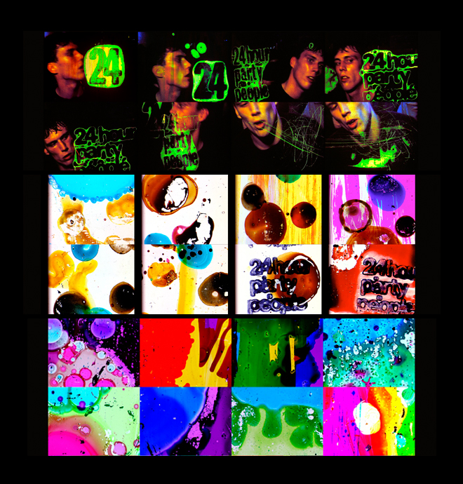
Original storyboards that established the direction for the three main elements: Type style and colour, painterly treatment for the logo and title, and a vivid technicolour landscape for all of the elements to live in.
Pat: It was a buzz hearing Michael and Andrew's messages on the answer machine after they'd seen it. Michael loved it and laughed. He said, “That’s great, but now can you remake it with our footage and incorporate all the credits?”
Karen: After a brief moment of high-fives, we were suddenly struck with the realities of the analogue, hand-made approach we'd established in the pitch.
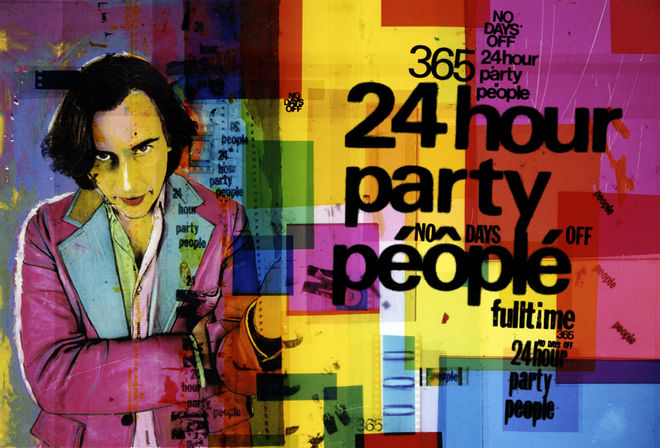
Original 24 Hour Party People film poster designed by Central Station
Sam: The job grew from the 13-second leader into a 1 minute 45 second full title sequence, around 20 intertitles or captions, a series of end title dedications, the animated colour background for the end roller and trailer – oh yeah, and the film poster!
Pat: We met with Michael and looked through everything that had been shot for the film. He supplied us with the original 35mm sections we chose to paint, fuck up, process and potentially destroy...
We would work painstakingly for weeks, painting frame by frame, night after night, making sure we made no errors, no typos, and trying to imagine what it would look like animated – something no one in their right mind would do!
Karen: The only digital fingerprint on any of our elements for 24 Hour Party People was during the editing stage – after transferring our processed film footage.
What were some of your influences or references?
Sam: A lot of the reference material was actually life experience.
Shaun Ryder is the lead singer of the Happy Mondays and Black Grape, and Mark Berry AKA "Bez" is a British dancer and percussionist. He was a member of the bands Happy Mondays and Black Grape.
Pat: Yeah, definitely… It was a pretty crazy time, and we were in the thick of it. We used to live in a house with Shaun Ryder and Bez. We'd go and put in a day’s shift at the studio till midnight, then meet back up with the crew at The Haçienda, ending up at houseparties at The Kitchen in Hulme, shebeens in Moss Side or illegal raves in the middle of nowhere – where we'd often bump into the likes of Bernard Sumner and Ian Brown, sometimes going straight back to work in the morning.
Shebeen is a term that originated in Ireland and referred to an illicit bar or club where alcoholic beverages were sold without a license. The term has spread far from its origins in Ireland, to Scotland, Canada, the United States, England, Zimbabwe, and other countries. The word derives from the Irish síbín, meaning 'illicit whiskey'.
Karen: Also because we were partly responsible for creating the aesthetic and colour palette of the time – working on the film was a case of rejuvenating and recontextualizing the style we’d become recognised for.
Sam: This is where lack of experience comes in as well – we didn’t know what we were doing and everything was new. Sometimes being unaware of the rules and technicalities can bring about a radical approach. You have to play to your strengths and figure out a process that works for you.
Were there concerns about legibility and the length of screen time for each name? How did you navigate that?
Sam: There was an edge and attitude to everything – no one gave a shit. Worrying about card length and legibility wouldn't have been in the spirit of the film.
Karen: Luckily Michael and Andrew agreed!
Band name interstitial graphics designed by Central Station
Pat: The choices we made visually and typographically had to capture the frenetic, hedonistic, full-on energy of the time.
Karen: There was an element of Factory and the scene that always felt like a runaway train – no driver, heading for a crash and could implode at any moment… Hopefully the tripped-out, pulsing, and dancing type – which we purposely painted to burn in and out of legibility – catches that vibe.
In the movie, Tony Wilson's character says that his heroic flaw is his excess of civic pride for Manchester. It seems like something that has been important to your work as well. What has Manchester meant for your work?
Pat: Manchester is a permanent character in our work and has played an important role in shaping who we are.
Sam: We still live and work in Manchester. Every time we get home from being away for a while, we are always hit by how underestimated familiarity is. You go on autopilot, you know every nook and cranny. It frees you up to observe, take in the great architecture and watch the world go by.
Manchester is big enough to have a lot of stuff going on, yet small enough that you see the same people and eventually get to know everyone… So when you’re looking to start something and find like-minded people there’s an instant connection, a shorthand – no nonsense. You just can get on with making stuff.
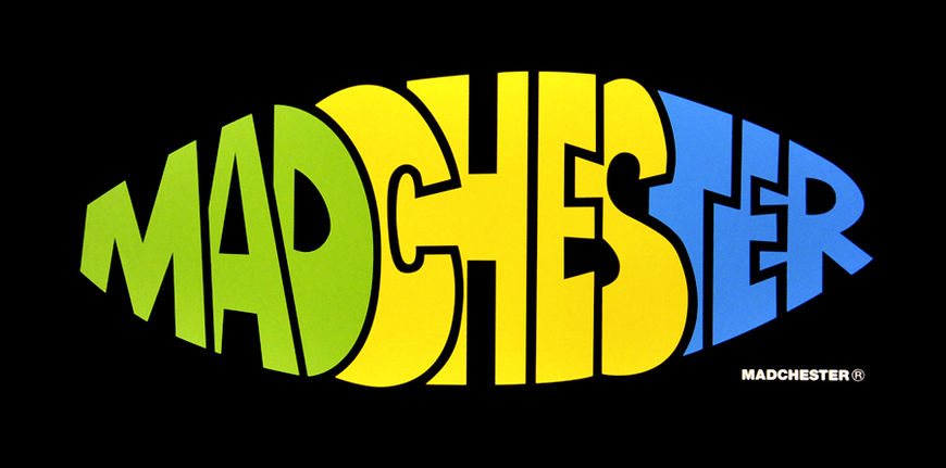
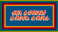
Madchester logo by Central Station Design. Available as a silkscreen print through Richard Goodall Gallery.
Pat: When we first set up Central Station, Manchester was quite a monochrome, oppressive, industrial place, suffering from years of neglect. It was a ghost town in the centre after 6pm. We all wanted to turn the lights on and re-paint the city with a new technicolour landscape.
Within our small nucleus of mates we all had something to say, were opinionated in our own worlds and were gonna find a way of getting ourselves heard. And backing up what Sam said – everyone influenced, inspired and fed off each other, and went on to start bands like Happy Mondays, Stone Roses, New Order, various companies, clothing lines – we even set up Gio-Goi with Anthony and Chris Donnelly, which went on to become a big streetwear brand in the UK.
Read about Anthony and Chris Donnelly in The Independent's feature article Rough Trade: How two brothers rose from gangsterland to create the fashion brand Gio-Goi, worth £40m (then promptly lost the lot)
Karen: At some point you need an incubator and a home for all this energy, which for us became Factory Records, Dry Bar and The Haçienda. Tony Wilson articulated the value of this energy, people like Kevin Cummins photographed and documented it, the bands soundtracked it, and we tried to paint it.
The city has contributed a lot to our work and we hope we have contributed to the city.
Pat, you studied graphic design in the late ’70s. How do you think graphic design has changed?
Pat: Well, apart from the ridiculous fact that we used to deliver finished artwork on CS10 – basically very thick cardboard, coated with china clay – not much really!
CS10 was a thick paper stock which featured a kaolinite or china clay top-coat which allowed erasure with a scalpel and redrawing without bleed.
The outlets for design have increased. You have to consider social media, blogs, video, online and print advertising, apps and games… but more important is the commitment to the daily maintenance of all these demands and keeping people’s attention. When we were working with Factory, you were pretty much good to go with a logo, album cover and a poster.
Sam: Now you can look at everything ever done by anyone – it makes you realise that all the mad, cutting edge ideas you’re coming up with have already been done by somebody in 1930!
In 2008, you did an exhibition entitled Faç Off, which was a retrospective of your work, at the Richard Goodall Gallery, right?
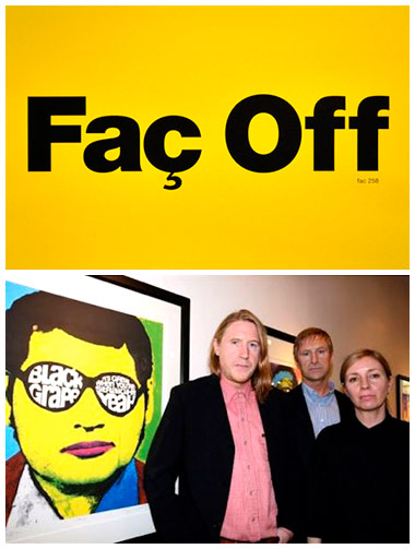
Photos from Central Station's Faç Off exhibition at Richard Goodall Gallery, 2008. Logotype design by Central Station. Photos © Karin Albinsson.
Pat: Right. Faç Off was a 25 year retrospective of Central Station which featured artwork from our Factory Records days, various fine art paintings and portraits of TV and radio personalities like Tommy Cooper, Ken Dodd, and Kenneth Williams.
What has it been like working with Michael Winterbottom? You've worked with him for years, right?
Karen: Our relationship with Michael is now moving into its 15th year! We have worked on all of Michael's titles and graphics since 24 Hour Party People. He's very prolific and always makes films with interesting, challenging and sometimes controversial subject matter, which is inspiring for us as interpreters of his vision.
Sam: I reckon we have worked together on about 16 projects so far...
Pat: It's pretty mad – some of our most productive work has been a result of long-term collaborations, building a trust and almost family-like set up. You can experiment more and push the boundaries with each other.
And how did all of your Coronation Street work come about? The paintings of the cast?
Karen: At the opening launch party [for Faç Off] there were a few Coronation Street cast and crew members. They asked us if we would be up for collaborating on their 50th anniversary. We definitely wanted to be involved in the celebration of something so iconic and successful that we grew up on.
Sam: Inspired by our love of the handpainted film posters from the golden age of Hollywood and Bollywood and Indian street graphics, we decided to paint a series of portraits of the colourful characters that have graced the cobbles over the years.
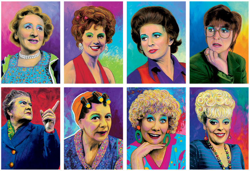
Painted portraits by Central Station of Coronation Street characters
You've also done a number of other title sequence projects, including for the Cracker TV movie, and the films The Look of Love and The Killer Inside Me.
Karen: Right. It turned out that the director of Cracker, Antonia Bird, was into our work. She first approached us to work on a drama about the rehabilitation of drug users. This was the beginning of another great working relationship.
Pat: Not only was she a great director, she was also one of the most generous and beautiful people we have ever met.
Sam: Cracker was always filmed in Manchester and one of our favourite pubs became Robbie Coltrane's local during shooting. We used to see him in there all the time, even before we started working on it.
We’ve been fortunate enough to work on a lot of great projects: Prime Suspect, A Mighty Heart, Code 46, A Cock and Bull Story, The Trip...
But obviously our personal favourites are the title sequences where we have been able to go to town – create a visual narrative that transports you into the environment, atmosphere, time period, colour palette and mindset of the film.
Pat: The Killer Inside Me and The Look Of Love are two sequences that we feel exemplify this.
The Killer Inside Me (2010) – main title sequence designed by Central Station
Karen: For The Killer Inside Me we tried to create our own contemporary take on ’50s title sequences.
Sam: The Look of Love focuses on the personal life, relationships and family turmoil of Paul Raymond, played by Steve Coogan. The titles were originally going to be still white cards intercut throughout the opening funeral scene of Paul's daughter.
However, Michael wasn't sure if this was the best way to introduce the film and the man who opened the UK's first strip club, launched the best-selling soft porn magazine Men Only, and was dubbed the "King of Soho" after his wholesale real-estate purchases, ending his days as Britain's richest man.
Michael asked us if we had any ideas or suggestions… so we went about creating an opening 3 minute film-within-a-film and various montages that would bring this eccentric, wild and colourful world to life.
The Look of Love (2013) – main title sequence designed by Central Station
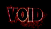
Have you seen the film Enter the Void? Its title sequence bears some similarities to the one for 24 Hour Party People – its credits are flashed in bright colours, on the edge of legibility.
Sam: Those titles are brilliant! Perfect set-up for the storyline… really captures the sensory overload that is Tokyo after dark – albeit through an acid-fuelled filter – throbbing along to the sounds of Thomas Bangalter.
Karen: It has a similar spirit and energy. Sam mentioned how we approach moving image with the idea of creating 24 pieces of art a second – Enter the Void seems to do the same thing.
Sam: Love the climactic build, where by the final cards he has created multiple standalone logos and animated them into a fantastic frenzy of kaleidoscopic typography… we would probably get on really well!
What are some of your personal favourite title sequences, whether classic or contemporary?
Pat: For us you have to start with the godfather of the modern title sequence, Saul Bass. In every industry there are trailblazers whose work speaks to you and lights the blue touchpaper for your imagination – inspiring you to want be a part of that world.
Touchpaper is paper that has been soaked in saltpeter and used for firing gunpowder. To "light the blue touchpaper" is a British expression meaning to do something that causes anger or excitement.
Sam: We could pretty much list every film he worked on as a favourite, but we have to mention Anatomy of a Murder, Vertigo, Seconds, Psycho, The Man With The Golden Arm, and North By Northwest.
Karen: Right through to his last contribution to cinema, Casino.
Sam: Recently we were watching the great titles by Patrick Clair for True Detective, which also reminded us of one of our favourite sequences by Robert Brownjohn – Goldfinger. We all love From Russia With Love as well.
Karen: It doesn't get much better than The Thomas Crown Affair! Introducing the multi-screen effect for the first time in any motion picture and defining the cinematic style of the late ’60s…For Pablo Ferro to follow this up with Bullitt – genius!
Pat: The humorous, disturbingly ordinary titles for Dexter were a stand-out.
Karen: We love all of Jean-Luc Godard’s stuff – especially Une Femme est Une Femme.
Sam: Iginio Lardani changed the game with his work on on A Fistful of Dollars but our personal favourite is Faccia A Faccia.
Faccia A Faccia (1967) title sequence designed by Iginio Lardani
And what are you working on now? What does the future hold for Central Station?
Sam: There's no better feeling than making something from nothing – that process of staring at a blank screen, page or canvas and entering another dimension – only to come out the other side with something you are proud of… but the best thing is when you can share that journey with the people you care about most on this planet… with no egos, no bullshit and no arguments about money or who did what.
Pat: What Sam said! It's probably the reason we can come up with a lot of ideas so quickly – we can focus on the big picture and all pull in the same direction.
Karen: So, more of the same! Hopefully we can keep finding kindred spirits that we can share this journey with.
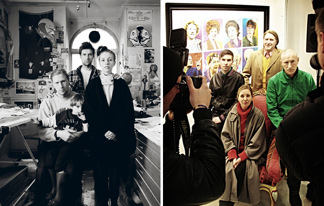
Portraits of Central Station in their studio in 1989 (left) and at their Coronation Street 50th Anniversary exhibition in 2010 (right). In the left photo, clockwise from top: Pat Carroll, Karen Jackson, Sam Carroll, and Matt Carroll.
Support for Art of the Title comes from
NEW YORK FILM ACADEMY LOS ANGELES
Get hands-on experience to prepare you for a career in filmmaking.

