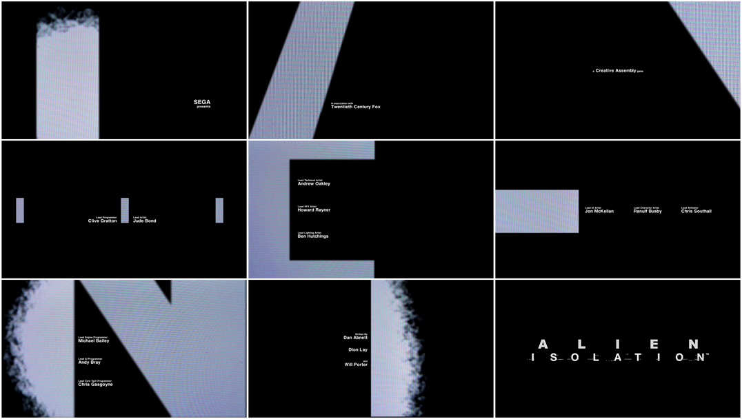
A pale column of light sears the darkness, fuzzy and pixelated, ascending with a creaking, ominous rumble before fading away. As other beams angle in and out of frame in quick succession, the visible strokes of some larger form, a message begins to play. One of cinema’s most enduring heroines cautiously invites us back to the place where we left her in 1979 – back to the cold and terrifying world of Ridley Scott’s Alien.
Invoking Ripley’s memorable sign off in the opening moments of Alien: Isolation – a new survival horror game from Creative Assembly and direct sequel to the original Alien – is both a bold statement of intent from its creators and one hell of a hook. Set 15 years after the events of the first film and 42 years prior to Aliens, Alien: Isolation puts players in the role of Amanda Ripley – the grown daughter of series protagonist Ellen Ripley (Sigourney Weaver). Although the game parks itself firmly in territory unexplored by prequels, sequels, or god awful spin-offs, it absolutely revels in the lo-fi, “used universe” aesthetic that Scott’s movie helped immortalize, and does so in a way that no movie or video game has since.
Almost every game based on the Alien franchise has drawn liberally from James Cameron’s gung ho 1986 sci-fi actioner Aliens (indeed, what would gaming be without the venerable space marine?). But none have ever seriously attempted to channel the creeping dread of its 1979 predecessor until now.
In the spirit of the original Alien, Isolation is a game about loss and survival against the odds – not badasses on a bug hunt. This return to the series' roots is made abundantly clear by the game's title sequence. Slow, deliberate, and disquieting, the sequence echoes R/Greenberg Associates' iconic main titles for Alien both in form and function. The opening also acts as a reset button of sorts for the franchise, reintroducing us to Ripley before Hadley's Hope, before Fury 161, just as we left her and Jones aboard the lifeboat Narcissus.
Countless filmmakers and game designers have tried to add their own little piece to the Alien mythos over the years, and most have failed for one reason or another. So how does a game studio best known for military strategy games fare? Far better than you might expect.
A discussion with user interface and title designer JON MCKELLAN of Creative Assembly.
Give us a little background on yourself and Creative Assembly.
I’ve been at CA for just over four years now, starting just as the project was beginning pre-production. I came in to cover mostly 2D and video work, graphic design and UI-related art, proof of concept videos, that sort of thing. Prior to CA I had done a few motion graphic jobs, some short film, and a lot of graphic design freelance.
Creative Assembly are known more for the Total War strategy series, so Alien: Isolation was a real departure for the company. They have been around for more than 20 years – one of the few studios still standing after all that time!
Alien: Isolation game announcement trailer
Coming into it, how did you feel about Ridley Scott’s Alien and the other films in the franchise?
Like any teenage kid in the ’80s, I was obsessed with Aliens. My friends and I used to watch it every Thursday, and we knew the script line for line. I’m pretty sure we had to get a replacement VHS as our copy was worn out.
It wasn’t until I got a bit older that I started to realise the genius behind Alien. It’s so much slower, darker, and quieter, and after years of the sensory assault of watching Aliens, the contrast was startling. I think it’s stood the test of time better than the others in the series. I picked up the Blu-ray Anthology just after I started on this project, and Alien looks incredible still. Those practical effects and set designs still look cutting edge. I think it’s a harder film for newcomers to get into, though – some hallmarks of ’70s editing and filmmaking techniques in general. Really long takes, overlapping dialogue, unforgiving sound mix. Compared to today’s films, you have to work a bit, and I like that! By comparison, Aliens and Alien³ haven’t aged nearly as well – the cracks are showing now.
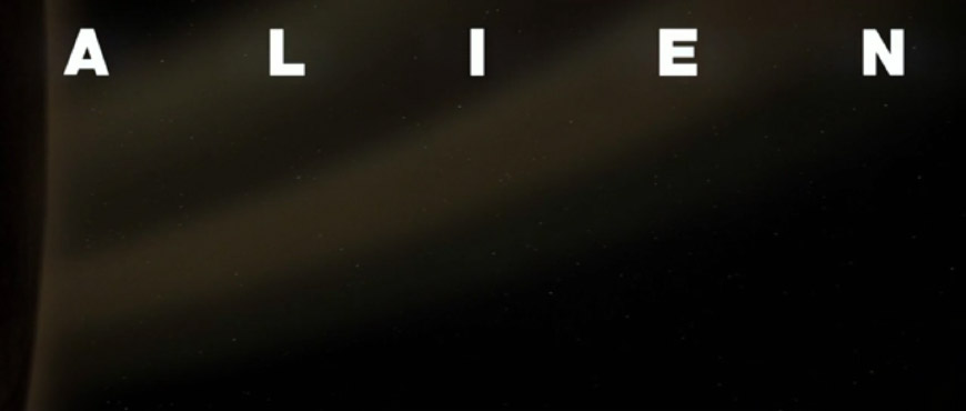
Alien (1979) title sequence designed by R/Greenberg Associates
Visually, [for this game] we were all about Ridley’s Alien. That was our benchmark and everything we did was measured against it: pacing, set design, character arcs, soundtrack – the lot. We had to break away occasionally to allow for larger areas on the station, and adapt to new situations, but we always intended the game to look like it was taking place beyond a closed door on the original set. It had to be unmistakably Alien.
We joke about how many times we’ve seen it, until we realise it genuinely is in the hundreds of times each. It was on loop in the studio and I always found myself being distracted and just watching, noticing something new each time.
How did you develop the title sequence? How did you set up the story?
The game’s story is about Ellen Ripley’s daughter Amanda finding the Nostromo black box, and looking for clues as to what happened to her mother.
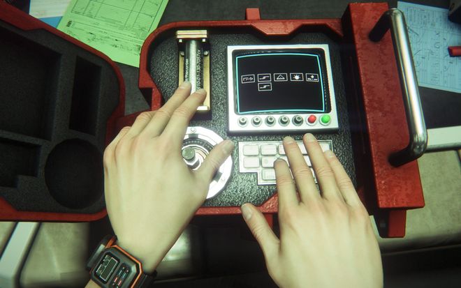
The Nostromo flight recorder or “black box” as seen in Alien: Isolation
I really wanted to establish a theme throughout the game’s UI layer to connect to the “lo-fi sci-fi” aesthetic and the narrative of finding the black box. The “black box” was the theme of all UI; old computer systems running through dated video technology.
The title sequence you see in-game came about very late in development, although it was always on our minds. The concept was always to set the scene; Alien is 35 years old, and a huge part of our audience won’t have seen the film! It took a while to get our heads around that fact, so we had to make sure people could understand what had come before. The original Alien titles were so iconic and memorable that I felt I just had to replicate – I wasn’t going to better it, so it was about re-creation. I had spent a huge amount of time matching the timing, softness of edges, the film stock – even the blue tint as each segment fades to white.
Prometheus (2012) film title card reveal designed by Prologue Films
Then, Prometheus came along and used the title concept! That came as a blow. To people new to the franchise, it would now be the Prometheus titles, not the Alien titles… just as many refer to the Space Jockey as a Prometheus thing first…
So initially the title sequence was going to be very similar to the original movie title sequence, but due to the length of that sequence, we brought in a voiceover to help tell the introduction. The monologue at the end of Alien really captures the storyline in a great, succinct way, and it felt perfect as a re-introduction.
We had Sigourney re-record it, as we knew it would fit somewhere, and when it came to it, the title sequence was the perfect place. I still feel starstruck about directing a title sequence with Sigourney Weaver’s iconic words – to now be part of that saga in some way is incredible! Her new delivery is spot on, and almost chilling. When we got the recordings back we were all just sat in silence while it all sank in.
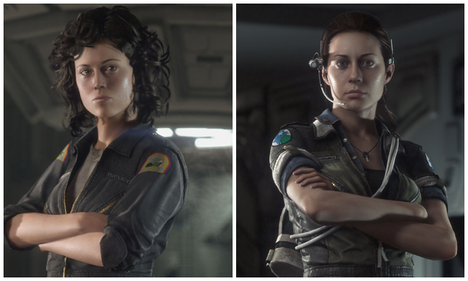
Mother and Daughter: Ellen Ripley (Sigourney Weaver) and Amanda Ripley as they appear in Alien: Isolation
So, Richard Greenberg’s Alien title sequence influenced the Isolation opening in a big way. Did anything else inspire you?
Inspiration came from a lot of different sources. I spent a lot of time watching the first five minutes of hundreds of films on VHS to get an idea of how they looked – anything motion graphic-driven pre-1984 was great. Seeing what VHS or analogue did to what would normally be sharp clean vector lines and logos was fascinating, especially after aging for 25 years in an attic! Production company identities and advertisements were great fodder too, as was Steve Gaynor’s Rekall tumblr – an absolute gold mine of reference.
It was that idea though – what the tech did to the original art – that became the focus of the sequence. I wanted to get deeper into the characters, as if we were showing in more detail what was happening as they were revealed in the original sequence. The red-green-blue of the pixels lighting up, the fuzziness, the noise – as if we were scrutinising what little data was there. The game narrative is all about having very little information – a black box has been found – and trying to get as much as you can from it, so it felt appropriate.
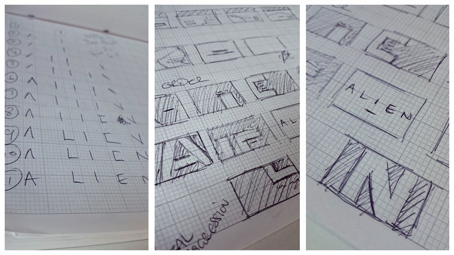
Early title sequence sketches and storyboards
At what point in the game’s development did you start working on the sequence?
Very late, literally a week or two before we submitted the disc to manufacture! We had other versions and ideas in place – at one point the title reveal occurred in the main menu slowly over the planet vista – but none of them felt right. One of the reasons was that we had a subtitle, “Isolation”, which works fine in the logo, but not when aping that original sequence. You do the reveal segment-by-segment and then suddenly “Isolation” appears underneath it and breaks the composition completely.
So in the middle of crunch, whilst frantically fixing UI bugs throughout the game, I took a final stab at it and locked myself in a dark room with old equipment, a Canon 5D, and a copy of After Effects for a few evenings in my own time. All in all, from storyboard to encoding the final version, it took four evenings…
Tell us about achieving that VHS look.
In-game motion graphics before and after being given the VHS treatment
I spent a lot of time trying to make digital look convincingly analogue, and it was a nightmare. As consoles and PCs get more and more powerful, the image gets sharper and the amount of effort you need to put in to soften and make it poorer increases. The tech we used in-game didn’t lend itself well to that analogue look – it’s vector heavy and the effects to soften are expensive to render in realtime, so it was a struggle.
I went to a car boot sale in the local area, and picked up a battered old VHS player, and a few used tapes (Alien, of course, and the rather excellent The Day Today) and started running video game footage through it. If I could, I would release a version of the game that looked and played like the footage I got back – it was incredible! Almost impossible to play, but visually fascinating. The equipment does things to signals you wouldn’t expect, and it was a real moment of clarity for me. Anything in the UI that was static – decorative elements, icons – we could push through VHS and back again and just roll with the results. I’ve said the line a million times but it’s appropriate; it didn’t look authentic, it was authentic. This was our game, just in the early ’80s.
Video featurette on the "lo-fi sci-fi" aesthetic
What movie did the 20th Century Fox logo you used come from?
That was ripped straight from Alien on VHS! The 1991 Special Widescreen Edition, to be exact. I used the VHS pipeline to get it into Premiere, make a few edits and a quick grade, and that was it. We didn’t think Fox would go for it, but they loved it and signed off on it for the game and for trailers, too! The Fox logo was the first thing to be seen of this game, and I didn’t want the super modern and clean version they have now to be how we intro our game to people. Opening with those distorted visuals, and the compressed, slightly overdriven audio treatment of the fanfare gave it a sense of identity right from the start – it made it ours.
It was quite satisfying, because I had done a proof of concept VHS effect video literally years prior to this, where I tested out the ideas of the “VHS pipeline”. Here we were right at the end of the project, and it felt like that seed I planted years ago had finally made sense.
Ron Cobb’s design work was such an integral part of Alien and must have loomed pretty large over the Isolation team. With regards to your UI work, how beholden to that existing Alien aesthetic were you?
Cobb’s work had a pretty massive influence. We even produced concept art in the same visual style, so we could try and find the “Cobb Solution” to new problems or spaces. The UI overlays weren’t particularly related to Cobb’s work, but everything in-world borrowed quite heavily – I produced signage, branding, crew patches, and general graphic design décor elements, all lifting from Cobb’s and [John] Mollo’s work on Alien, both used and unused.
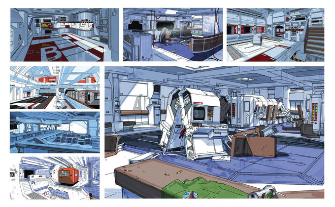
Game concept art compared to Ron Cobb's original Alien concept artwork
How did you balance the established look-and-feel of the movie with the usability, clarity, flexibility, etc. required for the game?
The balance of functionality and form of the UI was the hardest thing about the project for me, in fact, the hardest thing I’ve done on any project. Everything I knew about UI design, and everything amazing about the lo-fi visuals, fought with each other. The first challenge was with the source material. When going through every frame of the movie and finding examples of interfaces I quickly discovered that there are none! Almost every screen in the film is showing a graph, or an output of some sort. There are no buttons, no interactions – it’s all done with levers and physical switches and the computers just relay results. There is only one actual computer interface in the entire film, which is MU-TH-UR, the ship’s AI. It’s iconic and a great piece of visual design, but as an interface it’s terrible. Dallas or Ripley would ask it questions in English, like an old Text Adventure. “Go north” and such … Obviously that doesn’t map at all to a next gen console game in 2014!
So this was a fundamental problem to the entire UI – if the authenticity factor was good, the usability would be poor and vice versa. This made the entire a process a series of compromises and redesigns. It wasn’t until later in the project where I had a kind of epiphany that things got easier. I realized the UI had to break the fourth wall in a sense, and be somewhat difficult to use. The player had to experience the same difficulties in operating the software as the character.
There is a very clear split in the UI design of Alien: Isolation – anything internal to Ripley, UI representing her spatial awareness or memory for example, would be presented as a minimalist overlay, abstracted from the game world. The form would follow the function, and it had to be easy to use and minimalist to look at.
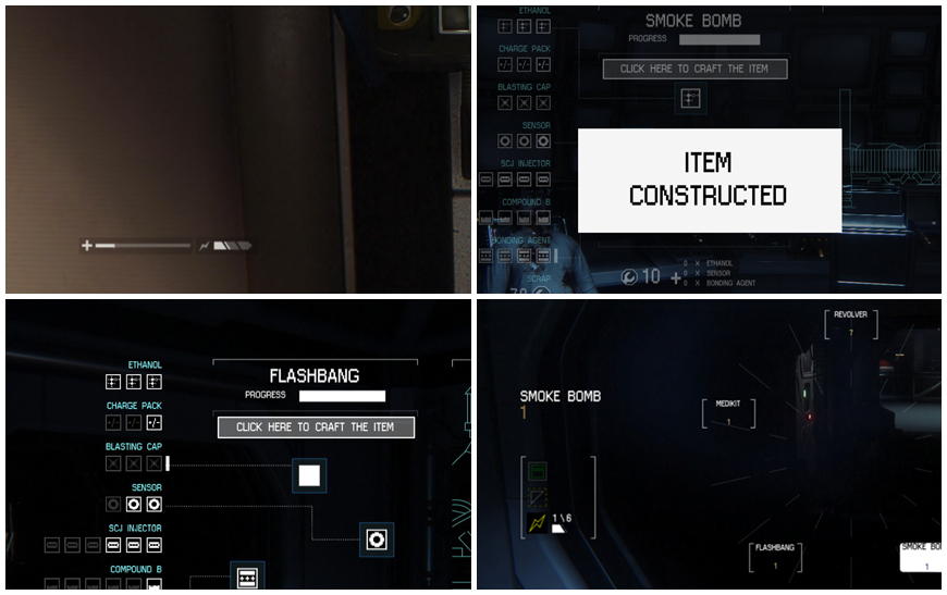
Internal user interface examples such as health status, personal inventories, etc
Anything external to Ripley, things that the character could physically interact with, would be rendered in-world as a diegetic interface. For these, function followed form. It had to look and feel like an old piece of primitive software, and for that to work, it had to behave like it. So in terms of usability, the interfaces were deliberately clunky to use, a bit confusing to read. They break so many of the UI presentation rules burned into me over the years.
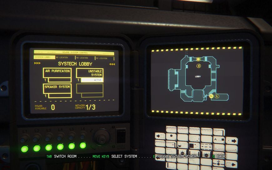
“In-world” interface examples
It was quite a risky and bold thing to do, as I was essentially making stuff deliberately unintuitive! But, the first time people fired up a ReWire terminal, or used the final hacking game, the responses were good. They felt correct, and the clumsiness of the interactions felt appropriate and not nearly as jarring as I feared.
Who worked alongside you?
I handled the lion’s share of the work. I had Al Hope, our Creative Lead, look over the first drafts and thankfully he loved it. Normally I would expect some considered feedback, but this time it was a “it’s great – run with it” which was great. Once the video edit was complete, Byron Bullock and Jeff Van Dyck handled the score and sound design which worked incredibly well and pulled it all together. It really transformed it, as great sound design tends to do. Paul Allison, who directed our marketing trailers and edited the cutscenes in-game, also gave valuable input to get the edit and pace just right.
What’s your favorite part of the sequence?
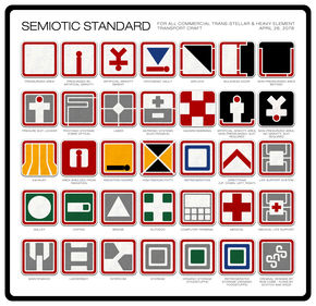
Ron Cobb's 'Semiotic Standard for all commercial trans-stellar & heavy element transport craft'
I’m just relieved it worked! In general I’m happy that it made it in and worked as a narrative introduction. I’m proud that I managed to pull it off almost entirely on my own. When I got the final audio mix back, and saw the full logo reveals at the end with that sound diving down, I felt a huge relief!
And finally, what are some of your personal favorite title sequences, either classic or contemporary?
In TV, Dexter was one of my favourites. I used to get people to recreate it when I was teaching film techniques at college a few years back. It was clever, visually stunning, and perfectly established the titular character.
For film, the first title sequence that really caught my eye and got me interested in sequences in general, was Se7en. I was a huge Nine Inch Nails fan, and it was a fairly obscure remix they used for that sequence and that caught my ear. The visuals were a great short story on their own, and it all came together really well. When every potential job in graphic design was obsessed with web, watching that sequence made me think there was maybe work in other areas for me somewhere.
I also have to shout out to Christopher Hewitt and Rob Chiu, who have both done some incredible work in motion graphics and film – things like OFFF title sequences in the past
OFFF 2007 New York Conference title sequence designed by Rob Chiu and Chris Hewitt
Those two artists were my biggest inspiration for moving into motion graphics and film. I would watch their showreels over and over on loop and dissect each frame to work out what they were doing. Really inspirational stuff.
And of course, Too Many Cooks might just be the best and worst title sequence ever created…
Support for Art of the Title comes from

NEW YORK FILM ACADEMY LOS ANGELES
Develop original video games in our hands-on game design courses.

