Sophia Takal’s second feature film Always Shine is a breathless and spellbinding look at the jagged intimacies of friendship and performance.
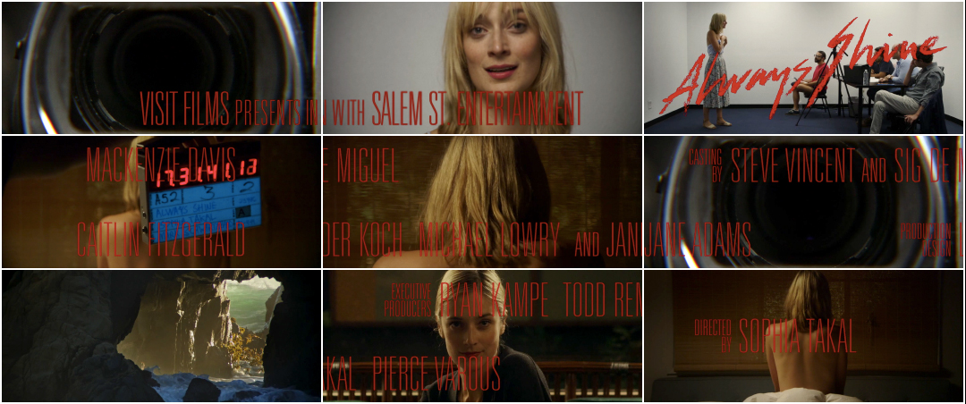
Caitlin Fitzgerald and Mackenzie Davis play Beth and Anna, both actors in the early stages of their careers, who ditch Los Angeles for a quiet weekend in the lush wilds of Big Sur. With nods to Robert Altman's Images, Ingmar Bergman's Persona, and David Lynch's Mulholland Drive, Takal’s film takes a dark and winding road in its exploration of identity in crisis and performance as power. The main title sequence is a dizzying amalgam of footage and ticker-tape text that sets up these themes and creates an atmosphere of unease.
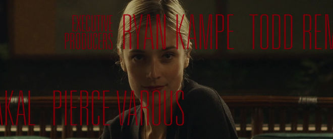
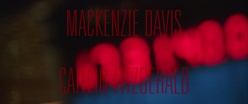
In the opening moments, Beth (Caitlin Fitzgerald) auditions for the role of a rape victim, watched and evaluated by a group of men. The scene is an extended look at and into Beth – her desire to please, her discomfort, her submission, her resolve. The quick cuts by editor Zach Clark that follow reveal flashes of the film, teasing out vital moments and lending the title sequence the feeling of a trailer. The effect is enticing and mysterious, drawing viewers in. Simultaneously, however, we’re given shots of the film’s clapperboard and camera lenses, reminding us of the filmmaking process and the medium itself, drawing us out. In the very moments that Always Shine begins to build, it also begins to deconstruct, starting a gripping and confident dialogue that warrants our participation. All the world’s a stage.
A discussion with Always Shine Director SOPHIA TAKAL, Editor ZACH CLARK, and Title Designer TEDDY BLANKS.
How soon after your feature Green, which came out in 2011, did you start working on Always Shine?
Sophia: I started coming up with the idea almost immediately after Green premiered at South by Southwest. The aftermath of Green was the inspiration for the movie. Just like, career competition with friends and feeling out of control. My husband Lawrence thought it might be cathartic and productive to turn all those feelings into a piece of art. Tapping into the anxiety I was feeling, I started throwing around ideas for a story that revolved around two actresses who are competitive, with my husband, who ended up writing the script. I think by framing it as a genre film it helped to externalize the inner turmoil I was going through at the time.
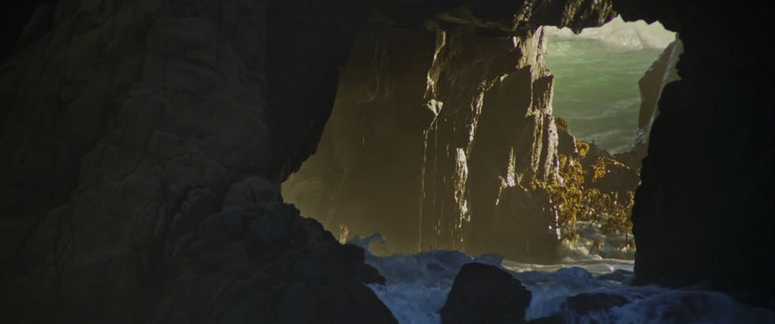
What feeling or association did you want that opening to have, for the viewer? What did you want to evoke?
Sophia: I always feel the very beginning of the movie is when you set the pace and rhythm of the film, the expectations for pace and rhythm with an audience. At first I wanted viewers to get pulled in and think that they were really watching a horror movie and then sort of have to recalibrate and realize that what they were watching was someone performing and manipulating them. And then I really wanted them to feel that the guys who were auditioning her were gross, sick dudes who were objectifying her. And then – with breaking the fourth wall and reminding people that they were watching a movie – that, to me, is the beginning of the dialogue with the audience. Just, like: How are you different than these people auditioning her? What do you expect from her in her regular life? When you interact with a woman, what expectations are you putting on them? How are you demeaning them? How are you objectifying them? That was the beginning of the conversation of the whole movie.
—Teddy BlanksThe opening serves a very specific purpose: it jolts the audience into paying attention. It’s unsettling.
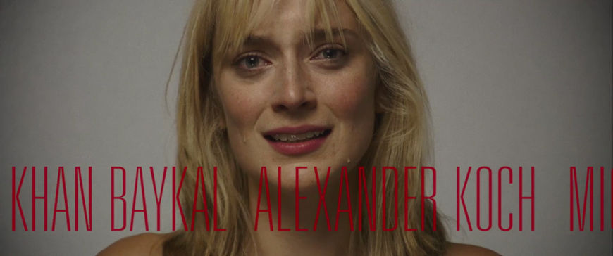
Still from Always Shine's main titles/opening scene featuring actress Caitlin Fitzgerald
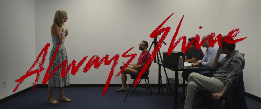
Always Shine's (2016) title lettering by Teddy Blanks superimposed with an audition scene featuring actress Caitlin Fitzgerald
How did you direct Caitlin, in the opening title scene, where she’s auditioning?
Sophia: The emotional tenor of that scene was delicate. I kept the set really calm that day. Every day on set we would do warm-ups where the cast and crew would do breathing exercises and meditate together. I remember doing that and keeping the set really calm so that Caitlin could get to an emotional place where she'd be crying and sustain that for take after take. When she did that she said she was having, like, PTSD remembering all the auditions she'd been on and how traumatic they were! [laughs]
In the film you develop this feeling where the audience doesn’t always know what's film and what's performance. The opening scene is mirrored almost immediately in the scene with Anna and the mechanic. How did that come together?
Sophia: We really wanted to establish early on that we were deconstructing performance and deconstructing femininity and what we're taught is acceptable and attractive and what we're taught is unattractive when it comes to being a woman. Larry distilled that idea in a really clear way with those two scenes that mirror each other.
—Sophia TakalWe really wanted to establish early on that we were deconstructing performance and deconstructing femininity
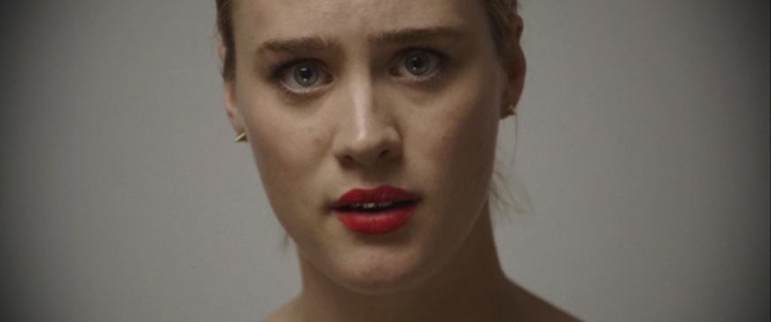
Still from Always Shine featuring actress Mackenzie Davis
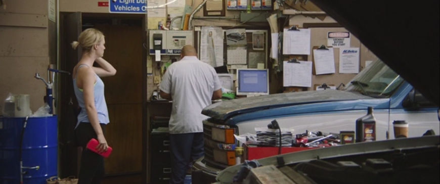
Still from Always Shine in which the opening scene is mirrored, this time featuring actress Mackenzie Davis
Sophia: That scene with Mackenzie Davis was really tough because we didn't shoot it in a garage, and we didn't have a real actor! [laughs] It was really challenging. We did it a few times, and then if it seemed like she was getting into her head, I'd say stuff like, “Now do it in an Australian accent!” just to get her out of her head. She was doing great, but I remember her feeling like there was a lot of pressure in that scene. So it was more reassuring her that there was no right way to do that scene.
Mackenzie was the first actress I cast. We had a terrific conversation about the material and I was struck by her openness and understanding of this aggression and assertiveness that can be considered unattractive for a certain type of guy or girl in our patriarchal society. Caitlin was similarly open and honest about her experience working in Hollywood and her experience playing into this idea of the delicate, shy, thoughtful woman and how she knows when she's using that and manipulating that to get something that she wants. That was really refreshing.
It seems like that's something that the film plays with a lot – this idea of how being soft and weak can actually be a form of power.
Sophia: Yeah, totally. [laughs] That's the big challenge. Anna, Mackenzie's character, really resents that Beth is able to play the game, but notices that no one else around her thinks it's a game.
That was something that I sort of struggled with for a long time. I felt like people didn't like who I was and they responded more to people who were shy and quiet and deferential but I knew that wasn't entirely who they were – they were just able to inhabit this traditional femininity better than I was.
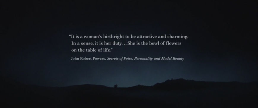
Quote from the opening of Always Shine
Zach and Teddy, how did you come on board? What was the first meeting about the titles like?
Zach: Sophia had already shot the movie when I came on board. I had read an earlier version of the script. She invited me to her apartment and showed me an assembly of the first 30 minutes or so. Sophia's a good friend and I loved her previous film Green so it was an instant “yes.”
Teddy: Sophia and I are old friends, and we've worked together before.
Sophia: Teddy actually did the titles for my husband's movie Wild Canaries, which I think were also incredible. He did a great job with those.
Wild Canaries (2014) main titles, designed by Teddy Blanks
Teddy: I went to a rough cut screening at Sophia and Larry’s apartment in June of 2015 with the understanding that I’d be working on the titles in some capacity. Even at that point – fairly early in the editing process – the tone and style felt very assured.
How did the opening scene form? How did you determine how that would play?
Zach: The film opens with a long, unbroken take and then dives into the opening credits, which have a lot of quick, erratic cuts. I wanted the two to act as counterpoints to each other but also to prep the audience for the rhythms of the film, which combine these two techniques throughout.
Sophia: I am a novice editor. I've edited a couple things – I edited Green myself – so I sat down and tried to cut together an opening myself to show Zach tonally what I was going for. I wasn't skilled in that the way Zach is, but I referenced – in my version that I showed to him – the opening titles of Persona.
—Sophia TakalWhen are we performing, and when are we being our authentic self? What’s the difference between an actress playing a part and a woman playing a role in her day-to-day life?
Persona (1966) opening and main title sequence
Sophia: If it's a simple movie or a slow movie or a character-driven movie then I might want simpler titles, but for this movie I really wanted the audience to know that we were going to go to some strange, maybe non-realistic places so that once those twists and turns came they felt justified.
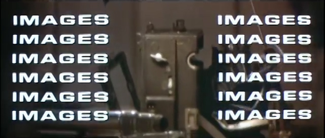
And then another thing we looked at was the trailer for Images, Robert Altman's movie. It also was this wild, fragmented, trippy edited trailer that had a similar pace and energy to it.
Images (1972) trailer
Sophia: Zach took the adjectives that I said, like trippy and disjointed and weird, and he made them a reality.
The opening sequence almost functions like a trailer, actually. There are glimpses from throughout the whole film. What did you want to do with that?
Sophia: We wanted to create a sense of tension because the beginning of the movie is a bit slow in terms of establishing the characters and what's going on. It takes a little while for it to get scary. One of the big conversations Zach and I had was how to incorporate moments from the whole film without giving away the twist.
We were really playing with ideas of like, when a woman puts herself in the appropriate box – which is being there to be in service of a man, to listen to whatever they have to say, and reflect back to them what they want to see about themselves – then women are replaceable. Once Mackenzie's character interacts with the bartender [in the film], we see that it doesn't matter that it's a different person. He doesn't even notice; to him it's just a person to listen to him talk, and make him feel good about himself.
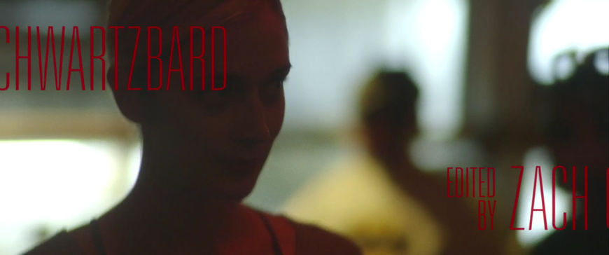
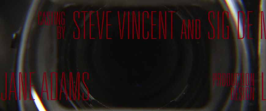
Right, so it sets up that sense of disjointed confusion from the outset.
Teddy: It tells us immediately that this won’t be a conventional movie, and that we should be on edge, and perhaps not trust everything we’re seeing. The way Zach cut the opening serves a very specific purpose: it jolts the audience into paying attention. It’s unsettling.
Sophia: That was part of his cut, to create that disjointed energy. Zach also outlined the way that the credits were scrolling across the screen. Then Teddy came and smoothed that out and we talked about using a font that mirrored movie poster fonts.
Teddy: The temporary titles were set in a freeware font called “SF Movie Poster” to mimic the smooshed-together credits you see on the bottom of a one-sheet. I loved this.
The condensed typography – or the "billing block" – at the bottom of many American movie posters is the product of marketing requirements, legal agreements, and guild rules. Read more.
The intention with the typography was to mimic the billing block on movie posters?
Sophia: Yeah! As another way of referencing that you were watching a movie and we weren't trying to pretend that it was anything but a movie.
Zach: I wanted the font to feel like the billing block, and its movement through the frame added an extra layer of unease. Fassbinder's Gods of the Plague has left-to-right scrolling opening titles and I always really loved the way that played, so it's almost maybe a little ripped off from that.
Gods of the Plague (1970) main titles
Teddy: To reference the vernacular typography of movie posters in the opening felt totally right. So I chose to set the titles in Univers Thin Ultra Condensed, which is a typeface actually used on the bottom of a lot of movie posters. I tried to further clarify the allusion by stacking the words in the job titles – “produced by” for example, on two lines.
Then it was just a matter of working with Sophia to tweak the size, speed and position of each title.
What was the inspiration for the lettering of the title card itself?
Teddy: The only reference Sophia gave me was from a 1985 TV movie with James Spader called Starcrossed. The titles were glowing neon, pink, cursive.
Starcrossed (1985) TV movie main titles
Teddy: I tried making something similar but eventually we decided to ditch the neon in favour of handwritten cursive. The texture of the charcoal pencil I used to draw the title treatment reminded Sophia of writing in lipstick. She liked that.
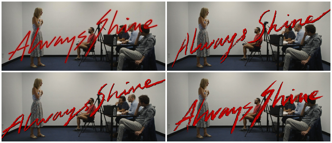
Lettering tests for the title card by Teddy Blanks
As for the sound design and the music, how did you work on that for the opening and for the film overall?
Sophia: We used some temp music for the opening credits that was a piece from Images, the Robert Altman film. When I showed it to my composer Michael Montes, he understood tonally what we were going for and we talked a lot about using sounds that were traditionally thought of as hippie meditative music, like Tibetan singing bowls and the didgeridoo – all of these instruments that are thought of as creating peace and calm – and sort of inverting their purpose and making it ominous and scary.
Zach, which tools and software did you use to put it all together?
Zach: I edited Always Shine in Final Cut Pro 7.
What are some of your personal favourite title sequences at the moment?
Teddy: I’ve been assisting Marlene McCarty on a sequence she is working on now, which has been a great excuse to revisit her fantastic work, from The Safety of Objects to Office Killer to Carol.
The Safety of Objects (2001) main titles, designed by vBureau and Marlene McCarty
Zach: Some of my favourite title sequences include Douglas Sirk's Imitation of Life, Mario Bava's Blood and Black Lace, and Josh and Benny Safdie's Heaven Knows What.
Imitation of Life (1959) main titles, designed by Wayne Fitzgerald
Teddy: I was also reacquainted with the end titles for Skidoo after reading your feature on Sandy Dvore, which is as far as I know the only title sequence in which every name is sung as it is being displayed.
Sophia, you mentioned Persona as one of your favourite openings. What was it that drew you to those titles, that you felt a kinship with?
Sophia: I loved the energy of Persona's opening title so much. I really liked how... it breaks the fourth wall.
Right, so much of it is about that movie-making process.
Sophia: Yeah! I really loved that. I thought that fit thematically so well, with this idea of performance. The opening titles were the first thing that Zach edited as a way of showing me what he was thinking tonally to buoy the whole movie. We talked a lot about – and we included this idea – of establishing that we would be breaking the fourth wall throughout the film. When are we performing, and when are we being our authentic self? What's the difference between an actress playing a part and a woman playing a role in her day-to-day life?
