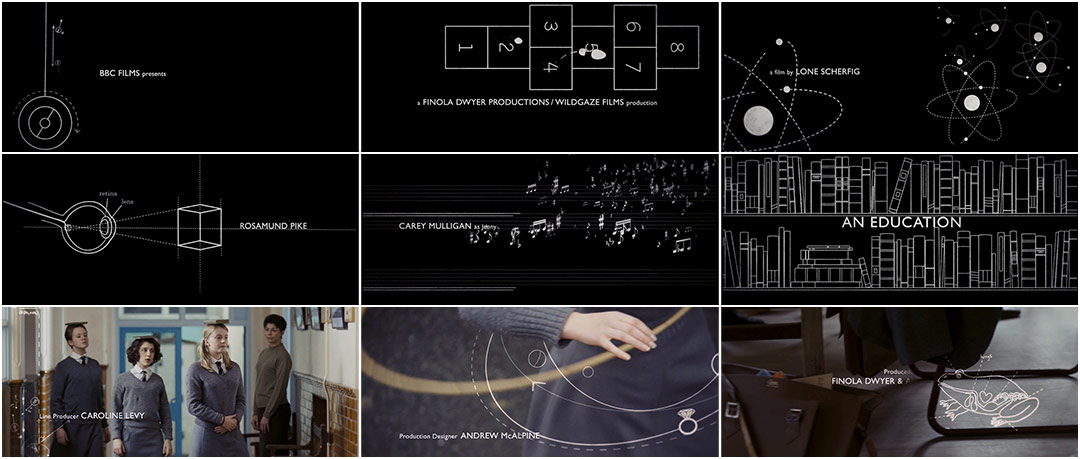
Couched in the jovial notes of Floyd Cramer’s “On The Rebound,” Momoco’s titles to Lone Scherfig’s An Education poignantly capture main character Jenny’s potential and position – right at the cusp.
Jenny’s bright eyes yearn for romance, the exotic – independence. She’ll find all of this and more, but first there’s innocence and naïve bookishness, the cajoling camaraderie of lessons and grammar school games. The simple line drawings and diagrams of the title sequence, folding, dancing, and multiplying over each other, pinpoint her purity, her play, and her longing to reach out and take hold of the world in all its sophisticated glory.
A discussion with Creative Director NIC BENNS of Momoco.
Tell us a little about Momoco.
Miki and I met at CalArts, formed Momoco in '99, and have been producing title sequences for 12 years now. We've been fortunate to collaborate with great directors and win the main titles Emmy in 2012. Our creative approach is very different and we pitch hard. People describe the studio's aesthetic as textural and organic, often quite dark. An Education is so unlike that.
Talk about your initial concepts and discussions with Director Lone Scherfig.
In 2007, we saw a rough cut of the feature which was helpful. We usually only get the script where you can miss the tone and director's interpretation. When we get the full picture, it feeds more ideas into the pitch and we can reference visual motifs that may not be on the page.
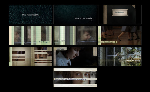
Alternative title concept pitches
The brief was sent out to studios in the US and UK and Lone had shot establishing scenes which needed cutting into a sequence. Some shots even had space consideration for type. She was open to design direction.
Miki and I researched the world of the film over two weeks, then pitched boards. We wanted the graphics to be integrated and motivated by the action somehow. We also explored transitional devices to break up the footage with graphic elements.
Our ideas were derived from school life and studying in the ’60s. Some others we had alluded stylistically to the main character's time in Paris. The direction we focussed on was based on schoolbook doodles, reflecting innocence and a world beyond that. I also explored a piece of branding that involved a tree, like a naïve, biblical tree of knowledge and an apple falling away from it. The elements of love were more overtly integrated into the schoolbook diagrams to suggest a mind wandering from the subject and also the double education of Jenny's life.
Detail the creation of the sequence for us. How did the mixture of animation and live-action come together?
We collaborated with Film Editor Barney Pilling, with whom we worked before on another feature. He would send us shots and we would animate little vignettes into them. As the music took shape, so did the sequence. There were many shots that were cut, like one that featured a cat's cradle game with type getting tangled in string.
We created diagrammatic imagery that could segue seamlessly so we persuaded the director to give us more self-contained screen time on black, on a chalkboard texture.
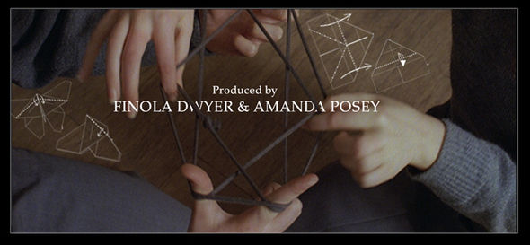
Cat's cradle game cut from the final sequence
The titles are quite playful, even though the film itself takes a slightly more serious direction as it progresses. Were you conscious of this?
We wanted to set up the sense of fun and innocence but also the restrained mundanity of school life in that pre-’60s, pre-revolution era. The typeface – Gill Sans – is institutional. In the original boards we began with the first names being institutional and the surname more slick/glamorous to convey Jenny’s duality. There's a thread of humour throughout the film, especially with Alfred Molina’s character. The darker consequences emerge later, so there was no need to create foreboding in the titles; we wanted it to feel whimsical – an idealised memory of school days. We taught Lone how to play – and cheat at! – conkers. They almost didn’t make it into the credits as she hadn't heard of the game before.
Were you able to animate to the opening music?
The music came further down the line. As the animation on black expanded, the composer had to add more bars and repeated phrases which stretched it a bit but reflected the rigorous repetition of school days.
How big was your animating team?
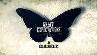
Four members including a 3D artist. We're a micro-studio and everyone we work with gets the opportunity to take part in all facets of the production. The teams are always small – on Great Expectations there were three, on 30 Days of Night there were two.
Can you talk about some challenges you encountered – either creatively, technically, or with personnel?
Well, the producers had differing ideas on shots throughout as there were layers of executives making decisions. That process is much simpler in film than TV – there’s more freedom. Creatively, the main challenge was complementing the live action. We wanted to create more interesting transitions but that would have been unnecessary and distracting from the storytelling aspects of Lone's footage, so we didn't. We often had to remove elements and simplify layers to stark diagrams.
What was the schedule like – how long did it take from the first meeting to the finished product?
Three months to online delivery – a couple of days a week.
What was the hardware and software you used to put it together?
The usual Adobe kit with C4D and toon shader. We animate and composite all titles in After Effects unless it's stereoscopic, where we use Nuke.
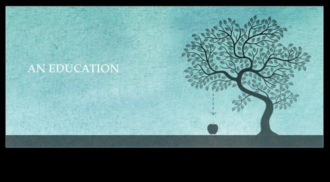
Alternative title treatment
What are some of your favourite title sequences in general, whether film or television?
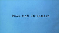
Miki likes Dead Man on Campus by Imaginary Forces, Karin Fong – great editing, graphically strong, clever type integration, and above all: humour!
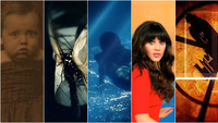
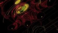
I like Seconds by Saul Bass. The sequence is created in-camera and with a distorted mirror, which is incredibly haunting on a big screen. It's an intense exploration of identity. We produced a title in 2006 for Eleventh Hour where we spent days creating an iris splitting like cells. I then saw this sequence and Bass had created a more powerful effect with flexible mirror-film. I resolved to produce a lot more titles outside of the Mac after that point – you just can't beat nature.

