Ever since they met more than a decade ago while working at studio Prologue, creative directors Aaron Becker and Simon Clowes have been looking for projects to work on together.
In the last decade, Becker has made waves with title sequences for films like The Conjuring (2013), Mission: Impossible – Rogue Nation (2015), and Split (2017). Meanwhile, Clowes has been busy creating title sequences for X-Men: First Class (2011), TV series Elementary (2012), and video game Metal Gear Solid V: The Phantom Pain (2015). In 2012 Becker co-founded Filmograph, a studio specializing in film and TV title sequence design with partner and executive producer Seth Kleinberg, and in 2018, they found themselves with the chance to land a white whale: the elusive superhero film.
Many small design teams dream of scoring a DC or Marvel gig but what do you do when you finally reel in such a big fish? For Filmograph, creating the end sequence to Aquaman meant bringing in extra hands, renting additional graphics processing units, upgrading their power and switches, boosting their software infrastructure and committing to months of painstaking production.

James Wan, second from left, directs a scene on the set of Aquaman with Amber Heard, Jason Momoa and Willem Dafoe
(Photo: Warner Bros./DC Entertainment)
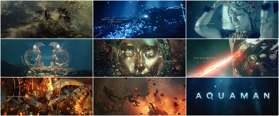
The finished sequence is a stunning departure for Filmograph and a testament to their ability to grow and adapt. It's a gorgeous travelogue that gives viewers a chance to take a deep breath and a slow dive into the various aquatic kingdoms of the film. Moving gracefully between three distinct acts – bioluminescence, gold and pearlescence, and lava – the sequence feels like a soft reminiscence and a gentle discovery of life beneath the surface. While they took inspiration from documentary-style cinematography as well as modern title designs like Game of Thrones, the team was conscious of creating something impressionistic, surreal, and truly their own.
In our interview below, we talk to Becker, Clowes, and Kleinberg about souping up to meet the demands of a new pipeline, making and breaking the rules of underwater action, and how they got that lustrous undersea look.
A discussion with Creative Directors AARON BECKER and SIMON CLOWES and Executive Producer SETH KLEINBERG.
You’ve worked with director James Wan a lot over the years. Was this your biggest project together?
Aaron: Yeah, Aquaman was a crazy thing. We have an ongoing relationship with James, since 2010. But with a film of this stature there were four or five other companies pitching on the titles. We put a lot into it and luckily our relationship with Kirk [Morri], the editor, and James and the producers helped. But it definitely felt like we had to pour even more into it.
Your first collaboration with James was for Insidious, right?
Aaron: Insidious was in 2010, that was the first film together.
—Seth KleinbergWe were just like, "It would be tragic if we didn’t at least ask if we could do Aquaman." Asking got us in the room.
Insidious (2010) main titles, designed by Filmograph
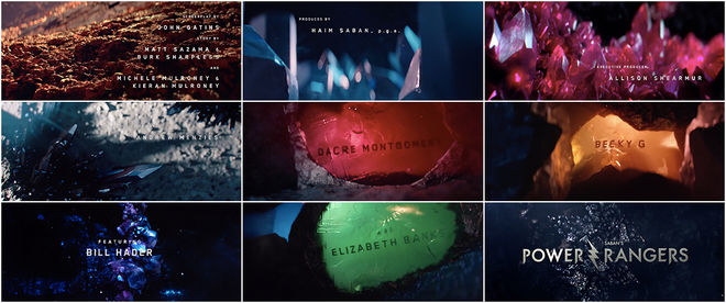
Aaron: Then there was The Conjuring and then Insidious 2, The Conjuring 2 and Furious 7. He jumps around between projects and it’s amazing to see his career transform after Saw back in 2004. A lot of opportunities have come up to collaborate and this happens to be the biggest one! To date, our largest CG projects have been Power Rangers and Aquaman.
Simon was also part of the team for the Power Rangers titles. You've known each other a long time, right?
Power Rangers (2017) main-on-end titles, designed by Filmograph
Aaron: We all met back in 2005 so working together now is a pretty cool dream come true. Simon is a great creative director for CG-heavy jobs because he’s done a lot of these projects with larger teams.
Simon: We worked together at Prologue for years. There was always a joke that we were going to work together in the future. Aaron went to Chicago for a while and then came back to LA and started working with Seth on Filmograph. We kept looking for the right project to work on. I think the first one was… what was it?
Seth: It was Wish Upon… then Power Rangers and Emerald City.
How did work on Aquaman start? Did you meet with the producers initially?
Seth: We have a shorthand with James’ team now and we were just like, It would be tragic if we didn’t at least ask if we could do Aquaman. Asking got us in the room.
Aaron: We felt really strong as a team, really well rounded. Simon is great at supervising and leading the CG process. We had a CG lead, Lee Nelson, and Patrick Vidal, the lead lighter. It’s important to mention these names outside of the credits list because of everything they contributed. This was such a tough finish in many ways.
The Brief and the Pitch
Let's talk concepts. What did they ask for and what did you pitch?
Simon: There were about six different concepts! [laughs] There was a lot in the deck.
Aaron: We had three or four boards that were internally produced and then the other three were collaborators we hired.
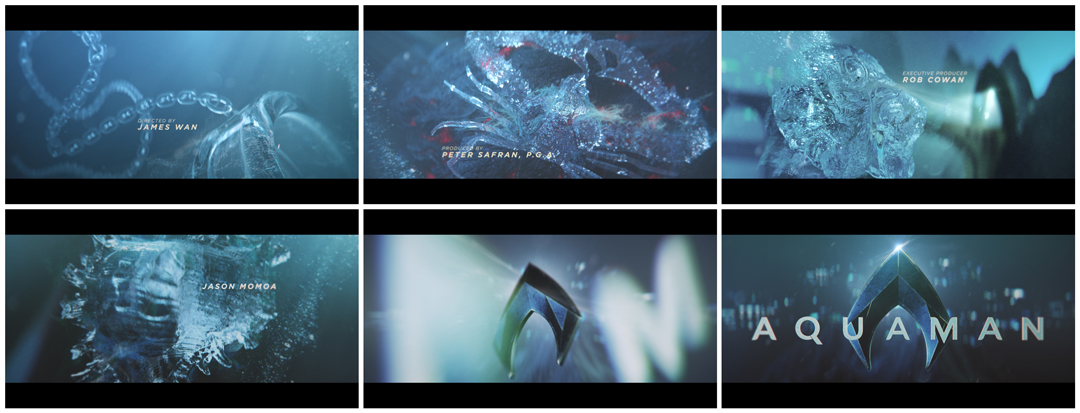
Seth: The brief was about a travelogue and revisiting the kingdoms you see in the film but not do the traditional, you know, Here’s what just happened in the movie you saw. It was important to not do that.
Pitch Concept #1
—Aaron BeckerThey wanted the opportunity to say, “This is a very rich mythology, and if the audience is on board with this wacky world, it’s limitless.”
Pitch Concept #1
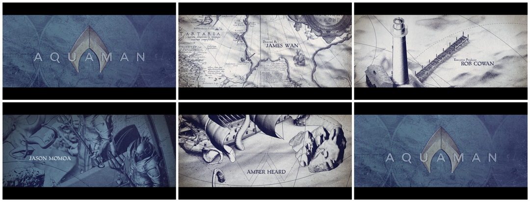
Pitch Concept #1 title card
Aaron: It needed to be a journey. Game of Thrones was important in terms of the travelogue DNA – that was part of the brief, to focus on the expansion of the kingdoms for future films. They wanted the opportunity to say, “This is a very rich mythology, and if the audience is on board with this wacky world, it’s limitless.” It was taking that idea of Atlantis the myth and saying, “It wasn’t just Atlantis. That was one of the kingdoms underwater.”
Simon had a board that he did with Lee, who ended up being the CG supervisor on the piece.
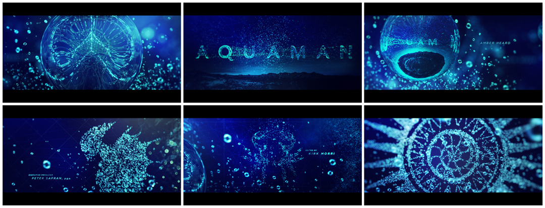
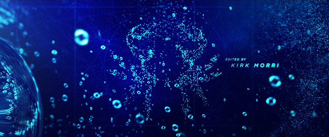
Simon: It was quite ethereal, it was all made out of particulates and underwater light particles that would make up images and then disperse and come back together to create something else.
Pitch Concept #2
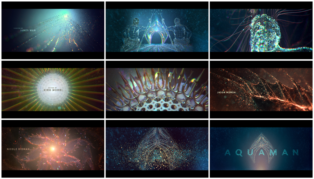
Pitch Concept #2
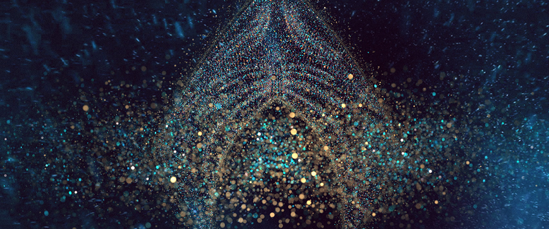
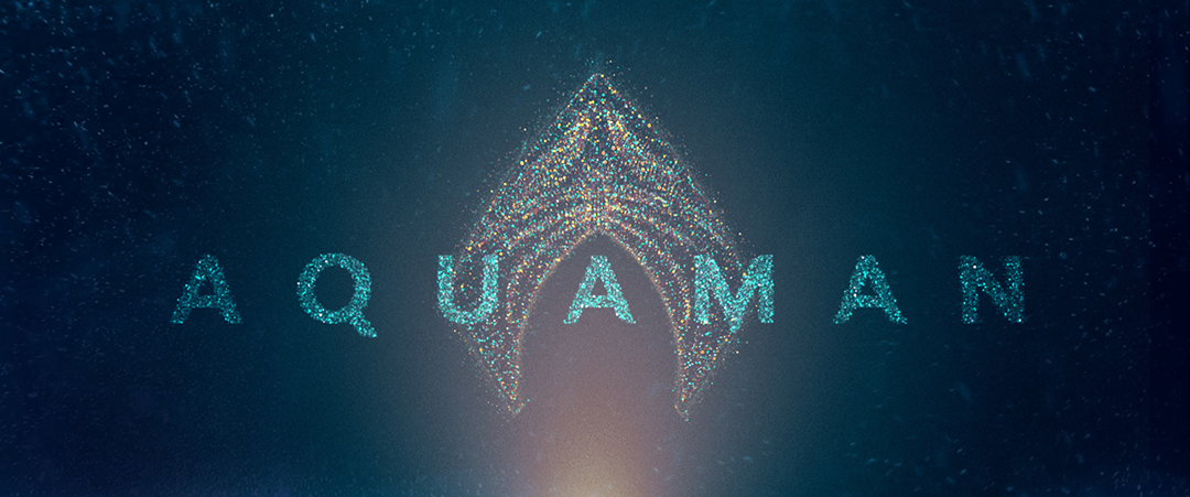
Pitch Concept #2 title card
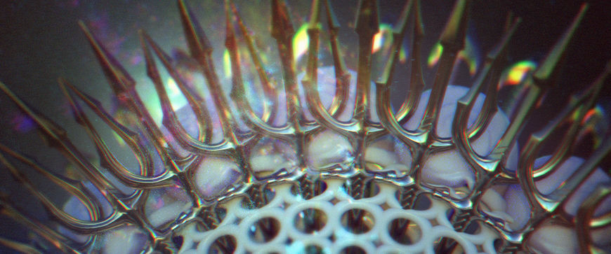
Simon: We didn’t have the budget to start modeling things from scratch. There’s a lot of transparency in that direction. I still like it.
Pitch Concept #3
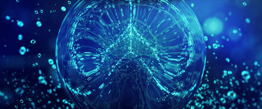
Pitch Concept #3
Pitch Concept #3 title card
Seth: You come in with all these great ideas … There was one that just didn’t make it but it was really cool. The nautical map that became 3D.
Pitch Concept #4
Pitch Concept #4
Pitch Concept #4 title card
Aaron: A lot of times they end up saying, “We like everything you did … but we don’t want to just choose one idea.”
You end up having to kind of mash them together.
Aaron: Right, that happens. So many times you come off the pitch and they don’t really decide what style they want. They want you to slowly get there because they’re not ready to commit, you know? They want you to start telling the story, slowly chipping away at the story, which is what we did in previz. Even though we didn’t have the render style down, that conversation was evolving with in-person meetings over the course of the process.
The Second Round
Simon: We went to a second round where we had to create a motion test. The boards weren’t enough to win the job; we had to go back and do a low-poly render to communicate how we can execute this stuff in motion.
Aquaman motion test 2
Previsualization of various shots, before major story changes took place
Simon: It was quite primitive at that stage. We were playing with different rendering techniques, trying to create a new look. We didn’t have any assets at that time. It was very minimal because the film VFX team was still building things and there was so much secrecy so we weren’t provided much. We thought, How can we just visually represent the Brine Kingdom or Atlantis or the Fisherman Kingdom with various objects? So we were duplicating things, as Lee likes to call it, “kit-bashing” models together.
We took [direction 3] and did the motion test from it. Even though not a lot of that technique was employed in the final, there were some tricks that we learned.
Motion test 1
Aaron: Some of those techniques are part of a look we had begun exploring years ago, too, on a previous superhero pitch for Marvel. Without getting into too many details about that, it was a heartbreaking loss for us after we had been awarded the project and then it went in a different direction.
Seth: So Aquaman was a big resurgence for us, personally. We knew we could do a big superhero film.
Do you feel that the superhero movie is a new benchmark for the title design industry? Every studio wants one?
Seth: Well, they may want one but then they don’t want them afterward!
Aaron: We’re definitely noticing a shift. I agree with Seth. Everyone wants one but then once they have it, you’re not sure you want to do it forever. DC were really fair with us and I can’t say enough about them as an organization. Their post-production supervisor, Josh Levinson, was amazing.
Is that just because DC hired you and Marvel didn’t?
[everyone laughs]
Aaron: For a while, Marvel was our goal and we did go through that process though, yes, DC gave us the opportunity! The tone of what DC is doing gets me a little more excited. The Aquaman film, visually, looks really unique. I’ve never seen a movie that’s completely underwater like this, with its action scenes.
Previsualization of various shots from mid-way through the project
Previsualization of various shots from later in the project
The Look and the Rules
Seth: We didn’t want to compete with the film’s visual effects. We wanted to have something more surreal, frozen in time. We had rules. We couldn’t have it be underwater and animated the whole time. We had to figure out how to evoke “underwater” with frozen bubbles and dust motes. There’s two or three moments of animation, but the main rule was that it would be frozen in time, which you get through Simon’s colour correction and the particulates. That tells you it’s underwater.
Simon, what research did you do to understand and create the underwater look?
Simon: I was looking at some recent documentaries. Treasures from the Wreck of the Unbelievable… It was a Damien Hirst documentary. A lot of that was filmed quite raw under the water. I didn’t try to research something that was a visual effects take on underwater. Documentary allowed me to see how the light would actually react versus an interpretation of what light would do down below.
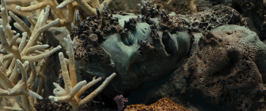
IMAGE SET: Stills from the 2017 film Treasures from the Wreck of the Unbelievable, featuring "treasures" created by artist Damien Hirst
Seth: In the first third of us developing this animatic, we came up with the rule that it would be divided into three acts: bioluminescence, pearl and gold iridescence, and lava. After the dive by the lighthouse, we tried to maintain that rule, to stay within these three worlds. Not only from a story perspective but also to help the production.
Act 1: Bioluminescence
Walk me through the three acts. We start with the dive down and bioluminescence…
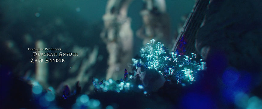
Simon: There are little bioluminescent orbs. We didn’t want to copy what was in the movie, ’cause obviously we had some reference of plant life that they were doing, but we were trying to do our own abstract version of that.
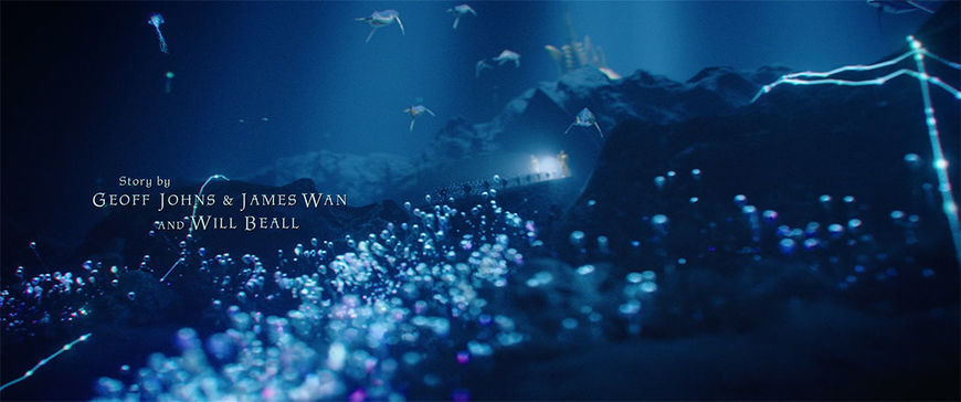
Simon: Some of the bioluminescent stuff just wasn’t possible to do in Maya. The sheer mass of all of those little bioluminescent bulbs on the ground and also instancing on the bridge where you have all the ships...
Seth: We employed Houdini on that.
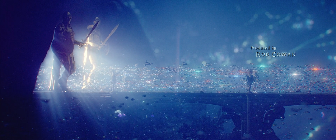
Simon: Yeah, we had to use Houdini which is always a risk because you never see anything right until the last minute.
[everyone laughs]
Seth: That’s so true.
Simon: It was all about trust! One of the tasks also was that in each act there would be a map but we didn’t want an obvious illustrated map on the ground. So how could we communicate a map with bioluminescence, and how could we communicate that in gold or porcelain?
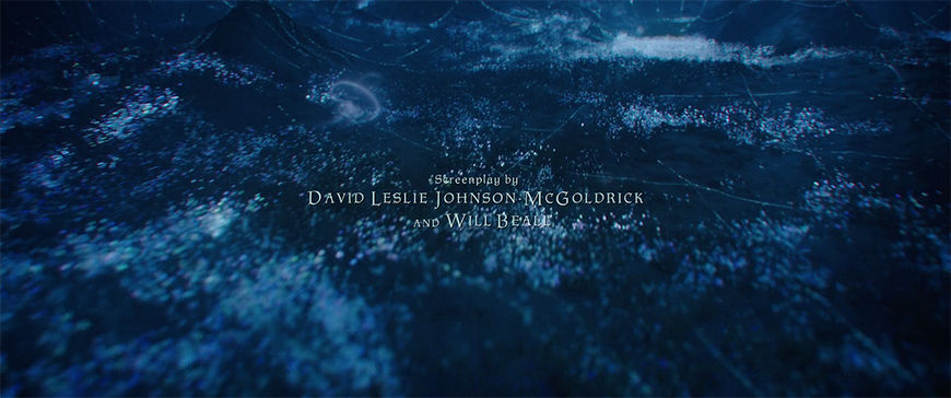
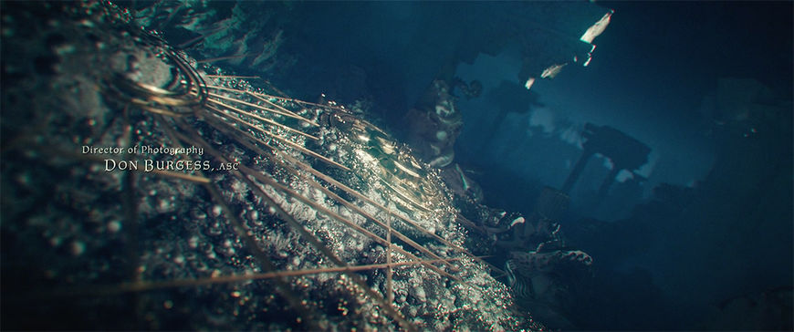
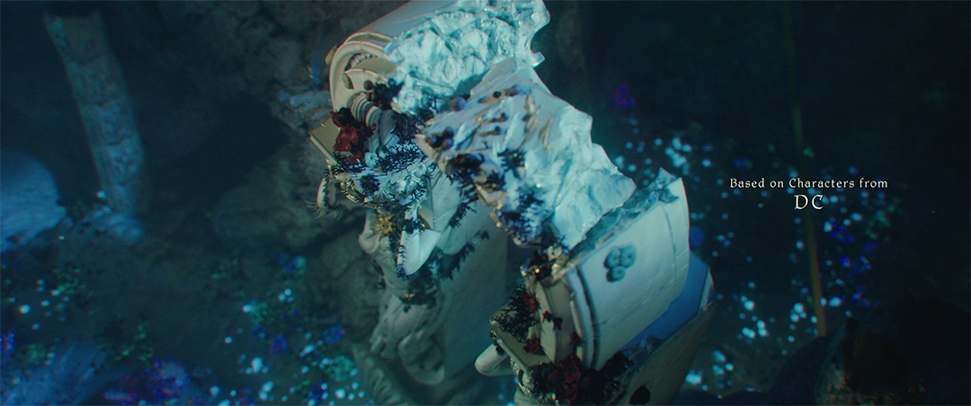
Aaron: Those compass roses were embedded into the geo, to look like they had aged over many years at the bottom of Atlantis. In the film, the modern Atlantis is futuristic, with electricity and lots of life, and that’s been built on top of the old Atlantis. At 30 or 40 seconds in, you’ll notice that we get to the antiquity part where everything crumbled and fell to the ground. You can see some of those relics and older sculptures that have crumbled.
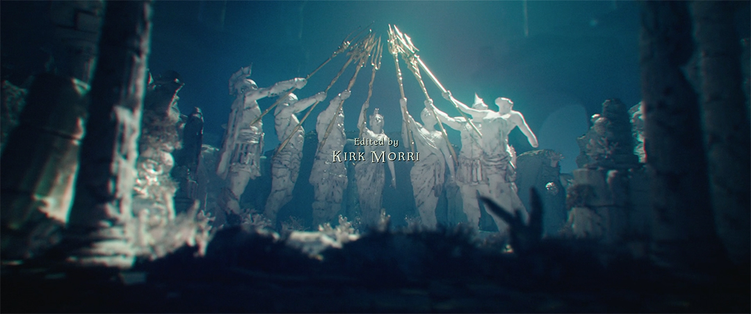
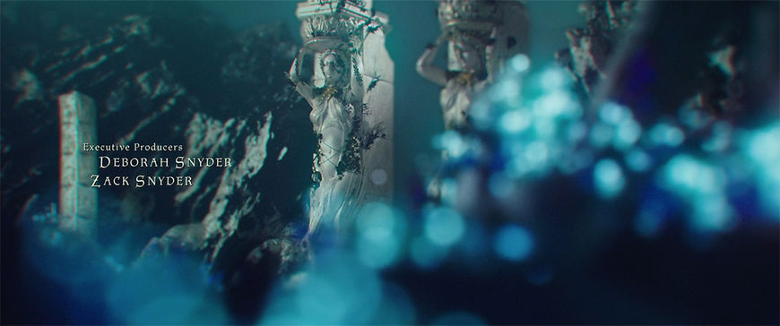
Seth: There are whole kingdoms that don’t get visited in the movie, too. They’re not represented other than in those statues in that moment at 00:50 or so. When we watched the early clips of the film, we saw that they were using jellyfish as light sources and organic elements to light the scene, and that plays back to the bioluminescence and what we included on the seafloor.
What assets did you get from the film? I assume the logotype was handed to you?
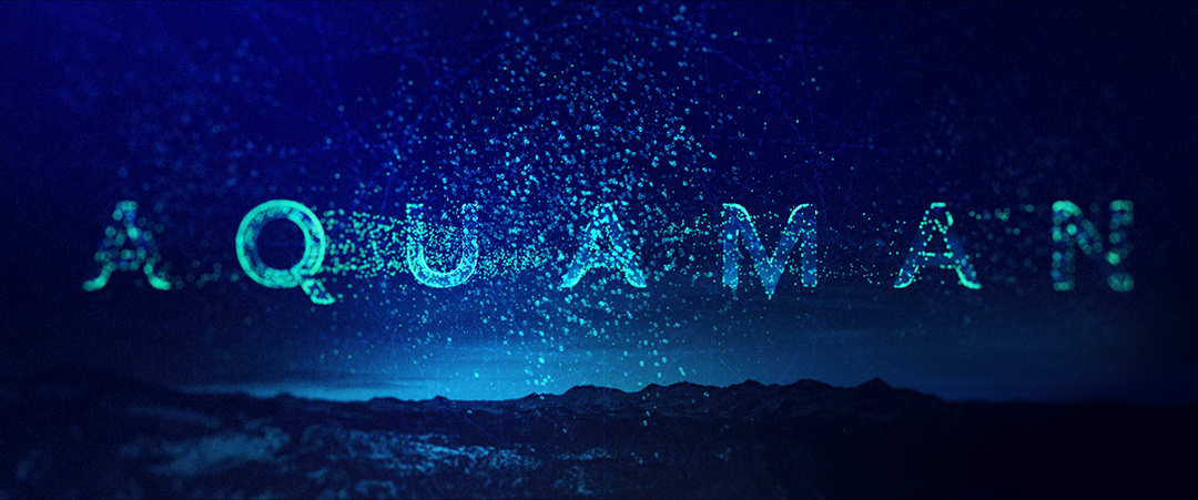
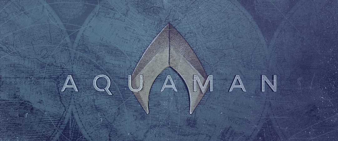
Aaron: If you look at the marketing “Aquaman” and ours, it’s slightly different. We made a couple of improvements, in our opinion.
Seth: It was already decided that ILM would do the title in reel one where it was built out of fish, so we knew that wasn’t on the table. We just had to reprise that at the end. We got a lot of assets that got shaped and chiseled over here. Any compass, we designed ourselves. All the landscape is ours. The rock.
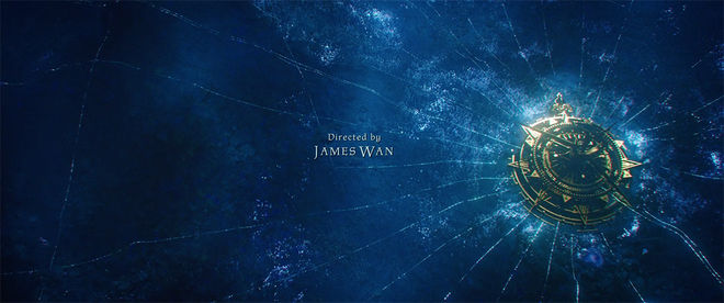
Aaron: Right, all the compasses and the terrain. Natural elements were all created by us. We got the basics from them. We got a face scan of Mera. There wasn’t the luxury of waiting for the actual assets.
Simon: I also just want to point out something. There’s a couple of moments where we transitioned elements across shots. The overhead shot around 00:38 when we’re looking down on the archway, we wanted to carry through some of that bioluminescence from the Atlantis area so it’s not just a hard stop. We’re still reminded of a bit of it and then it transitions out.
Act 2: Pearl and Gold
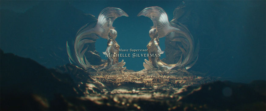
After bioluminescence, we’re into the pearlescent statues. When it pulls out, there’s those twin mermaids. Tell me about those and the sculptures.
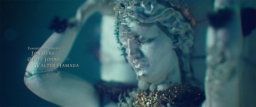
Seth: Eric Keller, he modelled the twins under Michelle Silverman’s card. That’s an original asset for us. They represent the Fisherman Kingdom.
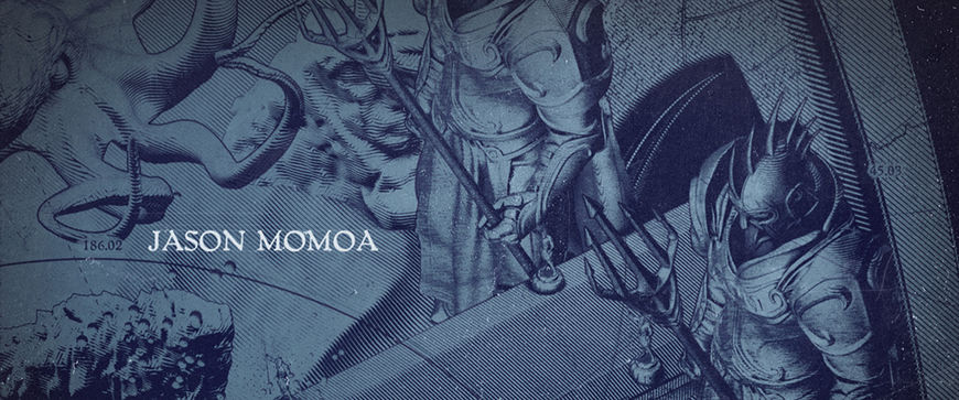
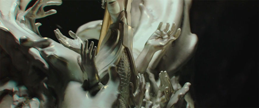
Seth: The idea of the hands all reaching for the trident, that was from Simon, under Jason Momoa's card. That’s an original sculpture by us.
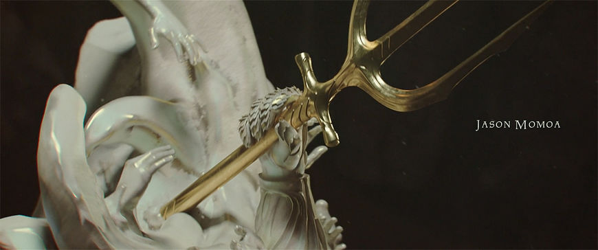
Simon: We didn’t initially have moments that related back to the actors. The cards for the credits were over terrain or something abstract but we then needed to pivot to create moments that represented each character, which was a little painful at the time. [laughs]
Aaron: Very painful. That was challenging. We had previz that we were excited about, that we thought was meeting the brief. They said, “We know we asked for maps and a journey but we need to find a way to build in heroic moments for each of the main characters.” Up until that point we hadn’t talked about showing face scans of the characters or anything like that.
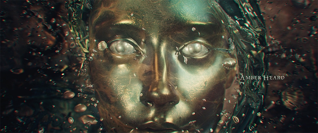
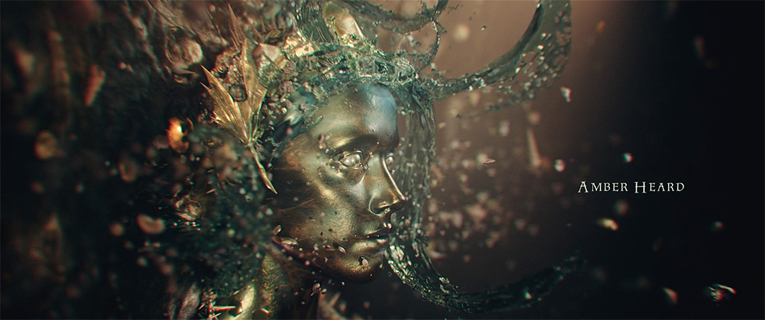
Aaron: Luckily, we were allowed to extrapolate. It got pared back in terms of how far we travel but you still get a sense of the various kingdoms.
Seth: The hero shot of Patrick Wilson’s card will always be so beautiful.
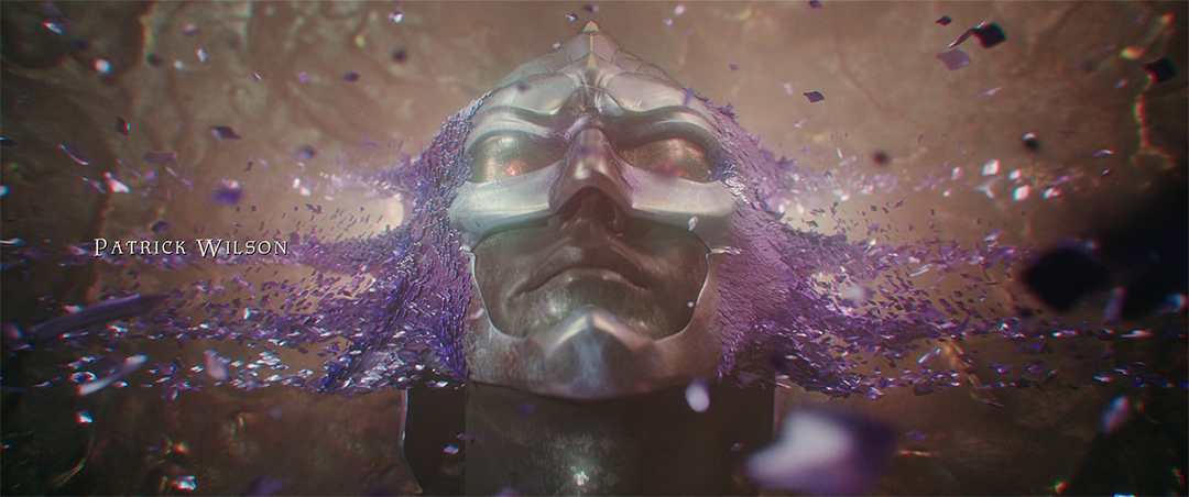
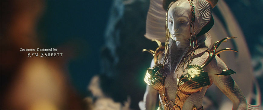
Aaron: I agree. The pearl shading… The evolution of that and how it looks with the gold was something that I really liked. There’s a strange cleanliness that happens when you mix white and gold. It was a very regal way of saying, These people are rulers of these kingdoms. It made it feel epic without making it look exactly like the movie. When title designers try to do that or promise that to a filmmaker, they’re not only doing themselves a disservice but they’re also doing a disservice to the film.
Simon: I was really happy with the Garden of Pearl around 00:36 seconds in, with the twin statues. I wanted to try and reference the Tales of the Wreckage. I thought there were a lot of beautiful monuments in that film, the way that the gold sits with the pearl and you can make it feel aged but still clean… the coral that’s growing on the side of the face. That worked well.
Act 3: Lava
After the 2-minute mark, we move into the battle and lava section. Tell me about that.
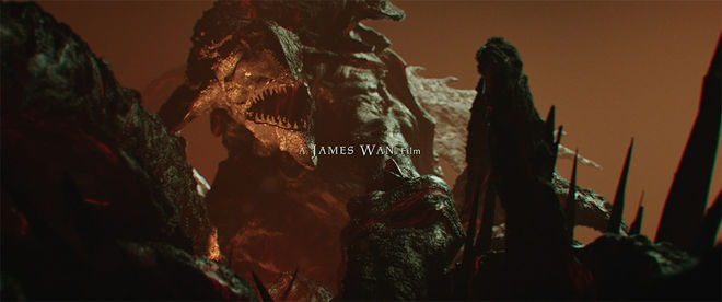
Aaron: There was no way to capture the scope of the battle scene at the end of the film, so we tried to mirror the arc of the story. We represented it in a chess-piece kind of way. We assembled little sculptural sharks and we took it into the Brine Kingdom, where the lava is. That’s where the epic battle happens where Jason Momoa’s character becomes ruler of all the kingdoms. That’s why toward the end of the sequence we go violent and we warm everything up. It is just the most epic visuals that we could end on.
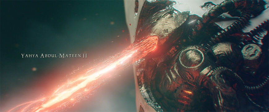
It’s interesting because it’s basically all frozen except for this flare that is falling through...
Aaron: It’s funny you say that. Seth is very rule-oriented and Simon and I had to basically say, “No, you have to understand the sequence is better because of the motion! Imagine playing Monopoly but not being able to move the pieces!”
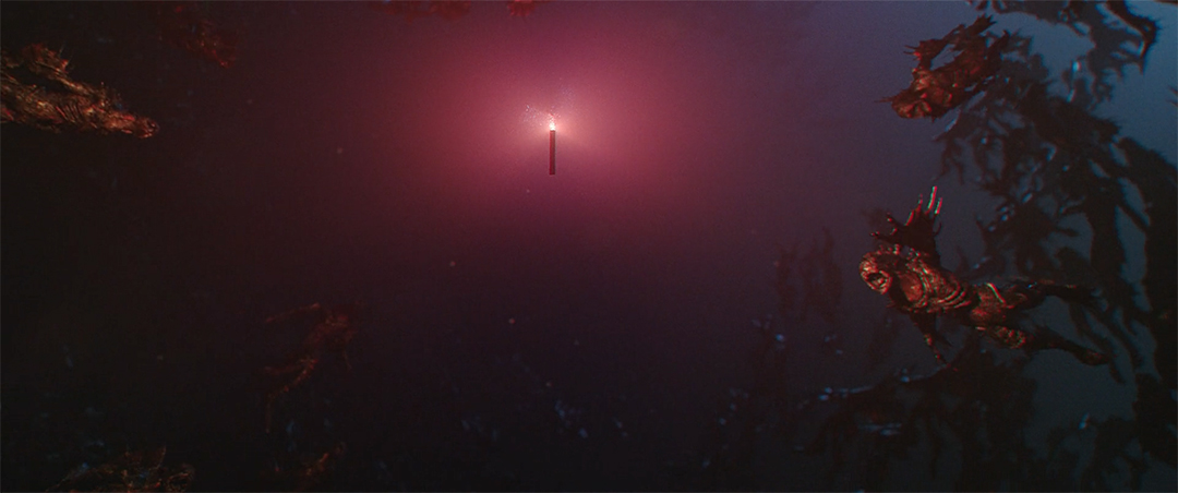
Motion test for a shot from the Brine Kingdom section of the sequence, transitioning from Houdini to Maya
Right, you need to break the rules a little to give it some energy.
Seth: Yeah. There’s the lighthouse, the deep dive water is animated, the flare… there’s dustmotes. There’s animated heat shimmer in one shot.
Simon: I really like the Brine section. We were trying to create the battle scene in our own interpretation. Around 2:08, 2:10, with all of those sharks that we fly through, that shot was done after everything. We had pretty much delivered and spent all our adrenaline getting this out the door and then last minute we had to change that shot.
—Simon ClowesSometimes the magic happens when you’re under pressure and you have to think really quickly. Now that’s one of my favourite shots.
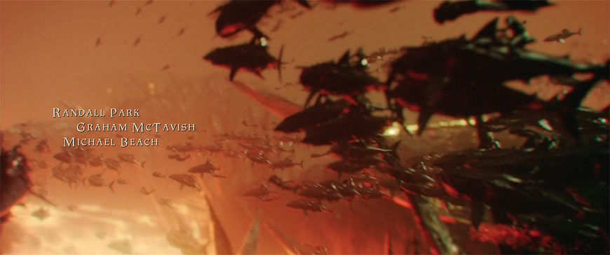
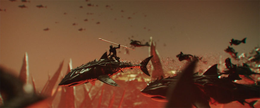
Seth: It needed to be more dense. They wanted to see more objects.
Simon: We had to do that with a skeleton crew. I wasn’t happy with what was there before. Sometimes the magic happens when you’re under pressure and you have to think really quickly. Now that’s one of my favourite shots.
Simon: The other shot that was also Houdini is the explosion at the end, the second-to-last few shots of the sequence. It could be possible in Maya but to get the level of details in the bubbles and the way the fire was reacting, we needed Houdini. We worked with Troy Barsness who graciously gave us some time at the end of his dayjob to work on this.

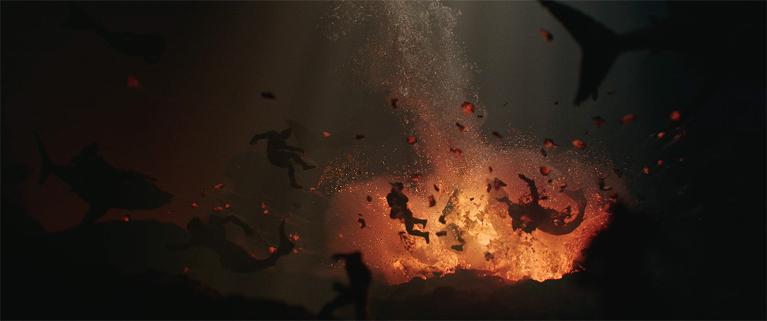
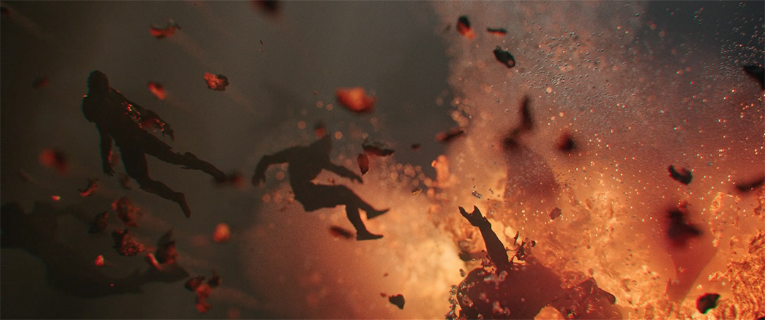
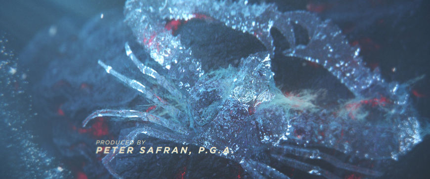
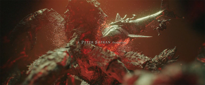
Simon: You might see in some of these shots – where we could afford it, specifically in the Brine section at the back with the more golden rocky stuff – you’ll see we have these bubble trails, like in Peter Safran’s card. We had a bubble guy. [laughs] And he just sat there and made these bubble trails. That helped save some of these shots because you really get the feeling of motion even though it’s a still render.
You mentioned that you were essentially setting up this world and hinting at other worlds for the future. Are there any Easter eggs in this, things that you put in that people don’t notice right away? Or should I say: oyster eggs?
[everyone groans]
Aaron: Noooo! You’re gonna have to write that one down.
Seth: I think there’s nothing hidden. Unless Simon hid something?
Simon: Nah. [laughs] We weren’t trying to do that.
Aaron: This isn’t in the title sequence but apparently the Annabelle doll is in the film, at the bottom of the sea! James had that put in.
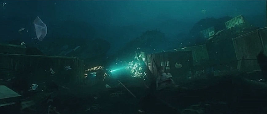
A still from Aquaman featuring an easter egg of the doll Annabelle from The Conjuring (2010)
Timelines and Pipelines
All in all, how long were you in production for?
Aaron: The pitch happened in February 2018 and it didn’t get completed until end of October. It was ten weeks of devoted production.
Seth: In the last two weeks we had to take every element we made and dissect it. The hard drive was five terabytes when we sent it to the 3D conversion company.
Aaron: It was really cool to see it in 3D, how they post-converted it. It’s a relief to not have to do that ourselves.
What did you have to do as a studio to soup up and meet the demands of this pipeline?
Simon: The first thing is software. You’re not using Maya Redshift every day, so it was a software infrastructure increase. Also we got to a point where, close to certain delivery milestones, the power and switches also had to be upgraded.
Seth: Yeah, we had some growing pains but we utilized cloud rendering when we could and since Redshift’s a GPU-based renderer, we rented additional GPUs. Aquaman was essentially taking up the entire upstairs of our office but now you can rent software on a monthly basis so it’s not like you’re taking a huge financial hit by saying, “Oh, I need ten seats of Maya.” Being able to rent Maya on a monthly basis was really clutch for us. We could get four GPUs in a box to significantly speed up rendering. We have monthly subscriptions to Substance. We’re predominantly Mac infrastructure and while you can do Redshift on a Mac with some hackery, we knew we would have to build out a heterogeneous infrastructure with PCs so the PCs would have to be able to access our Mac network and render to it. There were a few bottlenecks but it got worked out.
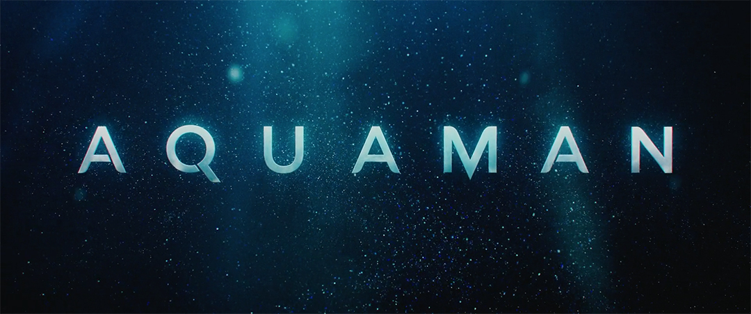
Aaron: And then for the finish – for the editing and colour that Simon did – that was on a Mac. For the Aquaman title card, that transition was Cinema 4D and AfterEffects.
Seth: By our frequent collaborator Takayuki Sato.
It’s nice to see how James Wan is obviously such a huge fan of title sequences. He’s used them in his films since day one.
Aaron: He cares about every inch of his films. On The Conjuring 2’s end titles, for example, he went back and forth with us forever about stills that were flash-framing! We carefully crafted and made adjustments to stills that were on screen for one frame just to scare people. He obsessed about what exactly needed to be changed up until the last minute.
When it’s your art, it’s your art.
Aaron: Yup! He takes that level of care.
Seth: We love working with him. We are so grateful to have been included and this film meant so much to us.
