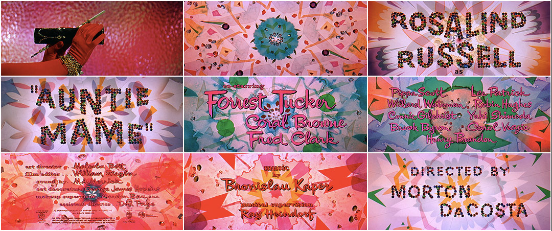
With Auntie Mame, we present to you, our readers, the art of the title sequins.
Auntie Mame, a bon vivant expertly captured in a tour-de-force performance by Rosalind Russell, revels in the beauty of her time through her eccentric parties, extravagant decorating, and endless travels, bringing disparate characters together in light and love, and so her title sequence must follow suit. First, the Warner Bros. logo on pink glass like strawberry skin. The red velvet hands, the cigarette holder, and that little cylinder, all decked in jewels, coming together to introduce a vortex of color. The kaleidoscope envelops us in a swirl of vibrant, shifting shards of painted glass as a piece from Bronislau Kaper’s elegant score plays and glittering sequins and gems gather to form several of the credits.
This spectacular sequence does much to set the stage for director Morton DaCosta’s 1958 film adaptation of the popular play, itself based on the bestselling novel by Patrick Dennis. Unabashedly ostentatious and delightfully unusual, it remains to this day a vivid and joyful piece of title design. Auntie Mame would expect nothing less.
Main title designer WAYNE FITZGERALD discusses the creation of the Auntie Mame opening title sequence and revisits his time at Pacific Title and Art.
What was it like, designing titles in the late ’50s, and designing the Auntie Mame titles specifically?
Jack Leonard "J. L." Warner was a film executive and the president and driving force behind the Warner Bros. Studios in Hollywood, Los Angeles, California. Warner's career spanned some 45 years until he retired in 1969, its duration surpassing that of any other of the seminal Hollywood studio moguls.
Read more about Jack Warner.
In general, it was still a studio time, when the studio heads ran all the details, whereas later, and now, you basically work with the director and the editor and so on. But in those days, you worked with the head of the studio. So the Auntie Mame titles reflect something of the personality of Jack Warner, which was not all great, but not all bad. It's a very early, very different title, though. Titles had pretty much become by rote and were not very creative in a lot of ways. And part of that was because whoever was running the studio had their taste and Jack Warner had his. I was relatively new at the business. I had been in it since about '52 and spent, you know, three or four years in the art department doing all sorts of things. Just shop boys, we were. I was ultimately trying to change the way titles were done and bring some creativity to it. We were still limited by the taste of those in charge and the technology. I did the Lucille Ball one too and I know that's much later.
So, for Auntie Mame, I remember it because it was out of the ordinary and we shot something on the stage. I was shown the movie and it was decided that it really needed something colorful up in the beginning – a very colorful design but sort of abstract – because Mame was a colorful character. That's the best we could do in this sort of abstract form – just make it very colorful. And so it was a matter of how to do it. I can't remember exactly how we came up with the cigarette holder but the point was to get it to the kaleidoscope. I drew sketches. I thought on them, then I went to show them to Warner. He OKs it or he doesn't OK it. If he OKs it, then it's good as gold ’cause whatever he said, goes. The concept worked out fine, you know, the hands and the cigarette holder and the kaleidoscope to set up some elegance.
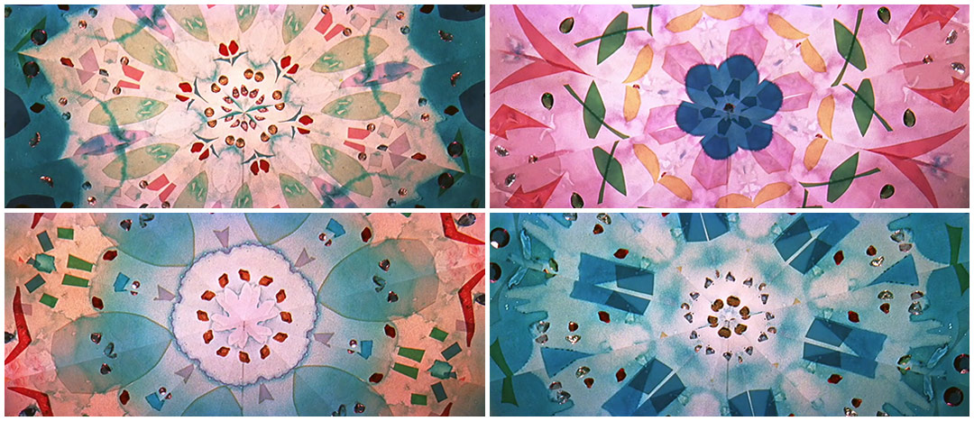
Kaleidoscope background plate examples
That concept – going into the kaleidoscope and the way the names appeared – was that Warner’s direction or did you come up with that concept?
No, I came up with that concept. But you had to clear everything through him – you would just work directly with him. Other than the type size and color, I was happy with the idea. It worked conceptually and in those days we put all the titles on the head end.
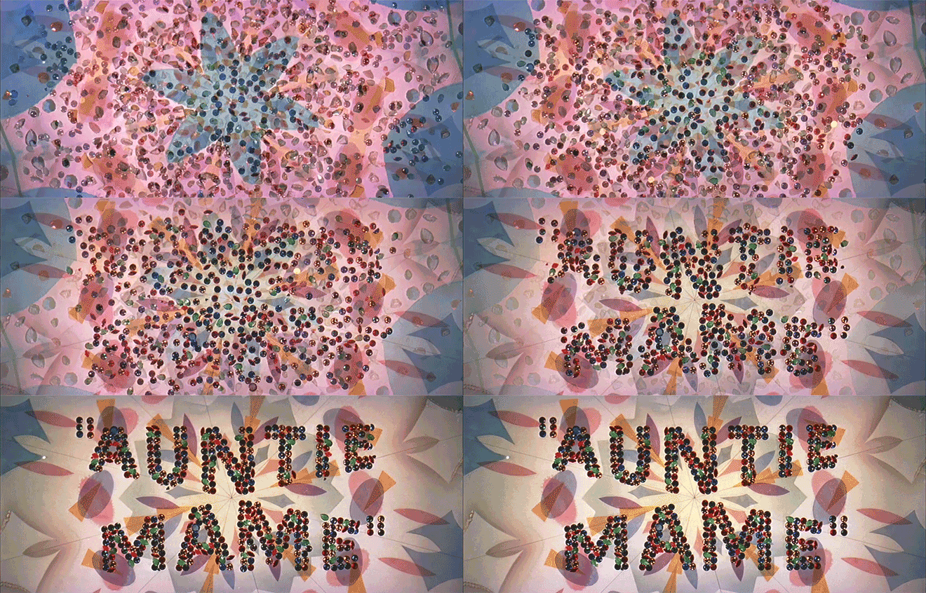
Auntie Mame title card
Originally, in the '40s anyway, titles were very simple and they were very short, because there may be only ten or fifteen people getting credit. But by the '50s, they were beginning to get up to 24 and 25 and most things, of course, were terribly boring and the audience went and got their popcorn while the credits were on. Things were beginning to change but it took a while.
So, how many people would work on a sequence like Auntie Mame?
At the time, there were probably about 30 people who worked at Pacific Title. Of that, I think half of them were title artists, since everything was hand-lettered.
Was Auntie Mame’s pink type hand-drawn on glass plates?
I don't remember exactly how that worked; they either had it on a card or in a black shot optical unit or they did it on glass and shot it from a back light. They could introduce color by shooting black and white units and putting the color in optically.
Mostly the artists were lettering it [at the time]. Then there were people who did illustration and background. But everybody did a little bit of everything. Then it went to the camera department. Then to the optical department to be composited. Unless it was shot original – originally in the camera – but that was relatively unusual. I suspect this type was shot and optically put on, not on glass.
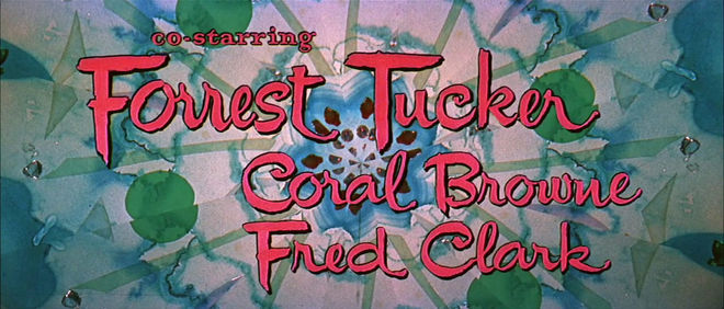
Hand lettering example
So something like the changing kaleidoscope backgrounds, was that animated on an animation stand, frame by frame?
A lathe bed is similar to an animation stand, which is a device assembled for the filming of any kind of animation that is placed on a flat surface, including cel animation, graphic animation, clay animation, and silhouette animation.
Yeah. Well, we shot that on a lathe bed. But basically, it was shot at Pacific Title one way or another and then optically composited.
Let’s talk about the typography itself. There’s the actors' names and the main title in a kind of stop-motion animation of what look to be sequins, and also the pink lettering with the drop shadow for the cast and crew.
That's what it was supposed to be, yes. The sequins came down and formed “Morton Da Costa.” It went Da Costa and the main title and then "Directed By," which was Da Costa again.
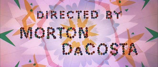
The sequin-based title for Director Morton DaCosta.
The title itself, the type and so on, is a disaster! [laughs] Jack Warner wanted titles to be big! And his comment was, “I'm paying those actors all that money, I want to see their names up there big!” Which was OK by the actors, but it sure as hell looked awful on the screen, let's put it that way! So the title sequence works, as far as I'm concerned, but it's got this disastrous lettering. I'm talking about the type style itself and the size and the readability of it. It's very frustrating to look at it even today. Every time I look at that title, I cringe because of the color and the unreadability of it. If it's going to be there, you might as well be able to read it! But that's the way it was, generally speaking. You had to work through that, work around it.
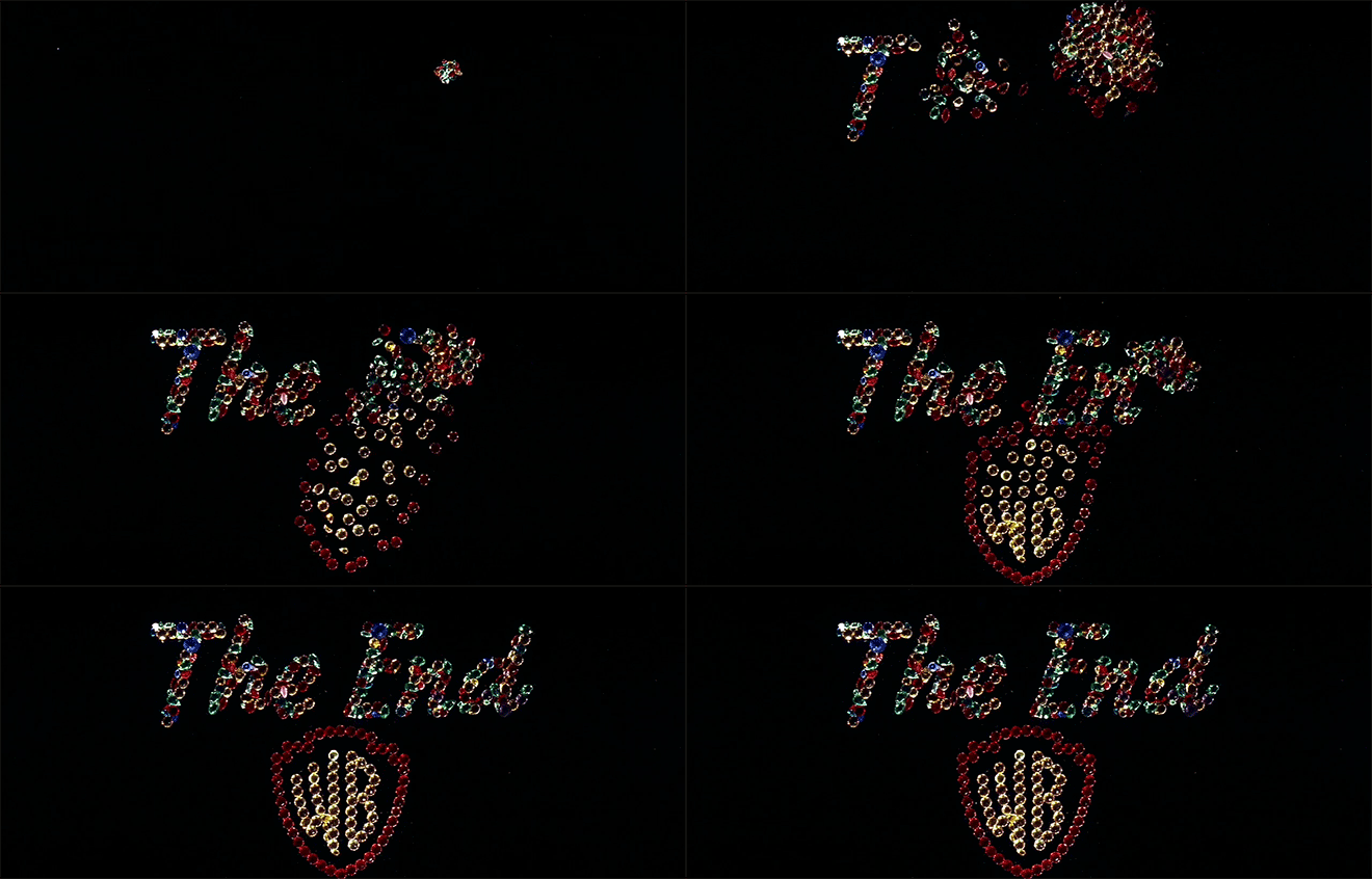
SUPPLEMENTAL: End title card

