“Let’s not be shy to say it,” says Christian Buss, Der Spiegel’s cultural critic, about TV show Babylon Berlin. “[Germans] are big again — as the world champions of angst.”
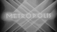
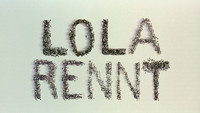
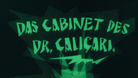
If the spending behind Babylon Berlin is any indication, German angst is indeed big again. Created by Tom Tykwer (Run Lola Run), Henk Handloegten, and Achim von Borries, it had a budget of €55 million, making it the most expensive TV series ever produced in Germany. The series, which was picked up by Netflix and debuted in 2018 in the United States, Canada, and Australia, takes place towards the end of the Golden Twenties of the Weimar Republic. It taps into growing international interest for depictions of German history and the rise of Nazism, deftly exploring the anxieties swirling through many cultures today. Hailed by critics as dazzling and dynamic, the 16-part series has been likened to the “German angst cinema” of the 1920s including silent film classics The Cabinet of Dr. Caligari (1920) and Metropolis (1927), both of which feature landmark title sequences.
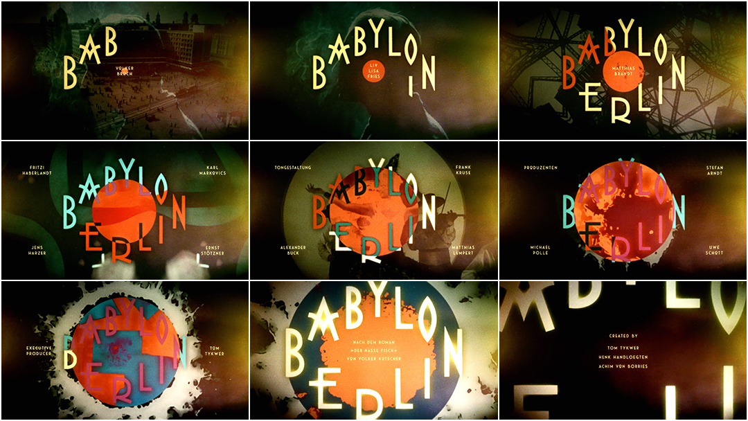
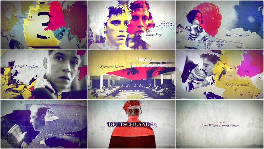
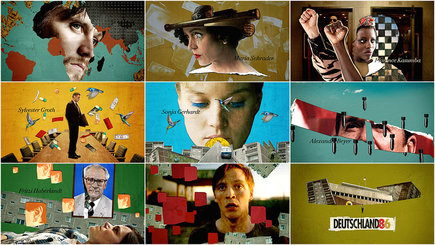
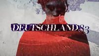
This angst is front and center in the show’s vibrant, hypnotic, and Art Deco-infused opening. The sequence, created by designer Saskia Marka, was named Art of the Title's number one title sequence of 2018 and was one of the finalists in the 2019 SXSW Title Design Competition. Marka created a “seething energetic fireball” of bold colour, typography, and tension, everything moving ceaselessly forward like a ticking clock. The theme composed by Johnny Klimek and Tom Tykwer serves the same function, the notes speeding up and climbing to a higher register; a kettle about to blow. Marka, who also designed the openings to Deutschland 83 (2015) and its successor Deutschland 86 (2018), wanted to depict a Berlin that is always in motion, always changing, and dangerous. “Nothing is ever safe,” she says, and we feel it.
A discussion with Babylon Berlin title designer SASKIA MARKA.
Congratulations on your work for Babylon Berlin! It was named number one in Art of the Title’s Top 10 Title Sequences of 2018 and it was a finalist at SXSW this year.
SM: Thank you! I still can’t believe this. This is a dream come true, seriously. You and other people from America are coming to me and are interested in my work but in Germany, no one is interested in title design! When it gets on the air, everyone talks about the show but no one ever talks about the titles. Almost never. You’re always doing your best and giving your best and no one seems to care, as if it’s not there.
You’ve been doing a lot of amazing work, especially for German productions.
SM: Thank you.
Deutschland 83 (2015) main titles, designed by Saskia Marka
The title sequences for Deutschland 83 and Deutschland 86 particularly stand out.
SM: I was very lucky that I got the Deutschland 83 title sequence because they already had one for German TV. But Anna LeVine, one of the showrunners, didn’t like it. She came up to me and we started this job from no concept to delivery. I had six weeks! But in the end I think it turned out pretty nice and the show was a success. That opened the doors for me, for Babylon Berlin. I’m also very happy that they came back to me for Deutschland 86.
For Deutschland 83, they already had a sequence for the German market but they wanted a new one for the international version? Does that happen a lot?
SM: No, actually not. I think it was an exception that Anna wanted a new one. She saw one of my title sequences at a movie premiere and then came to me and asked if I could do it. I said of course I would love to do it! She made it possible. She can make anything possible.
Deutschland 86 (2018) main titles, designed by Saskia Marka
So how did you get into designing title sequences? Give us a little background.
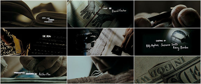
SM: Actually, I knew pretty soon I wanted to be a title designer. I love movies and I think a title sequence can set the tone for what to expect and get the audience into the right mood. When I studied design I realized there has to be more than putting print layouts together. At that time, the movie Se7en came out and I was really hooked. Kyle Cooper and Imaginary Forces and all those US studios just became my role models. I started to learn After Effects by myself.
Se7en (1995) main titles, designed by Kyle Cooper and R/Greenberg Associates West, Inc.
Wow, Se7en really inspired you.
SM: Very classic, isn’t it? [laughs] Yeah. It did. Of course there were others before, Saul Bass and all that, but you can’t compare that. Se7en was really killing me. It was crazy. At that time there were no classes or even the phrase “motion design” in Germany. I loved New York so I went there with some of my work and knocked on the doors of Balsmeyer & Everett and R/Greenberg and you name it! But I didn’t even get one foot in the door. I had no references. That was 20 years ago, in 1999.
You went to the offices of R/Greenberg and B & E?
SM: Yeah, I just couldn’t get an appointment! [laughs] I was young and dumb, I would say. After that, I went to Filmakademie Baden-Württemberg to study motion design. It was called “TV and Film Design” at the time. That’s where I learned a lot about filmmaking, also. That was the stepping stone for my first projects and also a great network for filmmakers in Germany.
Do you have favourite German title sequences in film or TV?
SM: The only one I can think of is a classic from the ’70s that’s been repeated to death in Germany. The titles for the crime series Tatort. It’s timeless and it still gives the series its unique face. They always put it in front of the show and it has nothing to do with anything but still it’s beautiful.
Tatort (1970– ) main titles
SM: It’s very reduced… very timeless. I also like the music, how it fits together. It’s hard to explain what it’s about because it’s very associative.
On that note, let’s talk a bit about Babylon Berlin. How did this project come to you?
SM: I had worked for one of the production companies before and they invited me to pitch, among others. I don’t know who else was pitching. My first meeting was a brainstorming session with one of the directors, Henk Handloegten. We didn’t talk that much about the show itself. I had read their screenplays and they had shown me a first trailer of the footage. He was telling me about the Absolute film movement and movies from the 1920s, that something surreal might be right. He mentioned the movie Secrets of a Soul, 1926. In German the name is Geheimnisse einer Seele.
Clip from Secrets of a Soul (Geheimnisse einer Seele) (1926)
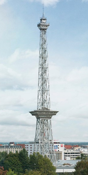
The Berliner Funkturm or Funkturm Berlin (Berlin Radio Tower), constructed between 1924 and 1926, is a former broadcasting tower in Berlin, Germany.
SM: He liked the appearance of the massive steel of the Berliner Funkturm that was a monument built at that time. It was just first thoughts, like collecting images and moods. But I remember the key word was “hypnotic.” That the title sequence should be hypnotic was very important to them. Then he played me music for the titles that was already composed by Tom Tykwer and Johnny Klimek that was hypnotic by nature. I really love the score. If you have great music that already sets the tone it makes it so much easier to come up with ideas. For the briefing, the music was settled and the directors knew they wanted to use the abstract Opus sequences from 1921 to be the underlay of the end credits.
End titles of Babylon Berlin episode 1, featuring original footage from the Opus films created between 1921–1925 by Walter Ruttmann
SM: They’re from the German Absolute film movement. It’s original footage. They weren’t sure they were going to get the rights for it but they did. That’s what they always wanted – those abstract forms, different ones for each episode. Over it we would run the typography.
Did you present a number of directions for the opening?
SM: Yeah. I wanted a visual connection to this Absolute film movement because the abstract forms in motion are really like moving paintings, just timeless. I really liked that and I wanted to refer to that. I developed two different concepts for my presentation. The first one was a clip that picked up on the idea to use footage of Walter Ruttmann. Because those Opus sequences would be in the end titles. So I took the film about Berlin, Die Sinfonie der Großstadt by Walter Ruttmann, and distorted and edited it like they did in the ’20s. I put on prism and kaleidoscope effects, multiple mirror effects, and so on. With the music it develops its own energy, it feels surreal and true at the same time. It gives room to find your own interpretation. In terms of typography I chose something very clean and simple which is also referring to the style of the absolute film movement.
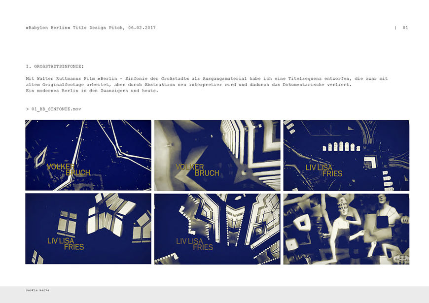
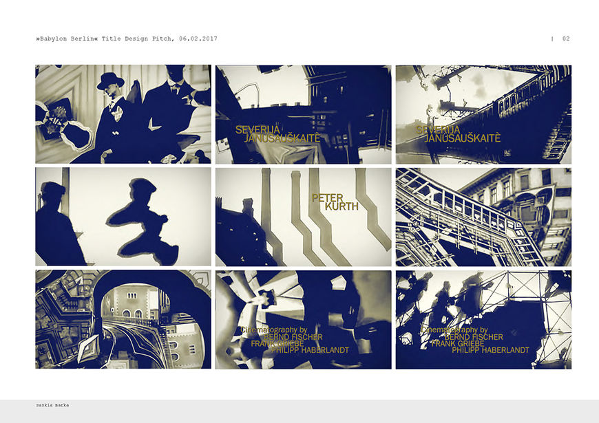
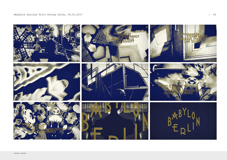
Concept #1 designed by Saskia Marka
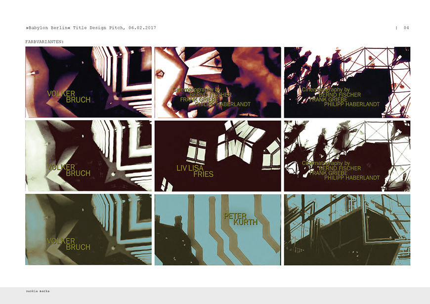
Concept #1 colour variation
Concept #1 "SINFONIE" motion test
SM: The second concept was picking up on the idea of being hypnotic, an abstract implementation of the city of Berlin as a seething cauldron. The circle, energetically charged, constantly changing, like a ticking clock, and unpredictable – like the explosion at the end. I wanted to show that Berlin is always in motion, always changing, vibrating and is also dangerous at the same time. Nothing is ever "safe." I liked how the radial wipe gives you this feeling of a ticking clock, especially in regard to what is going to happen in Berlin and to the world after the Golden Twenties. As the sequence continues, the circle is supported by abstracted frames of a seething energetic fireball that finally explodes. In some parts the circle also functions as a mirror or an entrance to a "darker place," with the colours reversed inside the circle.
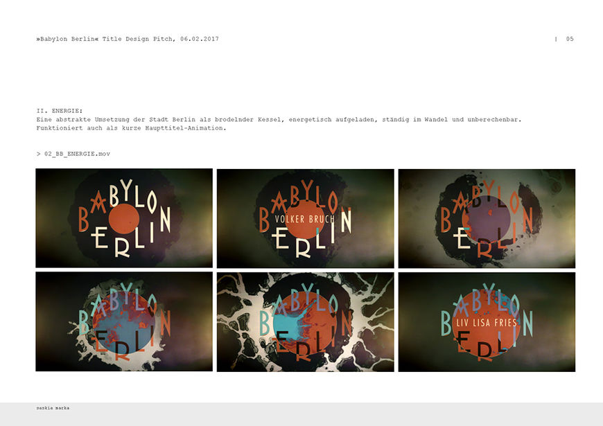
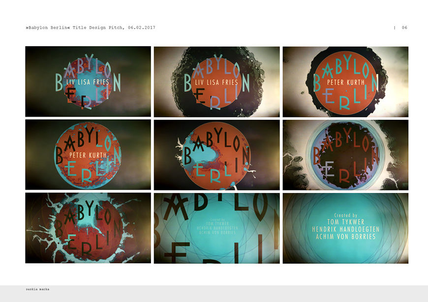
Concept #2 designed by Saskia Marka
Concept #2 "ENERGIE" motion test
SM: The directors liked both concepts but they were very proud that they didn’t have to use any real footage from the ’20s [in the show] so that should not be part of the title sequence. They also weren’t big fans of the clean aesthetics of the fonts I used. [laughs] But I thought they wanted a minimal ’20s look. They had really clean typography back then, if you do not think of the artistic elements. But Tom Tykwer said he also wanted the title sequence to be glamorous so the decision was made to combine both concepts and use footage from the show instead of the Walter Ruttmann film.
—Saskia MarkaI put in clips from the show that set the tone for crime, drugs, sex, lavish wealth and glamour, mixed it up with Art Deco elements and landmarks
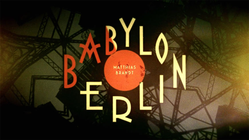
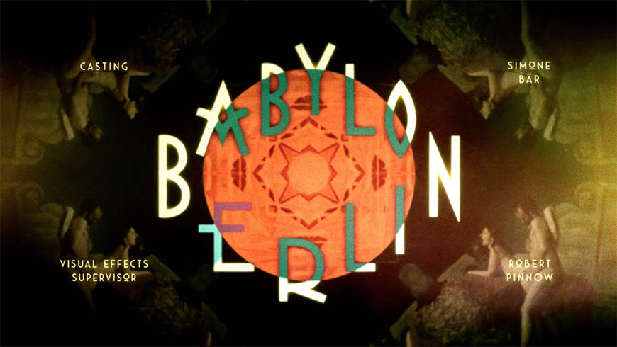
Stills from the Babylon Berlin title sequence showing steel structures and sexual images in the background
So I put in clips from the show that set the tone for crime, drugs, sex, lavish wealth and glamour, mixed it up with Art Deco elements and landmarks like the victory column, the massive steel of the Funkturm Berlin. The distortion and kaleidoscope effects put on those sequences are inspired by experimental films like Ballet Mécanique, that worked a lot with prism effects and abstracts as well.
Ballet Mécanique (1923–24), directed by Fernand Léger and Dudley Murphy (with cinematographic input from Man Ray).
Which tools and software do you use to put everything together?
SM: I used Photoshop, After Effects, and Red Giant Universe. From Universe I used all those flicker effects and shrink ray effects. Sometimes I use effects not for what they’re actually made [laughs]. That’s about it. To create the old film look. For the distortions, of course the kaleidoscope effect and the others are pretty simple.
—Saskia MarkaSince there is a lot going on in this title sequence, the clean but special and modern letterforms seemed to be the right choice.
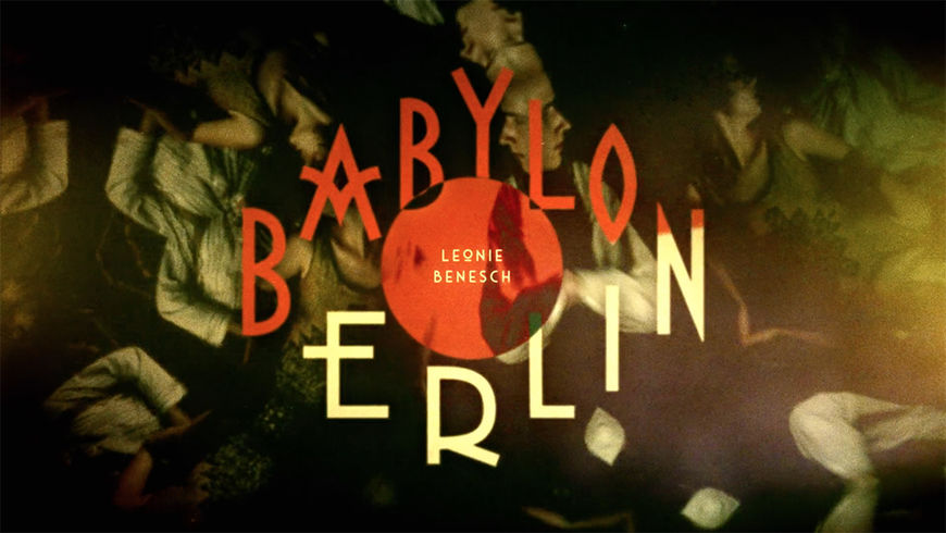
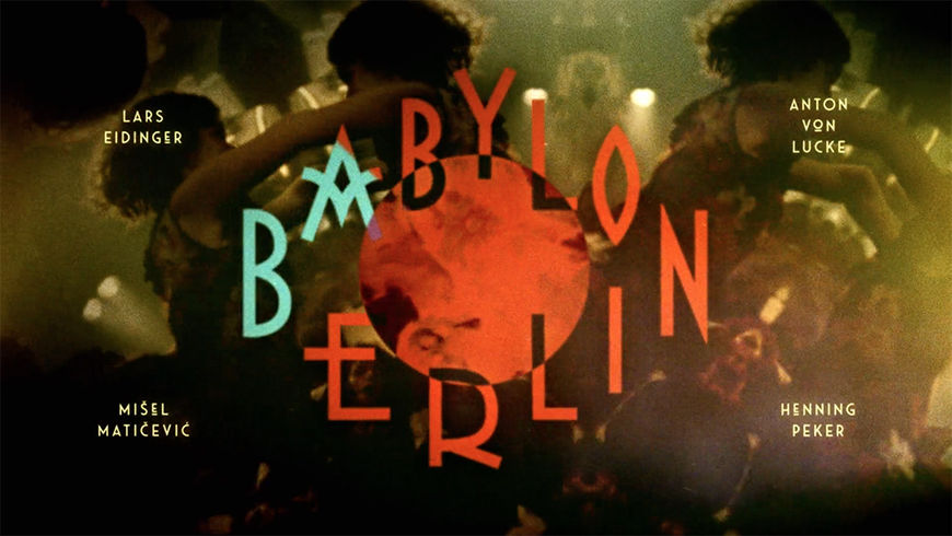
What can you tell me about the typography and your choices there?
SM: Since there is a lot going on in this title sequence, the clean but special and modern letterforms seemed to be the right choice. I used the font Saveur Sans with alternates that have a strong Art Deco look.
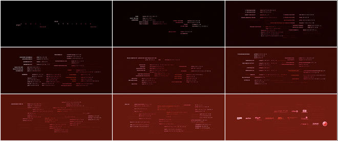
I wanted the credits to be integrated into the overall design of the title sequence and not just another layer with info text. When it gets to the head of department credits I split up the lines and put them into the corners separately to emphasize the Art Deco style even more and to have a cleaned up and controlled result, since there were so many people involved.
—Saskia MarkaI got away with this unusual formal approach, letting the logo of the show sit there for the whole sequence, like a branding plus credits in the corners.
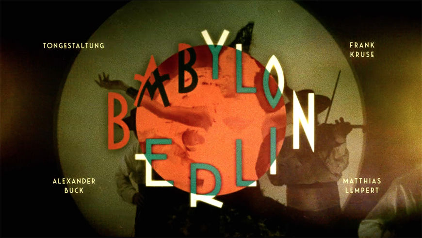
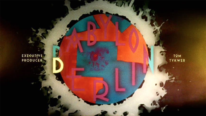
I love that you have the title on screen almost the entire time and that you have the credits split up into the corners. Both of those ideas we almost never see. Was it hard to keep that structure?
SM: I was so happy that they let me get away with it! I got away with this unusual formal approach, letting the logo of the show sit there for the whole sequence, like a branding plus credits in the corners. Throughout the whole production time of the title sequence I was really mentally prepared that they might kill it. But they didn’t! It makes me happy that I can look at it and I don’t have anything to nag about. Usually I’m never satisfied with my work.
This is Love (2009) end titles and crawl, designed by Saskia Marka
I also enjoyed your end sequence for This Is Love, which has really interesting typography too.
SM: Thank you. For that I received a certificate of typographic excellence from the Type Directors’ Club. Kyle Cooper was on the jury. I was just so happy. That was in 2010.
So you’ve kind of come full circle.
SM: Yeah. If you want to put it that way! [laughs]
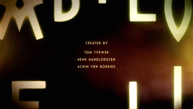
The final frame of the Babylon Berlin opening

