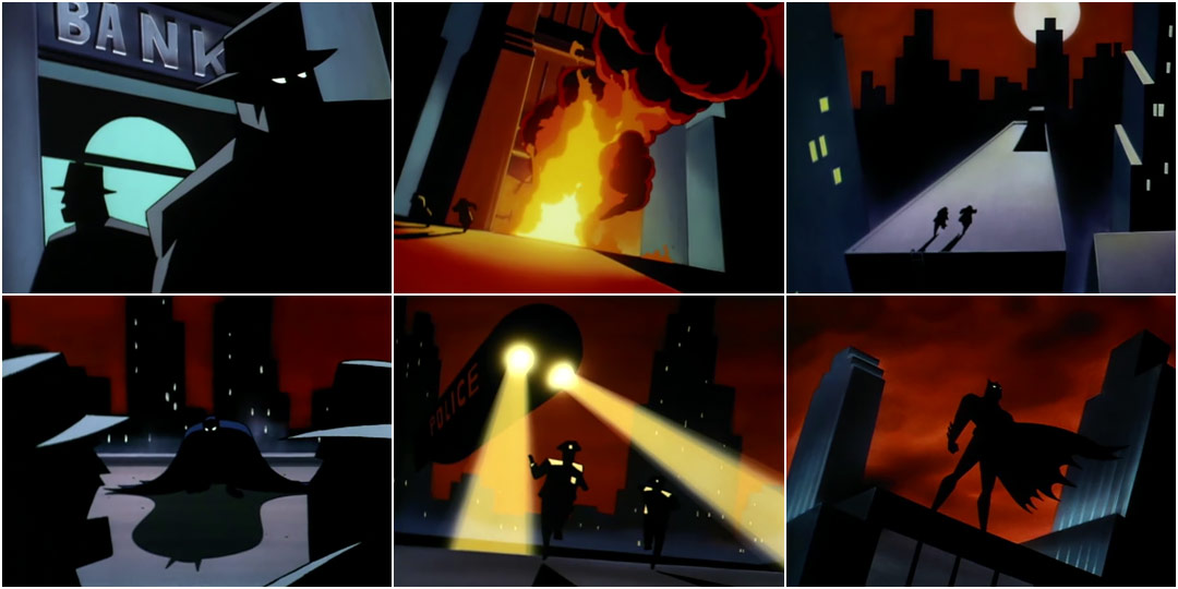
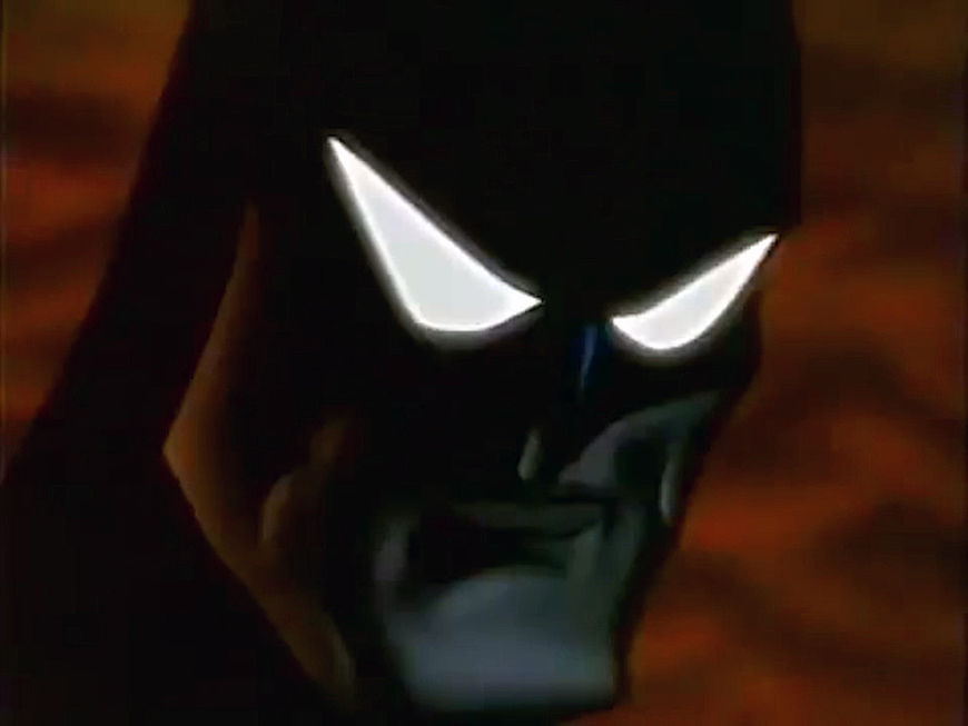
Picture the definitive on-screen Batman. Maybe you see Michael Keaton or Christian Bale in their respective cowls. Or perhaps you’re more inclined towards Adam West and his blue leotard. Bob Kane and Bill Finger help you, maybe you’re even picturing George Clooney and his infamous bat-nipples. But for many Batfans only one image comes to mind when they’re asked to picture the definitive Caped Crusader: It’s Batman surveying his domain from a dark rooftop, a flash of lightning illuminating Gotham’s protector before he disappears once more into darkness. In other words, the opening of the Emmy-winning Batman: The Animated Series.
“Everything you need to know about Batman is in [that opening],” DC Entertainment President and CCO Geoff Johns said in 2004, encapsulating what has distinguished the opening for 25 years. Not to shortchange the opener’s distinct aesthetic, the otherworldly music of Danny Elfman, the evocative colours, or the crisply staged action, but the reason the sequence is so embedded in many of our minds is because of how perfectly it defines Batman without a single line of dialogue. In the 25 years since its premiere, it is now as much associated with the character of Batman as any comic book, movie, TV series, or video game. And just as every superhero has their origin story, so does the Batman: The Animated Series title sequence.
Batman Begins
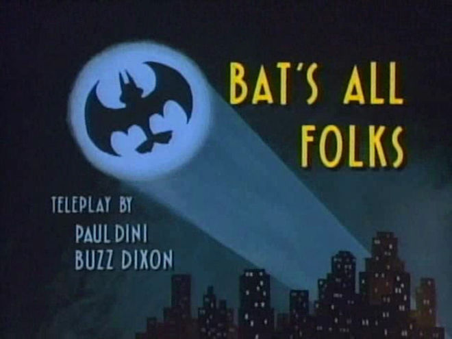
The road to Batman: The Animated Series began in a somewhat unexpected place: a Tiny Toon Adventures short called “Bat’s All Folks”. A knowing spoof of Batman, the short puts Plucky Duck in the role of Spruce Vain, a reclusive millionaire who becomes the masked vigilante known as Batduck.
Tiny Toon Adventures (1990) short "Bat's All Folks"
What’s clear throughout Batduck’s (mis)adventures is that there’s more than just a genuine affection for Batman’s story at play, there’s a deep knowledge of the character’s history – whether it’s the inclusion of dialogue from Batman’s first comic book appearance or the recreation of iconic imagery from Frank Miller’s The Dark Knight Returns. A glimpse at the credits reveals those partly responsible – not one of the show’s usual writers, but a model designer and storyboard artist named Bruce Timm. “Bat’s All Folks” would mark the beginning of Timm’s quest to find an animated home for the Caped Crusader.
In 1990, Warner Bros. Animation president Jean MacCurdy called together the members of the then-fledgling television animation unit. Encouraged by the creative success of Tiny Toon Adventures, MacCurdy announced that WB was looking to move beyond the Looney Tunes characters and develop other properties for animation. When MacCurdy mentioned that Batman was one of those properties, the man behind “Bat’s All Folks” saw an opportunity.

Members of the Batman: The Animated Series team in September 1992. From left: Producer Alan Burnett, Eric Radomski, Batman, Executive Producer Jean MacCurdy, and Bruce Timm.
In a retrospective DVD feature called “The Legacy Continues,” Timm says he immediately returned to his desk after the meeting, pushed his Tiny Toon work aside, and began drawing the Dark Knight. That eagerness was driven by his love and enthusiasm for the World’s Greatest Detective, but also out of the hope he might land a job working as a character designer on a potential Batman show.
When MacCurdy saw Timm’s initial Batman drawings, she loved them. She then introduced him to a Tiny Toon background artist named Eric Radomski, who had dreamt up a take on Gotham City that MacCurdy liked. Timm recalls she told the two artists, “I want you guys to put together a short Batman cartoon. Like a mini-pilot to show the studio heads what we’re talking about.”
Much of what would eventually become the opening title sequence of Batman: The Animated Series – and the show itself – began there.
Gotham Noir
One of the first things Timm and Radomski did was immerse themselves in inspiration. Timm was a great admirer of 1940s pulp fiction characters like Doc Savage, The Avenger, and The Shadow, and he wanted to channel that into the project. He pinned Xeroxed blow-ups of pulp book covers to the walls around him.
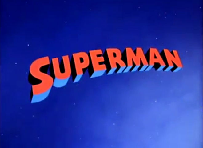
Superman (1941) main titles
He and Radomski also decided to base the look of the pilot on Max Fleischer’s Superman cartoon shorts from the 1940s, particularly its deep shadows, angular character designs, minimalist backgrounds, and Art Deco style.
With those aesthetic influences in place, the two creators applied them to a simple but appropriate-to-Batman pitch written by Timm. As Radomski summarizes it: “Thugs on roof, Batman shows up, dark and mysterious, he takes them out, and flies off heroically.”
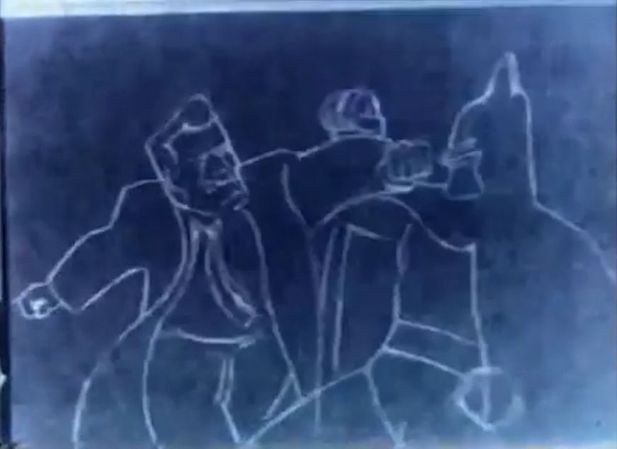
Early pencil test for Timm and Radomski's Batman proof-of-concept.
With the help of Lightbox Studios in Toronto (who were involved with animating, cel painting, photography, and compositing), the end result is as Radomski describes, but also much more. When you watch the proof-of-concept, it’s not just a series of action beats. It feels like what Batman should be: omnipresent, mildly malevolent, and manifesting wherever crime happens with a workmanlike dedication. The sequence also imbues Gotham City with an assured personality, a blood-orange dusk shrouded in dense smog, with noir-garbed goons and Art Deco skyscrapers. Sure, there are imperfections, like a slight imbalance in tone and an at times out-of-proportion hero, but at its core, it was Batman. The two men felt it too. “Batman was absolutely going to work in this world,” Radomski recalls thinking when they were finished.
The proof-of-concept "mini-pilot" created by Bruce Timm and Eric Radomski for Batman: The Animated Series.
But what Timm and Radomski didn’t know at the time was that studio executives had already made their decision. Before the two artists even had a chance to complete their proof of concept, which took them a month and a half, the higher-ups had given the greenlight to an animated Batman show – without even seeing their work. When they heard the news, Timm says he and Radomski hoped their pilot would at least serve as a portfolio piece that could earn them roles on the greenlit Batman: The Animated Series. What they didn’t expect was that the mini-pilot would lead to them being put in charge. Nor would that be the last influence that early sequence would have on the show.
Shadow of the Bat
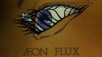
The foundation of what would become the opening for Batman: The Animated Series would largely be built on Timm and Radomski’s proof of concept, evolving further once the show got a full-season order. Guided by a continued commitment to the noir aesthetic, the short’s inspirations became the show’s house style, the heavy shadows essentially becoming the official hue of the series. “We knew that it would be darker and more moody, very film noir,” Timm says in the show’s original press release. The style, attire of characters, and decor of the world were refined in that direction. The show even adopted classic film-like title cards for each episode with nods to the typography of early 20th century pulp and noir.
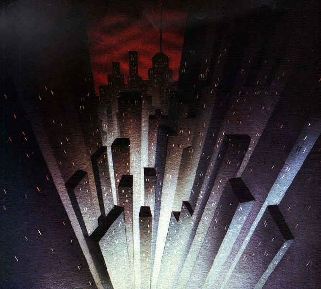
A Gotham City background painting used in the mini-pilot, painted by Eric Radomski
Gotham City’s treatment would be further developed into what the creators called “Dark Deco,” which paired film noir aesthetics with Art Deco design. Architect Hugh Ferriss was a particular inspiration, as was much of what also inspired Tim Burton’s 1989 film adaptation – especially the German Expressionist movement and films like The Cabinet of Dr. Caligari and Metropolis. Darkness even found its way into the physical materials used to produce Batman: The Animated Series. Many traditional animation techniques call for painting on white background paper, but Radomski wanted the series drawn on true black background paper in order to achieve the darker look they wanted – but one that was still capable of allowing whatever colours were used to feel vibrant.
This approach would eventually result in an art style that served both the character and themes of the series, and would greatly affect the look and feel of the opening sequence. The conceptualization of Batman as outlined by Bruce Timm, Paul Dini, and Mitch Brian (the latter both becoming writers on the series) in the show’s Writer’s Bible heavily informed that style.
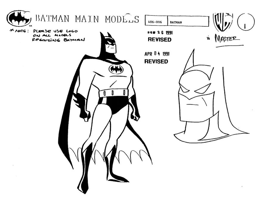
Finalized Batman model from the Batman: The Animated Series Writer's Bible
In the bible, the Caped Crusader is described as “… an invincible force – a mysterious figure seemingly impervious to bullets, able to fly and capable of appearing out of nowhere.” Elsewhere it reads: “One thing and one alone keeps Gotham from drowning in a sea of corruption and despair. It is a grim being cloaked as much in mystery as he is in shadows… To some, he is merely a legend. To others, he is a dedicated, driven avenger. And to criminals, he is their worst nightmare. He is … BATMAN.” It is especially that last sentence that would come to define how Timm and Radomski’s first stab at animating Batman would ultimately change into what we now know as the title sequence.
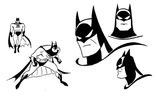
Various Batman models from the Batman: The Animated Series Writer’s Bible
The Dark Knight Rises
Although each episode of Batman: The Animated Series featured a unique title card, at no point during the opening do titles ever appear. That was done for good reason. “We figured anybody in any language would be able to look at it and go, ‘Oh, it’s Batman,’” said Timm. It was also reflective of a prime ambition the producers had: economic visual storytelling. “We want expository information conveyed as visually as possible, stressing ‘visual shorthand’ over lazy, expository speeches,” reads the Writer’s Bible. “Keep the images and actions clear and vivid.” It is that spirit that marks many of the changes that turned the mini-pilot into the opening.
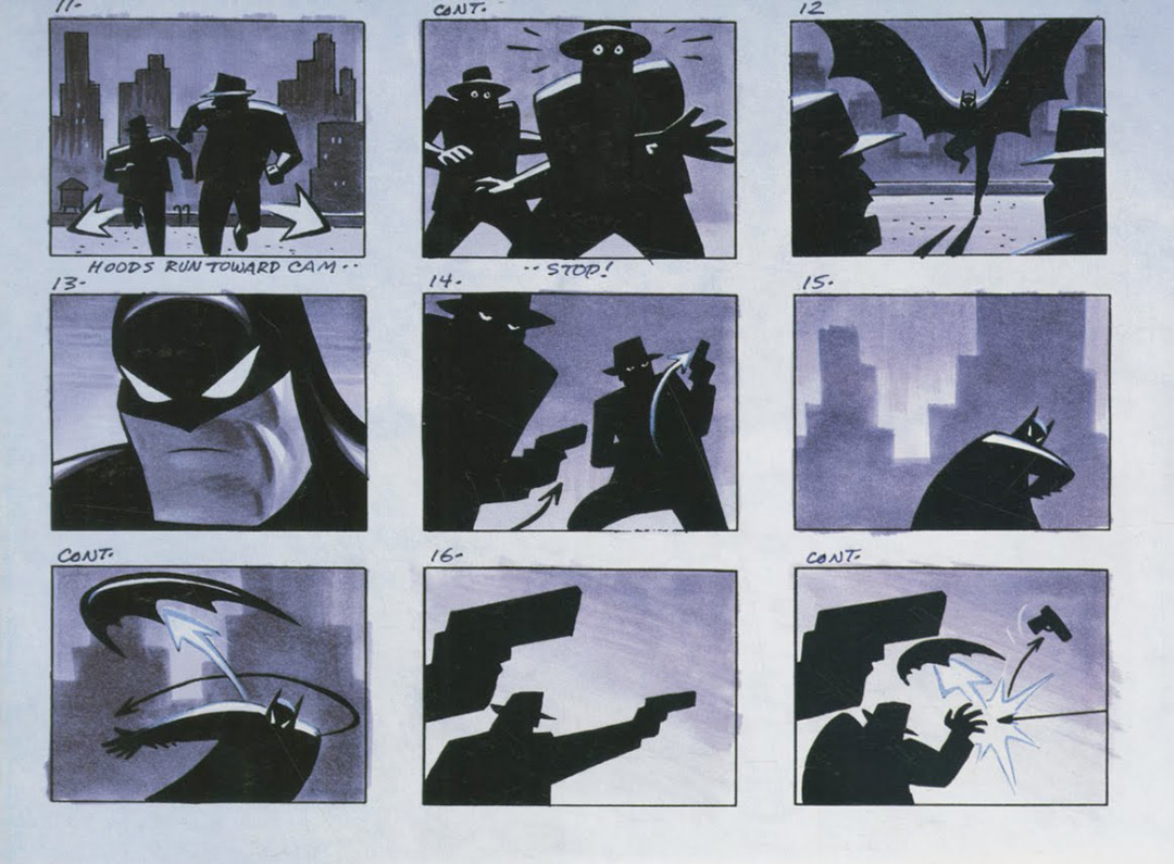
Image set: Batman: The Animated Series (1992) opening storyboards, drawn by Bruce Timm and coloured by Eric Radomski.
There are of course numerous similarities. Watch the the proof-of-concept and title sequence back-to-back, and the connection is readily apparent. The series’ main titles still demonstrate the core concept of Timm’s original pitch: thugs on the roof, Batman appears, he takes them out. Specific moments are retained as well. There’s a close-up of Batman’s face souring with disgust, goons being disarmed by a Batarang, an animalistic leap onto the criminals, mano-a-mano fisticuffs ended with a haymaker before the cops arrive to find their work done for them.
The creative team also finessed the opening into something more effective. For one, we’re given more of Radomski’s Gotham City. There are more Dark Deco buildings and more of the city’s geography as the camera descends down into the city’s bowels and back up again. In the process, more of the metropolis’s character and mood is revealed in visual shorthand: the hovering police blimps convey constant surveillance, the eerily empty streets suggest danger, the blood-red skies carry the threat of perpetual violence.
There are aesthetic changes, too. Some of which were briefly compromised when TMS, the Japanese animation company that was subcontracted to execute the opening, strayed from the style of Timm’s storyboards and created a more realistic look for the opening. Once it was fixed, the aesthetic intentions of Timm and Radomski were back on track. In the original proof-of-concept Batman is often all black, but here the once baby blue and beige suited bad guys are, too – both often mere silhouettes reflecting the shadowy underworld they inhabit. Batman’s face in close-up is tweaked to have narrower eyes, a squarer jaw, no lips, and cleaner lines. The pace of the sequence is altered as well, with an attention-grabbing explosion a mere ten seconds in, a glimpse of the Batmobile building anticipation for Batman’s reveal, and quicker editing overall.
But arguably the most significant change is to Batman himself and the story the opening tells about him. Gone is the mild humour of the shoulder tap in Timm and Radomski’s original sequence, replaced by a Batman looking to instill fear. Gone is the Batman who gets shot at and punched, replaced by one who never lets the crooks get off a shot, nor lets them land a blow.
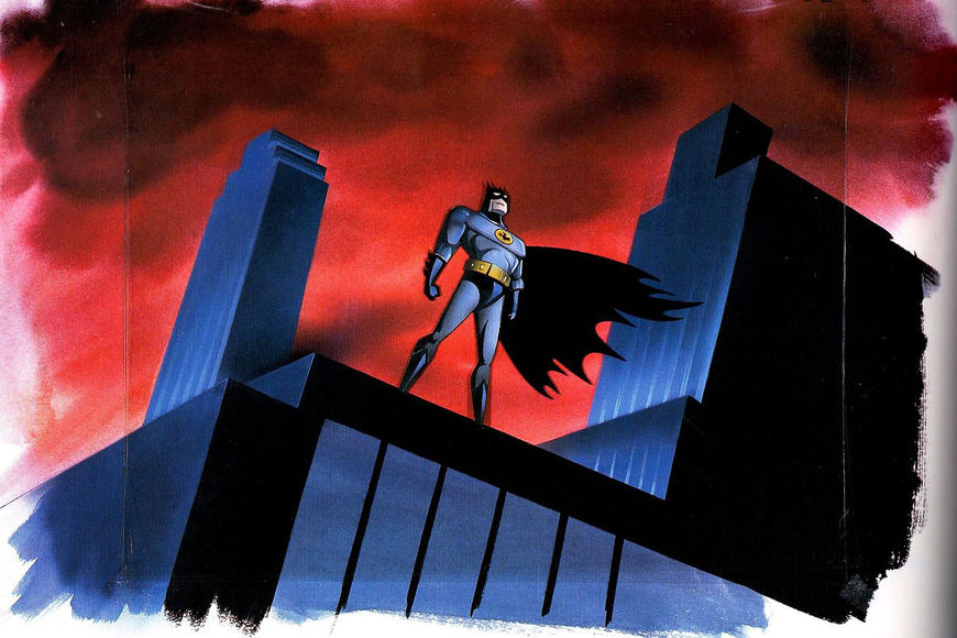
Production illustration for Batman: The Animated Series (1992)
Most significant, however, is how the titles end. In the mini-pilot we end with Batman fleeing the police, his back to us. In the Animated Series opening sequence, he is long gone when the police arrive and we get that definitive shot: Batman on top of the roof facing us and the city, a force of nature like the lighting behind him. It’s an image that evokes both the lightning strike on the cover of The Dark Knight Returns, and the final shot of Tim Burton’s first Batman movie.
That moment is Batman. It’s the whole show. And like Geoff Johns said: everything you need to know about the character is right there. You come away with the feeling that those responsible for the opening really understood Batman. But what’s clear looking back on the 25 year legacy of Batman: The Animated Series is its enduring place in the character’s history. Bruce Timm, Eric Radomski, and the team at Warner Bros. didn’t just capture the essence of Batman. They helped define it. And while they decidedly did that with the many stellar episodes that followed, they never did so more succinctly or more impressively than with the show's opening sequence.
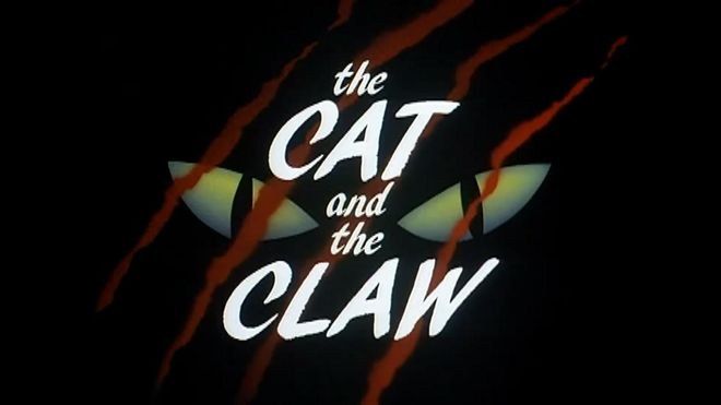
SUPPLEMENTARY: Batman: The Animated Series (1992) episode title cards
Production Studio: Warner Bros. Animation
Executive Producers: Jean MacCurdy, Tom Ruegger
Producers: Bruce Timm, Eric Radomski
Director: Kevin Altieri
Editors: Al Breitenbach Kelly Ann Foley Theresa Gilroy-Nielsen
Animator: Kazuhide Tomonaga
Composer: Danny Elfman
Music: Harvey Cohen, Wayne Coster, Shirley Walker

