“They say if you want to tell a story right, you gotta start at the beginning,” chirps the titular heroine in the opening moments of Birds of Prey: And the Fantabulous Emancipation of One Harley Quinn.
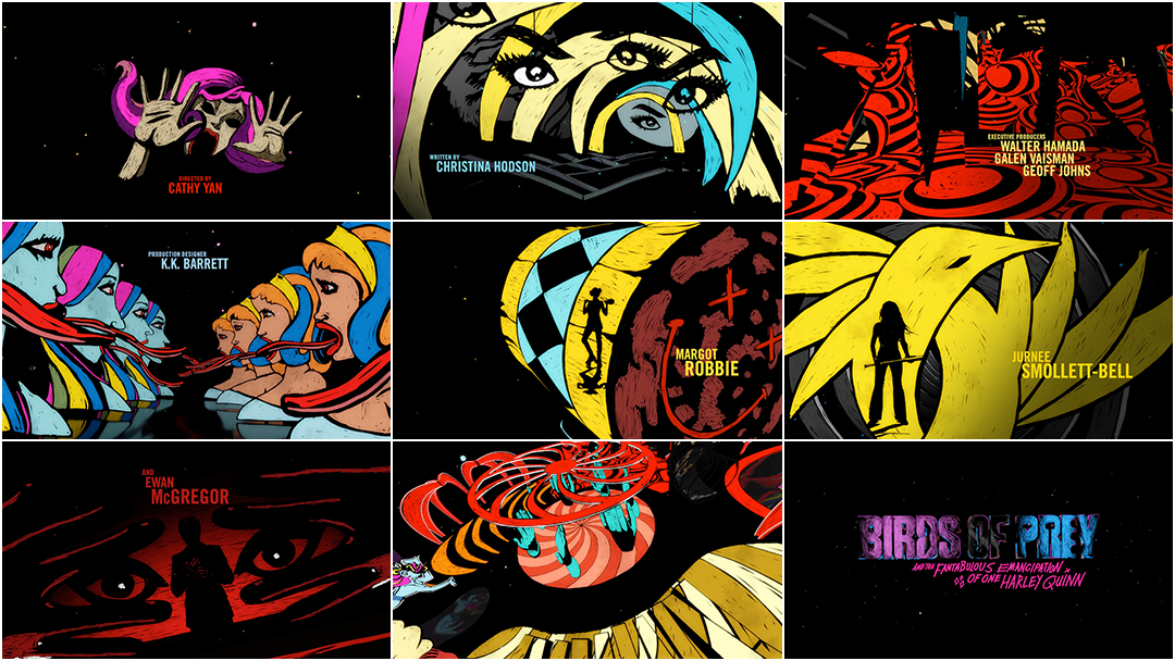
Director Cathy Yan’s Birds of Prey is a jittery, glittery joyride through loss, independence, sisterhood and gory vengeance. Graphics burst forward at every opportunity, bright and multicoloured, neon and shining. Like its central figure, they cannot be contained. At the film’s head and tail are a perky cartoon prologue and a vibrant, illustrated closer, respectively, created by two different teams and linked through colour and typography.
Kicking off the film is a spritely sequence by Warner Bros. Animation that exudes Powerpuff energy and neatly sums up the punchy PhD’s provenance, from bouncing babe to Joker paramour and the events of Suicide Squad, so that, thankfully, nobody has to watch that again.
Birds of Prey (2020) opening prologue animation by Warner Bros. Animation
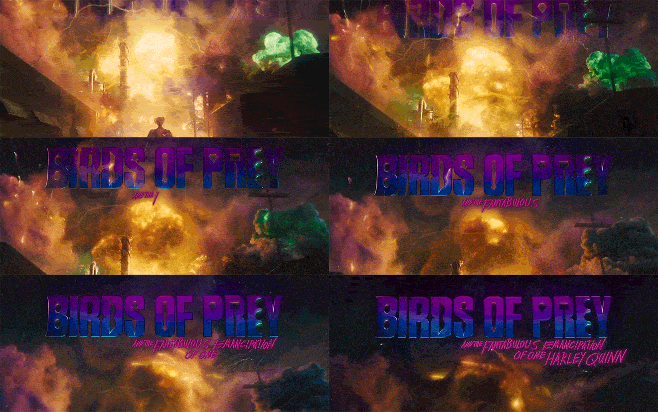
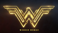
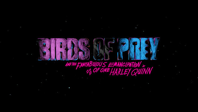
The film’s mouthful of a title appears after Quinn drives a truck carrying flammables into a chemical refinery. The collision ignites a gorgeous explosion of enormous proportions and the title logo, produced by studio Filmograph, shimmers darkly in the sky above.
* If you look closely, the logo bears symbols representing some of the key weapons and items from the film: a mask, an arrow, crosshairs, a bow (or is that a mouth?), a knife, a bat, a diamond, a hammer and brass knuckles
Birds of Prey (2020) main title drop, created by Filmograph
It is Quinn’s spunky voice – Margot Robbie delivering a cracked Brooklyn cheerleader fuelled by egg sandwiches and rage – that leads the way through this balls-to-the-wall post-break-up bonanza. As main characters appear on screen, their names appear alongside them, customized to the individual. Minor characters seeking revenge are given graphic names and grievances scribbled in red, blue, yellow, and hot green, an extension of Quinn’s scattered psyche.
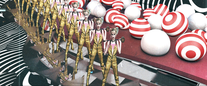
After delivering one manic melee after another, the film finishes with a main-on-end title sequence doused in vast swaths of colour and looped in loose, agitated lines that blink, swing and bleed into the shapes of key setpieces. To create the end sequence, design studio Shine took inspiration from the film’s production design and turned to a tool that hasn’t historically been used for big-budget Hollywood productions: Procreate, Apple’s graphics software for iPad. We chat with Shine about their workflow, the directions that didn’t make it, and how they used Procreate with After Effects and Cinema 4D to create the sequence’s uniquely scrappy look.
A discussion with Creative Director MICHAEL RILEY of Shine and Lead Animator PENELOPE NEDERLANDER.
Michael, your studio, Shine, has been around a long time so it’s a pleasure to finally chat! Tell me a bit about Shine.
MR: Shine is a small studio. At any given time we’ll have myself, four designer-animators, an editor and a production assistant. We grow when there’s more stuff going on and then we come back down to this size as a constant. We’re lucky to have a lot of repeat clients, mostly broadcast and streaming – some are film, some are advertising. We do some branding things, like animated logos for movie studios. We just did the Dreamworks 25 logo.
Penny, do you freelance with Shine? Is that how it’s worked for some time now?
PN: Yeah! Did we decide how long ago I started freelancing for y’all? I think 14 or 15 years ago?
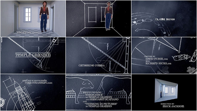
MR: Probably 15 years. Because we’ve been working together on so many projects that’s given us a level of creative trust. The working relationship makes the process so much more fun. The first title sequence that Penny and I worked on where we really clicked was Temple Grandin, which was in 2010. That was a special project.
Temple Grandin (2010) main titles, designed by Shine
MR: There’s so many other ones that we’ve had fun with but nothing has been more fun than Birds of Prey.
PN: This was my favourite job, I think! Top three career jobs. Definitely.
How did you get started on Birds of Prey?
MR: Sue Kroll was one of the producers and she called Shine in the middle of June. She had liked some of the work that we’d done, La La Land and a couple other things. We did some typography on that but really didn’t do a ton of animation outside of the logos. But she liked it and thought we might be right for this. We went over to Warner Bros. and they showed us 15 minutes of the movie to give us a bit of the flavour.
What was exciting about this project was not just that it was a main title sequence but there was a ton of stuff that went into the body of the film – all these antiheroes had grievances against Harley and they wanted graphics to help tell that story. Wasn’t exactly clear on what they would look like or how they would interact with the live-action backplates but it had to have Harley’s voice.
We went away and talked. I love designing storyboards myself so I did one board and then Aaron Bjork, who is a really great designer, pitched another couple of ideas. We came in with three directions and each one of our concepts had three distinct chapters. We did our best to come in with things that had Harley Quinn’s voice.
Cathy [Yan] is a brilliant director. She has a very inspiring yet very clear way of giving direction. The one nugget of direction that Cathy gave us was “funhouse”. In the movie there's this crescendo fight scene in a funhouse, so the production design was very inspiring. We always try to do title sequences that come from the DNA of the movie as a starting place. Using some of the characters and the shapes and the architecture, the spirit of the funhouse, that was where we took all three of our ideas from.
Director Cathy Yan discussed the making of the funhouse action scene in Birds of Prey with The New York Times. Read more.
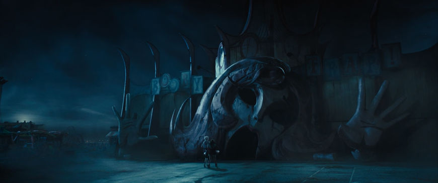
Still from Birds of Prey featuring the funhouse "Booby Trap" exterior
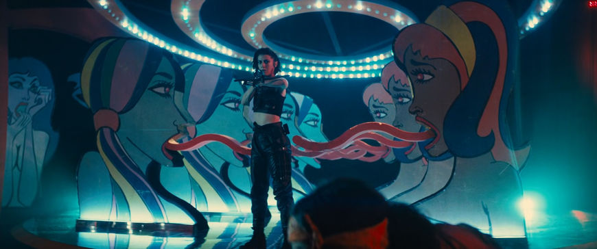
Still from Birds of Prey featuring funhouse interior
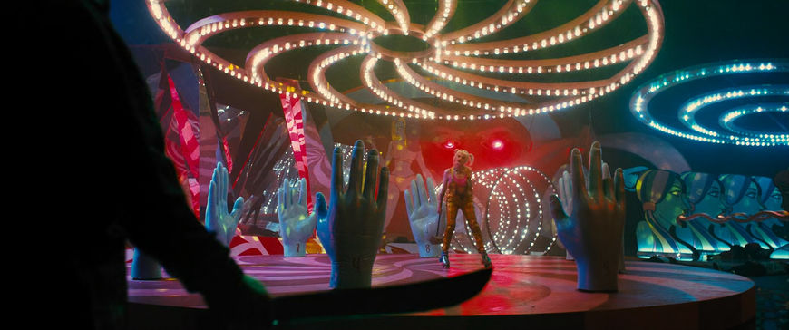
Still from Birds of Prey featuring funhouse interior
There's the main-on-end sequence but you made a lot of elements within the film, too. Tell me about all the different elements.
MR: Right, we had the main-on-end title sequence, 10 grievances, four names, a handful of subtitles and some locator cards. The main-on-ends was the biggest part of it. Each one of the grievances had to work in concert with the characters, who would come out of the shadows or surprise Harley. It had to introduce the name of the character and the particular grievance that they have against Harley. Young Kim, who is an animator-designer here, did a lot of the grievances stuff.
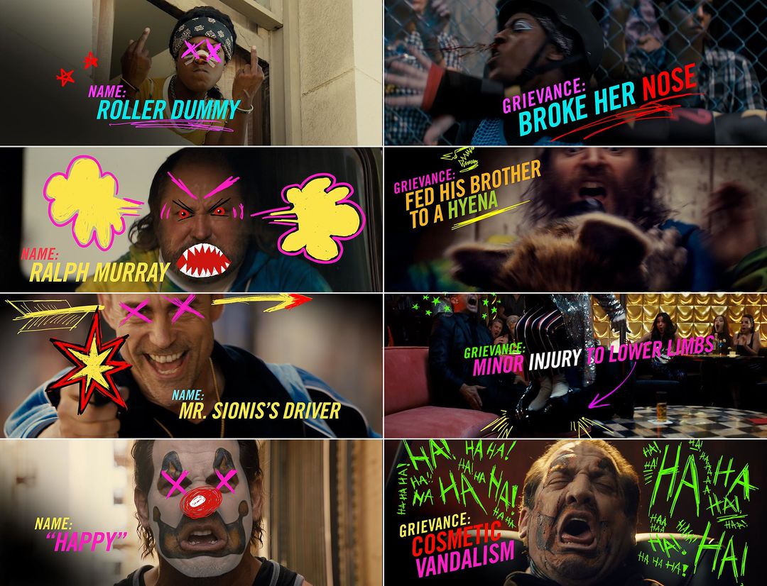
Examples of names (left) and grievances (right) text and graphics used to introduce characters in Birds of Prey
MR: A lot of them were really funny. Cathy wanted them all to be colourful and spirited and in the style of the movie.
Penny did the mask logo and she worked on Huntress, the names.
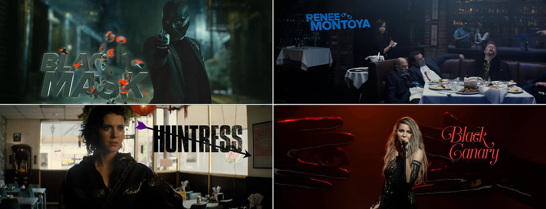
Name designs in Birds of Prey for characters Black Mask, Renee Montoya, Huntress, and Black Canary
Tell me about the direction that was ultimately chosen for the title sequence – the sort of loose, hand-rendered drawings.
MR: Penny and I both love drawing and a month before this project I had bought an iPad Pro. I went to the Apple store and they had Procreate loaded on to the iPads and I started painting with it and I was just like, Oh my god, this is an amazing tool. I started doodling and illustrating the production design. I had to take a couple of trips to Europe so I had hours on Lufthansa, just sitting there, so I was drawing Birds of Prey stuff in my iPad for hours.
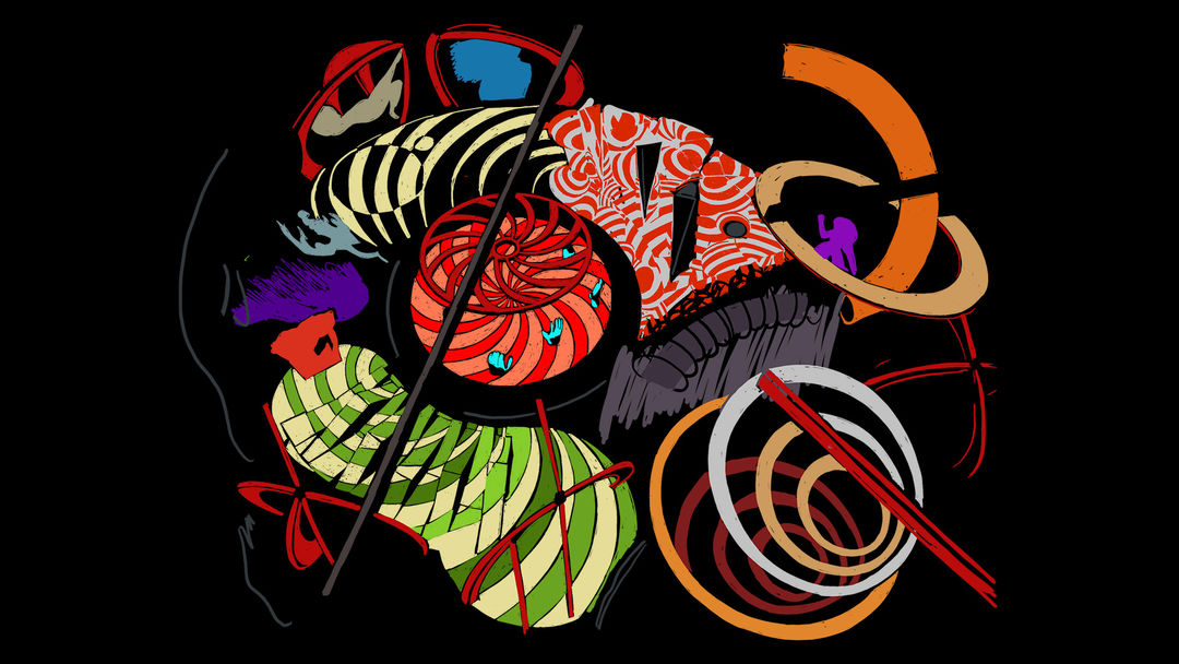
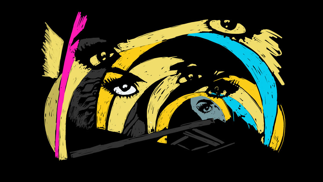
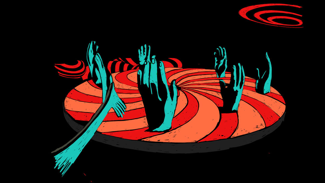
MR: We came up with these illustrations and ended up using them in the storyboards. Penny is an amazing illustrator, so when they ended up choosing this idea I knew she would be able to take this to the next level.
What were the other directions you had presented?
MR: The other two ideas that Aaron Bjork did, one was kind of a ripped paper idea. The photographer Aaron Siskind – he photographed posters that were ripped on the side of a wall, they’re kind of in sedimentary layers. There was one idea that had kind of funhouse graphics that were torn on a wall. The concept was animating graphics that represented Harley and the different characters in that style.
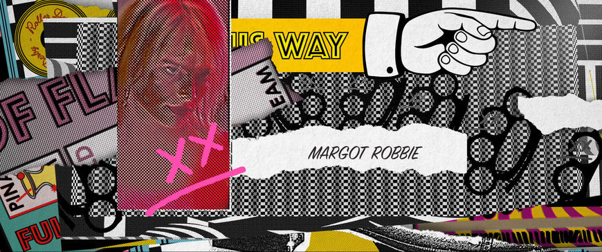
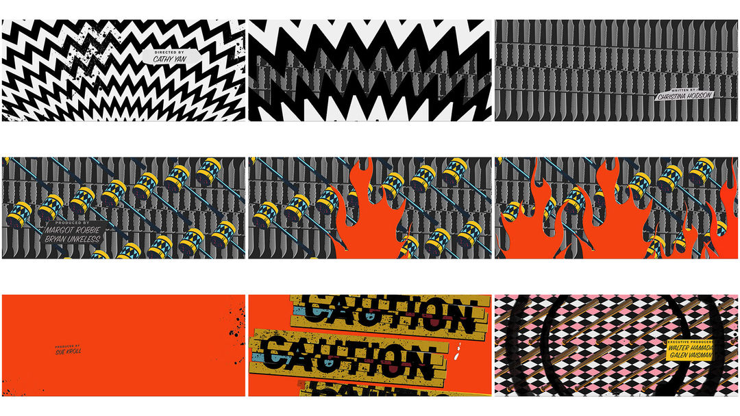
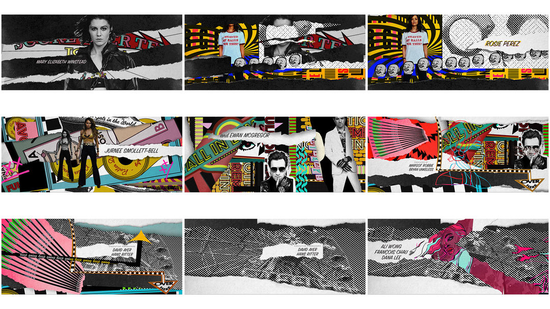
MR: And then the other one was more dimensional, it was a more 3D exploration of the funhouse.
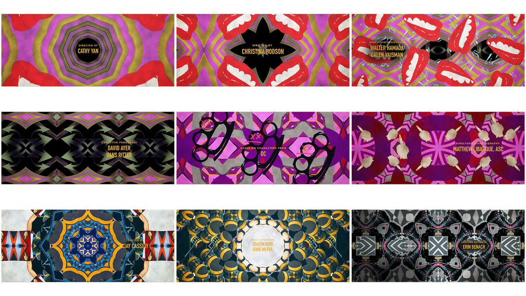
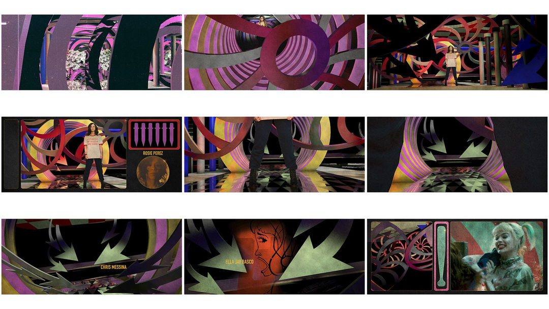
MR: Each one was designed in chapters where there’d be a chapter that introduces the funhouse, a chapter about the key characters and a third a little more about conflict. I would’ve been thrilled to do any of the concepts, but they landed on the hand-drawn idea.
Penny, when you look at a flat illustration or sketch, what is your process for figuring out how to make that dimensional and bring it to life?
PN: When I saw Michael’s boards, the way they were really sketchy and interpretations of those setpieces in the movie, I wanted to show it as if it was how Harley Quinn views the world, like through her sketchbook. I built a rule: Does the shot feel sketchy and hand-drawn? And I didn’t want you to be able to know exactly what technique accomplished it.
Animatic
Cel animation tests
PN: I would use any trick that I could, be it a camera move or a distortion or animating focal length or bending the textures. I wanted to implement as many different types of animation as I could but still make it feel cohesive.
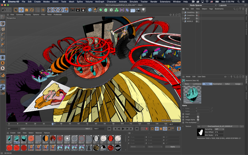
Screenshot in Cinema 4D featuring multiple elements from the funhouse interior
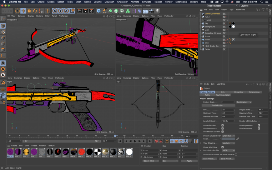
Screenshot in Cinema 4D featuring the crossbow
PN: Some of it is two-dimensional in After Effects, some of it is 3D in Cinema4D, some elements were cel animated frame-by-frame in ToonBoom. We stuck it all together and had a common treatment across all the shots. Everything was brought in through After Effects so we had a colour treatment, a glow-distortion kind of thing. We tried to use After Effects as much as possible because it would be more true to the drawings but then when we wanted to do a fly-through we didn’t want it to feel like a bunch of flats. I modeled out the booby trap hideout in 3D, just for myself, to get an idea of the space so I could better build it in 2D.
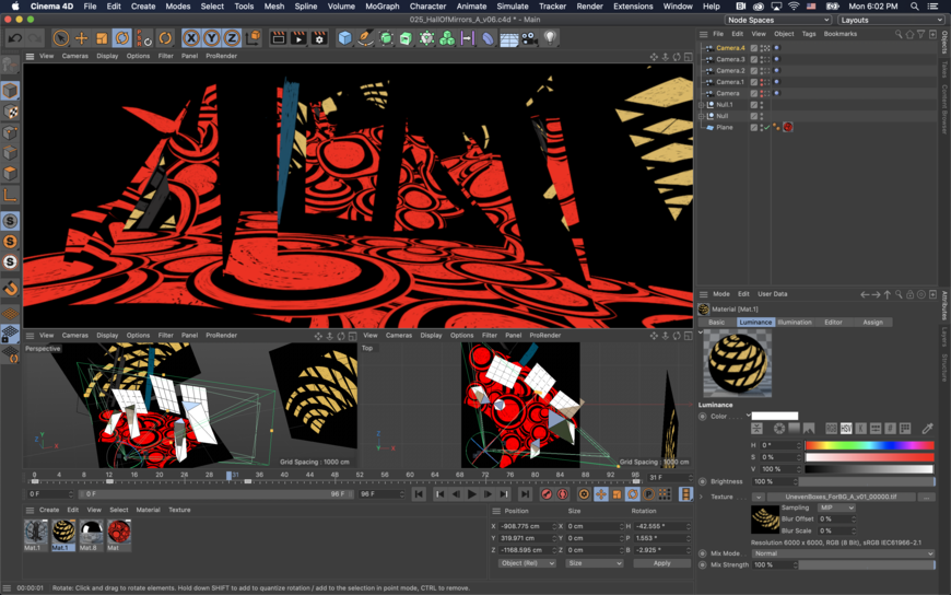
PN: I did a test and applied some hand-drawn textures and figured out a very easy looping six-frame setup in Cinema 4D, where it shuffled two frames per texture still, so it shuffled through one-one, two-two, three-three. Then that was applied to everything in a black environment and very flat-shaded. There were a lot of very interesting shapes in that space! You can do a lot in After Effects with two-and-a-half-D but sometimes you just need to be able to turn around something or expand the camera field of view so much that in After Effects you might see that everything is just a flat.
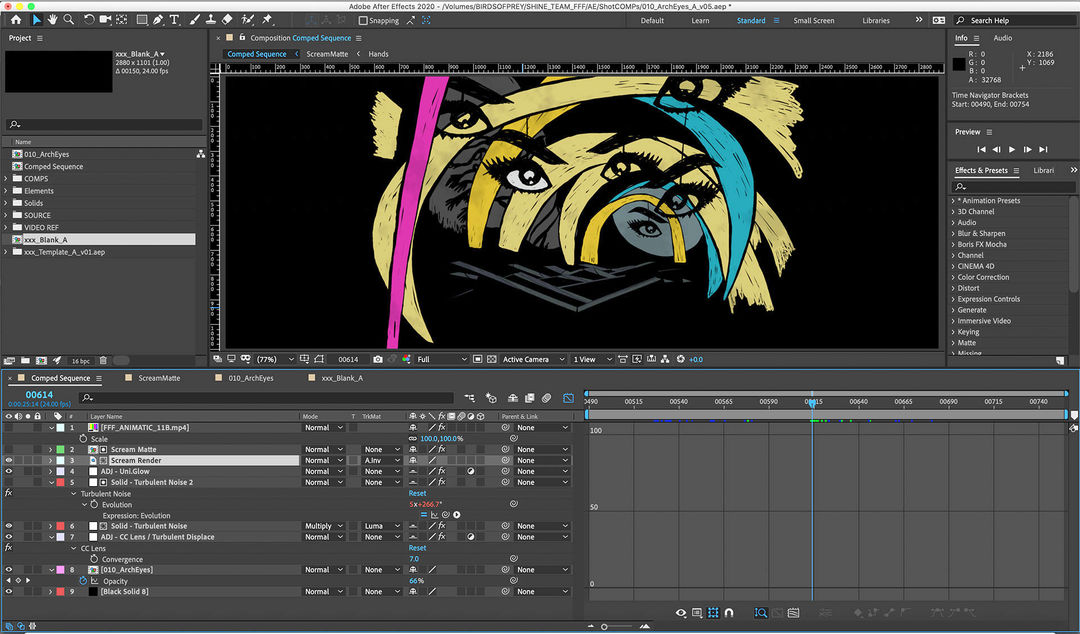
Screenshot in Adobe After Effects
There’s a great segment with a yellow and black hammer that spins around.
PN: That was one we couldn’t do in After Effects! It’s a very simple few shapes, maybe four cylinders, but the textures are enormous, probably 8K textures that we drew. It deserved to be a real object and then it was about trying to get it to look as flat, as drawn, as possible.
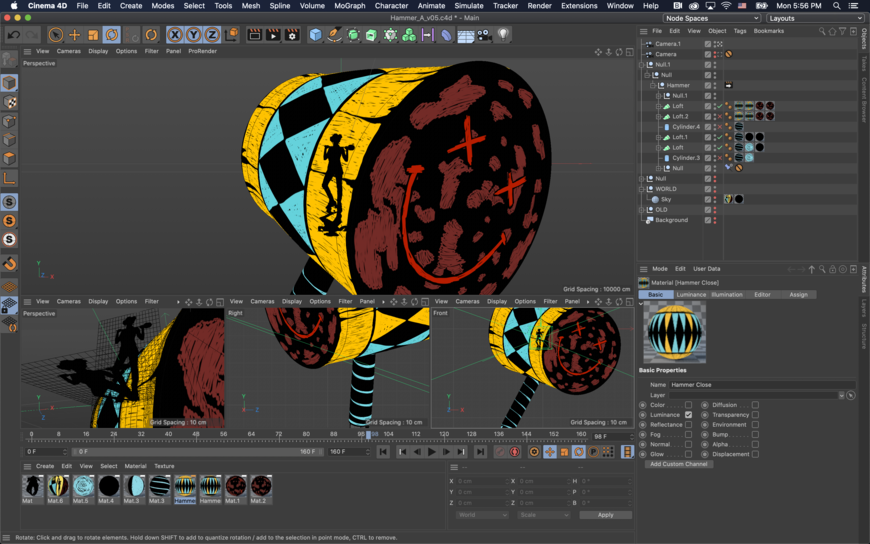
Screenshot in Cinema 4D featuring the yellow and black hammer
How did you interface with Warner Bros, who created the opening sequence?
MR: There was one point during the process that Sue called us and said, Maybe you guys could work in tandem with Warner Animation on the opening but it didn’t end up happening. They have amazing animators that are so good at that style of animation and it made more sense that they do it. We communicated the name of the font, Trade, so that it would have kind of the same voice.
Penny, you said this project was a career high point for you. What made it great?
PN: I think it was a perfect storm. The boards were so artistic unto themselves, so we were trying to bring to life what existed there. Every shot was its own puzzle. The flow was great. I live in Austin but I went to L.A. for seven weeks to work on this and I couldn’t wait to get to work. What is it that people say? There are jobs for the reel and jobs for the meal? I take a lot of jobs for the meal. There’s only so many cell phone ads you can make and still feel like you have an artistic outlet. This felt like it could’ve been a personal project. It was a fresh look I’d never done before, it was with my favourite crew. Sometimes you work on a job, and you think, That was a really cool spot but man, the attitudes!
Name names!
PN: I ain’t! I ain’t gonna! [laughs] But no, really, we’re still sending each other stuff because of this job! We developed a little illustration channel in our Slack.
MR: It was a gang that really clicked and I hope we can work more together. We love to draw and it got us back to that feeling, the love of drawing and scribbling. How would Harley draw this stuff? She’d scribble it with very colourful pens and pencils so we tried to have that spirit from start to finish. I hope you think we did it.
It’s beautiful. Thank you for your time.
MR: Thank you!
Birds of Prey (2020) end title card

