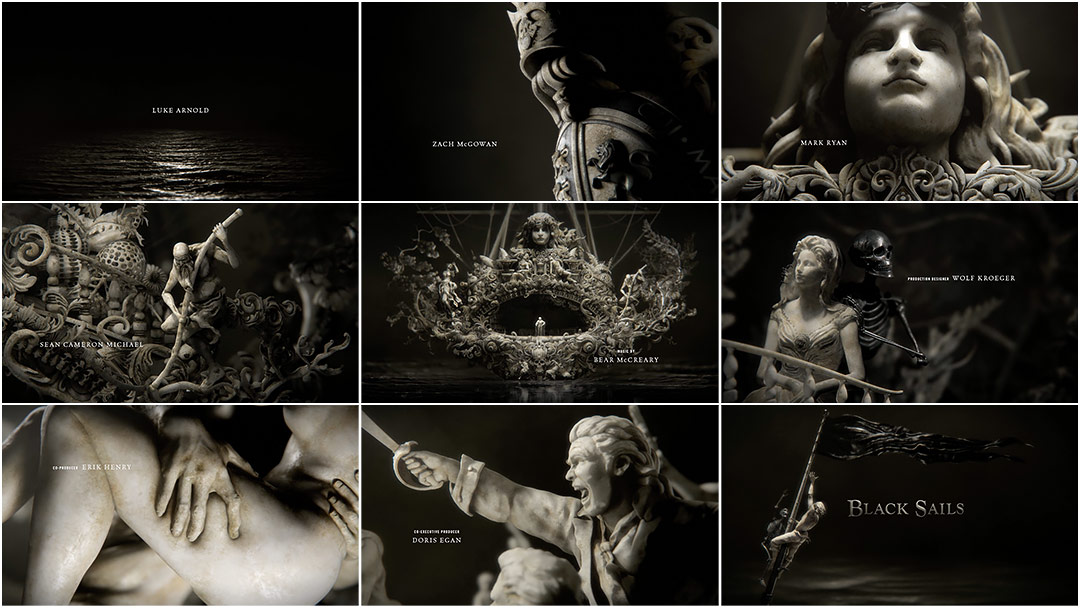
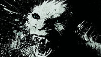
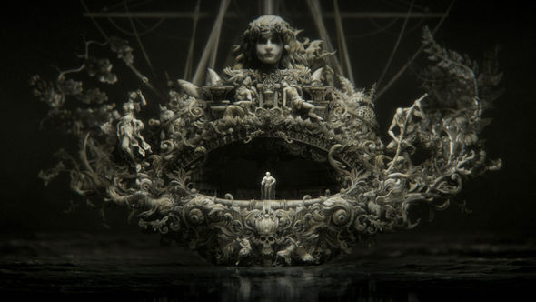
The dark sea, calm, is waiting. Sabre and shield invade as elaborate tableaux float past, smooth porcelain faces contorted in ecstasy and anguish. A battle rages in freeze-frame maelstrom, ebony bones clashing with ghost white figures – fierce outcasts crashing against civilization. The remarkable carved filigree designed by Imaginary Forces wears its Baroque and Rococo influences on its ivory sleeves while Bear McCreary's thunderous score breathes gloom throughout.
Beware that delicious sinking feeling as the opening titles for Black Sails draw you down into the Davy dark.
A discussion with Creative Directors KARIN FONG and MICHELLE DOUGHERTY, and Art Director ALAN WILLIAMS.
What have you two been up to since we last chatted, for Boardwalk Empire?
KF: I rolled right into the video game world, directing the live-action trailer for the Sony Playstation game God of War: Ascension, and creating cinematics that served as flashbacks within the game. Title-wise, our New York crew and I worked with Trey Parker and Matt Stone to create the opening sequence of South Park for season 17. And in the spring of last year, I relocated from New York back to Los Angeles.
MD: I worked on the main title for Magic City, another Starz production, and I have been directing quite a bit for commercials. I’ve also been working on some passion projects including a PSA for veterans, as well as a short film about ocean conservation. Since Karin moved to LA, we have shot a few spots together… We shot a Lexus spot, and we recently returned from Cape Town in December where we shot a beer commercial.
That’s where Black Sails is shot, right?
MD: Yes, coincidentally. So, of course, we arranged for an on-set visit while we were there. It was amazing!
KF: They were in the process of building their third full-scale ship. You could see these massive ships from the highway, with the South African landscape behind them. It was a bit surreal.
What was the first meeting like?
MD: We went to talk to Jon Steinberg and Robert Levine, the creators, over a year ago in Los Angeles.
KF: I distinctly remember it was International Talk Like a Pirate Day. We were debating about how far to take that.
MD: We quickly learned that this show was the furthest thing from Pirates of the Caribbean or any other pirate-styled fantasy. No parrots or eye-patches or Jack Sparrow types. This is a story of people fighting for survival, going up against society. They operate outside of European civilization, which makes them feared. It’s a brave new world, but tied to the old one.
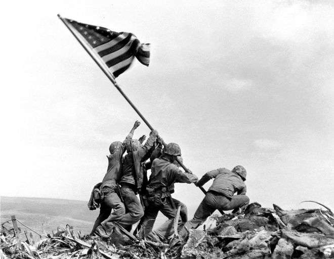
Raising the Flag on Iwo Jima by Joe Rosenthal
KF: The grit and struggle of these outcasts is central to the story. Jon mentioned that if there was an existing image that captured the spirit of the show, it would be that of the soldiers at Iwo Jima, where they all strain to raise the flag. These guys are both pioneers and survivors.
Tell us about the chosen concept for the title sequence and how it was developed.
MD: We definitely responded to the larger theme of fighting the establishment, that these guys are basically battling the world superpowers. The threat of pirates to civilization and vice versa is a rich idea. It’s 1715, pre-Treasure Island, during the golden age of piracy, and we know from history that it’s not going to last. There’s a sense that doom is coming.
KF: As with many projects, especially period pieces, we like to dive into art of the time, or art that’s inspired by that particular era. While we were brainstorming, Alan Williams at our New York studio referenced these beautiful photos by Pablo Genoves.
There was something so haunting about the icons of European power – the church, the opera, lavish state buildings and palaces – being destroyed by water. Nothing lasts forever. Clearly this wasn’t the exact idea and execution, but the tone was right.
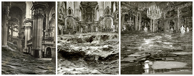
Pablo Genoves photography
AW: We started thinking about how to translate this into a direction that is more specific to the show. In researching 18th century architecture, it was the baroque scenes and figures found throughout cathedrals and palaces of that era that provided an aesthetic starting point. From there we asked, "What would rebel pirates, collapsing shanty towns, whore houses, etc. look like if they were represented within those ornate sculpted vignettes – amongst pristine saints and kings?"
KF: We changed the scale to be more intimate, shot as if in macro amongst these figurines. Did you ever see the Halo video game spot that depicts a battle scene with immobile action figures? It has more gravity because the moments are frozen in action, rather than animated. Using sculptures allowed us to be far more violent and provocative than live action or photorealism would have allowed.
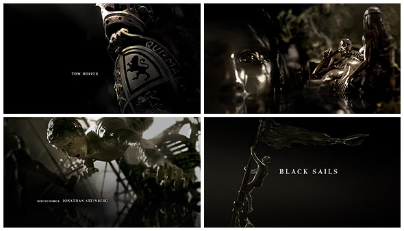
Initial styleframes
AW: Ultimately, this whole world and way of life will meet its end, so a sense of doom had to play out, however subtle, throughout the sequence. So we returned to the idea of the dark sea of fate rising ever so slowly to sink this strange vessel. At some point we considered that sand might slowly fill and bury everything… but… water just looks better!
Besides the photos you mention, what were some of the art and real-life sculptures that inspired the look and feel of the pieces designed for the sequence?
MD: It’s an art history mash-up, so anything that could represent either the world of European might or pirate lore was fair game. We were looking at everything from Rodin’s Gates of Hell, Bernini, to portraits of lords and saints, and the British coat of arms. Not everything was so high-brow; we also studied the Rococo figureheads and carvings on ships, scrimshaw and tooth carvings, as well as the tombs and sarcophagi of Paris and Italy, for their gothic use of skeletons. Even the Statue of Liberty served as a reference for the kind of classical face that would have been sculpted during that time.
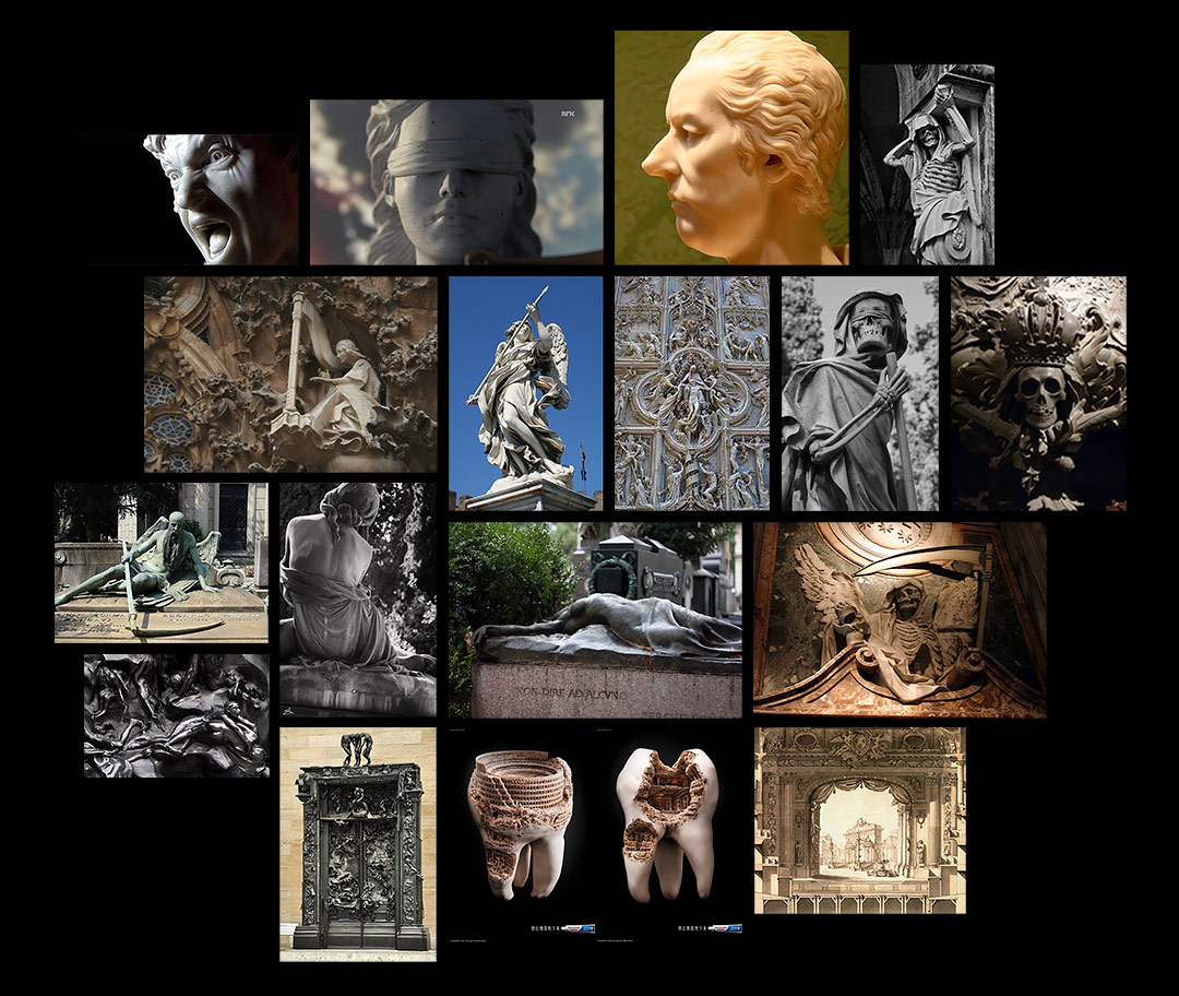
Art history reference examples
AW: As we collaged together these motifs to create a unified visual language, a contemporary artist came to mind. A few months prior, a bunch of us had walked over to Chelsea’s Joshua Liner Gallery to see the baroque-inspired work of Kris Kuksi.
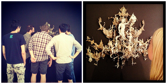
IF staff visit Chelsea’s Joshua Liner Gallery to see the work of Kris Kuksi
It was truly awesome. You can see how he takes the influences of Bosch and Bruegel to a whole new place. His use of intricately assembled objects inspired us further as we fleshed out the look of our piece.
KF: Intricate biological etchings, such as those from Ernst Haeckel’s Art Forms of Nature, became an unexpected visual source. Similar drawings of seaweed or various exoskeletons rendered in 3D in our materials suddenly became bizarre forms that we could weave into the architecture. They look like things that Gaudi would have created.

Page examples from Kunstformen der Natur (Art Forms of Nature) by Ernst Haeckel
So how exactly did you use all these influences to design this sequence?
KF: Well, that was one of the biggest challenges but also the most fun part, making up the vignettes to serve as metaphors for the show’s themes, and then building very detailed custom artwork from scratch. Jon Steinberg really responded when we paired ideas representing the world’s duality: the youth of a maiden opposite a symbol of death, Europe vs. the “exotic” colony cultures, land vs. sea, the court vs. lawlessness… a hybrid world of old and new.
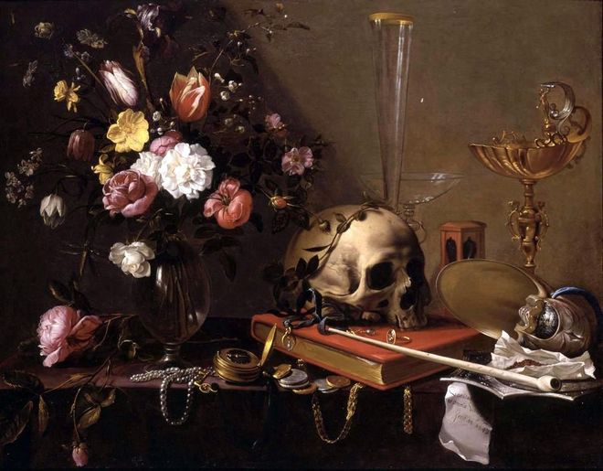
Vanitas: Still Life with Bouquet and Skull, c.1642 by Adriaen van Utrecht
He liked that we wove in skeletons as a reminder that no matter how grand or beautiful, death was lurking, always present. In a way, it is like a Vanitas still life painting from the 16th and 17th centuries, in which a skull represents the fleeting nature of life.
MD: We called the concept “Allegory” as we weren’t depicting any particular characters or plot points. No spoilers here! Instead we depicted archetypes from the show. It’s more powerful when you don’t have to be literal. Each scene was about the tension of conflicting forces. We loved the idea of building a sequence in which the audience can find meaning and details in repeated viewings.
KF: In terms of our process it’s probably easiest to show you our worksheets. Here’s an example of what went into two scenes. We’d work out the design and concept of each shot, sketching a general composition and pulling references for the details. Then, we worked with storyboard artists to generate art based on these ideas as well as many others we couldn’t find reference for. Using drawings gave us the freedom to invent whatever we wanted and not depend wholly on existing sources. These drawings were used to create an animatic, and as the blueprints for our modeling team.
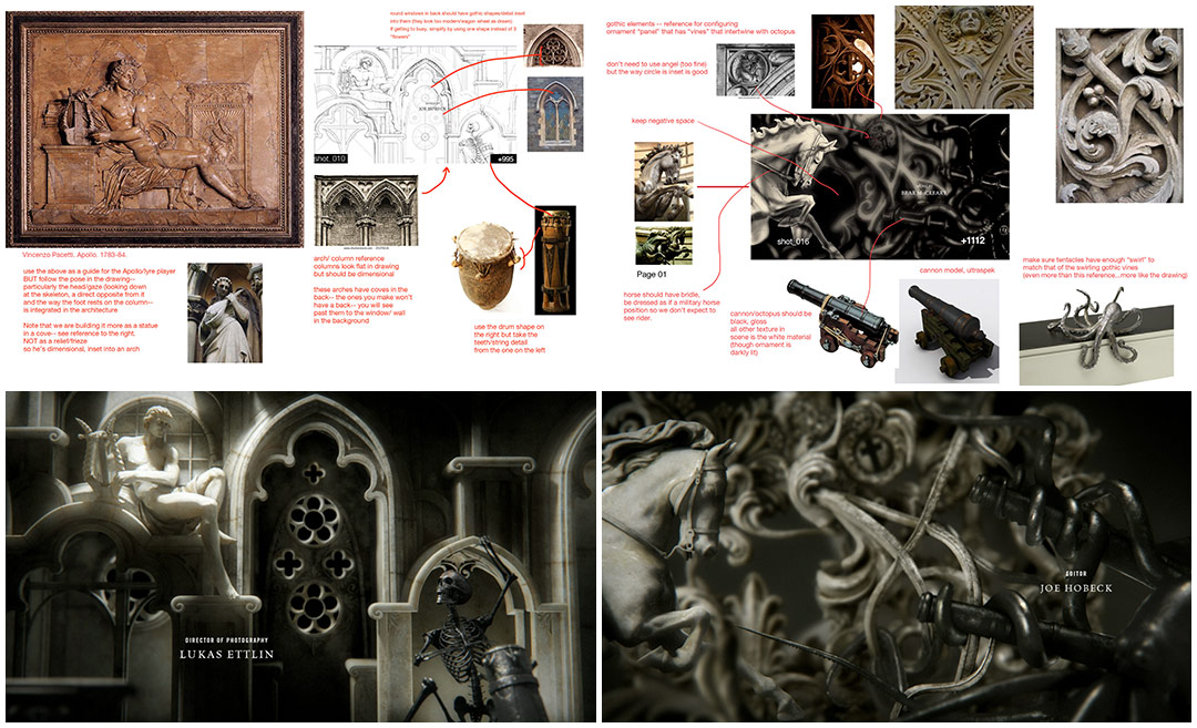
Worksheet shot breakdowns and final rendered frames
That was my next question – this is all CG, right?
MD: There was a moment in the beginning when we entertained notions of finding master craftspeople to carve elements to do this practically, but that just didn’t fit into our schedule or provide the flexibility we needed. Despite the fact that we had our initial meeting months ago, by the time we got the greenlight we only had 12 weeks to produce the sequence! Our producer Brian Butcher rose to the challenge and put together an A-team of modelers, texturers, lighters, and animators at our LA studio. Altogether, we had a team of about 15, though not all at the same time. Collaborating with these talents was a joy, and a relief, for me and Karin. They took our designs to the next level.
KF: That’s the best, when you can work with artists who take on your vision but up the ante with their own expertise. And we were happy that we had a project that really utilized their skills. I mean, in some cases we were asking them to mimic master sculptors, so they could bust out their classical training to build upon what we had.
Zbrush modeling example by Meats Meier
MD: For instance, we were lucky to collaborate with CG artist Meats Meier, who is known for pushing the envelope using Zbrush modeling software. He worked on several scenes, including the wide proscenium ship shot. We had laid out many of the symbols, but Meats really went to town, crafting all the minutiae and embedding everything from shells to a sea monster into the structure. We had to hold our breath that all of it would actually render, but of course we were in good hands. All of the modelers, mostly working in a combo of Zbrush and Maya, had to deal with a somewhat unconventional process.
For most CG jobs, it’s important to create a figure that will be used in many different scenes and angles in the film or game. The model then comes to life in context, as it is animated. But for this piece, it was much more important to create just one pose in very specific detail. So often the blocking would happen quickly but we would spend a lot of time tweaking the way the frozen hair or fabric was blowing, or the way a muscle was defined, all to a specific angle and lensing.
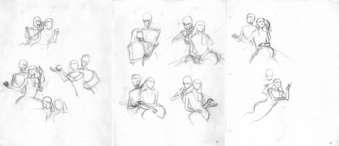
Skeleton/bride sketches
We spent a lot of time working with the team on the facial expressions and the hand positions. Our reasoning being that if a sculptor had to take the time to chisel it out of stone, one would be sure that the pose was as elegant as possible. The surprising thing was how much work it would take to make the figures look classical and of the era, how we had to really alter proportions so they didn’t reflect the beauty ideals of today.
KF: The devil’s definitely in the details. Equally crucial was the texture and lighting, which needed to be photorealistic. We had chosen two contrasting materials: white alabaster and dark bronze, like Rodin’s work.
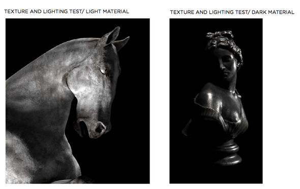
Lighting and texture test for granite and bronze
Joe Langmuir lead this effort with many viz-dev tests. He developed varying degrees of wear on the surfaces, slight color variations, imperfections, and subtleties to sell the idea that these are real objects. At some point, as Joe was getting closer to the final look, we thought, Okay, maybe we have a real shot of pulling this off!
MD: We were really happy to get to the stage of dealing with subtleties. This extended right into the composite, which took place in Flame. Our lead Flame artist Rod Basham was instrumental in getting the separately rendered elements to live together as a space, tweaking layout and the depth of field to get that dreamy macro look. I’m thrilled that some people think we shot it practically!
Tell us about Bear McCreary’s fantastic score – at what point in the process did you have the theme to work with?
KF: This is the second time I’ve been lucky enough to work with Bear. The first was also with Jon, on the titles for Human Target. For Black Sails, Jon described having a grinding, mechanical heaviness to the music, as if something monstrous and inevitable was coming. We’d been editing to a temp track during the animatic stage when the theme was given to us, and from the moment we laid it to picture, we knew something was off – but in a good way. Jon had us embrace the out-of-tune quality with edits that don’t line up entirely on the expected beats. The music definitely does more than its share to make the opening distinctive. In fact it’s maddeningly catchy and we still have it stuck in our heads. But it’s worth it to be able use the words “hurdy gurdy” in a conversation.
What are some of your personal favorite title sequences, either classic or contemporary?
KF: I’ve always loved Delicatessen… I’m a sucker for the ones the weave in the credits within the image. It’s a camera move around various objects, and we see the music credit on a record, the cinematographer’s on an old camera. A sentimental favorite is The Pink Panther. It’s one I watched as a little kid, and I remember wishing that the animation continued instead of switching to the film my parents were watching.
MD: Such a tough question because there are so many great title sequences. I love To Kill A Mockingbird and It’s a Mad Mad Mad Mad World.
What’s next for the both of you?
MD: I’ve currently got a lot on my plate in the commercial world, which will keep me busy through the next few months. All of it is very creative work, a fun mix of live action, design, animation, and visual effects stuff. I truly feel lucky to be part of so many great projects. I would love to do another main title before too long though. Hopefully another show or film will be calling soon!
KF: At the beginning of the year, I joined McG as his partner and president of Wonderland Sound and Vision, which produces film, television, and digital content. I’ve collaborated with McG for over a decade, ever since I designed the titles for his first film, Charlie’s Angels. Now I’m excited to pour my creative energy into the vast space that occurs after the opening sequence. I look forward to working again with the talented people I know – ideally, on a main title for a film or show that I have a hand in producing!
Support for Art of the Title comes from

CINEMA 4D BY MAXON
Featuring an Unmatched Live 3D Pipeline with Adobe After Effects CC.

