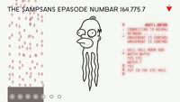
Good design has the power to both amaze and inspire, but can it also arouse or titillate?
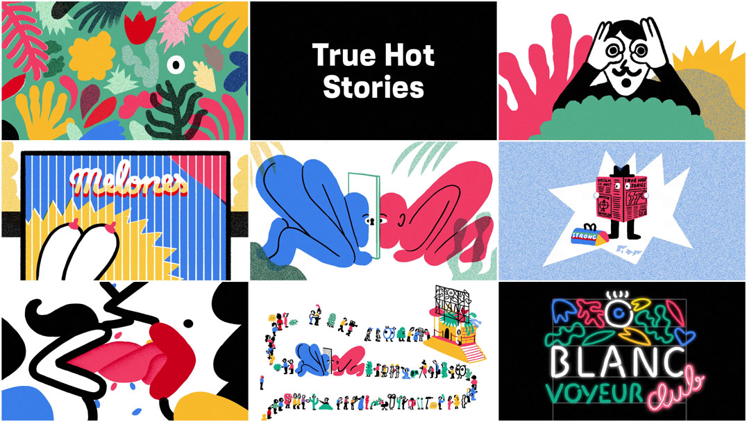
That’s the thinking behind the bawdy opening titles for Blanc Festival 2015, an annual celebration of graphic design held in Barcelona. Conceived by BCN design studio Can Cun and consummated by illustrator Olga Capdevila and animator Genís Rigol, the sequence, titled “True Hot Stories,” is exactly as advertised: it’s a hot and heavy animated romp featuring a cavalcade of creeping cacti, poppin’ peepers, bared bosoms, and waggling tongues.
But what has everyone going gaga? Is it the swinging music or the ornithological erotica? Is it the nods to Hitchcock or Cher? Nah. It’s all that wonderful design, of course. The kind of work that catches your eye across the room and makes you do a double take; design that ignites passion and sets hearts aflame. Artists and designers bare their souls – and more – to create great work. Go ahead, take a good look. The line starts here.
A discussion with Illustrator OLGA CAPDEVILA and Animator GENÍS RIGOL.
Give us a little background on yourselves and your work.
Olga: When I finished my art and design and illustration degrees at Escola Massana, I rented a space with some friends in order to start and share our new freelance lives. That was five years ago. Since then I’ve been working as a freelance illustrator in a number of different fields: editorial, advertising, sculpture, window displays, art for bands, murals, and some really simple and intuitive animations. Also with the people of the studio we founded Tropèl Illustració, an independent project that mixed illustration with design, visuals, and even performance. This gave me a holistic view of illustration.
Genís: I’ve been working as an animator for the last five years. I used to work in motion graphics, but I began to feel as though I was always doing the same thing. In the end I felt like the content was dictating my style, so I decided to come back to illustration, which let me do whatever I wanted to. I used to work in advertising while thinking about how cool it would be just animating for fun…
How did your working relationship come about?
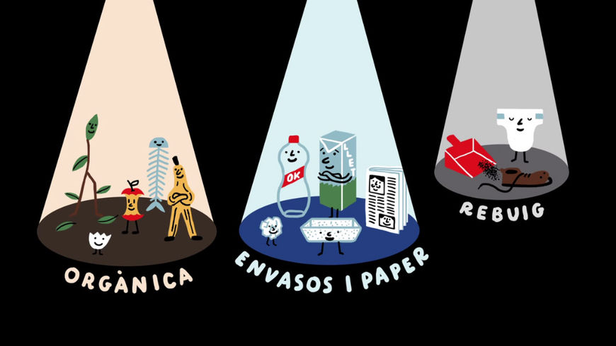
Genís: I was tired of working from home, so a mutual friend, Camille Vannier, suggested I bring my stuff to Tropèl, Olga’s coworking space. As I was the only person there who worked as an animator, Olga asked if I wanted to work together on a short animation for a recycling campaign. We really enjoyed working on it – especially recording the voices – and both of us wanted to do something more ambitious together, so when the opportunity to work on Blanc came, we decided to do it.
"Recycling is easy. We do it right" (Reciclar és fàcil, ja ho fas bé?) awareness campaign, illustrated by Olga Capdevila and animated by Genis Rigol
So Can Cun provided the creative direction for the Blanc Festival project. How did you become involved and what was the first meeting about this sequence like?
Olga: Every year the Blanc Festival organizers ask a different design studio to work on the campaign. This includes creating the graphic identity, the main concept, the website, the book, flyers, posters, street banners, and also the title sequence. Last year Can Cun was chosen to take on this huge project. When they settled on the main concept of ‘Voyeurism’ they thought my illustrations would help them to explain the concept with humour. They had also seen some of my basic short animations, so when we first met they suggested that I work in that style for the title sequence. I really thought that it was an incredible opportunity to work on something more ambitious. That’s when I talked them about Genís and how wonderful it would be if he got involved in the project.
What was the thinking behind the “Voyeurism” concept? Were there any other concepts you worked on?
Olga: Can Cun arrived at the "Voyeur "concept by thinking about the parallels between the classic voyeur – someone who gets sexually excited by spying on others – with graphic designers going to a graphic design festival and getting ‘sexually’ excited by looking at the work of other professionals. With this big and generic concept in mind, I started working on some simple drawings.
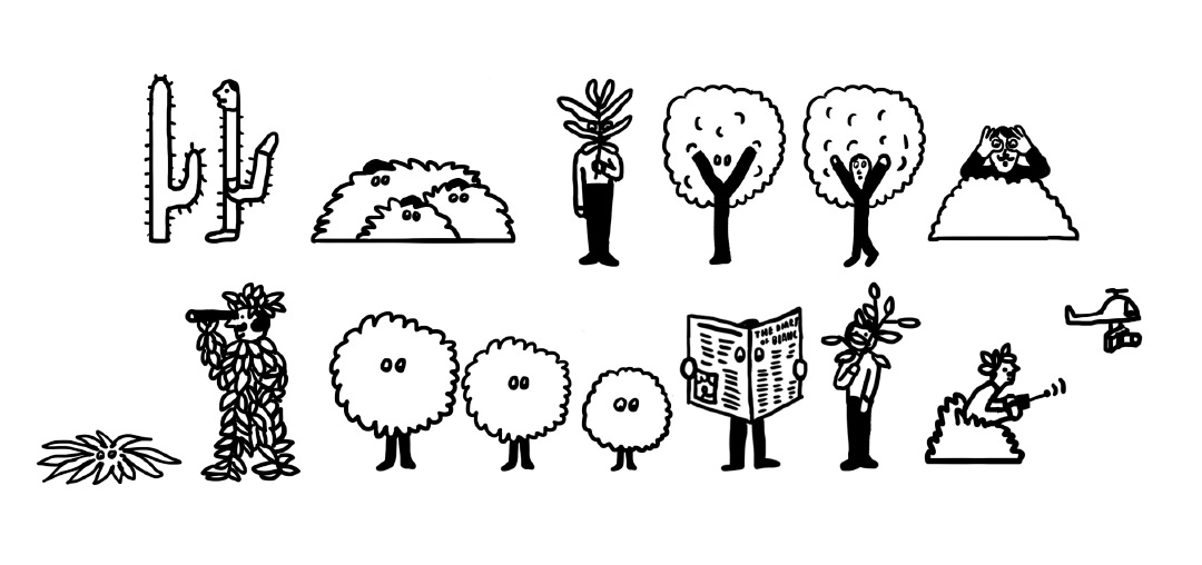
Early concept illustrations by Olga Capdevila
Olga: Using these drawings Can Cun and writer Esteve Plantada made a list of nine types of voyeurs, called “The Voyeur’s Rules”. When we received the list, we started writing the final script, trying to erase the limits of the list and write a single story that put all the characters together. It was important for us to contextualize the characters and play with the spaces and atmosphere to make the connections between the scenes.
The "Voyeur's Rules" by Esteve Plantada of Can Cun
Tell us about the production process. What were your first steps?
Genís: Luckily, the script came together easily. We wrote it in two hours on one inspiring afternoon and didn’t change anything important during the production. The client was expecting something a little more simple, but we just started writing and we felt so comfortable that we just couldn’t stop. We knew that it was more work than what was expected, but both of us were motivated to take on the extra work. We have a similar sense of humour, so we identified with the story and tried to think of the work as a personal project. So, in the end, the big challenge was just to finish it and enjoy the process, doing what we liked and what our intuition told us. We actually went to a beach apartment for a week to find a nice atmosphere to work on the project.
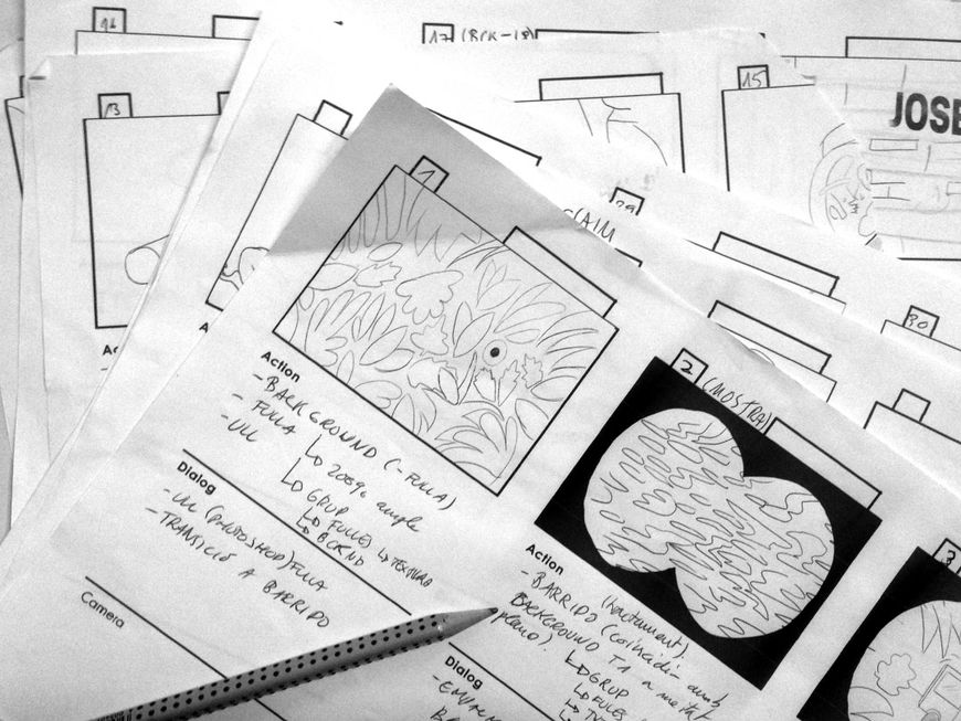
Blanc Festival 2015 storyboards
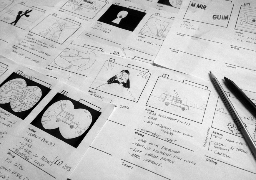
Blanc Festival 2015 storyboards
Let’s talk about the colour palette The illustrations and typography pair so perfectly with one another. How was the interaction between the type and visuals determined?
Olga: One of the first things I did was design a colour palette. Four main colours – black, turquoise green, light blue, and pink – and a secondary extra colour, red. This palette let us explore all the different scenes in the video, and informed all the graphic material. The typeface ‘Blanqueta’ was created exclusively for the festival some years ago by typographer Joan Carles Casasín. Before starting the video we knew this was the font, so I tried to design the characters using a thick line so they could combine with the type. The guys from Can Cun made the final design and layout of the type frames using our palette, and it definitely worked perfectly.
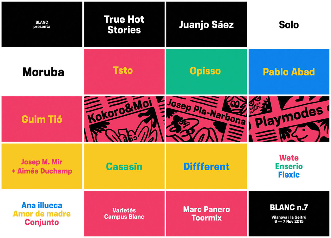
Image set: Blanc Festival 2015 title cards
How did the team at noiz.es become involved in the sound design and music?
Genís: During the production, we had so many doubts about what was the best direction for the sound. We have many musician friends who would have been able to create a really beautiful soundtrack for the title sequence, but we felt we needed someone used to designing sound effects. After months of feeling annoyed by this particular element, we found the work of noiz.es, which combined both sound and music fantastically. When we showed them the piece, they immediately knew what kind of sound it needed. They solved it by making a nice collage of vinyl samplers that worked very well with the frenetic rhythm of the piece.
How big was the production team?
Olga: Basically the team was composed by Genís and me. I guess it would have been useful to have another animator to help Genís. The crazy and complex frame-by-frame animation meant he had to spend all summer in front of his beloved Cintiq. But to have such a tiny team definitely has its advantages: it’s easier to make decisions, and any clever ideas you come up with go directly to the project, so the jokes are more spontaneous and fresh. Of course we also had the support of the Can Cun team. They trusted us completely and let us do what we wanted.
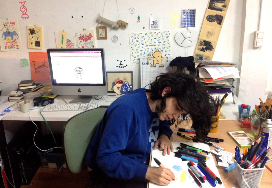
Olga Capdevila in production on the Blanc Festival 2015 title sequence at the Tropèl Illustració studio
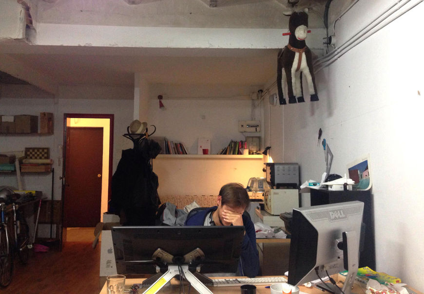
Genís Rigol in production on the Blanc Festival 2015 title sequence at the Tropèl Illustració studio
Which tools and software did you use to put it all together?
Genís: Olga drew and designed in Photoshop. I animated and did clean up in Photoshop as well, shot by shot. That’s really interesting because it allowed us to work with the same tools. Actually we created some brush presets to share, so the combination of design and clean up worked great. Finally we composed it all in After Effects, adjusting the timing and applying subtle colour and texture effects.
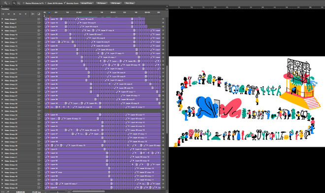
Animating the sequence in Photoshop
Was there anything that took you by surprise when working on this sequence?
Olga: The most surprising and wonderful thing for me was realizing the complexity of this kind of animation. Genís has a very fluid way of designing the movement. It means that the characters or objects change and deform when there are movements or accelerations. This emphasizes the emotion of the scene. So it really surprised me when he asked me to create a ‘quick passing cactus’ or a ‘blur’ (00:12) design at the beginning of the clip.
Genís: For me the only trauma came when I was trying to animate the walk cycle of the big boobs woman (00:33), which is the first shot with complex movements on a single character. It was so difficult to make the movements while keeping Olga's style. I realized my own limitations and it was great. After some hours crying, Olga drew some pose sketches which helped me finish the shot and understand the essence of her characters.

Image set: Blanc Festival 2015 storyboards, sketches, and proofs
What element(s) of this sequence are you most happy with?
Genís: As an animation I especially like the convertible car as it accelerates and goes out of the shot (00:27). I also like the last shot in which we see the queue incoming into the building, using a time lapse technique (01:50). My favourite scene is definitely the close-up of the ornithologist (01:34) – it’s the only one I did not animate. Olga did it. I love it because I can see Olga’s intuition in it; it breathes some genuine freshness into the piece. I like it when someone who doesn’t have formal training in something works by intuition, because I can sense the authenticity of it.
Olga: I’m so proud of all the inside jokes that we hid inside the piece. For example at 00:28 in the background mountains appear as busts, as a kind of Mount Rushmore homage. At 00:55 there’s a tribute to Cher’s song ‘Strong Enough’ – look what happens to the bag of the newspaper man. Also in the final queue there are some characters from the legendary series Dragon Ball and comic representations of all the people at our studio.
What are some of your personal favorite title sequences, whether classic or contemporary?
Olga: I‘m in love with all the work of Sally Cruikshank.
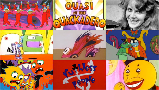
Read more about Sally Cruikshank’s work in our feature article Sally Cruikshank: A Career Retrospective, Part 1.
Genis: As far as classic TV series go, I like the Sherlock Holmes and Pee-wee's Playhouse intros. For contemporary openings I like the Clarence and Man Seeking Woman title sequences. For animation, I like the opening of Adam Curtis' films, especially All Watched Over by Machines of Loving Grace. I love the great editing, how he introduces the subject by combining beautiful images and a sense of humour. I also really like Napoleon Dynamite's opening, Garth Marenghi's Darkplace, and Wonder Showzen, but actually my favourite opening is The Eric Andre Show.
What have you seen or watched lately that’s been exciting to you?
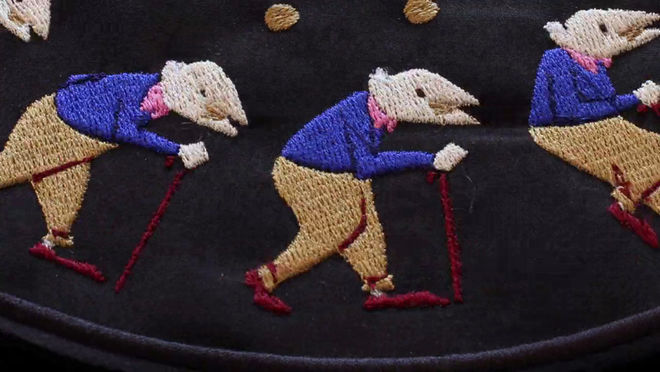
Olga: I recently found the Embroidered Zoetrope by Elliot Schultz. So crazy and beautiful.
Embroidered Zoetrope (2015) short film, directed by Elliot Schultz
Genís: Some weeks ago I saw a really nice performance by the Crater Lab collective. They were using eight 16mm projectors at the same time on a canvas. The result was really impressive, especially for the analogue quality combined with the beautiful effects they applied.
What advice do you have for someone who’d like to get into the fields of illustration, animation, or title design?
Olga: Be patient, be ambitious, follow your intuition, travel abroad if you can, sit well on your chairs – back problems are terrible – and most importantly: realize and be proud of your abilities, but also be realistic about your limitations. So make friends and surround yourself with people that can go further and make things better. If you are from Spain you also should consider changing your country.
Genís: Don’t choose your projects for economic reasons and don’t pay attention to what’s successful online. Look for inspiration in disciplines which are not exactly yours but which share a common element. Those who tell you having fun at work is not important can fuck off. Stop procrastinating, get back to work – or rather get back to fun.

Genís Rigol and Olga Capdevila

