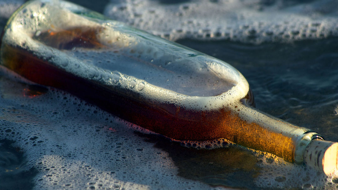
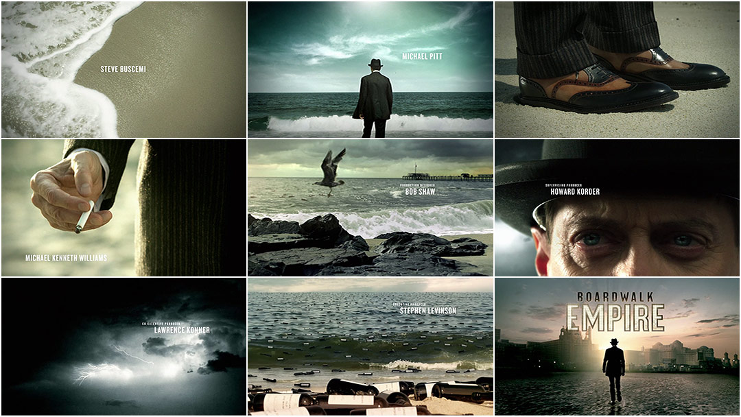
The roaring Atlantic City surf breaks to the beat of an anachronistic slide guitar, rolling in and out to reveal names in the soaking sand. An immaculately dressed Enoch "Nucky" Thompson steps towards the shoreline, gazing out at the horizon as he flips a lit cigarette between his well-manicured fingers. The future of this crooked town is carried on the tide, crashing in, submerging Nucky's unsullied shoes in a wave of vice. Thousands of liquor bottles, like an armada of messages from so many drunken castaways, wash up before the boardwalk. The water recedes and his shoes remain dry.
The hooch keeps multiplying and those waves keep rolling on in Imaginary Forces' title sequence for HBO's Prohibition-era epic Boardwalk Empire.
A discussion with Creative Directors KARIN FONG and MICHELLE DOUGHERTY at Imaginary Forces.
So how did all of this start? When did you meet to talk about the sequence?
KF: I met Terence Winter, the show’s creator, and his team in early 2010 in Brooklyn, where they were shooting. Terry walked me and Producer Cara McKenney through the show’s premise, explaining the context of Atlantic City in the 1920s and describing Nucky Thompson, who was based on a real life gangster–politician. He described the boardwalk as a microcosm of America, so the stories touched on everything: commercialism, class struggle, corruption, violence, new wealth… the ’20s was a decade of incredible growth. He left us with a very open creative brief so as not to limit our ideas.
And the pilot was already shot at this point?
KF: Yeah, it had been shot and they were editing it for its debut.
Boardwalk Empire Trailer
Did you get many references from the show?
KF: Scorsese was still working on the cut so we just had the trailer at this point. We got a ton of visual references from the art department though, which was a treat. They had a research advisor on the production, Ed McGinty, who grew up in Atlantic City and knew all the lore from his parents. He gave us a stack of books featuring posters, ads, newspapers, and postcards of the time. And of course they built this wonderful boardwalk set with props and signage that was so exciting. It’s magical the way they recreated 1920s Atlantic City on a dock in Brooklyn.
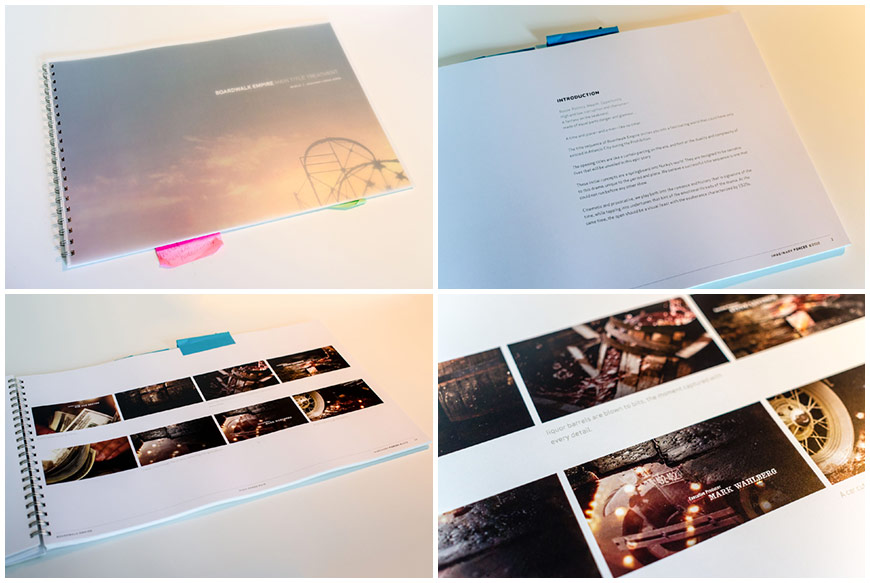
Printed Presentation Storyboards, 03/11/10
So you went to see it?
KF: Yes. After presenting the first set of boards, we were invited to the set as they were shooting.
Initially, we had our hearts set on doing a “portrait” of the boardwalk, a montage that would show how the different worlds collided. That dichotomy of the fun of daytime – the carnival, the gluttony, the cotton candy, the seafood – versus nighttime, which had prostitution and organized crime and seediness, provided a kind of two-toned portrait of American society.
I tend to think that a main title shouldn’t be generic and one way to know it’s working is if it can’t introduce any other show. And what made this show more distinctive than its boardwalk location? The set and all its period details seemed to be a beautiful way to address that.
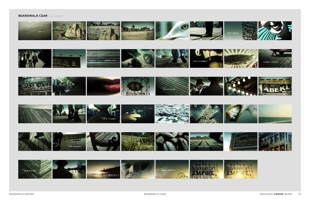
"Boardwalk Czar" storyboard, 03/11/10
Let’s go through these first concept boards.
KF: Sure. They vary. There’s one that was all about distortions like fun house mirrors called, “All That Glitters.” It’s kind of crass and bawdy and we thought, “How can we capture the glamor but also the seediness?” – the idea that a gilded life is also tarnished.
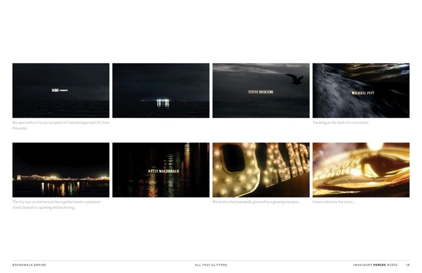
"All That Glitters" storyboard, 03/11/10
For this one, we took the Delicatessen route, hiding the names among ephemera, like going through Nucky’s desk and seeing names on nightclub matchbooks and boxing posters and things that would tell the stories of Atlantic City.
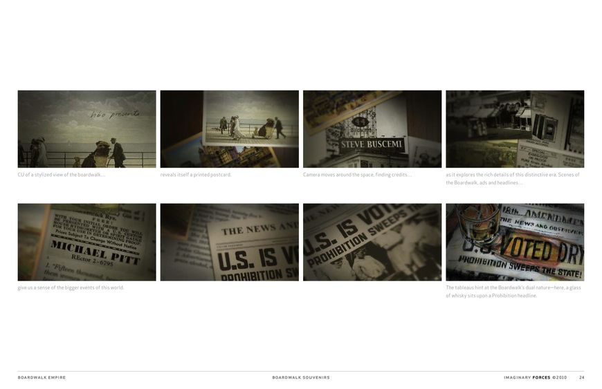
"Boardwalk Souvenirs" storyboard, 03/11/10
Then “Daily Ritual,” with the idea of suiting up – if Nucky’s valet was dressing him. There are some very obvious references to films like The Untouchables. It placed Nucky in the Ritz Hotel just off the boardwalk, so it’s a kind of location and character portrait in one.
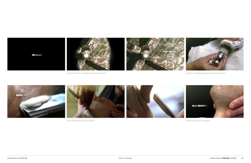
"Daily Ritual" storyboard, 03/11/10
“Head of the Table” again uses distorted glass. You see the grittiness reflected, the image of gluttony. Dreamy crystals and glasses would reflect other scenes: gambling, violence, women, eventually revealing a classic mob gathering with Nucky at the head of the table.
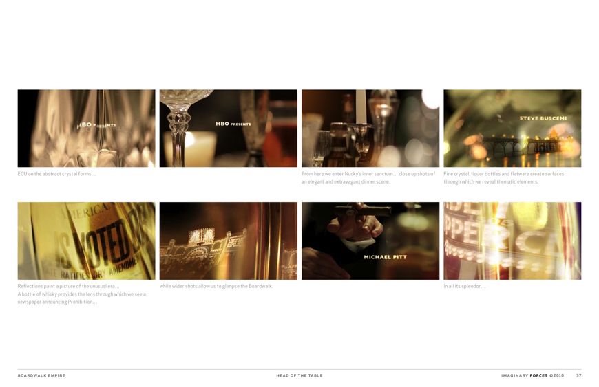
"Head Of The Table" storyboard, 03/11/10
Would you say it’s typical to present so many ideas?
KF: Every project unfolds in its own way. For instance, during this same season I was also working on the opening to Rubicon, and right off the bat we decided on a graphic language for that sequence. Sometimes it just hits you and you spend the entire schedule refining one idea. But other times, you go wide and see what you can distill – liquor pun intended!
So of these first boards, which one did they respond to?
KF: That first montage concept, which was later renamed “Nucky’s Walk of Life.” It was one I was really psyched to shoot. Storyboarder Arisu Kashiwagi did a beautiful job on a series of detail shots, creating a palette and atmosphere that gave a real sense of place. You’d see Nucky’s feet as he walked his kingdom, getting his point of view, going from day to night, from the carnival world to the darker, violent side. Terry also loved the sandcastle idea in the beginning because it hinted that the town was a kingdom built on sand – impermanent.
So we showed up on set to figure out what footage we might be able to steal for the sequence. Our editor Caleb Woods shot some pacing tests on the Coney Island boardwalk and cut together a board-o-matic.
"Boardwalk Czar" animatic
And then?
KF: There was a conversation between Terry and HBO that happened as we were moving towards refining our shot list and getting our shoot dates together. HBO felt that with this show they had something really unusual, and while a montage would definitely show off the gorgeous production, they wanted something with more of a conceptual impact. It was hard to give up what we’d been developing… but looking back, I appreciated being pushed past that. It’s cool when the network and creators see the opening as an opportunity to do something surprising, plant some questions. So we went back to the drawing board…
And that led to the time-lapse board?
KF: Well, Terry summed up the period as one of intense, constant change, of which Nucky is the center. So wouldn't it be great to keep his walk on the boardwalk, but this time show him marching to his own beat, through time? Seasons would come and go… the hustle and bustle would blur around Nucky as he moved through the tide of people coming and going.
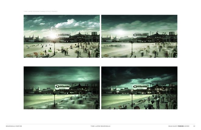
"Time-lapse Boardwalk" storyboard, 06/09/10
Working on the opening to Boardwalk Empire reminded me of when I worked on the film Bedazzled, using a similar technique, but for a totally different comedic effect. We had Brendan Fraser slow down his walk while crowds walked normally around him and we readjusted the playback speed so it looked like he was at a normal pace and everybody else was zooming by him.
Bedazzled opening title sequence
For this, we imagined the effect on an epic scale, shooting motion control crane plates that would give a wide view of the boardwalk below. We’d also intercut some hi-speed shots of various people coming into Nucky’s view, dramatically slowing down for a moment as he passed them. This was sort of a “no-holds” conceptual stage where we weren’t concerned with production parameters. Go too far and then scale back. Do your editing from your biggest idea. In the end we didn’t produce this concept but used the ideas within it as a springboard for what came next.

Printed Presentation Storyboards with client meeting notes, 06/09/10
So the next boards are “Beneath the Surface,” “The Storm’s Coming,” and “City in a Bottle.”
KF: At this point, I was brainstorming with Terry and then doing a bunch of written treatments, because the whole thing had burst open. I wanted to present ideas quickly. Cara and I visited the cutting room to get a sense of where the series was going. As it took shape, certain themes came to the forefront. Terry felt the role of prohibition was central, a catalyst for what happens in the series. The sea itself was also important as Atlantic City’s coastal position made it a smuggling capital. And then there’s the idea of a storm coming. Time-lapsed weather is just very interesting to us, the idea that the conditions are always shifting – feeling a change in the winds, turbulence approaching...
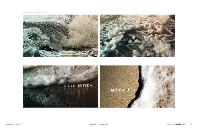
"Beneath the Surface," "Storm Coming," and "City in a Bottle" storyboards, 06/22/10
And that idea appears on the June 24th one, which is a combination of about three ideas since the 22nd.
KF: Right. We thought that the idea of a message in a bottle – something coming, seeing your future – seemed very appropriate. But then we wondered, “What if the bottles literally are the storm?” In a meeting Tim van Patten drew a sketch of a little man looking out with hundreds of bottles coming at him. And so we ran with that surreal image, building a story around it. A man looks out to sea and sees his destiny, calmly watching the chaos roll in. Nucky’s the kind of character who, no matter what is thrown at him, is untouched by the storm. That’s why he’s not soaked at the end: he’s above it all – his shoes don’t get soiled.
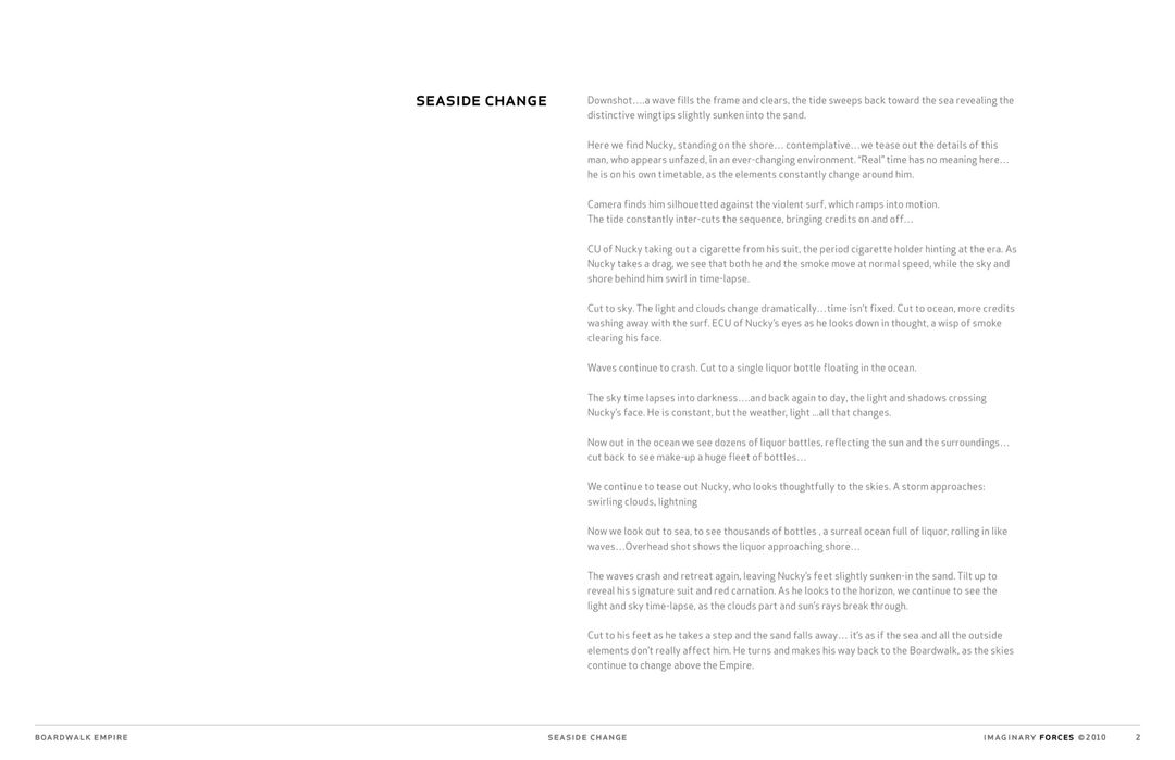
"Seaside Change" storyboard, 06/24/10
And you made an animatic for that.
KF: Caleb cut that so we could get a feel for the progression. This is where we tried to figure out the tempo and lay down some music as well. He experimented with everything from a ’20s ditty called “By the Sea” to Bob Dylan in an effort to establish the tone.
Once the idea was approved, production moved quite quickly. It bears mentioning that at this point I was eight months pregnant and the shoot was scheduled for three weeks before my baby was due – I could go into labor at any moment! So I partnered up with Michelle Dougherty, whom I’ve worked with for years. It was great to have her on it.
"Seaside Change" animatic
Let’s bring in Michelle at this point. How did you dive in?
MD: Karin and I worked on the shot list together. A lot of it she had already planned out so I was there to push it further and say, “Is that the best angle? Is that the best way to shoot it?” The first day I got to the shoot, we were already on set and we started shooting the board. It was pretty fast.
KF: It was a two-day shoot. One was on a beach in New Jersey. The other was on a stage against a green screen. The stage was used for close-ups and inserts we knew we would have to composite, like Nucky’s head turning with the storm changing behind it.
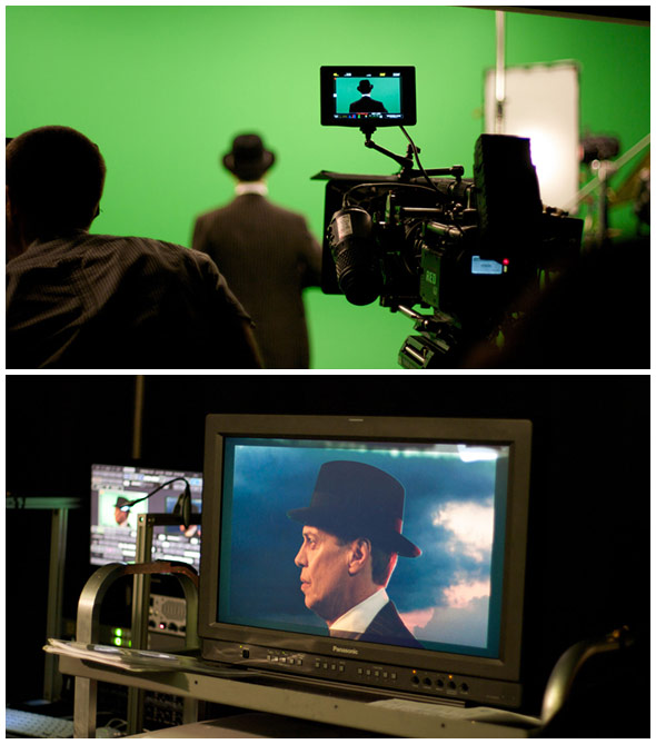
Studio shoot
MD: We basically put him on a turntable and rotated him! That was an interesting shot because it’s human nature for your eyes to look at what’s around you. So his eyes were unstable, and we really didn’t want it to look like that. We wanted it to look like the world behind him was moving. Our VFX supervisor Jeremy Cox tracked his eyes so they wouldn’t jitter.
It was interesting to shoot Steve Buscemi because he is a director himself and there was a little bit of pressure because he’s done some pretty amazing stuff. But he was just wonderful. There were times where we’d say, “Hey Steve, want to see how you did on that shot?” And he would look at it and say, “Hmm, I can do better.” So it was nice to see him self-edit and have him predict what we were about to say. It was helpful too because he had brought props from the set.
KF: All the details had to match the show. For the close-ups of the shoes we had to get vintage socks! And Steve just has such a presence. Since a lot of the shots are from the back or cropped you might think we could use a body double. But you can’t, really! He’s got such a unique silhouette... it was hard to get somebody to even fit his suit!
MD: The last shot of the sequence is actually the last shot of that day, because we wanted to get that nice golden light and we were running out of time. And we knew we couldn’t get someone to do that distinctive walk, so we were like, “Oh my God, hurry, let’s get this shot.” We had him walk away and then it was all composited – just the sand and Steve are real.
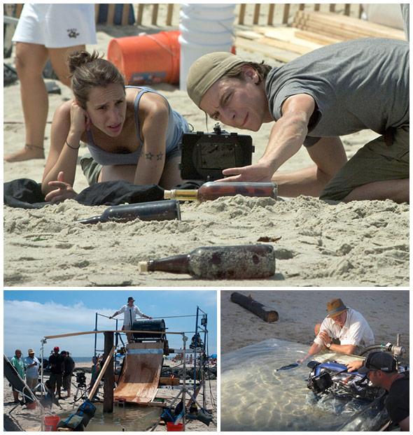
Location shooting of the bottles
And the bottles?
KF: They’re a mix of live action and CG elements. We had a mini second unit shooting them on the beach and we also did some pick-up shots later. As for the bottles smashing against the pier, we built a contraption where we rolled bottles down to smash against a pylon in a tank of water. I find it’s always better to shoot that kind of stuff because it’s more beautiful, more realistic, and you match the location. We did cheat a little on the wide shot of the pier itself. One of our colleagues in LA shot it, because this beach doesn’t have that kind of pier.
So what happened after the shoot?
KF: We started cutting it together based on our animatic. Things were still changing but we needed to lock a cut so our VFX supervisor Jeremy and the team could start with the effects.
MD: We had to place Steve walking towards the boardwalk so we got the 3D model from HBO and also created the matte painting so that it looked realistic. And then the color palette needed to be assembled so the blue skies and the progression of the light and weather would be consistent. We had Art Director Lauren Hartstone help us come up with the master color palette.
KF: Yeah, and you need to plan that in advance, during the animatics, because in one of the shots he might be backlit or there might be a pink glow in the sky and you want to be able to talk to your DP about matching that light. It’s a sort of invisible design element – a color story.
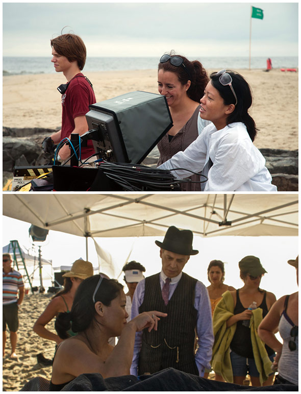
Location shoot with Steve Buscemi
MD: And then there were details like creating the labels on the bottles. We wanted to riff off the Canadian Club labels that were actually used during prohibition. We had Designer Karen Soukup do some research on the typography and labels of that period so it would feel authentic. She also worked up some logos but we ended up tweaking what HBO had already.
How was the post-production timeline?
MD: Whenever you’re in it, you always think you don’t have enough time. But I think because this one was so well planned I didn’t feel the intense stress that you sometimes feel with others…
KF: I’m glad you thought that because there was a lot to do in six weeks! Almost every shot had compositing, whether it was sky replacement or a major CG shot like the mass of bottles in the water.
Did you have the music track as you were building the sequence?
MD: Yes. We had others we played with during the animatic stage, but we were really trying to push for the Brian Jonestown Massacre track because it felt so modern. There were others that came from the 1920s but this one felt like it gave the piece some edge.
KF: Though set in the past, it’s a modern drama and it should hit the viewer emotionally, viscerally. Terry never wanted the sequence to feel quaint. This was a song that HBO was already using in the trailer and it seemed right to pair Nucky with a sort of bluesy sound.
MD: It made the show and the time period feel much larger and substantial. It was fresh, too.
KF: There’s definitely some tension there. We wanted the visuals and sound to complement each other rather than slip into nostalgia.
So it’s not about being literal…
KF: That’s right. It’s more about getting a feel for the soul of the show.
