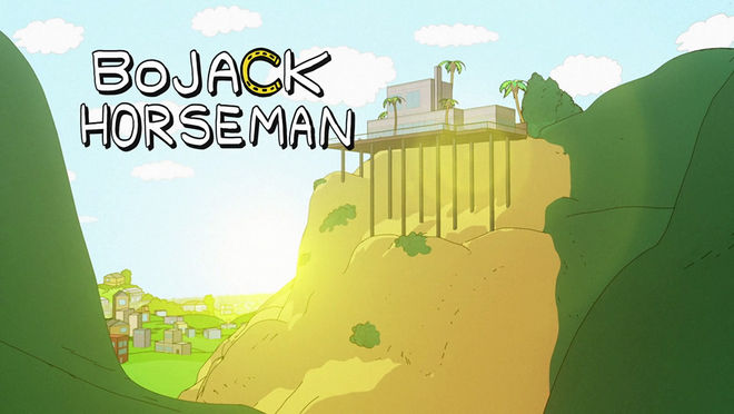
BoJack is half-man, half-horse, and all washed up. He’s also the star of Netflix’s first animated show, BoJack Horseman, a dark comedy about an equine sitcom has-been trying to reclaim his relevance in the Hollywood Hills.
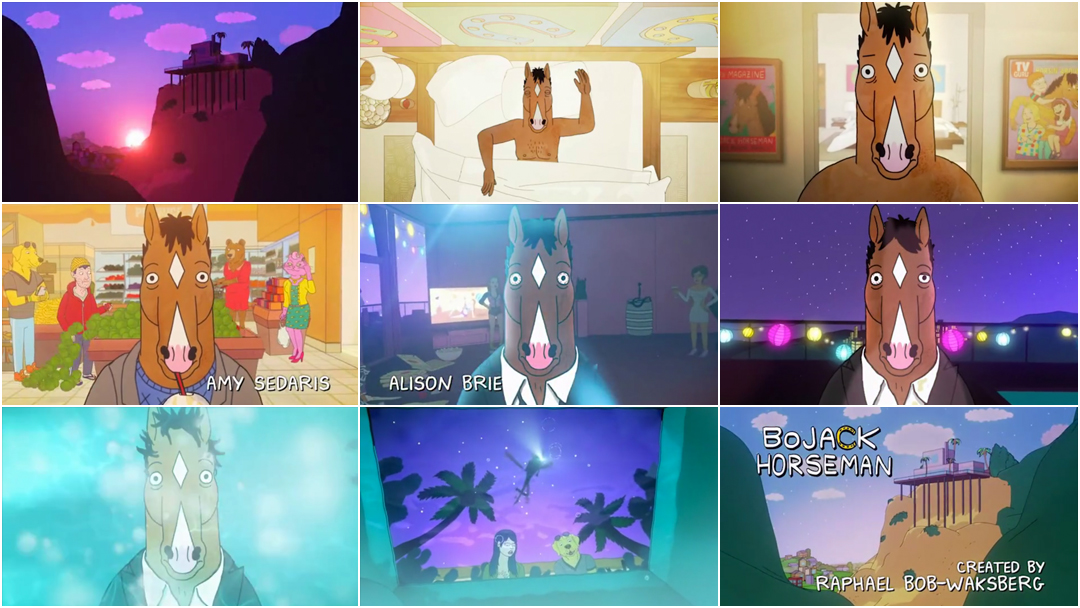
The show is the product of comedy writer Raphael Bob-Waksberg’s heartfelt humour and cartoonist Lisa Hanawalt’s lifelong obsession with drawing goofy animals. The opening sequence directed by Mike Roberts and with music by Patrick and Ralph Carney features BoJack floating through the spaces of his life, disconnected from everyone and everything, staring bleakly into the eyes of the viewer. The sequence is colourful and intricate, the details inviting close inspection – particularly as they evolve over the course of the series.
The title sequence, and the ensuing show, is powered by BoJack and his ennui, and the screwy cast of characters in his orbit. Hot on the heels of the release of its second season, we chat with the show’s creators and main titles director about how to entice an audience into watching a cartoon about a depressed talking horse.
A discussion with Creator RAPHAEL BOB-WAKSBERG, Production and Character Designer LISA HANAWALT, and Main Titles Director MIKE ROBERTS
Give us a little background on yourselves, and how you got to where you are today.
Raphael: Well, I’m a comedy writer! I was a play-writer in college. Bard College, which is a small liberal arts college in New York, and that’s where I met the other Olde English guys. Most of my experience comes from them, working with them, being in the writing room with them and collaborating. Once we all graduated, I moved out to LA and I got a couple jobs. Then I got to make my own show, which is very exciting.
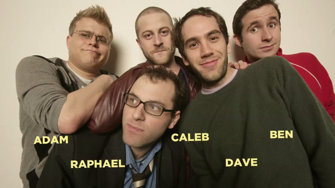
The Olde English sketch comedy troupe as featured in The Exquisite Corpse Project (2012). From left: Adam Conover, Raphael Bob-Waksberg, Caleb Bark, David Segal, and Ben Popik.
Lisa: I’ve been drawing since I was a child, and I went to art school at UCLA where I studied studio art. I was doing photography and ceramics and large paintings mostly. When I graduated, I started doing pet portraits for money, and then I got a couple illustration jobs from places like Vice Magazine and The New York Times, up to the point where I was working completely as a freelance illustrator. And... then this happened!
Oh also I had published some comic books. Wait, I told that in the wrong order, didn’t I?
A little bit! Mike, you're from Toronto, right? How did you start out?
Mike: I’m originally from Toronto. Growing up I thought I’d be a comic book artist. I took Classical Animation at Sheridan College, and then I did animation and storyboards for shows like Angela Anaconda and Bobby’s World and then moved into online editing and motion graphics. I did a few early title sequences – one for a show called Radio Free Roscoe, and another for Little Mosque on the Prairie, a CBC show.
I worked on some films with documentary filmmaker Ron Mann, doing all the graphics, animation and artwork. I made my first short film, Rumbleseat, which ended up winning a JUNO Award, but it wasn’t until I got a staff pick on Vimeo that I started getting phone calls. It’s funny – that Vimeo staff pick got me a manager, agent, etc. I moved to LA in 2012 to pursue directing full-time.
So where did this all start? Where did Bojack Horseman, as a character and an idea, come from?
Raphael: Lisa and I were both big into high school community theatre, and we used to do plays. We would mostly hang out in the green room in our high school theatre and talk about ideas for cartoons.
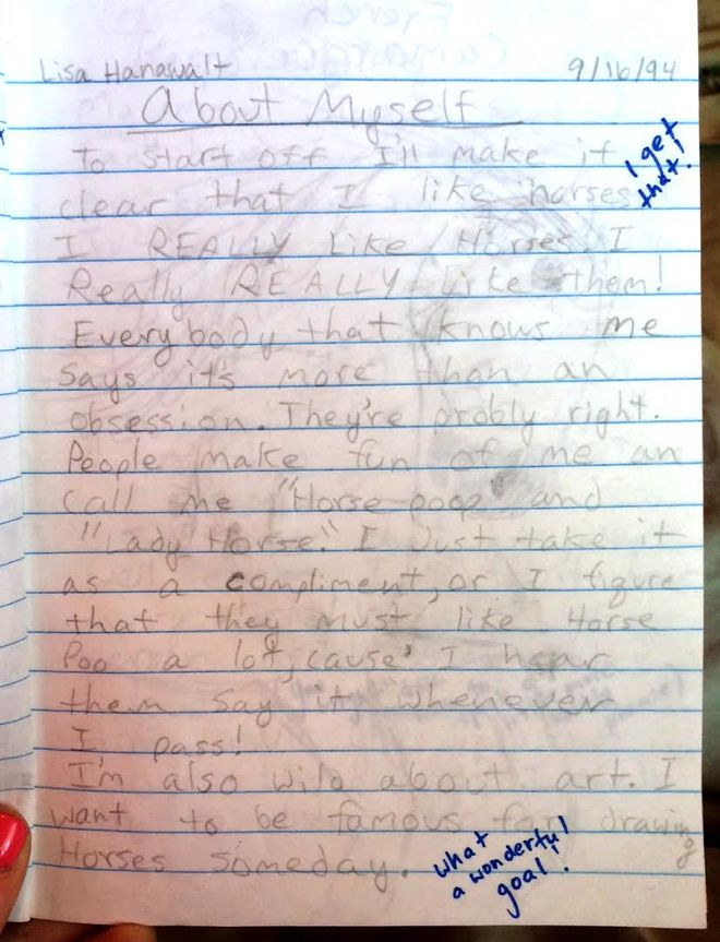
Lisa Hanawalt aka Horse Poop, child prophet, accurately predicts her future life
Lisa: I mean, I have comics I made with animal-people from when I was like eight years old. I’ve been drawing them forever. We used to joke around about what our TV show would look like when we were in high school so it’s funny that we ended up doing this. It’s come full circle in a way that’s surreal to think about.
Raphael: It’s amazing that now we get to do it for real. The beginning of BoJack came when I was living in this tiny room in a gorgeous house that a friend of a friend had. I’d just moved out to LA but I got in a car accident almost immediately so I had no way to travel around, and I felt isolated and stranded in the Hills. I remember looking out over the city, and feeling on top of the world and sort of more alone than I’d ever been. That feeling was kind of the beginning of the BoJack idea – on top of everything, but also feeling utterly alone. Lisa had been doing these animal people for a while, and so I went to her blog and I printed those characters out, and I went to pitch a show. I said “Here’s the world, here’s the characters, and here’s what I want to do with them.”
Lisa: When Raphael first came to me with this idea, he had taken my drawings and shown them with his first pitch. He was trying to think of ideas for the show, he was thinking about doing an animal character, and he was looking at my drawings, and something about this horse character just spoke to him.
Raphael: I mostly used the show as an excuse to work with Lisa.
Lisa: At first I said no, because it seemed like a huge commitment and I wasn’t sure I wanted to do it. They really wanted me to work on it, designing the characters. Eventually they convinced me and over the course of like three years we created all the characters and made the pilot episode and I came on board to art direct everything. I’d never really worked in animation before, besides making small GIFs in Photoshop.
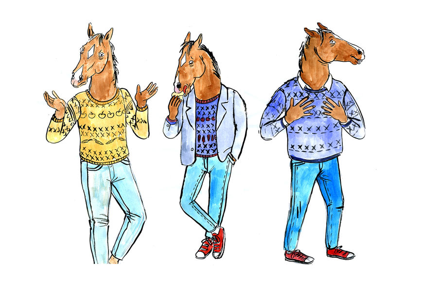
Early drawings of BoJack Horseman by Lisa Hanawalt
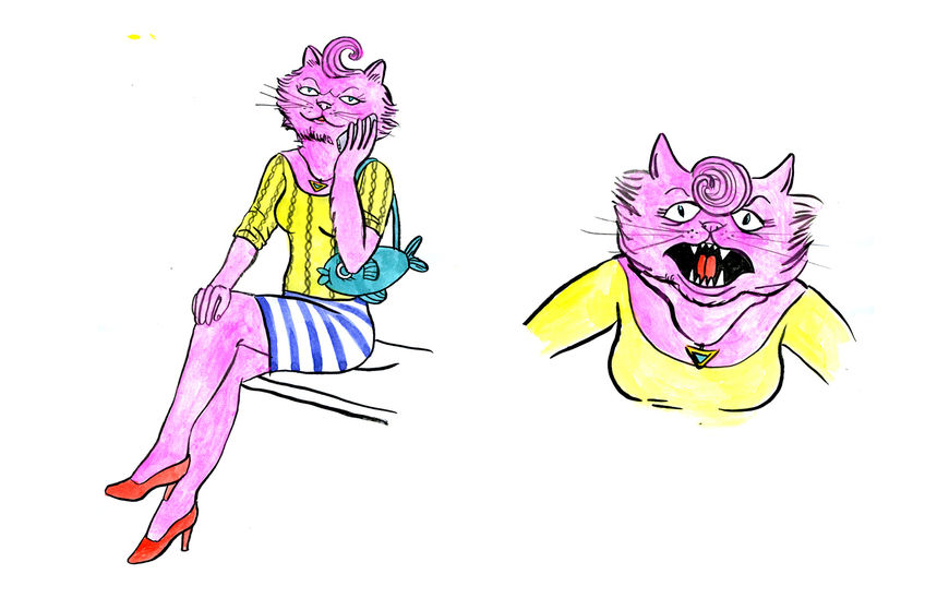
Early drawings of Princess Carolyn by Lisa Hanawalt
Mike, you directed the title sequence. How did you come into the picture?
Mike: I was working at ShadowMachine when Alex Bulkley, the EP there, suggested me to the BoJack team. I’d seen the pilot presentation, and heard all the great buzz about the show, but didn’t know much about it. The first time we really met was when we sat down to talk titles. Raphael had this show down. There was no ambiguous feeling – they just wanted to talk ideas. I’m sure they had millions of ideas of what the titles should have been – but they just wanted to listen to my pitch.
At what point in the show’s development was this?
Raphael: We started working on the title sequence once all 12 episodes had been written. We were in the animation stage of the show, and we started talking to Mike about designing for us.
Mike: It was the perfect time to join in, because without really knowing where the season goes, there’s a risk to go breezy or goofy or “cartoony" with the opening.
—Title Designer Mike RobertsPart of the job of the title designer is to make you invest in the show as a whole.
Raphael: One of the important things for me was the idea that this was a dark show – it’s darker than a lot of other animated shows. It starts out sunny and cartoony and it gets darker as the show progress. We wanted a title sequence that reflected that and hinted at the darker moody elements to come so that people tuning in wouldn’t dismiss the show out of hand. They’d see the hints and maybe they’d think, oh, maybe there’s something more here.
Mike: I feel like I knew exactly what the title sequence should be the minute I read the scripts. I think I also pitched a version of the titles where BoJack was driving or walking around Hollywood listening to his headphones and passing people from the show but that’s still just a version of where we ended up. It had to set the tone and tell the audience the show wasn’t just stringing jokes together. It’s supposed to make you feel a little uneasy – like that feeling where a laugh turns into an “oh shit.” Part of my job was to let you know that there’s going to be funny episodes, thoughtful episodes, and some dark shit later on. You could probably do a whole show that’s just the animal puns and gags – but that's what makes BoJack so great. It juxtaposes that surface with depth and darkness and story that’s always knocking you off balance in the best way. Part of the job of the title designer is to make you invest in the show as a whole. It gets you excited about investing in a story you haven’t even seen yet.
Raphael: Mike pitched the idea of having this GoPro fixed camera on BoJack as he drifts through his day, and I loved it from the beginning. We really gave him a lot of freedom to show us that. He put a storyboard together, and we talked about what kind of characters we wanted to see in the background, but it was really mostly him. I remember he was doing it even before we had the music, even before we had the songs.
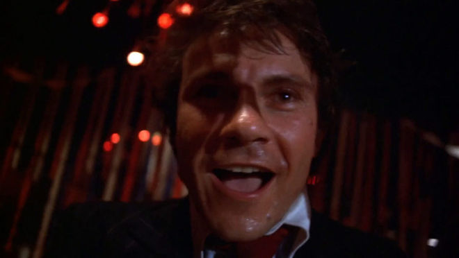
That fixed-camera look, especially in the party scene, seems like it's referencing Mean Streets.
Mike: You know what's crazy? I haven't seen Mean Streets since high school!
The oft-imitated party scene from Martin Scorsese's 1973 film Mean Streets.
I wish I'd copied that scene – I would have added that side fall! Much more dynamic than what I did.
I'm a huge Scorsese fan, so I'm sure that movie is so burned into my subconscious that I didn't even know I was doing it. I love the lighting and look of Mean Streets and Taxi Driver – but that was totally subconscious that it looks like that. There are no real deliberate references in the titles, but it's awash in deliberate cliché! I wanted it to feel desperately Hollywood.
I always tell people that it's the Smashing Pumpkins "1979" video I'm going after – though they're probably referencing Mean Streets, too. Ah! It's all just a big echo chamber!
So, what was your process? How did you work together?
Mike: Raphael and Lisa were incredibly helpful and collaborative, and helped whenever they could – but the great thing is – it’s all on paper. Visually, Lisa’s world is as fleshed out as Raphael’s is with the written word. I read the scripts, studied Lisa’s amazing art – every question I could have was so well communicated in the material.
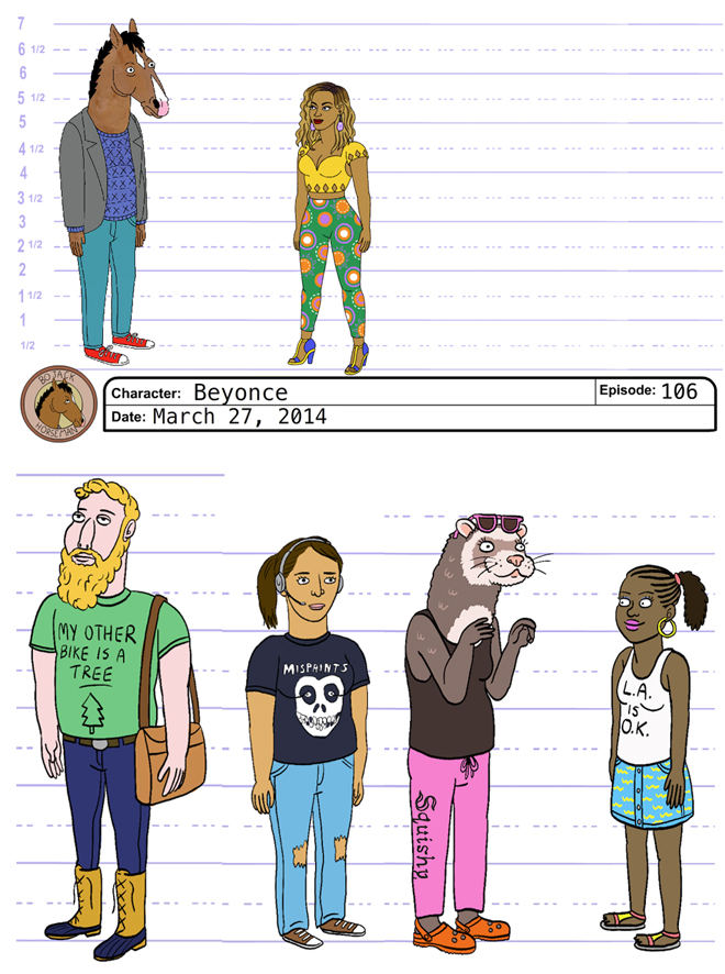
Image Set: Character designs by Lisa Hanawalt
It was a best-case scenario. I made sure they saw my work as often as they could so I didn’t run in the wrong direction, but it flowed so easily.
When I decided we had to build the established 2D world in 3D to achieve the “floaty” feel, the challenge for my team became matching the look as closely as possible, while creating a whole new nightmare/daydream version of what comes after the opening.
We really wanted the titles to feel different-but-the-same. My animation director Ben Bjelajac worked on season one and worked hard to translate the artwork from Flash, the program the show is made in, to After Effects so we could give it that extra "filmic" look.
We used the CINEWARE stuff for After Effects to get the 3D models right in the composition so we could build it in real-time and avoid rendering passes, which feels more trial and error. We re-built BoJack using DUIK tools, which are some amazing Inverse Kinematic scripts. We also grabbed actual elements from the episodes as often as we could for background characters and elements.
Then we added grain and color correction. I wanted it to look like how BoJack wished his life looked – that chromacolor look.
Lisa: I like the colours in the sequence, I like how the lights change as he swivels around that party in his living room. I just like the overall mood. I like how evocative it is. He’s going through this entire day, a typical day of his life, but something about his expressionless face really gives me a lot of feelings when I watch it. You can project a lot on to him, as you often can with horses.
I came on at the very end of that development and made notes, and art directed it. I quickly whipped up the design for BoJack’s swimming trunks.
Oh right, all those apples.
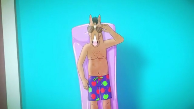
Still from the title sequence in which BoJack wears apple-patterned swimming trunks
Lisa: Yeah. And I drew artwork for the walls and peppered it with more of my art to make it match the rest of the show. It was difficult because the opening was done in more of that 3D style which can look a bit like oil and water when compared with my flat drawings, so we had to kind of quality check it to make sure all that stuff was well integrated.
How did you determine that mixed-media approach? The flat colour, the watercolour textures, and then the 3D going on. Can you talk a little more about that?
Lisa: I developed it with the help of our supervising director Mike Hollingsworth and the background artist who worked on the pilot. We all wanted a look that combined Flash animation with the watercoloury look of my personal work. It’s sort of a complicated process of scanning in real watercolour pages and using that texture behind the digital colour. I think it gives the show more of a handmade feel, maybe makes it look a little warmer.
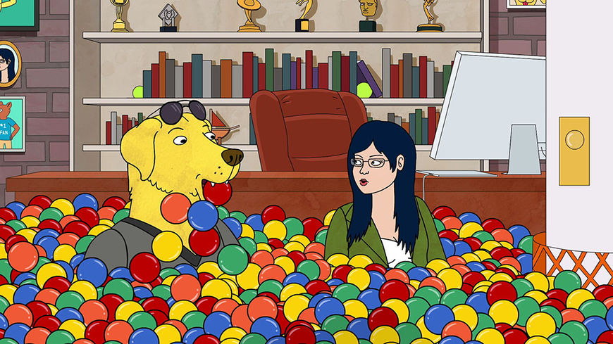
Image Set: Stills from BoJack Horseman
I use a Wacom Cintiq, a tablet and an external monitor that I can draw directly on. I draw everything in Photoshop. The animators then take my Photoshop drawings and import them into Flash and then rig them for animation.
I've seen a few character designs and things that didn’t end up making it into the show floating around the Internet. What were some of your favourite things that didn’t make it in?
Lisa: There aren’t a lot of characters that don’t make it. Most of the characters that aren’t approved at first, I just revise them so that they get approved, and then they end up in the background somewhere.
The Crab Lady's pretty special.
Lisa: The Crab Lady is a rare example of one that just wasn’t going to work in any way [laughs] ’cause she’s so strange!
Raphael: That Crab Lady horrifies me! That is definitely not for this world. Luckily, I’m the boss, so I get to decide.
Lisa: I mean, I still want to get her on. People really respond to her.
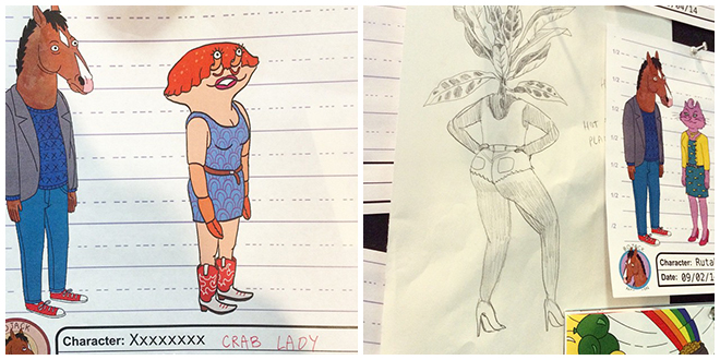
Image Set: Unused character sketches by Lisa Hanawalt featuring Crab Lady (left) and Plant Babe (right)
What about the music for the sequence? How did you work with that?
Mike: The music was really fun to pore over. I can’t remember how many songs there were initially – five or six, tops – and they ran the gamut tonally. There were a few funny poppy songs, bluesy ones, but every option could have worked. I had a cut of the animatic without music, and we just kept laying the picture over the song and we had it down to two or three options. We ended up split between the Patrick Carney song and the Grouplove music.
Raphael: It really came down to those two. We brought all these animators and writers in and showed them both and took a tally, and it kinda came down to half and half. I really love this Patrick Carney piece that again felt darker and moodier than what we would normally hear, so I had the idea that we could use one for the opening and one for the closing.
My worry – with the Grouplove song – is that it’s really fun and bright, and also incredibly on-the-nose about what the show is. I felt like that might be a little cheesy at the start of the show, but at the end it has this perfect fun energy. Especially at some of our darker endings, cutting to a peppy song kinda feels like a great sick joke. [Sings] Back in the ’90s! – it really punctuates the show in a great way.
Let’s talk about how the title sequence evolves as the show goes on. A big change happens in episode 6, when the D is dropped from the Hollywood sign. How did you determine that evolution, the changes in the sequence?
Lisa: The show plays so much with continuity, and something about the way you can binge-watch stuff on Netflix makes those little changes even more apparent. It was really fun to start showing that in the titles, to have his ottoman be burnt, have the D be missing, just make little changes that you might not even notice at first, but if you watch it over and over again you’ll see those things pop up.
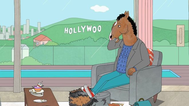
Still from BoJack Horseman featuring the Hollywoo sign and the burnt ottoman
Raphael: There’s a bunch of changes that happen throughout the season! In episode three, the ottoman is lit on fire. Todd breaks BoJack’s bed, and he props the bed up with a bunch of books, and you can see that from then on in the title sequence. It’s become an important piece of our show. It’s really fun to talk about!
Part of it is that we really wanted to hammer home as much as we could that unlike most cartoon shows that revert back to the status quo, this is a show that accumulates damage. BoJack accumulates damage. The things that happen matter, and things carry weight in a broader sense. The characters will change, and grow older, and relationships will shift and I just felt like every change we could do to hammer that in was a benefit to the show.
That kind of detail can be really rewarding for a viewer.
Raphael: Yeah, for sure. The more details we can put in and the more easter eggs we can hide, the better. It encourages the audience to pay attention, and it rewards repeat viewings. They’re much more in tune that way.
Four days after BoJack premiered on Netflix, it was renewed for a second season. What was that like for you?
Raphael: It was great! [Laughs] But also, it was scary. You know, there’s a certain amount of stress in trying to plot out a season and there’s also a certain amount of stress in seeing the reaction to it. When you put those together, it’s actually helpful because one distracts from the other. There’s always something else to worry about.
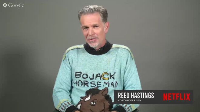
Netflix CEO Reed Hastings wears an intarsia BoJack Horseman sweater in the company's Q2 2015 earnings interview
Photo: YouTube/Netflix
Lisa: Netflix is great because not only do they let us do pretty much whatever we want but I just get the feeling that they’re fans of the show. Whenever the network executives come to table reads, they’re just giddy. They’re always excited to see what happens next, and I feel like they dig what we’re doing.
Raphael: It’s very encouraging. We really found an audience who gets the show, and it’s wonderful to get to make more.
Mike: I was just lucky they let me drive the truck for a few miles. And if it didn’t get renewed I wouldn’t have had the chance to direct a couple of episodes of season two! It was very interesting to be a part of the show at an obtuse angle, then be really immersed in it for the second season.
What’s different about BoJack season two and its titles?
Mike: Little has changed really. We continued Raphael’s evolution of the opening. There’s a big change to one segment, but other than that, I don’t think they wanted to reinvent the wheel – just remind everyone that the show is constantly evolving. They just wanted an extra chuckle for those paying attention.
Lisa: It’s very very similar, but we incorporate some themes and backgrounds and characters from the new season. There are little changes as it goes along as well. The song is the same, and the overall feel of it is the same.
BoJack Horseman season two main titles
And the show itself?
Lisa: Last season it was like, can BoJack be happy, can he change? This season is about him trying to implement changes. He’s being more proactive, at least at first, about trying not to be the worst person.
Now – and this is important – is there going to be another crazy-ass drug trip sequence?
Lisa: [Laughs] There is not, but there is a sequence where a character is telling a joke and we go into a kind of watercolour storyboard sequence. It kind of looks like a Richard Scarry book. I wanted it to be super nostalgic. And there’s a part where BoJack goes to New Mexico and it’s crazy… there’s a lot of stuff that’s visually interesting this season.
Oh, there’s a part where Todd builds his version of Disneyland which is just fucking insane. We went kind of balls-out on stuff this season!
Perfect. And, more generally, what have you watched lately that’s been exciting to you?
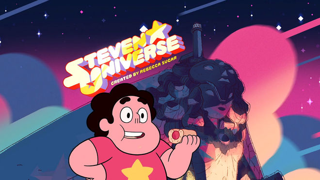
Lisa: Lately I have been really into Steven Universe. I think it’s probably the best animated show on TV right now.
Steven Universe (2013) main titles
I like that, and Rick and Morty, which are two of my favourites. I’ve also been rewatching a lot of Miyazaki movies. As for live-action, I just watched Jonathan Strange and Mr. Norrell, which is a BBC mini-series that I really like.
Raphael: I think there’s so much exciting stuff happening on TV right now. Rick and Morty would be the obvious example – another cartoon that I adore. I feel blessed that I get to make cartoons at the same time as them. I think Broad City is phenomenal. I’m loving Amy Schumer’s show.
Mike: I’m eternally in love with Hell on Wheels. Peaky Blinders is another. I’m a huge Archer fan. I thought Mad Max was a revelation. I don’t know, those feel like pretty obvious picks!
And in terms of titles, what do you think are some of your personal favourites?
Lisa: The one from Steven Universe! The song gets stuck in my head all the time and it’s beautiful. In terms of live-action, I really like the title sequence for True Detective even though I hate the show.
The first season’s titles or the second season’s?
Lisa: The first season! I just thought the titles were so beautiful and the song was so great, but I didn’t care about any of those characters at all. My friend keeps trying to get me to hate-watch it with her. But I do enjoy a good hate-watch, and I feel like there’s a lot to learn from things you don’t like.
Mike: Obviously True Detective blew everyone’s mind, but it’s so unique and masterful that it’s almost dangerous to allow it to be an inspiration. I love when a movie or show sets the tone with a great title sequence. I’ve been loving Hell on Wheels’ incredible title sequence. And how great was the title from Skyfall? I’ll watch a James Bond movie just for the opening. I remember the original MK12 stuff was a real game-changer for me.
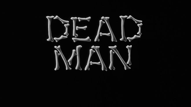
Main titles to Dead Man (1995), designed by Balsmeyer & Everett, Inc with music by Neil Young
But even the simplicity of The Great Escape or the original Thomas Crown Affair or The Long Goodbye. Love the opening from Jim Jarmusch’s Dead Man, and I love the simplicity of the end titles from Blue Valentine.
Raphael: I really love those cheesy family sitcoms, from the ’80s and ’90s – pretty appropriate, considering my show, right? Step By Step had a fantastic title sequence. The idea of this family going to this amusement park together. They updated it every year and as a kid I thought it was really fun. It always had the same framing device but as the kids got older, it would update what the kids would do, what rides they could go on. I know it’s not cool or edgy at all, but that’s what comes to mind.
I was watching Bloodline, which has this timelapse title sequence, and I was thinking, “That’s weird that they do that on Bloodline, because House of Cards also has a timelapse sequence. It’s weird that Netflix would allow two shows to do the same trick like that!” Then I realized, wait a minute, my show also does a timelapse thing! [Laughs] So I can’t begrudge any show for doing that.
They all feel really different, though. The music changes everything.
Raphael: They really do! Exactly. I don’t think Bloodline feels the same as House of Cards at all.
Oh, I can’t not mention Unbreakable Kimmy Schmidt! That title sequence is so good. So infectious. When I’m watching – I’d be watching the show and I’d get to the end of an episode, and I’d think, do I want to watch another one? Then, you know, the countdown would finish, and I’d get a bit of that title sequence, and it would push me to watch another one! It’s so infectious.
Mike: Netflix makes the potential for inspiration so amazing. I watched 11 seasons of Cheers a couple of weeks back for no reason. What did people used to do? I bet trees miss us.
Raphael: I really like when TV shows have full title sequences, when they move away from the trend of having just the title card. Now cable and Netflix is really giving itself time to tell the story through titles, which I love.
Support for Art of the Title comes from

CINEMA 4D BY MAXON
Featuring an Unmatched Live 3D Pipeline with Adobe After Effects CC

