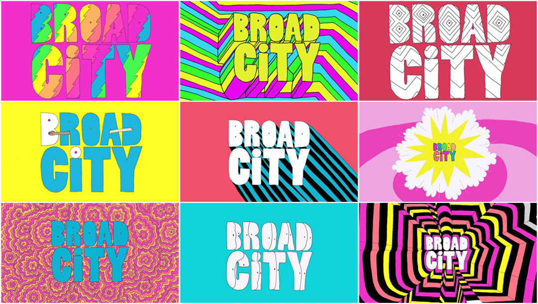
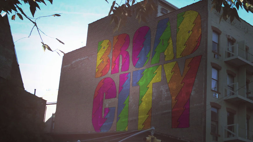
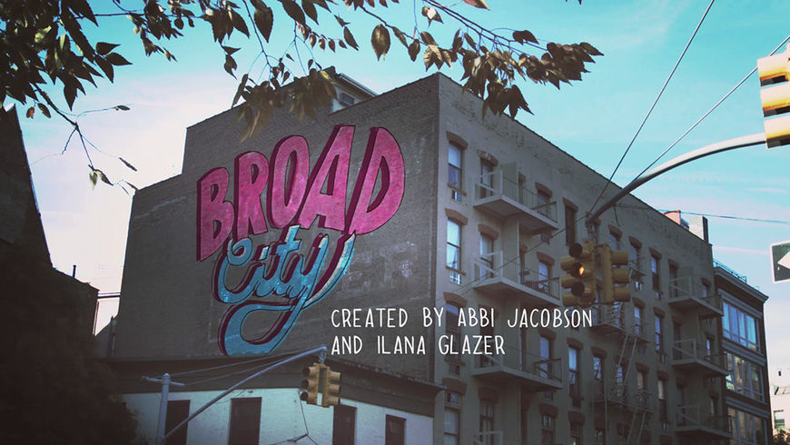
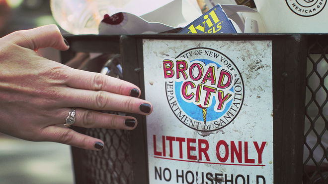
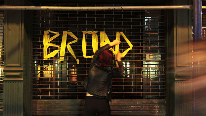
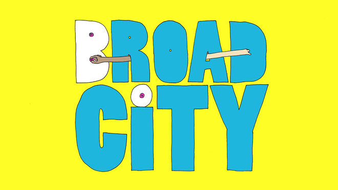
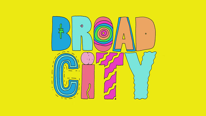
Ink-vomiting letters, spinning breasts, exploding geometry: one never knows what to expect from the animated title sequences of Broad City. Artist Mike Perry had so many ideas ahead of his initial meeting with Ilana Glazer and Abbi Jacobson, the show's creators and stars, that one was not enough. So every episode of the Comedy Central series — returning for its third season next spring — offers the viewer a different sequence and a new glimpse into Perry’s limitless imagination.
“I wanted it to be big, bold, and weird,” Perry explains of his initial inspiration during our conversation with him. He highlights his exploration of color as a way to “vibrate the viewer.” His designs nail this goal, flashing fast and bright like a drug-fueled sprint through Times Square. The sequences, each a mere seven seconds long and set to the same percussive jingle, burst with energy as they present a new treatment of the show’s bubble-lettered logo. Though each sequence is different, their dual constants are Perry’s hand-drawn linework, loose and imperfect, and a seizuring neon palette punctuated with black and white. Before every episode this combination of form and color ignites like a perfect seven-second bomb, sweeping the viewer into Abbi and Ilana’s adventures amid the effervescent backdrop of New York City.
A discussion with Illustrator MIKE PERRY and Comedy Central Senior Designer & Animator JULIE VERARDI
Give us a little background on yourselves. Who are you?
Mike: I was born in Kansas City, Missouri, a child of the ’80s. I watched a lot of cartoons and always loved to draw. My mother got me this book Chuck Amuck and I drew every page in that book.
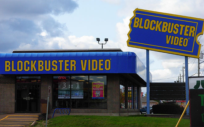
Blockbuster Video was a US-based provider of home movie and video game rental services with over 9,000 stores throughout the US and Canada at its peak in 2004. The company effectively folded in 2013.
When I was in high school I wrote a few movie scripts. Not because I was interested in making a movie but because movies were in my vocabulary. I worked at Blockbuster Video where I was given five rentals a week. I had a bootlegging system set up in my room and I would record on super long play so I could fit three films to one VHS. By the time I got to college my movie collection was epic. I went to college at the Minneapolis College of Art and Design. I got a credit card and bought a $500 trunk to store all of these movies in. My friends would borrow films all the time. The cassette that was borrowed the most had the animated G.I. Joe and the Transformers movies.
Then I moved to Philadelphia and worked as a designer for Urban Outfitters for a few years. And now for the last 10 or so years I have been in New York doing my own thing. It's been a wild ride of creation. I have been fortunate enough to make all kinds of crazy things. From an official Nike NYC Marathon shoe, to using social media to get strangers to GET NUDE GET DRAWN. So when I signed on to Broad City I jumped in headfirst ready to continue the ride. Broad City was the moment that showed me I can make my ideas move.
Julie: I was born in the ’80s and grew up in the ’90s in Staten Island, NY. My notebooks were always covered in doodles. I had an unhealthy obsession with unicorns and She-Ra. I signed everyone’s yearbook in fifth grade with an illustration of a cat doing a different activity. I had no idea what I wanted to do with art but I wanted in.
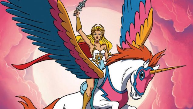
She-Ra and her unicorn Swift Wind, from the animated series She-Ra: Princess of Power
I went to School of Visual Arts in NYC and I randomly picked graphic design. I didn’t particularly care for it. I got into advertising for a little while and then I had an amazing teacher my junior year who was so in love with this class he was teaching called Motion Graphics. He talked about it with so much passion it became infectious. I just wanted to hear more and more. He mentioned that one of the great things about it was how it encompasses all forms of art like editing, animation, illustration, music, typography, and so on. I loved the idea of how this one form of art could be so many things. I wouldn’t have to choose. It wasn’t until I started animating and making design come to life, did I wind up appreciating and loving graphic design.
I had also always loved title sequences but I had no idea what that was called or how people made it. Motion Graphics helped me realize what it was and how I could be a part of it.
So how did Broad City come to you?
Julie: I remember being told we had a new show coming to Comedy Central that was very different from the current programming and that everyone was really excited for. It was a web series first, so I watched every early episode and loved it.

Broad City creators Abbi Jacobson and Ilana Glazer
I was beyond excited to help develop the show opening. We had a meeting to introduce ourselves. I brought with me a collection of images I saw potential in for the opening. The first meeting went great. They liked the references in the mood boards. I remember Abbi and I were wearing the same shirt, from the same store, and we both really liked the same restaurant that one of my design references was pulled from. I left the meeting feeling like we were all on the same page. They had also mentioned that they were really into this artist named Mike Perry and to see if he was available to work with us on any concepts.
Mike: Originally I was asked to design the logo and a title sequence that would be used for every episode. But the project was so rich that I had so many different ideas. I went into the meeting and showed a ton of those ideas. Then boom. Someone said we should do different titles for each episode. I couldn’t have been more stoked! One, I’d just created job security for myself, and two, I now got to make all the ideas I had come to life! What else can you ask for?!
So what were some of the early concepts?
Julie: I started to play around with incorporating Mike’s and my illustrations with videos and stills of NYC.
Early title sequence explorations featuring still photographs of New York City and illustrations by Mike Perry and Julie Verardi
Early title sequence explorations featuring still photographs of New York City and illustrations by Mike Perry and Julie Verardi
I also looked at tagging Broad City stickers all over NYC as a potential concept. NYC is a third character in the show so it felt right to explore the title living in the city.
Early title sequence exploration featuring Broad City stickers
I also went around with coworkers and started threading plastic caution tape through fences in a park to spell the title in a stop motion execution. However, we were quickly shut down by the parks department. Where is Leslie Knope when you need her?
Early title sequence exploration featuring plastic caution tape
I even went around with miniature cut-out characters of the girls and put them in set-ups around Washington Square Park.
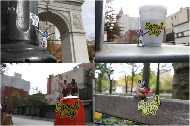
Image Set: Broad City "Miniatures" concept explorations
All of the explorations came out great, but at the end of the day, we decided the right way to go was with a fully illustrated world from Mike. He had created a pitch deck of gif-based animatics of different title treatments and environments.
Mike: There was no real concept. I knew I wanted it to be big, bold, and weird. I wanted to make something wiggly. I also was fortunate to see the episodes come together as I was developing the work so I wanted to include the same kind of humor. I wanted everything to be as colorful as possible. Coming from a world of print where neons cost extra I was thrilled to work RGB and go wild. For me half of the animation is color exploration. Trying to vibrate the viewer.
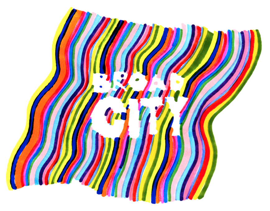
"Marker Sketch" – unused concept sketch by Mike Perry
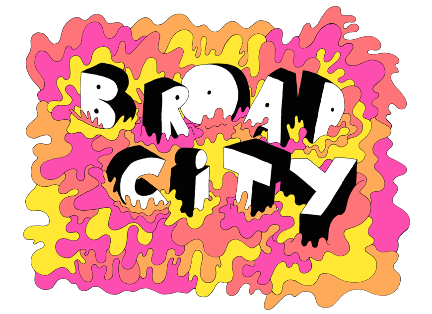
"Lava Splash" unused concept sketch by Mike Perry
Julie: Comedy Central and Broad City loved how unexpected and fun they were and we all quickly agreed on a logo and which backgrounds and environments we thought would be good to use to develop into an animation.
The initial samples were so exciting, it was quickly decided to work up a custom animation for each episode's open. Mike went on to draft a series of penciled animation tests, which we narrowed down to the favorite 10. Mike then developed these into fully inked and colored cell animation image sequences.

Broad City animated logo sketch by Mike Perry
What was that production process like?
Mike: The process starts pretty old school! Quick pencil animatics as proof of concept. Then I jump into making the drawings, one frame after another. All drawn with a Faber-Castell (S) on 11x17 paper. So it’s just hour after hour sitting at my light table working away. During season two I watched most of the Ken Burns documentaries on Netflix as I worked. Once the drawings are done comes the moment of truth. I scan them all in, load each drawing into Photoshop, and hit play. This is the best moment. All of those hours come alive. Then I make adjustments to the drawings then start coloring frame-by-frame. Phase two is done in Photoshop. Then I send them off to Julie, who edits them to fit to the music.
Julie: As Mike finished each sequence, he would email his layered Photoshop files for each open, which were anywhere from 10 to 100 layers. I would then bring them into After Effects and see how they would fall into the seven-second time frame of the song.
The song was very crucial in this process. It starts off counting out a beat, “four and three and two and one one.” On the last part there is a skip/repeat and then the beat kicks in. These were very distinct beats I wanted to hit with the animation.
For some of the show opens we just looped the animations and things fell into place naturally. For others, I would help tease the progression of the animation out using AE and Photoshop by timing the build of how things were animating on to the beats of the music. I would sometimes go into Photoshop and add extra frames by pulling apart some of Mike’s illustrations and creating new ones based on the originals. I’d add color fills to the type and different colored backgrounds just to experiment and see what worked best, but always keeping it in Mike’s world.
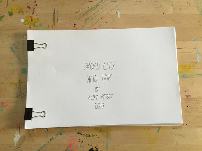
"Acid Trip" sketches
Another technique I used often to help focus the viewer’s attention was to punch in and highlight parts of the animation. The files were nice and large, so I had the ability to focus in on certain letters animating. Then when the full audio would kick in I would make sure we were wide to see the full animation build on. I would also re-time the animation to look like it was reversing when the audio would make that noise like it was skipping.
It was very important for me to find the natural balance between traditional cell animation and using AE to help add to it. I wanted to make sure to not take anything away from the natural beauty of frame-by-frame animation.
If I needed something a little extra I would go back to Mike and ask for him to draw a few more frames to help enhance a particular section. Chris Scarlata, the Vice President of Design at Comedy Central, would oversee our collaboration.
Mike: During season one Chris and I talked almost every day, often very early in the morning. I feel a great deal of trust with Chris and am massively grateful for him looking at my work and thinking, “Mike can do this.” This was my first proper animation gig.
Just seeing everything move after spending days and days drawing was thrilling. So many moments where I was just shocked that things worked. Giving drawings life through animation has changed everything for me. It has made me think about storytelling. It has made we watch how people move and interact with space. It has opened my eyes. It has also made me tired at moments because, goddamn, you have to do a lot of drawings. Good thing it's my favorite activity!
What was the genesis of the jingle used for the sequences? How was that made?
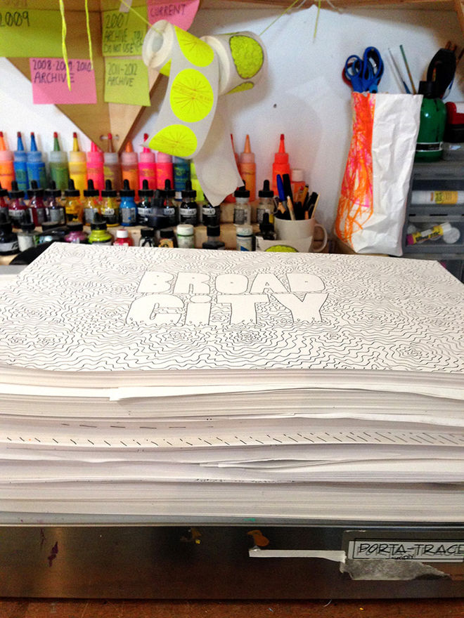
Image Set: Mike Perry's sketches for season two
Julie: We started off working with a beat that sounded like Missy Elliott’s “Work It” that we got from Broad City as a temp. The editors from the show were the ones who found the music track that is currently used. I thought it was perfect and had a lot of variety in that seven-second part to animate to.
How did your approach change between seasons one and two?
Mike: For season one we were figuring things out on the fly. So while the show was in production we were solving the look and feel, the way things moved, trying different types of music. Working through it. Season two was much more relaxed. We had the track. We had the look and feel. It was just up to me to go deep and do my thing.
How do you see it changing for season three and beyond?
Mike: Hopefully things will get weirder!
And what happens with the hundreds of individual drawings that go into each animation?
Mike: After season one I gave Abbi and Ilana and a few members of the Comedy Central team complete sets of drawings that I handbound. The rest are in the studio in a box. Season two’s in another box. Season three...
What’s your personal favourite opener from the show?
Mike: "Nipple Twister," season one, episode ten. Because we had to get the FCC to approve the content. And it got approved!
Broad City episode 1.10 "Nipple Twister" titles
Julie: It’s so hard to choose. From season one I really loved episode five, called “Chamber of Colors”. The design was so powerful and striking. I feel like the evolution of that animation worked out great by adding the fly-throughs in After Effects and animating the colors to the beat.
"Vomit" from season two, episode two. I liked it so much that I made sure to do an edit of it for the promo commercials. I love how the type would flow and come on. The type was transforming a lot so it was fun to go into Photoshop and edit this one around. This was another one that was great to do punch-ins. I think it worked especially well on the audio skip at the top.
Broad City episode 2.2 "Vomit" titles
And an honorable mention to “Pimple” from season two, episode eight. There was a great variety of scenes and layers to play around with.
Mike, you’re doing another TV series project called Island Life, this one with Jim Stoten. It sounds like a really fun concept. What can you tell us about that?
Mike: We’ve been working on it for over a year now. It is getting wild. We’re about to do our first animated short. Hoping to launch that by the end of the year. We have our bible pretty fleshed out – we’ve written five episodes. We have done way too many concept drawings! It’s a blast working on it. This animated short is going to be an important next step. Just to work out some of the logistics and finally see things move the way we’ve been dreaming about from the beginning!
What are you working on lately, Julie?
Julie: I recently wrapped up my first semester of teaching at Parsons The New School. It was a really great experience and helped me to grow as a designer and educator. I was teaching sophomore illustration majors how to animate for the first time. I probably would have never discovered motion graphics if it wasn't for the teacher I had in college, so I hope that I got to inspire them in the same way. You can check out some of the student work on my website.
I'm also always taking classes to challenge myself. I've recently taken classes in photography, illustration, typography and I'm currently in a silk screening class. I'm always updating my site with projects I'm working on.
Last question, here. What are some of your personal favorite title sequences, whether classic or contemporary?
Julie: My all time favorite is The Simpsons, which I grew up on. I didn’t have cable and it was on almost every day. It was just an amazing show. I always loved how each title sequence was different, unexpected, and fun – it was like receiving a little gift. This was definitely something we had discussed early on for Broad City and I feel like this method works great for the show and the viewers.
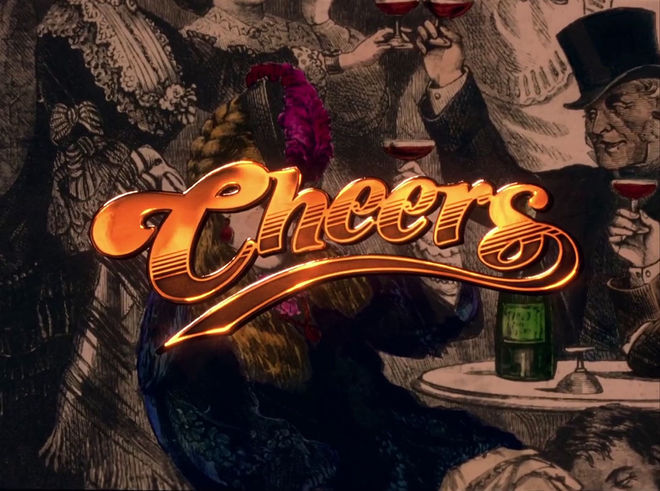
Cheers main titles, designed by Castle/Bryant/Johnsen, Inc.
I also love the titles for Dexter, True Blood, True Detective, Unbreakable Kimmy Schmidt, Cosmos, Black Mirror, West Side Story, The Maltese Falcon, and A Series of Unfortunate Events, to name a few others.
Mike: This is the hardest question for me! My first thought is MacGyver or Cheers because I love the theme songs and they live in my head fulltime. When I got to college I was introduced by my friend Namdev Hardisty to a rare cut of North by Northwest which opened my mind.
Scott Makela was an alumni of MCAD and I always looked up to the work he did. I really love the Casino Royale titles. But most recently anything by Monty Python fills me with joy. As a visual person I reflect mostly on the theme songs of my favorites. What does that mean?
Haha. They did their job well!
SUPPORT ART OF THE TITLE
