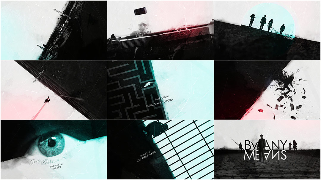
How do you catch a crook the police and the courts can’t touch? With a clandestine unit operating in the shadow of the law and the criminal underworld, of course. The title of the new BBC crime drama By Any Means tells you just how far this team will go to get their man, and Huge Designs’ title sequence strikingly details their unorthodox and less-than-legal methods.
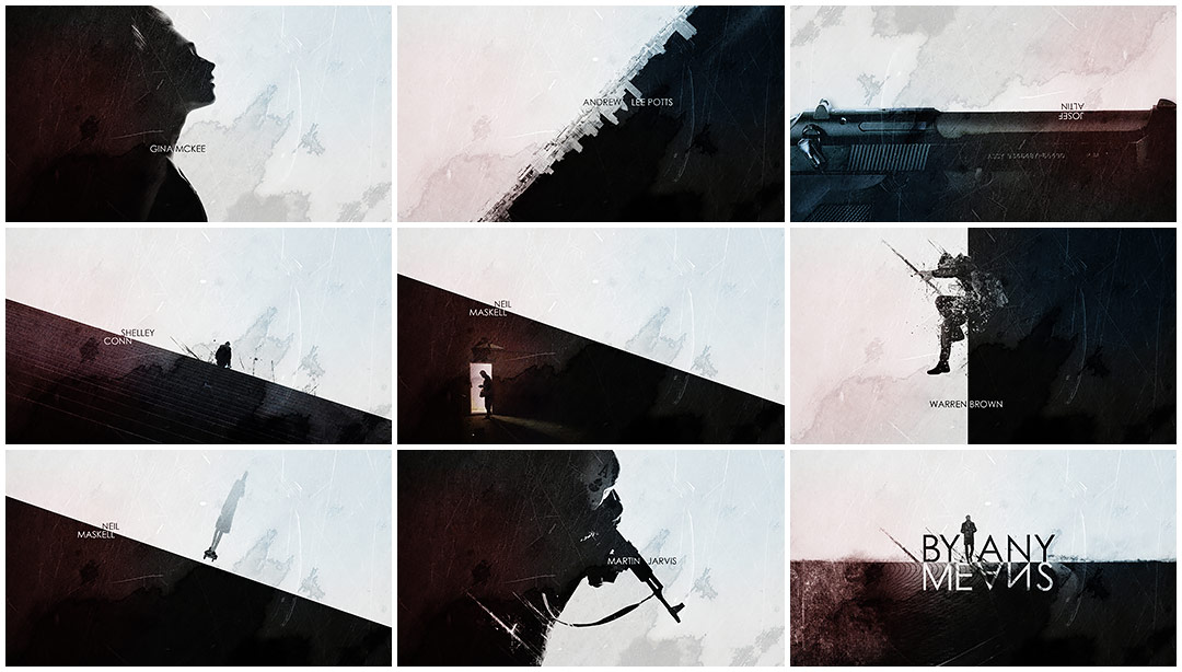
As if placed atop a slowly rotating turntable, a cityscape stretches out of the darkness, the horizon folding into the barrel of a gun and the scene of something sinister. The titles, black and white and splashed with red, blue, and endless shades of grey, continue in this fashion, recounting the ins and outs of an especially difficult case. A brazen heist, a heated chase, a desperate hunt, a clever trap, and the big bust – each credit, like the silhouetted cast of characters, straddles the ever-shifting axis of this uncertain world.
Though reminiscent of much of the TV title design coming out of the United Kingdom of late, Huge turns a familiar formula quite literally on its head with a title sequence that doggedly captures the gritty spirit of By Any Means.
A discussion with Creative Director PAUL MCDONNELL of Huge Designs.
What was the first meeting about this sequence like?
One of the show’s directors, Charlie Palmer, and the producer, Tim Key, stopped by our studio. It was pretty early in the process so they didn't have any footage to show us, but they left us with the scripts and a basic overview of what the show is about. The premise is set around four characters secretly funded by the police who bring down criminals using their own game.
What were some of your initial concepts?
One of our first ideas was to shoot certain parts of London from seldom seen angles. Our main issue with that concept was keeping it visually interesting for 30 seconds. It doesn't sound like a long amount of time by any stretch but we like to keep the viewer guessing if at all possible and we just couldn't get the mileage out of that idea.
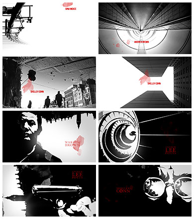
Initial pitches
We were also playing around with an illustrated approach. The show had a graphic novel feeling about it so we thought that could be fun. If we hadn't come up with the black and white solution, that probably would have been our next best contender.
The rotating plane is central to the sequence, could you talk about that concept, what it was inspired by, and how it was developed?
Throughout the series it is brought to the viewer's attention that the main characters work in a grey area between the law and justice. We wanted to represent that visually. Throughout the sequence you have shapes forming between the stark line and blending into each other. The black and white was a simple metaphor for good and bad. The fact that it's rotating is meant to represent the changing boundaries. Plus, we thought it looked cool!
Though it’s not very long, there’s a lot going on in this sequence – rotating planes, textures, distressing, overlays, some shake effects – How did you decide on the elements to include?
There is actually a loose narrative running through the sequence. The idea is, we start on the establishing shot of London and then we immediately jump into a crime being committed. That is then brought to the attention of our four heroes who then begin their pursuit. The criminal then goes into hiding only to be brought out by the honey trap and subsequently caught. All wrapped up in a neat little package! Once we had our narrative we then had a set of guidelines so the rest fell into place.
Where did the textures come from? Did you have to create those in-house or are they stock?
I get all of my textures from lostandtaken.com. If you haven't checked them out yet, it's well worth a visit. You'll never have to take a close up of the side of a dumpster again!
Styleframe from chosen pitch
Can you talk about the effects in the sequence and the software you used?
It was all pretty low-fi. We filmed a lot of elements on green screen and created a rough key. These were all composited in After Effects. The only 3D in the sequence is the bullet shell at the beginning and the maze. We then used Video Copilot's Twitch to add a bit of color and energy. There is a tiny bit of Plexus in there too, but it's hardly noticeable. We really wanted a Phantom* to film the person jumping out of the window but the budget wouldn't stretch that far, so I ended up hanging from the studio ceiling in a climbing harness and moving very slowly. At one point my harness started to rotate and that is where we added a jump. The healing power of jump cuts!
*The Phantom Flex is a 2.5K cinema camera providing exceptional flexibility in all areas of high-speed image capture. Depending on the shooting mode and resolution, the Flex is capable of shooting from 5 frames-per-second (fps) to over 10,750 fps.
What do you want viewers to take away from the sequence?
We wanted to keep them guessing. We had a lot of fun coming up with new ideas of what this black line could be. The show has so many twists and turns in the plot we thought we could have literal twists and turns!
Can you talk about the music? When did that come into the picture?
We had a rough version of the music really early on. It had that nice beat where we put the eye opening and that was always a timing anchor point for us. Samuel Sim composed the piece and we worked very closely with him in order to marry the track with the images as closely as possible.
Initial animatic
Title sequences for many recent British dramas have adopted a very specific look – lots of backlighting, silhouettes, high contrast visuals, etc. By Any Means certainly falls into that category. How aware were you of this trend when you were making the sequence?
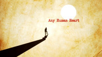
It didn't really cross my mind. We felt like the black and white symbolism was such a strong one, that we didn't give much thought at all about it being hackneyed. There was a stage where I felt like it was getting a bit too close to the Any Human Heart titles when we started playing around with the stretched shadows so we trimmed those back a bit.
How much, if any, live-action shooting did you need to do for this sequence? Can you tell us about that process?
We did quite a lot. The only scene without live-action is the opening scene of London. The rat was the most fun of all those shoots. Hugo has a friend who owns pet rats and he was happy for Hugo to drop by with his camera and green screen. We needed the rat to follow a certain path to make it look as if it's in a maze. In order to do that the owner of that rat put olive oil onto a Q-tip. Because the rat had never smelt olive oil before he was super curious. So where ever the Q-tip went, the rat followed. It was like having a tiny magical rat wand!
Behind-the-scenes
Are there elements that didn’t make it into the final cut?
Not really, in all honesty. The process was really smooth. The only note that we had was to be careful not to let it get too dark. The show has its dark moments but there is also a levity to it. With that in mind we added a few shots as opposed to removing any. For example, the rat in the maze was put in to correct that. We added the bills falling with the criminal to make it feel a little more 'caper-ish'. We also put the woman on the giant trap based on that note. We initially had her simply lying on the floor in order to represent the honey trap. We weren't sure if that was going to be obvious enough so we thought we would beat you over the head with it instead!

