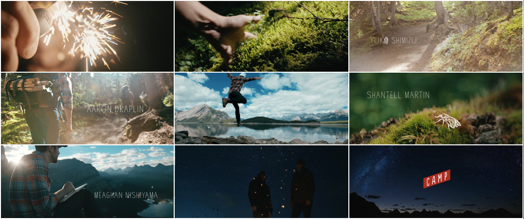
The predominant trend in conference opening titles is to instill excitement and energy, to prepare audiences to be blown away by the creativity and brilliance of presenters. The opening titles to CAMP Festival 2015, on the other hand, are a deep breath put to video. Studio Dialog’s relaxed approach to the task at hand takes inspiration to a quiet place, open and full of possibility. Unrestrained. Warm. Welcoming.
There’s a sense of luxury in this hike through the foothills of the Canadian Rockies, in time and space, in the air between dirt and dawn. The footage and the movement are gorgeous, but it's the music that adds texture and emotion, adding heft and depth to each footfall, each skip of the stone. Chris Vail’s tender timbre glides over simple strings, reaching into sadness and coming out light. In all, the sequence is a gentle reminder that inspiration is as likely to emerge from small, quiet sparks as it is from bright, roaring blazes.
A discussion with Designer STEVE SEELEY of Studio Dialog.
So, the last time we talked was in 2011 for Blackstone. What have you guys been up to since then?
A lot of different things. We’ve started, this last year, getting into some more live-action stuff. Both myself and Robb Thompson started as graphic designers, doing print and digital stuff. We moved on to motion design when we started Studio Dialog, and just as we’ve gotten more into photography and that kinda thing, recently were like, why don’t we do more live-action stuff? So we’ve been doing a lot more of that, where it made sense, here in Calgary. There’s the – it used to be called the Epcor Centre for the Performing Arts, and they’ve rebranded to Arts Commons, and we’ve done a bunch of videos for them.
So, the main titles to CAMP Festival, how did that come up for you guys?
Well, we’re friends with the organizer of CAMP, Bram Timmer, and he created this festival. Last year was its first year, and he asked us if we could do the titles. His whole thing is just getting the creative community together. In Toronto, I think there’s a lot more of that happening, but in Calgary there’s not that many creative things and festivals where people can come together and get to know others in the same community, so he wanted to get that happening here. Last year he wanted us to do it, but we didn’t have the time, and luckily we had some time this year. We collaborated with another friend of ours, Mark Gervais, who did a lot of the animated moths that you see on there as well. We asked him to help out.
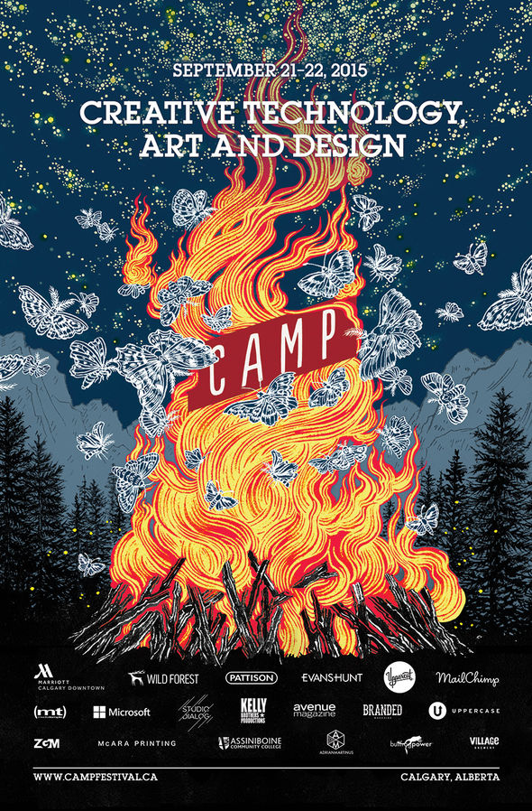
Camp Festival 2015 poster, illustrated by Yuko Shimizu
Were those moths and butterflies inspired by Yuko Shimizu’s artwork for the festival?
Yeah, exactly. Bram had that done when he came to us. He was like, “Here’s the look that’s going to be inspiring this year’s festival.”
It’s this awesome poster of these moths flying around a campfire, and the detail is really awesome. We liked that idea. At first, we were gonna do something based purely around that idea – these moths to a flame, at night – but then we realized there’s not much of a story there to last for, you know, a two-minute long title sequence if it’s all purely at this campfire stage. So we wanted to create a little story beforehand, and end up at that scene that Yuko designed.
So that was your original concept, but did you have any other ideas that you floated around?
Well, one thing I’ve always wanted to do is go out into the forest and light up the forest at night in some way. So we threw around a few ideas like that, like hanging fluorescent lights off of trees, having these vertical beams of light everywhere through a forest scene, and then having a giant bonfire, but there were some technical issues. It didn’t really make a lot of sense, and then Mike Seehagel, who worked on this too, at Studio Dialog, said, “Why don’t we just do what a lot of us do anyways, just kinda go out on a little adventure and film that, on the way up?” So that’s where that came from.
Where did you go? What are the locations?
It’s called Rawson Lake, in Kananaskis [in Alberta]. And there’s a ridge above Rawson Lake that we hiked up. Mike had been there a few times before.
There was just three of us: myself – I was shooting the video – and the two people in it, Mike Seehagel and Mark Gervais, who are the other two that worked on it! Mark was the animator. They’re kinda hard to tell apart, they both have that plaid…
[laughs] Yeah, that standard West Coast Canadian dude look.
Exactly. [laughs] They were the talent, so to speak, and animators, editors, everything else.
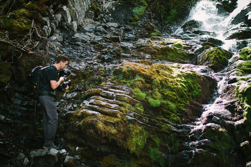
Steve Seeley filming a small waterfall
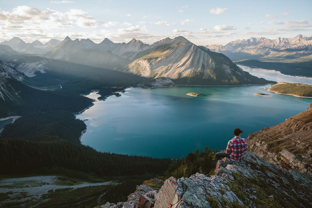
Mark Gervais sitting on the edge of a cliff overlooking Rawson Lake, Alberta. Photo by Mike Seehagel
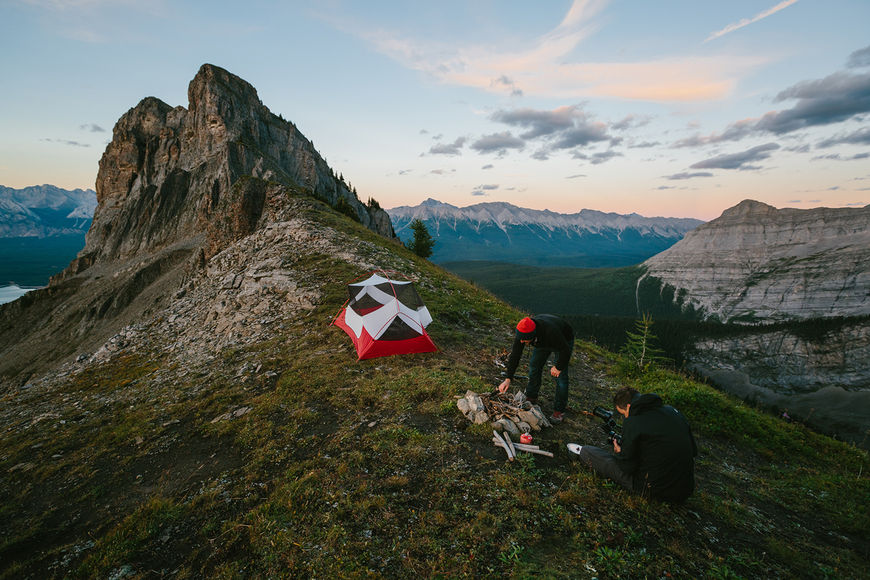
Tent and campfire setup atop the ridge
What did you guys bring with you on your adventure?
Well, Mike brought a tent and some sleeping bags, and we brought some wood with us, and I brought all my camera gear that I was carrying. I shot it on a Sony FS7 and some lenses, batteries, all that kind of stuff.
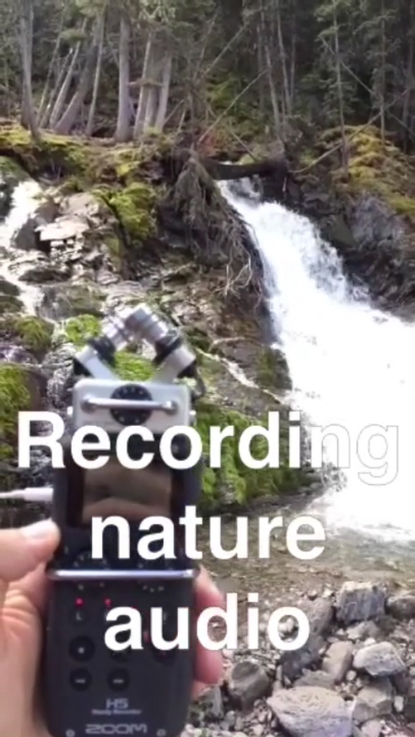
Behind-the-scenes Snapchat videos from the live-action adventure shoot
Then we also needed to bring lights with us, since we were gonna go up there and stay until dark, then we had to come down at night, so we had to bring some stuff so we could see at night, and some warm clothes for up top.
It almost doubles as a tourism video for Calgary and the area, because you capture so much of its natural beauty.
Yeah, exactly, and that’s something that we’re trying to get more into – doing some of that more tourism-based stuff. It ended up being kind of a show piece. There’s kind of an old way of showcasing tourism that’s maybe a little bit more cheesy, but this was just pretty natural, hanging out with friends and bringing a camera along.
So how did you set up your shots when you were filming in the wilderness? There’s some far away, silhouetted shots, through-the-trees stuff. How did you figure out the framing?
It mostly came to me naturally. I’m definitely more of a photographer and when I go out I kind of just see a scene.
Some things we’ll shot-list out and storyboard, and make sure exactly the framing and composition. This was way more off-the-cuff. Plus, I didn’t know the area very well.
For instance, there was one shot where we got Mike to sit on this cliff, which was actually really sketchy [laughs], hundreds of feet down, and we were like “Just dangle your feet off the edge and take a photo!” We were kinda trying to allude to the creative process a little bit. So he’s sitting there, and I’m looking around, trying to make it look nice, and I can kinda see him poking through these holes in the branches, and I thought, “Oh that would be cool, if we kinda rack focus from the tree to Mike there taking the picture.”
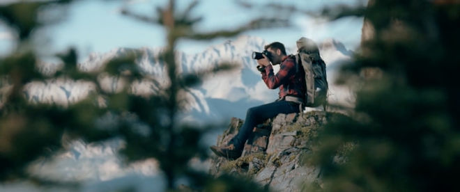
Still from the CAMP Festival 2015 title sequence of Mike Seehagel taking a photo from the edge of a cliff
And then in kind of a similar spot, I told the two of them to go ahead, thinking it’d be neat if we got kind of a wide shot up on the ridge. A lot of times you don’t know if it will work or not. There were these two outcroppings and it just worked out – they could both come out and be in the shot. We were a little bit worried because the light went behind the mountain really early on, when we were hiking up, and everything was in shadow, but luckily when we hiked up we got this amazing light before the sun set. We tried to get it all done in one day.
It was interesting though, since we stayed all night, once we got to the bottom, the northern lights came out, and it was this amazing display of northern lights, which I’d never seen before.
Oh, wow.
That was amazing, and we didn’t get home until three in the morning, but it was worth it!
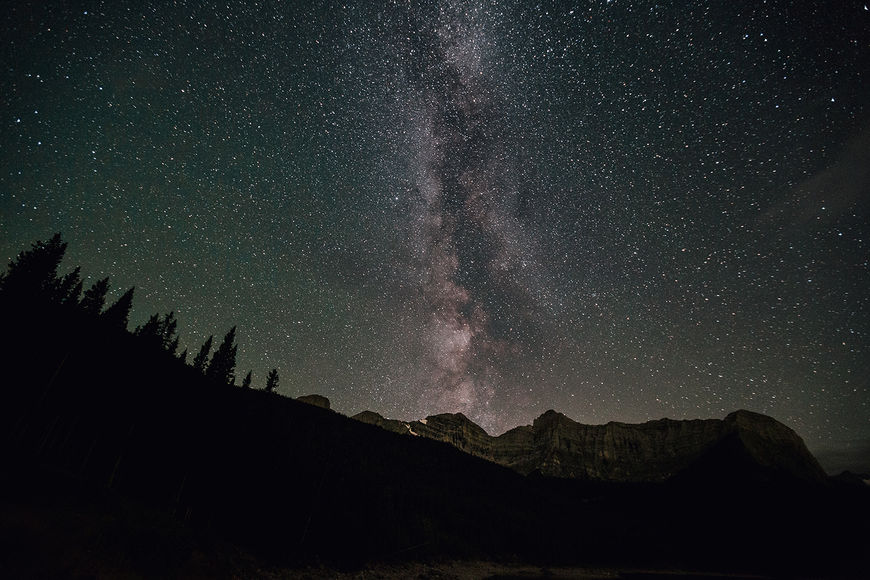
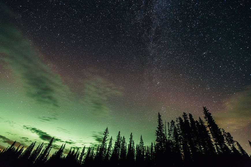
Photographs of the night sky and northern lights taken from below the ridge, by Mike Seehagel
How did you work with the music? When did that come in?
That’s by a company in town called Six Degrees. We had asked if Six Degrees wanted to be involved, and they said yeah. Mark is good friends with Chris Vail, who wrote the song. We were like, maybe it’s like something like this song “Clocks” that he had written and previously recorded. We went back and forth. We thought, “Oh, maybe it should be more mysterious and less reflective,” and I think they did three or four different versions, but in the end we liked the original, so they rearranged the song and made it fit, and added sound design.
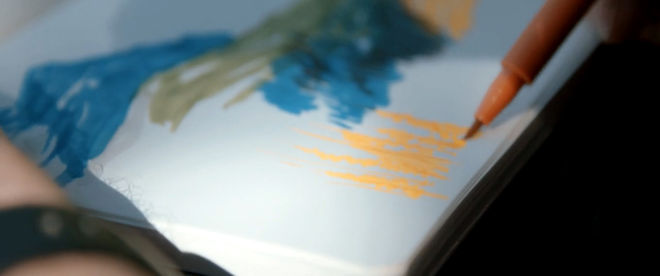
Still from the CAMP Festival 2015 title sequence of Mark Gervais sketching the landscape
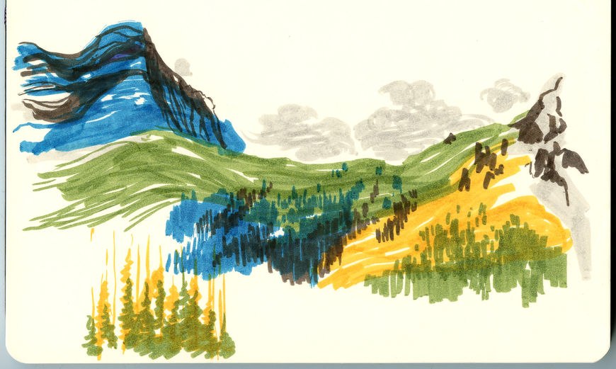
Scan of the finished landscape sketch, by Mark Gervais
For the credits themselves, where did that type design come from? It’s a typeface, right?
It’s called Hannah. We got it from You Work For Them.
And so you just did little animations on those?
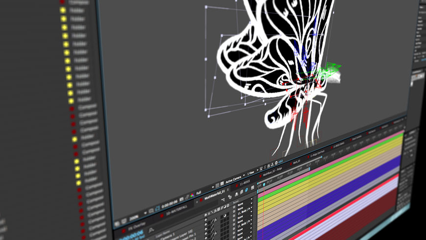
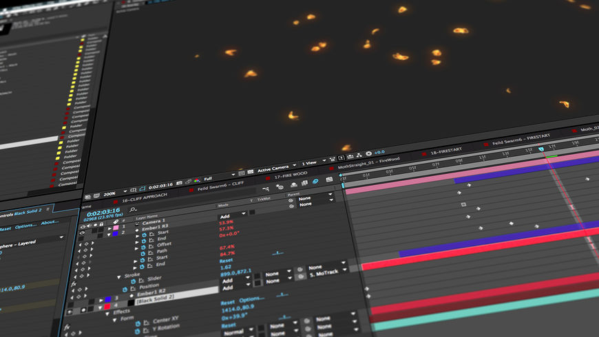
Yeah, to make it a little more custom-feeling, we drew in little bits. It started reminiscent of the fire, little animated sparks. The illustration in the poster had all of this line work creating the fire, and we thought maybe we’d try something like that, but it didn’t end up working, it was too much. So we added a little bit of a wiggle to the type to give it some motion and give it a hand-done feel. And then Mark Gervais drew the moths and animated them, and he’s amazing what he can do. He just puts these little details into it.
What does Studio Dialog have coming up that we can look out for?
There’s another title sequence that we did, for a documentary that opened at this year’s Calgary International Film Festival. It’s called The Smalls: Forever Is A Long Time, it’s about the band The Smalls, from the ’90s, kind of a Western Canadian band. I don’t know if they got out to Eastern Canada much. That was a really fun one to work on and we put a lot of time into that. It’s got a real ’90s grunge vibe. It's coming out soon, I hope.
And sort of more generally, what have you seen or been watching lately that’s been really exciting to you?
Ah, I wasn’t prepared! What do I like? I remember in one of my first interviews, like 15 years ago, someone asked “What are your favourite magazines, and what are your favourite designers?” And I got like, really hot! I was like, I don’t know, I can’t think of anything right now, I’m not gonna get hired!
But there are a few Canadian studios that consistently produce amazing work – Giant Ant and Tendril. Designers like Ash Thorp and Danny Yount are always super inspiring.
Photography has always been a big part of my life. A few photographers that I have been into lately are Renan Ozturk, Ravi Vora, and Chris Buck.
We also love to ask about favourite title sequences. What are some of yours?
I like some of the super obvious ones that everyone likes, just ’cause they’re so amazing. True Detective, those are amazing – I’m sure you know all about that. I also really like Halt and Catch Fire, too.
Those are both by the same studio, Steve!
[laughs] I know, but they’re amazing! I just really like that aesthetic.
I also really like the F5 titles from this year. Love, I think, was the theme. They had this kind of really frantic music, orchestral music. Basically just a bunch of short snippets of various representations of love, back-to-back, and big type, overlaid, super colourful.
F5 Festival 2015 main titles, designed by Block & Tackle
I love watching the opening titles to Cosmos with my son, Easton. It’s such an amazing show full of inspiring and imagination-filling ideas. The titles evoke an amazing sense of wonder I see in his eyes as it comes on. The most memorable titles are the ones that connect with the story. Something that gets me excited about what I'm about to watch.
LIKE THIS SITE?


