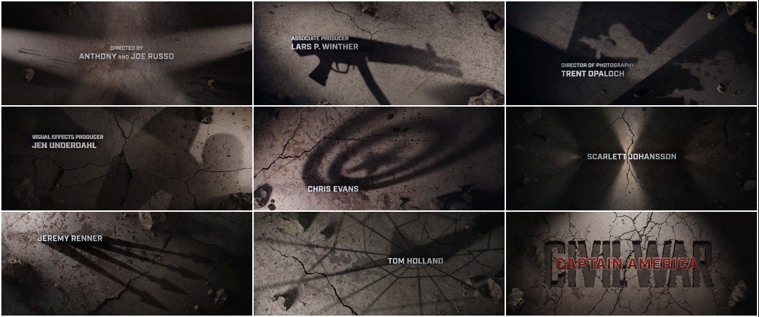
French poet and novelist Victor Hugo wrote, “To contemplate is to look at shadows.” This is precisely what Sarofsky Corp.’s main-on-end title sequence for Captain America: Civil War implores us to do.
In the aftermath of this superhero throwdown, the earth is scorched and cracked, the fissures expanding outward and deep into the ground. The mood is melancholy and dark, the light moving just out of frame. Long and shifting shadows stretch out from the typography, neither reality nor reflection. In this, the third film in the Cap franchise, everyone is on shaky ground.
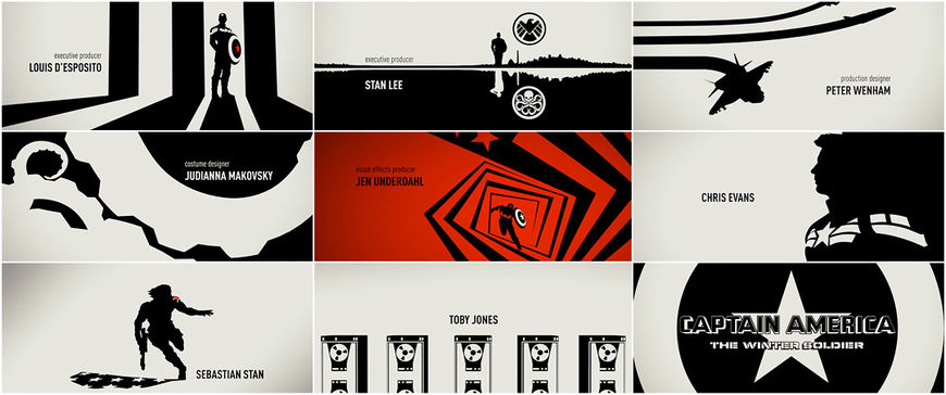
The franchise has come a long way. In Method Design’s end titles for The First Avenger, vibrant and iconic propaganda art comes to life, enticing the viewer to join the fray. The titles for the second installment, The Winter Soldier (also by Sarofsky), take a minimalist graphic approach, reducing the key players to silhouettes and paring the palette down to three colours. Both sequences are high energy and high contrast. Civil War pares down even further, the colours becoming muted and mottled, burnt umber and steel blue and cold grey. This end sequence is a gentle time between the end of the picture and Marvel’s now inevitable post-credits stinger, a moment with space enough to linger on the film’s relationships and their refractions, the chaos cementing itself in the past.
Made with a blend of graphic illustration, 3D-generated typography and debris, and photorealistic textures, the team at Sarofsky provide audiences with an artful comedown and a powerful segue into the franchise’s future.
A discussion with Creative Director ERIN SAROFSKY of Sarofsky Corp.
As a company, Sarofsky had previously done the titles for Winter Soldier. When did you know you'd be working on the next film in the series?
Erin: We didn't know about it until after they were done filming Civil War and into post-production. We went through the normal pitch process but we were, I believe, the only company to do so.
Marvel isn't known for doing opening titles with their films very often, instead opting to do main-on-end sequences. Why do you think that is?
Erin: I think it has to do with the writer of the film and the director in terms of what kind of tone they have at the beginning of the film. It has to do with setting a tone right away, in the theatre. At the end, it can be a nice moment to have a kind of a softer scene. An emotional scene.
Captain America: The Winter Soldier (2014) main-on-end title sequence, designed by Sarofsky Corp.
Erin: With Guardians of the Galaxy the titles are up in the front, but that was the filmmaker's choice. That was [director] James Gunn's choice to create a bed that worked for titles, in terms of his live-action story.
Right, and with Guardians, it's almost like a music video because so much of it is about setting up the Peter Quill character and his love of music.
Erin: Exactly.
We knew it was going to be a challenge to make it feel like a Captain America title sequence and not an Avengers sequence.
So what was the goal with this main-on-end sequence?
Erin: Well, this film was almost an Avengers movie. We had a lot of cast members to show and a lot of different superheroes to show off. So we knew it was going to be a challenge to make it feel like a Captain America title sequence and not an Avengers sequence. That was my first thought, like, “Oh no, if we put all these people in it, the superheroes, we have to make sure it feels on-brand for Captain America.” That was the biggest challenge, in terms of coming up with concepts and directing the team, it was like, “No, that feels too Avengers.” It was hard to figure out what exactly that means until you see imagery and visuals.
Also, the big thing with the movie was that there wasn't a happy ending. [laughs] At the end of the movie, the Avengers are split, it’s literally fractured, and it's just very sad. They're all thinking about their impact on the world and how it may not have been so great. So, doing a big whiz-bang-biff main title wasn't the right tone. We wanted to do something more sombre and slower and more thoughtful.
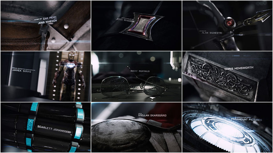
It's interesting you say that because it makes me think of the end sequence for The Avengers movie, which is a slow pan across their equipment, all damaged and scuffed up. But it also focuses on each character.
Erin: Right, exactly.
The Avengers (2012) main-on-end title sequence, created by Method Design
How did you steer this towards a more Captain America style?
Erin: In tone and with flat colour – a limited colour palette. The shadows, everything was kind of a slow, creeping shadow, with all these greys. It was all on concrete, so solid greys and a little bit of blues – at the end you see a little bit of red worked in – but Captain America's really in that steel blue palette.
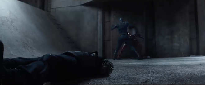
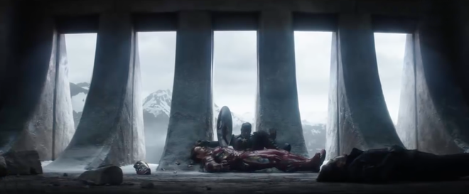
Stills from Captain America: Civil War in which the steel blue colour palette can be seen
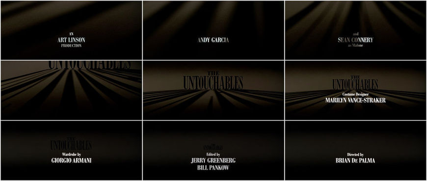
The shadows also bring to mind Richard Greenberg's titles for The Untouchables.
Erin: Oh, yeah! I didn't think of that. [laughs] It's funny, though, I always think of that thing: there's no such thing as a new idea. That's 100% a thing. It's just: how appropriate is what you do?
The Untouchables (1987) main title sequence, designed by R/Greenberg Associates
Erin: I mean, there are artists now doing all these installations where you shine a light on it and then it's something totally different than you expected it to be. So in terms of like, art with type casting a shadow that isn't its shadow, that's not a new thing.
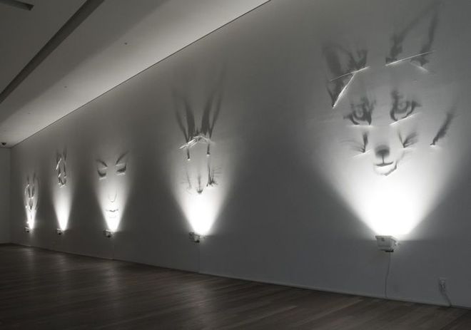
Image Set: Reference imagery of art installations and designs in which the shadows complete the form or experience
For this specific case, the shadows are illuminating a fact about [the character]. It's giving you something deeper about them, some kind of insight into the character, and it's literally on broken ground which is what happened to the Avengers, so there's these cool refractions happening. In terms of the technique though, people have seen and done shadows all the time, since early filmmaking.
I know you're not allowed to share the visuals from the other concepts, but maybe you could talk a bit about the other ideas you pitched?
Erin: Yeah! We had a more graphical version of the shadow board. We worked a lot on things being hidden and broken, you know what I mean? A lot of stuff under the surface.

Image Set: Process reference photography featuring practical shadow tests and surface cracks
There was one board where things were moving under the surface, like if you imagine a groundhog moving around and the ground lifting... The idea that you can’t really see what’s happening. That’s what the movie was, basically. There was this bad guy and everybody was blaming everybody because nobody knew what really was going on. So there was a lot of playing around with that as a theme. But I think ultimately they chose the one that really hit the nail on the head.
What do you think you learned on Winter Soldier that you wanted to incorporate this time around?
Erin: So much of Winter Soldier was process. Just like, what do we need in order to work on this big budget, live-action, superhero, visual effects-driven movie? [Marvel’s] process and pipeline is so specific and intense that it's really not something a motion graphics company is naturally suited for, you know? People call us and we're like, “Oh, we'll fly some type around and we'll do some stuff in Cinema, it's really no big deal.” Even regular movie effects are still no big deal. But once you work with other vendors and people are supplying you with elements – everything's supplied in such a specific way, and then we render and send everything to Technicolor and the end is very specific. So our pipeline is very much defined by our deliverables which are crazy, crazy files. Even the software we use has to be cool with the stereoscopic, 'cause we have to deliver that way, and the renders are huge.
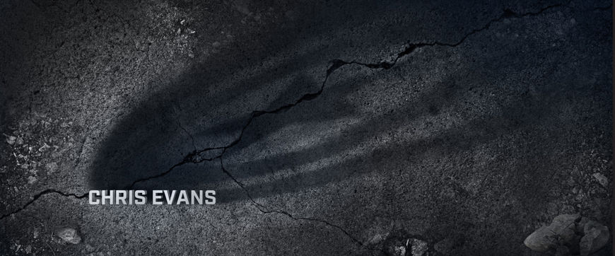
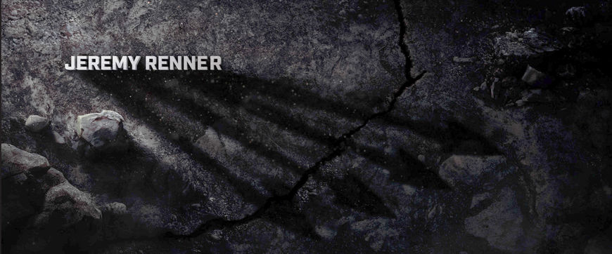
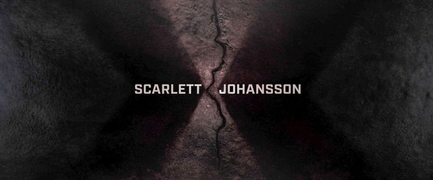
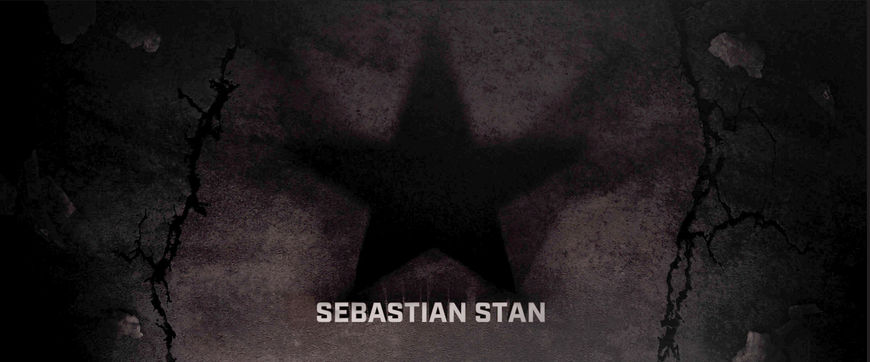
Original look frames
You relied heavily on Maxon's Cinema 4D for this, right?
Erin: For this one, yes, and for Winter Soldier. We used a lot of SoftImage with that along with Cinema 4D. But SoftImage is out of date so we don't use that anymore.
Can you talk about your production pipeline for this a little bit?
Erin: We built all the 3D in Cinema and then we used Nuke to composite and Smoke to finish. That's the basics. The look is really set in Nuke, you know what I mean? The finished look. We were assuming we would do a lot of the shadow work in Nuke but it just didn't work that way – we had to do a lot of it in Cinema. But it's how we got it looking the most real and working the best. Ideally you want to load up as much work in Nuke as possible, but yeah! [laughs] It just didn't go that way at all!
An early edit of the Captain America: Civil War main-on-end title sequence by Sarofsky Corp.
To celebrate it together is one of the best parts. You see your names come up in the credits and everybody cheers
We've been talking about switching to Maya, and that might be in the works, but right now our staff is very engrossed in Cinema. So that's what our tool is right now. But every time we do one of these we take it apart and reconstruct and rebuild it in Maya if there's something we need to know for the future.
When you wrap the project, what do you guys do as a team? Do you go to the theatre and watch it all together?
Erin: Oh yeah, at the end of one of these big jobs, we have a big party! And we take everybody and their significant others and families and rent a theatre – it costs a fortune! [laughs] – and we go watch the movie. It’s such an important part of the process to celebrate it. These jobs are really, really hard. To celebrate it together is one of the best parts. You see your names come up in the credits and everybody cheers, so it’s one of the most special things.
This made like a billion dollars in the theatres, so to think about what that means in terms of hundreds of millions of people that saw this movie is just like, out of control! I’m never on an airplane and I don’t see someone watching one of these Marvel movies. [laughs] It’s always on somewhere. That’s when it hits home, like, this thing that we were working on in our little studio is everywhere.
One thing I want to ask you – just to put it out into the universe – is who would you still really like to work with?
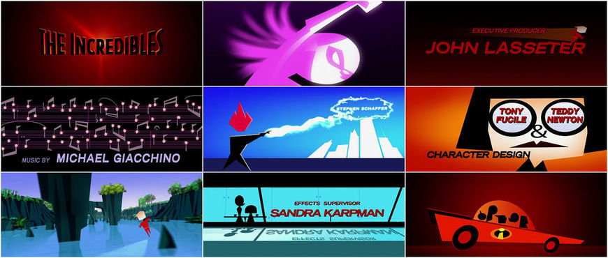
Erin: Oh, my god. Who would I still really like to work with? [pauses] I think Pixar’s great. I really do. I think they’re really special storytellers. I watched The Incredibles the other day, and maybe that’s why it’s so top of mind, but what they did for their title sequence was flat and graphic and so fun! I think I would learn a lot from working with them, you know?
The Incredibles (2004) main title sequence, by Pixar Animation Studios
Erin: And then you have people like Fincher where I feel like I would do a good job because it’s so dark and moody and a lot of our main title work tends to skew that way. I feel like we could really get into that vibe. That would be fun. But he has his people, you know? Once you make relationships with somebody it’s very hard to see working with anybody else. I mean, if you look at Martin Scorsese, every single film he does is with literally the same group of people. From production designers to editors to… you know, and literally the only way they’ll change is if somebody dies! [laughs]
You’re right. Has he ever made a movie without Thelma Schoonmaker?
Erin: Exactly! [laughs] I don’t know! That’s what I mean! Once you get to that level and you have your team, like, you kind of don’t want to talk to anybody else, and I get that. It’s the same thing here with people in the studio.
And, last question: What have you seen or watched lately that’s been exciting to you?
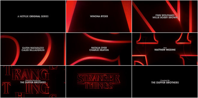
Erin: Well, Stranger Things was awesome! I sat down and binge-watched that the other day. The logo was genius. It was just so appropriate for what it was. It’s that thing – this wasn’t art for the sake of art. This is exactly right for what it was. Sometimes with main title design some designers forget we’re still branding a film. We’re still synopsizing a story or setting a mood for something. We have to reflect back what the filmmaker intends in that moment. I think Stranger Things for sure did that.
We have to reflect back what the filmmaker intends in that moment. I think Stranger Things for sure did that.
Stranger Things (2016) main titles, designed by Imaginary Forces
Erin: I also just saw the sequence for – what is it called? It’s that new HBO one that Elastic did?
Erin: Yeah, Westworld! Stunning. Beautiful. I can’t wait to see the show, but in my head, I’m like, how the hell does that – what could that sequence possibly represent? What could be going on? I hope I’m really surprised to see that it actually connects with the show. Because for me, [the title sequence for] True Detective was one of the most beautiful things I’d ever seen, but to me it didn’t connect to what I was seeing in the television show. And it literally gets referenced in ten calls a year, where a client asks, “Can you do that double exposure thing they did in True Detective?” And we’re like, yes, of course we could do that, but why? What are you trying to sell? Like, you’re selling chicken nuggets! It’s probably not the best technique to use! But it is beautiful. But yeah, I’m looking forward to seeing Westworld to see if it’s appropriate for that. It really is up to the filmmaker or the writers to hit the right tone.

