Since 2008’s Iron Man, the main-on-end title sequence has taken on a dual role for Marvel Studios films. Not only do these finely crafted pieces provide the Marvel Cinematic Universe movies with one final flourish of action and one last injection of branding, they also keep the audience glued to their seats until the all important post-credits coda rolls.
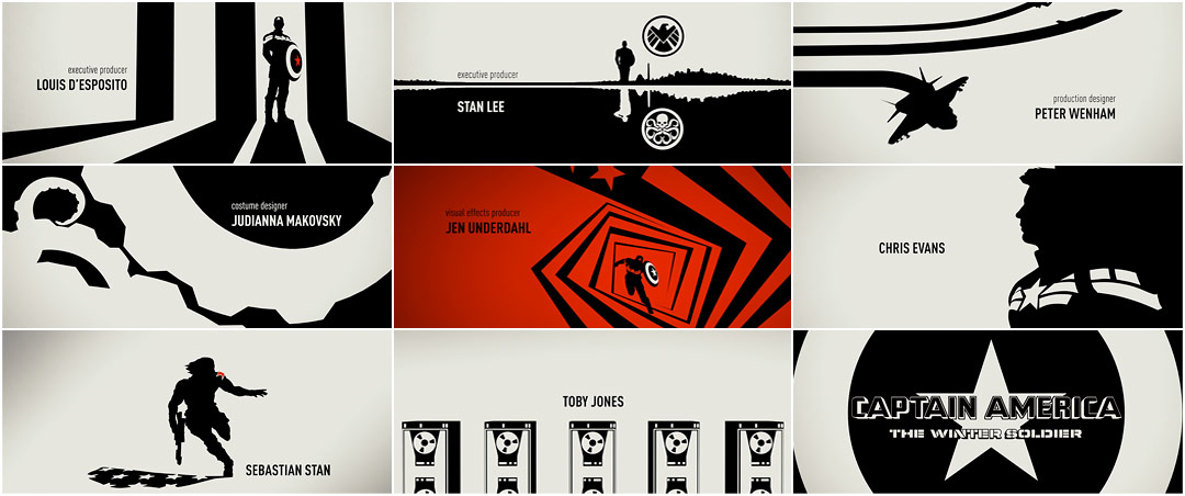
Sarofsky’s minimalist main-on-end titles for Captain America: The Winter Soldier exemplify the newfound function of the end credits. Perfectly distilling the essence of the Russo brothers’ action-packed potboiler, the sequence plays up familiar superhero iconography and pares down the themes and characters to their most basic elements. Stars and stripes, shields and skulls, gears and tentacles, a grand conspiracy unfolding as heroes and villains battle it out in silhouette. Given the morally complex and uncertain world in which the film operates, the stark black, white, and red palette of the sequence provides an unexpected, contrasting backdrop.
With nods to both the graphic stylings of title designer Saul Bass and the innovative work of Silver Age comic book artist Jim Steranko, the Winter Soldier title sequence is one of Marvel’s boldest efforts to date.
A discussion with Main Title Director ERIN SAROFSKY of Sarofsky Corp.
Give us a little background on yourself and your company.
I started out in 2001, right after I finished grad school at the Rochester Institute of Technology. I immediately landed at Digital Kitchen just as they opened up their Chicago office. I began as a designer and, over the course of many years, became a creative director.
In 2006, I moved to New York to work as a creative director at Superfad. It was a wonderful experience, but I missed Chicago. So in 2008, I decided to move back to Chicago and start my own company. Initially, I opened a different company with a couple of partners, but that quickly came to an end. Then a few opportunities came up and I started my own company. That’s when Sarofsky Corp. was born – in January of 2009.
Since then, I’ve fostered some great relationships and we’ve grown to a bustling 6,000 square foot office.
So, how did Captain America: The Winter Soldier come to you?
We were asked to come in to see the movie and meet with Jennifer Bergman, the producer. We saw the film and talked about the technical requirements, but did not get any creative notes. They wanted to see what we came up with without any influence from them. I did press for some, because I find my best work comes when I really understand what the director is looking to achieve, but it was clear that we would have to brainstorm from square one. A week later, at the pitch, we met the creative team.
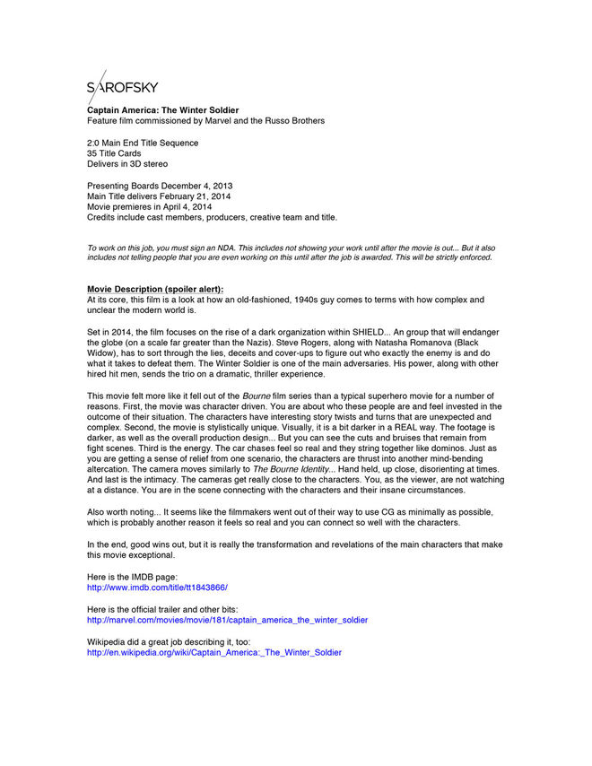
Sarofsky's internal “Project Brief” for Captain America: The Winter Soilder
What was your first meeting with the directors, the Russo brothers, like?
I’ve known the Russos for many years – we’ve done a lot of work with them on the TV side – so it was like catching up with old friends. It was meeting the team at Marvel that was new and exciting. Kevin Feige, Victoria Alonso, Louis D’Esposito... Holy shit, right?!
So, how long did you have to come up with something?
We only had a week to create the pitch for these titles, so I created a thorough brief with themes and insights from the movie that I felt could translate into a main title. I made sure each of the visual treatments focused on one of those ideas. It was important that the overall aesthetic of the main title represent the concept well and had a unique point of view... But it also had to fit well with the film, even if it set itself apart stylistically. Overall, we had eight directions. Each had its own distinct vision for the main title.
How did you present the options and how did you choose a direction?
How I sequence a presentation is very important to me. When arranging the boards, I think about what I want to talk about and how I want the conversation to go. In the past, the Russos and I have had similar opinions about things, so I felt like my instincts were going to be on target... So I started the presentation there.
Throughout the pitch, the team kept going back to one specific board... That first one. You could tell that every other concept we explored just made that one stronger. In addition to its graphic, bold simplicity, they loved how the concept was a nod to the fact that the film is, at its core, a spy/political thriller. And they loved that the look would be totally unique in the Marvel franchise.
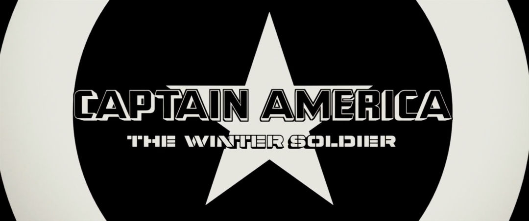
Captain America: The Winter Soldier (2014) main-on-end title card
How did you decide upon the black, white, and red colour scheme?
Initially, we pitched it as black and white, but one of our other treatments had some pops of red throughout. They liked it and I loved it... so in the first round of development, I snuck it into the animatic. Using it minimally added to the story and created wonderful, impactful moments.
What were some of the inspirations for this sequence?
The movie evokes 1970s conspiracy thriller cinema, but with a modern twist. We wanted to create a main title sequence that acknowledged that. So we worked within a style that has simple, graphic compositions with strong, legible typography.
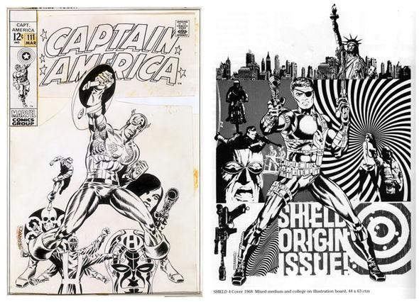
Jim Steranko artwork examples
Of course, we are respectfully bowing to the master, Saul Bass, here... But we were also inspired by the graphic styling associated with Jim Steranko. His bold, graphic illustration style really spoke to us when it came time to illustrate the characters.
Jim Steranko is an American graphic artist, comic book writer/artist, historian, magician, publisher and film production illustrator. His most famous comic book work was with the 1960s superspy feature "Nick Fury, Agent of S.H.I.E.L.D." in Marvel Comics' Strange Tales and in the subsequent eponymous series.
The simple compositions spoke to us in a Russian constructivist kind of way. The use of positive and negative space also takes the look to another level, using the theory of gestalt to its full potential. And, in stereoscopic, this is brought to life in a way we’ve never seen before.
Tell us about the music. When did that come in? How did you work with it?
Henry Jackman was responsible for the entire score, including the main title. To start, we were given a temp piece to work with. It was made from other pieces within the movie, so the tone was pretty close. Then toward the end, they gave us the final. We noodled the edit ever so slightly to accommodate.
Sound design and music are large components to the main title experience. Ultimately, that’s what tells you how you should feel... happy, concerned, scared! For me, it never matters how good my work is if the music is terrible. That's the heart and soul of the piece.
So having a seasoned veteran like Jackman work on it was amazing. The music worked within the constraints, but also built along with our story.
What’s your favorite part of the sequence?
My favorites of the actor vignettes are Chris Evans and Sebastian Stan. They are just so simple and well executed. It’s not easy to refine something into its simplest form and still have it look right. Especially in silhouette, where the slightest thing being off will make the person look unrecognizable. We literally talked about Chris’s eyelashes for days.
My favorite transition is when we are in the red world and Captain America tosses the shield and it cracks the screen. We then reveal a star and turn to show Chris Evans’ card. It’s the perfect combination of editorial and seamless transitions.
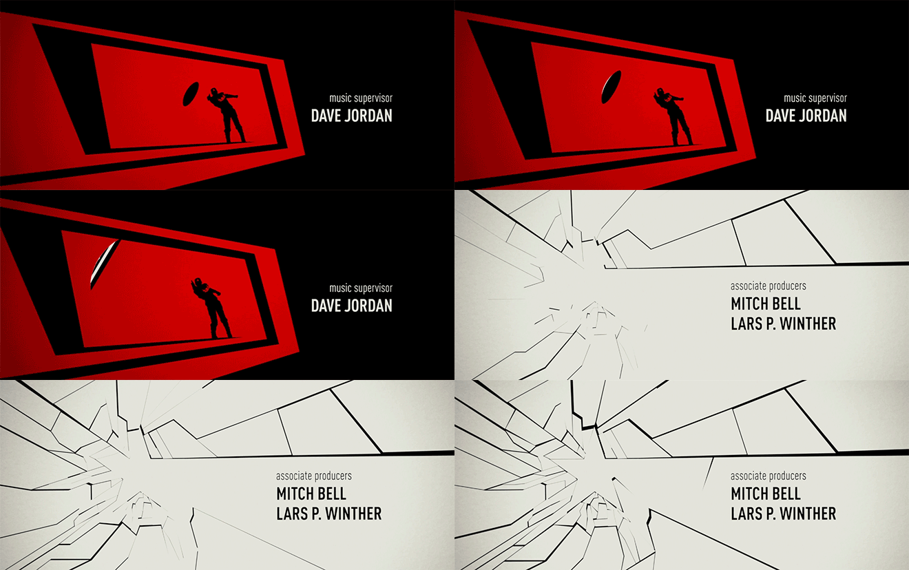
Screen crack transition example
There’s been a lot of discussion lately about Marvel’s lack of representation of female heroes. If you could design a title sequence for a film about a female Marvel superhero, who would that be?
As a woman in a male-dominated industry, I have been fielding a lot of questions like this lately.
For now, I am hoping that Black Widow gets her own movie. I think it would be an interesting film, because she’s such a complex character. Exploring that angle in a main title would be really fascinating.
Who did you work with on this title sequence and how big was the production team?
It was a substantial team. While I defined the overall direction of the approach, I collaborated on the storyboard with talented comic book illustrator David Mack. It’s a special skillset to be able to pull that off... and I wanted the characters to be authentically rendered. Also, not having any materials from Marvel at that point made it essential to bring in a specialist.
Once we moved into production, the illustrations were referenced but not actually used in the finished piece. Each character was rebuilt in 3D with the proper uniform, technology and, of course, likeness. Because of that, the 3D department was our largest team within the production process.
Also, everything was built simultaneously in 2D and stereoscopic, meaning our 3D team was tasked with animating every shot twice.
I crafted the rough cut until we had something close to approved in terms of a shot list, then we had a couple editors come in to finesse the timing. They really tightened things up. A seasoned editor can truly elevate a project.
Which tools and software did you use to put it all together?
We wanted to keep our pipeline consistent, so we only used Adobe After Effects, Nuke, Maxon Cinema 4D, and Softimage.
As the edit was locking and shots were becoming closer to final, we planned carefully to build everything simultaneously in standard 2D and stereo 3D. This way, we could constantly maintain a current stereo version of the sequence. We developed a handful of robust, custom tools to tackle complex stereo notes on the fly with virtually zero disruption to the pipeline.
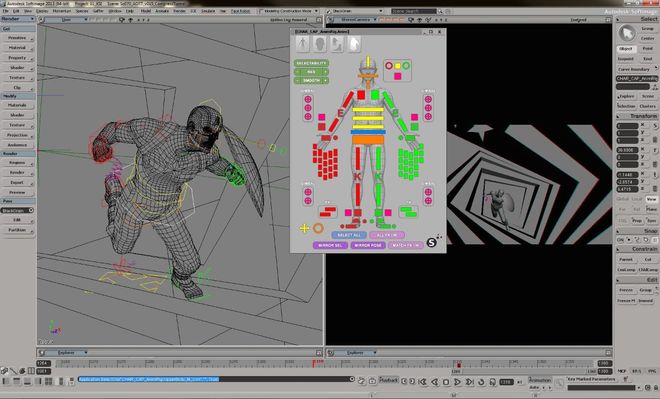
Screenshots of the stereoscopic working methods in Autodesk's Softimage
Prior to this job, RV was our standard playback tool, which was great because it handles stereo flawlessly and was already proven within our pipeline. We also used Smoke as our conform tool and as a basis for playback to our 4K, 3D TV.
How was the stereoscopic process handled?
Working in stereoscopic was very interesting and added to the already intense process... It introduced entirely new creative avenues that are not afforded on a typical 2D main title.
One example is the “Chris Evans” card. We thought the stereo pass provided a perfect opportunity to accentuate his physical build. We worked up several convergence tests, each varying how far his chest pushed out into negative space. Viewing it with the Marvel team on their 100-inch screen allowed us to set our depth for the scene and, subsequently, the tolerances for the entire piece.
Overall, the stereoscopic process was a lot of work. But ultimately, it made for a completely awesome main title.
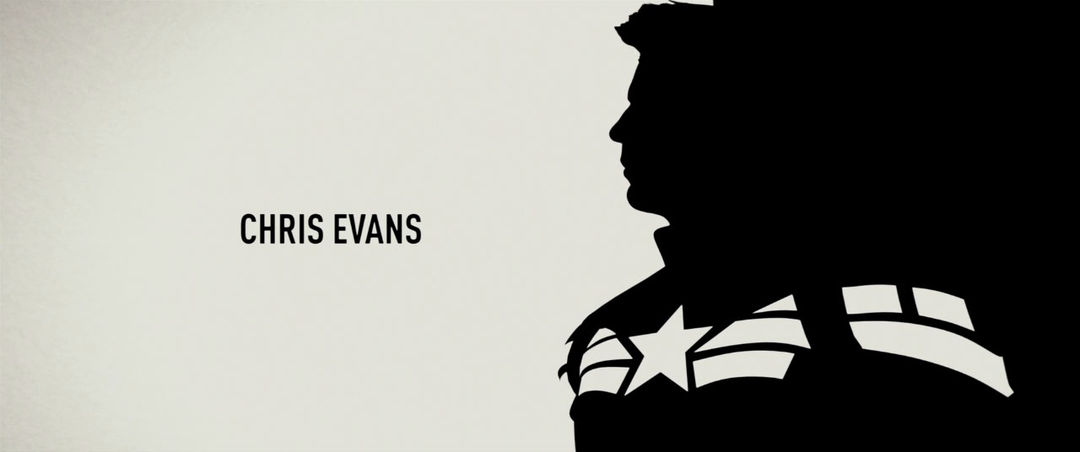
Chris Evans title card
What do you think of Marvel’s recent strategy of using main-on-end titles to keep audiences seated until the post-credits bumper?
I love it! It keeps me employed in what I think is the best possible venue for a main title designer.
The Marvel executives have specifically told me that they are committed to the art of the title sequence. They love what it does for a movie from an impact standpoint and how it brands it. They also are very aware that audiences are looking for it. They see it as a very special part of the experience when watching the film.
You also created the titles, among other things, for Marvel’s Guardians of the Galaxy. How did that come about?
Well, we met the Marvel team through the Russos. When Victoria Alonso, Kevin Feige, and Louis D'Esposito reached out to us for Guardians and introduced us to James Gunn, the film’s director, I was so thrilled.
What are some of your favorite film and television title sequences?
Friends... Who doesn't love The Rembrandts?! OK, but seriously… on the TV side, I love everything from The Brady Bunch to Six Feet Under. I think it’s important when something has a point of view and is rooted in concept.
In theaters, I love something that transports you... and really gets you in the right headspace for the film. But main-on-ends have become very popular. And with those, I enjoy something that wraps up what you saw. It’s like the sorbet of the movie, a palate cleanse before you head back out into the real world.
But for my money, David Fincher never misses with his. No matter who produces, his titles always have a distinct point of view. And they always work with the film itself, even if it is set apart stylistically.
Do you think there should be an Academy Award for Best Title Design?
Yes! I’m a narcissist... and that's kind of the narcissist’s ultimate goal. It would make my IMDB rating go off the charts!
But seriously, the main title is a big part of the experience when watching a movie. So where and when do we picket?
What are some books or media that have been influential or helpful to you in your career? Is there any reference material that you find yourself returning to?
As a kid, I sat and made mixed VHS tapes like some über nerdbot. I didn't even care about the music. It was 100% the visuals. I specifically remember waiting for A-ha’s “Take On Me” video to come on TV, recording it and watching it over and over again.
Aha's “Take on Me” music video, directed by Steve Barron in 1985.
Now I tend to fall in love with highly surreal movies and work that's not grounded in reality at all. Stuff where imagination is your only limitation. I guess that's why it’s especially rewarding to be working on these Marvel projects. What’s more limitless than superhero movies?
Support for Art of the Title comes from

CINEMA 4D BY MAXON
Featuring an Unmatched Live 3D Pipeline with Adobe After Effects CC.

