Carmen Jones is playwright Oscar Hammerstein II’s adaptation of Carmen, a 19th-century French opera set in Seville, Spain. In it, serviceman Don José is seduced away from his military duties and fiancée by a young gypsy named Carmen, ending – as operas often do – in tragedy for all involved.
Hammerstein’s adaptation strips the opera down to its core narrative and redresses it as a modern love story, setting it in the American deep South during WWII and transforming José into Joe, an African-American serviceman in love with Carmen Jones, who, ironically, manufactures parachutes for the War. Joe’s blind love for Carmen turns to jealousy when her affections are instead given to another man, setting in motion a chain of events from which there is no turning back.
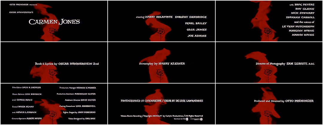
Carmen Jones was Saul Bass’ first title sequence, and he landed the gig quite by accident. Having just moved from New York to Los Angeles to establish his practice, he was contacted by director Otto Preminger to brand the film. Preminger was so impressed with his work that he suggested that he also direct the sequence, thus beginning Bass’ forty-plus year career as a title designer.
The sequence is a combination of two simple, symbolic elements: an illustration of a rose and a perpetual fire, superimposed over one another for the duration of the sequence. For Bass, these elements summarized the emotional core of the film, in which love, lust, greed, betrayal, and rage are not only key motivators but are often ambiguous and indistinguishable from one another. Similarly, Bass echoes this confusion of intent by presenting the rose as a timid line drawing against the red-tinted live-action fire, assigning neither a clear symbolic value. And while a first read of Bass’ symbols would indicate that love is inevitably consumed by the flames of lust, it is noteworthy that neither the fire or the rose decay over the course of the sequence, indicating that the two are perhaps imperishable and distinct by their own merit, forced into an uncommon union by external factors.
It could also easily be assumed that the rose is symbolic of Joe’s love for Carmen, and the fire is representative of Carmen’s wild (and occasionally dangerous) nature. But both Carmen and Joe are complex characters, waning through the emotional spectrum over the course of the film. As such, neither symbol is an accurate summary of their individual motives; instead, Bass’ juxtaposition of the two speaks more to the eventual polarization of their dynamic relationship.
The sequence is scored with an adaptation of Georges Biset’s “Carmen Overture” – a nod to the original 1845 opera. The typeface and the title cards themselves were designed and set by Harold Adler – a lettering artist who would continue to collaborate with Bass for another twenty years on many of his title and film branding projects, including Psycho and The Seven Year Itch.
Titles Designed by: Saul Bass
Lettering by: Harold Adler
Discover more Saul Bass

SAUL BASS: A LIFE IN FILM AND DESIGN
By Jennifer Bass and Pat Kirkham


