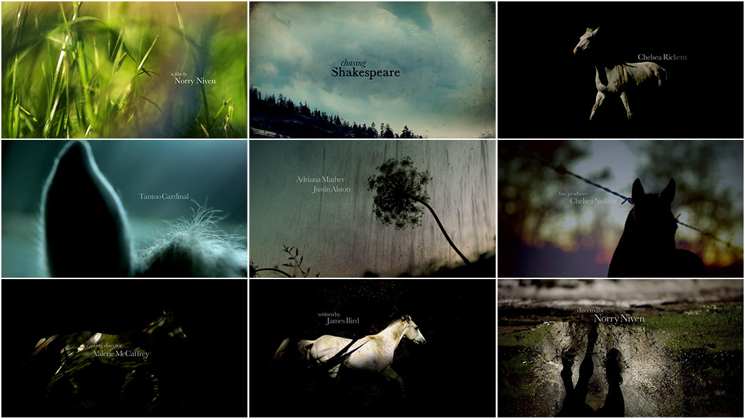
A contemplative examination of a sublime yet threatening natural beauty, Chasing Shakespeare’s title sequence soars as a tonal overture to the film. The camera whisps through blades of grass with all the tranquility of a dream and incipient raindrops splatter the lens, looking skyward at dark clouds promising more. The typography integrates subtly, lending the credits an organic quality. Suddenly, lightning interrupts this stormy dream, the title comes into view, and there it is: the horse, galloping through the void. It stirs at the far-off thunder.
Eric Kaye’s sparse piano notes punctuate the sounds of the approaching storm, creating a soundscape that is more felt than heard. The dream is at once peaceful and foreboding, with a wordless poeticism akin to the works of Malick.
Audience Award for Excellence in Title Design, 2013 SXSW Film Design Awards
A discussion with MARC CHARTRAND of Lucky21 and SAI SELVARAJAN of Lucky Post.
Give us a little background on yourselves.
Marc: Before I got into motion, I was a photojournalist and then a studio photographer, though I always loved and studied film. Title sequences in particular caught my attention as they seemed to be the culmination of film, music, and graphic design... the three of which I consumed voraciously. I met Sai in college and knew immediately that he was operating on a different wavelength. He came in from another planet! It was both a kick in the ass and a beacon. I think it's where our healthy competition began.
Sai: I was a business school reject and new to the art department. The idea of making something and sharing it with the world is what got me up for those 8 a.m. classes. I majored in film and graphic design. It was a few years after graduating that we decided to join forces. Marc is the reason I stay up late and break down Fincher edits. Marc is the reason I lose sleep over the pacing and structural foundation of my edits; I know he's across town doing the same thing.
Marc: We are continuously bouncing ideas off of each other and raising the bar in a positive, collaborative way.
Nowadays, I am a director at production company Lucky21 and Sai is an editor at our sister company, Lucky Post.
How did you become involved with this production and Director Norry Niven?
Spec work (short for speculative) is a job for which the client requires examples or a finished product before agreeing to pay a fee.
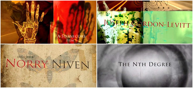
M: Sai had known Norry for a few years as a commercial director. When Norry went into early pre-production on his first film The Nth Degree, he asked us to spec* a title sequence for the project. We shot a ton of typographic background plates, scanned images out of old medical catalogues, and experimented with fire, water, ice, and every other conceivable way of destroying acetate sheets in-camera. Ultimately that project was put on hold, but we ended up with this really interesting title sequence that got us hungry to do more. Norry was pretty happy with the results, so when he started on Chasing Shakespeare, he asked us to helm the title duties again.
The Nth Degree spec titles
So, describe the development process of this sequence for us.
M: Well, we both spent some time going over the script, isolating strong story elements, and figuring out a way to integrate them without spoiling the plot. The overture to the curtain rise, essentially. We developed some still frames in Photoshop to try to convey a sense of the mood we wanted and then played with some very short visual experiments in After Effects to lock in a direction.
The Phantom Flex is a high-speed cinema camera manufactured by Vision Research which is capable of shooting from 5 frames-per-second to over 10,750 fps.
We spent some time experimenting with a watercolor effect that we developed out of shooting macro bits of ink spreading across textured paper. We loved the effect but felt like it might be too visually complex for the serene nature of the film, so we opted for a shoot with a horse or two and a Phantom*.
Initial motion test
S: Being filmmakers ourselves helps us see the forest for the trees. Whether the project is a TV spot or a title design, we go at it like we're making a mini-movie. We want you to feel something, we want to stir something up in your hearts and your minds. After reading the script, Marc and I had the mother of all brainstorming sessions and we hashed out some rough ideas for the pacing and the feel.
It’s very intriguing the way the typography is “interfered with” by the visuals – where did that idea come from?
At one point Marc was wrestling a horse to try and keep it from escaping its stable and it stomped down on his foot!
S: We wanted the type to be integrated with the live action, but we didn't want to make it 3D and put it in perspective which has become a fad. We wanted it to be subtle and have a poetic nature to it.
M: Yeah, subtle enough to go almost unnoticed.
Did you have the music in mind when you designed the piece or did it come later?
M: Well, we cut it to a beautiful track by an amazing band called Stars of the Lid. Eric Kaye did the score for the entire film, and while the music is quite different from Stars of the Lid, it's also quite similar in its emotional resonance. Eric did a great job dialing in the vibe.
Tell us about shooting the live action elements.
S: We drove about two hours north of Dallas to a ranch on the Texas–Oklahoma border and shot Phantom and 5D for a full day.
M: It was Sai, myself, my wife Melanie who is also a director-slash-photographer, our tiny crew, and a Phantom.
Rack focusing or focus pulling is the practice of changing the focus of the lens during a shot, i.e., pulling from shallow to deep or vice versa. In larger productions, a camera assistant called a "focus puller" is responsible for rack focusing.
S: Marc shot the Phantom and Melanie shot 5D. It was a grueling day of horse wrangling and focus pulling*.
M: The horses were beautiful and wild. Shooting them was a challenge, though, as they moved fast and did whatever they felt like for a large portion of the day. We chased them handheld with the Phantom and tried to make the action happen in the light.
S: At one point Marc was wrestling a horse to try and keep it from escaping from its stable and it stomped down on his foot!
M: When they decided they'd had enough of us we shot the grass blowing in the wind by taking turns running the camera through tall blades and rack focusing to little bugs and things we'd find.
S: Marc also shot more elements back in Dallas in and around his house. The ominous storm clouds rolling in were shot in his backyard minutes before a tornado tore through his neighborhood.
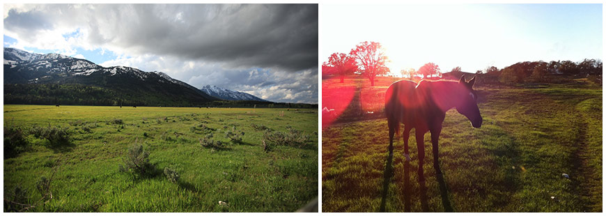
Location scouting
Hah! And how did you layer the live action with textures and type? Were there any VFX used?
M: We used After Effects and Final Cut Pro. For the intro, we tracked and cut grass to periodically wipe and reveal type. We also got into some keyframing to make the sunny sky get stormy on command. Then there was the build to the main title which harkened back to some of the watercolor experiments we'd previously experimented with.
S: We used composite options in FCP and After Effects to layer the live action.
What’s the most important thing you learned while creating this sequence?
M: How to adjust my thinking. I was in a completely different mindset when we began this project.
Titles are films unto themselves... They redefine what’s possible in motion design.
I was still feeling the Nth Degree vibe, except I wanted to one-up that in terms of its graphic storytelling quality as well as the visual blitz. Slowing myself down to this pace proved to be the biggest challenge.
S: Bring the pain everyday, because you never know when your work will be shown to a festival audience and brought before a jury to be judged – not to mention featured on the biggest film title website in the world!
How big was your production team and what tools and software did you use?
M: The team was tiny!
S: Five people including Marc and myself.
M: And we used After Effects, Final Cut, Smoke, Photoshop
And more generally, do you think there should be a Best Title Design category at the Oscars?
M: Abso-fucking-lutely! Titles are films unto themselves, and in a few of Kyle Cooper's cases, more interesting than the film itself. They set the tone. They redefine what's possible in motion design. They push the boundaries of traditional typography. Great title sequences go hand-in-hand with the memory of the film itself because they enhance the story by looking at it from another angle.
S: Yes! The world needs to know about good design.
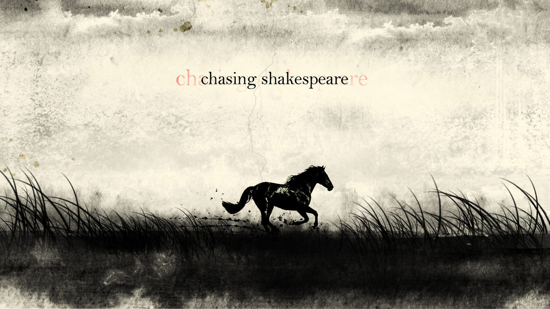
Title card concept
What are some of your personal favorite title sequences, whether classic or contemporary?
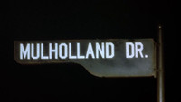
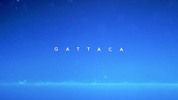
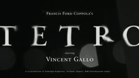
M: I've always loved the pacing and restraint of Donnie Brasco. Any frame from Tetro would make a gorgeous still, but it works even better in motion, which is hard to do. I love the frenetic energy of Island of Dr. Moreau. Se7en is still the highwater mark for me, mentally. The Fall has to be by far one of the most beautifully shot title sequences I've ever seen and probably ever will – and it wasn't even nominated for best cinematography! Total bullshit! And finally, Ghost In the Shell. That sequence gives me a chill every time I watch it. It's stunning.
S: Dead Man on Campus. It's so simple, but it captures the dark comedy nature of the film. Twin Peaks. This sequence is long, but it really sets up the mood and pace of the show.
And I know this isn't a title sequence, but Fincher's commercial “Instant Karma.” This was the first Nike ad that didn't make me want to buy shoes. Instead, it made me want to be a filmmaker so I could one day make an ad like that. I had no idea you could even make commercials for a living, but this ad and the way it used type made me want to make something.
Finally, what excites you outside of design?
M: Filmmaking and photography. Poetry, music, industrial design. Astrophysics! I won't pretend to understand the math... but the concepts open your mind to new possibilities.
S: Design is 100% manipulation and I love that. It's a subliminal drug. When I see good design it makes me feel really happy, it inspires me to answer the bell and come out swinging.

