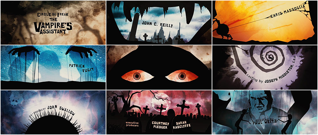
Designer Brandon Lori discusses the opening titles for Cirque du Freak: The Vampire’s Assistant, from his 2009 Motionographer article.
While many cinematic title sequences suffer from a sense of autopilot, the main title for Cirque du Freak: The Vampire’s Assistant keeps you guessing. Taking on the thrust of a children’s nightmare, the resulting aesthetic is innocent but deftly tuned with motifs of fear – a surefire way to take the edge off the sweetness.
Borrowed from themes developed by the film’s director, Paul Weitz, the typography serves a dual purpose in providing information while also being an extension of the puppets themselves. By redrawing original woodcut lettering, the typeface takes inspiration from lithographic circus banners, and as a narrative device, leads the children along an ominous journey. Cracked from the vault of graphic design, inspiration for the letterforms was drawn from the stylistic sentiments of Dada, shadow puppetry, and German Expressionism.
The result is decorative but highly engaging, with an undercurrent of darkness and grit à la Tim Burton. Through a string of slick transitions, the sequence strides forward with a sense of athletic perseverance resolving in moments of compositional clarity.
This article originally appeared on Motionographer.com on Nov 3rd, 2009 and is republished with permission.
Motionographer's Brandon Lori spoke with Creative Director GARSON YU in November 2009.
How hands-on was Director Paul Weitz? How much leverage did he have in terms of the title sequence?
The director’s role is to guide the design process and Paul directed every single aspect of his film. As title designers, we showed Paul what we thought the tone of the opening should be during the development stage. Once the idea was sold to Paul, it was our job to run that creative process independently and show him our progress, always working towards the vision that was discussed.
I think it’s rare that directors will micromanage the design process since they have other, more important things to deal with then. Post-production, especially when it comes to the last stage of the making of the film – doing final audio mixing and dealing with studio reviews – is pretty demanding. At the end of the title design process, Paul worked with the composer making sure the music hit every single beat of the picture. Although the titles are the work of the title designer, it is always the director’s film and they’ve got to put their touch on it. We’re just one of the many contributors – the filmmaker is the soul of it.
Although the titles are the work of the title designer, it is always the director’s film and they’ve got to put their touch on it. We’re just one of the many contributors
How has working with Paul Weitz compared to working with directors like Steven Spielberg, Ang Lee, or Sydney Pollack? How does each one consider film titles?
Compared to those other directors, Paul is quite young. At first, he said he had no ideas for the opening. He left it up to us. He invited me to watch the film and after some time, he called another meeting. He told me he wanted the opening to be about Mr. Tiny controlling the boys like puppets. I always try to think on my feet and have an answer on the spot, so my response was: “Why don’t we create it with shadow puppet animation?” And he loved that idea. It sounds obvious, but he bought it! I think it turned out to be the right idea for the project.
So there was a creative back-and-forth dialog, which I enjoyed. He was receptive to all my ideas. Sometimes directors have clear ideas but sometimes they have no clue. As for working with Ang and Sydney, they are always very clear with what they want. They have a lot of respect for our work and they hire us to do what we’re good at.
Most commercial productions are known for their tight deadlines. Was that the case with Cirque du Freak? How much time and effort went into development?
We had a decent amount of time to develop the concept and the design of the look. We also had enough time to execute it. You’re right, on most commercial projects we don’t have time but film is a craft – that’s why we like to do it.
For this project, we had two months to develop the design and two months to actually produce it.
Specifically for Cirque du Freak, how challenging was it to distill the film’s complex narrative into the time provided by a main title?
It was quite a challenge! I try not to over-think creating a complex narrative for the opening unless it’s necessary. The idea of a main title sequence is to set up the tone and mood so the audience can discover the story as the movie unfolds. I believe the opening sequence needs to be metaphorical in content and impressionistic in tone. Unless there is a very specific prologue that the filmmaker feels strongly about, I usually try not to be too literal and keep it simple.
I mean, you don’t want to reveal too much about the plot of the film in the title sequence. As for Cirque Du Freak, it is a graphic opening that introduces six freak show characters and brings them together through the journey of two puppets. I wanted to let the credits play an important role. They become the main actors throughout the sequence and the story is the backdrop.
Can you talk a bit about the sources of inspiration and references that went into the style of the sequence?
Well, Cirque du Freak is a series of three books by British writer Darren Shan and all of the characters and motifs are taken directly from them. Paul worked with the art department to come up with the woodcut illustration look and also the look of German expressionist paintings. Those were our main source of inspiration.
If you see the credits as actors on stage instead of just titles in the foreground, then you can imagine doing anything you want as long as you direct them
And let’s talk about the type. Can you explain the dual purpose of the letterforms in providing information while also being interactive devices for the characters?
The typography is inspired by references throughout graphic design history. I am particularly interested in Dada artists such as Filippo Marinetti in the way they use letters to literally illustrate the content. It becomes a figurative poem. And concrete poetry – the idea of seeing letters as actual objects – as well as Bradbury Thompson’s work in the ’50s and ’60s. All those were sources of inspiration for the title.
I also wanted to see if I could innovative a bit, invent a new way of how credits behave. If you see the credits as actors on stage instead of just titles in the foreground, then you can imagine doing anything you want as long as you direct them. They can dance and they can interact with the characters. In this case, they’re actors on stage with the puppets.
The title is so heavy in design content that it can seemingly be broken up into a series of moments effortlessly transitioning into one another and then resolving in an instance of visual resonance. How did you decide to use slick transitions as opposed to camera cuts?
Great question. That decision was based on how the music drives the visuals. In the overall story, there are many small stories introducing each freak show character. So there are about six different vignettes in addition to the intro and closing – a total of eight short stories, each connected by a visual transition. The idea was to maintain a flow throughout instead of making it feel fragmented.
It seems like there has been a lot of cost-cutting these days because of the state of the economy. Did the production ever feel squeezed?
Most of the time, the film’s budget has already been planned, so cost-cutting has not had a major impact on us. It seems like there is always a piece of the budget allotted to title design. Normally it will reference the previous film’s budget. For CDF, we had a pretty healthy budget to do it right.
Like most things, motion graphics is not immune to cliché, where certain visual cues like lens flares and pop-up books now spark contempt where once they were all the rage. With Cirque du Freak and several other film titles under your belt, how mindful are you of that kind of repetition?
Film is about storytelling and the title sequence should be driven by that story. If the story doesn’t require those clichéd visual cues, then they shouldn’t be there. We used the shadow puppet idea as a visual metaphor because it fits the story. I never want to repeat myself on new projects.
For a main title, you have a captive audience, while for a main-on-end, you have the opposite – you’re battling people shuffling out or leaving en masse. How do the creative processes differ in designing a main title versus a main-on-end for you?
A main-on-end is the credits and we no longer need to set up tone or mood. The only objective is to engage the audience to stay in their seats and watch the credits so it needs to be visually engaging. Any heavy storytelling will just not work. The credits are the most prominent element so I usually build the graphics around them.
Finally, how do you see changing technology affecting the continuing evolution of film title design?
I believe the media that we use will change the product. With changes in technology, the look will invariably change as well, get more sophisticated in its execution. However, film is about storytelling and I believe the choice of medium will always depend on that.

