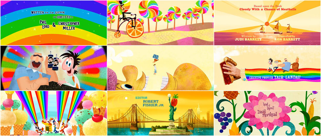
Pure sugarcane, Yellowshed’s main-on-end credits to Cloudy with a Chance of Meatballs take 2D to the land of Pez and Skittles… and doesn’t let up. There are candied orange slices and pinwheel lollies! And as we race from savory to spray paint it is raining sunshine on this rainbow highway. There’s even a pasted hand-powered pie in nod to Terry Gilliam’s stop-motion animation for Monty Python. Disasters are remedied and through child’s eyes. Whoa.
A discussion with main-on-end credit sequence co-director TODD HEMKER at Yellowshed.
How was the sequence put together?
Todd Hemker: We took our cues from directors Phil Lord and Christopher Miller, who wanted to end the film on an absurdly happy note set in a utopian trippy wonderland made out of food. We worked from story ideas already developed by them that would help provide some sense of resolution with the storytelling of the film (i.e. food did NOT destroy the planet, the formation of a tight bond between father and son, the corrupt mayor getting his just desserts, etc…).
The unpredictable nature of the titles was already “built-in” by the directors’ original vision for the piece. However, when you know the story and characters from the film, you see that the titles are a mix of tying themes from the film together with things that are just plain silly.
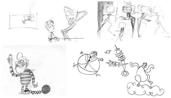
Production sketches
Our inspiration in many ways mirrored that of the directors and designers at Sony. At our initial meeting with them they referenced the Muppets, the film Twice Upon a Time, the illustrator Miroslav Sasek, Yellow Submarine, Monty Python, Schoolhouse Rock, and Xanadu. We were thrilled… and it was all relevant in terms of getting us into the right frame of mind for establishing the look of sequence (for example, the quality of character animation was influenced by The Muppets and Twice Upon a Time while the FX were very Xanadu inspired).
Overall, it was a very collaborative effort. Since there were many unknowns to be addressed, we started a back and forth process with the directors/designers of refining the boards and building animatics to figure out transitions, character performances, and timings. It took close to two months to get a “locked” animatic, because each version brought fun opportunities that pushed the sequence even further over the top.
Whenever we would show them something as a suggestion, they would send back sketches that brought it to the next outrageous level. There was also cause for some concern, because at one point we ended up a full minute over the mark we were supposed to hit (2 minutes 30 seconds). So we had to figure out how to trim it back to that length – which was difficult considering that almost everything was built with a continuous camera move.
Animatic, version 2
One of the more interesting developments was the evolution of the Bruce Campbell/Andy Samberg card. Originally, it was just the fat mayor (Bruce Campbell) floating and dancing with the title hovering somewhere in the sky. The camera was supposed to fly into his mouth and down into his stomach, where there would be a conga line of characters dancing with various fruits and vegetables. Then we learned that Bruce Campbell needed to be paired on a card with Andy Samberg, and we introduced them floating together on clouds.
Chicken Brent (Andy Samberg) danced with a shish-kebob as the mayor sneaks a bite – which leads us down his gullet. This lead to the final solution of clouds being food items that the mayor could eat as he floated across the sky… so the mayor became a hot-air balloon, with chicken in tow, and all of our problems were solved. This is what you see in the final version of the sequence.
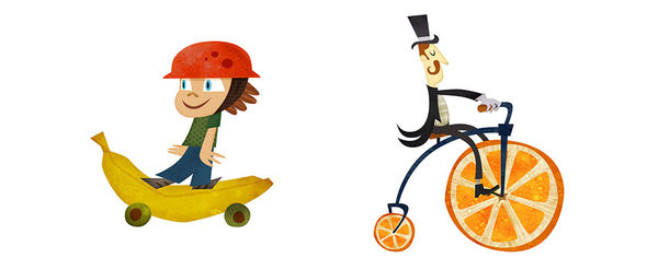
Incidental character designs
The background designs were primarily handled by the team of artists at Sony, led by Justin Thompson. They did all the backgrounds up until the molecules. We designed backgrounds and titles from there to the end. The Sony team also designed all the main characters for animation, led by Paul Rudish. We designed all incidental characters and FX. Once we received artwork from the Sony artists, everything was prepped and rigged for animation by our team at Duck.
Technically speaking, the project was done entirely with Photoshop and After Effects. The scenes were built in 3D space and done multi-plane to give the environments some dimension for the final 3D stereoscopic output. There were no plug-ins or third party applications involved, since we were going for something that had a much more traditional and hand made feeling to it. Justin and Paul were extremely generous and helpful in the process by providing character pose sketches and layouts for some of the more difficult shots.

Plants layout design
What was the most difficult aspect of the piece?
Because all the title cards needed to be on screen for an equal and set amount of time, it was extremely difficult to get as much out of the character performances as we were really hoping for. An additional challenge was to make sure that whatever we did with the character animation didn’t compete too much with the readability of the names – so in many cases we had to force ourselves to “hold back” on what the character was capable of doing (or what it’s personality was begging us to do).
Along these lines, there were a lot of moments that would have been nice to spend more time on – and it was difficult to let that go. For instance, we all loved the goat animation that Morgan Williams (our lead animator) did but it got lost in a camera move as part of a transition. It was a similar case with the plants, near the end, that were designed by Soyeon. Because they were mainly transitional, you don’t have a lot of time to appreciate the nuances of the artwork and the motion.

Character lineup
Do you have any interesting stories related to the development of this sequence?
The mayor in the jail suit was an odd development that came near the end of the project. Several weeks before our deadline there was a “final” review of the piece and it came back to us with a “request” that the mayor character needed to be punished, or separated from the rest of the characters in some way (as a form of resolution). His character in the film was quite corrupt. This forced us to go back to the drawing board to figure out how we could insert that concept at this late stage of the game and still meet the deadline. It turned out to be really fun for us – because we got to sit in with the directors and designers to brainstorm / problem solve the issue.
How did you work with the musical element?
Phil and Christopher had a fondness for the Xanadu theme by Olivia Newton John, so we set everything to that track (on an 11 frame beat). Once that was established it was critical not to mess with it, since all the character animation was timed to be in sync with that beat. The most amazing thing was that no one seemed to get sick of hearing that song over and over again.
In the end, they weren’t able to use the track and we were pretty nervous that the animation might suddenly be out of sync, or that it wouldn’t match the fun energy of Xanadu – but our fears were put to rest by the “Raining Sunshine” track by Miranda Cosgrove.
LIKE THIS ARTICLE?


