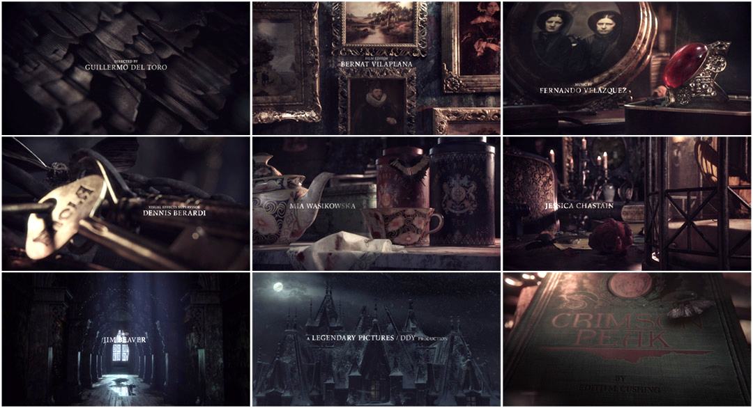
Take a postmortem tour of the imposing Allerdale Hall, the decaying English estate also known as Crimson Peak due to the blood-red clay that stains the snow in wintertime. This is a place possessed by its past. The walls bleed. The building breathes. Its residents, both living and dead, haunt its endless hallways and rooms.
The sumptuous main-on-end titles for Guillermo del Toro’s Crimson Peak are a lepidopterologist’s dream. Butterflies and moths – one of the film’s key motifs – are the viewers’ guide, filling every room, every corner of every frame; fragile and fluttering, pinned and mounted, witness to countless horrors. The camera glides through the manor on a ghostly journey, passing through a series of strikingly arranged tableaux, various objects and ephemera arrayed to reflect the players in this Gothic romance.
The sequence, created by Toronto-based design studio IAMSTATIC, is a cover-to-cover review of the film, literally and figuratively closing the book on the tale that precedes it – a conscious nod to the storybook movie openings and endings popular in the 1930s and 40s. Del Toro’s film is a tough act to follow, particularly when it comes to matching the film’s lavish production design. But aided by Fernando Velázquez’s score, a whisper of moths, trinkets, tools, and a whole lot of atmosphere, the end titles perfectly capture the broad brush strokes of this dark tale, sending the audience home to ruminate on their time at Crimson Peak.
A discussion with title designers RON GERVAIS and DAVE GREENE of IAMSTATIC.
Give us a little background on yourselves and your company.
Ron: We are Ron Gervais and David Greene, creative and directing partners at IAMSTATIC in Toronto. We started in university as a web-based art collective at the dawn of Flash animation in the early 2000s. We would create code-based interfaces and animations and curate online and offline exhibitions of similar work. After a couple years working agency-side, we evolved into a production and design studio and directing duo.
So how did you become involved with Crimson Peak?
FITC Toronto 2014 opening designed by IAMSTATIC
Ron: When this opportunity came up we were working and collaborating with our friends at Topix. They have a long-standing relationship with Mr. X, who did the excellent visual effects for Crimson Peak. When it came time for title production they asked us about submitting a reel for consideration. The timing worked out because we had just finished working on the FITC Toronto conference titles with the team. We submitted a joint reel with the various title work we had done over the years and fortunately we were asked to pitch on the titles.
So where did you start? What was the brief like?
Ron: Our initial brief was very… well, brief. What we were told was that Guillermo wanted “vines, butterflies and moths”. So with those words and a copy of the script and whatever imagery we could find online, we got to work. The first meeting we had with Guillermo and the Crimson team was the day we actually pitched. Which as you could imagine was pretty nerve-racking. Not only were we pitching on a great project but we were meeting one of our film heroes. But we were very excited and had faith in our concept, so that helped.
What was your concept, at that point? It started out as an opening and not a closing title, right?
Ron: Right. For this project we wanted to center the titles around the film's gothic themes and try to match mood and tone. We wanted the titles to tell an eerie little mini-story that gave some hint to what was ahead. As the film was coming together it made sense to move the titles to the end. I think [an opening title] would have given too much away and it felt better as a sort of visual recap.
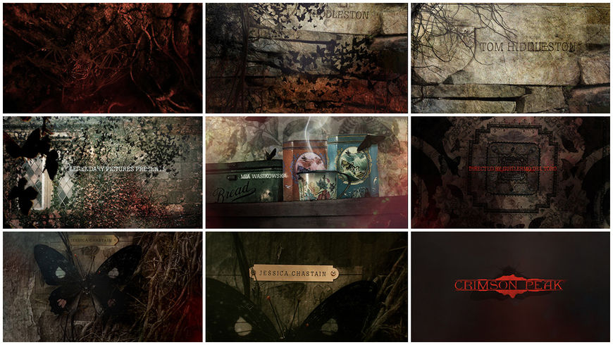
Image Set: Crimson Peak styleframes
We tried to distill the film into iconic vignettes that would not only represent the characters, but also give a nod to the crew. For example, we included spectacles in the frame representing the director of photography, we paired the editor with a wall of pictures and frames, and matched the cast members with sets that recalled their characters.
As we received more material from the production team, we were happy to see how beautifully art directed the film was and that we were going down the right path. So we worked hard to refine our scenes to reflect the richness of the movie. The last thing we wanted was to follow this visually stunning film with titles that felt disjointed or lacking the same richness.
Did you make a list of traits and objects related to each respective character and build from there? What was the process?
Dave: At first we only had the initial script. We took as much from it as we could during the pitch process to define what objects we would use for each character and we created our styleframes. Initially we just did our best to match the characters with what we found interesting. After the pitch we asked about specific objects and sets, and we were fortunate enough to have two large crates of props sent to us that were used in the film. We could sort through it all and pick the perfect set pieces to add to the initial boards.
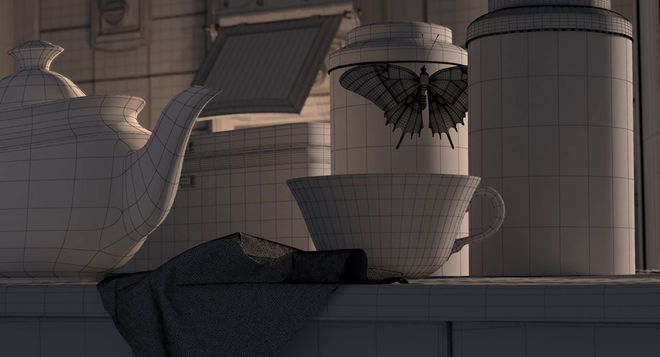
Ron: We joked about just using the props and shooting them practically instead of rebuilding everything [digitally], but ultimately we felt there was a special quality we were achieving by re-creating the props in a new setting.
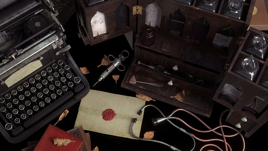
Tabletop shot of props, all rendered digitally
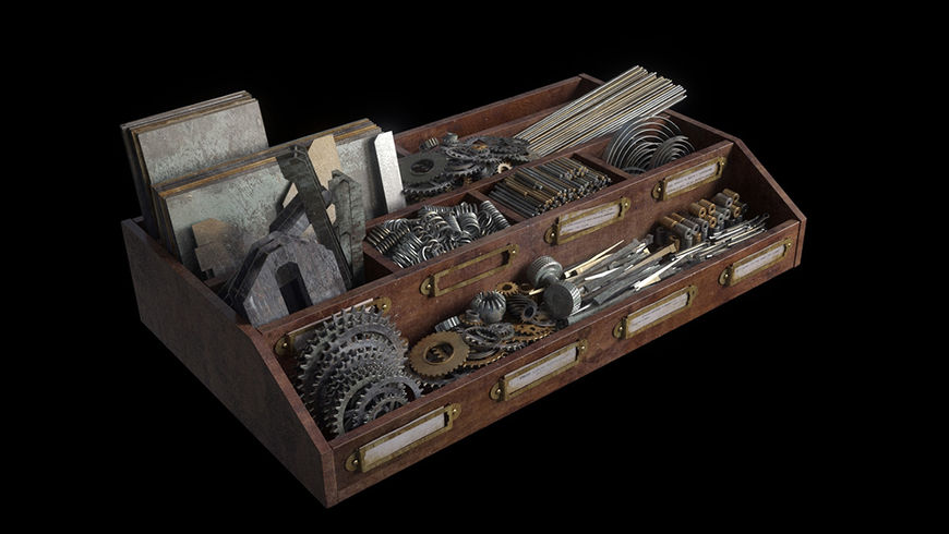
Still of a tabletop prop featuring gears, springs, and small metal parts
Was that the only concept you pitched? Did you have others?
Ron: We pitched one main idea, but because we originally developed and pitched the titles as an opening, it was a little different at first. The only other idea we pitched focused more on the house itself. The original storyboards had the camera moving from outside the house, following vines up and inside where we would be carried through each vignette or scene by the moths.
Dave: It also involved a section about a dramatic birth of a moth that had wings explode out from its cocoon. This looked really great in previs, but we all made the call to focus on the concept of bringing each credit in line with the film’s characters.
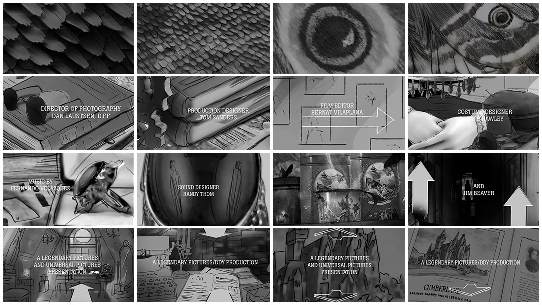
Image Set: Title sequence storyboards
How did you work to match the look and feel of the movie?
Dave: At first we had around 10 stills from the movie that we used as the standard for lighting and the complexity of the 3D models. When we had our first screening of the film, we’d already completed over half of our shots, and were happy with how close our vision matched up. We also worked closely with Guillermo and he would let us know if we were going too far off track.
Let’s talk bugs: there are a lot of insects in the sequence – butterflies, moths, flies – What are some of the challenges in creating CG bugs?
Dave: We were able to get our hands on the base models from Mr. X so that there would be some consistency between our renders. We took the opportunity to model the moth’s hair ourselves because we got so tight into some of them. We had to make sure our models held up for our specific needs. I guess it all comes down to textures and animation for this sort of thing. If the animation doesn't look right, then it throws it off. The overall amount of critters varies between shots, as the camera is macro on some and wide for others, but we wanted to keep it specific to the characters as much as possible. We used the insects strategically to give nods to certain events that happen in the film.
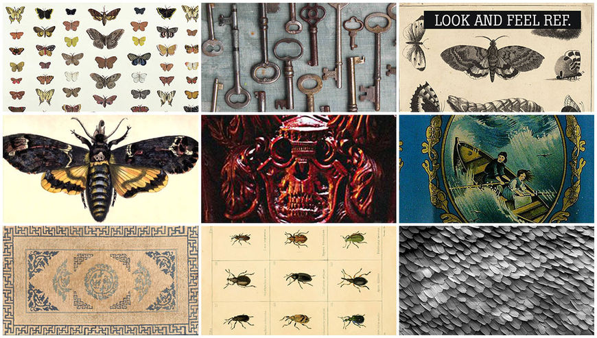
Look and feel reference images
Tell us about that ghostly typography. How did you choose the typeface?
Ron: Ghostly is exactly what we were trying to accomplish for the type treatment. I think it was Poppl-Pontifex that we used. The main Crimson Peak wordmark, which was provided, used a customized typeface. For the main block of type, we wanted to explore how we could tie it into the story. The main character Edith is an author so we looked at using a typeface in the style of a period typewriter. We also thought about a handwritten look but decided in the end to use a serif font that looked like it could be found in a published book from that time. We wanted it to be subtle and elegant and feel like it was layered but still very legible.
Crimson Peak title sequence "making-of" video
Music is often one of the last elements title designers get access to in a production. At what point did you get Fernando Velázquez’s gorgeous score? Did you cut the sequence to a temp track?
Ron: We cut the sequence to a Clint Mansell track from The Fountain. We used it for quite a while actually, and it was later in production that we got the score. But we always knew what instruments were going to be used and the general tone. Our temp track definitely had a much darker tone to it than Fernando Velázquez’s amazing theme.
What kind of feedback did you get from Guillermo as you worked on the piece?
Dave: Time was always of the essence, and feedback was usually in person. We would screen the titles with him each time, and he was always very fast and precise with his feedback. Most of it revolved around things to bring it closer to the film, since in essence we were creating new set pieces. He paid particular attention to the camera moves and transitions, and the materials and lighting of the CG objects.
How many of you worked on this? How big was your team?
Dave: It was a relatively small but incredible team of artists from Topix who we worked with day in and day out. At its most it was 12 people, with a core between team of five to eight, including ourselves.
How long was was your timeline working on this?
Dave: We spent about four to five months. At that point the film was pushed to hit an October date and Guillermo had a specific idea for how the titles should end. Originally we ended the titles on a wide shot of the house and surrounding landscape, which was then replaced with an interior shot that was more like the rest of the titles, and literally closed the book on the story.
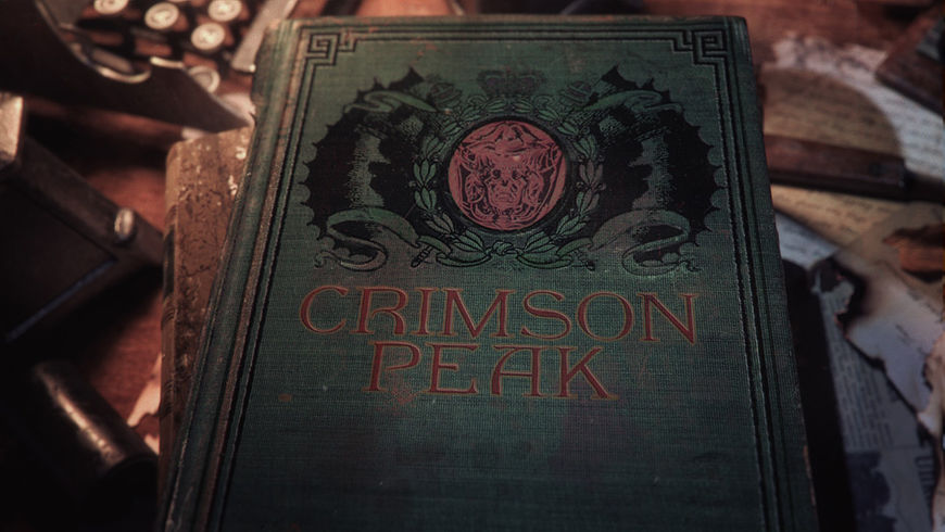
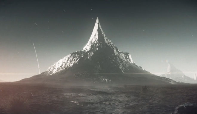
Crimson Peak title card from the opening sequence
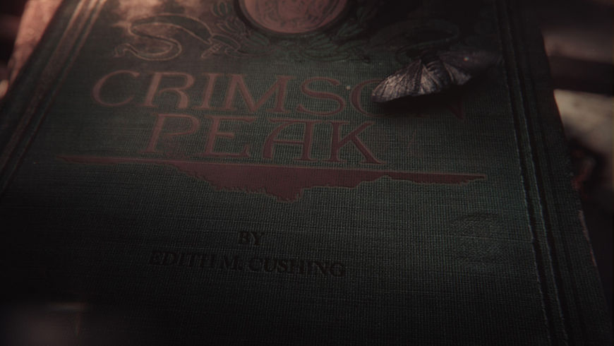
Crimson Peak title card from the closing sequence
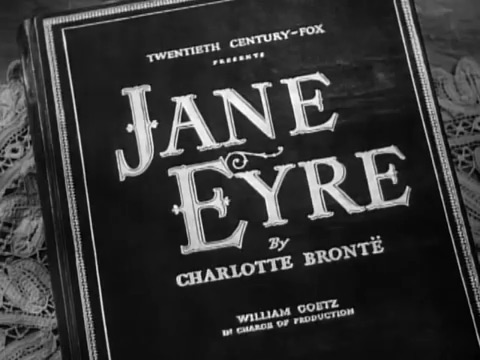
Right, and that closing book is totally in line with titles from the 30s and 40s. You can look at something like Jane Eyre, another Gothic romance, from 1943, and it’s got that same opening book.
Ron: That totally fits. The bookends were added after we had delivered a first version. Our original ending was a pull-out shot to the gate of the Allerdale Hall that read "Crimson Peak"
Dave: I’m sure it played a factor in some way. He even sent us one of his very old books that we used for reference.
Jane Eyre (1943) main titles
Which tools and software did you use to put it all together?
Dave: 3D Max, Zbrush, Ornatrix, Nuke, After Effects and rendered in VRay.
Are there any secret little things you put in, like easter eggs, hidden in the sequence?
Dave: There is really only one, and it is mostly cut off in the final framing of the film. One of the custom paintings we made is a landscape that has the core team in it, and we are all looking lovingly towards our friends who are cooking in the distance, who in real life love to make the best competition BBQ ever! You would never be able to tell though, as it looks like an old classical painting, but it is fun nonetheless.

Image Set: Easter egg painting featuring the creators of the title sequence, in close-up (left) and embedded in the title sequence (right)
As you guys no doubt know, title designers can be hard to find in Canada! How do you feel about the state of motion design in Canada, particularly in film and TV?
Dave: There are incredible world class studios and motion artists working in Canada and our hope is that people will recognize that fact and realize that these projects can be done right here.
Ron: We have always loved working on titles. Titles are probably the most fun projects to work on and we are always looking for opportunities to do more.
What have you seen or watched lately that’s been exciting to you?
Outside of titles, Mr. Robot, The Last of Us Remastered, Mario Maker, and Crimson Peak of course!
LIKE THIS FEATURE?


