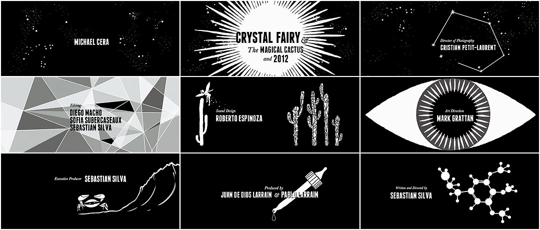
A graphic love letter to designer Saul Bass, Smog’s title sequence to Crystal Fairy & The Magical Cactus and 2012 is a delicately intriguing gateway to a film about a young man's journey of substances and self discovery in Chile. The credits twinkle into view one by one until, with a flourish, a supernova of multifaceted geometry envelops the viewer in a sliding world of stark and impermanent figures. All crackling into crystal or swept along in their own time, the figures distill the film into clear and distinct moments – a gleam of what's to come.
A discussion with Title Designer PABLO GONZÁLEZ of Smog.
What was the first meeting about this sequence like?
Our collaboration with Director Sebastian Silva began in the editing room, where I went to see the first cut of the movie. That was a great starting point.
Silva’s first ideas had to do with photorealistic crystals growing and some really CGI-heavy sequences – rather enigmatic. I wasn’t particularly crazy about it, but the bottom line was that it wasn’t really working for the film, so we gave that up and started again. I wanted to go in the exact opposite direction. I felt the movie really needed some acknowledgement of itself – a sequence that was simple, funny, but not trying to be funny – and honest and beautiful.
So, how did you think about showing that? What was the new concept?
The title sequence was meant to be an overture in the most classic of senses. The image for each card is taken from the movie – in a rather free way – to set the mood and tone, anticipating motives that will eventually grow and develop, such as the road trip, the universe, the molecule – which is, in fact, a depiction of a mescaline molecule... and, well, the cactus! So, in that way, we had some very simple – but graphically very powerful – vignettes that would contain the names of the people behind Crystal Fairy. It’s a really classic approach in an It’s a Mad, Mad, Mad, Mad World sort of way.
The first image we created – that actually made it to the final cut – was the film’s logo.
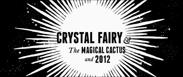
I had this image in mind and the rest of the sequence was built around it. I envisioned a starry night... a sort of persistent and dark image, a couple of credits, and then – boom! – a supernova lights up the whole screen – and the theater, for that matter – and crystals fly toward the camera, revealing the title and triggering the rest of the sequence.
What tone or effect were you trying to achieve?
While it’s pretty evident what the images are, how they are related probably is not. So it was important that the title sequence was intriguing but engaging.
In my opinion, Crystal Fairy is such a beautiful film on so many levels and I wanted the audience to see that beauty and honesty in the sequence
What kind of storyboarding did you do?
Mostly digital. We didn’t use much paper in the process at all. I would doodle the scenes and those very files would eventually evolve into the art provided for the animators. I would love to say that it was all paper cutouts but it’s the early 21st century version of that: digital animation.
What tools and equipment did you use? How big was your team?
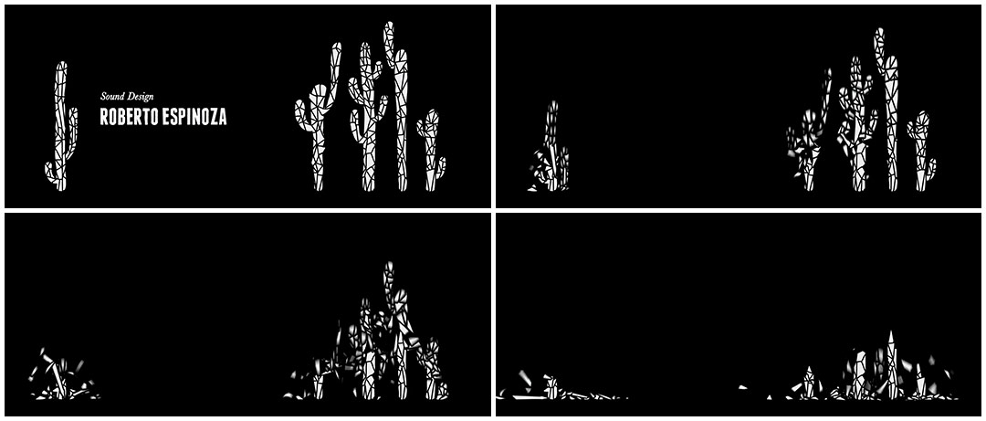
It was me and two amazing animators, Patricio Molina and Eric Guerrero, one for the crab sequence, and the other for all the rest. We went through so much testing trying to get the crystal right, or the breaking of the crystal cacti... it was a lot of work, definitely!
What was your favorite part about working on this sequence?
At one point or another one has to make compromises, because your work is part of something much bigger – someone else’s film. Somehow I can’t really think of having to make such compromises for this project... Of course, it did change along the way, but I truly feel like the author of it. That’s a great thing about working with Silva, who considers the titles for his movies to be a collaboration.
Also, the end credits and the poster. The end credits turned out to be a very simple sequence of cards, but I’m really happy with the result.
Crystal Fairy & the Magical Cactus and 2012 end credits
It picks up on the crystals idea we gave up for the opening sequence... we just favored a rather graphic representation of them.
And although the poster design didn’t come out of our studio – it was designed by estudio ESE. I was still involved in the design process as a consultant, which was also a very interesting experience.
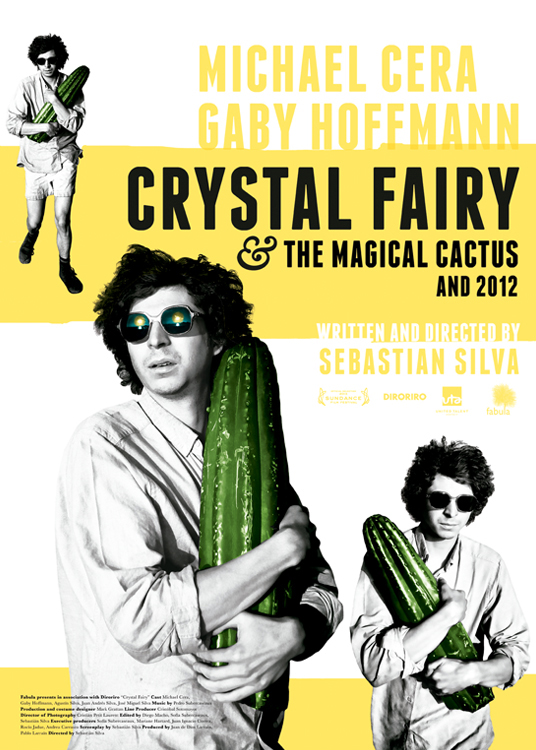
Film poster design by estudio ESE
Can you tell us about the music and sound effects? Who composed the music?
It was composed by the super-talented musician Pedro Subercaseaux, also known as Pedropiedra. He jumped in the process when there was only a rough animatic of the title sequence. My idea for the music was something with a very classic 1950s movie score feel. I really admire Pedro’s work, and I was looking forward to what his ideas would be for the sequence, and he came up with this idea of endless variations of one very precise theme, which I think worked fantastically.
You mentioned It’s A Mad, Mad, Mad, Mad World and the sequence definitely has a graphic quality reminiscent of Saul Bass. Are you big fans of his generally?
Definitely. To me, this title sequence is a love letter to Saul Bass... and there are so many of his sequences that are worth mentioning.
What are your favorite Bass sequences?
One of my favourites is Bunny Lake is Missing. It is such a powerful and confident and simple idea, executed in such an uncompromising way.
And finally, what’s coming up for Smog as a company?
We’re currently woking on the title sequence for Sebastián Silva’s new feature film, Nasty Baby.

