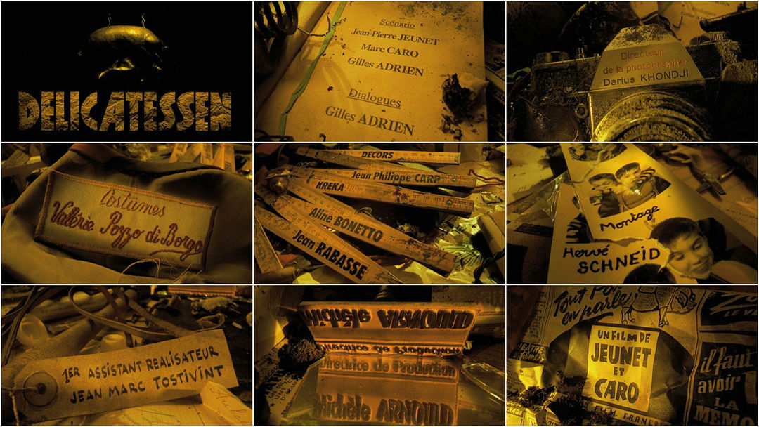
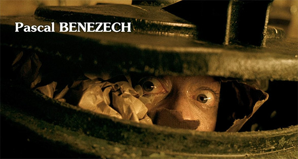
Crass laughter drowns out the man’s final whimper as a meat cleaver comes crashing down, delivering his end as well as the opening titles for Delicatessen. The butcher shop's emblem, a hanging pig, sways back and forth, in and out of the shadows. It is a dismal reminder of the realities of this post-apocalyptic world: meat of pig, cow, and chicken is a rarity, and the only substitute is human flesh.
The descending notes of a piano usher the camera towards a notepad, passing a severed hand along its way, and the first set of film credits. With a macabre charm, the title sequence glides through various twists and turns, the camera deftly capturing remnants of survivors past, while the jovial intro music underscores the film's black comedy.
Delicatessen's distinct visual aesthetic can be attributed partly to an intricate chemical process called ENR. Named after its inventor, Ernesto Novelli Rimo, a technician at Technicolor Rome, the process was created for legendary cinematographer Vittorio Storaro (Apocalypse Now, Reds, The Last Emperor). The bleach-bypass process imbues the film stock with a sanguine overcast, giving it a cannibal quality that matches the subject matter.
We asked KARIN FONG, creative director and title designer (Boardwalk Empire, Rubicon, Black Sails) for her thoughts on the Delicatessen titles:
One of my all-time favorite main titles. I love how it creates a whole world in tabletop. The production design in macro is fantastic; all the details and texture, along with the music, are so charming. But more than that, how it weaves in each of the crew credits with cleverness – the DP’s credit etched on the camera, the music credit on a broken record. I’ve always appreciated how integrated the titles are with the environment, as if they are waiting for you to discover each one. It almost becomes a game, and once you realize what is going on, you delight in seeing the idea in each one – yes, of course the costume designer would be stitched on a clothing label! It’s like every credit is its own little a-ha moment.
I can’t remember when I first saw it – somehow independently from the film – but it always stuck with me. When I first started designing titles I very much wanted to do something in that vein. I remember one of my first pitch boards, for the film Dead Man on Campus, involved hiding all the credits on student “cheat sheets”: written on the sole of a shoe, on a pencil, tucked away in the top part of boxer shorts peeking out from jeans. That exact idea didn’t fly but it hasn’t stopped me from thinking about the next time I could use such an approach.
Of course, most people don’t realize that when it comes to making these sequences, it can be harder to get the studio’s legal department to approve how you are treating the names, since every one of them has some variation in appearance. Most major films have clauses in the cast and crew contracts about how the names must appear in the credit sequence. It’s tricky when you’re using different fonts and camera angles, but, knowing that, I suppose it makes me appreciate those title designs that do ingeniously weave in the credits even more.
Supplementary: Delicatessen end credit sequence
LIKE THIS FEATURE?


