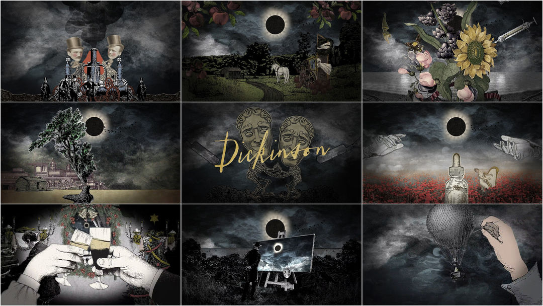
Watching Apple TV+’s series Dickinson, one word immediately comes to mind: refreshing. Matching anachronistic dialogue and music with sumptuous, period-specific sets and costuming, the series is an irreverent, wild, and above all fun depiction of the life of Amherst, Massachusetts-born poet and renowned shut-in Emily Dickinson.
With its initial slate of shows, including The Morning Show, See, For All Mankind, and Dickinson, Apple's new streaming service has come out swinging, ensuring it joins the fray dressed to the nines. Naturally, there's been an investment in the brand and graphic presentation of each offering. Most feature longer, full-fledged opening sequences but not Dickinson, which stands out with its 15-second title hits designed by production studio Shine. Each episode features a different collage of vintage illustrations and etchings, restless text and a jolt of thick electronic beats from composers Drum & Lace and Ian Hultquist, enlivening the experience of each installment and breathing modern life into this mid-19th century story. There’s a confidence in a title treatment like this that, when it works, is delightful, endearing and contagious. “Title divine” indeed.
Title Design Studio: Shine
Creative Director: Michael Riley
Executive Producer: Bob Swensen
Animation/Design: Colin Hess, Young Kim, Kate Mrozowski
Production Assistant: Nick Riggs
Music by: Drum & Lace, Ian Hultquist

