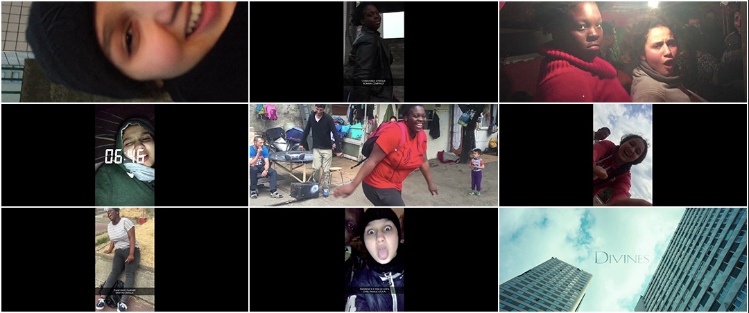
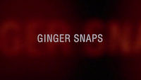
To visitors, Paris is the city of love and lights. But there is a Paris that tourists rarely see: La Ville-Immigrée — The Immigrant City, an impoverished periphery where opportunities are few and far between, and those that appear must be seized or stolen. Glimpses of that Paris can be seen in the opening moments of Divines, Director Houda Benyamina’s timely, heart-wrenching drama about two young women coming of age in the outskirts of the French capital. The film opens with a montage of Dounia (Oulaya Amamra) and Maimouna (Déborah Lukumuena) goofing around. Shot vertically on a mobile phone, the pair record themselves smiling and laughing, dancing and mugging for the camera, aping their idols and broadcasting it to the world. These “snaps”, shared through the video messaging app Snapchat, are as much for them as anyone else — fun and fleeting projections that belie the poverty and violence that surrounds them, revealing a deep bond between the two.
Director Benyamina and Editor Loïc Lallemand assembled the opening sequence from footage shot by stars Amamra and Lukumuena. Title Designer Anaïs Mak then designed the credits to appear as on-screen captions in line with the app’s signature style. The selfie aesthetic helps to ground Divines in a level of realism that’s impossible to shake. When paired with Vivaldi’s haunting Nisi Dominus, the girls’ playful antics begin to take on a foreboding dimension. Closing with Dounia’s defiant declaration that she’s “queen of the world” and a sky high title card, it’s hard not to wonder what the future holds for these two friends.
Divines is featured on Art of the Title's Top 10 Title Sequences of 2016 list.
A discussion with Divines Title Designer ANAÏS MAK and Editor LOÏC LALLEMAND.
Hi Anaïs and Loïc! Can you give us a little bit of background on yourselves?
Anaïs: I'm a graphic designer, animator, and illustrator. I graduated from Gobelins school as a graphic motion designer in September 2015. Before that I had a master’s degree in Visual Studies from EHESS (École des Hautes Études en Sciences Sociales), which is more of a social science school.
Loïc: I was born in Lille, in Northern France. I grew up in a middle class family where culture did not hold much importance. I received a Bachelor of Science degree in Industrial Technology. I have no idea why, but I fled from that fate. My parents did not oppose me and let me go to film school in Paris at 18.
Anaïs, what originally attracted you to the motion design field?
Anaïs: I started doing some VJing, which is like live visual projection for music in clubs and stuff like that. So I did a lot of sampling and from there I went on to experimenting with video matting and finally motion design and graphic design.
Excerpts from "Apec Blue" VJ set created by Anaïs Mak
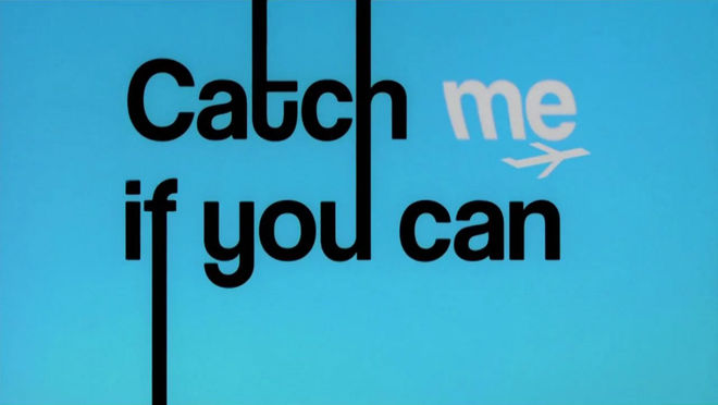
Anaïs: I’m quite young, so I think that the first movie that really struck me in terms of title design was Catch Me If You Can. I remember seeing that and thinking, “Oh, you can do so many things!” From there I started getting more interested in older films and being more attentive to title design.
And Loïc, how did you become involved in film editing?
Loïc: From my first year in film school, I knew that editing was for me. Telling stories with images and sounds was very exciting. I eventually became an assistant editor on a film by François Ozon, Jeune & Jolie. He then introduced me to Laure Gardette, his new editor. I was her assistant for five years. We built an exceptional relationship, based on great trust and a real cinematic exchange. I owe her a lot, she’s taught me very much and we have established a truly rich and constructive collaboration on the films we have worked on. She is the one who helped me become editor.
What do you feel is the role or function of a title sequence in a film?
Loïc: I never have preconceived ideas when it comes to title sequences. The original idea is often right there in the screenplay, so I am receptive to the material at hand, of the atmosphere that the images speak to. For me, a title sequence must serve the film, must serve its intentions without stealing the spotlight. It must not be a tech demo for the graphic designer – everything must make sense in relation to the themes. Whether it’s completely created for or associated with the image, it is that requirement for me that the title sequence must be perfectly integrated. It must therefore evoke a style, an era, an atmosphere, or a useful elegance for the film.
Anaïs: Its main role is to serve the film. I consider a title sequence to be a space in its own right in a film – a space that allows to say something about the film in a way that would not have been possible elsewhere, if we take the trouble to invest it. It’s also a space of transition to condition the audience. I really like the efficiency that the title sequence enables. That is why the title sequence of Enter the Void is so great. It seems to tell you “this film is a rollercoaster and we are going start with a huge plunge right from the beginning.”
So could you tell us how you both came to be involved in Divines?
Loïc: The production was looking for an editor and Laure Gardette was contacted. She was not available, so she gave them my contact. Houda Benyamina was meeting with several editors and she chose me as well as Vincent Tricon. We worked together up until the first cut and then I continued alone with her for the final cut. Like many of the post-production heads on this film, Divines is my first feature film as an editor within a traditional funding system.
Divines (2016) international trailer
Anaïs: It was Laure Chapalain, who was my former teacher at Gobelins and the founder of We Love Your Names, who put me in touch with the producer of the movie, Marc-Benoît Créancier. Then I met with Houda. It was a rather informal meeting, we went for lunch. Houda was in the midst of editing on the film and she was looking for a graphic designer for the opening and closing title sequence. She told me a lot about the movie and about the characters, but more generally about the themes of the film. I had already seen a rough cut of the film, which had impressed and touched me enormously, so I confess that I immediately felt a lot of pressure! We then met with Houda and Loïc to start working.
Could you tell us about the original concept for the opening title sequence and how it was developed?
Loïc: Houda’s initial desire was clear: she wanted cell phone images and to seem more authentic, she wanted her heroines to use an app of their time. But the script only indicated “Every day Snapchats, photos, and videos of Dounia and Maimouna.” Oulaya and Déborah were sent to be immersed in a Roma camp, among other things, and had to film as much material related to their friendship as possible. We did not know what they would give us, so we had to construct it all in editing.
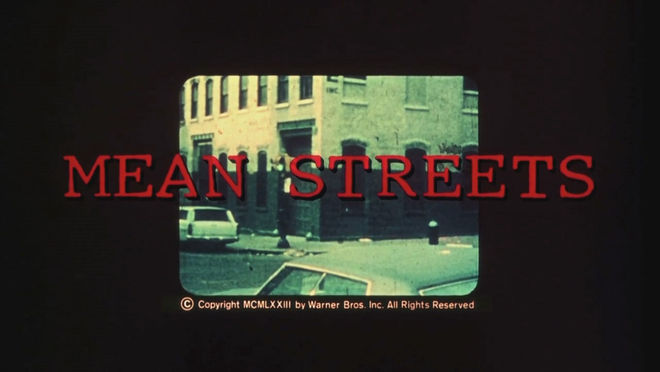
Anaïs: I think there was a total of an hour and a half of snaps. It was just Oulaya and Déborah improvising! Snapchat video appears several times in the movie, it’s used as a strong narrative element. Houda had been working on the editing with Loïc and Vincent Tricon. I saw the early edit of the opening sequence and it was already very intimate. I remember early on that Houda mentioned the opening of Mean Streets as a reference for this sequence.
Mean Streets (1973) main titles
Anaïs: It was a reference that really interested me a lot because of the immediate familiarity it gives the characters through the footage – it’s their memories, an intimate picture of their daily life.
Loïc: As for the graphics, only the names of the crew were added, everything else was done by the girls. We had asked Anaïs to present us different versions of what was possible with Snapchat: animations, logos, colour, etc.
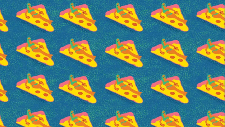
Anaïs: Houda really encouraged me to try a lot of things. We started to experiment with all the possibilities of the app, like trying to include some emojis, scribbles and sketches, typos, and some of the different kinds of fonts you can use, but very quickly it appeared to not be necessary. The image needed some space and the focus needed to be on the characters. So we took a step back.
Loïc: The energy of the girls and the rhythm of the cut did not allow for us to integrate crazy graphics. It distracted from the intention of the sequence and so naturally we opted for something simple.
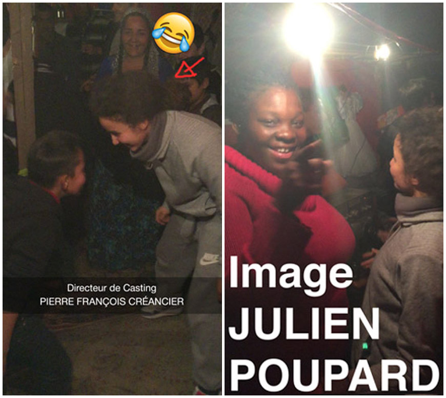
Divines (2016) unused credit concepts
Anaïs: It was really interesting because there really was this willingness to try a lot of things, even to go too far and then go back. There was a lot of different approaches and experimentation. Finally we arrived at something very simple: the Snapchat caption. At that point it seemed obvious to us that we had to go towards simplicity and really leave it to the imagery. It was very important for Houda that as the film ages, that there is something very timeless that emerges from this sequence, despite the fact that we use a very current video app like Snapchat.
Could you give us an example of an experiment you tried that didn’t work out?
Anaïs: I think the use of the emojis was clearly not a successful test, but we still did it. [laughs] It became clear that it wouldn’t go in this direction, if we used the emojis. It wouldn’t be modern, which was the idea, but it would be more of a trend. It was important that it be modern but not trendy.
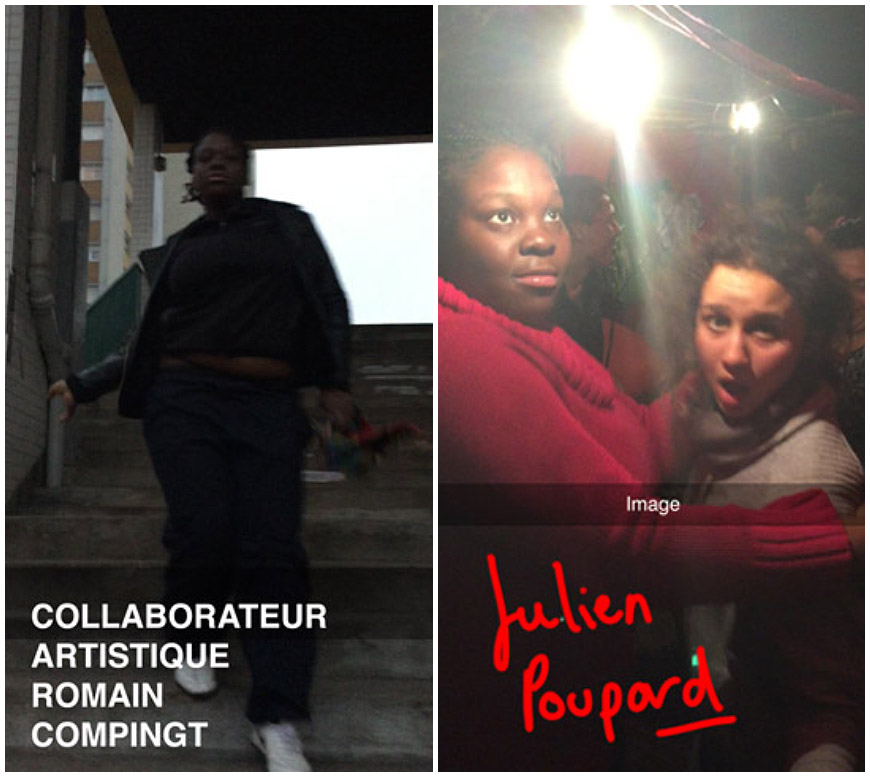
Divines (2016) unused credit concepts
Anaïs: Houda was really great though. She said it was always better that we did it, that we tried it, than not doing it. I remember Houda saying to me that it was important that all the design tends towards something timeless, even though we were using something like Snapchat. There was this attention to the fact that the movie should age well and not become outmoded, even though it’s documenting the current use of mobile video.
Was there anything about the app’s style that was difficult to translate to the screen?
Anaïs: I worked to make it as close as possible, to have the right opacity shade and all that, but I think at the end of the day that wasn’t the most important thing. Some of the rushes already had the Snapchat elements overlaid on the image, like the moment where there is the time of night. That’s actually Oulaya and Déborah that shot that as a Snapchat and decided to put the time on it! Another example is when there’s this caption that says “En direct” or “Live” which is also a choice they made. It was necessary to play within these constraints so that we don’t feel any difference with what I then added.
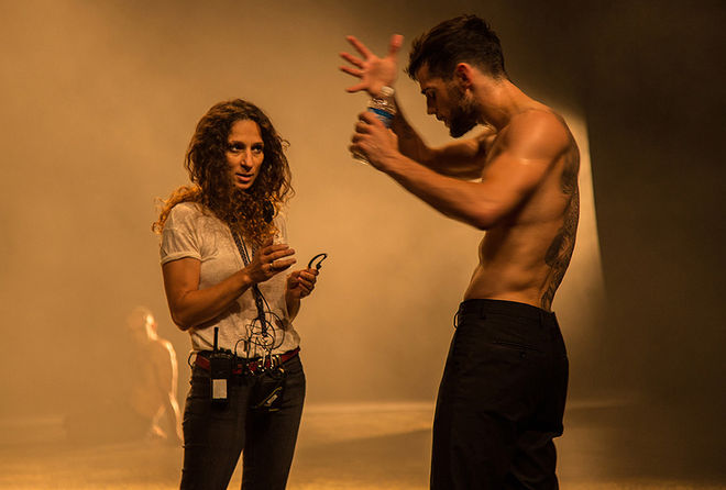
Divines director Houda Benyamina and actor Kevin Mischel on set.
The bulk of the title sequence takes place after a brief cold open. Did the film ever open with the Snapchat montage?
Loïc: We had played around with the placement of the sequence at the beginning of the film, to try and introduce their relationship, but it was not as strong. It did not have the right force. The characters and themes were presented by way of the title sequence, introducing the viewer to familiar ground. They’re no longer simply discovering these characters, they live with them, which is paramount to communicate information and emotions. We therefore decided to divide the title sequence in two and open with a text box with the producers’ names. The font used by Anaïs, the smoke of the mosque, the overlays, the colour blue, associated to the sounds of the cosmos and to the first Quran verse chanted, douse us in spirituality to then dive into the heart of the film.
Anaïs, what can you tell us about the title card reveal? What were some of your conversations with Houda about that?
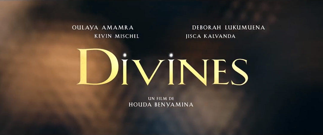
Anaïs: Yeah, there was this shot with the sky and the buildings. Houda wanted the title card to appear from the sky and have the feeling of a holy text, a sacred text. It’s a really important notion through all the movie. So we tried lots of things, but we went for this Roman style font that appears literally in the clouds.
The film had a working title, which was Bâtarde, for a very long time, so there was this contrast with this insult “Bastard” with this really religious Roman font. It’s also a nice link with the end title sequence.
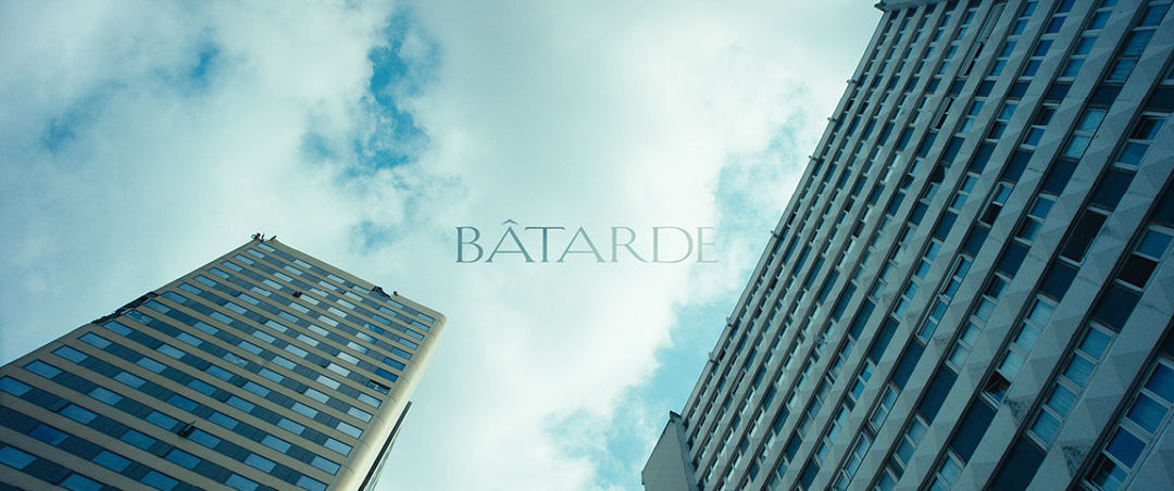
An early version of the title card featuring the working title Bâtarde.
Was there anything that took you by surprise when working on this sequence?
Loïc: Its relationship to music. We tested some more expected stuff like rap or electro, but that classical piece by Vivaldi seemed obvious. It symbolized of course the theme of the sacred, but what was interesting was its beginning. Its snare evokes a military band and reveals immediately Dounia’s warrior side, which we do not know of yet. The unexpected association between classical music and street imagery, much desired by Houda Benyamina for the whole of the film, was beautifully established.
Anaïs: It was a really long process, but I feel really, I don’t know how to say, confident with Houda? She had such patience with us. It wasn’t clear from the beginning that that was going to happen, but once I was on it I didn’t really second guess it. But being a young motion designer, I have to say that many things have been a surprise overall! I had only made one feature film before, so I really learned a lot from Houda and Loïc – and I sincerely feel very fortunate to have been able to work with such talented and passionate people.
What elements of this sequence are you most happy with?
Anaïs: I am glad that we managed to create a consistency between the different credits featured in the film, despite very strong differences. It was necessary to make the link between the opening credits – with their very modern with the use of Snapchat – the title card, and end credits – which really put forward the idea of sacred text.
I enjoyed working on the end credits even though I know it's traditionally considered a less interesting form than the opening credits. The last scenes of the film leave the viewer in a state of emotional shock. It was really necessary that the end credits be there to accompany that.
Divines (2016) end titles
Loïc: I love how the title sequence turned out! After that strong montage of the girls in the iPhone shots, hearing "mes mains sont faites pour l’or!" (“my hands are made for gold”) from our dear lead, followed by "je suis la reine du monde!" (“I am the queen of the world”) and cutting to that majestic, aerial, divine shot of the buildings in close-up, it is very enjoyable.
Anaïs: Houda had this desire to evoke a sacred script during the end credits with references to the cosmos in particular. So I suggested that we take inspiration from the palimpsest – these are handwritten documents whose writing has been erased to be able to rewrite on top of it. The traces that preceded it are always there to be seen. I think it was an interesting way to portray the character’s quest for a spiritual father – what preceded us but which escapes us.
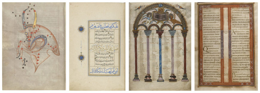
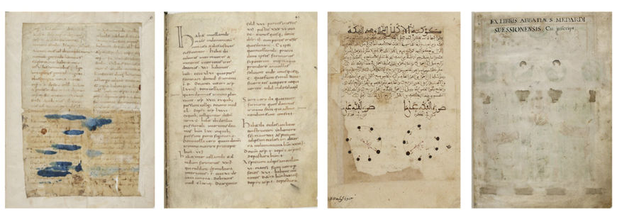
Palimpsest reference materials
Which tools and software did you use to put it all together?
Anaïs: It was Photoshop and After Effects for both title sequences. Nothing too fancy! [laughs]
Loïc: As for us, we edited classically on Avid.
What are some of your personal favourite title sequences, whether classic or contemporary?
Loïc: The one that comes to mind immediately is Catch Me If You Can by Steven Spielberg. But also The Good, The Bad and The Ugly by Sergio Leone.
Catch Me If You Can (2002) main titles, designed by Olivier Kuntzel and Florence Deygas
Loïc: The wacky title sequences by Gaspar Noé, the one from Delicatessen by Jeunet and Caro, and how can I forget The Shining by Kubrick.
Anaïs, you also mentioned Catch Me If You Can earlier. What are some of your other favourites?
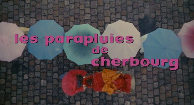
Anaïs: Les parapluies de Cherbourg. The Umbrellas of Cherbourg. I think this one is my favourite title designs. It’s so graphic, the music, I don’t know, it’s just so effective.
The Umbrellas of Cherbourg (1964) main titles, designed by Jean Fouchet
Anaïs: It’s hard to say just one! Maybe The Graduate as well. It’s so simple but effective. Maybe those two! It’s a hard one. [laughs]
And also more recently, the opening title sequence of Narcos is a favourite. I found their use of archival imagery quite interesting. I'm amazed by the variety of sources and techniques they used and how it comes together so well. I'm betting it was difficult to pull off, but it creates quite a striking atmosphere.
What have you seen or watched lately that’s been exciting to you?
Loïc: The film Victoria by Sebastian Schipper. The feature I'm editing at the moment was shot in six days. The director wanted me to come visit the set, so I have an appreciation not only for the enormous preparation required, but also the luck, in terms of weather and potential tech problems, necessary to do this. So I was totally amazed to discover that Victoria was shot in real-time for 2 hours and 12 minutes. It’s an impressive technical feat, but the film is also very good. Despite the time constraints each character is perfectly realized – I believed every situation. It’s a film without editing, but everything is integrated with the staging and rhythm of the actors. I find that extraordinary. Despite some hidden cuts, it did not feel artificial, it did not feel like they were cheating. I was totally won over by this excellent film.
Anaïs: I recently discovered this movie Spetters by Paul Verhoeven released in 1980. It’s very realistic, it’s very violent. You should definitely check it out! It was a real shock for me. It’s a deeply moving film and has a lot in common with Divines thematically – youth from working class neighborhoods who dream of success and social ascension.
Special thanks to Anita Abbasi for the translation in this article.

