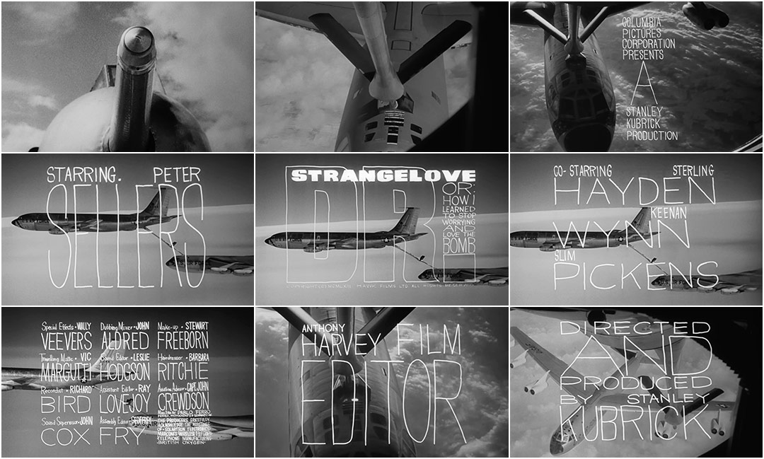
The title sequence to Stanley Kubrick’s Dr. Strangelove, featuring aircraft refueling mid-flight and the hand lettering of title designer Pablo Ferro, is an undeniable classic of the art form.
Having been first hired by Kubrick to produce the trailer for the film, Ferro was then asked to produce the opening title sequence as well. It was his first foray into title design. A true collaboration with Kubrick, the sequence prepares the audience for a loopy, satirical romp through hot love and Cold War. But first, an ominous narrator warns of a doomsday device. As we float above a field of clouds, the voice glides cold and deadpan over the stark sound of the wind. Next, a kind of phallic apparatus appears accompanied by “Try A Little Tenderness”, at once disarming and bizarre. Planes in flight come together in a kind of mechanical copulation, up and down, their movement bumbling yet mesmerizing.
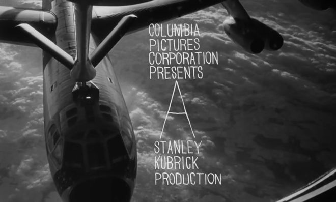
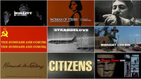
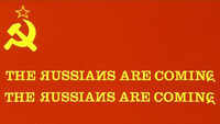
Pablo Ferro’s loose letterforms and slack compositions superimposed over aircraft footage represented a distinct departure from American title design of the time. Prior to 1966, the aesthetic of main titles was defined primarily by designers such as the Basses, Binder, and Brownjohn and their symbolic geometry, clean typography, and bold graphic forms. The stage was set for Ferro’s strain of ambitious artistry. His lettering, variously squat, long, and lean, allows the footage to peek through, unobtrusive but utterly individual. It was all done by hand, with grease pencil on glass.
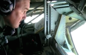
Notably, none of the aerial footage in the opening came from – or was even made for – Kubrick’s film. The footage is all stock. Because it came from more than one stock reel, the sequence features multiple aircraft, including an angle from a KC-135 Stratotanker’s refueling deck, which dates back to October 20, 1956 and came directly from the Boeing company. The sequence shows the KC-135 transferring its precious fluids to a B-52 Stratofortress, the colossal bomber featured later in the film. The phallic piece of machinery in the first shot, however, is not the refueling probe of a B-52 or of a KC-135, as one would assume, but possibly that of a Gloster Meteor jet fighter. Regardless, it is the first in a long line of sight gags and sex jokes sprinkled throughout the film.
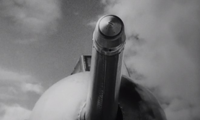
First shot of an aircraft refueling probe
The music, a light and airy arrangement of “Try A Little Tenderness” by composer Laurie Johnson, does much to set the mood. By 1964, the song originally written by Jimmy Campbell, Reg Connelly and Harry M. Woods was an American staple and one that would have been immediately recognized by the audience, having been covered by countless performers in the preceding years. It would still be another two years before Otis Redding gave the song an R&B spin and recorded his rousing, popular version with Booker T. & the MG’s.
Laurie Johnson is an English film and television composer, and bandleader. Along with Dr. Strangelove, his film scores include The Moonraker, No Trees in the Street, Tiger Bay, Spare The Rod, First Men in the Moon, and others.
As Ferro details in our interview below, the design of the titles was a last-minute affair. He had lettered some temporary frames for the opening but Kubrick liked them so much that they were put toward the final version. This might explain why, if you look closely, there appear not one but two spelling errors. In one frame, a line reads "Base on the novel Red Alert" and in another, we see the word “Ficticious”. There are many such endearing slips throughout the film including visible wires on the model planes and continuity errors, but they all merely add to its charm.
The titles to Dr. Strangelove remain delightfully evocative to this day and have become one of Pablo Ferro’s most well-known works. The combination of aircraft footage, Johnson’s arrangement, and Ferro’s quirky lettering presents us with a number of tongue-in-cheek cues, and we are formally prepped for a comedy grounded in harsh technicalities but light as air.
Title Designer PABLO FERRO speaks about his work on Dr. Strangelove in this excerpt from our feature article Pablo Ferro: A Career Retrospective.
Dr. Strangelove was [produced under your company FMS], right?
Pablo: Right. I was doing commercials and I created a new way to cut and that’s why I got popular. That’s how Stanley [Kubrick] saw my work. He saw my reel and he loved it. He said, “I would like you to do the trailer for Strangelove because I like your commercials.” He said we could sell the movie as a product. I said that would be great.
Dr Strangelove trailer (1964)
So the trailer came first. How did the titles come about?
Pablo: So we had the whole campaign and he talked me into staying [in the UK] for six or seven months. I said to him, “I have a company and I have to do commercials,” and he said, “You can do commercials here.” He made it very pleasant; I had a beautiful house in London and he gave me a telephone number if I ever needed a car. No matter what time I called I would get one! He didn’t need me all the time, so I did several commercials while I was there.
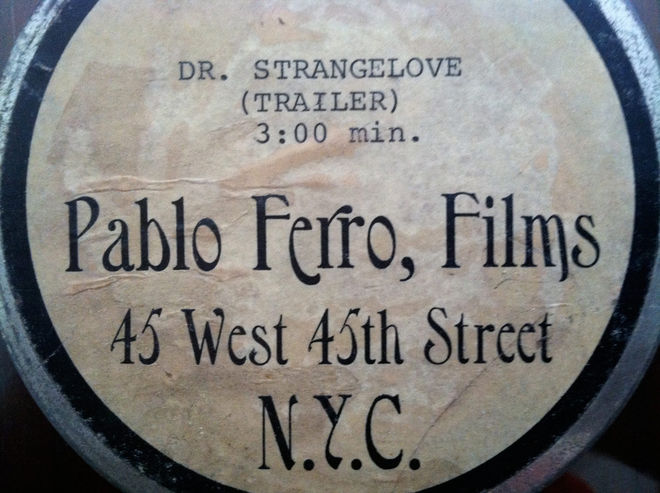
Dr. Strangelove trailer canister
The titles for Strangelove were last-minute; I didn’t have much time to produce it. It came up because of a conversation between Stanley and I. Two weeks after I finished with everything, he and I were talking. He asked me what I thought about human beings. I said one thing about human beings is that everything that is mechanical, that is invented, is very sexual. We looked at each other and realized — the B-52, refueling in mid-air, of course, how much more sexual can you get?! He loved the idea. He wanted to shoot it with models we had, but I said let me take a look at the stock footage, I am sure that [the makers of those planes] are very proud of what they did and, sure enough, they had shot the plane from every possible angle.
There’s one particular angle where the planes were attached to each other and they were swaying up and down, up and down. I asked him if we could shoot something like that and he said no, use the stock footage. I got the stock and started putting it together and when I was about finished cutting it into more pieces he came in with a piece of music. An instrumental of “Try a Little Tenderness.” I agreed and to our amazement the music was doing the same thing! It was swaying up and down. “Try a Little Tenderness”… I didn’t have to adjust anything in the cut.
And how did you develop the lettering?
I tried to do the lettering like it’s usually done in films, but he said, “Pablo, I don’t know whether to look at the lettering or look at the plane. We have to see both at the same time.” I said to myself, oh boy, how could you do that? I remembered that I do my own lettering, just doodling around, thin and tall and things like that, and I thought I’d try that.
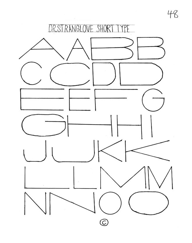
Dr. Strangelove short type example
We did a test and it worked! Stanley filled the screen with my lettering. It was perfect! You could see the plane and you could see the lettering at the same time.
The challenge was that I had to do everything, all the layout, and then when I had just done the last layout, he asked me: “Where’s your name?” I didn’t know I was supposed to put my name! The only open space was between two parts so I did it there, very little. You have to look for it.
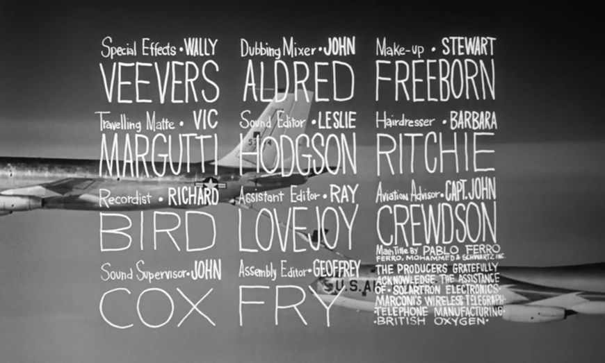
Still from the Dr. Strangelove title sequence featuring Pablo Ferro's credit
From then on, it was amazing working with him. I never thought that lettering I did was anything special — the only person there that liked it was Stanley.
Well it’s very iconic now, and has become the particular style that you are known for.
Pablo: Right, it’s almost a stock now that’s being used by everybody. I just finished a font book, part one, and it has lettering that I created that’s never been shown before. The Strangelove lettering is in there also and I am working now on part two. It’s amazing what you can do with lettering, what kinds of shapes it could take to make an A or B and each would be different. I took a look at a bunch of graffiti books. There was some great lettering in there but you couldn’t read it, so I took that and made it my own style. I am going to continue to do some more of that.
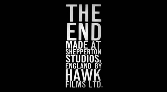
Dr. Strangelove end title card evoking the lettering layouts from the opening sequence
LIKE THIS ARTICLE?


