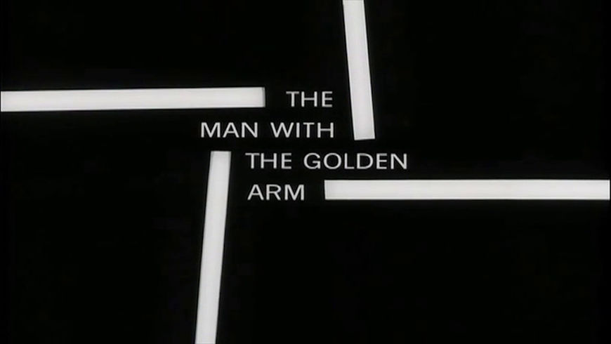
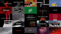
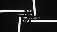
The late 1950s were an important time for Saul Bass. The graphic designer, previously known mostly for his eye-catching poster designs and innovative trade ads, was changing the way Hollywood thought about opening credits with his stunning main title sequences for films such as Carmen Jones, The Seven Year Itch, and most significantly The Man with the Golden Arm, his third and most well-known collaboration with director Otto Preminger.
“A movie's title and its list of credits is usually a monotonous interlude when moviegoers go to the popcorn machine or the rest room or simply explore their seats for long-range comfort and chatter with their companions about where they'll eat after the show,” Bass told Newsweek in a 1958 interview for Bonjour Tristesse. “They consider the whole title thing a great bore.”
Aware that his work was changing the paradigm for opening credits at the time, Bass summed up his approach to film title design thusly: “I've forced the audience to sit down and watch. I do, visually, a one-sentence reduction of the story, a real tight condensation of a big, fluffy, wonderful thing. I sort of compress it into a little white tablet."
The Man with the Golden Arm (1955) main titles, designed by Saul Bass
That beautifully simple approach applied so effectively made Bass one of the most sought after designers of his day. Between 1956 and 1958, Bass and his collaborators were producing four to five film title sequences per year, in addition to TV titles, movie posters, and print and television advertisements. During this prolific time three especially pivotal events took place in Bass’s life: In 1956 Elaine Makatura joined him as his assistant, beginning an incredible creative partnership that would last for 40 years, and in 1958 he not only formed his legendary design firm Saul Bass & Associates but also produced the main titles for Vertigo, the first of his iconic collaborations with Alfred Hitchcock.
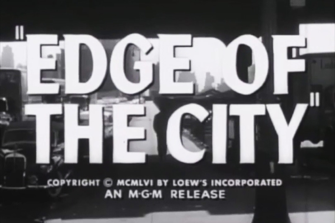
It was here, in the midst of one of his most significant creative periods, that Bass would quietly design the titles for a low budget “quickie” called Edge of the City – an inauspicious production forgotten by the studio and rejected by cinema owners, directed by a blacklisted filmmaker and starring a duo of unknowns who would go on to become two of the most important and influential figures in modern American cinema. The movie also has the unfortunate distinction of being one of the few Bass title sequences not to survive into the digital era, existing in its original form only in certain rare cuts of the movie and, elementally, in its striking marketing and advertising campaign.
A Man Is Ten Feet Tall
Edge of the City follows Axel Nordmann (John Cassavetes), an army deserter who gets a job as a New York City longshoreman under an assumed name. Axel is quiet and tries to keep to himself, but soon befriends fellow stevedore Tommy (Sidney Poitier). The pair form a quick bond, however the budding friendship doesn’t go unnoticed by Malick (Jack Warden), the racist leader of a rival gang of dockworkers who originally hired Axel. When Malick discovers that Axel is AWOL and tries to extort him, the two friends find themselves in deep trouble with only each other to rely on. It's a surprisingly affecting film, and one that aptly demonstrates why Cassavetes and Poitier went on to become the stars they did.
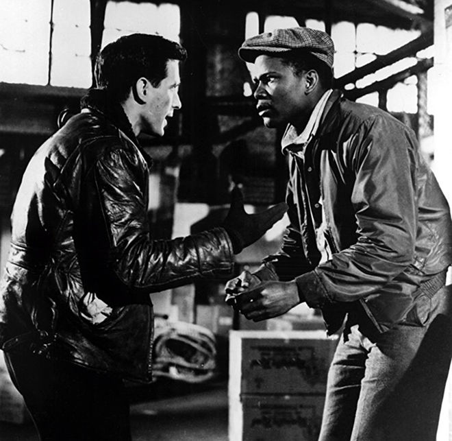
John Cassevetes and Sidney Poitier filming Edge of the City in 1956
Based on the 1955 Philco Television Playhouse teleplay A Man Is Ten Feet Tall by screenwriter Robert Alan Aurthur, Edge of the City was intended to capitalize on the success of Marty (1955), another Philco teleplay that had been adapted for the big screen and earned four Academy Awards. A so-called “cheapie” or “quickie,” Edge of the City was produced for just $500,000 and shot over 28 days on location in New York. The film was Cassavetes’ first starring role and it gave Poitier, who also played Tommy in the TV version, his first co-star billing on a movie. The filmmaker, Martin Ritt, a director of stage and television productions, had been blacklisted by Hollywood in the early 1950s. He was hired to direct precisely because the studio wouldn’t have to pay him a large sum. The small budget was reportedly the result of studio MGM’s belief that the film’s depiction of an interracial friendship would make it difficult to sell to cinemas in the American South.
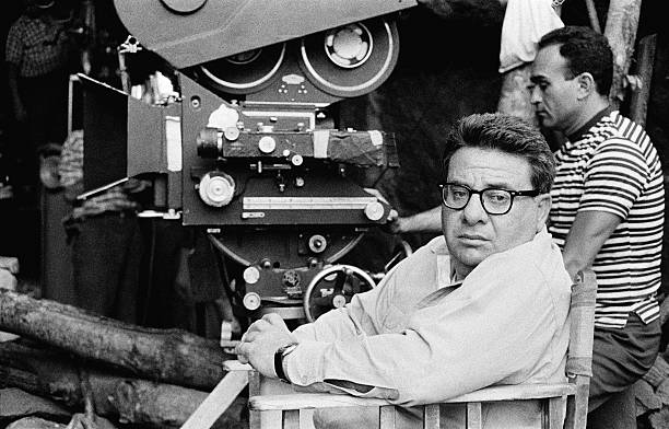
Edge of the City director Martin Ritt in 1959
“The studio didn’t even want to release it,” Ritt recalled in a 1958 interview with New York Times film critic Howard Thompson. Despite a promising start at the box office and critical praise in the large urban markets of New York and San Francisco, MGM’s fears were realized when many southern theatre owners rejected the film outright due to its depiction of “racial integration.” Although not a commercial success in the US, the film was released in the United Kingdom under the story’s original title A Man Is Ten Feet Tall, where it earned two BAFTA nominations. “I was particularly pleased when the picture and Sid were nominated by the London Academy,” Ritt said. “I liked the picture, too. Why? Well, it moved me; I like anything that moves me to laughter or tears.”
On the Edge of Your Seat
Moviegoers in 1956 might have been moved to laughter upon seeing the original theatrical trailer for Edge of the City. With its peppy tone and silly “Meet the Script Girl” framing, the trailer makes it clear that MGM had little idea how to market such a racially charged film to American movie audiences. "This one is different… in its setting, its story, and its people," exclaims the nameless script girl as a montage of scenes from the film play out of context. Cassavetes and Poitier are positioned as smiling pals who work at the docks, an odd couple – a white man and an African American man. Together! Although pitched as “offbeat” and “real,” the trailer skirts the film’s downbeat tone, harsh portrayal of racism, and brutal violence to an almost painful degree.
Edge of the City (1957) theatrical trailer
It’s unclear how Saul Bass originally became involved in the marketing campaign for Edge of the City, but it’s evident that his talents were needed by MGM to better position the film. It’s possible the studio sought out the designer because of his work on another controversial movie released the year before: Daniel Taradash’s Storm Center – the story of a small-town librarian who is branded a communist.
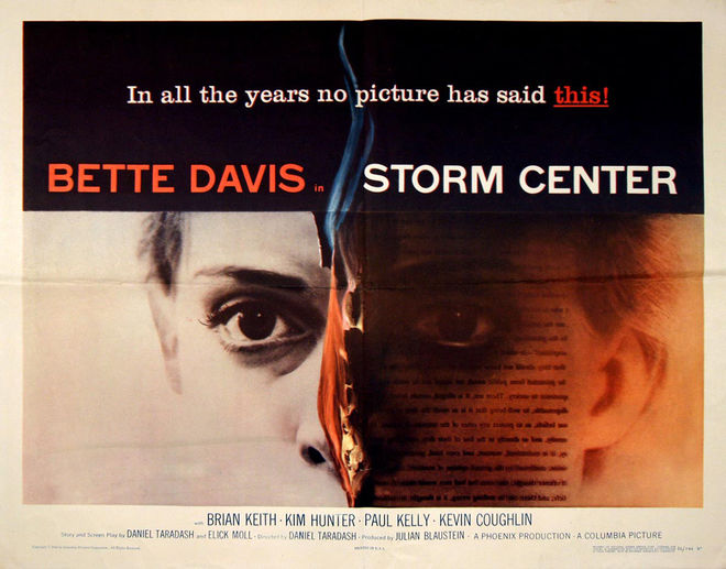
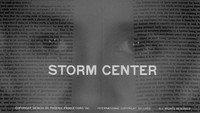
Storm Center (1956) half-sheet poster designed by Saul Bass
Bass’s poster design and title sequence for Storm Center succinctly expressed the film’s overt anti-McCarthy messages. Perhaps after seeing him handle such a political hot potato so eloquently with his designs, MGM believed he was the right person to bring the marketing campaign for Edge of the City – with its then-divisive themes of racial integration and equality – to a wary American public. More likely, however, is that the studio simply thought a flashy marketing campaign and opening title sequence could add prestige or intrigue to its small, low-budget movie, an approach that would become common practice for studio pictures and B-movies alike in the following decades.
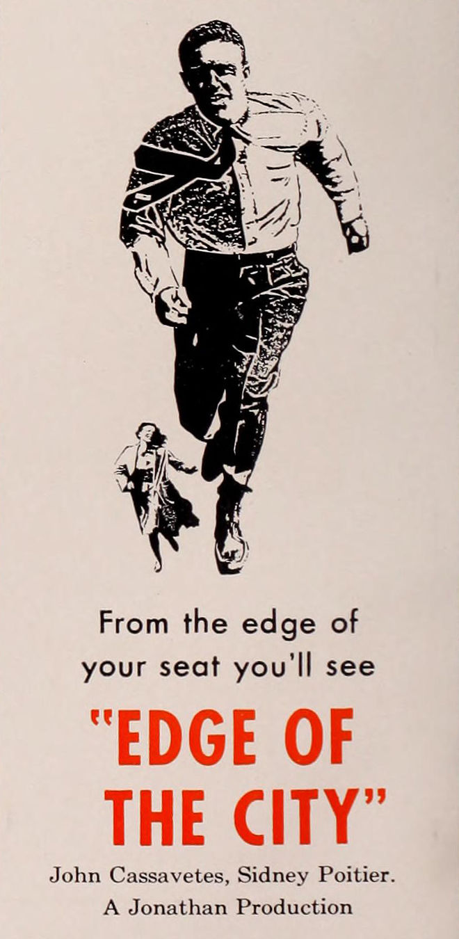
A 1956 trade magazine ad for Edge of the City featuring Saul Bass's key art for the film
The initial trade advertisements for Edge of the City appear to have little to do with the film beyond the title – or with Bass’s later, more refined work on the campaign. The key art – a pencil sketch of a man and woman fleeing – is present, but the square window pattern used in the final one-sheet posters for the movie is not. Additionally, the man’s face and upper body, not seen in any of the other posters or marketing for the film, bear no resemblance to star John Cassavetes. In all likelihood this trade ad was prepared by another designer who worked from Bass’s original sketch. However, the reveal of the man’s face does raise some interesting questions about Bass’s process. Did Bass draw these figures before he’d seen the movie or was their generic appearance intentional and simply meant to represent the modern angst evoked by the film’s title? Was the positioning of the figures part of the original concept or did Bass crop out the man’s head because the studio thought it didn’t look enough like their up-and-coming star? We may never know the answers, but happy accidents are often part of the design process.
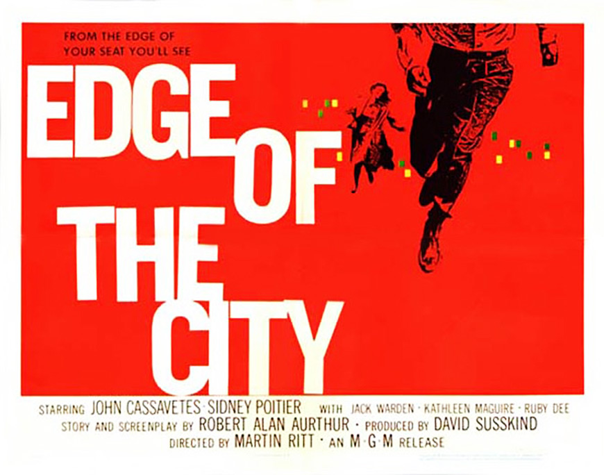
Edge of the City (1957) half-sheet poster designed by Saul Bass
Bass’s credited poster and print designs for Edge of the City are far more evocative than their trade magazine counterparts. The aforementioned framing of the figures imbues the poster with a feeling of motion and energy, as if the man is about to sprint out of frame. In the background, an assembly of yellow rectangles allude to a skyline, windows glowing in the night. When combined with the large, slightly off-kilter typography – rubbing the edges of the frame and again echoing the idea of the hustle and bustle of a crowded city – and that bright red – integral to so many great Bass designs – it becomes clear why this poster is more well known than the film it promotes.
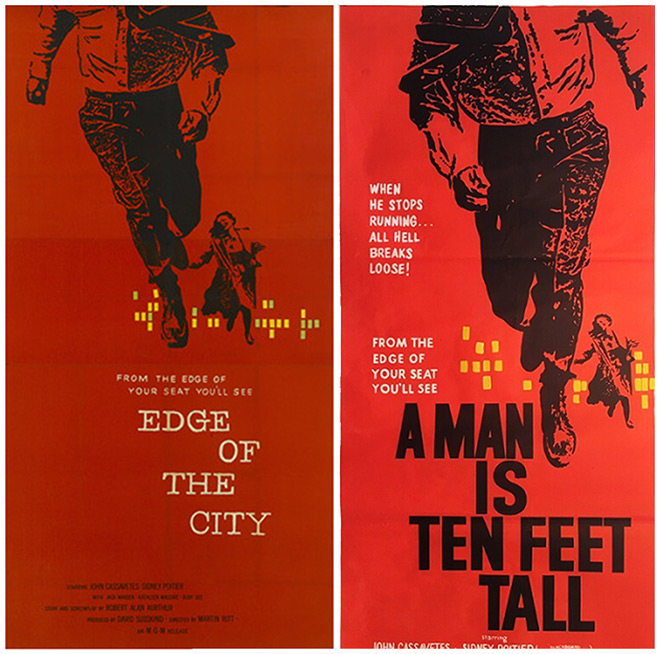
Image set: Edge of the City (1957) poster variants, featuring an alternate typeface that matches the film's title sequence (left) and the international title A Man Is Ten Feet Tall (right).
The imagery may have no direct connection to the movie in terms of who and what’s being depicted, but the poster and print designs successfully convey the idea carried by the film’s title: people being driven to the edge – in a literal sense but also figuratively pushed to the fringes of society or choosing to go there with a purpose.
Under the City Lights
Read more about Edge of the City in Saul Bass: Anatomy of Film Design by Jan-Christopher Horak
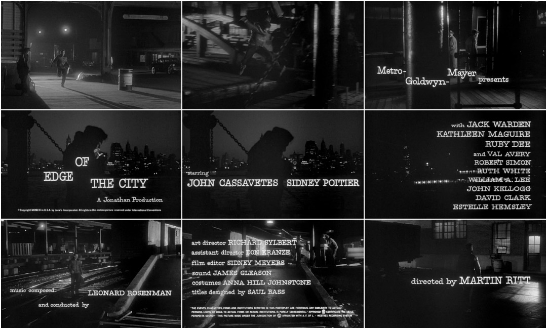
The opening title sequence of Edge of the City starts in the same position as the poster: a man on the run. But Axel Nordmann (Cassavetes) isn’t running from the city, he’s running to it – or rather to the ferry that will bring him there. After bashing through a gate and leaping onto the departing boat, Axel settles in for a cigarette, bathed in darkness and uncertainty as he looks out toward Manhattan. White credits fill in the dark night sky as the ferry crosses the East River, like the lights of a tall building being turned on and off, floor by floor. Axel’s journey briefly continues thereafter with a meandering waterfront walkabout before bringing him to his destination.

Edge of the City (1957) title examples
At the time, it was still common for Hollywood title sequences to list credits in a conventional way, featuring title cards aligned plainly for maximum clarity and readability. In Edge, Bass’s credit placements for the “Metro-Goldwyn-Mayer presents” and “Edge of the City” title cards was so unusual that their alignment actually had to be detailed in the film’s shooting script so as not to confuse anyone working on the post-production process. No, there’s nothing wrong with the credits – it’s just the work of Saul Bass.
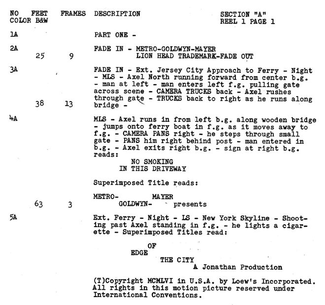
An excerpt from a 1956 Edge of the City shooting script highlighting how Saul Bass's title card placements were described by the production.
The version of the Edge of the City opening featured and described above was not Bass’s preferred version of the sequence. The designer originally produced a variant of the opening titles that carried over the rectangular dotting motif used sparingly on the poster and other designs; the animated rectangles representing the lights of the city. This alternate version, which includes the same serif typeface and credit placement minus the animation, cost $3,300 for Bass to produce.
Bass explained his original version of the Edge of the City titles at a 1979 seminar held by the American Film Institute:
Read more about Edge of the City in Saul Bass: A Life in Film and Design by Jennifer Bass and Pat Kirkham
Against the live action background play a series of animated rectangles. At the beginning, they create a sense of “drive” (as the protagonist runs down the pathway to a ferry) by popping on and off the screen in long, horizontal patterns. Later (as the figure crosses the river on the ferry) they assume a symbolic representation of the lights of the Manhattan skyscrapers as they flicker on and off the screen. They once again resume the horizontal “drive” character (as he moves through the freight yard on the other side of the river) interspersed with random flickering “thought” patterns near his head. Finally, they lead us visually to the bright light of the hiring office door and end as our story begins.
Unfortunately the version of the sequence that Bass described did not make the final US release cut and does not exist on the North American DVD release. It’s rumoured to still exist in certain film versions of the movie, but those prints are difficult to come by and have rarely, if ever, been screened for the public.
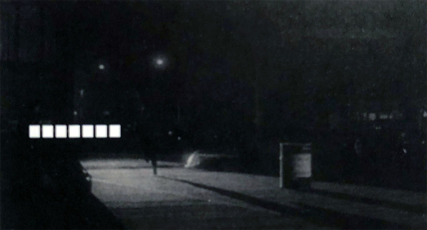
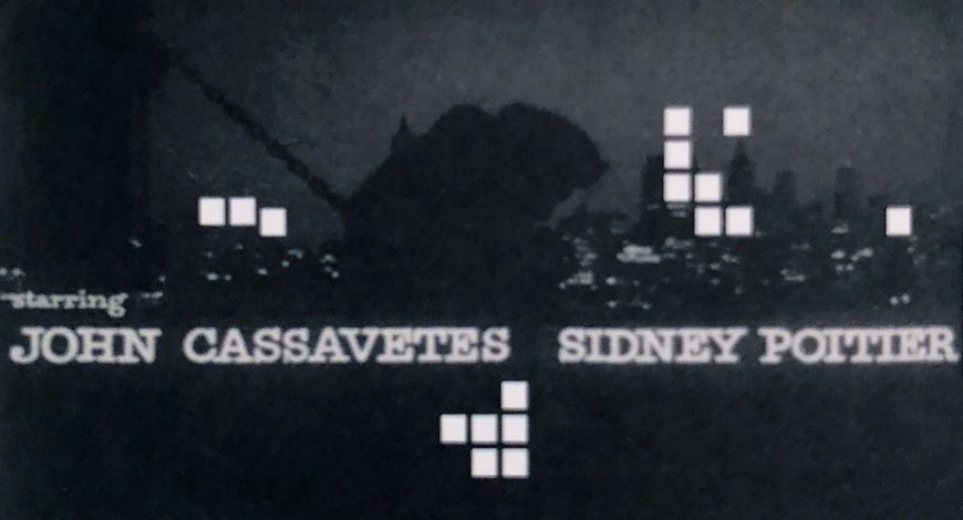
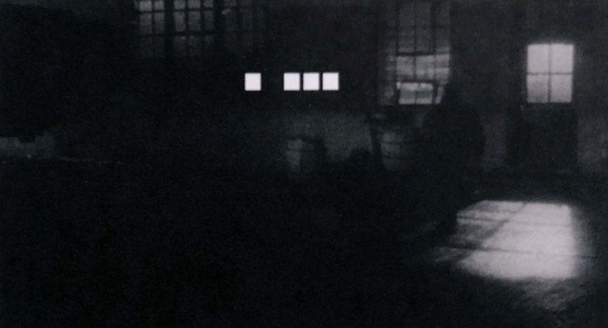
Still frames from Bass's original version of the Edge of the City title sequence featuring the animated rectangles.
Undeterred, Bass and company would continue to experiment with animated shapes forming patterns, graphics, or architecture, most notably in the openings of 1959’s North by Northwest and 1960’s Ocean’s Eleven. It's worth noting that Bass's initial involvement with the latter project began in 1956 – around the same time as Edge of the City – while working with star Frank Sinatra on Johnny Concho and later The Frank Sinatra Show.

Image set: Colourized stills from the PM EAST/PM WEST (1961) television opening designed by Saul Bass
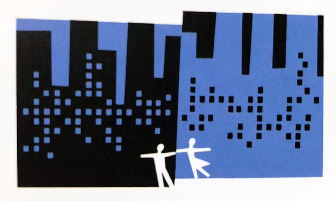
The Saul Bass designed letterhead for West Side Story (1961) featuring the familiar geometric skyline pattern.
One year later, Bass would revisit the concept of dots or shapes as city skylines on three different projects – West Side Story (in the form of the film’s official letterhead), the opening of the bi-coastal talk show PM East/PM West, and the title sequence of Something Wild – at which point his fascination with the concept seems to have waned and he moved on to other ideas.
Director: Martin Ritt
Director of Photography: Joseph C. Brun
Title Designer: Saul Bass
Music: Leonard Rosenman

