Editor’s Note: This article has been marked “Not Safe For Work” due to elements which contain nudity and sexual situations.
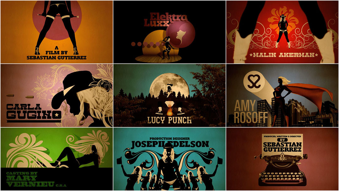
In the title sequence for Sebastian Gutierrez’s Elektra Luxx, a psychadelic mélange of bullets, guns, and art deco ornaments materialize around the nude silhouette of the title character. As Elektra teases the audience with her own bawdy burlesque, she reprises her various adult film roles wearing next to nothing.
Creative Director MOISES ARANCIBIA of Smog outlines how he and his Chilean supergroup used a bucket of paint and 3D software to make sure that Elektra lived up to her titillating reputation.
How did you first get involved with the project?
After seeing our credit sequence for El Don, Sebastian Gutierrez contacted us to create a graphic world for the opening titles for his new movie. Besides the titles, we also designed both the "Gato Negro" and "Elektra Luxx" logotypes.
What were some of your initial ideas and concepts?
Through meetings via email, phone calls, and Skype, Sebastian explained the film's plot, characters, and what he had in mind for it all. Then we sent a few emails where we attached images that showed the direction we were thinking of in terms of the look: the style of Dita Von Teese, the beautiful and delicate feminine silhouette illustrations by Milo Manara, and especially the photography of Sam Haskins. In addition, we wanted to incorporate some art nouveau and psychedelia graphic elements.
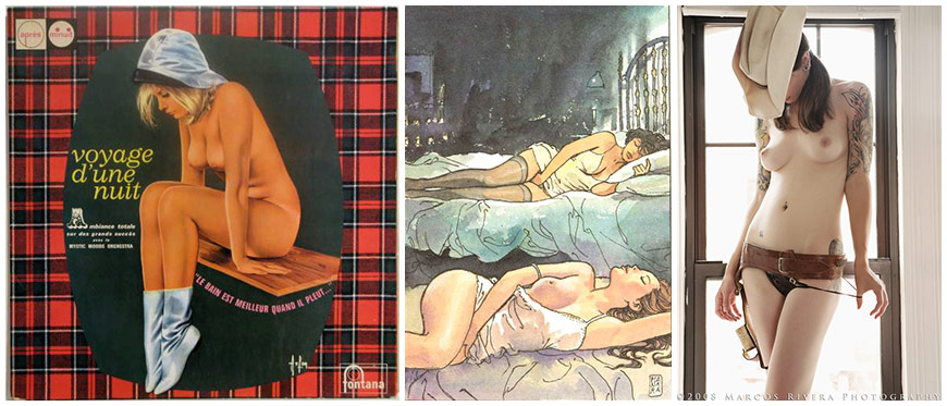
Reference images
We designed a mixture of storyboards and styleboards using a look similar to what we wanted to achieve to show Sebastian our vision for the full title sequence. We described it as “sexy... a bit kitschy, and a bit absurd.” Although there were a couple of scenes we had to remove by force majeure, the script was approved by the director almost immediately. Our goal was to ensure that each frame of the sequence was interesting and behaved almost like a poster.
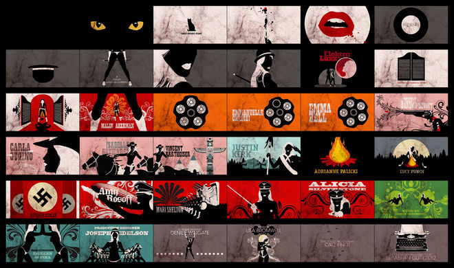
Styleboard
Tell us a little about the sequence and your process.
Elektra Luxx is the second film in a trilogy by director Sebastian Gutierrez. The film tells the story of a porn actress who dreams of changing her life and leaving her past to fulfill her dreams, one of which is to make a Broadway musical. This was the foundation that led us to give Elektra (Carla Gugino) her own musical key title sequence which runs throughout her life, her films, and her future. The title sequence shows us some of the films she starred in and recalls the different roles she’s played like scout, superhero, western... and it includes her dream of becoming a mother and encountering the Virgin Mary.
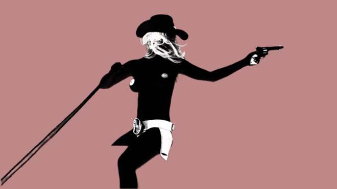
We really wanted to accentuate the female figure, to be erotic without being pornographic, so we resorted to using the nude silhouette of Elektra with white elements emphasizing her anatomy. Unfortunately, we couldn’t use Carla. But we decided to paint our model black and then retouch her in post production to achieve a more natural silhouette.
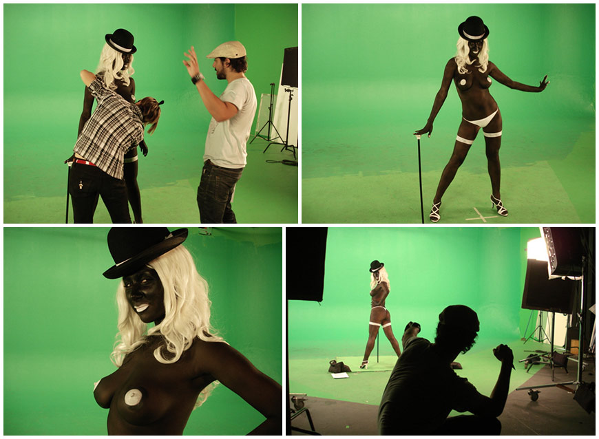
Green screen shoot
After we shot all of the model vignettes, we went into the process of cropping and retouching the silhouettes. This was the longest process in the project because in order to get the silhouettes as perfect as we had them in our mind, we had to digitally enhance some parts. For instance, all of the nipples and mouths were modeled in Cinema4D and then motion tracked to the original footage using After Effects. We also repainted the majority of the footage to exaggerate the contrast between different parts of the body – for example, the hair got a treatment completely different from the clothes. All of that was time consuming enough, but we ended up doing the whole process TWICE because we had a break-in at the studio and we lost two computers that had our completed scenes on them!
Demo video matte
Parallel to that process, we developed the graphic design like the backgrounds, fonts, and ornaments, and the composition of it all. I’m a big fan of typography, so it was important that we use the right font in the right place. We chose Romeral – a font designed by Juan Pablo de Gregorio – for the logotype and most of the titles. We had other fonts that fit the themes for the superhero, western, and scout sequences. The scout theme used Alpaca, a font that I designed myself. We try to use fonts designed by our friends throughout all of our projects.
The entire process took a month and a half. Sebastian was very happy with our work, so he asked us to make some animated sequences for a short Elektra Luxx promo for the Internet.

