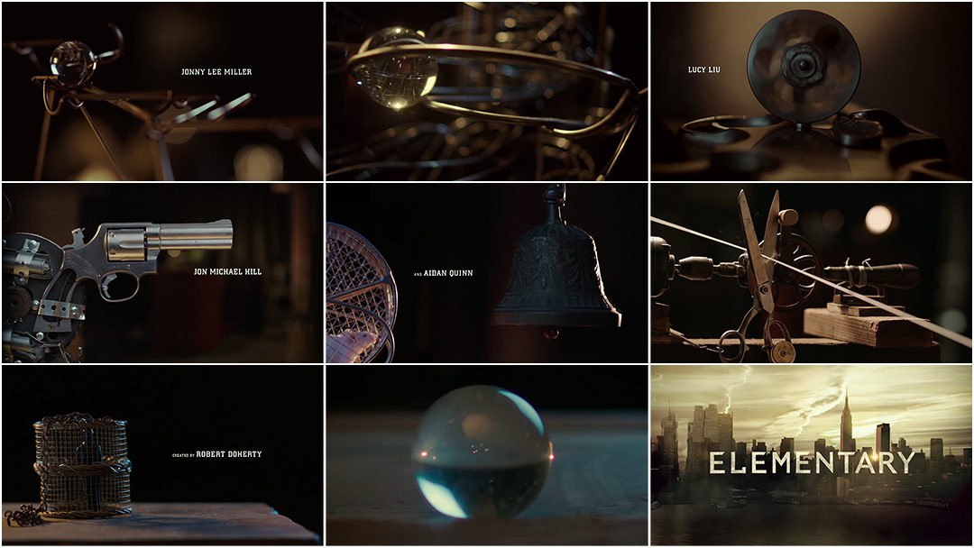
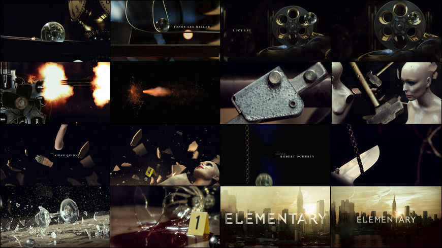
The opening title sequence for CBS’ updated Sherlock Holmes series Elementary reflects the show’s contemporary take on a classic character. Prologue Creative Director Simon Clowes employs a Rube Goldberg contraption to represent the manic detective’s unorthodox, sometimes convoluted and often aggressive approach to crime solving.
A large, transparent marble finds itself in the elaborate apparatus, setting off a chain reaction of increasingly violent events that culminate in the caging of a helpless figurine. Like the mind of the great detective, the invention works at a dizzying pace, with only parts of it revealed while others remain a mystery. A steadily intensifying score composed by Sean Callery adds a sense of impending danger and urgency to the marble’s iconoclastic course.
Just as one can’t make an omelette without breaking a few eggs, this sequence illustrates that you can’t always catch a criminal without subverting a few idols.
A discussion with Creative Director SIMON CLOWES of Prologue.
Give us a little background on yourself and your current position at Prologue.
I relocated to Los Angeles from London in 2005 after completing my studies in graphic media design. The sole purpose was to secure a job offer as a designer at Prologue and I have been there ever since! Currently my position is creative director.
And as for Elementary, how did that process begin?
I found out about the project late, but it sounded interesting – especially after watching the pilot episode. There had already been a lot of work done on it pertaining to the brief while I was on vacation. The client requested that we lean towards a “New York” theme since they wanted to communicate that this adaptation of Sherlock Holmes was set in New York as opposed to London. There were already storyboards that communicated what the client had asked for. It would have been a waste of time to design something of the same ilk, so I decided to design something that did not adhere to the brief... and see what happens.
So what were those concepts and how were they developed?
I wanted to communicate how Sherlock Holmes' mind works in the non-traditional sense of detective work. Even though the show was a modern adaptation of him, his techniques were still very rudimentary and unexpected and this aspect of Holmes' character is always of interest to me. This is what separates his style from that of other detectives.
Initial styleframes
I thought about how I could playfully represent one thing leading to another – a chain reaction, scenarios becoming the catalyst for something else to happen. In the pilot episode, Holmes found the location of a hidden dead body by using a marble to identify a misalignment in the floor. This stood out to me as a summation of his technique of using mundane objects to simplify a complex situation. I wanted to make the marble the hero of the sequence and this led me to the work of Rube Goldberg and contemporary adaptations of his work such as the OK Go music video, "This Too Shall Pass."
How did you come up with the different elements of the Rube Goldberg contraption?
We commissioned Rolling Ball Sculptures to create five standalone pieces to feature in the sequence and collaborated closely to ensure there would be enough variation between each structure. I then decided to construct the rest of the contraption with potential murder weapons, but using a gun or a rope wasn't enough, it needed to feel like it was all handmade.

Rough mechanism sketch and sculpture/gun mechanism works-in-progress
This would also complement the other, more modern structural elements we were having built and hint at the fact that the series is a modern adaptation of a classic story. It was then a matter of deciding how many ideas we could fit within the 30-second time constraint and how the elements would interact. The mouse was included to suggest the whimsical, crafty element of Holmes’ character.
Mechanism and sculpture tests
How did the live-action shoot go?
*The Arri Alexa is a film-style digital motion picture camera system made by Arri and first introduced in April 2010. The camera marks Arri's first major transition into digital cinematography after smaller previous efforts such as the Arriflex D-20 and D-21.
The one-day live action shoot took place on Mack Sennett Stage in Silverlake, Los Angeles. We shot everything on the Arri Alexa* and, as always, we had a very tight schedule with multiple setups throughout the day. Each element was different, requiring specific lighting setups, particularly any shot featuring the metal structure.
Some props were still being assembled, auditioned, and adjusted on set which made things even more interesting. This freedom, however, enabled us to make decisions on-the-fly and also execute some last minute ideas I had. The metallic structure itself consisted of five customized elements which were individually commissioned and one complicated 7ft sculpture which is featured in a few shots.
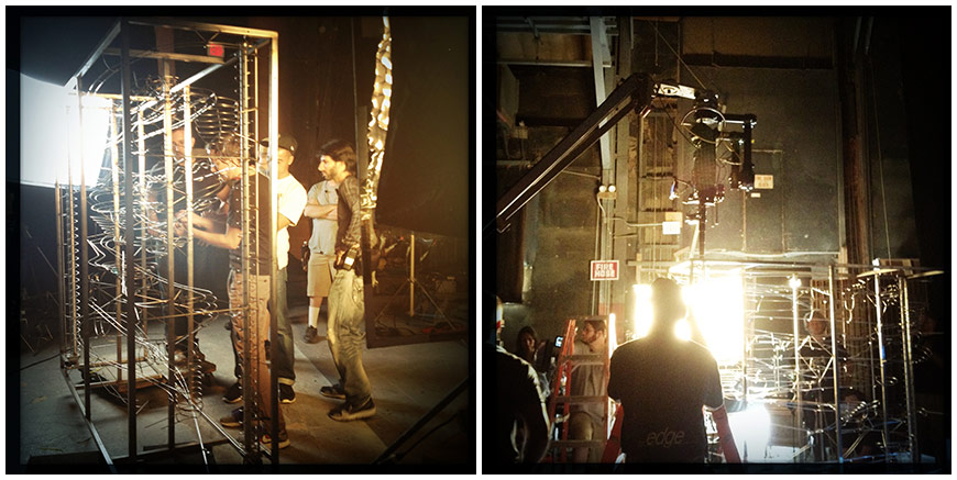
Large 7ft sculpture live-action shooting
What about the titles themselves – the typographic treatment?
The animated typographic treatment was intended to suggest the piecing together of clues, to complete the puzzle so to speak, but in retrospect, if I were to change anything I probably would choose not to animate the credits. Maybe there’s enough going on in the shots and it wasn’t necessary to have them animate.
How big was your production team and what did you use to put everything together, including tools and software?
The production team consisted of around 30 to 40 individuals including the 12 mice and two mouse wranglers.

Behind the scenes of the live action shoot
Due to budgetary constraints, the aim was to get everything in camera with a minimal "we will just fix it in post" approach to the shoot. With the exception of the end card and about three shots that needed slight rig removal in Nuke, everything else was captured in-camera. Victor Duncan animated the credits, end title card, and transitions in After Effects, along with completing the necessary cleanup in Nuke.
Everything was shot digitally by Cinematographer Benji Bakshi on the Arri Alexa. We employed the use of various lenses, in particular a probe lens for a few shots, enabling us to get between some of the complexities of the structure and create an interesting perspective in the shot.
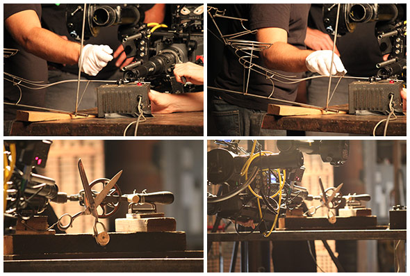
Probe lens live-action shooting
In total, we had a few days of editorial in Final Cut where I worked with Nathaniel Park. We have worked seamlessly together on numerous jobs in the past and this was no exception. I then completed the final colour grade in DaVinci Resolve.
What element(s) of this sequence are you most happy with?
I am most happy with what the art department brought to the table on this shoot and how efficient and flexible the process was of building each custom element. I kept in constant communication with Production Designer Andrew Clarke during pre-production and I feel they nailed the aesthetic I was trying to achieve. It was always a concern as to how to make each scenario work especially as it all had to be captured in-camera but on the day it all went as planned.
Anything else interesting happen while producing this sequence?
Besides one of the mice escaping on set and watching the wranglers chasing it while trying not to knock down any equipment, no.
And more generally, what are some of your personal favorite title sequences, either classic or contemporary?
I have always been a fan of the early Bond sequences and the conceptual simplicity of title sequences such as Wimbledon.
What excites you outside of design?
Doing as much traveling as possible!

