In Kike Maíllo’s criminally overlooked 2011 film Eva, it is the year 2041 and robotics designer Alex Garel (Daniel Brühl) is invited back to his alma mater to design a new android.
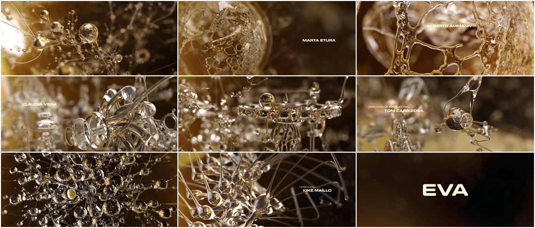
For designers and science fiction aficionados, the real stars of the film are the robots, of which there are plenty – large, small, lumbering, graceful – and their interfaces. The gorgeous crystal machinery of the opening title sequence is based on an interface in the film used to design the brain of a new robot. Its characteristics are customized, a set of traits plucked from thin air and arranged to create a being as close to human as possible. The film’s central question is one that is often asked of intelligent machines in cinema: “What do you see when you close your eyes?” This question of dreams and desires, of the hereafter, is one that appears again and again, most notably in Do Androids Dream of Electric Sheep?, the novel on which Ridley Scott’s Blade Runner is based. Perhaps it’s the interface that is the gateway to both the question and the answer.
Designed by Fernando Domínguez Cózar at studio Dvein, the interface is a stunning piece of work. Its structure appears as a set of glimmering jewels and connectors elegantly fitting together and floating in air, a sort of crystal projection that is operated deftly by hand. That viewers are given a closer look at its parts in the main title sequence is a stroke of genius, and one that wonderfully prepares audiences for a film of quiet marvels.
A discussion with Eva Title Designer and 3D Artist FERNANDO DOMÍNGUEZ CÓZAR.
How would you describe yourself and your career up to this point?
Fernando: Like practically everyone who has a job in the creative field, I consider myself a curious person. I’m interested in lifelong learning, and everything that has to do with creativity. In my case, I consider myself a specialist in not being specialized; I enjoy a lot getting into trouble and new challenges. I find this process really interesting and rewarding. After working in different studios and on all kinds of projects, I decided to become a freelancer, because I could be somewhat more selective regarding projects. The greater flexibility helped me to create a balance between my personal projects and commissioned ones.
For many years, you were with studio Dvein. How did Dvein start, and what is it now?
Currently, Dvein is a collective made up of Teo Guillem and Carlos Pardo. Its origins date back to Universitat Politècnica de València – a fine arts university where Teo and I studied. During that time, we were looking for a job, so we decided to make a reel and a web page. Funnily enough, listening to Pantera’s song “Cowboys From Hell” gave us the idea to call ourselves “Designers From Hell”, but we decided to use a Spanish translated acronym version – “Diseñadores VEnidos del INfierno”. What was initially just a joke became our name.
OFFF Festival 2006 main title sequence designed by Dvein
After creating credits for different festivals and working with Prologue Films, we acquired enough experience in order to start an independent studio in 2007. Carlos joined us shortly thereafter.
In 2013, I needed a change and left Dvein in order to focus on other passions such as writing music.
You worked on the film Eva before you left, right? How did this project come to you?
Yes, I did Eva's titles when I was still working in Barcelona. Thanks to the jobs we had already done, Eva’s production staff thought that it would be a good idea if we did the title credits. The rest of the team were involved in other projects, so I had to assume the direction and execution of the project on my own.
Eva’s title sequence is the result of many stages. As the film was set in winter, I investigated snow as an element. Its inner structure looked extraordinarily elegant to me.
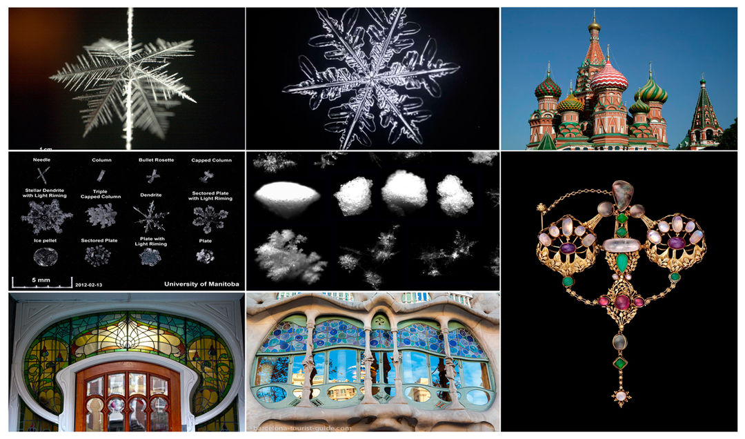
References images including snowflakes, stained glass, and Russian architecture
It helped to guide me as to format and colour levels. I was also interested in the Victorian period, especially the complex laboratories, the steam engines and any type of mechanism. I was attracted to the ideas from Art Nouveau, which is basically that mechanical elements need to resemble or imitate the organic forms of nature.
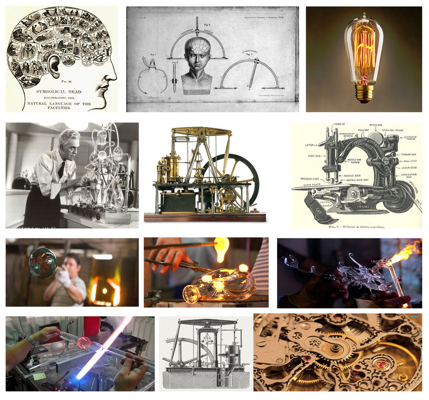
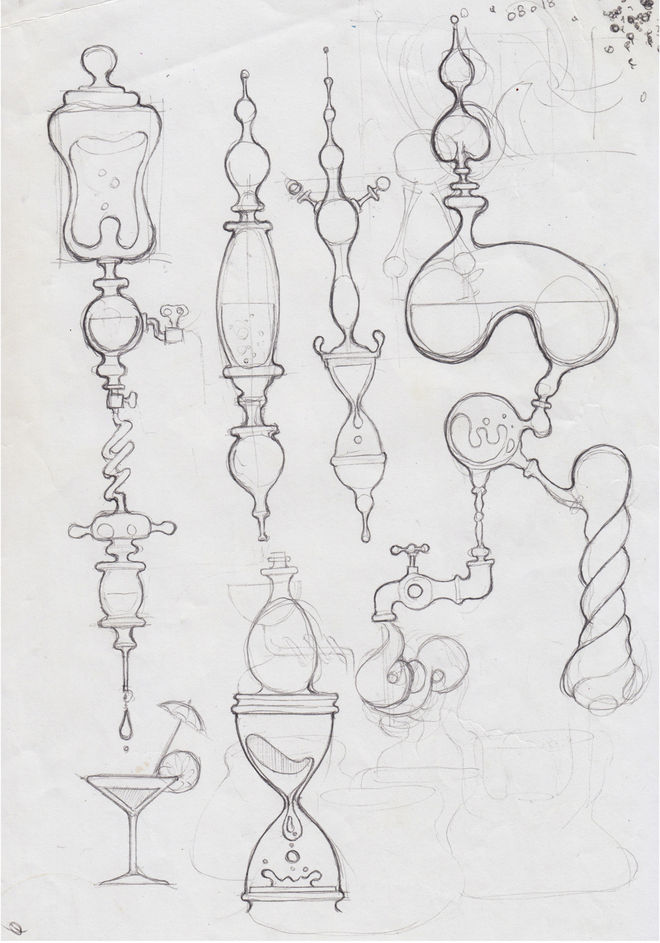
Sketch by Fernando Domínguez Cózar of various organic mechanical forms
In the beginning, the title sequence was based on the path across the snowstorm that a little first aid robot follows. This little robot, which was attached to the main character’s belt, was only activated in case of emergency, and its objective was to get to a safe place in order to sound an alert. So the opening credits were based on the robot making its way through the snowstorm, and I decided to design a little circular robot based on sci-fi flying saucers from the ’60s.
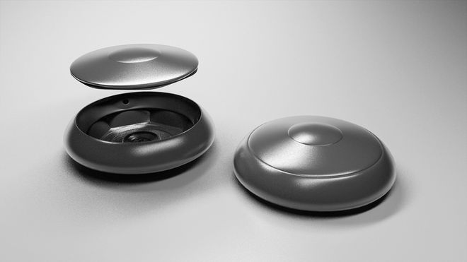
I decided to design a little circular robot based on sci-fi flying saucers from the ’60s
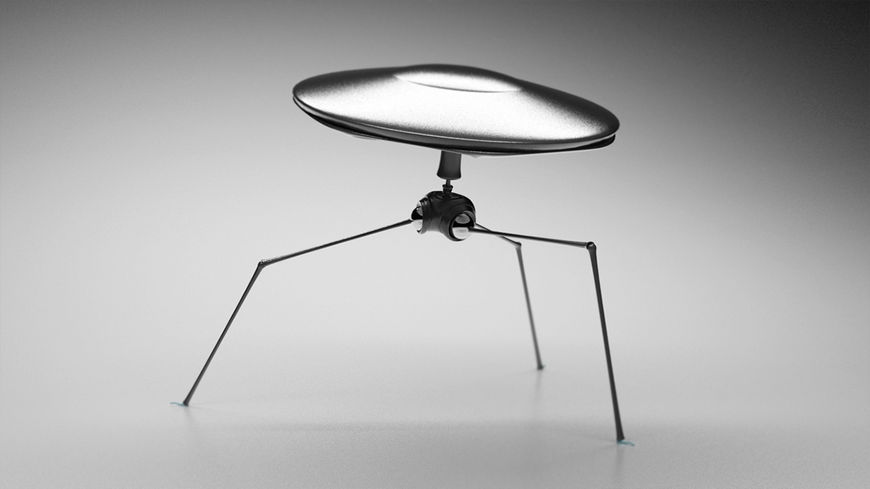
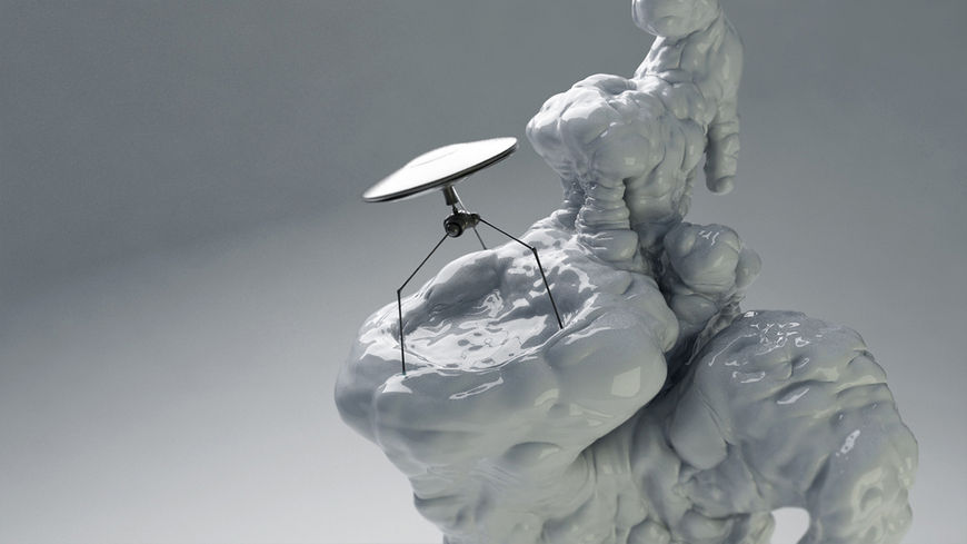
I just wanted to create a simple, beautiful and concise design that could easily be animated. Part of that idea became real, as it was shot by using tunnels made out of bags of salt, which looked like snow.
What came first – the robot-AI interface in the film, or the main titles?
I first designed the interface in the film. Kike Maíllo, the director, wanted me to design the “Hand Up” or interface, where the main character of the film creates the personalities of his robots. Afterwards he suggested that we base the title sequence on the interface.
So, how did you start?
Kike had in mind a type of interface that floated. In fact, Kike was inspired by Iron Man 2, in which Robert Downey, Jr. handles information on kind of floating interfaces. However, Kike preferred to find his own aesthetic since Iron Man’s was much too military-like.
Learn more about the interface in Iron Man 2 designed by Prologue on Motionographer
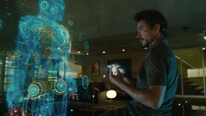
Interface from Iron Man 2, designed by Prologue
One of the first interface designs I did was similar to a type of abstract geometric shape; it looked like a broken Rubik's Cube, which had multiple faces that could be manipulated and fit together allowing the creation of new forms.
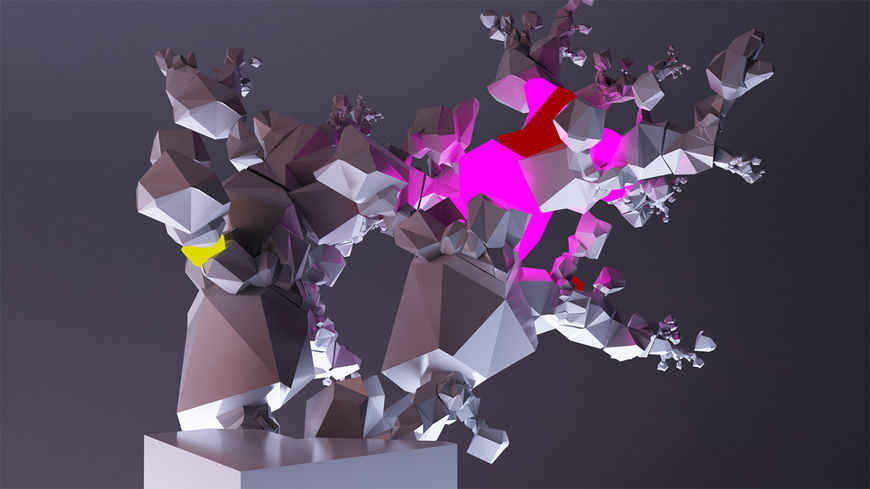
Early interface design by Fernando Domínguez Cózar, based on abstract geometric shapes
Though it was a really interesting idea, it didn’t fit that well within the film’s aesthetics. So in order to get inspired for the “Hand Up” design, I thought about the snow-covered landscape, which functions almost as another character.
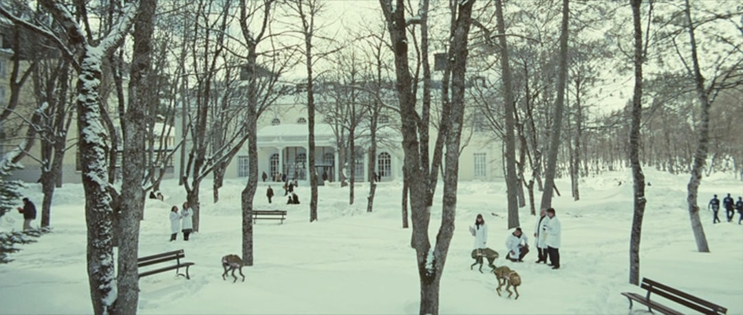
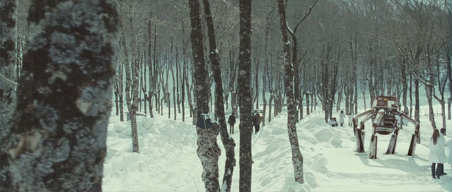
Stills from Eva featuring the snowy landscape and various robots
I found the micrographies of the inner structure of snowflakes beautiful – that type of fascinating geometric shape reminded me of neurons in the brain. So this was a starting point for designing the “Hand Up”. From that moment, I began to model forms in 3D in an intuitive way.
My objective was to demonstrate how objects that were supposed to be rigid could be easily transformed into malleable ones
Animation test with wireframes (top) and render (bottom)
As I kept designing, new elements came to mind to complete the structure. There's something I've always found fascinating about mechanisms, Victorian laboratories, test tubes, devices... I thought that these retro ideas fitted well into the atmosphere of the project. So the “Hand Up” began to look like a network of bizarre mechanisms, memory spheres plus characters’ personality traits.
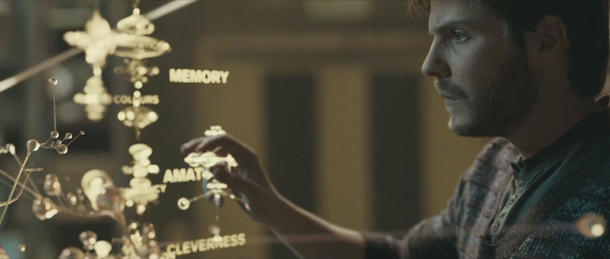
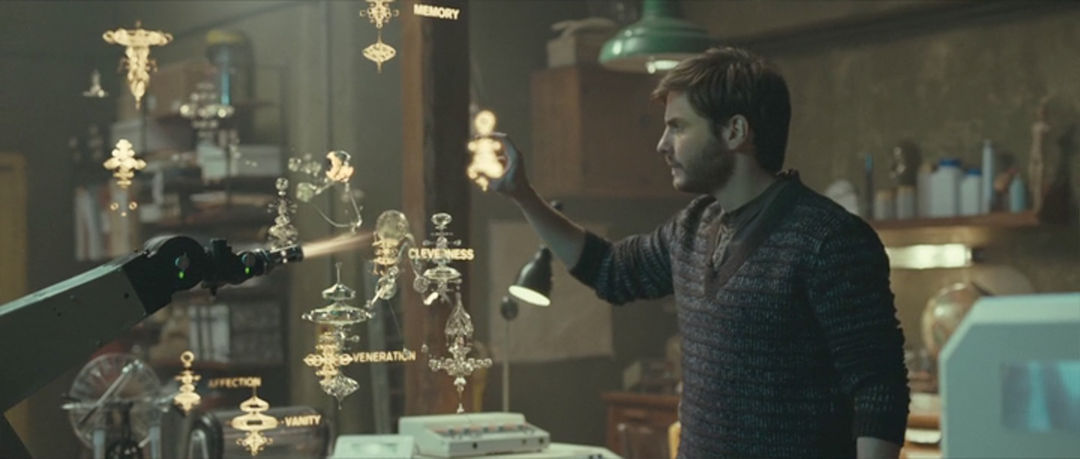
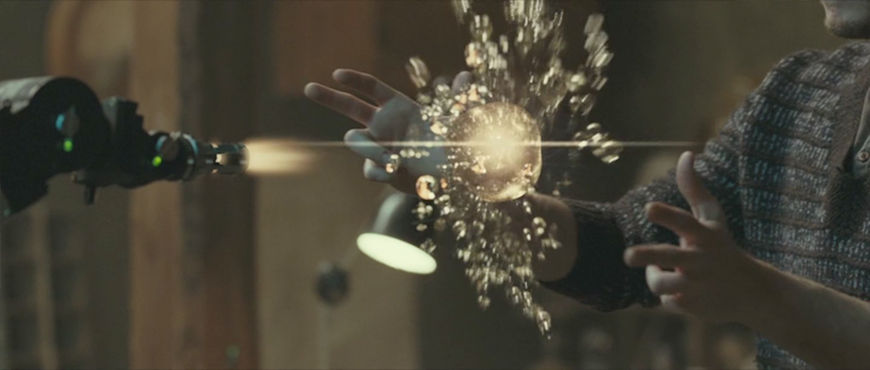
Stills from Eva featuring Alex Garel (Daniel Brühl) using the "Hand Up" interface
Kike loved the interface design so much that he suggested doing something similar for the opening credits. I had a lot of modeled material so it was fun collecting all the different elements and finding the bests points of view in order to make it look as nice as possible. My objective was to demonstrate how objects that were supposed to be rigid could be easily transformed into malleable ones and the other way around. The chosen materials reminded us of the painfully beautiful and fragile inner structures of snowflakes. So basically, the credits introduce the spectator to a journey where delicate forms, innerworkings, and mechanisms display Eva’s world little by little.
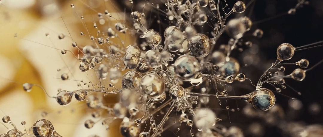
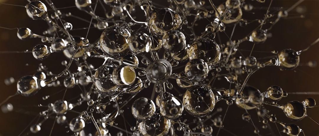
Stills from the Eva title sequence
Is the interface holographic? Or did you imagine it having a texture? What would it feel like to the touch?
I always imagined it physically, as if it was a crystal with different temperatures, depending on what was on the inside. If the sphere contained a memory with rage, the temperature to the touch would be like a really hot crystal.
Clip from the documentary Eva: Making Of (2012), directed by Alex Rademakers, featuring Fernando Domínguez Cózar (1:07) speaking about creating the "Hand Up" interface and elements
Music and sound design were added once the titles were finished. I didn’t have the opportunity to talk directly to the sound guys, but I suggested sound design guidelines to Kike that they followed.
Although I usually work in teams, in which everyone has a specific function because otherwise it could be a complete mess, it wasn’t the case while I worked on Eva’s credits. As I’ve mentioned, the rest of the team was involved in other projects, thus, because it had a low budget and there was a longer period before the deadline, I assumed the responsibility for it. It became a personal project since I am reasonably familiar with 3D modeling and rendering tools, liquids simulation and post-production. It took me five months to finish the project, working day and night all along.
Animatic of Eva main titles by Fernando Domínguez Cózar
Which tools and software did you use to put it all together?
I mainly used Photoshop, 3D Studio Max for modeling and animation, Realflow for fluid simulation, and After Effects for compositing.
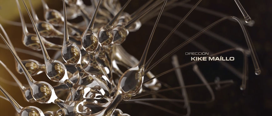
Still from Eva title sequence
When you think about title sequences and design, do you have favourites? What got you into this field?
I remember myself being a student and watching for the first time Se7en, with titles directed by Kyle Cooper. It was then I discovered the art of the titles. Se7en’s credits had such an impact on me that everything I did for the next few years was clearly influenced by this piece of art. What I enjoyed the most was how the typography seemed to appear randomly accidental and broken but in fact everything was drawn with precision.
I believe that Dawn of the Dead, with titles also directed by Kyle Cooper, is another masterpiece.
Six Feet Under’s titles directed by Danny Yount have been always an inspirational reference to me, too. It’s also worth mentioning his piece of work called The Reaping.
The Reaping (2007) main-on-end titles, designed by Danny Yount
What have you seen or watched lately that’s been exciting to you?
I really enjoyed watching Coldplay’s “Up&Up” video.
Thanks, Fernando! We appreciate you taking the time to talk about your work.
Thank you very much for offering me such an opportunity to share my opinions and work. Congratulations, as well, for the amazing job you’re doing.

