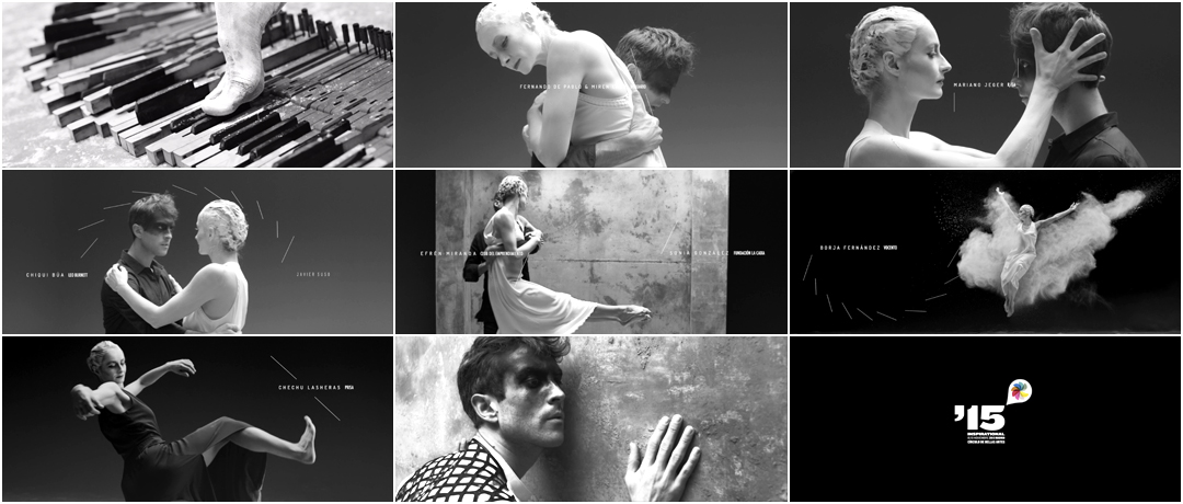
Taking a fluid and purposeful step away from the gloss of visual effects, Madrid-based studio Apéritif lets inspiration manifest itself through dance.
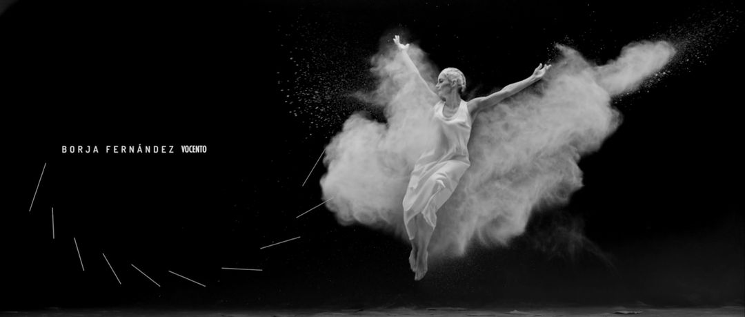
In the opening titles for Festival Inspirational 2015, a two-day event based in Madrid that celebrates creative work, a single, dusty toe on a piano key becomes a catalyst. A male figure, draped in black, encounters the shadow of himself and a woman in white. As they spar in their stark push-and-pull tête-à-tête, the typography of the presenters’ names embraces the angles of bodies in motion. Fragile and fierce, their movements transform them and their surroundings, the space suddenly more rough, the divisions between them disintegrated.
Dance is a rare medium for an opening sequence, particularly in the 21st century, but the direction and choreography here demonstrate just how powerful and refreshing it can be.
A discussion with Creative Director MARGA CASTAÑO of Apéritif and Director and Choreographer BEATRIZ ABAD.
Give us a little background on yourselves and on Apéritif.
Marga: I grew professionally at Wysiwyg, one of Spain’s pioneering agencies in the digital world and now part of the Publicis Group. After 15 years there, the last six as executive creative director, I decided to take a turn in my professional life and started Apéritif, a creative studio born to create ideas and develop projects, both our own and our clients’.
Beatriz: I have been working in commercials, music videos, short films, fashion films, and other audiovisual works. This is my first collaboration with Apéritif. Púgil Film offered me this project because I have a big background as a dancer and they thought I was the best choice to do it.
—Marga CastañoInspiration is beyond technology. Inspiration is what brings together all of us who work in the ideas world.
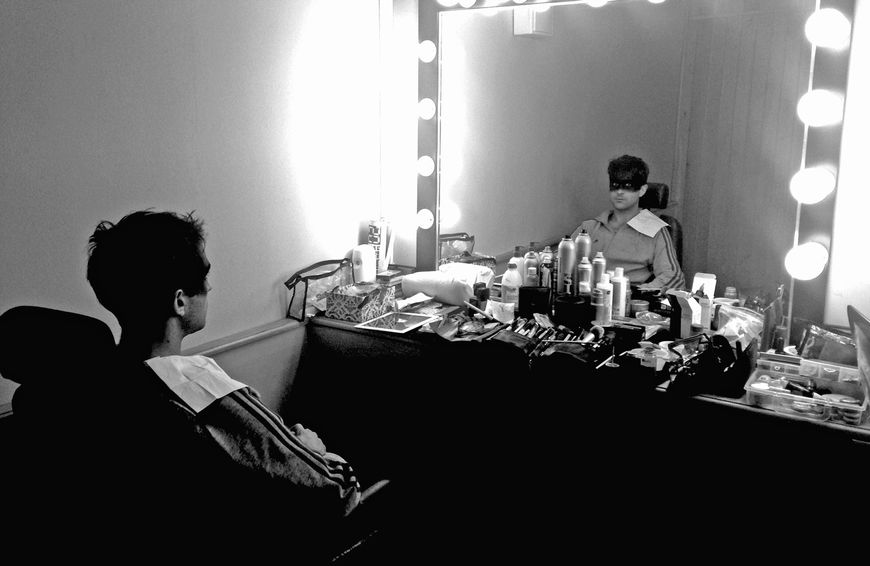
Dancer Borja Valle Cortina with make-up by África
This title sequence is pretty unique in that it features dance exclusively. How did you decide on that direction? How did you start?
Marga: The Inspirational Festival is focused on digital communication and innovation, where inspiration plays a very important role. And that’s basically the objective we set up for the opening titles: to inspire everyone from the beginning because the titles are the first thing the festival shows. We knew we had to break with some visual codes that were used in previous editions and that insisted on 3D, digital effects, and electronic music. We do enjoy those videos, but we decided to do something totally different.
To us the digital world is nothing new. It’s totally part of our lives – something that comes natural and is expressed in infinite languages. Inspiration is beyond technology. Inspiration is what brings together all of us who work in the ideas world and that’s all we wanted to show in the titles – the creative process and how hard, inspiring, desperate, and fun it can be.
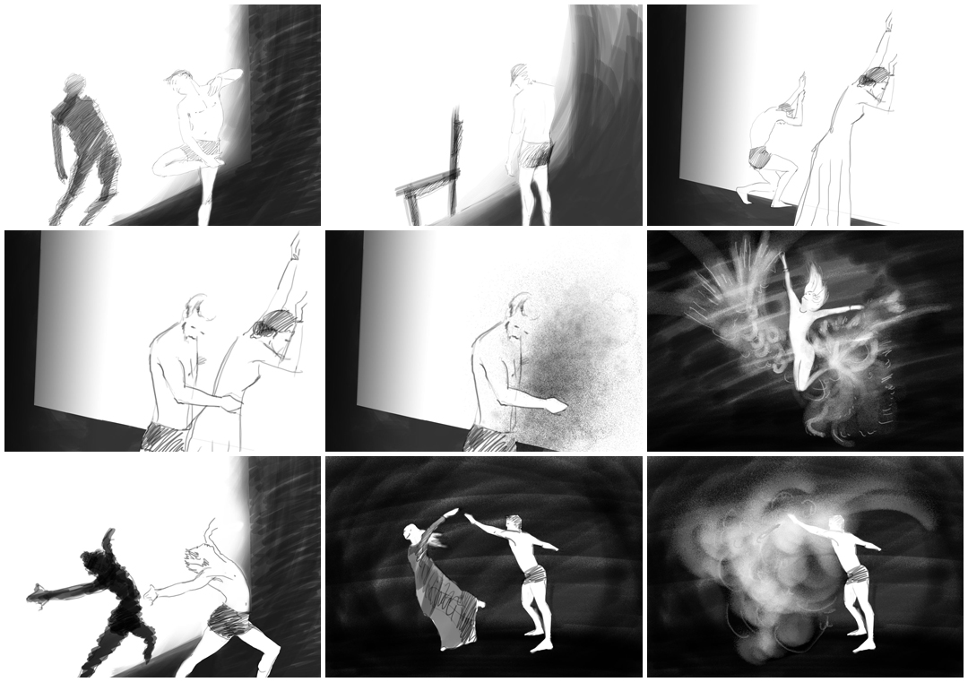
Image Set: Initial storyboards illustrated by Marga Castaño
Beatriz: From the beginning we thought that the relation between the artist and inspiration needs to be expressed with dance.
Marga: If we think about how we relate to inspiration when trying to create, we all go through different phases: first, you fall in love with an idea you like; after a couple hours, it frustrates you because it doesn’t seem so good; then, you feel rage because time runs out and you don’t find anything better.
That insecurity, that love, that hate, that with-or-without-you… seemed very theatrical to us, very plastic, in a way. That was how we decided to define the steps of the creative process and choreograph inspiration itself.
Beatriz: The original concept was to create a piece with two different ideas: a contemporary dance with two characters – the artist, and his inspiration – and the image in black and white.
Did you have the music first, and then work out the dance?
Marga: The song was key to creating the choreography, the timing for each title text so it could actually be read, so it was the first item before everything else was developed. The music was specifically composed for the sequence. We told the composers, Hijos Music Design, what we had in mind. We talked about different styles and listened to lots of references. We wanted something with its own personality, with enough cadence to develop the story so it wouldn’t leave you indifferent.
We were very lucky Beatriz used to be a dancer herself, so she already had that extra sensitivity that was needed to make our approach grow. We shared with her the basic story we wanted to tell and she made it grow. She created the dance steps for our idea: she actually made our concept real.
—Marga CastañoIt’s about the story, not about the effects.
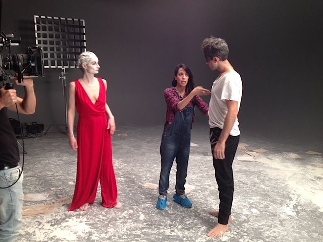
Director and Choreographer Beatriz Abad directing the dancers
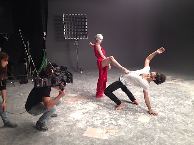
Director of Photography Willy Jáuregui framing the dancers' movement
Beatriz: We found the dancers from a casting director, Txave Atxa. I worked with the dancers step by step. First I chose small fragments of the music and we worked on the ideas, the emotions that were already written in my screenplay. And then we arranged the small fragments so we made an entire piece.
How did you decide on the black-and-white colour scheme?
Marga: There are several reasons for that. On the visual side, we liked the drama black and white brings. We also loved how it helps to play with shadows in some parts of the story, just like old German expressionism: those shadows in Nosferatu that seem to become one more character in the movie!
And yes, black and white and grain size were also a way to move focus away from the tech and digital codes of cold and crisp images to insist on the human side and struggle of inspiration itself: it’s about the story, not about the effects.
When you thought about using dance, what were your inspirations?
Marga: Contemporary dance in general and Pina Bausch in particular.
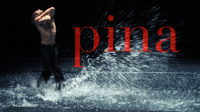
Beatriz: My inspiration came from my own style of dancing and from the style of the dancers in the Pina Bausch documentary film Pina. I like Pina Bausch, Pavlova, Nacho Duato, Victor Ullate...
Pina (2011) official trailer
I know your approach was primarily analogue, but the output was digital. What did you use to put it all together?
Marga: For 3D we used Maya. For composition and integration, Flame. The camera was an Alexa Min. The editing was done in Final Cut.
How did you work with the typography?
Marga: We used sans serif typography but with some personality that would go along with the story. It was important that it wouldn’t take much space when increasing kerning so we could keep the visual contrast between the two parts of each credit – name and position or company. We used Dosis Medium and Futura Condensed. For a while, we considered the DIN family, but we finally chose these other two.
—Marga CastañoThe credits had to be part of the choreography – an extension of what was going on.
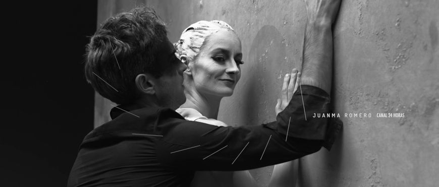
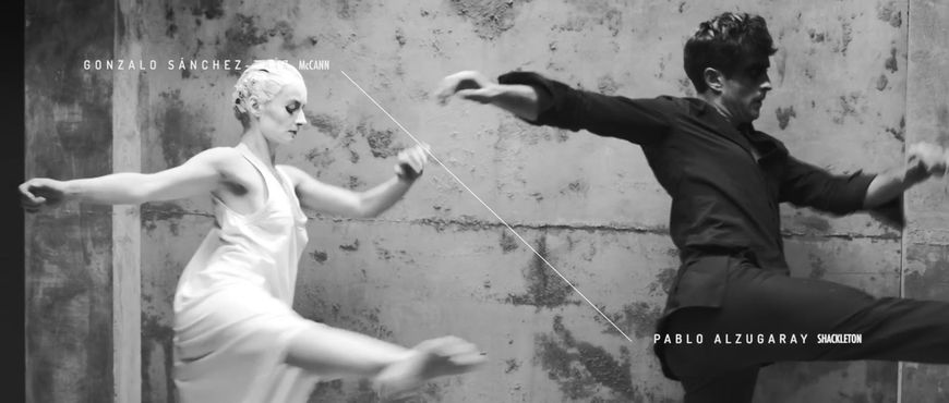
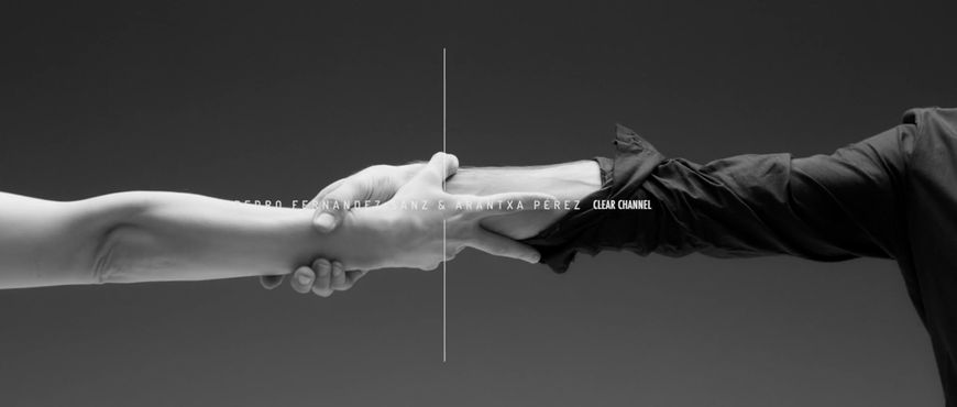
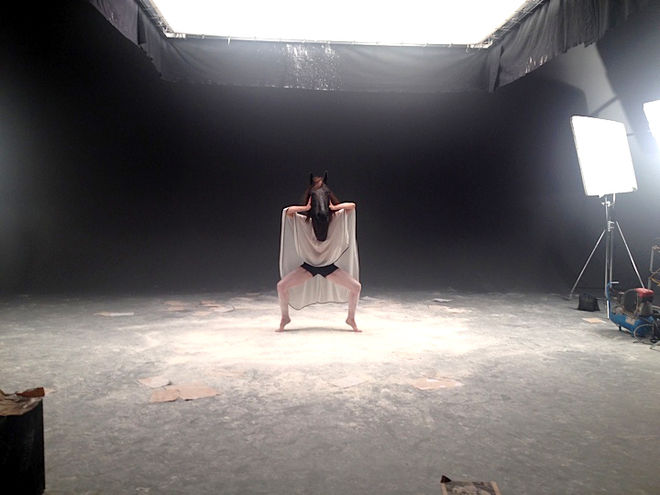
Marga: The credits had to be part of the choreography – an extension of what was going on. We wanted something very organic, very natural. That’s why lines are drawn from the dancers’ movements and go along smoothly with each name. I love how the lines and text go along with the male dancer the moment he leans back on the chair or the strength in the shot when she bites his head. I also love the plasticity of her jump and the craziness of the horse head moment.
Beatriz: The element I like most is the wall that appears in the video. I call it the wall of creativity because is in that wall, where the artist and his inspiration, find each other. They find the harmony, the understanding and the agreement between them.
What are some of your personal favourite title sequences, whether classic or contemporary?
Marga: I’m a big fan of Saul Bass. I believe he’s one of the masters.
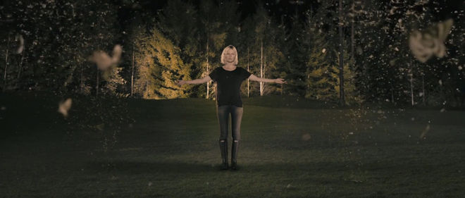
From more recent examples, I love the prologue in Lars von Trier’s Melancholia even though, technically, it’s not a title sequence. I find very daring the way he uses it to tell almost the whole story and still make the audience willing to watch the whole movie.
Melancholia (2011) opening sequence, directed by Lars von Trier and designed by Poland-based Platige Image

